Colour or Black & White?

Artist Ginger Brady emailed me to ask:

I am wondering if you get asked by many people if you would do your drawings in color instead of Black & White? I am having many folks tell me they would buy my work “if only” they were in color or had some color to them? Have people asked you to add color? I have, to appease a few people, but I am not happy with the results from colored pencil or water color. I miss my Graphite pictures and I feel like I’ve been wasting a lot of time trying to make others happy.

Been there, done that, Ginger. And like you, I found that “working for others” didn’t appeal. I had to stay with the medium I really care for and working for “me”. That’s what art is about, isn’t it? Expressing your love or feelings for something. Displaying the subject to your viewers and saying “Look at this. No, look closer. See what a beautiful creation this is.” To my mind, there’s a world of difference between “fine art” and “illustration”. The first involves passion and is personal, the other is commercial and mechanical. I suspect your “must work in colour” art is creeping into the latter category.

It’s been said that “Colour appeals to the senses and drawing appeals to the mind”.

For me, colour gets in the way; it’s a distraction. Colour allows the eye to quickly pass over an image and gather enough information to be satisfied. A brown horse in a green field can be identified in a nanosecond and possibly dismissed. Remove the colour and the mind has to linger to gain an understanding. And in that time span, however short, we graphite artists have the chance to grab the viewer’s attention and suck them into the image.

We have only a pointed stylus to work with, so detail tends to dominate our thoughts. Detail can, if used with care, pull the viewer ever deeper into the work. It can educate – invite exploration of what the viewer might recognise but have no real knowledge of – and it can tell our story. That, I think, is what you’re missing – art has to say something! And your language is graphite-based.

In the past I’ve had dealers moan that “If you worked in colour I could sell your work in much greater quantities.” I’d argue that if I worked in colour, it wouldn’t be my work. Despite that, I purchased a few small canvases, an array of paint brushes, and a wide selection of oil paints, so if I felt the urge to paint I could do so immediately. Those paints are in a drawer of the unit that sits by the side of my drawing board… and they’ve been there for over twelve years – unused.

If you feel you need, for commercial purposes, to work in colour then do so, but don’t stop working in your first love, graphite. You may find you sell more drawings on the back of your paintings if your overall sales increase. However, I made a personal decision to stay pure to my love of graphite. It’s true that the available market for drawings is much smaller than for paintings, but conversely the competition is much less too. It’s a niche market that you have to work hard to survive in. That said, if my prints are exhibited in a store, I can guarantee my graphite work will stand out from the plethora of paintings. That’s an advantage you can make use of but only by first refining your craft until you have something of real quality to display.

If colour pays the bills then work in colour. But use your quality time for graphite. Personally, I find nothing beats the direct mind-to-hand-to paper connection of graphite. I think, I draw. One completed section at a time until the overall picture emerges and my story is told. Painting, pastel, coloured pencil are too involved and “mechanical” to suit me – colours to mix, layers to apply…

Now I am wondering if my Graphite drawings are not appealing to the public? What has your feedback been?

My experience is that there’s a small but discerning sector of the public who appreciate graphite drawings. In the same way that some, but not many, appreciate Black & White photography – but most people would accept the argument that classic photography is B&W. We are in the same market. We are not displaying glowing colours that the senses can revel in. No, we, with our palette restricted to just contrast and texture, invite thoughtful appraisal – we provide food for the mind.

Stay faithful to your chosen medium – even if you have to pay the bills with jobbing colour work. And, above all else, draw FOR YOU. While I might make the occasional alteration to a composition to suit my market, I will only do so when it doesn’t adversely affect the story I want to tell or the message that I wish to convey. I draw for myself and always will do. I’m a fine artist and not a commercial artist. Yes, there have been times of despair, just as you are experiencing, but have faith in yourself and your work, and in time others will appreciate it.

Enjoy Ginger Brady’s fine work at: www.GingerBrady.com
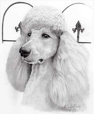
Pet Portrait by Ginger Brady

Dog Drawing critique

Molly emailed to ask…

I sent you a few of my pet portraits a few years ago and you were kind enough to give me a free critique. I purchased your book and have studied it, but still am struggling with my drawings. I was wondering if you would have the time to give me a quick critique on my more recent drawings so I can see how I have improved.

I would like to attend your workshop in Yellowstone, hopefully it will work out for me to attend this year.

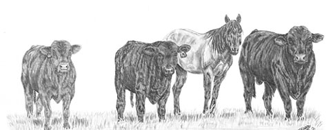
Molly's livestock drawing

You sent me five images, Molly, but I’m going to concentrate on just one, because I think they all contain the same approach.

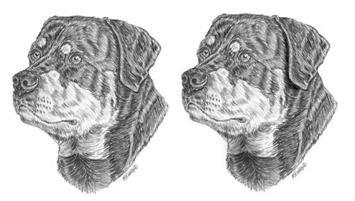
Molly's Rottweiler drawing

You’ve developed a good eye, Molly, and you show a good understanding of what you are attempting to draw. The Rottweiler’s nose, for example, is perfectly shaped – and you’ve certainly captured the character of this lovely dog!

However (you could see that coming, couldn’t you 🙂 ), I think you’re too focussed on the reference, and drawing without really being aware of the three-dimensional shape that you’re depicting. You are very accurate with the growth direction of the hair but reacting, I think, to the tones you see before you without asking yourself what they represent. You’re drawing the two-dimensional content very well, but losing sight of the three-dimensionality – and the finer detail that adds that sense of reality.

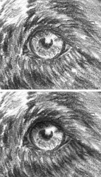
Eye with tonal range altered

Decide on a lighting direction before you begin. It doesn’t have to be the same one as seen in your reference – in fact, it will benefit you if it is different, because when you are forced to impose your own lighting, you HAVE to understand each element in three-dimensions. It’s this lack of three-dimensional lighting that is making your drawings appear to be flat – as is your shyness in using bold blacks.

For example, you’ve used good solid blacks for the pupils, but then not used them in the shadow beneath the top eyelid. As a result the eyeball and lid appear to be on the same plane. Think about where the structure you’re drawing recedes or protrudes and then light it accordingly. With a little practice you can then begin to manipulate elements of your drawing to bring out or emphasise the three-dimensional nature. I would, for example, be planning to introduce deep shade between the ear and head so the difference in planes was obvious. And I’d darken the neck beneath the chin too for the same reason.

The ear forced to stand away from the head

The ear now stands proud of the face and adds a definite three-dimensional sense for the viewer. Never be afraid of going dark – you can always later reduce the intensity of the tone with Blu-Tack or similar.

Now you are much more comfortable with your pencils begin to look deeper into the reference. Understand the exact make-up in greater detail and then build that into your work. The Rottie’s nose, for instance, looks good but in reality it has a leathery texture of pits and islands. You have a good idea of its construction – now slow down, focus more on that single element and add the texture. Treat it as a drawing in its own right so you’re not tempted to move on to other areas too quickly.

You’re definitely heading in the right direction! I do hope you can make it to the Yellowstone workshop in June. There’s so much I can show you more easily – and I can look over your shoulder too 🙂

Drawing Trees

Having read my book “Drawing from Line to Life”, Rob emailed me to ask…

I admire your attention to detail without the sacrifice of the ‘drawing’ appeal in your pictures. I was wondering, when drawing trees you mention drawing the internal structure. Are you advocating that when setting out to draw a tree you would draw the internal structure first, then map out the main masses of foliage on the limbs, then go back and erase the bough structure from within the mapped-out areas of foliage masses?

I don’t have any hard and fast rules for myself – I just wing it and do whatever best suggests itself.

Typical guideline drawing

However, one thing is certain – I need to have a three-dimensional idea of what I am about to draw. Establishing the trunk and major boughs gives me an armature to work around. On that skeleton I can then map out (however roughly) the major masses of foliage. If you keep your guidelines light, you probably won’t need to erase them.

You can start with the edges or the centre, but do bear in mind that the central ones will overlap those at the side of the tree. All this helps to reinforce the three-dimensional nature of the structure in your mind but relieves you of the need to work out form and lighting of each element. That said, I often lightly hatch the basic shading required to remind myself later of what I was visualising at the time.

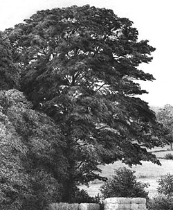
I’m assuming (I hope correctly) that you are referring to midground and background trees. Foreground trees require more planning and tighter detail. Look closely at tress and ask yourself why you know it’s a tree even though, in all probability, you cannot discern actual leaves. Maybe it’s the dappled pattern of light? Perhaps the shadows that describe the three-dimensional nature of each leaf mass? Or, more probably, a combination of the two – and more.

Completed tree from guideline drawing

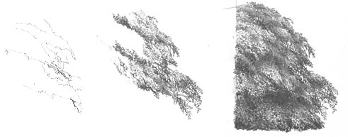
Next decide on the lighting direction and then begin drawing. I prefer to begin with those areas of branch that show through the foliage. as little light enters deep into the tree, and they are seen against a bright sky, they are relatively dark. Establishing one first, in the area that are going to work in, gives you the deepest tone and the white of your paper, of course, supplies the lightest. Now all your intermediate tones will fall into place as you work.

I tend not to shade but to just work in random patterns of lines and scribble; working light with more visible hie remaining in the brightest areas, and overworking the darker areas with more pressure. There’s little conscious thought involved – just watch the tree grow before your eyes.

Stages of spontaneously drawing a midground tree

As each element is three-dimensional, it must obey the laws of light and form – each casting its shadow on the mass below, and having a highlighted top and more shaded bottom.

Take a look at an earlier article of mine (“drawing-trees-and-bushes”), don’t plan too much, keep it free and spontaneous, and you’ll find yourself drawing realistic, organic trees in no time!

Working on a slant

Debbie wrote to ask:
I just wanted you to know that I’m learning a lot from your book. But I have a question. I’m ready to start shading, blending ect. When you do this do you do it with your drawing board flat or still on a tilt?

On a tilt, Debbie – for two reasons.

First, I’m too lazy to readjust my drawing board 🙂

Second, it allows loose graphite to drift down away from my drawing surface. There is almost no other reason why you shouldn’t work on a horizontal board.

However, the practice of drawing on a tilted drawing board is universally accepted because it minimises parallax errors. If you work on a flat board you may be looking directly down at the base of your drawing but parallax distortion will occur because the top of your drawing is angled away from you. This is like working in perspective (measurements diminish in size with distance) on something that will ultimately hang vertically in front of the viewer.

That said, if you already have guidelines in place then parallax errors shouldn’t occur, because you will simply be working within predefined boundaries.

It’s your choice but, personally, I’d choose a tilted surface where every part of my drawing is an equal distance from my eyes.

Colour Shapers

Kevin emailed me to ask:

I read in your book (Line to Life) yesterday that you use colour shapers sometimes for blending. I would like to buy a set but I was not aware that they came in different sizes. Could you please advise me as to which size to buy. The ones I have seen are size 0, 2 and 6. Many thanks and I love the book.

Colour Shaper varieties

When I see a tool, however far removed from drawing, and it looks useful I just have to try it 🙂

Colour Shapers are intended for painters but I find then ideal for blending in tight spots. Unlike tortillons or stumps, they don’t absorb much graphite, so they lighten less. And they’re easily cleaned by screwing the business end into a lump of Blu-Tack.

They come in different sizes and profiles, as you mentioned, and in two types – stiff and flexible. I know a couple of artists who prefer the stiff variety but I find the flexible more appealing.

I have three:

Flat chisel – size 6 (rarely used)
Taper point – size 1 (I think – it’s rubbed off!)
Taper point – size 2

Of the three I mainly use the size 1 Taper Point. I find it’s ideal for blending when I’m drawing remarques. Because I remarque on the coated surface of the (offset-litho) printing paper, I’m restricted to using 2B and 2H, and I achieve the half tones by establishing the line element of each area with the 2B and then dragging the graphite over the lighter areas.

If you don’t have one you won’t miss it. But if you do, you’ll find unique uses for it. In my case, I very rarely blend anything, apart from skies and dirt floors, so blenders are not my most popular tool. But the Colour Shapers certainly fulfil a need at times.