I sometimes answer drawing-related questions on Quora. This is my latest post in answer to the query “DO I NEED TO DRAW FROM LIFE IN ORDER TO GET BETTER AT DRAWING?”
I’ll assume by “draw” you mean the use of graphite pencil, and that the drawing includes both line and three-dimensional shading. A realistic, or semi-realistic, end result being your goal.
Because the pencil is a relatively narrow, pointed stylus, we tend to be detail-orientated artists. We don’t have the facility to lay down broad areas with a quick gesture, so spontaneous “suggestion” is rare. Instead, we concentrate on the finer details.
To do that you need to know what the details are. You cannot successfully draw something you don’t understand. That understanding, and the knowledge of the detail, comes from observation. You store individual elements in your brain and subconsciously retrieve them as you work. Drawing from life is an excellent way to load data into your brain, because it forces you to focus on the make-up of your subject. And the more data you store, the easier drawing becomes.
You can gain similar information from photos too, or just by looking at something in real life. But the act of drawing reinforces the memory of its parts.
You can test your ability to recall quite easily. And this exercise is a good one to run through before you draw anything. Use words, not drawing – describe the object to yourself. Take a leaf: you know its shape but is it flat? Or does its surface consist of rounded and raised islands? Are the intervening veins lighter or darker than the body? Do the veins sink in to the upper surface or stand proud of it? How does the underneath surface differ from the top? Drawing from life helps to answer those questions, and commits the results to memory. The next time you draw a leaf, you’ll have all the information you need to draw it confidently and realistically.
Sometimes when I’m drawing foliage I find my store becomes depleted. No problem. I grab a sketchbook, walk to the nearest leafy lane (which I fortunately live on) and sketch individual leaves. Now, armed with an array of different shapes and forms, I can inject a greater sense of reality into my drawing.
Photos are good sources of detail, but they won’t supply much three-dimensional information.
Pure observation will help to analyse textures, form, and detail, but the memories might fade in time.
Drawing from life – even simple line drawings – will explore all aspects of the subject. You’ll remember your drawings, and their constituent parts, far more clearly and permanently. And, if you reach out and touch the subject, run your fingers through its hair, feel its glossy smoothness beneath your fingertips, scrape you nails over its rusty surface… you’ll remember all that too. It’s all “brain food” to feed into your future drawings.
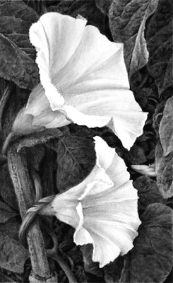
This is a little 2″ x 3″ (2.5 x 7.5cm) drawing drawn from my imagination, but I was drawing what I knew and understood – recalling information supplied by various earlier life studies.
Bindweed
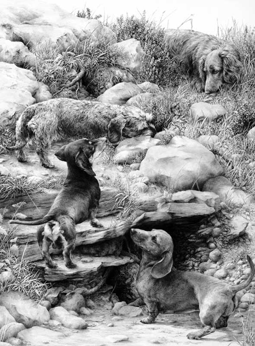
Or here in “The Warreners”:
The Warreners
I worked from photos of the dogs, although I had stroked and got to know each one. The rest is imaginary, but that was only possible because of earlier drawing from life – I know how grass springs from the ground; how heather forms into slim, angular branches; how sandstone is formed, and limestone rocks are altered by water action.
The human brain loves images. Draw what you see – convert your vision to an image – and you’ll remember everything about it for years to come.
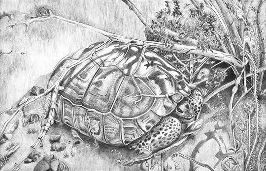
Having offered some advice to Jay on an earlier project he emailed me again with his latest drawing – “Mojave Terrapin”. In Jay’s own words:
Our discussion centered around modifications to values as a drawing progresses. I had significantly enhanced the shadows over the photo reference I had for this image. I worked to enhance the darkness of shadows from the branches of the bush the Terrapin was under as well as darken the shadows under the turtle. I am a little disappointed that I didn’t even go darker.
MOJAVE TERRAPIN by JAY SULLIVAN
I’m disappointed too, Jay. My first reaction was that my eye goes straight to the black hole at the right. My eye going there first is not too bad because I’m quickly taken to the Terrapin, but the lighter values used for the Terrapin do make it look rather flat. I don’t think the lighting is helping that either.
Judging from the shadows across the Terrapin the light appears to be very even across the shell – but I think you can use artistic license to lie about that convincingly.
May I suggest you progressively darken the left-hand side of the shell? That would increase it’s three-dimensionality. You could also echo the value of that black hole at the back of the head, where it disappears into the shell. It’s another “hole” so it should look natural. And all that might then allow you to further darken the shadow cast by the shell. There appears to be a lot of white in this drawing that needn’t be there.
Having done that you might then have to darken the ground, but I think it can withstand that – and it would help to separate the ground plane from the vertical one behind.
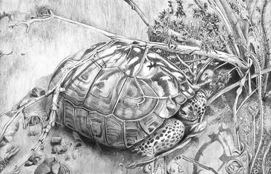
I’ve had a very quick attempt at adjusting your image – darkening the places I mentioned with Photoshop to show you what I mean:
Altered image
Jay replied this morning:
Thank you for your insight. You confirmed and certainly went beyond what I was thinking. Your feedback is invaluable to me.
In my head I had finished the drawing. So I’ve been working at getting over being done with this drawing. One of my realizations is that I have fallen into a habit of not exploiting value for the best result. The terrapin is an example of creating an overall pattern that is too light even when I was trying to be more extreme in using dark to create contrast and emphasis. It is a wakeup call to increase my extremes and watch more closely the overall effect on the drawing. I think a part of cause of this pattern is that I’m not viewing my work at a distance enough. With my nose to the paper I’m working up close and fail to see the effect from a distance unless I put the work across the room for a good look at the whole thing.
I completely understand that. On completion your head will be so full of the individual details that it’s almost impossible to see the drawing as a single entity. My solution to that is to put the drawing away for a few days – or until I can’t exactly remember everything about it. Then I go through a strange ritual. I take out the drawing (face down) and fix two pieces of Blu-Tack to the top corners. Then, without looking at the drawing, I stick it to the wall of my studio and walk away from it. When I turn round I’m too far away to see detail and I get to experience the drawing in the same way everyone else will.
Sometimes I’ll notice a tonal imbalance, or perhaps an element that is distractingly prominent. Then I’ll find a way to fix it with the minimum of work – not because I’m lazy, but if I make changes that are too drastic I’ll quite probably unsettle something else.
Finally, I’ll decide that the drawing is as good as it can be, given my current abilities. I know it can be better, but going beyond my abilities at that late stage will create more problems than it can solve.
One artist commented that drawing is vastly different than painting. If I was being judged by brush wielders they might see my work as incomplete. Pencil artists see white or negative space differently. These differences in perception influence lighting. Trying to apply painting criteria to drawing breaks down over issues of negative space.
I totally agree. You can perhaps best compare drawing to watercolour painting, since both have only the white of the paper available. In my workshops and online I try my hardest to get the artists to see the negative space positively. Two pencil strokes can leave a very usable white shape between them, and we pencil artists need to be constantly aware of the white spaces we are creating. I often find those spaces suggest something that I wouldn’t perhaps have consciously thought of, yet the space works well – especially when refined to become a specific positive element.
Jay continued:
I remember your lesson about negative space, focused on drawing grass. I’m trying to work through how to apply this lesson to contrasts between different foreground/background values like the shell of a terrapin and a stick he is under from a bush nearby. Shadows help with separation. At the same time, exaggerating the value differences between the stick and the light grey of the shell creates an artificial contrast making for greater separation of objects.
Your thinking is 100% accurate. Never be afraid of exaggeration. I do it all the time. False atmospheric perspective, for example, that exaggerates depth. I see drawing as a collection of visual clues that we supply to our viewers. If a little subtle exaggeration is required to add clarity to the clues, then I’ll apply it. We don’t have colour – we can’t add blue to create recession – so I use diminishing detail, softening edges, and lighter values that are often lighter than would naturally occur. Ultimately, all that matters is that the drawing is “read” correctly.
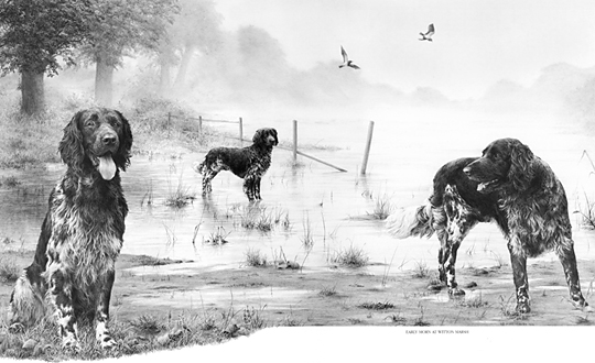
Here are two examples within one drawing “Early Morn at Witton Marsh”.
Early Morn at Witton Marsh
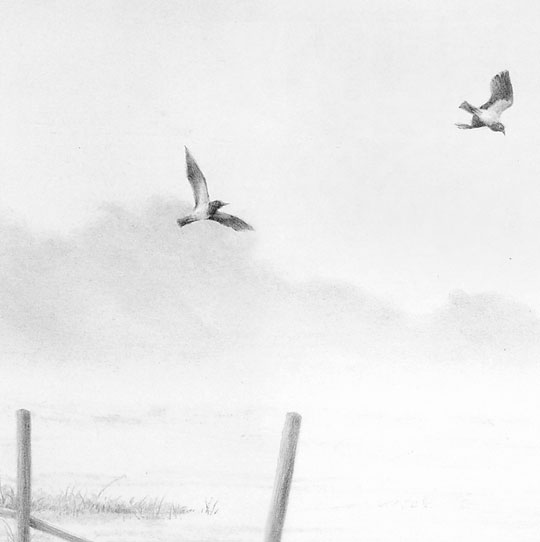
The atmospheric perspective has been stretched to create more recession, and the two birds are deliberately placed to enhance the gap between background and midground – contrasting their relative sharpness against the soft, misty trees and sky.
Detail from Early Morn at Witton Marsh by Mike Sibley
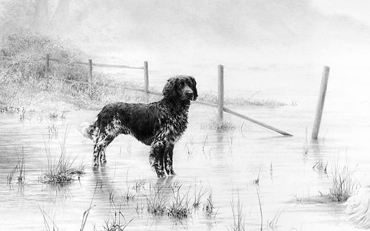
Lower down, the central dog is larger than it should be. It was sized for balance and presence rather than natural accuracy. To overcome that, the fence behind it has a false perspective – it recedes more quickly than it should. But it provides scale alongside the dog and then seamlessly connects that to the scale of the brush and trees behind it.
Detail from Early Morn at Witton Marsh by Mike Sibley
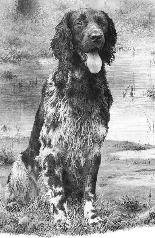
And to return to Jay’s original point, all the hair depends entirely on negative drawing – all white hair is purely negative space. The adjacent drawing defines the edge
detail – “Early Morn at Witton Marsh” by Mike Sibley
Laurene emailed me from Canada to ask about printing and the problems she’s encountered:
This year I’d like to try offering a few limited edition prints on my website and I’m quickly learning that printing is an art form in itself!
Printing is not so much an art as a frustration! It involves… compromise 🙂 When I first went into print I couldn’t understand why printers kept saying “Well, this is as close as we can get to the original.” My mind kept saying “Why are they happy with ‘close’? Shouldn’t they be looking for ways to improve the printing process?” This was in the days when offset-litho was the only printing system available.
Later I understood the inherent limitations of printing. Offset-litho uses a pattern of dots, so four adjacent round dots will always possess a white patch in the centre where they meet. That limits blacks to an 80% coverage, resulting in a dark grey and a decrease in contrast. Printing, therefore, is a compromise between what you want it to look like, and what the technology can accomplish.
Now I print in-house using a giclée (pigment-based inkjet) printer that doesn’t have that limitation, and I have full control over the resulting image. Of course, no printed image can be better than the initial scan, but I’ll return to that.
Red-tailed Hawk by Laurene Spino
The prints will be giclée. They’re using a process they call Durachrome that heat-sets the ink after printing with UV light.
With that in mind, I’ll concentrate on digital printing but cover offset-litho too because it might be helpful to other artists.
I have a good local printer who can scan my drawings on a large scanner that can accommodate my drawings so they don’t have to be patched together in Photoshop. It’s a flatbed scanner not a drum scanner but it does a very good job.
With the exception of the Cruse flat-bed scanner I still believe that a laser drum scanner will produce the best results (see “The Best Scanners for Artwork”). It’s always my #1 choice, but if you’re happy with your Printer’s result, that’s OK.
I’ve tried 3 different papers so far. I like the results on Arches watercolour paper, hot press, and on Canson Infinity printmaking rag paper (museum quality). The problem is that both of these papers are not quite as white as Mellotex (even though they’re sold are “pure white”) and the print has a sepia tone to it. Is this a problem you’ve had before Mike?
I’ve experienced that problem but I’ll cover the paper choice first: I think there are two schools of thought – those that believe the name will help sell the print, and those (me!) who think the result is more important than the paper’s trade name.
Arches and Canson are excellent and well-respected papers, but are they as smooth as Mellotex? If they aren’t, you’ll encourage ink bleed or introduce an unintended distracting texture (both generating a softening effect), and your print will not reflect the quality of your original.
When I first began drawing dogs for print I drew on plate-finish Ivorex, which was also available commercially as a printer’s paper – job done! Ivorex morphed into Mellotex, and Mellotex was exclusively available as an archival quality printing paper. Now that Mellotex is deceased, we have Conqueror Diamond White – also an acid-free, archival, plate-finish paper for the printing industry… so it would be an ideal choice for offset-litho printing.
However, for giclée printing you need to use an appropriately coated paper. To avoid the ink bleed I mentioned – where the ink soaks into the paper and spreads so it blurs edges – giclée papers have an impermeable coating usually termed the “ink receiving layer”. Finding a bright white paper, in my experience, is not easy. In fact I’ve yet to find my ideal paper.
I’ve tried Hahnemühle Photo Rag with reasonable results, but it’s not as smooth as it appears to be and it’s not as bright white as Mellotex or Conqueror Diamond White, but it’s probably worth trying. You’ll find the Data Sheet here.
You might also try Hahnemühle FineArt Baryta 325gsm, which wasn’t available when I was using Photo Rag. It claims to be bright white and to generate high contrast. Or there’s a Photo Rag Baryta if you prefer cotton over wood-fibre papers.
Again, not one I’ve used: Hahnemühle Photo Rag Ultra Smooth 305gsm (very smooth matt finish). It’s mould-made, 100% cotton, pH neutral, has an extra smooth surface, and has a brighter white point than Photo Rag. Here’s the Data Sheet.
It appears to be very close to what you need, but being mould-made it’s not going to be as smooth as the plate-finish Mellotex or Conqueror. However, it might give a visually perfect result – not exactly the same as your original but presenting its best qualities. Personally, I aim at producing a pleasing and saleable print rather than trying to faithfully reproduce every aspect of the original drawing. You have to bear in mind that only you, and not your potential purchasers, have seen the original drawing.
There’s also an alternative approach I recently stumbled upon – applying an inkjet receiving coating to non-inkjet paper – and, as you’re in Canada, it’s Ontario based!
inkAID™
Manufactured by Ontario Speciality Coatings, inkAID liquid inkjet receptive coatings are hand-applied to any type of paper, as well as metals, fabrics, wood-veneers, canvas and more. The coatings are pH neutral, acid free and are specially-designed to work with dye and pigment inks. Shelf life is a year from the date of purchase.
Because the bleed of inkjet printing on uncoated paper reduces contrast and sharpness, the results are usually unacceptable. Coating paper with an inkjet receiving layer solves the problem. That means you could use Conqueror Diamond White as a giclée printing paper by adding a coating. Source: The-Artisan-approach-to-Inkjet-Printing and inkAid1.com
Would you know if there’s a special print instruction that I could give the printer so that the prints look more graphite? If I print the scan on my home printer on bright white paper, there is no sepia tint at all, but if I push the saturation in Paintshop Pro I can see the natural warmth of graphite, meaning that it’s not a cool grey.
I suspect I know what’s happening… it’s a result of using 4-colour CMYK printing. When I changed my Printer, the new company experimented with 4-colour printing, believing they would reproduce finer detail. As a result, I have one print with an overall pale blue colour-cast and another with a sepia cast. Nothing we tried could solve that problem.
Later, using a commercial digital printing business, I had the same problem with giclée prints – until Epson introduced the K3 ink system. Instead of mixing colours to obtain greys, this system uses a black and two grey cartridges. Switch the colours off and colour-casts are banished! My Epson R2300 uses this system (choose the “advanced B&W photo” option).
Previously, with offset-litho printing we used Duotone printing. That uses two or the four 4-colour plates: we used black ink for one and a warm grey for the other. The result was excellent, within the bounds of offset limitations. We also tried mixing a “grey” that was a brownish purple. That worked even better! It’s my understanding that graphite draws with a black mark but the clay mixed with it introduces a brown tint, which is what the brown/purple mimicked.
When I’m printing giclée prints in-house I always reduce my images to greyscale. That, and opting to print using only blacks and greys, guarantees there cannot be a colour-cast present.
This is just an idea and untested, but… if you are using giclée printing and want to introduce a controllable degree of sepia tint, in Photoshop I suggest you try:
desaturating the image (not greyscale, you need to maintain it as an RGB file)
copy it to a new higher layer
sepia tint the copy
set the copy’s opacity to 10%
Now experiment with the opacity until you achieve a grey print with a touch of warmth from the sepia overlay. That should give you the ultimate in control over the appearance.
I’d like the prints to look as close as possible to my original drawings but I’m stumped at the moment. The printer who produced the Ducks Unlimited prints last year did a great job but his press is meant for large volume runs. A run of 10 would be cost prohibitive.
Were the Ducks Unlimited prints offset-litho? I’m assuming they were. The greatest proportion of the charge for an offset press is for the machine set-up time; in comparison, the cost of materials and running time are almost negligible. So short print runs are always very expensive per print.
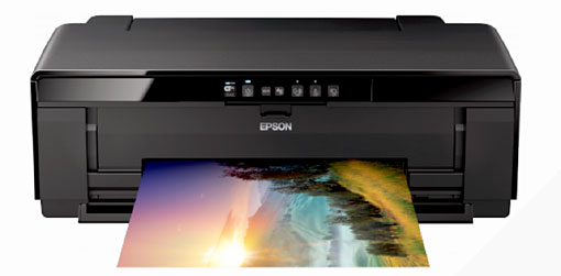
A short run of 10 prints really needs to be giclée printed in-house to be financially viable. I have an Epson R2300 that cost in the region of £500 (about $800 CAD). That was over ten years ago but it paid for itself with the first 20 prints produced. Prices haven’t altered much – the Epson SureColor SC-P400 is a similar A3+ 8-colour printer that currently costs around £470 ($750 CAD).
Epson SureColor SC-P400
Offset-litho is cheaper per print but the entire edition has to be produced in a single run, to avoid repeated additional expensive set-up times.
Giclée printing costs more per print than offset-litho but (using in-house printing) prints can be produced when required; there’s no dead stock or dead money involved. However, there is the initial cost of paper stock, so if your printer can viably produce a run of just 10 prints, it sounds like a good deal. When your prints sell – they will! – then consider changing to in-house printing for the maximum control and financial return.
Finally…
…congratulations on Drawspace being chosen as one of the top 50 online learning sites! I know your Intermediate and especially the Advanced courses changed my approach to art. I overcame my hesitancy with regard to composition and I gained confidence in my artwork which encouraged me to show my work more. I’m enjoying myself and I’m trying new things as a result.
I’m so pleased you found the courses helpful. I’m still teaching at Drawspace and still enjoying it immensely! New sessions are starting soon:
Dear Mike, Drawing with graphite pencil gives me a lot of pleasure and happiness. In the past using color made me more and more feel like I was losing contact with my work and the pleasure disappeared. But since I removed color from my drawings people keep saying: “Why don’t you use color? You have to use color, that’s much more beautiful” and so on. Probably you have had these comments too. Could you please give me any advice what to say to these people so they stop nagging?
Leaning against one wall of my studio are two pristine stretched canvasses. One drawer of the unit containing my drawing materials is full of unused oil paints, palette knives and brushes. They’ve been there for fifteen years, awaiting the day I feel the urge to paint.
That they are there is a result of my dealers telling me I’d sell more work if I painted. However, I believe they mean they better understand, and can more easily sell, paintings.
One drawer above holds acrylic paints. I once spent half a day using those and thoroughly enjoyed it – but I too felt a loss of connection with the work. I don’t paint. It’s not the way I see the world. I see and enjoy colour but prefer to look beyond and behind. It’s an attractive veneer that hides the real world – the tactile world I prefer to inhabit.
Pencil does everything that I ask of it. I am not a fan of colour. I believe the lack of colour in pencil work forces the eye to look deeper into the image. The eye can scan over a painting and quickly pick up sufficient information to satisfy it just from the shapes, tones and hues of the colour alone.
Pencil, by stripping away the familiar outer covering, demands a much closer inspection. In short, colour can get in the way of real perception.
There’s another important difference between painting and graphite pencil drawing too – spontaneous creation. I think this explains your “losing contact” with your work.
Consider the following:
We graphite artists only have two “colours” at our disposal – texture and contrast
We work with a thin, pointed stylus so we tend to become detail orientated.
By controlling the pressure applied to that stylus we can control the value it produces
The use of a chisel point means we can switch between a broad face and sharp edge by simply rotating the pencil
Combine those points and they add up to a medium that offers instant and spontaneous creativity.
At this point I should mention that, in my opinion, there are subjects that demand the use of colour and are therefore not suitable candidates for monochrome rendering in pencil. A sunset was my first obvious thought. My next was brightly coloured fishing boats under a Mediterranean sky – but then I realised that’s not true. In fact, pencil would be ideal for that subject. Why? Because almost all viewers will see only the colour. Remove the colour and they are forced to look at the boats – the chipped and peeling paintwork, the old frayed ropes, the sinuous weave of old wickerwork creels… all the textures previously hiding behind colour. The essence of the boats exposed; not just their superficial appearance.
Of course the two elicit completely different reactions – both equally valid. The first generates feelings of warmth and beauty. The second exposes the viewer to the intricacies and beauty of the real world beneath.
Personally I begin each drawing with a set of guidelines within which I work. I then draw one small section at a time. And I rarely return to that section – it is complete and, because I don’t work on it again, it remains sharp and fresh.
It’s the immediacy offered by pencil that attracts me to it. My thoughts travel down my arm, and my pencil translates them into drawing. There are no colours to mix, no drying times, no complex layers to apply. Nothing breaks my concentration. I can create and complete an area in a single unbroken session. I become deeply immersed in it. The work exists in my mind – I can see it; it’s alive – and it’s transferred effortlessly to my paper. I often become so engrossed, and disconnected from the world around me, that it is not uncommon for me to look at the work I’ve just produced and to have difficulty in believing I drew it.
Finally, have you noticed that most “high art” photographs employ black and white film? Again, I’m certain that’s because the viewer is forced to look directly at the beauty of the subject. Composition, balance, contrast, emotion, texture; all are now fully exposed – they occupy primary positions, no longer secondary to colour.
The viewers of our work live in a world of colour and expect to see colour in images. When someone says “You have to use colour, that’s much more beautiful” I think they are really saying “Make my life easier. Don’t make me work to gain enjoyment.” By removing colour we are forcing them to look deeper for understanding, but if they accept the challenge, I believe their enjoyment will be much enhanced. And that necessity to look in depth gives us the ideal opportunity to draw them into the work.
Personally, I try to subtly exaggerate texture, and emphasise contrast – as if to say, “Do you see this? Do you really see this? Isn’t it beautiful, this marvel of Nature.” And if I feel just one person has finally been encouraged to “see” instead of look, I’ll have done my job.
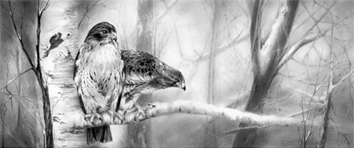
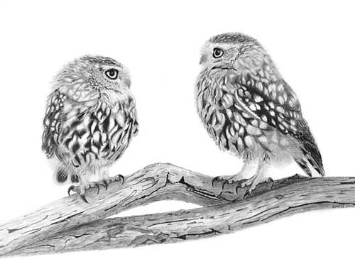
“Owls” by Chris Strijthagen“Owl & Mouse” by Chris StrijthagenArtwork by Chris Strijthagenextract – “Spinney Lane End” by Mike Sibley