Jason, who has recently joined TheDrawingForum.com, jointly run by myself and JD Hillberry, emailed to ask:
Just a very quick question, I am thinking of taking my drawings a bit more serious to supplement my wildlife oil paintings, so I have been reading both yours and JD Hillberry’s books, websites etc so I don’t make too many novice mistakes, and I wondered why you don’t appear to have gone down the same road as JD, regarding using charcoal pencils to get the non-reflective, VERY darks that seem impossible with standard soft graphite.
A quick question but the answer might take longer 🙂
First, JD and I work in completely different ways. JD’s work is more planned and controlled, such as using frisket to blank out selected areas. That requires a very accurate initial drawing that probably cannot be readily altered during the drawing process. However, I love working in graphite because it offers that direct mind-to-hand-to-paper connection – you think, you draw. So I begin with a very loose set of guidelines (except where accuracy is vital) and I constantly alter or even ignore them as I draw each section. I also begin top left and work down to the bottom right-hand corner (as a generalisation). Nothing is blanked out.
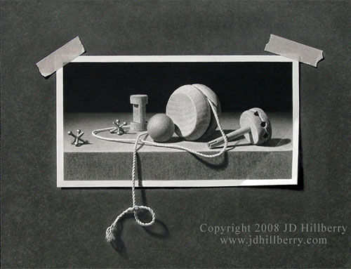
The entire image is drawn including the background, tape, and string.
When I first began drawing seriously I did use carbon pencils for a while (never charcoal) to achieve more intense blacks. But they always looked false because they lacked the sheen of graphite. At some point I realised I had to be a graphite purist in order for my work to have the unity I wanted, and to allow the mind-to-paper flow that I so enjoy.
I also found ways around the problem of weak darks – which isn’t a problem where prints are concerned because they can be corrected. If I need very intense blacks, I complete the drawing and spray with a matt fixative – that allows me to add further layers of soft grade graphite, and I can repeat that process as many times as required. In more general use, I found that 2B would give reasonable blacks (if applied with pressure – and my Mellotex paper can withstand a lot of punishment) but I could increase the intensity by layering with a harder grade – usually HB over 2B. The harder grade breaks up and smooths the courser grains of the soft graphite and fills the tooth that the softer grade left exposed. I also discarded all grades softer than 2B, because they are too grainy and leave a lot of tooth exposed (tiny white pits that visually dilute the intended dark value).
Finally, spraying a graphite drawing on completion with a matt fixative removes much of the sheen. With the reflective surface dulled, blacks increase in intensity, three-dimensional form becomes more solid, and the drawing has more visual impact. With practice, I draw in the knowledge that the value I’m creating will later darken and increase in intensity.
You can view Jason’s wildlife and other work at www.OnlineArtDemos.co.uk
JD Hillberry’s amazing Trompe l’Oeil work at www.JDHillberry.com
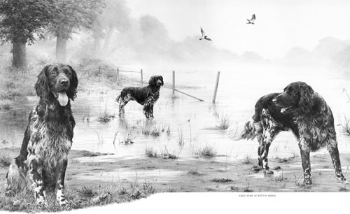
Drawn using graphite pencils only.