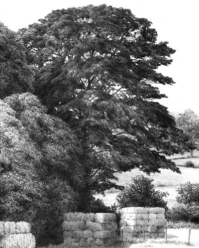
DRAWING MIDGROUND TREES

DRAWING TREES with midground mystery

Artist Richard Devine submitted a query on my website to ask:

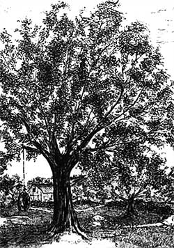
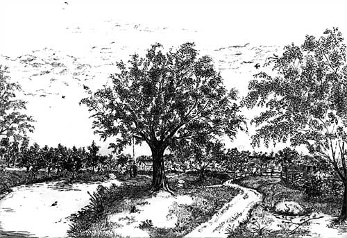
I thoroughly read all I could find both in your book “Drawing from Line to Life” and on the web about drawing trees. Then I tried to capture the beauty of Florida’s Champion Live Oak, the Cellon Oak. I would appreciate your honest critique of my work and how I could improve it. The suggestion of leaves was done with irregular squiggles, for the leaves are about 2″ long and 1/2″ wide. If I was to render a maple tree at the same distance, would I use a different size or shape squiggle? Perhaps angular shapes?
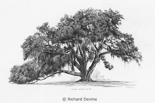
Richard's Cellon Oak drawing
Richard’s Cellon Oak drawing

This critique won’t take long 🙂 For a midground tree, it does its job admirably. It has believable form, suggestions of detail, and an excellent sense of reality. Personally, I think the beauty of working with squiggles and circles is that it allows you to explore an area without a break in concentration, unlike line that has to be continuously restarted. So you very quickly slip into working directly from your mind and sculpt what you expect to see.

If I was to render a maple tree at the same distance, would I use a different size or shape squiggle? Perhaps angular shapes?

Exactly that. Consider why you know it’s a Maple from that distance and then adapt your squiggles to reflect that knowledge. In the case of the Maple, or my preference for Sycamore, the visual clue lies with the angular shapes of the leaves. Build in that clue and you send the intended message. Very often, I find, using that clue around the perimeters of each foliage mass is all that’s required. When you create the shaded side of a mass and use that to negatively create the lighter edge of the adjoining mass, use that shade to create angular “maple-like” shapes. Edges are what most attract the viewer’s attention.

The other equally important area is the outside edge of the tree itself. Here you can be quite explicit about the leaf shape. Although you described your Oak’s leaf to me, I was already aware of that, based on the shapes around the extremity of your drawing. Those are the only clues my brain needs to understand the species of the tree, the leaf size and shape, and that all suggested foliage within it should be read as being identical.
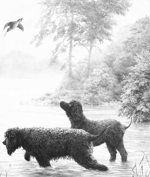
Creating midground recession

Here, no actual leaves exist, only suggestions of leaves. But the outer edge of the right-hand bush is deliberately sharp-edged and intended to suggest the scale of its foliage. The outer leaves were not drawn, or even planned, but created as negative white shapes as I drew the shaded area behind them.
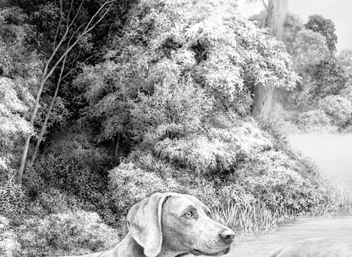
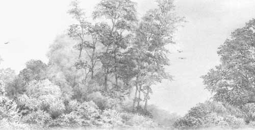
Midground trees drawn with clarity

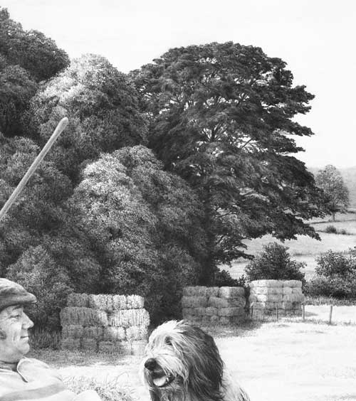
Behind these trees is a lake with morning mist rising from it. To increase the depth, these midground trees were drawn with exaggerated sharpness and contrast. Most contain very little internal “detail” so attention is thrown onto the outer edges, which suggest the species (usually imaginary!) and its leaf shape and size.
Midground secondary element trees

These trees are merely a backdrop – something to contain the viewer, and to suggest locality and strength of light. Again, most of the work was concentrated on the negatively drawn edges. The interiors are simply squiggles, circles and random meandering of my pencil as it sought to reproduce the three-dimensional form and lighting that was in my mind.

I had references to assist with the drawing of the central dark tree but all the others were imaginary and created without any prior planning. The only conscious goal was to clearly differentiate between the two species.
Foreground, midground and background trees

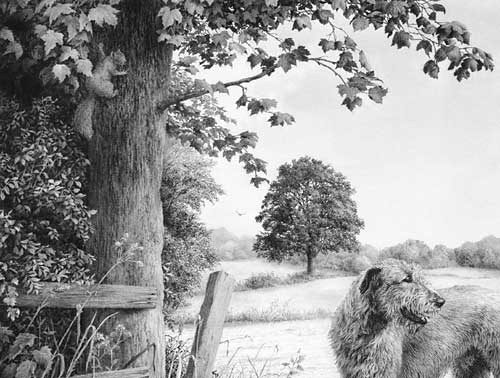
Both the midground and background trees were drawn in the same manner applied by Richard – squiggles that sculpted what I was imagining. The distant background trees were lightly blended to soften any hard edges.

The foreground tree and bushes employ a similar approach with one exception. Here the extreme foreground leaves were outlined first to isolate them. Then the midground “leaves” were established by spontaneously and negatively creating the solid dark background between them, resulting in white silhouettes of random, partial leaf shapes. They were then darkened to variously push them back into the shade. Finally, the foreground leaves (the visual clues) were carefully drawn to make you believe that everything behind them is also foliage.

Don’t over-plan or over-think foliage. Take a long look at the Nature around you and you’ll quickly realise that it is full of mystery. Very little is clearly understandable. Even close up, you may understand the foreground leaves on a tree, but one or two layers back you simply assume that what you are seeing are more leaves. To achieve a sense of realism you need to emulate Nature and allow mystery to exist.

Then stand back at look at the overall internal shaping – the way the rounded masses of foliage form. Combine that knowledge with your feeling for the local foliage and you’ll create a tree with a true sense of reality – even if your interpretation is more abstractly suggested.

Thanks for letting me see your tree, Richard – it’s excellent in both composition and implied texture.

You can view more of Richard’s work at : RichardDevineFineArt.com.
How To Draw Trees

Artist Stephen Sample, who works in Pen & Ink, emailed me to ask:

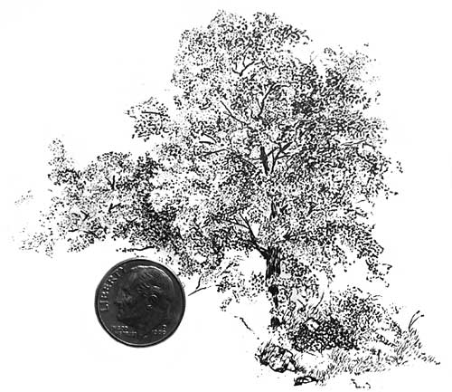
I have been working on trees for the last couple of years, and they turn out pretty nice, but it is predominately due to the amount of stippling I use to create the leaves. The difficulty that I am having, is that, although it looks fairly like a tree, it is choppy if you catch my meaning, not even close to as defined as the trees that you are drawing. Your work has incredible detail, and that is ultimately my goal. I have two questions so far (and I did read your tutorial on trees): How do you do the leaves, and how do you incorporate your shading into your leaves without taking from the “leaf” effect. In doing the leaves, do you do more of a small random dash, or perhaps is it more of a dot? I think that is where I am stuck. Here is a drawing from 2010. Would you at all be willing to give me a few pointers perhaps?

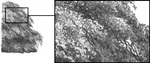
In most cases, except for the foreground, my leaves are simply result of scribbling, bearing in mind that the white areas are as important as the marks I am making. In other words, rather than draw the leaves themselves, I draw the shadows between the leaves, so the leaves are represented by the spaces and holes that remain. The second stage is to add overall three-dimensional shading, and it’s the previously white leaves that take this up. The more stages you can divide anything into the simpler it becomes.

Your trees are lacking depth. I’ll concentrate on the central one, which is fan-like – a series of radiating ribs with leaves attached. However, there is some depth, as a few of your leaf masses appear in front of some of the branches.

Stephen's submitted drawing
detail of central tree

What is missing is the mass of foliage in the foreground and, more importantly, foliage in the background. Bear in mind that a tree is basically a deformed ball. It is a round, three-dimensional shape that overall will have a shaded side and a highlighted side. The top will receive more light and the base of the foliage mass will cast a shadow beneath it. Then you have to consider local lighting – each individual mass of foliage is itself a rounded three-dimensional form that requires its own highlighting and shade.

How to fix it? First, I think there is an unnatural amount of light visible through the tree – there are too many holes through which we can see sky. Second, many of those holes need to be filled with the foliage behind the tree. To suggest depth, that background foliage needs to be a blurred suggestion rather than sharply drawn. You can think of a tree as being in three layers:

1. The background layer (the leaves behind the tree) that contain no detail at all.

2. The midground foliage that makes up the bulk of the tree – it possesses very little detail except for the silhouette of the outermost leaves against the sky.

3. The foreground foliage – those masses of leaves that are in front of the trunk and directly facing you. This layer requires the most detail. The eye will detect that detail and understand everything behind it as being more foliage that, receding from the viewer, is less distinct.

You need to give your viewer’s eye sufficient clues, often quite obvious ones, such as the midground foliage edge silhouettes.

Take a look at the ballpoint pen work of a friend of mine, Vincent Whitehead, at www.RuralRouteOne.com. Vincent has an excellent tutorial on how he draws his trees that you may find invaluable. And my good friend Diane Wright has another comprehensive “How to draw trees” tutorial.

Stephen replied:

I am very grateful for your splendid advice. I do however have a couple more questions now. I did look at Mr. Whitehead’s tutorial and found it must helpful indeed.

I appreciate that working in ballpoint allows Vincent to create half tones that are not easy to obtain with pen & ink or stippling. But those out of focus halftones are what gives depth by providing the rear half of a tree.

I created a second picture that I thought was more on your track, and was wondering what is needing to be improved as far as depth goes. On this scale it was a little difficult adding shading in the background and, as you can see, it is a lot of stippling still. Is that bad? Would it be better if I didn’t do that? I am trying to go for a leaf effect, but I don’t want to make it too busy.

Attempting a leaf effect is fine but don’t overdo it. Take a long hard look at trees and try to work out what you can really see – and what visual clues you gain from each element. You’re well on your way to achieving that -= especially the use of negative drawing at the left, which immediately adds depth. Your foliage now extends in front of the trunk and the glimpses of branches reinforces the depth of the tree. I still think it needs the incorporation of background foliage – a darker, enigmatic mass that will push the midground foliage forward, but I’ll have to leave the means to convey that to your expertise in Pen & Ink.

Let’s take this in three layers:

BACKGROUND
You cannot see leaves, only a silhouette of a mass of leaves, and it is devoid of three-dimensional detail.
A silhouette tells you little but the holes in that silhouette hold the clues because of the leaf shapes that surround their inner edges.
The outside of each dark silhouetted mass also has detectable leaf shapes.
The side of that background mass that you’re looking at is inside the tree and will thus receive very little or no light.

MIDGROUND
You can see leaf-like shapes, but mainly masses of leaves with some more visible and highlighted leaves within them. It contains little tight detail but each mass or clump of foliage will show three-dimensional form that depends on the lighting and its direction.
The leaf shapes that surround the edges and are starkly visible against the sky behind offer the most powerful visual clues to the viewer.

FOREGROUND
This is largely those masses of foliage that are directly facing you and are in front of the trunk.
You can see sharply defined leaf shapes with parts of leaves visible behind them that become less distinct as they recede into the internal shade.
You use these very visible and highlighted leaves to offer the clearest visual clues about the tree. Use sharp drawing and strong contrasts, and use the more shaded internal leaves to push the most foreground leaves forwards.
Use shade within the midground masses to strongly highlight the leaves around the most brightly lit side of each foreground mass. Thinks of those edge leaves as “icons” – recognisable shapes that instantly convey to the viewer the type and maybe even the species of the tree.

Combine all three and you achieve a good deal of depth; a drawing that is instantly understandable; and a tree that invites the eye to linger and explore ever deeper – but as the eye travels deeper, it has to find what it expects to find.

One final point (in graphite at least – I’m not certain about pen & ink): work from the background forwards. It’s the background that negatively defines the edge detail of the midground foliage, and the midground that defines the foreground edges. You cannot in my opinion, work from foreground to background for two reasons: the foreground will control what is possible in the drawing of the background, and the possibilities may not be sufficiently abundant; and you will be drawing the foreground with nothing to refer to. With no reference, its tonal range is a complete unknown and can only be guessed at. Guess wrong and the error extends right back through the tree. But by drawing the dark background first (including the silhouetted trunk and branches) you immediately establish the darkest tones in the drawing. The white of your paper is the lightest, and all other tones will then fall into place as you work.

Drawing Tree Bark

Tony Bird recently wrote to me asking:

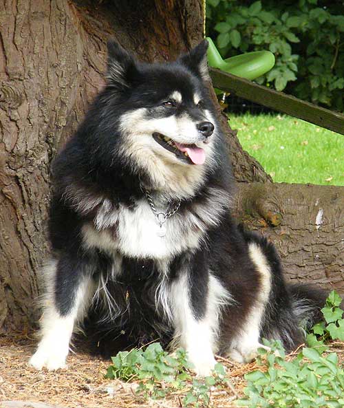
I am drawing the attached photo and whilst I’m getting on OK with the dog, I’ve tried all sorts of techniques to do the bark without success. This was the one exercise I didn’t do at your Kent workshop! Any pointers you can give me would be greatly appreciated.

I’ll cover HOW later but first I want to question the WHY. Why do you want to include the bark? Is it simply because it appears in the background of your photograph? Is it connected with your dog? Does it tell us, the viewers, anything about the dog. In brief: if it doesn’t add anything to the story being told then it’s probably best omitted.

Tony Bird's reference photo

Of course, you might then wonder what to replace it with! In this case it could still be a tree, but one with smooth bark that doesn’t attract attention away from the dog, or cause confusion between its busy surface and that of the dog’s coat. It might help you to find a reference of such a tree, so you can study it closely and form an overall impression that you can aim to capture. But whatever tree you use, it is essentially a secondary element of the drawing and should be played down. You can do that by either softening the edges as you work or restricting your grey pallette to the middle of the range – or both.

Also you don’t need depth in this drawing; being able to see past the dog and the tree simply leads the eye into dead territory. What you could do here, is to bring the background foliage forward until it’s just behind the tree. That would provide a good visual backdrop, remove the unnecessary recession and, if thrown into shade by the tree, give you an overall dark area that would make the dog stand out. We covered the negative drawing techniques required for doing that during the workshop.

Personally, I think the foreground works well. It does add to the story, because it subtly fixes the location as being outdoors and natural, it isn’t too complex, and the leaves overlapping the paw will give a sense of localised depth. It will also hide that paw. Grass has to be the artist’s best friend when drawing paws!

Now for the HOW, since you asked 🙂 Begin with the foreground darks and pitch them a little lighter than the darkest tone in the dog. That will preserve the dog’s dominance. Study each area before you draw it until you understand its three-dimensional nature. Then draw it, making certain that the lightest tone is darker then the whites in the dog. Finally progress backwards, reminding yourself as you do so that this is curved surface, so none of it will be directly facing you and will progressively turn away from you. If you retain the dark area above the dogs head, don’t just block it in; instead, provide detail within that area. The detail will prevent it being too tonally solid and vying for attention with similar tonal areas in the dog. If you decide to bring the background foliage forwards, I’d draw that dark area of tree considerably lighter, so the tree curves back into the foliage, and allow the foliage to act as a visual stop.

Break the job down into easily manageable parts. Starting with the darks means you only need to concentrate on each individual sharp edge. Then, having worked out the form in your mind, draw your interpretation of each area of bark one at a time. Where possible use your mental idea of the lighting direction, instead of copying that in the reference, so you are constantly reminded of it. You’ll find yourself sculpting each area instead of just applying tones and drawing a rough approximation.

As with any other texture that you have a reference for, study the photo carefully untill you understand it in three-dimensions and not just as a series of adjoining shapes and tones. Drawing from your mental image will always produce superior results to working directly from a reference.

Go to Drawing Trees & Bushes for a more in depth explanation.

Drawing Trees

Having read my book “Drawing from Line to Life”, Rob emailed me to ask…

I admire your attention to detail without the sacrifice of the ‘drawing’ appeal in your pictures. I was wondering, when drawing trees you mention drawing the internal structure. Are you advocating that when setting out to draw a tree you would draw the internal structure first, then map out the main masses of foliage on the limbs, then go back and erase the bough structure from within the mapped-out areas of foliage masses?

I don’t have any hard and fast rules for myself – I just wing it and do whatever best suggests itself.

Typical guideline drawing

However, one thing is certain – I need to have a three-dimensional idea of what I am about to draw. Establishing the trunk and major boughs gives me an armature to work around. On that skeleton I can then map out (however roughly) the major masses of foliage. If you keep your guidelines light, you probably won’t need to erase them.

You can start with the edges or the centre, but do bear in mind that the central ones will overlap those at the side of the tree. All this helps to reinforce the three-dimensional nature of the structure in your mind but relieves you of the need to work out form and lighting of each element. That said, I often lightly hatch the basic shading required to remind myself later of what I was visualising at the time.

I’m assuming (I hope correctly) that you are referring to midground and background trees. Foreground trees require more planning and tighter detail. Look closely at tress and ask yourself why you know it’s a tree even though, in all probability, you cannot discern actual leaves. Maybe it’s the dappled pattern of light? Perhaps the shadows that describe the three-dimensional nature of each leaf mass? Or, more probably, a combination of the two – and more.

Completed tree from guideline drawing

Next decide on the lighting direction and then begin drawing. I prefer to begin with those areas of branch that show through the foliage. as little light enters deep into the tree, and they are seen against a bright sky, they are relatively dark. Establishing one first, in the area that are going to work in, gives you the deepest tone and the white of your paper, of course, supplies the lightest. Now all your intermediate tones will fall into place as you work.

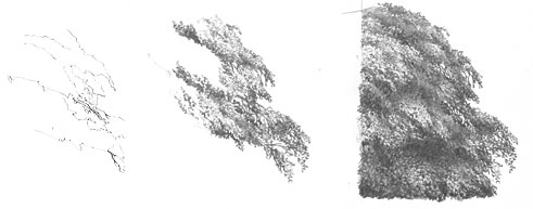
I tend not to shade but to just work in random patterns of lines and scribble; working light with more visible hie remaining in the brightest areas, and overworking the darker areas with more pressure. There’s little conscious thought involved – just watch the tree grow before your eyes.

Stages of spontaneously drawing a midground tree

As each element is three-dimensional, it must obey the laws of light and form – each casting its shadow on the mass below, and having a highlighted top and more shaded bottom.

Take a look at an earlier article of mine (“drawing-trees-and-bushes”), don’t plan too much, keep it free and spontaneous, and you’ll find yourself drawing realistic, organic trees in no time!

Drawing Trees and Bushes

Example of bush drawing

Drawing trees or shrubs really has to begin with observation. I’m forever looking at trees and trying to work out in my mind how I would draw them.

You really need that information in your mind – the layers of foliage and how they stack one over the other; the side and front elevations of blocks of foliage; the holes through which you can see sky; the relative sizes and appearances of the internal structure, and so on.

With a good three-dimensional idea of structure in your mind you can now begin drawing trees with confidence. I tend to “talk” to myself as I draw, as if explaining it to someone else. So I’ll be drawing a layer of foliage whilst telling myself that it will contain the cast shadow of the layer of leaves above; that this is at the edge of the tree and will show more sky; that I need more depth here so the appearance of a section of trunk would aid understanding.

Or of course you can take Diane Wright’s method – which is to draw intuitively and brilliantly and capture the absolute essence… 🙂
www.DianeWrightFineArt.com/drawing-trees

When drawing far-away trees or trees in mist I try to draw correctly first time. But if that doesn’t work, I will often draw stronger than I need to, which gives me more control over relative contrasts – then I gradually fade the area with Blu-Tack until I reach the desired overall tonal structure. Sometimes I then redraw and fade again – repeatedly at times – each time bringing the drawing a little more towards the reality I’m trying to depict.

Background trees in Weimaraner study 'Vanished!'
Background trees in Weimaraner study “Vanished!” © Mike Sibley 2004

When drawing midground or background shrubs and trees bear these points in mind:

  • Be aware that it has a real sense of roundness. It is a three-dimensional rounded form and should conform to the lighting present.
  • Is it perhaps a little too tidy? Even if it is a shrub clipped into a shape you can adapt it to suit your own requirements. Imagine looking at the bush in real life and asking yourself what, at that distance, are the major features that make it what it is.
  • One feature might be the dense shadow it casts beneath itself on the ground. If your reference bush is too low, lift it a bit. That shadow will properly ground the bush.
  • If you show dark areas within your bush that are assumed to be the shadows in the depths between foliage layers, be aware that there should be two distinct tones – a dense tone to represent the inner depths of the shrub, and a lighter shadow cast on that layer by the one above.
  • Another important feature to consider is the appearance of the leaves at the extremities (around the outside of the tree or bush). You can make excellent use of these by using them as visual clues to signal to the viewer’s eye the presence of an overall leafy appearance, and an indication of leaf size and possibly even the species.

Sketch on coarse paper with a blunt 6B Progresso pencil
But it all begins with observation. As an exercise, try sketching a tree in real life but really small – no bigger than 2″ x 3″ (or larger but using with a very soft, blunt pencil). This will force you to abandon detail and concentrate only on what is important.

You will find more information on drawing trees in my website’s Drawing Trees tutorial and a complete chapter in my “Drawing from Line to Life” book.

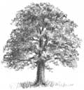
Drawing a Tree example from 'Drawing from Line to Life'
Drawing a Tree example from ‘Drawing from Line to Life’

A tree study from 'Done Balin' &copy Mike Sibley
A tree study from Bearded Collie drawing Done Balin’