Having offered some advice to Jay on an earlier project he emailed me again with his latest drawing – “Mojave Terrapin”. In Jay’s own words:
Our discussion centered around modifications to values as a drawing progresses. I had significantly enhanced the shadows over the photo reference I had for this image. I worked to enhance the darkness of shadows from the branches of the bush the Terrapin was under as well as darken the shadows under the turtle. I am a little disappointed that I didn’t even go darker.
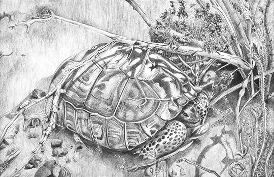
I’m disappointed too, Jay. My first reaction was that my eye goes straight to the black hole at the right. My eye going there first is not too bad because I’m quickly taken to the Terrapin, but the lighter values used for the Terrapin do make it look rather flat. I don’t think the lighting is helping that either.
Judging from the shadows across the Terrapin the light appears to be very even across the shell – but I think you can use artistic license to lie about that convincingly.
May I suggest you progressively darken the left-hand side of the shell? That would increase it’s three-dimensionality. You could also echo the value of that black hole at the back of the head, where it disappears into the shell. It’s another “hole” so it should look natural. And all that might then allow you to further darken the shadow cast by the shell. There appears to be a lot of white in this drawing that needn’t be there.
Having done that you might then have to darken the ground, but I think it can withstand that – and it would help to separate the ground plane from the vertical one behind.
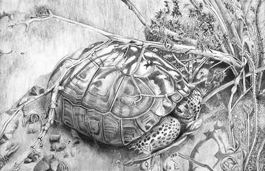
I’ve had a very quick attempt at adjusting your image – darkening the places I mentioned with Photoshop to show you what I mean:
Jay replied this morning:
Thank you for your insight. You confirmed and certainly went beyond what I was thinking. Your feedback is invaluable to me.
In my head I had finished the drawing. So I’ve been working at getting over being done with this drawing. One of my realizations is that I have fallen into a habit of not exploiting value for the best result. The terrapin is an example of creating an overall pattern that is too light even when I was trying to be more extreme in using dark to create contrast and emphasis. It is a wakeup call to increase my extremes and watch more closely the overall effect on the drawing. I think a part of cause of this pattern is that I’m not viewing my work at a distance enough. With my nose to the paper I’m working up close and fail to see the effect from a distance unless I put the work across the room for a good look at the whole thing.
I completely understand that. On completion your head will be so full of the individual details that it’s almost impossible to see the drawing as a single entity. My solution to that is to put the drawing away for a few days – or until I can’t exactly remember everything about it. Then I go through a strange ritual. I take out the drawing (face down) and fix two pieces of Blu-Tack to the top corners. Then, without looking at the drawing, I stick it to the wall of my studio and walk away from it. When I turn round I’m too far away to see detail and I get to experience the drawing in the same way everyone else will.
Sometimes I’ll notice a tonal imbalance, or perhaps an element that is distractingly prominent. Then I’ll find a way to fix it with the minimum of work – not because I’m lazy, but if I make changes that are too drastic I’ll quite probably unsettle something else.
Finally, I’ll decide that the drawing is as good as it can be, given my current abilities. I know it can be better, but going beyond my abilities at that late stage will create more problems than it can solve.
You can enjoy more of Jay’s work at JSullivanArt.com