Negative Drawing – part 3

MANAGEMENT
We previously explored the ways that Negative Drawing can:

  • Allow you to concentrate on one texture at a time.
  • Draw a structure without reference to it’s three-dimensional shaping.
  • Divide any area into a collection of easily-managed elements.

Don’t try to draw many textures at one time. To draw effectively, you must understand the area you are working on, feel its texture, experience its three-dimensionality. We’re creating our own world one step at a time. In order to transmit your mental image of wood through your hand and onto paper, don’t try to draw grass at the same time. If you’re drawing the deep confines of an old wooden crate, you need to experience the deep shadows diluting into mid-tones as they approach the light. You KNOW what it looks like in reality, so don’t dilute your image by suddenly trying to draw the wood around the opening. Concentrate and LIVE one element at a time and you’ll built a reality into your work.

DETAIL and TONE LAYERS
Negative Drawing can be used locally within any area, by using layers to divorce detail from shading. Work logically and with understanding and divide the task into two. Detail and Value. Line and Tone. Detail is often simple to comprehend, especially if viewed as a collection of abstract shapes and unidentifiable negative spaces between them, and line best suits their depiction. On the other hand, tone, which describes the lighting and three-dimensional form of the area, is best suited to an application with a broad, flat pencil lead with a complete absence of line. So why mix the two?

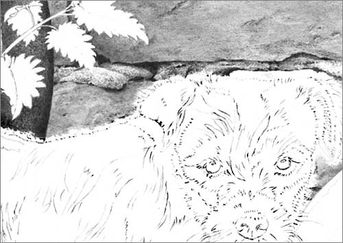
Let’s consider a dog, which has a rough coat of light brown hair, and we’ll work on a small area at a time, perhaps only a half-inch square. This, being manageable, aids our concentration and understanding. The detail layer, formed by line, contains all the cast shadows between the hairs, which negatively create the hairs between them and describe their texture and direction of growth. All tone is omitted so the hairs (created purely by negative drawing) remain virgin white.

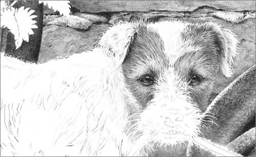
Now a tone layer is applied. Some application may be global, describing the overall lighting, shade and three-dimensional form, and other may be local, perhaps enhancing a particular hair or suggesting colour. Further layers may be added as required.

Now, unique to this method, adjustments can be made with Blu-Tack (or a kneadable eraser), as the tone layer can be incrementally removed without affecting the detail layer beneath. I often find that the repeated partial removal and re-application of tone layers produces wonderfully subtle results. And for extra subtlety, try drawing the detail and tone layers and then gently and repeatedly remove both until the merest trace remains. It’s almost impossible to draw with that degree of finesse – something that this system overcomes.

FINALLY…
Let Logic rule: If you reach a point in the area you are drawing where your understanding wanes, leave it. Stop. Move to an adjoining area and work back towards the problem. Your understanding will have greatly increased once you have surrounded the problem area.

Don’t be afraid to draw “too dark”. Blu-Tack or a kneadable eraser will allow you to adjust the intensity later. In the meantime, you have simply split a job into two again: by first establishing the required lines with a weight that helps you see them, then adjusting their tonal values until they meet your expectations.

Concentrate on and draw one texture at a time. “Live” that texture and you will inject life into it.

Don’t be tempted to rush ahead. Doing so may result in inferior drawing. Remind yourself: “My drawing will only be as good as its weakest part!”

Don’t be tempted to leave something if its removal would benefit the drawing – no matter how pleased you are with it. And don’t “showcase” an area of your work that displays your technical prowess. In the words of Pierre Parisienne, “Don’t show me that what you are doing is difficult”. Ultimately it will shout “drawing”, destroy the overall reality, and drag the rest of the study down with it.

Parson Russell Terrier pup study 'What?
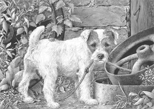
“What?” A completed drawing showing areas of subtle white hair produced by drawing over-strong and then adjusting with Blu-Tack. The result has a delicacy that is difficult to achieve by drawing alone.

Negative Drawing – part 2

NEGATIVE DRAWING
Negative drawing enables you to perform tasks easily. We previously saw:

  • How we can control separation of background, midground and foreground elements.
  • How we can isolate those areas we don’t yet understand.
  • How Negative Drawing protect our virgin whites.

Negative drawing involves the creation (or isolation) of an element within your drawing by simply drawing around it. To return to our dog example, by completing the background first, you have an established setting in which your dog can exist. Because you are drawing this dog as a part of its world, the two will become unified and possess an enhanced feeling of reality.

RECESSION
Up until now I’ve been referring to background and foreground. But in reality our dog is more likely to be situated in the midground. So by “background” I’m really referring to the major part of the setting – that area BEHIND the dog, and not the foreground, which is on a level with and below the dog.

We will have created enough of the dog’s world to give us an understanding on the environment – a ‘feeling’ for that world. Because we cannot avoid taking that world into account as we draw, the dog will inevitably become a part of it.

In practice, you might choose to partially draw the background to get a feel for it, then to begin drawing the dog, establishing the tones required for the background around its outline. That’s OK if that appears to be the logical way to work.

LOGIC
Logic, as I explained earlier, plays a major role in this way of working. Logic in this case is mainly dictated by understanding. You draw what you understand then, when that understanding wanes, you logically move to another area of understanding. This is difficult to describe but easy to understand in practice.

Let’s take one small area again – the junction of the dog’s coat along its back with the background. If you want that topline to be obvious to the viewer you cannot draw the dog first. Without a background, you have nothing to balance your tones to. So we draw that section of the background first, right down to the dog’s back. There we have two choices – if we fully understand the outline of the dog, we can draw around the hairs along its back, leaving them pristine white. Or we can stop short of the dog and make the junction a job in its own right. This gives you all the control you need. Finally you can concentrate on the dog, engineering the tones used within the coat to make it stand out from the background – to whatever extent you wish. It’s a logical progression that puts you in control.

Below you will see that I drew the brickwork down to but short of the dog’s back. Why? Because I was immersed in brick, not hair. Now I can concentrate on defining the dog’s outline while blending new drawing back up into the brickwork – I’m thinking “hair”, not “brick”.

Detail from Parson Russell terrier pup study 'What?'
Brickwork stopped short of dog. Now I can concentrate on defining the dog’s outline while blending new drawing back up into the brickwork. I was thinking “brick”, now I’m thinking “hair”.

Note that I didn’t attempt to draw the dog while defining its outline. My concentration was purely on the creation of the hairs around its extremity.

CONCENTRATION
A drawing, any drawing, can be broken down and simplified in this way. If you’re drawing the wooden side of a barn, just draw wood. If grass overlaps it at the base, draw around it. You’re drawing wood – your concentration is on wood – you’re living wood! And, as a bonus, when you begin to draw grass, you’ll have full control over those negatively drawn stalks that overlap the barn door, so you can highlight them, push them into shade, or make them as dominant or subtle as you wish.

WHICH IS DOMINANT?
Where any two textures meet, ask yourself which is dominant. Which will logically control the tones of the other. If we draw the grass first, the tones used within the blades will control and limit the tones available for our barn door. If we draw the barn door first, its tonal values will control those available for the grass. Which is logically dominant from the point of view of physically drawing them? Which is easier to engineer to overcome the limitation imposed by the other? No contest, in my mind, the barn door wins on all counts. It’s so much easier to engineer the blades of grass to stand out from, or blend into, the barn door.

As a bonus, Negative Drawing prevents you from polluting the virgin white within your drawing. Erasing graphite from a spot that should be a pristine white highlight will rarely achieve a good result.