Drawing Skies

Gary posed another question:

Can you offer any advice on how you tackle skies? Skies can sometimes make or break a drawing, especially if you want the focus to be on the scene but need to add some degree of the sky as well – be it understated. Would you apply a cross-hatched technique here and if so, is there a particular method that works well for blending and creating a natural looking sky?

Skies are more important than I once realised! I used to leave the areas white but I soon discovered that adding even a light tone to skies immediately increased the brilliance of highlights within the drawing. In other words, removing all white from a drawing, except where they are intended, forces the viewer’s eye to read highlights as pure, brilliant white.

Applying an overall, smooth tone to skies can present technical problems; there should be a total absence of line and smoothly graduated changes of value. Any marks that don’t conform to Nature immediately reduce your carefully rendered realism to mere “drawing”.

I almost always hold my pencil in a normal “writing” position, but for skies, and other large areas of light tone, I use an underhand grip.

Underhand shading hold

Here I use only the weight of my clutch pencil to apply the tone, and usually with a 2H pencil. Of course, I cannot shade a large area from side to side with a single set of lines, and shading the area in sections leads to two potential problems. First, stopping a line to shade back in the other direction leaves blunt ends. And an overlap of blunt ends when shading adjacent areas will result in a very obvious double layer of graphite.

Banding caused by overlapping blunt ends

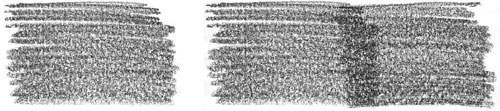
Over the years I’ve developed a technique to overcome both faults. Try this: practice drawing a line that drops gently onto the paper, continues with the required weight and then is as gently lifted clear. This will produce a line with tapers at both ends. Think of it as drawing an arc – a swing down onto the paper followed by a swing up from it. You can extend such a line at will with no evidence of a join, as a taper over a taper is simply a full strength line.

Feathered ends overlap seamlessly

Once you get a feeling for drawing this way you can begin to shade large areas – with a taper at the end of each line, which you should also stagger to prevent the eye detecting an edge. Each shaded area will now have a feathered edge that you can overlap with adjacent areas – a feathered edge layered over a feathered equates to a solid, matching tone.

Once the area is completely shaded you will need to blend it. Incidentally, blending is a technique I rarely use, except for skies or skin tones. Knowing beforehand that you intend to blend, you can make allowances for this when applying your graphite. That’s why I use the pencil-weight, underhand method, because the graphite sits on the top of the paper and not deep in the tooth. I usually blend very lightly with tissue wrapped around my finger. As the tooth of the paper is still available, I can apply additional layers, if required, to build up the tone.

I don’t customarily produce dark skies or include more than a hint of clouds. For good advice on drawing those I can recommend Diane Wright’s “Drawing Skies” tutorial.

I describe the techniques I’ve mentioned here in much more detail in chapter four of my book “Drawing from Line to Life”.

Tracing and other Transfer Methods

Gary wrote to ask:

Is tracing the outline of a sketch and drawing round this onto a chosen paper a good way to transfer the image? Is there a particular grade of pencil that works best?

I’m assuming you are referring to the technique of scribbling on the back of the tracing and then drawing over the traced lines to transfer the loose graphite to your paper? If that is so, then there are a couple of variations that might work for you.

First, make yourself a sheet of graphite “carbon” paper by heavily coating one side of a sheet of Mylar or tracing paper with a 6B pencil. Lightly tape the top edge of your tracing to your drawing paper so it cannot move. Slide the “carbon” paper between the two and proceed to draw around your traced lines – experience will tell you how hard to press. This will lightly transfer the 6B to your drawing paper and, unless you’ve used too much pressure, the lines will not be indented into the surface. You need to avoid that fault at all cost, because indented lines (particularly those drawn in error) will remain visible in your completed drawing.

The advantage of using this transfer method is that you can re-use the tracing at any time and, as it is hinged to your drawing paper, you can overlay it onto your drawing to check for accuracy or to redraw any lines at any stage of the drawing process.

I no longer use this system but when I did I found 6B to be the best choice, because it will erase completely. If you trace from a projection or use any other method of drawing your guidelines directly onto your paper, I recommend the use of lightly applied 2B, which produces sharper edges than 6B and is also fully erasable.

What is the best way to achieve this without getting unwanted dark lines which can be a nuisance if you want areas to be very light in tone on the actual drawing?

Whatever method I use I always use Blu-Tack to fade the guidelines in the area that I am about to work in. You could also use a kneadable eraser or another make of wall putty. Don’t rub the lines, simply roll Blu-Tack over them to gently lighten them until just a faint shadow remains.

Aside from a projector or light box which can be expensive, is there a better way to transfer the image without leaving unwanted lines or marks?

It’s as good a method as many and better than most. How you transfer your guidelines to your drawing surface is immaterial – all that really matters is that they are lightly applied, to prevent indentations, and can be faded or completely removed. They are just guidelines and should be reworked, adapter or even discarded as you work, so the facility of complete removal is essential.

Negative Drawing – Tiger’s ear

Alexandra emailed me to ask:

I was wondering if you would be able to give me some tips on a tiger’s ear I am drawing at the moment. The fur is really wiry and thin, and I’ve tried breaking it all down, but am not sure whether I should use the indenting technique or negative technique or both. Do I try and draw individual strands of fur, or not worry about drawing exactly what’s there?

Tiger's ear reference

First, don’t concern yourself with copying the photo. A split second after the photo was taken that area probably changed. Instead get an overall feeling for it, study it until you know it well, and then draw your interpretation.

Indenting works best in areas of high contrast, so you could use it where the hair is in front of the dark depths of the ear. Either use a fine needle or, as this is not white hair, use a hard sharp pencil, such as a 6H or even 8H. But don’t overdo the indenting, because it produces a very mechanical line that does not blend easily into surrounding drawn lines.

Personally, I’d use negative drawing for almost all of this with just a few narrow indented lines where those lines directly cross over others or where the background is dark.

Don’t be daunted by the seemingly complex task – split the job up into many stages, so you can more easily concentrate on each one. Start with the shadows between the hairs so you leave a network of white hairs. The next step is to begin working on those hairs one hair at a time. Tone each down as you think fit, to give it shaping and form, and decide at each junction or crossover if your hair is beneath or in front of the other hairs. Have fun! Seriously, don’t stress about it – take it in easy stages and just watch it grow.

Finally, you can use layers of overall tone if you need to push any areas further back, or lighten with Blu-Tack or a kneadable eraser to bring it forwards.

I hope that helps. It looks like a great project!

You can view Alexandra’s work at:
alexandra-riley.artistwebsites.com/index.html

Using copyright photographs?

How do I avoid using copyrighted photos?

Elizabeth asked:

“Do you take your own photos and draw from them? Do you draw from uncopyrighted materials? Or is it entirely from your head? I draw a little, and it’s mostly from horse encyclopedias, old calendars, and free (or not-so-free) stock photos I’ve found on the internet; most pictures I take myself I get frustrated with, but if I want to make any money off of it I can’t legally use someone else’s photography. So I was curious to know how you handled it.”

First, let’s simplify the copyright issue: Unless the originator of your photograph has given permission for it to be used, you are infringing the copyright by copying it – with or without modification. On the other hand, reference photos from a book, the Internet, or any other such source, can be used to provide information and inspiration. Use of such “borrowed” images is perfectly legal if your intention is solely to gain an understanding of, for example, the growth pattern of hair on a bear, the characteristic shape of a particular species of tree, or the texture of a hand-made brick.

If you copy copyright material for your own enjoyment or education, I doubt many photographers will object – but you should always ask first. However, if you use the image for a commercial purpose you’d better be well insured. Like you, the photographer’s income probably comes from his or her work – put yourself in the photographer’s shoes… would you permit it?

When I first began drawing seriously I ran into the same problem that you’re experiencing. Now I always work from my own photos. But I’ve also learned to do without them. I’ll explain…

In the early days I became fixated on detail. I actually believe this is a necessary stage of development that eventually leads to the skill of making rational decisions about what is important to the study and what should be discarded.

I’ve also found that the very best results come not from faithfully reproducing a reference photo but from studying it until I’ve formed a mental three-dimensional image – it’s that image I draw and not the original 2D photographic one.

Photographs are still important suppliers of detail or overall feelings for a subject or texture. For example, when I draw trees, I surround my drawing with suitable photos. A few may provide actual details, some supply a feeling for the textures and internal forms, and all remind me of what I already know.

Once you free yourself from actually copying reference photos you can use whatever you like – book illustrations, stock photos, real life, sketches – because the result takes a little from each but is undeniably YOURS. And that freedom presents one additional bonus – the reliance on memory increases your ability to see and recall everything around you.

The ability to “experience” whatever you are drawing is something I try to teach in my workshops. Once you are physically “living” within the art you are creating, memory, emotion and interpretation are of prime importance and not references.

'Overlooked!' by Mike Sibley

For example, my “Overlooked!” drawing is based on photos that I personally took of Border Terriers – I had perhaps 180 of them, supplying every detail and breed characteristic that I needed.

The Border Terriers used

I had one other single photo – the one that gave rise to the idea – of a tree growing on top of a low bank. The soil had slipped and its roots were fully exposed on one side.

Inspiration for the composition

And many years earlier I had photographed a pet wild rabbit (rescued from a hay baler). Those were my references – everything else is entirely imaginary.

Pet wild rabbit photos

Even though the dogs are fairly accurately reproduced from the photos, each part was carefully studied, understood and my mental interpretation drawn.

So, my advice is to gradually cease using photos as the prime source of information. Whenever possible, take your own photos and take MANY. The first shot may be the one you want to use but then zoom in and take more of the detail. Move your position and take more from differing angles – take enough and you’ll be able to pick the subject up as you draw and turn it around to study it from all sides. Many 2D photos will help build a 3D image in your mind. Aim to increase your understanding of the subject and not just to capture its basic image.

You don’t say why you become frustrated with your own photographs. In my case, I’m not a natural photographer and constantly make basic errors. However, if it suits my composition, I can quite readily work from an out-of-focus photograph, because I can rebuild it using detail from all the others I took. If your photos are too dark, load them into Photoshop, or a similar program, and use the Levels facility to display all the previously obscured detail. But that’s a subject to discus on another day…. 🙂

Fixatives for pencil drawings

A reader wrote to me a week ago (apologies for the delay) and asked:

What exactly is a fixative for pencil/graphite drawings? How and why should it be used? Is there a special kind?

There definitely is a special kind! So forget the use of hairspray as championed by a few artists. Why use a product designed for gluing hair together, with its unknown future problems, when you can use a product carefully formulated by scientists for just the purpose in hand.

I am by no means an expert on this matter but I do always use a fixative on my drawing on completion. In my case I use Winsor & Newton’s “Fixative for Pastel, Charcoal and Pencil”.

A good fixative not only fixes the loose graphite to the paper to prevent smudging, it also contains a UV filter to help to prevent yellowing (or aging) of the paper by sunlight.

I would always recommend its use…

…and here’s how…

    * Place scrap paper at either side of your drawing
    * Spray on one sheet until you are certain it won’t spit
    * Pass the spray across your drawing
    * Repeat in the other direction.
    * Many light coats are better than one heavy coat.

The most immediate effect is that the sheen will disappear from the drawing and your blacks and darks will noticeably deepen in tone. They are not actually altered but just retuned to what they should have looked like had the flat plate-like graphite grains not reflected stray light.