Are my leads GRAPHITE or CARBON?

Michael emailed to ask:

I was looking over your most excellent website regarding fine art drawings. I referred to some of your tools on the “tools and tips” page. I had a question. Basically you present drawings and drawing instruction in graphite. But the tools you use – particularly the Staedtler clutch pencils and leads are actually carbon, at least here in the US they are.

This a Staedtler “problem” I’m often asked about – particularly when an artist has ordered Lumograph “graphite” but received a pack of “carbon” leads.

First, a little history: The Staedtler Mars Lumograph brand dates from 1931 and the lead’s slightly waxy composition was formulated for the creation of graphite drawings that could be printed from without the need for inking. Over time this formulation replaced the plain Mars leads.

Originally wood-cased Lumograph pencils were designated as “2886” and leads (for leadholders or clutch pencils) as “1904”. These later became “100” and “200” respectively. I have in my possession packs of “2886” 2B wood-cased pencils and later “100” designated pencils, and they are indistinguishable in all respects – except for the gold writing that is now printed in white.

I also have elderly packs of 2mm “graphite” leads and the more recent “carbon” leads – both with the “200” designated stock number and they too are identical.

Staedtler manufactured two types of leads for holders – thin, for mechanical pencils and 2mm for clutch pencils. The thin leads were made from a technique known as “carbonisation” and, as I understand it, the raw materials used could have included natural graphite, pet and pitch cokes, and soots – in other words ‘carbon’. The graphite used for the 2mm leads is itself just a very pure form of carbon, so it seems likely that Staedtler just decided to call all their graphite leads for mechanical and clutch pencils “carbon”. So there you have it – the difference is zero, zilch, nada, nothing at all.

As Staedtler themselves say on their website under ‘graphite pencils and accessories’ “Easy to refill with “…STAEDTLER Mars micro carbon mechanical pencil leads”.

Graphite or “lead” pencils:

As you probably know, pencil ‘lead’ contains no actual lead, just graphite, so it is non-toxic and very stable, and graphite is a form of pure carbon.

Charcoal pencils:

These are made of charcoal and provide richer blacks than graphite pencils, but tend to smudge and are more abrasive than graphite.

Carbon pencils:

These are usually made of a mixture of clay and lamp black, but are sometimes blended with charcoal or graphite depending on the darkness and manufacturer. They produce a deeper black than graphite pencils, but are smoother than charcoal.

Incidentally, graphite has a flat plate-like structure where charcoal and carbon have rough grains. That plate structure reflects light – the common sheen displayed by pencil drawings – but the coarse grains of charcoal don’t reflect light at all, so blacks appear to be more dense. There is a solution – on completion, spray your graphite drawing with a matt fixative. The effect can be quite magical as the sheen disappears and your drawing pops with increased contrast. And a good fixative contains an Ultra-Violet filter to protect the paper against the effects of sunlight, so you should always fix your drawings.

With thanks to www.Leadholder.com for providing some of the information.
Drawing Tree Bark

Tony Bird recently wrote to me asking:

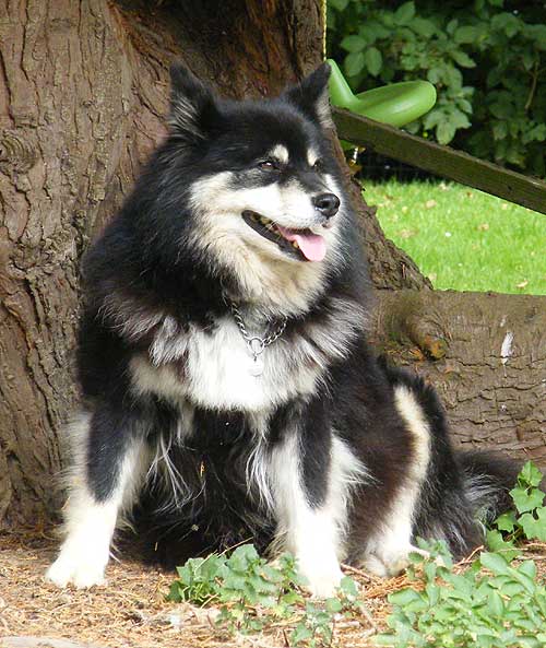
I am drawing the attached photo and whilst I’m getting on OK with the dog, I’ve tried all sorts of techniques to do the bark without success. This was the one exercise I didn’t do at your Kent workshop! Any pointers you can give me would be greatly appreciated.

I’ll cover HOW later but first I want to question the WHY. Why do you want to include the bark? Is it simply because it appears in the background of your photograph? Is it connected with your dog? Does it tell us, the viewers, anything about the dog. In brief: if it doesn’t add anything to the story being told then it’s probably best omitted.

Tony Bird's reference photo

Of course, you might then wonder what to replace it with! In this case it could still be a tree, but one with smooth bark that doesn’t attract attention away from the dog, or cause confusion between its busy surface and that of the dog’s coat. It might help you to find a reference of such a tree, so you can study it closely and form an overall impression that you can aim to capture. But whatever tree you use, it is essentially a secondary element of the drawing and should be played down. You can do that by either softening the edges as you work or restricting your grey pallette to the middle of the range – or both.

Also you don’t need depth in this drawing; being able to see past the dog and the tree simply leads the eye into dead territory. What you could do here, is to bring the background foliage forward until it’s just behind the tree. That would provide a good visual backdrop, remove the unnecessary recession and, if thrown into shade by the tree, give you an overall dark area that would make the dog stand out. We covered the negative drawing techniques required for doing that during the workshop.

Personally, I think the foreground works well. It does add to the story, because it subtly fixes the location as being outdoors and natural, it isn’t too complex, and the leaves overlapping the paw will give a sense of localised depth. It will also hide that paw. Grass has to be the artist’s best friend when drawing paws!

Now for the HOW, since you asked 🙂 Begin with the foreground darks and pitch them a little lighter than the darkest tone in the dog. That will preserve the dog’s dominance. Study each area before you draw it until you understand its three-dimensional nature. Then draw it, making certain that the lightest tone is darker then the whites in the dog. Finally progress backwards, reminding yourself as you do so that this is curved surface, so none of it will be directly facing you and will progressively turn away from you. If you retain the dark area above the dogs head, don’t just block it in; instead, provide detail within that area. The detail will prevent it being too tonally solid and vying for attention with similar tonal areas in the dog. If you decide to bring the background foliage forwards, I’d draw that dark area of tree considerably lighter, so the tree curves back into the foliage, and allow the foliage to act as a visual stop.

Break the job down into easily manageable parts. Starting with the darks means you only need to concentrate on each individual sharp edge. Then, having worked out the form in your mind, draw your interpretation of each area of bark one at a time. Where possible use your mental idea of the lighting direction, instead of copying that in the reference, so you are constantly reminded of it. You’ll find yourself sculpting each area instead of just applying tones and drawing a rough approximation.

As with any other texture that you have a reference for, study the photo carefully untill you understand it in three-dimensions and not just as a series of adjoining shapes and tones. Drawing from your mental image will always produce superior results to working directly from a reference.

Go to Drawing Trees & Bushes for a more in depth explanation.

Colour or Black & White?

Artist Ginger Brady emailed me to ask:

I am wondering if you get asked by many people if you would do your drawings in color instead of Black & White? I am having many folks tell me they would buy my work “if only” they were in color or had some color to them? Have people asked you to add color? I have, to appease a few people, but I am not happy with the results from colored pencil or water color. I miss my Graphite pictures and I feel like I’ve been wasting a lot of time trying to make others happy.

Been there, done that, Ginger. And like you, I found that “working for others” didn’t appeal. I had to stay with the medium I really care for and working for “me”. That’s what art is about, isn’t it? Expressing your love or feelings for something. Displaying the subject to your viewers and saying “Look at this. No, look closer. See what a beautiful creation this is.” To my mind, there’s a world of difference between “fine art” and “illustration”. The first involves passion and is personal, the other is commercial and mechanical. I suspect your “must work in colour” art is creeping into the latter category.

It’s been said that “Colour appeals to the senses and drawing appeals to the mind”.

For me, colour gets in the way; it’s a distraction. Colour allows the eye to quickly pass over an image and gather enough information to be satisfied. A brown horse in a green field can be identified in a nanosecond and possibly dismissed. Remove the colour and the mind has to linger to gain an understanding. And in that time span, however short, we graphite artists have the chance to grab the viewer’s attention and suck them into the image.

We have only a pointed stylus to work with, so detail tends to dominate our thoughts. Detail can, if used with care, pull the viewer ever deeper into the work. It can educate – invite exploration of what the viewer might recognise but have no real knowledge of – and it can tell our story. That, I think, is what you’re missing – art has to say something! And your language is graphite-based.

In the past I’ve had dealers moan that “If you worked in colour I could sell your work in much greater quantities.” I’d argue that if I worked in colour, it wouldn’t be my work. Despite that, I purchased a few small canvases, an array of paint brushes, and a wide selection of oil paints, so if I felt the urge to paint I could do so immediately. Those paints are in a drawer of the unit that sits by the side of my drawing board… and they’ve been there for over twelve years – unused.

If you feel you need, for commercial purposes, to work in colour then do so, but don’t stop working in your first love, graphite. You may find you sell more drawings on the back of your paintings if your overall sales increase. However, I made a personal decision to stay pure to my love of graphite. It’s true that the available market for drawings is much smaller than for paintings, but conversely the competition is much less too. It’s a niche market that you have to work hard to survive in. That said, if my prints are exhibited in a store, I can guarantee my graphite work will stand out from the plethora of paintings. That’s an advantage you can make use of but only by first refining your craft until you have something of real quality to display.

If colour pays the bills then work in colour. But use your quality time for graphite. Personally, I find nothing beats the direct mind-to-hand-to paper connection of graphite. I think, I draw. One completed section at a time until the overall picture emerges and my story is told. Painting, pastel, coloured pencil are too involved and “mechanical” to suit me – colours to mix, layers to apply…

Now I am wondering if my Graphite drawings are not appealing to the public? What has your feedback been?

My experience is that there’s a small but discerning sector of the public who appreciate graphite drawings. In the same way that some, but not many, appreciate Black & White photography – but most people would accept the argument that classic photography is B&W. We are in the same market. We are not displaying glowing colours that the senses can revel in. No, we, with our palette restricted to just contrast and texture, invite thoughtful appraisal – we provide food for the mind.

Stay faithful to your chosen medium – even if you have to pay the bills with jobbing colour work. And, above all else, draw FOR YOU. While I might make the occasional alteration to a composition to suit my market, I will only do so when it doesn’t adversely affect the story I want to tell or the message that I wish to convey. I draw for myself and always will do. I’m a fine artist and not a commercial artist. Yes, there have been times of despair, just as you are experiencing, but have faith in yourself and your work, and in time others will appreciate it.

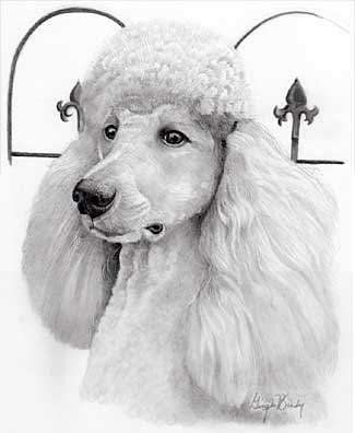
Enjoy Ginger Brady’s fine work at: www.GingerBrady.com

Pet Portrait by Ginger Brady