Jason, who has recently joined TheDrawingForum.com, jointly run by myself and JD Hillberry, emailed to ask:
Just a very quick question, I am thinking of taking my drawings a bit more serious to supplement my wildlife oil paintings, so I have been reading both yours and JD Hillberry’s books, websites etc so I don’t make too many novice mistakes, and I wondered why you don’t appear to have gone down the same road as JD, regarding using charcoal pencils to get the non-reflective, VERY darks that seem impossible with standard soft graphite.
A quick question but the answer might take longer 🙂
First, JD and I work in completely different ways. JD’s work is more planned and controlled, such as using frisket to blank out selected areas. That requires a very accurate initial drawing that probably cannot be readily altered during the drawing process. However, I love working in graphite because it offers that direct mind-to-hand-to-paper connection – you think, you draw. So I begin with a very loose set of guidelines (except where accuracy is vital) and I constantly alter or even ignore them as I draw each section. I also begin top left and work down to the bottom right-hand corner (as a generalisation). Nothing is blanked out.
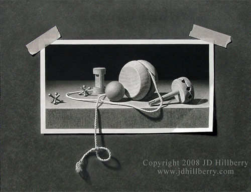
“A String of Memories” by JD Hillberry The entire image is drawn including the background, tape, and string.
When I first began drawing seriously I did use carbon pencils for a while (never charcoal) to achieve more intense blacks. But they always looked false because they lacked the sheen of graphite. At some point I realised I had to be a graphite purist in order for my work to have the unity I wanted, and to allow the mind-to-paper flow that I so enjoy.
I also found ways around the problem of weak darks – which isn’t a problem where prints are concerned because they can be corrected. If I need very intense blacks, I complete the drawing and spray with a matt fixative – that allows me to add further layers of soft grade graphite, and I can repeat that process as many times as required. In more general use, I found that 2B would give reasonable blacks (if applied with pressure – and my Mellotex paper can withstand a lot of punishment) but I could increase the intensity by layering with a harder grade – usually HB over 2B. The harder grade breaks up and smooths the courser grains of the soft graphite and fills the tooth that the softer grade left exposed. I also discarded all grades softer than 2B, because they are too grainy and leave a lot of tooth exposed (tiny white pits that visually dilute the intended dark value).
Finally, spraying a graphite drawing on completion with a matt fixative removes much of the sheen. With the reflective surface dulled, blacks increase in intensity, three-dimensional form becomes more solid, and the drawing has more visual impact. With practice, I draw in the knowledge that the value I’m creating will later darken and increase in intensity.
Jackie emailed to tell me she was enjoying my book and that she loves to draw wildlife and horses. She asked…
“When drawing the horse that has fine “show coat” hair, would I just use a blending technique or actually try to draw smooth, short hair?”
Definitely not blending! If I’m correctly picturing the type of coat you mean (smooth, glossy, with sharp–edged highlights) the last thing you want to so is soften anything. Personally, I’d build it up using short adjacent marks that allowed me to “sculpt” the form as I progressed through the horse. And I’d be aiming at producing sharp edges.
“Also in drawing a cougar, would you consider the hair to be short? My try at this looks like I am just drawing hairs. I have tried not to, but it just keeps looking that way, especially when the face does not have long flowing hair, but short hair. I’m used to working in oils and watercolour.”
When drawing hair, think of it terms of watercolour and not oils. With oils you have the opportunity to add highlights. However, with watercolours and graphite the only white we have is the paper, so you need to work in reverse. Don’t think of it as drawing hairs – instead draw the shadows between the hairs. That takes practice but it really is the perfect solution. Pencil marks very rarely represent hairs themselves – except when a black hair overlaps an area of white hair.
Take a close look at hair and ask yourself “If I ignore the colour, why can I see individual hairs?” It’s because each hair, or lock of hairs, is defined by the shadows either side of it. And its three-dimensional form is displayed by the highlights it contains. So think of drawing a hair in three stages:
• 1. define its edges by using the surrounding shadow.
• 2. give three-dimensional shaping to the, currently white, hair working towards but avoiding any central highlight.
• 3. tone down the highlight if required.
That way you preserve the pristine white of your paper at each stage and, when you do add graphite to an enclosed area it will be surrounded by completed drawing that will help you to perfectly judge the values required.
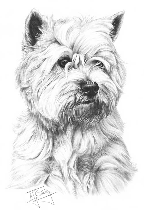
This Westie takes that method to its extremes but it clearly illustrates the point:
West Highland White Terrier
With the sole exception of the wet hairs around the mouth, all hairs are defined only by the shadows around them.
And these two drawing (both 3″ x 2″ / 75 x 50mm) show the method in a more common application.
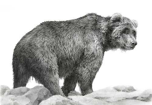
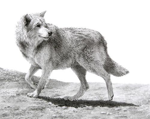
“Grandpa Grizzly”
“Lone Wolf”
In both cases, “hairs” do not exist at all, only the shadows between hairs. The negative “hairs” that result are then toned down, with reference to the lighting direction, to match their global positions within the three-dimensional form.
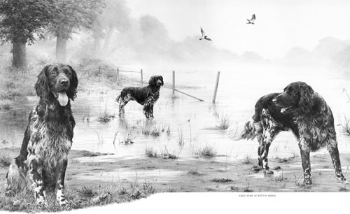
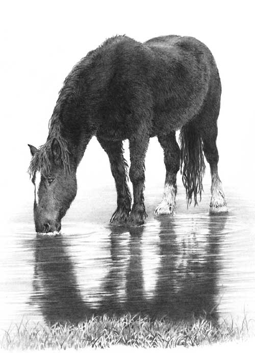
And even Tom’s dark winter coat employs the same negative drawing method.
“Winter Thaw”
You can see in this 6″ x 4″ (150 x 100mm) study that exactly the same negative drawing method used for Tom’s white rear fetlocks has been used throughout the body and head… and even the grass.
John emailed to ask about indenting – a technique that isn’t working too well for him:
I tried to draw the cat in the ‘Cat Food Advert’ as an exercise but it never really came off. I’m happy with the drawing as such but my indenting never really worked and I gave up trying to draw the chest area fur.
My drawing of our Clarrie produced for Burns Pet Foods cat food packaging
The chest fur of our lovely tortoiseshell cat is all negative drawing, which is quite easy once you get used to seeing white shapes on white paper and using the shadows to make them appear.
I’m happy with the drawing as such but my indenting never really worked… The width of the whiskers looked to vary due, I think, to not having even pressure of lines crossing the indentation.
Indenting, in my experience, has to be applied with as much pressure as your paper will stand – and the pressure has to be consistent, except for the final taper of course. It works best on a smooth surface – my Mellotex takes it like a dream – and ( this is important) you must have a hard, smooth surface beneath your paper. My drawing board is both hard and smooth, but if you’re using a wooden board or like to work with additional sheets below the one you’re working on, it won’t work effectively.
There always seems to be minute gaps between it crossing!, if that makes sense.
I’m not certain what you mean, unless your indent is throwing up a burr on each side? My Mellotex does that and I like it – it gives a very sharply defined edge. Also I don’t find it to be a problem, so I don’t think I have a ready answer for you.
Then there is a problem when the underlying fur runs in the same direct as the indentation. I keep getting stuck in the ‘tram lines’!
Often I divide the drawing of an area into line and tone – line detail first and then shaping tone on top – but if I meet an indent, I’ll sometimes reverse that. By applying tone with the flat face of a chisel point, I avoid dropping into the indent. That tone clearly displays the indent, and then it’s just a question of drawing the line content carefully so each stops at the indent and continues on the other side. If the hair direction is the same as the indent, that procedure works just as well, although more care has to be taking with lines that cross “underneath” the indent.
I have tried practicing but I’m not sure what I really should be doing about the above, even having read the book. Is there an ultimate width for the tip of the inscriber and can one use different widths. I think of the difference between the main whiskers and those round the mouth area of the cat. Does one use a broad one for the whiskers and a narrower one for the mouth area.
I have two indenting tools, both mounted into old clutch pencils. The one for whiskers is a darning needle that has a rounded point, ideal for indenting. For the smaller hairs of the top lip that extend over the darker mouth below, I have a smaller needle that has had the sharp point blunted on an oil stone.
If you’re trying to indent hairs to either side of the nose, or below it, I would never do that. Indenting works best in areas of high contrast – where the indent runs over black or very dark areas – but it produces a very mechanical line. I overcome that to some extent by drawing into the root of the indent to merge it into the surrounding drawing. For all areas above the fringe on the top lip, I always use negative drawing. The results are far more natural, and more controllable.
However, if you meant you indent thinner short whiskers on your cat’s muzzle, by all means use a thinner needle, but do ensure it does not have a sharp point that might tear the fibres of your paper. If you try to use a thick needle to indent thin lines, your pressure will not be great enough to indent deeply and cleanly. A little light flat-face shading with 2B will display their positions, and it can be removed or faded with Blu-Tack as you reach each area.
I e-mailed you a few weeks ago, about doing another course next year if you are doing some. What I really want to get to grips with is draw long fur, like a Spaniels ears and the throat ruff of the cat (as above). If you do another course, is it possible to be there but do my own thing!!
You certainly can do your own thing! 🙂 I have an new Intermediate course on April 12-14, 2013, which I haven’t written yet, but it will be based around my Drawspace 8-week course. That includes a week on drawing hair, and another partial week, so I can virtually guarantee the workshop will also include long tresses and curls.
There are three exercises in the Drawspace course that between them virtually cover the drawing of all types of hair and at any distance and they will undoubtedly be included. Other subjects will be negative space, negative drawing, advanced and creative shading techniques, using contrasts and drawing weeds and grass (the latter uses very similar techniques to hair).
Oh, my picture from the course this year; my wife framed it and actually has it in the lounge on the book cabinet for all to see!!
A wife with a refined artistic eye – what could be better! 🙂 There’s so much to fit into the 3-day Intermediate course there may not be a final drawing, but at least you’ll have the opportunity to work on your own. I hope you can join us.
I recently received yet another query about the technique of indenting. After answering the query I began to write “see my tutorial at SibleyFineArt.com for…” and then realised that after all these years… I have never written it.
So, based on Week 5 of my 8-week Beginners course at www.Drawspace.com, I’ve finally remedied the situation.
Almost all erasing techniques suffer from a few problems, such as the inability to create pure whites. An erased area will never match the brilliance of an untouched one, and an erased line, however carefully carried out, will never possess a truly sharp edge. And removing graphite from paper often flattens the surface texture, which results in less tooth for succeeding applications of graphite to adhere to. So let me introduce you to a saviour — although not one for the timid, this method produces white marks with clean, sharp edges, and it protects the white of your paper.
Indenting – impressing grooves into your paper that later drawing skips over and leaves as pristine white lines – is an excellent method for creating whiskers, stitches and other accurate parallel-sided lines that suffers none of the faults of an eraser.
As I understand it, the layering of graphite is a major part in order to achieve the desired effect of tone and texture. But what I cannot understand is, after reading somewhere that it is almost impossible to build up tone from light to dark and that it must be done from dark to light, I believe it has something to do with hard graphite filling in the hollows of the tooth and then preventing softer grades from staying on the paper. Is this understanding somewhere near the mark, or I am totally way off the mark?
As with all things in Art there are no rules, which means I agree with your understanding and observation but I also know excellent artists who work light to dark. Personally, I belong to the dark to light camp, and here’s why…
First, you must understand the properties of graphite and the manufacture of pencils.
The crystalline structure of graphite is layers of flat plates. That’s why graphite reflects light while the irregular grains of charcoal and carbon don’t, and why graphite is an excellent dry lubricant. It also helps to explain why erasers are usually ineffectual at removing graphite – because once the erasing surface becomes graphite coated it simply slides plates over plates.
Raw graphite produces a black mark. In order to create differing grades – degree of hardness or softness – the graphite is mixed with clay. Imagine that an 8B is almost pure graphite and an 8H contains mainly clay and little graphite. Clay does not possess the plate-like structure of graphite, so the flat-plate structure is diluted as the clay content increases and the grades become harder.
The more clay added to the mix, the harder the grade and the lighter the achievable tones. For example, 6B has a far greater graphite content than 6H, which contains much more clay. This means 6H has a very fine composition and draws smoothly and light, but the softer 6B draws darker with a much grainier appearance.
Of course, this is a general description. In reality, the process varies between manufacturers and the quality they set out to achieve. A manufacturer of cheap pencils, apart from using inferior graphite, might also use inferior clays, which may be ground for less time – possibly just a few hours instead of days. Personally, I use Staedtler leads that are wonderfully consistent and impurities are almost never encountered.
There are more variables to consider too. For example, papers differ greatly, so what works on my ultra-smooth Conqueror Diamond White might not work on a more textured paper, and vice versa. It’s the tooth (the pits and crests in the paper’s surface) that causes the graphite to flake off the pencil’s lead, and some papers possess much more tooth than others.
If you use a soft grade (B to 8B) its minimal clay content means the individual graphite grains are large and won’t fill the pits of the tooth entirely. This leaves flecks of white paper showing through it, but that can be solved by burnishing with a harder grade – HB over 2B, for example – so the harder grade breaks up the softer one and fills the remaining tooth.
Because the soft grades always leave some tooth unfilled, you can always layer a hard grade over a soft one.
Conversely, hard grades (H to 8H) fill the tooth completely with a mix of clay and fine graphite particles, leaving insufficient tooth to accept the soft grades. Their large flat plates simply slide over the top and won’t hold. Remember, graphite is a dry lubricant, so it’s simply doing what it knows best. You can feel this in use, as the soft grade skates effortlessly over the harder grade. It’s much harder to get that soft graphite to stick to the harder underlying layer, and often impossible.
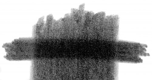
Hard over Soft – HB over 6B
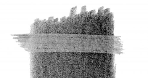
Soft over Hard – 6B over 6H
TURNING DRAWBACKS INTO BENEFITS
There is a technique that I’ve sometimes used that turns this problem into a benefit. You can create your own “masks” – like acid resist in etching. It works best in areas of high contrast, such as highlights on hairs within a black coat. Simply draw your highlights first, with a 4H or harder grade applied with some weight, and then apply a layer of soft grade over it, perhaps 2B or 6B. As the soft grade slides over the lines of hard grade, those lines turn from visible, comparatively dark lines into light highlights. It gives quick results but is not entirely controllable.
Minty and Bramble
Highlights drawn first with 4H then layered with 6B
THE IMPORTANCE OF DARKS
Personally, I feel the often-taught method of building up dark values from a lighter base is simply an admission that no firm decision has been made about the value required. Instead, I advocate the immediate application of the desired value. It produces the freshest drawing and, because it requires a confident approach, the result is sharp and clear. And, perhaps more importantly, as soon as the darkest value is established in a drawing, the entire palette of available greys is known and all midtones automatically fall into place.
If the initial dark value is too light, the entire drawing will be based around a restricted palette of greys. It will lose depth, vitality and impact.
I know I often repeat myself when promoting the use of dense and solid blacks and darks but they really are important. It’s light and shadow that make a drawing, not middle values. If you want your subjects to appear three dimensional, you must have light and shade. Look at the drawings of Ingres or the paintings of Rembrandt for clear lights and darks. And if you work from photographic references, try to find high contrast ones and not ones with almost all middle values – although with practice you should be able to interpret mid-value photos as though they were high contrast.
When someone looks at your drawing their brain will register the darkest value, however small, and then read the white of your paper as being pure white. From those check points it will compare the two extremes and understand all the mid values. The wider the overall tonal range the more three-dimensional information you can impart.
FINALLY…
When you’ve completed your drawing, or a completed section of it, lightly shade with a 2H, or 4H, over everything, avoiding only the highlights. That will remove all non-intentional white from your drawing and your highlights will shine with an increased brilliance.