I’m involved in a series of discussions concerning the relative merits of the different techniques used for drawing hair – dog hair in particular – and I’m arguing for the use of Negative Drawing against the use of applying tone that is then cut through with a sharpened eraser. So, having set the scene, here is my initial argument, followed soon by a more in-depth look at the Negative Drawing method.
First, erasing hairs is a technique worth exploring and it may work well for you. However, in my opinion, it will rarely achieve a sense of true reality… and here’s why:
- Layering tone onto an area before establishing the position and tonal values of the hairs that will exist in that area may result in the loss of the purity of the white of your paper – you may never be able to remove all of the graphite.
- This immediately limits the range of tones available to you for those hairs and, more crucially, controls the brightness of your highlights.
- Erasing will produce a soft-edged line. Intrinsically, hairs possess sharp edges. However, erasing may be beneficial if the hair is of a soft nature, and with fly-away ends that tend to soften the edges of bunches of hair. But in most cases, as I said, hair and locks of hairs do have sharp edges.
- But, of far more importance than all of the above, erasing does not permit a full understanding of the hair you are working on. It is, in truth, the exact reverse of the technique required to render believable hair.
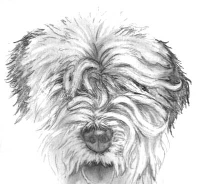
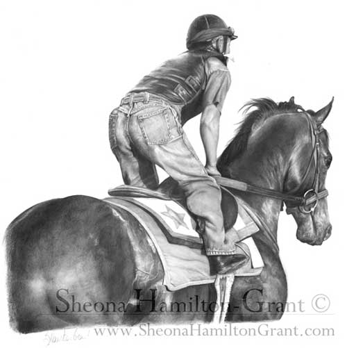
Exercise showing the eraser method of establishing hair.
Let’s, for example, take a lock of white hair of an Old English Sheepdog, or similar smaller breed as shown above. That lock of hair springs from the top of muzzle, above the nose, to fall down the side of the face. Beneath the lower end of that lock, another lock curves down towards the mouth. A casual glance will lead you to believe that the two are one long single lock, as they appear to flow into each other.
ERASING
Erasing is that “casual glance”. You see a white or light shape in your reference photo that begins on top of the muzzle and falls down the face towards the mouth. You erase that shape and establish the position of the lock. Now you look a little closer, identify stray hairs emerging from the lock and attempt to erase those also. That’s when you discover that an eraser, however sharp, cannot produce a sharp pointed end to a hair. You can of course draw around the erased shape to sharpen it’s edges but, as the original edge was soft and blurred by the eraser, you cannot be certain that you’ve drawn into it sufficiently to overlay the non-white content.
Now let’s assume you have a similar lock close to the original one and, to suggest depth, you decide to cut an angled hair in between them – one that emerges from under one of the locks then disappears under the other. Not difficult, but you will have to start erasing within the white of one lock, cut through it’s outline, through the previously applied tone, and then through into the white body of the other lock. The eraser will drag graphite into the second lock, which now needs to cleaned up. Then the edges need repairing. And finally you can tone down the new oblique hair and add the necessary cast shadows and shading.
NEGATIVE DRAWING
Now we’ll work the reverse way – the way I work. First you lightly outline the position of the white lock. This forces your concentration away from the lock as one single entity and onto its edge, section by section. As you search for understanding of that edge and look ever closer you discover that it is not one long lock of hair from muzzle-top to mouth but two. The upper one extending down the side of the face where it overlays the root of the second that curves down towards the mouth. You find all those stray hair ends too as you work your way around the extremity of those locks. As you’re just outlining, you can establish those stray hairs so they possess truly sharp ends.
Once you have the lock of hair outlined, and the adjacent one, you ignore them and begin to work on the hair between them. That crossover hair you attempted to erase earlier is now simple to establish. You draw it between and up to the outlines of the two locks to either side. Your full concentration is on that tiny area so your understanding is greatly increased. Now you also have the facility to draw an even deeper layer behind that crossover hair, which you progressively darken to almost push it right into the shade. That makes the crossover hair stand out, so you can now tone that down too, to push it back into the midground, and add the shadows cast by the two main locks.
Those two main locks are as yet undrawn. They remain as pure white “silhouettes”. But now you can finally begin to work within them, working your way slowly down their lengths, one at a time. As each is surrounded by the previous drawing of the midground crossover hair and background hairs, you have perfect control over its tonal values. You could, for example, create a three-dimensional edge that curves down to meet that crossover hair beneath it, and you can control the tonal values of that edge so it as lost in the shadows or as plainly visible as you wish. You are thinking three-dimensionally, taking the lighting direction into account, and not just erasing a two-dimensional shape through previously applied tone – tone with values that you could only guess at.
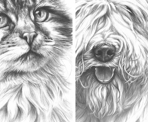
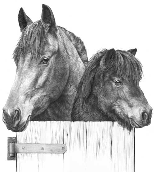
Drawings showing the use of negative drawing techniques
All those hairs – the two locks, the crossover hair beneath them, and the background hairs – are living forms. You are not trying (or tempted) to draw a large area at one time with minimal understanding, but slowly recreating those hairs so they grow out of the paper. As they grow, your own mind will spot inconsistencies with Nature and correct them; it may experience an imbalance caused by a too-clean edge and force you to break it up by adding protruding, wispy hair-ends; it will see the lock as a three-dimensional form and suggest the application of tone to the side receiving less light; and be your guide as to where to leave bright highlights. And, as you are working on pristine paper and not an erased surface, you will still have your brightest white available for your highlights.
In brief, and assuming you’re working from a reference photo, I believe that the erasing technique may cause you to look in too shallow a manner. To see “blocks” and “shapes” that you can create with your eraser in the previously applied tone. But to achieve a sense of reality, you need to study each tiny area until you fully understand the qualities (texture, three-dimensional form, edge features, etc) of the element you are about to draw.
Instead of erasing a long lock of hair and then, in my view, attempting to “repair” it and turn it into a semblance of hair, consider the Negative Drawing alternative. I recommend that you use Negative Drawing to isolate that lock of hair (you’ll learn much about it as you decipher it’s true outline), then establish the background hairs around it that will add depth to your drawing. Finally draw the lock itself, beginning at one end. Work your way slowly down as you experience it in your mind as a three-dimensional object. Make changes if you feel the need; perhaps introduce a narrow parting that exposes the background drawing beneath, if you feel the lock is looking too regular and uninteresting; but above all imagine it as being a real-life lock of hair. And don’t feel the need to complete it quickly and move on…… remember:
Any drawing is only as good as its weakest part.
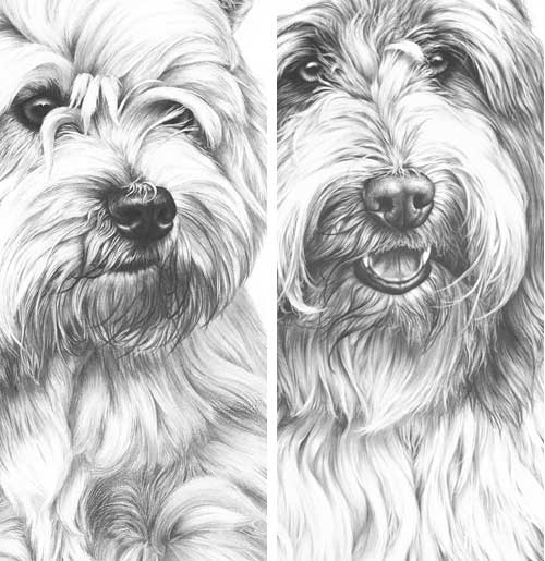
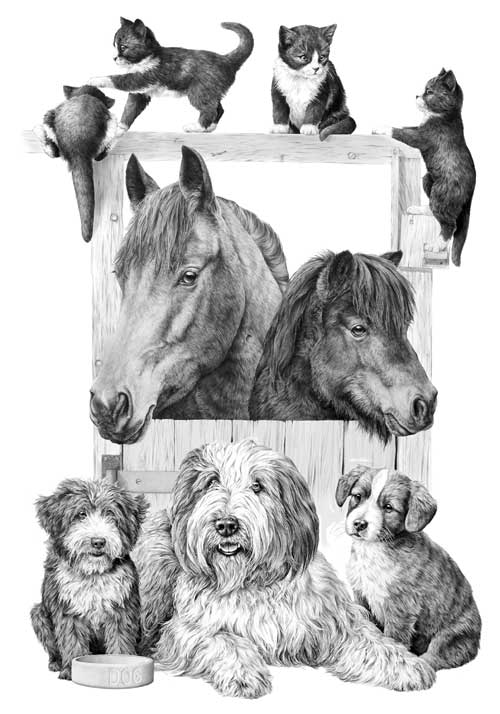
Drawings showing the use of negative drawing techniques