DETAIL v FORM – DRAWING SHORT HAIR

Liz emailed me to ask:

How far do I take the “detail” of short hair, when the horse’s coat is so very smooth? I feel I’m losing the “sense” of shape if no detail. in the very smooth areas. So detail or not?

It depends on what you think the major features are – the main message you want to convey. In this case it’s probably the smooth and glossy appearance, so I’d concentrate on that, and then add just enough texture to maintain the feeling of hair.

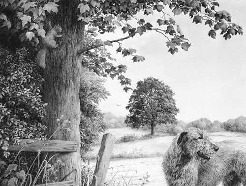
Coincidentally, my friend Sheona (who is currently taking my Drawspace Advanced course) submitted a drawing that might help you.

"Racing Ready" by Sheona Hamilton-Grant
“Racing Ready” by Sheona Hamilton-Grant

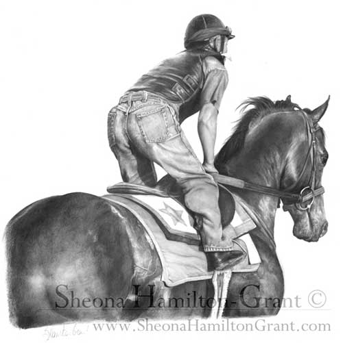
The horse is definitely glossy but not so smooth that it looks unnatural. In this case, it was an exercise on recession, so you wouldn’t expect to see hair detail on the head and neck, but I think the mottled rump sends the “hair” signal that you then subconsciously apply to the rest of the horse.

Personally, I went through a “Detail is King” stage and I believe it is a necessary step before you learn which detail to enhance and which to merely suggest.

Duvet design

Here’s an old drawing of mine from around 1987:

Section of Duvet design by Mike Sibley
Section of Duvet design by Mike Sibley, 1987

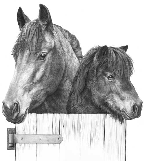
It is deliberately high contrast with few areas of flat midtone shading because it was designed to be printed onto fabric, but if I’d intended it to be a print or sold as an original, I’d consider it to be over-detailed.

The dark eyes do attract attention but the horse’s mane is so sharp that it drags my eye back – it’s more primary than secondary in importance. The same applies to the base of the neck – it contains detail with a strength that defeats any attempt at creating recession. Softer detail in that area would have increased the perceived depth. It’s also of little or no importance to our understanding of the horse. The Shetland Pony contains less physical depth so I can probably get away with the globally-applied tight detail it contains.

Incidentally, this was part of a duvet design. The rest of the stable and other featured animals are on a series of separate drawings:

Complete Duvet design by Mike Sibley

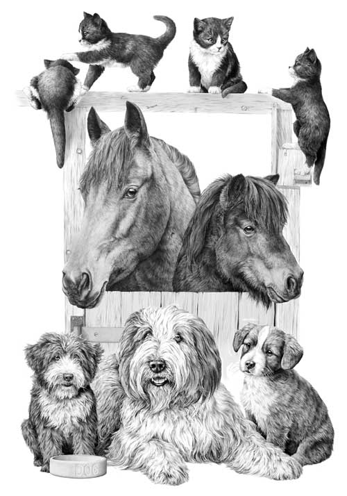
The kittens appear to be black and white, have glossy coats, and are obviously hairy. Again, if this was not intended for printing onto fabric, I would have softened the detail in the hair.

Finally…

Think of the message you want to send to viewers of your artwork; maybe look into your reference and extract the visuals clues that are working for you; then use what works and, to avoid visual confusion, discard the superfluous.

The “Universal” Chisel Pencil Point

Julian emailed to ask:

I’ve always been told to keep my pencil sharp but in your book in the ‘Charlotte-portrait’ chapter you mention in stage 4 using a ‘flat’ tip. I’m not quite sure what ‘flat’ means.

The universal chisel point

I always use a chisel point, which has many advantages.

To achieve that point, sharpen your lead as usual and then, holding it at your normal drawing angle, rub the point off on a piece of scrap paper. Now you’ll have a flat face surrounded by a sharp edge.

  • Use the edge whenever you usually use a point – except the edge lasts a lot longer. Unlike a sharp point that wears very quickly, a usable edge extends half way around the flat face. Turn the pencil as you draw to maintain that narrow width of line.
  • Use the flat face for shading. It cannot draw hard edged or thin lines so the coverage is smoother and more even. And there’s an added bonus…
  • Every time you use the flat face you automatically sharpen the edge.

I sharpen my pencils every morning and probably don’t have to do it again for the rest of the day. If you’re not using the flat face and need to sharpen the edge, restore it by quickly scrubbing the face on scrap paper again. It’s almost an ever-lasting “point”; there is no constant pencil sharpening to break your concentration; and there’s one more major benefit…

You can switch from a broad flat face to a sharp point with a half turn of your pencil. Imagine being able to draw sharp linear detail and then applying a layer of tone to create the three-dimensional shaping without having to change pencils or reform the point. It leads to very spontaneous and intuitive drawing.

I’m aware I need to build the layers thru several applications and blending. Any advice?

Use the flat face of your chisel point and I think your problems will disappear. You can seamlessly build up layers of tone and blend at any stage. I would add that I personally work from dark to light. Hard grades tend to quickly fill the tooth with clay so soft grades won’t always successfully layer on top – but a hard grade will layer over a soft one. So, to build up a darker area of skin tone I first lightly apply 2B to the darkest areas and then build up the whole area with HB or, more usually, 2H. The 2H will burnish the 2B; it breaks up the graphite grains, spreads them more evenly and polishes the result. Result: seamless and flawless skin tones.

2B and 2H flat-face shading

The completed drawing of Charlotte

USA – CANADA Workshops

Last-minute bookings still being accepted….

All the workshop supplies have been shipped to the venues and we fly to the US next Monday BUT I sent extra supplies, so we can still accommodate you.

WISCONSIN
Eau Claire – EC Centre’s Sun Room
only 2 seats available
June 27-29

TOTONTO
Mississauga – Novotel’s Amsterdam A room
July 4-6

FLORIDA
Clearwater – Pinellas Park Art Center
July 11-13

We’ll accept bookings right up to the first day of each workshop. The workshops are friendly and informal and designed for artists of all abilities and ages (we’ve had artists attend from age 12 to 92!). From novice to advanced, all you need is a desire to take your drawing to a new level of realism.

Paper, pencils and all other necessary supplies are included, and you’ll have ready-prepared guideline drawings, so you can concentrate on the techniques and not have to draw by eye. I strongly recommend you bring a table-top drawing board with you. This can be a manufactured board or as simple as a sheet of MDF or Masonite. Our paper size will be 12″ × 18″, so it need not be large.

For full details visit: Workshop Central

hickory1-300

My wife Jenny and I are looking forward to working with you.

WHAT SHOULD I DRAW TO PRACTICE?

As you may know, I’ve been teaching drawing at Drawspace.com for a few years, and one of my students has just asked:

“Mike, I think I would benefit from more practice of drawing things outside the realms of the course for further practice of actually looking at things. Have you got any ideas, please, as to what I could practice to try to improve my understanding?”

That’s an excellent idea! I firmly believe that you cannot successfully draw what you do not understand, so all opportunities to sketch from life, or even from photographs, are always worthwhile.

We graphite artists only have a pointed stylus to work with – no 1″ wide brushes for broad sweeps of colour – so we tend to be detail-orientated. In order for that to work well, we need a mental store of images we can draw on. Fortunately the more you draw, the more you cannot help looking closely at everything around you, and so your store grows ever larger. And we don’t have colour at our disposal – we only have texture and contrast to work with – so again we tend to study the detail in everything. As a by-product, we begin to see the world in a wonderful way that escapes almost everyone else.

When the average person sees a brown horse in a green field, they scan quickly across it and notice “horse” and “field”. But, as we don’t have colour and brown and green are tonally similar, we begin to try to work how we could make one stand out from the other. And we pick up information about the details of both at the same time, including the way, for example, we could use the light shining on its back to separate it from the darker grass behind.

Go and get a coffee…. this could be a long read 🙂

As I was saying… the more we draw, the more we store, appreciate and understand. So draw whatever you can, whenever you can.

Begin with things that are both simple and of interest to you. If you like plants, draw a leaf or two, but not the whole plant. You’ll learn more from one leaf than you will by repeating it over and over as you reproduce the plant, because you’ll be looking at a broad overview instead of concentrating on the understanding of one small part. If you like dogs, draw its collar – preferably not on the dog. And while you’re drawing it, look at the way the light helps us to understand its three-dimensional form.

I suspect you can draw a good resemblance of something but have problems making it look three-dimensional? That’s very common. The answers are there right in front of you once you tune yourself into looking at it in the way an artist does. Photos are excellent “frozen moments in time” in that respect too. Let’s take that collar as an example. Place it on a table and draw it, concentrating on its outline. Now you have a line drawing, hopefully fairly accurate, but line does not exist in Nature so we have to describe its edges in ways that Nature uses.

Begin to shade it and use that to describe its three-dimensional form – one small area at time, so you have time to work out and understand what that little area requires. You can see the collar and understand its shape, and see that it is not a part of the table, yet it has no line around it. The reason you can see it is due to light and shade. The way it catches the light, the areas that are hidden from the light, and the way it casts its own shadow on the table. Use those changes in tonal value to describe the edges instead of line – because that’s how we see them. And if you need to exaggerate to make it clear, do that. We’re artists, not photographers; we don’t copy, we interpret – we bend the world to suit our aims 😉

If you do that, you’ll quickly begin to understand how to construct three-dimensional believable objects in your drawing. And you’ll be storing all that knowledge so you can draw on it the next time you encounter a similar situation.

Just draw. If it interest you, that helps, but it doesn’t matter if it’s your coffee cup, the neighbour’s washing on the line, leaves from your garden, your phone, a crumpled sheet of paper… anything and everything is suitable. But, for now, steer clear of the cat on the mat… or anything else that is complex or heavily textured.

One final thought…

If you have a small camera, or a camera in your phone, carry it around with you and photograph whatever interests or pleases you. You can study it at length later, and that too will add to your store of mental images and textures. What you photograph is up to you, but I have packets full of photos of lovely old bricks and rocks, trees and weeds, old boats and tractors, rock pools and seaweed, tree bark, old weathered wood, and many many more.

DRAWING MIDGROUND TREES

DRAWING TREES with midground mystery

Artist Richard Devine submitted a query on my website to ask:

I thoroughly read all I could find both in your book “Drawing from Line to Life” and on the web about drawing trees. Then I tried to capture the beauty of Florida’s Champion Live Oak, the Cellon Oak. I would appreciate your honest critique of my work and how I could improve it. The suggestion of leaves was done with irregular squiggles, for the leaves are about 2″ long and 1/2″ wide. If I was to render a maple tree at the same distance, would I use a different size or shape squiggle? Perhaps angular shapes?

Richard's Cellon Oak drawing
Richard’s Cellon Oak drawing

This critique won’t take long 🙂 For a midground tree, it does its job admirably. It has believable form, suggestions of detail, and an excellent sense of reality. Personally, I think the beauty of working with squiggles and circles is that it allows you to explore an area without a break in concentration, unlike line that has to be continuously restarted. So you very quickly slip into working directly from your mind and sculpt what you expect to see.

If I was to render a maple tree at the same distance, would I use a different size or shape squiggle? Perhaps angular shapes?

Exactly that. Consider why you know it’s a Maple from that distance and then adapt your squiggles to reflect that knowledge. In the case of the Maple, or my preference for Sycamore, the visual clue lies with the angular shapes of the leaves. Build in that clue and you send the intended message. Very often, I find, using that clue around the perimeters of each foliage mass is all that’s required. When you create the shaded side of a mass and use that to negatively create the lighter edge of the adjoining mass, use that shade to create angular “maple-like” shapes. Edges are what most attract the viewer’s attention.

The other equally important area is the outside edge of the tree itself. Here you can be quite explicit about the leaf shape. Although you described your Oak’s leaf to me, I was already aware of that, based on the shapes around the extremity of your drawing. Those are the only clues my brain needs to understand the species of the tree, the leaf size and shape, and that all suggested foliage within it should be read as being identical.

Creating midground recession

Here, no actual leaves exist, only suggestions of leaves. But the outer edge of the right-hand bush is deliberately sharp-edged and intended to suggest the scale of its foliage. The outer leaves were not drawn, or even planned, but created as negative white shapes as I drew the shaded area behind them.

Midground trees drawn with clarity

Behind these trees is a lake with morning mist rising from it. To increase the depth, these midground trees were drawn with exaggerated sharpness and contrast. Most contain very little internal “detail” so attention is thrown onto the outer edges, which suggest the species (usually imaginary!) and its leaf shape and size.

Midground secondary element trees

These trees are merely a backdrop – something to contain the viewer, and to suggest locality and strength of light. Again, most of the work was concentrated on the negatively drawn edges. The interiors are simply squiggles, circles and random meandering of my pencil as it sought to reproduce the three-dimensional form and lighting that was in my mind.

I had references to assist with the drawing of the central dark tree but all the others were imaginary and created without any prior planning. The only conscious goal was to clearly differentiate between the two species.

Foreground, midground and background trees

Both the midground and background trees were drawn in the same manner applied by Richard – squiggles that sculpted what I was imagining. The distant background trees were lightly blended to soften any hard edges.

The foreground tree and bushes employ a similar approach with one exception. Here the extreme foreground leaves were outlined first to isolate them. Then the midground “leaves” were established by spontaneously and negatively creating the solid dark background between them, resulting in white silhouettes of random, partial leaf shapes. They were then darkened to variously push them back into the shade. Finally, the foreground leaves (the visual clues) were carefully drawn to make you believe that everything behind them is also foliage.

Don’t over-plan or over-think foliage. Take a long look at the Nature around you and you’ll quickly realise that it is full of mystery. Very little is clearly understandable. Even close up, you may understand the foreground leaves on a tree, but one or two layers back you simply assume that what you are seeing are more leaves. To achieve a sense of realism you need to emulate Nature and allow mystery to exist.

Then stand back at look at the overall internal shaping – the way the rounded masses of foliage form. Combine that knowledge with your feeling for the local foliage and you’ll create a tree with a true sense of reality – even if your interpretation is more abstractly suggested.

Thanks for letting me see your tree, Richard – it’s excellent in both composition and implied texture.

You can view more of Richard’s work at : RichardDevineFineArt.com.