Applying Soft Graphite Over Hard?

John emailed to ask:

As I understand it, the layering of graphite is a major part in order to achieve the desired effect of tone and texture. But what I cannot understand is, after reading somewhere that it is almost impossible to build up tone from light to dark and that it must be done from dark to light, I believe it has something to do with hard graphite filling in the hollows of the tooth and then preventing softer grades from staying on the paper. Is this understanding somewhere near the mark, or I am totally way off the mark?

As with all things in Art there are no rules, which means I agree with your understanding and observation but I also know excellent artists who work light to dark. Personally, I belong to the dark to light camp, and here’s why…

First, you must understand the properties of graphite and the manufacture of pencils.

The crystalline structure of graphite is layers of flat plates. That’s why graphite reflects light while the irregular grains of charcoal and carbon don’t, and why graphite is an excellent dry lubricant. It also helps to explain why erasers are usually ineffectual at removing graphite – because once the erasing surface becomes graphite coated it simply slides plates over plates.

Raw graphite produces a black mark. In order to create differing grades – degree of hardness or softness – the graphite is mixed with clay. Imagine that an 8B is almost pure graphite and an 8H contains mainly clay and little graphite. Clay does not possess the plate-like structure of graphite, so the flat-plate structure is diluted as the clay content increases and the grades become harder.

The more clay added to the mix, the harder the grade and the lighter the achievable tones. For example, 6B has a far greater graphite content than 6H, which contains much more clay. This means 6H has a very fine composition and draws smoothly and light, but the softer 6B draws darker with a much grainier appearance.

Of course, this is a general description. In reality, the process varies between manufacturers and the quality they set out to achieve. A manufacturer of cheap pencils, apart from using inferior graphite, might also use inferior clays, which may be ground for less time – possibly just a few hours instead of days. Personally, I use Staedtler leads that are wonderfully consistent and impurities are almost never encountered.

There are more variables to consider too. For example, papers differ greatly, so what works on my ultra-smooth Conqueror Diamond White might not work on a more textured paper, and vice versa. It’s the tooth (the pits and crests in the paper’s surface) that causes the graphite to flake off the pencil’s lead, and some papers possess much more tooth than others.

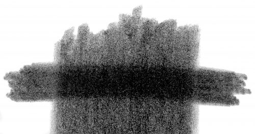
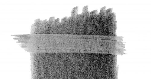
If you use a soft grade (B to 8B) its minimal clay content means the individual graphite grains are large and won’t fill the pits of the tooth entirely. This leaves flecks of white paper showing through it, but that can be solved by burnishing with a harder grade – HB over 2B, for example – so the harder grade breaks up the softer one and fills the remaining tooth.

Because the soft grades always leave some tooth unfilled, you can always layer a hard grade over a soft one.

Conversely, hard grades (H to 8H) fill the tooth completely with a mix of clay and fine graphite particles, leaving insufficient tooth to accept the soft grades. Their large flat plates simply slide over the top and won’t hold. Remember, graphite is a dry lubricant, so it’s simply doing what it knows best. You can feel this in use, as the soft grade skates effortlessly over the harder grade. It’s much harder to get that soft graphite to stick to the harder underlying layer, and often impossible.

Hard over Soft – HB over 6B
Soft over Hard – 6B over 6H

TURNING DRAWBACKS INTO BENEFITS
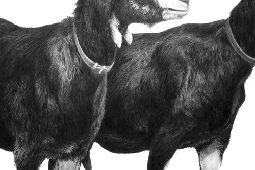
There is a technique that I’ve sometimes used that turns this problem into a benefit. You can create your own “masks” – like acid resist in etching. It works best in areas of high contrast, such as highlights on hairs within a black coat. Simply draw your highlights first, with a 4H or harder grade applied with some weight, and then apply a layer of soft grade over it, perhaps 2B or 6B. As the soft grade slides over the lines of hard grade, those lines turn from visible, comparatively dark lines into light highlights. It gives quick results but is not entirely controllable.

Minty and Bramble
Highlights drawn first with 4H then layered with 6B

THE IMPORTANCE OF DARKS
Personally, I feel the often-taught method of building up dark values from a lighter base is simply an admission that no firm decision has been made about the value required. Instead, I advocate the immediate application of the desired value. It produces the freshest drawing and, because it requires a confident approach, the result is sharp and clear. And, perhaps more importantly, as soon as the darkest value is established in a drawing, the entire palette of available greys is known and all midtones automatically fall into place.

If the initial dark value is too light, the entire drawing will be based around a restricted palette of greys. It will lose depth, vitality and impact.

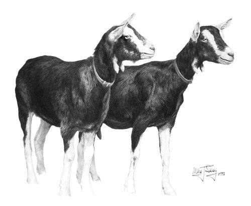
I know I often repeat myself when promoting the use of dense and solid blacks and darks but they really are important. It’s light and shadow that make a drawing, not middle values. If you want your subjects to appear three dimensional, you must have light and shade. Look at the drawings of Ingres or the paintings of Rembrandt for clear lights and darks. And if you work from photographic references, try to find high contrast ones and not ones with almost all middle values – although with practice you should be able to interpret mid-value photos as though they were high contrast.

When someone looks at your drawing their brain will register the darkest value, however small, and then read the white of your paper as being pure white. From those check points it will compare the two extremes and understand all the mid values. The wider the overall tonal range the more three-dimensional information you can impart.

FINALLY…
When you’ve completed your drawing, or a completed section of it, lightly shade with a 2H, or 4H, over everything, avoiding only the highlights. That will remove all non-intentional white from your drawing and your highlights will shine with an increased brilliance.

What paper do you use? Mellotex!

An artist wrote to me yesterday asking “What paper do you use”. Well, I’ve been using Mellotex (formerly Ivorex) for almost all of my thirty professional years.

Artists often use a variety of papers. For example, the renowned Trompe l’Oeil artist J.D. Hillbery (www.jdhillbery.com) chooses his paper to suit the texture he’s trying to achieve. Other artists choose from a narrower selection of paper, such as Canson or Strathmore smooth Bristol board. Personally, I stick with one paper regardless of the work, adapting my techniques on Mellotex rather than changing papers.

Mellotex can stand an enormous amount of punishment and hardly ever suffers from raised fibres. It’s smooth enough to take graduated tone with 6H and has just enough tooth to accept 6B (which I hardly ever use – I prefer 2B as my softest grade). The surface is virtually texture-free, so it doesn’t interfere with what I’m trying to depict – in fact, papers that display their surface texture within a drawing are one of my pet hates!

Mellotex is a UK product, available in Australia under the “Lustre” brand name but not generally available elsewhere. Although Mellotex is now sold as an office paper, as well as card, it is archival quality. The manufacturers state “Mellotex conforms to ISO 9706 requirements for permanence and as such is suitable for archival use or applications requiring ‘acid-free’ paper”. It is primarily used by the printing industry, so visit your local commercial printer and ask for the name of their paper supplier (or ask them to order on your behalf). I found a commercial paper supplier in Leeds about 20 years ago and bought 100 A1 sheets of Ivorex, which lasted until about five years ago. Then I discovered that Ivorex was now Mellotex, and available in Super White (the off-white I was used to using) and Ultra White. Now I work exclusively on 290gsm Ultra White Mellotex and enjoy the greater range of contrasts that are available to me.

Because I have many overseas requests for Mellotex and my own supplier has a minimum order of 200 sheets, I now supply both Super and Ultra White from my website – SibleyFineArt.com/shop. I have a minimum order of just 5 sheets (although ordering 10 sheets saves you money per sheet) and I will ship worldwide.

Drawing Papers and Drawing Sizes

PAPERS AND PAPER MATTERS
Earlier today I was contacted by an artist who has signed up to my 10-week correspondence course – the first one I’m running at DrawSpace.com. She had a query about the Mellotex paper she had just purchased from my website’s shop. She asked:

I ordered both the Super White and the Ultra White Mellotex
simply because I didn’t know which ‘color’ I should use. How do you
decide which ‘color’ of paper to use? Is it as simple as using the
off white paper if your drawing has mostly darker values in it, and
using the whiter paper if your drawing has more white in it?

First, I must explain that Mellotex is available in a number of varieties and I stock Super White, which is a warm creamy colour, and Ultra White, which is a brilliant white.

When choosing the paper for project, think in terms of available contrast. If your drawing needs a softer, less harsh look, choose the Super White. Alternatively, if you want the maximum range of tones available to you (almost always in my case), choose the Ultra White. Both papers are double-sided plate finish, so they have virtually no detectable surface texture – perfect in my opinion for detailed, realistic drawings.

How do you decide how large to make a drawing? Is it easier to work in a large size? But since ‘large’ is relative, how do you decide what size to make a drawing?

Personal preference and experience play a large part. Increasing the size of a drawing by 20% will often increase the time to complete it by 50% or more, as the amount of detail is greatly increased. You reach a point where suggestion will no longer suffice and only direct depiction will do.

Personally, I have a handy trick that I use. Let’s say the study is of a scene which includes a dog’s head and foliage. Sometimes I’ll print out an enlarged line drawing but more usually I just imagine an element on a blank sheet of paper, then I hold my pencil over it and “pretend” to draw the face. This simple exercise gives me an excellent idea of the work involved, how long it will take to complete, and the level of detail required. I might “draw” other areas too, such as foreground foliage. Based on the results from these exercises, I adjust the size accordingly.

You must also take into consideration the amount of information you have available. If you’re working from poor reference photos, small is better! Don’t increase the size past the point where suggestion will suffice, if suggestion is all you can achieve with the information to hand.

How do you decide how much of the paper to use for your drawing – is there a standard border size that should be left on the paper for framing purposes?

I always use a full 24″ × 18″ sheet of Mellotex no matter how small the drawing is. That way I can enlarge the area of the drawing at any time if I need to. The paper is finally cut to size to suit the mat and frame. Paper is not that expensive – not when compared to a drawing that has insufficient margin to mat correctly!

If your drawing is a commissioned study, don’t stint on those borders. Put yourself in the position of your client. Which would you prefer to receive – a 7″ × 10″ drawing on a sheet of 8″ × 11″ paper, or the same drawing on a generous 18″ × 22″ sheet? Human nature sees value for money in the second. Additionally, if the drawing is handed around the family for appreciation (it will be!), fingers prints will be kept away from the drawing itself. And framers often like to give the subject room to breath in a frame, and that in turn produces a larger and more imposing frame. Don’t assume that it will be closely matted – a good framer might well decide to use much of that generous 6″ border that you provided.