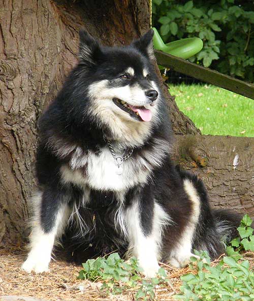
Tony Bird recently wrote to me asking:
I am drawing the attached photo and whilst I’m getting on OK with the dog, I’ve tried all sorts of techniques to do the bark without success. This was the one exercise I didn’t do at your Kent workshop! Any pointers you can give me would be greatly appreciated.
I’ll cover HOW later but first I want to question the WHY. Why do you want to include the bark? Is it simply because it appears in the background of your photograph? Is it connected with your dog? Does it tell us, the viewers, anything about the dog. In brief: if it doesn’t add anything to the story being told then it’s probably best omitted.

Of course, you might then wonder what to replace it with! In this case it could still be a tree, but one with smooth bark that doesn’t attract attention away from the dog, or cause confusion between its busy surface and that of the dog’s coat. It might help you to find a reference of such a tree, so you can study it closely and form an overall impression that you can aim to capture. But whatever tree you use, it is essentially a secondary element of the drawing and should be played down. You can do that by either softening the edges as you work or restricting your grey pallette to the middle of the range – or both.
Also you don’t need depth in this drawing; being able to see past the dog and the tree simply leads the eye into dead territory. What you could do here, is to bring the background foliage forward until it’s just behind the tree. That would provide a good visual backdrop, remove the unnecessary recession and, if thrown into shade by the tree, give you an overall dark area that would make the dog stand out. We covered the negative drawing techniques required for doing that during the workshop.
Personally, I think the foreground works well. It does add to the story, because it subtly fixes the location as being outdoors and natural, it isn’t too complex, and the leaves overlapping the paw will give a sense of localised depth. It will also hide that paw. Grass has to be the artist’s best friend when drawing paws!
Now for the HOW, since you asked 🙂 Begin with the foreground darks and pitch them a little lighter than the darkest tone in the dog. That will preserve the dog’s dominance. Study each area before you draw it until you understand its three-dimensional nature. Then draw it, making certain that the lightest tone is darker then the whites in the dog. Finally progress backwards, reminding yourself as you do so that this is curved surface, so none of it will be directly facing you and will progressively turn away from you. If you retain the dark area above the dogs head, don’t just block it in; instead, provide detail within that area. The detail will prevent it being too tonally solid and vying for attention with similar tonal areas in the dog. If you decide to bring the background foliage forwards, I’d draw that dark area of tree considerably lighter, so the tree curves back into the foliage, and allow the foliage to act as a visual stop.
Break the job down into easily manageable parts. Starting with the darks means you only need to concentrate on each individual sharp edge. Then, having worked out the form in your mind, draw your interpretation of each area of bark one at a time. Where possible use your mental idea of the lighting direction, instead of copying that in the reference, so you are constantly reminded of it. You’ll find yourself sculpting each area instead of just applying tones and drawing a rough approximation.
As with any other texture that you have a reference for, study the photo carefully untill you understand it in three-dimensions and not just as a series of adjoining shapes and tones. Drawing from your mental image will always produce superior results to working directly from a reference.
Go to Drawing Trees & Bushes for a more in depth explanation.