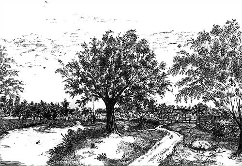
Artist Stephen Sample, who works in Pen & Ink, emailed me to ask:
I have been working on trees for the last couple of years, and they turn out pretty nice, but it is predominately due to the amount of stippling I use to create the leaves. The difficulty that I am having, is that, although it looks fairly like a tree, it is choppy if you catch my meaning, not even close to as defined as the trees that you are drawing. Your work has incredible detail, and that is ultimately my goal. I have two questions so far (and I did read your tutorial on trees): How do you do the leaves, and how do you incorporate your shading into your leaves without taking from the “leaf” effect. In doing the leaves, do you do more of a small random dash, or perhaps is it more of a dot? I think that is where I am stuck. Here is a drawing from 2010. Would you at all be willing to give me a few pointers perhaps?
In most cases, except for the foreground, my leaves are simply result of scribbling, bearing in mind that the white areas are as important as the marks I am making. In other words, rather than draw the leaves themselves, I draw the shadows between the leaves, so the leaves are represented by the spaces and holes that remain. The second stage is to add overall three-dimensional shading, and it’s the previously white leaves that take this up. The more stages you can divide anything into the simpler it becomes.
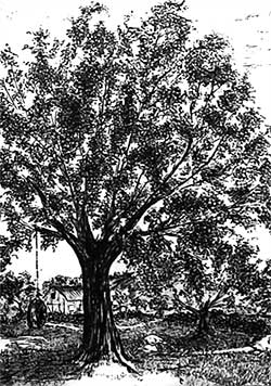
Your trees are lacking depth. I’ll concentrate on the central one, which is fan-like – a series of radiating ribs with leaves attached. However, there is some depth, as a few of your leaf masses appear in front of some of the branches.


What is missing is the mass of foliage in the foreground and, more importantly, foliage in the background. Bear in mind that a tree is basically a deformed ball. It is a round, three-dimensional shape that overall will have a shaded side and a highlighted side. The top will receive more light and the base of the foliage mass will cast a shadow beneath it. Then you have to consider local lighting – each individual mass of foliage is itself a rounded three-dimensional form that requires its own highlighting and shade.
How to fix it? First, I think there is an unnatural amount of light visible through the tree – there are too many holes through which we can see sky. Second, many of those holes need to be filled with the foliage behind the tree. To suggest depth, that background foliage needs to be a blurred suggestion rather than sharply drawn. You can think of a tree as being in three layers:
1. The background layer (the leaves behind the tree) that contain no detail at all.
2. The midground foliage that makes up the bulk of the tree – it possesses very little detail except for the silhouette of the outermost leaves against the sky.
3. The foreground foliage – those masses of leaves that are in front of the trunk and directly facing you. This layer requires the most detail. The eye will detect that detail and understand everything behind it as being more foliage that, receding from the viewer, is less distinct.
You need to give your viewer’s eye sufficient clues, often quite obvious ones, such as the midground foliage edge silhouettes.
Take a look at the ballpoint pen work of a friend of mine, Vincent Whitehead, at www.RuralRouteOne.com. Vincent has an excellent tutorial on how he draws his trees that you may find invaluable. And my good friend Diane Wright has another comprehensive “How to draw trees” tutorial.
Stephen replied:
I am very grateful for your splendid advice. I do however have a couple more questions now. I did look at Mr. Whitehead’s tutorial and found it must helpful indeed.
I appreciate that working in ballpoint allows Vincent to create half tones that are not easy to obtain with pen & ink or stippling. But those out of focus halftones are what gives depth by providing the rear half of a tree.
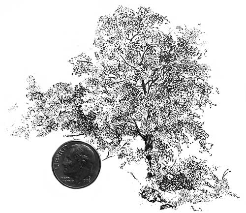
I created a second picture that I thought was more on your track, and was wondering what is needing to be improved as far as depth goes. On this scale it was a little difficult adding shading in the background and, as you can see, it is a lot of stippling still. Is that bad? Would it be better if I didn’t do that? I am trying to go for a leaf effect, but I don’t want to make it too busy.
Attempting a leaf effect is fine but don’t overdo it. Take a long hard look at trees and try to work out what you can really see – and what visual clues you gain from each element. You’re well on your way to achieving that -= especially the use of negative drawing at the left, which immediately adds depth. Your foliage now extends in front of the trunk and the glimpses of branches reinforces the depth of the tree. I still think it needs the incorporation of background foliage – a darker, enigmatic mass that will push the midground foliage forward, but I’ll have to leave the means to convey that to your expertise in Pen & Ink.
Let’s take this in three layers:
BACKGROUND
You cannot see leaves, only a silhouette of a mass of leaves, and it is devoid of three-dimensional detail.
A silhouette tells you little but the holes in that silhouette hold the clues because of the leaf shapes that surround their inner edges.
The outside of each dark silhouetted mass also has detectable leaf shapes.
The side of that background mass that you’re looking at is inside the tree and will thus receive very little or no light.
MIDGROUND
You can see leaf-like shapes, but mainly masses of leaves with some more visible and highlighted leaves within them. It contains little tight detail but each mass or clump of foliage will show three-dimensional form that depends on the lighting and its direction.
The leaf shapes that surround the edges and are starkly visible against the sky behind offer the most powerful visual clues to the viewer.
FOREGROUND
This is largely those masses of foliage that are directly facing you and are in front of the trunk.
You can see sharply defined leaf shapes with parts of leaves visible behind them that become less distinct as they recede into the internal shade.
You use these very visible and highlighted leaves to offer the clearest visual clues about the tree. Use sharp drawing and strong contrasts, and use the more shaded internal leaves to push the most foreground leaves forwards.
Use shade within the midground masses to strongly highlight the leaves around the most brightly lit side of each foreground mass. Thinks of those edge leaves as “icons” – recognisable shapes that instantly convey to the viewer the type and maybe even the species of the tree.
Combine all three and you achieve a good deal of depth; a drawing that is instantly understandable; and a tree that invites the eye to linger and explore ever deeper – but as the eye travels deeper, it has to find what it expects to find.
One final point (in graphite at least – I’m not certain about pen & ink): work from the background forwards. It’s the background that negatively defines the edge detail of the midground foliage, and the midground that defines the foreground edges. You cannot in my opinion, work from foreground to background for two reasons: the foreground will control what is possible in the drawing of the background, and the possibilities may not be sufficiently abundant; and you will be drawing the foreground with nothing to refer to. With no reference, its tonal range is a complete unknown and can only be guessed at. Guess wrong and the error extends right back through the tree. But by drawing the dark background first (including the silhouetted trunk and branches) you immediately establish the darkest tones in the drawing. The white of your paper is the lightest, and all other tones will then fall into place as you work.

Very helpful, as always!