Jonas contacted me through my website’s “Ask a question” feature with this query:
I recently received my new drawing pencils and Mellotex and absolutely love it all. As soon as I finish reading your book I’m
going to begin my first new drawing that I want to sell as prints. So far, everything I’ve done has been commission work so the printing process is new to me. Do you have any advice on how to go about doing this?
This is a huge subject, Jonas, so I’ll try to stick to the basics. You’ll find more detailed information elsewhere in this blog and on my website.
Let’s first tackle a few common questions:
“Does having prints done of an image change the value of the original?”
In my opinion, no, and certainly not downwards! I’ve had a few buyers in the past use this argument to push the price down but as far as I’m concerned an original is an original whether or not a print has been taken from it. I don’t see the value of Constable’s Haywain halving just because we can all buy postcards of the image.
“If you are going to have prints made to sell, will you have to make all of them first?”
It depends on (1) the process, (2) your “sales potential” among the dealers and (3) your pre-publication promotion.
(1) If you print by giclée then you can print whatever number you need on demand and don’t have to hold unsold stock. If you print by offset-litho then you have to print the entire run in one session – and pay for it, but it’s much cheaper in the long run than giclée.
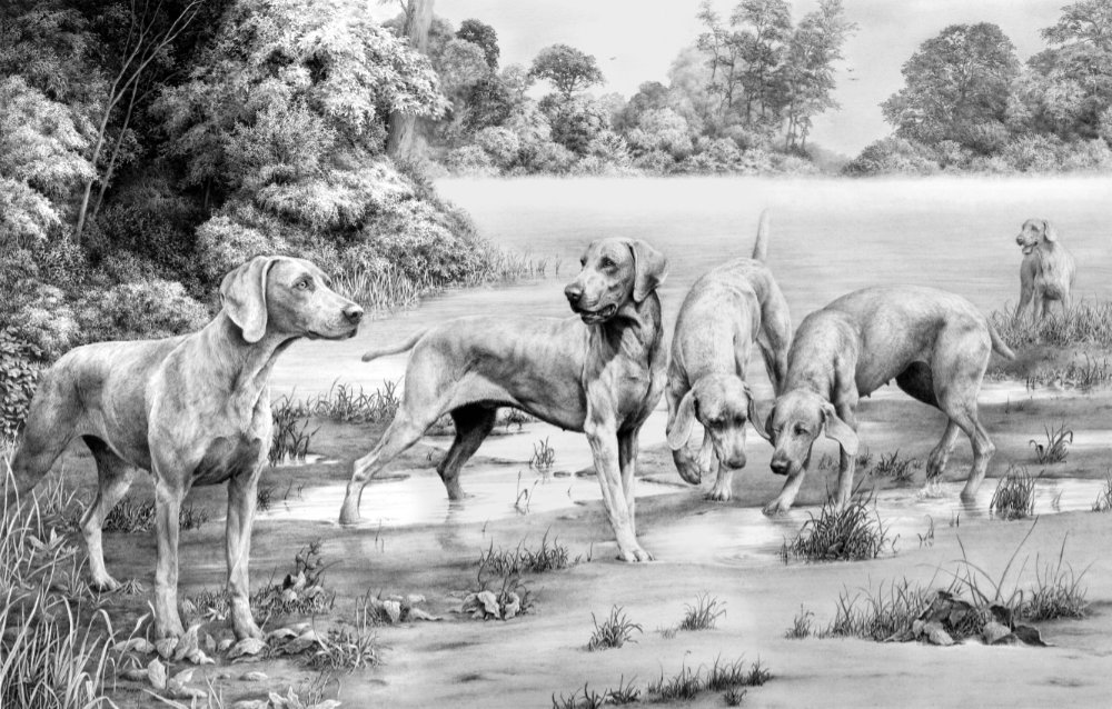
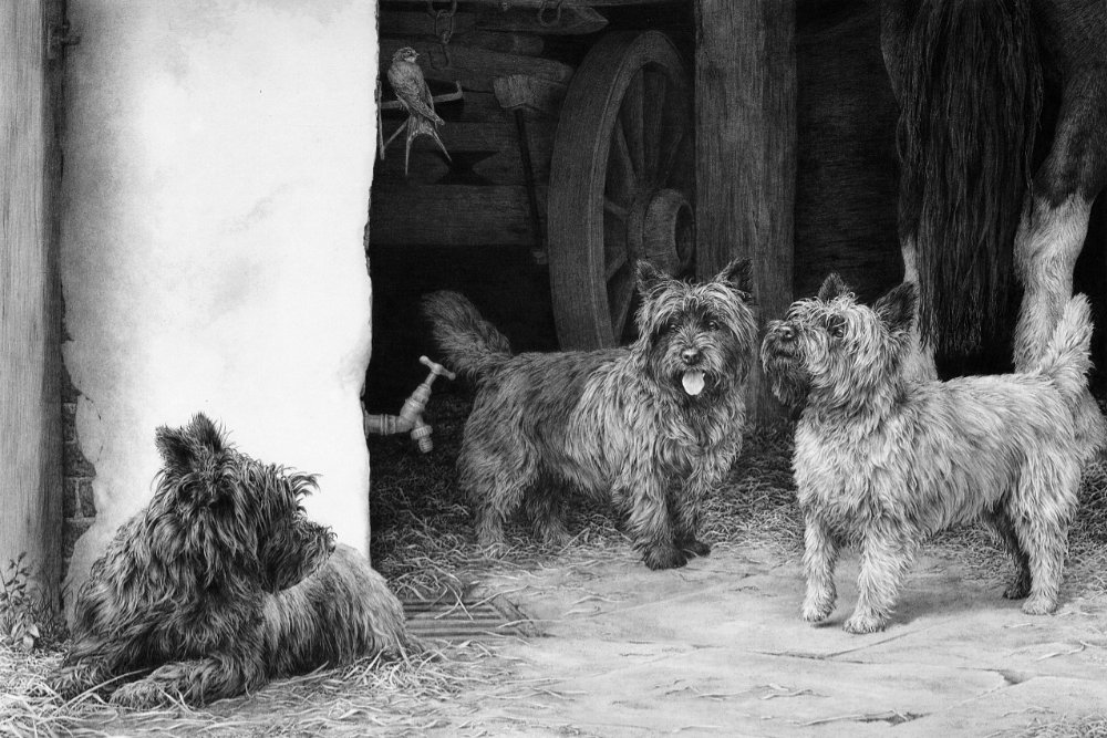
(2) If you have a known track record of sales then you will be able to take orders from the trade before you print. In time you can take them even earlier – I’d already sold the first 30 copies of my Cairn Terrier print “The Barn Patrol” before I knew what the setting was.
(3) If you can take enough forward orders then you’ll have the printing costs covered before you print. That’s what the What’s New page on your website is for – already promoting your latest drawing even if you don’t yet know what it will look like. You should be gathering email addresses of interested parties and awarding them “special” status by sending them pre-publication details.
“Does the fact that I want to make prints influence how I draw my picture?”
Yes, to some extent. First, always draw for you and never for your market, because if you don’t have anything personal to say about you subject, you can’t expect your buyers to be interested in it. The only commercial consideration I ever make is to use the most popular colouring for the dogs I include, but that doesn’t affect what they’re doing or how I see them.
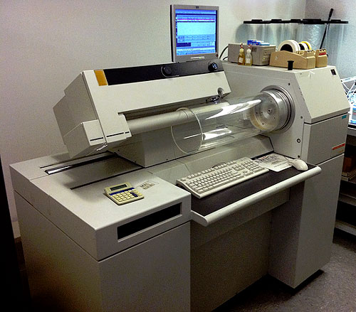
From a practical viewpoint, don’t draw on paper so thick that you can’t roll it. To achieve good prints you need a good scan, so follow the lead of the printing industry and use a laser drum scanner. Source the nearest pre-press house in your area and they should have one. It’s not expensive. I pay about £15 ($23 USD) for an A3 (about 30 x 42 cm) image scanned to CD, but it has to be taped around the scanner’s drum, so don’t draw on illustration board or any very stiff paper.
Tip: Tell the scanner operator you want the paper to be read as white! The scanners are so accurate they will read an off-white paper as a value in the drawing.
Printing types – Giclée printing
Giclée would probably be a good way to start. The per-print price is high but you don’t need to print many at one time.
Giclée is inkjet printing but not all inkjet printing is giclée. It involves state of the art 6- or 8-colour printers using 200-year lightfast inks on a variety of art papers. Just do an Internet search for your nearest giclée printer – although you can do this almost as well by mail with some of them. You can often have as few as 10 prints made, the settings are stored, and you can repeat the printing as often as you need to.
Printing types – Offset-litho printing
This is much cheaper per print but you need to print an entire limited edition in one print run, or maybe 500 open edition prints, to make it viable. It also means…
Life is fine and rosy until the fateful day when you decide to print. Suddenly you find yourself talking to Printers! The dictionary definition of a printer should be “One who puts ink on paper without any reference to the source image”. I’ve had some bad experiences, as you may have guessed! 🙂
After a while you can train them to look at art as Art and not as just another job. They can even be trained to understand that what you want is a print that is indistinguishable from the original. They however will tell you that this is not possible. And they’re right…… printing is one long agonising fight with compromise. For example, offset-litho printing uses a pattern of dots, and four adjacent round dots will always leave a white hole between them. Hence, the most solid “black” only ever achieves 90% coverage.
I use the duotone printing process that uses two of the four-colour process plates – black and magenta I think. As long as my printer knows which plates, that’s OK! The black plate prints with black ink and the magenta plate uses a warm grey. The two combine to capture the deepest blacks to the lightest of tones.
Incidentally, giclée printing can print dense blacks, and you can print on demand instead of holding dead stock – but it is ultimately much more expensive per print. Until recently, I used giclée only for images that didn’t fit into my current market, so I’m not paying to print copies that might never sell.
In-house printing
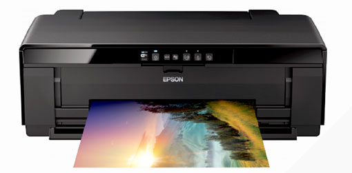
Buying a giclée printer can, depending on sales, quickly pay for itself. If, for example, you’re paying a Giclée Printer £15 per copy and your printer costs you £600, it only takes just over forty sales to pay for it, taking your running costs into account. It’s also an ideal way to test the sales potential of new work or work that doesn’t fit your usual subject matter. I use an Epson R2400 printer that prints up to A3 size. And, of course, you have ultimate control over the appearance of the print.
Do not be tempted to purchase an old used printer that doesn’t use the K3 system of inks. Older giclée printers mixed the colours to create the greys, and that usually resulted in a colour-cast (called Metamerism). Your print might look black and grey under natural light, but green under fluorescent, and blue under yet another light. The K3 system avoids that, because you can turn off the colours and print using only the black, light black, and light light black cartridges – no colour in the mix so no colour-cast.
Costing
Spreadsheets are an ideal way of controlling your costs and profit. Set up a “what if” spreadsheet so you can alter the variables and instantly see the results. Mine allow for paper and an estimation of ink costs, plus any other costs I might encounter. If you intend to sell your work matted, for example, then factor that in too. Who are you selling to? If it’s to retail customers through your website, set the final profit to the selling price less your costs. If you’re selling to the trade (stores, print shops, galleries, etc) then assume your profit will be reduced by their 50% discount. In my case, I assume 10% will be sold at retail price and 90% wholesale to the trade. If you’re unsure of a figure, always err on the gloomy side – so assume 50% discount for trade sales even if some will accept 40%.
Sales
As your website features commissioned portraits I don’t know what subject matter you want to sell as prints. If it’s animal related you might find associated clubs with websites who might be interested in selling your work. Some may just make mention of your prints and provide a link to your own site, which is just as valuable.
Never fail to follow up a lead, however tenuous it might be. For example, in the days before the Internet, I would always answer a letter with an enquiry about local stores that might be interested in my work – even if the letter was to my Electricity Provider. And every letter and envelope still bears my website address – even if it’s to my Aunt Edith or the Taxman!
You can visit galleries personally (by appointment) or send them a detailed mailing. Visit a few galleries with your originals before you print and ask them to give you some idea of the retail price you could command. They should know – it’s their business.
Run an online search for similar artwork and note their prices. Finally, when you determine your own prices don’t be too cheap. The price reflects your own opinion of your work and “too cheap” is far more damaging that “too expensive”.
Print types
OPEN EDITION : No restriction on the number printed and the image is reprinted every time stocks run out.
LIMITED EDITION : Restricted to a set number of prints, which gives the image a rarity value. Each print in numbered – 652/850 for example – where that’s print number 652 out of an edition of 850. No more will ever be printed.
I changed from open to limited edition prints because, theoretically, the cost doesn’t really matter. When you can sell a £1 offset-litho print for £60, the cost is largely immaterial. I wanted to be able to print to a quality and not to a price, as I had to with my open edition prints.
Finally…
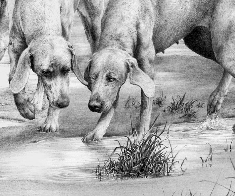
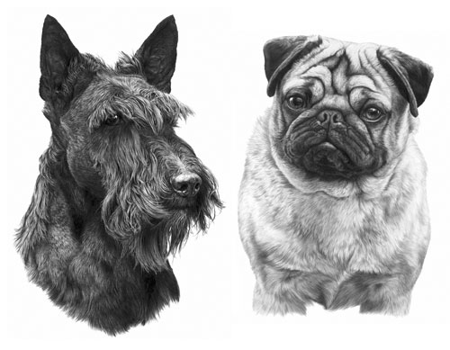
Finally, produce work that tells a story, however simple. Even my head studies tell a story. Before I began each one, I’d decide what the dog had just been doing and was about to do. That made it “alive” in my mind and it became built in as I worked. Each one was never a “drawing” but always a recreation of a living animal.
If your work doesn’t say something, you’ll be an illustrator and not an artist. Illustrations are not widely popular with the majority of the buying public. A botanical illustration, for example, will tell you about the shape, form and detail of a flower, but you won’t be able to feel its waxy petals or appreciate the way it bends in the wind. Illustrations tend to be too “clean” – Nature is a messy creature – so the occasional nibble by a caterpillar in a leaf adds the missing sense of reality 🙂
The story can be complex or simple, the drawing should be your interpretation and not a copy of a reference, and it should contain what you personally want to convey to your viewers and future customers. “Look at this” you should be saying “Look how beautiful it is. No, look closer. Really close…” and they will, and they’ll appreciate something that they only glanced at previously. As graphite artists, we can’t hide behind colour, and that’s a huge advantage – we’re detail-based and don’t have big brushes to suggest anything with a wide sweep. As a bonus, we also tend to stand out from the myriad of paintings in galleries.
If you haven’t already done so, join a good forum where you’ll receive constructive criticism and assistance. Social Media is fine if you just want praise but it’s rarely any use for constructive crtiques.