Choosing a Graphics Projector

Shanti, who attended one of my workshops last year, has emailed to ask:

“I have been reading your book like a fiend and wanted to ask a question about projectors for tracing. It must be a huge time saver and I was interested in knowing what you might recommend.”

A Graphics Projector is definitely a great time saver – but to be used with caution, as I shall explain.

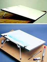
The best, in my opinion, is the Artograph DB300 (which I use) or the more powerful DB400. Unfortunately, neither are still in production but if you find one on eBay or a similar site, seriously consider purchasing it. It’s a huge and heavy beast, so you need permanent space for it, and a strong table or worktop to clamp it on to. The nearest equivalent that I know of, although not as solid as the DB300, is the Kopykake Kobra 5000. This has a similar sized copyboard to the DB300’s impressive 10″× 8″, but I’m told it can be a little inaccurate towards the outer edges of the image. That’s a common fault, as I shall also explain.

Artograph DB300 and Kopykake Kobra 5000

Incidentally, for mural or large-scale works, the DB300 can be lifted off its pedestal and replaced on its side to project horizontally.

PROBLEM:
Some Graphics Projectors have front-silvered mirrors and others are more conventionally rear-silvered. Which do I choose?
SOLUTION:
Always choose a front-silvered mirror. A rear-silvered one presents two surfaces for the image to reflect from – the front of the glass and, slightly behind it, the actual silvered surface. This can result in ghost images appearing.

PROBLEM:
My Graphics Projector displays distortion towards the outer edges of the projected image.
SOLUTION:
This is a common problem and easy to check. Draw out a grid of squares, load it onto the copyholder and view the result. Any distortion will immediately become apparent. Knowing that distortion is present is useful, but knowing WHERE that distortion occurs is invaluable. In most cases you should find the central section to be sufficiently distortion-free for most uses.

I overcome that problem by projecting multiple images to build up a complete composition. I’ll project an overall sketch of my proposed composition, resize it as required, and then outline only the background onto my final drawing paper, bearing in mind that it might not be totally accurate. At the same time I’ll mark the positions (placeholders) of the important elements – those that have to be accurate. Each of those elements will have been worked on as separate line drawings, and each is individually projected, placed in its placeholder and traced off. As these smaller line drawing occupy only the central area, they are free of distortion.

That might sound like extra work but, by isolating them, I learn much more about each of those elements while I finalise their appearances.

PROBLEM:
When I begin drawing, I find I only have a half-formed idea of how to tackle each element.
SOLUTION:
This can be a common problem when you simply trace directly from reference material. You have (and require) no understanding of the subject when you merely trace outlines and features. The solution is to use at least two steps.

Step #1: Project and trace the reference, so you remove all lighting, three-dimensional form, and texture. Boiled down to a simple line drawing, you can now easily alter it to suit your requirements, build in emotion, fix potential visual problems and even (if required) work out an entirely new lighting source direction. During this stage you will discover potential problems, work out what parts actually look like, and make the majority of the errors that might otherwise ruin your drawing.

Step #2: Project and trace your Stage 1 line drawing. Resize it to fit the placeholder or paper (if it is a stand-alone subject). What you are now projecting is YOUR drawing and not just a mechanical tracing of a reference.

Finally, a Graphics Projector can perform more tasks than you might consider possible. I now use a computer to perform many of those tasks, but previously I would, for example, use my DB300 to project one photograph of a dog onto another, using a piece of card to blank out unwanted areas so I could see the effect of one head attached to another body. Or I can superimpose the original photograph onto my line drawing and, waving a piece card from side to side through the projected light, easily check for substantial inaccuracies – any deviations between the two flash on and off. With some imagination, the uses are endless.

Colour Shapers

Kevin emailed me to ask:

I read in your book (Line to Life) yesterday that you use colour shapers sometimes for blending. I would like to buy a set but I was not aware that they came in different sizes. Could you please advise me as to which size to buy. The ones I have seen are size 0, 2 and 6. Many thanks and I love the book.

Colour Shaper varieties

When I see a tool, however far removed from drawing, and it looks useful I just have to try it 🙂

Colour Shapers are intended for painters but I find then ideal for blending in tight spots. Unlike tortillons or stumps, they don’t absorb much graphite, so they lighten less. And they’re easily cleaned by screwing the business end into a lump of Blu-Tack.

They come in different sizes and profiles, as you mentioned, and in two types – stiff and flexible. I know a couple of artists who prefer the stiff variety but I find the flexible more appealing.

I have three:

Flat chisel – size 6 (rarely used)
Taper point – size 1 (I think – it’s rubbed off!)
Taper point – size 2

Of the three I mainly use the size 1 Taper Point. I find it’s ideal for blending when I’m drawing remarques. Because I remarque on the coated surface of the (offset-litho) printing paper, I’m restricted to using 2B and 2H, and I achieve the half tones by establishing the line element of each area with the 2B and then dragging the graphite over the lighter areas.

If you don’t have one you won’t miss it. But if you do, you’ll find unique uses for it. In my case, I very rarely blend anything, apart from skies and dirt floors, so blenders are not my most popular tool. But the Colour Shapers certainly fulfil a need at times.

Mounted or Unmounted paper?

Michael Benee wrote to ask:

“I have just finished my first dog portrait, and I mounted the cartridge paper onto a mounting board before I started. I notice that you use a heavy weight Mellotex paper is this so that there is no need for mounting, and is this how you supply your originals to your clients i.e.unmounted?”

You don’t say how you mounted your drawing paper to the stiffer support. I’d recommend vacuum mounting by your local framer, because other methods (spray adhesives, for example) may not be permanent or may bleed through to the surface with time.

I don’t ever mount my drawing paper mainly because I detest any “bounce” in the paper as I’m drawing. A smooth and hard surface beneath my Mellotex means that the mark I make is the mark as I intended it – not one that sinks into a soft surface that interferes with my control. If your paper is lightweight, change to a heavier weight and place it on a melamine or similarly hard surface, such as a drawing board. Even tabletop drawing boards usually possess such a surface.

Another reason why I don’t mount my paper is that most of my work is destined to be released as limited edition prints. That means it has to be scanned and, in my opinion, you can’t beat a laser drum scanner, which demands that the paper be sufficiently flexible to wrap around the scanner’s drum.

When (rarely these days) I present a commissioned original to my client it is always in its raw state – trimmed to a suitable size and displayed in a custom-made matboard folder. The folder protects the drawing and doubles as a presentation easel, further protecting the drawing from being handled.

Michael added:

“Please find enclosed a pic of my first attempt at drawing my dog, any comments would be welcomed with open arms”

Copper by Michael Benee

For a first attempt (even for a tenth) this is admirable! Weimaraners suit graphite so well. The eyes are beautifully studied and executed and sufficient directional facial hair suggests the texture. My only criticisms are that the texture does not extend to the muzzle, which appears to be too smooth; that the dog overall is too tidy (it’s the out of place hairs, flecks of foam etc that add a sense of reality); and the nose has a highlight suggesting a shine, although Weimaraners have quite a dry, non-reflective nose.

Finally, just a personal preference, I would have feathered the bottom edge of the neck to suggest an unseen continuation.

That said, well done!

What paper do you use? Mellotex!

An artist wrote to me yesterday asking “What paper do you use”. Well, I’ve been using Mellotex (formerly Ivorex) for almost all of my thirty professional years.

Artists often use a variety of papers. For example, the renowned Trompe l’Oeil artist J.D. Hillbery (www.jdhillbery.com) chooses his paper to suit the texture he’s trying to achieve. Other artists choose from a narrower selection of paper, such as Canson or Strathmore smooth Bristol board. Personally, I stick with one paper regardless of the work, adapting my techniques on Mellotex rather than changing papers.

Mellotex can stand an enormous amount of punishment and hardly ever suffers from raised fibres. It’s smooth enough to take graduated tone with 6H and has just enough tooth to accept 6B (which I hardly ever use – I prefer 2B as my softest grade). The surface is virtually texture-free, so it doesn’t interfere with what I’m trying to depict – in fact, papers that display their surface texture within a drawing are one of my pet hates!

Mellotex is a UK product, available in Australia under the “Lustre” brand name but not generally available elsewhere. Although Mellotex is now sold as an office paper, as well as card, it is archival quality. The manufacturers state “Mellotex conforms to ISO 9706 requirements for permanence and as such is suitable for archival use or applications requiring ‘acid-free’ paper”. It is primarily used by the printing industry, so visit your local commercial printer and ask for the name of their paper supplier (or ask them to order on your behalf). I found a commercial paper supplier in Leeds about 20 years ago and bought 100 A1 sheets of Ivorex, which lasted until about five years ago. Then I discovered that Ivorex was now Mellotex, and available in Super White (the off-white I was used to using) and Ultra White. Now I work exclusively on 290gsm Ultra White Mellotex and enjoy the greater range of contrasts that are available to me.

Because I have many overseas requests for Mellotex and my own supplier has a minimum order of 200 sheets, I now supply both Super and Ultra White from my website – SibleyFineArt.com/shop. I have a minimum order of just 5 sheets (although ordering 10 sheets saves you money per sheet) and I will ship worldwide.

Drawing Boards – advice and tips

DRAWING BOARDS
Gary recently emailed me to ask:

At present I am unable to afford a decent drawing board so I’m looking to make my own. I was just wondering if you may be able to offer some advice on which materials may be best for the job? For example, would a piece of MDF be okay on it’s own or is there a material you suggest for covering the wood? I was thinking about covering the would with that sticky-backed vinyl covering you can buy to line kitchen drawers but would the surface be too slippery to hold the drawing paper? Alternatively would Melamine faced chipboard be any better (Being made of chipboard it may not be as versatile as MDF and therefore not offer a suitable surface for drawing). Just wondered if you might be able to recommend anything suitable?

When I first began I was in the same situation that you are – working on the dining room table at that time! From there I progressed to building my own drawing boards and have used Melamine-faced chipboard satisfactorily. My current draughtsman’s drawing board is simply made of that too.

MDF (Medium Density Fibreboard) on its own would be fine. However, for best results, I suggest you need a hard surface under your paper, as you don’t want any give under your pencil as you draw, so plastic laminate on MDF would be ideal. By that I mean Formica or any similar plastic laminate, such as is used for counter tops. Don’t used a textured laminate but search for a smooth flat surface – they do exist.

I certainly wouldn’t use sticky-back vinyl – it has a habit of shrinking over time and with temperature changes, which will probably lead to an annoying border of adhesive on your board. It’s also, in my opinion, far too soft for a drawing surface.

My first home-made board was a plastic laminate covered cupboard door! I fitted angled wooden brackets beneath it to angle it by lifting up the back edge. My next was an old sheet of 24″ x 36″ blockboard that I covered with plastic laminate. This time I hinged two angled brackets beneath it to lift up the back edge by 12″, although you may prefer a lower angle. It was also thick enough for me to use standard drawing board clips to hold my paper in place.

Now I use a draughtsman’s full-size (A0) drawing board, which is so heavy that after I installed I kept checking the ceiling of the room below to make sure it wasn’t about to drop down a floor!

An ideal, especially if you don’t have dedicated studio space, is to use a commercial table-top drawing board.

Table-top drawing boards

I have 15 of these that I use for my UK drawing workshops. Measuring 18″ x 24″, the folding handle swings down to form legs that give it a working slope – raising the top edge by about 5″. They also have notched rubbed strips at each side near the base, so the board can be moved forwards over your lap and the strips grip the edge of the table.