Liz emailed me to ask:
How far do I take the “detail” of short hair, when the horse’s coat is so very smooth? I feel I’m losing the “sense” of shape if no detail. in the very smooth areas. So detail or not?
It depends on what you think the major features are – the main message you want to convey. In this case it’s probably the smooth and glossy appearance, so I’d concentrate on that, and then add just enough texture to maintain the feeling of hair.
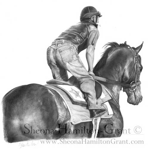
Coincidentally, my friend Sheona (who is currently taking my Drawspace Advanced course) submitted a drawing that might help you.

The horse is definitely glossy but not so smooth that it looks unnatural. In this case, it was an exercise on recession, so you wouldn’t expect to see hair detail on the head and neck, but I think the mottled rump sends the “hair” signal that you then subconsciously apply to the rest of the horse.
Personally, I went through a “Detail is King” stage and I believe it is a necessary step before you learn which detail to enhance and which to merely suggest.
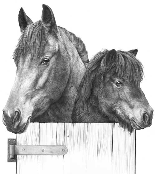
Here’s an old drawing of mine from around 1987:

It is deliberately high contrast with few areas of flat midtone shading because it was designed to be printed onto fabric, but if I’d intended it to be a print or sold as an original, I’d consider it to be over-detailed.
The dark eyes do attract attention but the horse’s mane is so sharp that it drags my eye back – it’s more primary than secondary in importance. The same applies to the base of the neck – it contains detail with a strength that defeats any attempt at creating recession. Softer detail in that area would have increased the perceived depth. It’s also of little or no importance to our understanding of the horse. The Shetland Pony contains less physical depth so I can probably get away with the globally-applied tight detail it contains.
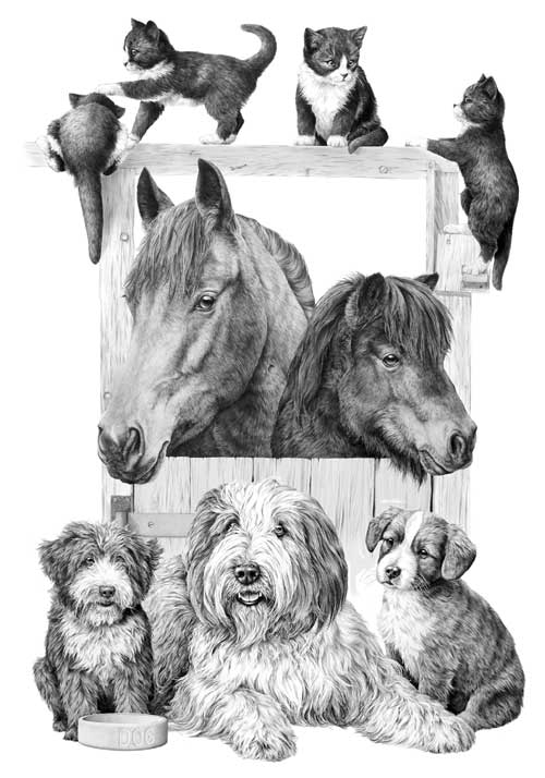
Incidentally, this was part of a duvet design. The rest of the stable and other featured animals are on a series of separate drawings:

The kittens appear to be black and white, have glossy coats, and are obviously hairy. Again, if this was not intended for printing onto fabric, I would have softened the detail in the hair.
Think of the message you want to send to viewers of your artwork; maybe look into your reference and extract the visuals clues that are working for you; then use what works and, to avoid visual confusion, discard the superfluous.