Dog Drawing critique

Molly emailed to ask…

I sent you a few of my pet portraits a few years ago and you were kind enough to give me a free critique. I purchased your book and have studied it, but still am struggling with my drawings. I was wondering if you would have the time to give me a quick critique on my more recent drawings so I can see how I have improved.

I would like to attend your workshop in Yellowstone, hopefully it will work out for me to attend this year.
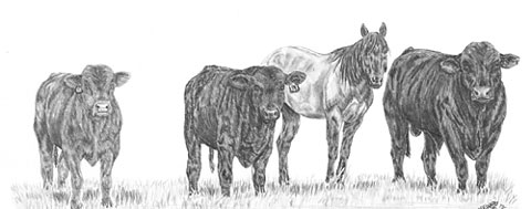
Molly's livestock drawing

You sent me five images, Molly, but I’m going to concentrate on just one, because I think they all contain the same approach.

Molly's Rottweiler drawing

You’ve developed a good eye, Molly, and you show a good understanding of what you are attempting to draw. The Rottweiler’s nose, for example, is perfectly shaped – and you’ve certainly captured the character of this lovely dog!

However (you could see that coming, couldn’t you 🙂 ), I think you’re too focussed on the reference, and drawing without really being aware of the three-dimensional shape that you’re depicting. You are very accurate with the growth direction of the hair but reacting, I think, to the tones you see before you without asking yourself what they represent. You’re drawing the two-dimensional content very well, but losing sight of the three-dimensionality – and the finer detail that adds that sense of reality.
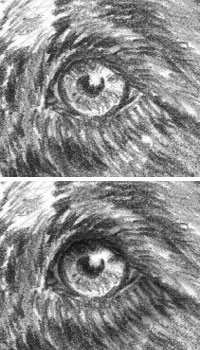
Eye with tonal range altered

Decide on a lighting direction before you begin. It doesn’t have to be the same one as seen in your reference – in fact, it will benefit you if it is different, because when you are forced to impose your own lighting, you HAVE to understand each element in three-dimensions. It’s this lack of three-dimensional lighting that is making your drawings appear to be flat – as is your shyness in using bold blacks.

For example, you’ve used good solid blacks for the pupils, but then not used them in the shadow beneath the top eyelid. As a result the eyeball and lid appear to be on the same plane. Think about where the structure you’re drawing recedes or protrudes and then light it accordingly. With a little practice you can then begin to manipulate elements of your drawing to bring out or emphasise the three-dimensional nature. I would, for example, be planning to introduce deep shade between the ear and head so the difference in planes was obvious. And I’d darken the neck beneath the chin too for the same reason.
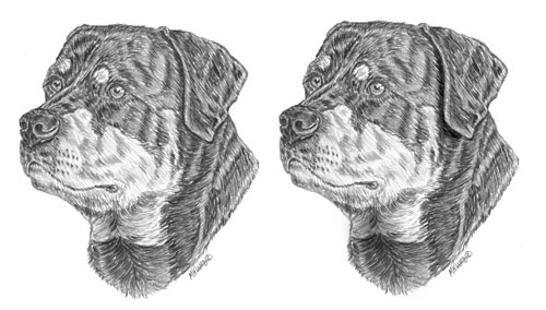
The ear forced to stand away from the head

The ear now stands proud of the face and adds a definite three-dimensional sense for the viewer. Never be afraid of going dark – you can always later reduce the intensity of the tone with Blu-Tack or similar.

Now you are much more comfortable with your pencils begin to look deeper into the reference. Understand the exact make-up in greater detail and then build that into your work. The Rottie’s nose, for instance, looks good but in reality it has a leathery texture of pits and islands. You have a good idea of its construction – now slow down, focus more on that single element and add the texture. Treat it as a drawing in its own right so you’re not tempted to move on to other areas too quickly.

You’re definitely heading in the right direction! I do hope you can make it to the Yellowstone workshop in June. There’s so much I can show you more easily – and I can look over your shoulder too 🙂

Drawing Trees

Having read my book “Drawing from Line to Life”, Rob emailed me to ask…

I admire your attention to detail without the sacrifice of the ‘drawing’ appeal in your pictures. I was wondering, when drawing trees you mention drawing the internal structure. Are you advocating that when setting out to draw a tree you would draw the internal structure first, then map out the main masses of foliage on the limbs, then go back and erase the bough structure from within the mapped-out areas of foliage masses?

I don’t have any hard and fast rules for myself – I just wing it and do whatever best suggests itself.

Typical guideline drawing

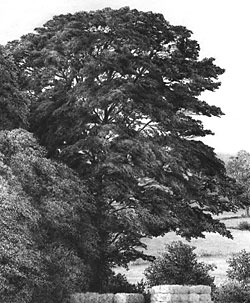
However, one thing is certain – I need to have a three-dimensional idea of what I am about to draw. Establishing the trunk and major boughs gives me an armature to work around. On that skeleton I can then map out (however roughly) the major masses of foliage. If you keep your guidelines light, you probably won’t need to erase them.

You can start with the edges or the centre, but do bear in mind that the central ones will overlap those at the side of the tree. All this helps to reinforce the three-dimensional nature of the structure in your mind but relieves you of the need to work out form and lighting of each element. That said, I often lightly hatch the basic shading required to remind myself later of what I was visualising at the time.

I’m assuming (I hope correctly) that you are referring to midground and background trees. Foreground trees require more planning and tighter detail. Look closely at tress and ask yourself why you know it’s a tree even though, in all probability, you cannot discern actual leaves. Maybe it’s the dappled pattern of light? Perhaps the shadows that describe the three-dimensional nature of each leaf mass? Or, more probably, a combination of the two – and more.

Completed tree from guideline drawing

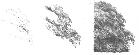
Next decide on the lighting direction and then begin drawing. I prefer to begin with those areas of branch that show through the foliage. as little light enters deep into the tree, and they are seen against a bright sky, they are relatively dark. Establishing one first, in the area that are going to work in, gives you the deepest tone and the white of your paper, of course, supplies the lightest. Now all your intermediate tones will fall into place as you work.

I tend not to shade but to just work in random patterns of lines and scribble; working light with more visible hie remaining in the brightest areas, and overworking the darker areas with more pressure. There’s little conscious thought involved – just watch the tree grow before your eyes.

Stages of spontaneously drawing a midground tree

As each element is three-dimensional, it must obey the laws of light and form – each casting its shadow on the mass below, and having a highlighted top and more shaded bottom.

Take a look at an earlier article of mine (“drawing-trees-and-bushes”), don’t plan too much, keep it free and spontaneous, and you’ll find yourself drawing realistic, organic trees in no time!

Drawing Skies

Gary posed another question:

Can you offer any advice on how you tackle skies? Skies can sometimes make or break a drawing, especially if you want the focus to be on the scene but need to add some degree of the sky as well – be it understated. Would you apply a cross-hatched technique here and if so, is there a particular method that works well for blending and creating a natural looking sky?

Skies are more important than I once realised! I used to leave the areas white but I soon discovered that adding even a light tone to skies immediately increased the brilliance of highlights within the drawing. In other words, removing all white from a drawing, except where they are intended, forces the viewer’s eye to read highlights as pure, brilliant white.

Applying an overall, smooth tone to skies can present technical problems; there should be a total absence of line and smoothly graduated changes of value. Any marks that don’t conform to Nature immediately reduce your carefully rendered realism to mere “drawing”.

I almost always hold my pencil in a normal “writing” position, but for skies, and other large areas of light tone, I use an underhand grip.

Underhand shading hold

Here I use only the weight of my clutch pencil to apply the tone, and usually with a 2H pencil. Of course, I cannot shade a large area from side to side with a single set of lines, and shading the area in sections leads to two potential problems. First, stopping a line to shade back in the other direction leaves blunt ends. And an overlap of blunt ends when shading adjacent areas will result in a very obvious double layer of graphite.

Banding caused by overlapping blunt ends

Over the years I’ve developed a technique to overcome both faults. Try this: practice drawing a line that drops gently onto the paper, continues with the required weight and then is as gently lifted clear. This will produce a line with tapers at both ends. Think of it as drawing an arc – a swing down onto the paper followed by a swing up from it. You can extend such a line at will with no evidence of a join, as a taper over a taper is simply a full strength line.

Feathered ends overlap seamlessly

Once you get a feeling for drawing this way you can begin to shade large areas – with a taper at the end of each line, which you should also stagger to prevent the eye detecting an edge. Each shaded area will now have a feathered edge that you can overlap with adjacent areas – a feathered edge layered over a feathered equates to a solid, matching tone.

Once the area is completely shaded you will need to blend it. Incidentally, blending is a technique I rarely use, except for skies or skin tones. Knowing beforehand that you intend to blend, you can make allowances for this when applying your graphite. That’s why I use the pencil-weight, underhand method, because the graphite sits on the top of the paper and not deep in the tooth. I usually blend very lightly with tissue wrapped around my finger. As the tooth of the paper is still available, I can apply additional layers, if required, to build up the tone.

I don’t customarily produce dark skies or include more than a hint of clouds. For good advice on drawing those I can recommend Diane Wright’s “Drawing Skies” tutorial.

I describe the techniques I’ve mentioned here in much more detail in chapter four of my book “Drawing from Line to Life”.

Tracing and other Transfer Methods

Gary wrote to ask:

Is tracing the outline of a sketch and drawing round this onto a chosen paper a good way to transfer the image? Is there a particular grade of pencil that works best?

I’m assuming you are referring to the technique of scribbling on the back of the tracing and then drawing over the traced lines to transfer the loose graphite to your paper? If that is so, then there are a couple of variations that might work for you.

First, make yourself a sheet of graphite “carbon” paper by heavily coating one side of a sheet of Mylar or tracing paper with a 6B pencil. Lightly tape the top edge of your tracing to your drawing paper so it cannot move. Slide the “carbon” paper between the two and proceed to draw around your traced lines – experience will tell you how hard to press. This will lightly transfer the 6B to your drawing paper and, unless you’ve used too much pressure, the lines will not be indented into the surface. You need to avoid that fault at all cost, because indented lines (particularly those drawn in error) will remain visible in your completed drawing.

The advantage of using this transfer method is that you can re-use the tracing at any time and, as it is hinged to your drawing paper, you can overlay it onto your drawing to check for accuracy or to redraw any lines at any stage of the drawing process.

I no longer use this system but when I did I found 6B to be the best choice, because it will erase completely. If you trace from a projection or use any other method of drawing your guidelines directly onto your paper, I recommend the use of lightly applied 2B, which produces sharper edges than 6B and is also fully erasable.

What is the best way to achieve this without getting unwanted dark lines which can be a nuisance if you want areas to be very light in tone on the actual drawing?

Whatever method I use I always use Blu-Tack to fade the guidelines in the area that I am about to work in. You could also use a kneadable eraser or another make of wall putty. Don’t rub the lines, simply roll Blu-Tack over them to gently lighten them until just a faint shadow remains.

Aside from a projector or light box which can be expensive, is there a better way to transfer the image without leaving unwanted lines or marks?

It’s as good a method as many and better than most. How you transfer your guidelines to your drawing surface is immaterial – all that really matters is that they are lightly applied, to prevent indentations, and can be faded or completely removed. They are just guidelines and should be reworked, adapter or even discarded as you work, so the facility of complete removal is essential.

Negative Drawing – Tiger’s ear

Alexandra emailed me to ask:

I was wondering if you would be able to give me some tips on a tiger’s ear I am drawing at the moment. The fur is really wiry and thin, and I’ve tried breaking it all down, but am not sure whether I should use the indenting technique or negative technique or both. Do I try and draw individual strands of fur, or not worry about drawing exactly what’s there?

Tiger's ear reference

First, don’t concern yourself with copying the photo. A split second after the photo was taken that area probably changed. Instead get an overall feeling for it, study it until you know it well, and then draw your interpretation.

Indenting works best in areas of high contrast, so you could use it where the hair is in front of the dark depths of the ear. Either use a fine needle or, as this is not white hair, use a hard sharp pencil, such as a 6H or even 8H. But don’t overdo the indenting, because it produces a very mechanical line that does not blend easily into surrounding drawn lines.

Personally, I’d use negative drawing for almost all of this with just a few narrow indented lines where those lines directly cross over others or where the background is dark.

Don’t be daunted by the seemingly complex task – split the job up into many stages, so you can more easily concentrate on each one. Start with the shadows between the hairs so you leave a network of white hairs. The next step is to begin working on those hairs one hair at a time. Tone each down as you think fit, to give it shaping and form, and decide at each junction or crossover if your hair is beneath or in front of the other hairs. Have fun! Seriously, don’t stress about it – take it in easy stages and just watch it grow.

Finally, you can use layers of overall tone if you need to push any areas further back, or lighten with Blu-Tack or a kneadable eraser to bring it forwards.

I hope that helps. It looks like a great project!

You can view Alexandra’s work at:
alexandra-riley.artistwebsites.com/index.html