Troubleshooting Fine Art Printing

Laurene emailed me from Canada to ask about printing and the problems she’s encountered:

This year I’d like to try offering a few limited edition prints on my website and I’m quickly learning that printing is an art form in itself!

Printing is not so much an art as a frustration! It involves… compromise 🙂 When I first went into print I couldn’t understand why printers kept saying “Well, this is as close as we can get to the original.” My mind kept saying “Why are they happy with ‘close’? Shouldn’t they be looking for ways to improve the printing process?” This was in the days when offset-litho was the only printing system available.

Later I understood the inherent limitations of printing. Offset-litho uses a pattern of dots, so four adjacent round dots will always possess a white patch in the centre where they meet. That limits blacks to an 80% coverage, resulting in a dark grey and a decrease in contrast. Printing, therefore, is a compromise between what you want it to look like, and what the technology can accomplish.
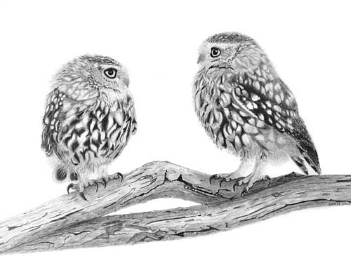
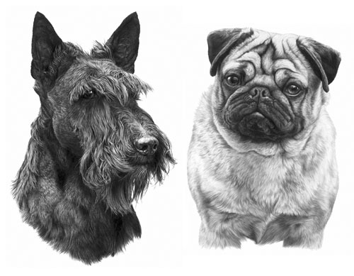
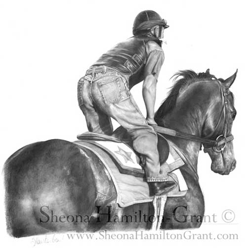
Now I print in-house using a giclĂ©e (pigment-based inkjet) printer that doesn’t have that limitation, and I have full control over the resulting image. Of course, no printed image can be better than the initial scan, but I’ll return to that.

Red-tailed Hawk by Laurene Spino

The prints will be giclĂ©e. They’re using a process they call Durachrome that heat-sets the ink after printing with UV light.

With that in mind, I’ll concentrate on digital printing but cover offset-litho too because it might be helpful to other artists.

I have a good local printer who can scan my drawings on a large scanner that can accommodate my drawings so they don’t have to be patched together in Photoshop. It’s a flatbed scanner not a drum scanner but it does a very good job.

With the exception of the Cruse flat-bed scanner I still believe that a laser drum scanner will produce the best results (see “The Best Scanners for Artwork”). It’s always my #1 choice, but if you’re happy with your Printer’s result, that’s OK.

I’ve tried 3 different papers so far. I like the results on Arches watercolour paper, hot press, and on Canson Infinity printmaking rag paper (museum quality). The problem is that both of these papers are not quite as white as Mellotex (even though they’re sold are “pure white”) and the print has a sepia tone to it. Is this a problem you’ve had before Mike?

I’ve experienced that problem but I’ll cover the paper choice first: I think there are two schools of thought – those that believe the name will help sell the print, and those (me!) who think the result is more important than the paper’s trade name.

Arches and Canson are excellent and well-respected papers, but are they as smooth as Mellotex? If they aren’t, you’ll encourage ink bleed or introduce an unintended distracting texture (both generating a softening effect), and your print will not reflect the quality of your original.

When I first began drawing dogs for print I drew on plate-finish Ivorex, which was also available commercially as a printer’s paper – job done! Ivorex morphed into Mellotex, and Mellotex was exclusively available as an archival quality printing paper. Now that Mellotex is deceased, we have Conqueror Diamond White – also an acid-free, archival, plate-finish paper for the printing industry… so it would be an ideal choice for offset-litho printing.

However, for giclĂ©e printing you need to use an appropriately coated paper. To avoid the ink bleed I mentioned – where the ink soaks into the paper and spreads so it blurs edges – giclĂ©e papers have an impermeable coating usually termed the “ink receiving layer”. Finding a bright white paper, in my experience, is not easy. In fact I’ve yet to find my ideal paper.

I’ve tried HahnemĂĽhle Photo Rag with reasonable results, but it’s not as smooth as it appears to be and it’s not as bright white as Mellotex or Conqueror Diamond White, but it’s probably worth trying. You’ll find the
Data Sheet here.

You might also try HahnemĂĽhle FineArt Baryta 325gsm, which wasn’t available when I was using Photo Rag. It claims to be bright white and to generate high contrast. Or there’s a Photo Rag Baryta if you prefer cotton over wood-fibre papers.

Again, not one I’ve used: HahnemĂĽhle Photo Rag Ultra Smooth 305gsm (very smooth matt finish). It’s mould-made, 100% cotton, pH neutral, has an extra smooth surface, and has a brighter white point than Photo Rag. Here’s the Data Sheet.

It appears to be very close to what you need, but being mould-made it’s not going to be as smooth as the plate-finish Mellotex or Conqueror. However, it might give a visually perfect result – not exactly the same as your original but presenting its best qualities. Personally, I aim at producing a pleasing and saleable print rather than trying to faithfully reproduce every aspect of the original drawing. You have to bear in mind that only you, and not your potential purchasers, have seen the original drawing.

There’s also an alternative approach I recently stumbled upon – applying an inkjet receiving coating to non-inkjet paper – and, as you’re in Canada, it’s Ontario based!

inkAID™
Manufactured by Ontario Speciality Coatings, inkAID liquid inkjet receptive coatings are hand-applied to any type of paper, as well as metals, fabrics, wood-veneers, canvas and more. The coatings are pH neutral, acid free and are specially-designed to work with dye and pigment inks. Shelf life is a year from the date of purchase.

Because the bleed of inkjet printing on uncoated paper reduces contrast and sharpness, the results are usually unacceptable. Coating paper with an inkjet receiving layer solves the problem. That means you could use Conqueror Diamond White as a giclée printing paper by adding a coating. Source: The-Artisan-approach-to-Inkjet-Printing and inkAid1.com

Would you know if there’s a special print instruction that I could give the printer so that the prints look more graphite? If I print the scan on my home printer on bright white paper, there is no sepia tint at all, but if I push the saturation in Paintshop Pro I can see the natural warmth of graphite, meaning that it’s not a cool grey.

I suspect I know what’s happening… it’s a result of using 4-colour CMYK printing. When I changed my Printer, the new company experimented with 4-colour printing, believing they would reproduce finer detail. As a result, I have one print with an overall pale blue colour-cast and another with a sepia cast. Nothing we tried could solve that problem.

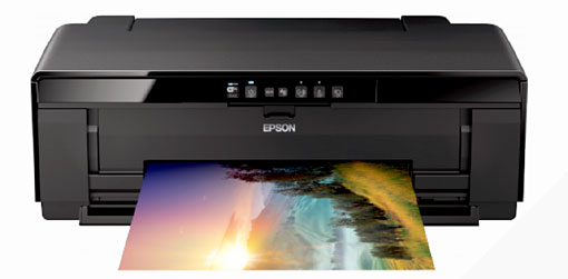
Later, using a commercial digital printing business, I had the same problem with giclĂ©e prints – until Epson introduced the K3 ink system. Instead of mixing colours to obtain greys, this system uses a black and two grey cartridges. Switch the colours off and colour-casts are banished! My Epson R2300 uses this system (choose the “advanced B&W photo” option).

Previously, with offset-litho printing we used Duotone printing. That uses two or the four 4-colour plates: we used black ink for one and a warm grey for the other. The result was excellent, within the bounds of offset limitations. We also tried mixing a “grey” that was a brownish purple. That worked even better! It’s my understanding that graphite draws with a black mark but the clay mixed with it introduces a brown tint, which is what the brown/purple mimicked.

When I’m printing giclĂ©e prints in-house I always reduce my images to greyscale. That, and opting to print using only blacks and greys, guarantees there cannot be a colour-cast present.

This is just an idea and untested, but… if you are using giclĂ©e printing and want to introduce a controllable degree of sepia tint, in Photoshop I suggest you try:

  • desaturating the image (not greyscale, you need to maintain it as an RGB file)
  • copy it to a new higher layer
  • sepia tint the copy
  • set the copy’s opacity to 10%

Now experiment with the opacity until you achieve a grey print with a touch of warmth from the sepia overlay. That should give you the ultimate in control over the appearance.

I’d like the prints to look as close as possible to my original drawings but I’m stumped at the moment. The printer who produced the Ducks Unlimited prints last year did a great job but his press is meant for large volume runs. A run of 10 would be cost prohibitive.

Were the Ducks Unlimited prints offset-litho? I’m assuming they were. The greatest proportion of the charge for an offset press is for the machine set-up time; in comparison, the cost of materials and running time are almost negligible. So short print runs are always very expensive per print.

A short run of 10 prints really needs to be giclĂ©e printed in-house to be financially viable. I have an Epson R2300 that cost in the region of ÂŁ500 (about $800 CAD). That was over ten years ago but it paid for itself with the first 20 prints produced. Prices haven’t altered much – the Epson SureColor SC-P400 is a similar A3+ 8-colour printer that currently costs around ÂŁ470 ($750 CAD).

Epson A3+ printer
Epson SureColor SC-P400

Offset-litho is cheaper per print but the entire edition has to be produced in a single run, to avoid repeated additional expensive set-up times.

GiclĂ©e printing costs more per print than offset-litho but (using in-house printing) prints can be produced when required; there’s no dead stock or dead money involved. However, there is the initial cost of paper stock, so if your printer can viably produce a run of just 10 prints, it sounds like a good deal. When your prints sell – they will! – then consider changing to in-house printing for the maximum control and financial return.

Finally…

…congratulations on Drawspace being chosen as one of the top 50 online learning sites! I know your Intermediate and especially the Advanced courses changed my approach to art. I overcame my hesitancy with regard to composition and I gained confidence in my artwork which encouraged me to show my work more. I’m enjoying myself and I’m trying new things as a result.

I’m so pleased you found the courses helpful. I’m still teaching at Drawspace and still enjoying it immensely! New sessions are starting soon:

Drawspace lessons with Mike Sibley

Why don’t you use colour? That’s much more beautiful!

Chris emailed to ask:

Dear Mike, Drawing with graphite pencil gives me a lot of pleasure and happiness. In the past using color made me more and more feel like I was losing contact with my work and the pleasure disappeared. But since I removed color from my drawings people keep saying: “Why don’t you use color? You have to use color, that’s much more beautiful” and so on. Probably you have had these comments too. Could you please give me any advice what to say to these people so they stop nagging?

Leaning against one wall of my studio are two pristine stretched canvasses. One drawer of the unit containing my drawing materials is full of unused oil paints, palette knives and brushes. They’ve been there for fifteen years, awaiting the day I feel the urge to paint.

That they are there is a result of my dealers telling me I’d sell more work if I painted. However, I believe they mean they better understand, and can more easily sell, paintings.

One drawer above holds acrylic paints. I once spent half a day using those and thoroughly enjoyed it – but I too felt a loss of connection with the work. I don’t paint. It’s not the way I see the world. I see and enjoy colour but prefer to look beyond and behind. It’s an attractive veneer that hides the real world – the tactile world I prefer to inhabit.

Pencil does everything that I ask of it. I am not a fan of colour. I believe the lack of colour in pencil work forces the eye to look deeper into the image. The eye can scan over a painting and quickly pick up sufficient information to satisfy it just from the shapes, tones and hues of the colour alone.

Pencil, by stripping away the familiar outer covering, demands a much closer inspection. In short, colour can get in the way of real perception.

There’s another important difference between painting and graphite pencil drawing too – spontaneous creation. I think this explains your “losing contact” with your work.

Consider the following:

  • We graphite artists only have two “colours” at our disposal – texture and contrast
  • We work with a thin, pointed stylus so we tend to become detail orientated.
  • By controlling the pressure applied to that stylus we can control the value it produces
  • The use of a chisel point means we can switch between a broad face and sharp edge by simply rotating the pencil

Combine those points and they add up to a medium that offers instant and spontaneous creativity.

At this point I should mention that, in my opinion, there are subjects that demand the use of colour and are therefore not suitable candidates for monochrome rendering in pencil. A sunset was my first obvious thought. My next was brightly coloured fishing boats under a Mediterranean sky – but then I realised that’s not true. In fact, pencil would be ideal for that subject. Why? Because almost all viewers will see only the colour. Remove the colour and they are forced to look at the boats – the chipped and peeling paintwork, the old frayed ropes, the sinuous weave of old wickerwork creels… all the textures previously hiding behind colour. The essence of the boats exposed; not just their superficial appearance.

Of course the two elicit completely different reactions – both equally valid. The first generates feelings of warmth and beauty. The second exposes the viewer to the intricacies and beauty of the real world beneath.

Personally I begin each drawing with a set of guidelines within which I work. I then draw one small section at a time. And I rarely return to that section – it is complete and, because I don’t work on it again, it remains sharp and fresh.

It’s the immediacy offered by pencil that attracts me to it. My thoughts travel down my arm, and my pencil translates them into drawing. There are no colours to mix, no drying times, no complex layers to apply. Nothing breaks my concentration. I can create and complete an area in a single unbroken session. I become deeply immersed in it. The work exists in my mind – I can see it; it’s alive – and it’s transferred effortlessly to my paper. I often become so engrossed, and disconnected from the world around me, that it is not uncommon for me to look at the work I’ve just produced and to have difficulty in believing I drew it.

Finally, have you noticed that most “high art” photographs employ black and white film? Again, I’m certain that’s because the viewer is forced to look directly at the beauty of the subject. Composition, balance, contrast, emotion, texture; all are now fully exposed – they occupy primary positions, no longer secondary to colour.

The viewers of our work live in a world of colour and expect to see colour in images. When someone says “You have to use colour, that’s much more beautiful” I think they are really saying “Make my life easier. Don’t make me work to gain enjoyment.” By removing colour we are forcing them to look deeper for understanding, but if they accept the challenge, I believe their enjoyment will be much enhanced. And that necessity to look in depth gives us the ideal opportunity to draw them into the work.

Personally, I try to subtly exaggerate texture, and emphasise contrast – as if to say, “Do you see this? Do you really see this? Isn’t it beautiful, this marvel of Nature.” And if I feel just one person has finally been encouraged to “see” instead of look, I’ll have done my job.

"Owls" by Chris Strijthagen
“Owls” by Chris Strijthagen
"Owl & Mouse" by Chris Strijthagen
“Owl & Mouse” by Chris Strijthagen
Artwork by Chris Strijthagen
extract -
extract – “Spinney Lane End” by Mike Sibley

The Best Scanners for Artwork

Artur emailed me to ask about scanning. He’s disappointed with the results from his local copy shop, and also concerned that he might have to draw multiple versions of the same image to please all his family members.

I started drawing a portrait of my father-in-law. He’s got three daughters and a son. I’m scared if all of them ask me to draw the same portrait… Drawing one thing for many times isn’t what I’m dreaming of … 🙂

No, you don’t need to draw it multiple times! In fact, I’d argue that each would devalue the others. So I suggest you get a really good scan of the single drawing, which I’d reserve for your Father-in-Law, and then supply prints to any other family members who wants a copy. When you’re here next month at the Drawing Dogs workshop I’ll show you a print of my granddaughter – her parents have the original and I have one of two printed copies.

The main point above is the “really good scan”. That costs money but I don’t think the cost is exorbitant, and it’s definitely justified. I’ve tried photographing my work and scanning with my studio scanner. If you are an expert photographer (I’m not) the results can be excellent. I have friend near Redcar who runs a giclĂ©e printing business and he successfully sources some of the artwork from photos he takes – but he does know what he’s doing. I have a good Microtek flat-bed scanner that produces decent results but almost all flat-bed scanners will have problems capturing the very lightest values.

The solution…

The solution I found is to use a laser drum scanner. I’m not suggesting you buy one! I think they cost between ÂŁ15,000 to ÂŁ70,000 each. There’s one on eBay for only ÂŁ500 if you hurry! 🙂

A typical Laser drum Scanner
A typical Laser Drum Scanner

Here’s something I found that might explain the differences between flat-bed and drum scanners:
www.KenRockwell.com/tech/scantek (scroll about 3/4 down the page).

As Ken Rockwell explains: “All the scanners you or I are likely to buy are based on CCDs, the same little chips that you have in your camcorder or digital camera… Drum scanners are good not because of the drum, but because the image is picked up by a much more sensitive PMT [that] is a zillion times more sensitive to light than a moving CCD with teeny weeny pixels.”

There’s only one requirement – the artwork must be capable of bring taped around the drum, so illustration board won’t be suitable. But one thing is certain… Drum scanners give fantastic results! In fact they’re so good at capturing everything, here’s a warning…

Tell the operator you want the paper to be scanned as pure white. If you don’t, and your paper is off-white, the scanner will read the paper as a colour. Of course, you can fix that later in Photoshop, but it’s better to have a perfect scan. I had three scans go direct from the scanning house to the printer – unchecked. The resulting prints look as though a cloud passed in front of the sun. It didn’t affect sales – because only I know what the original looks like – but it’s not a mistake I’d care to repeat.

I use Reprotech in York and have my drawings scanned to CD, at 300ppi or greater. The CD gives me the freedom to choose the right commercial printer, if I want prints made of it, or I can reduce its size for greetings cards, notelets or website use. But each use is derived from the perfect scan stored on the CD.

Laser Scanned images
Finally…

I have three scans to collect from York this week at a cost of ÂŁ20 (about $30 USD) for each of the A3 (11″ x 16″) images burnt to CD. Given the superb quality – that’s cheap!

So, first find your scanner. That should be relatively easy. Every commercial printer will use a pre-press house that has a Drum Scanner. Some printers might have their own but that’s not likely unless they are a large company. Ask your local printer where they get their scanning done, then contact the pre-press house they use.

[Scanner illustration from: www.waltzer.com]

DETAIL v FORM – DRAWING SHORT HAIR

Liz emailed me to ask:

How far do I take the “detail” of short hair, when the horse’s coat is so very smooth? I feel I’m losing the “sense” of shape if no detail. in the very smooth areas. So detail or not?

It depends on what you think the major features are – the main message you want to convey. In this case it’s probably the smooth and glossy appearance, so I’d concentrate on that, and then add just enough texture to maintain the feeling of hair.

Coincidentally, my friend Sheona (who is currently taking my Drawspace Advanced course) submitted a drawing that might help you.

"Racing Ready" by Sheona Hamilton-Grant
“Racing Ready” by Sheona Hamilton-Grant

The horse is definitely glossy but not so smooth that it looks unnatural. In this case, it was an exercise on recession, so you wouldn’t expect to see hair detail on the head and neck, but I think the mottled rump sends the “hair” signal that you then subconsciously apply to the rest of the horse.

Personally, I went through a “Detail is King” stage and I believe it is a necessary step before you learn which detail to enhance and which to merely suggest.

Duvet design

Here’s an old drawing of mine from around 1987:

Section of Duvet design by Mike Sibley
Section of Duvet design by Mike Sibley, 1987

It is deliberately high contrast with few areas of flat midtone shading because it was designed to be printed onto fabric, but if I’d intended it to be a print or sold as an original, I’d consider it to be over-detailed.

The dark eyes do attract attention but the horse’s mane is so sharp that it drags my eye back – it’s more primary than secondary in importance. The same applies to the base of the neck – it contains detail with a strength that defeats any attempt at creating recession. Softer detail in that area would have increased the perceived depth. It’s also of little or no importance to our understanding of the horse. The Shetland Pony contains less physical depth so I can probably get away with the globally-applied tight detail it contains.

Incidentally, this was part of a duvet design. The rest of the stable and other featured animals are on a series of separate drawings:

Complete Duvet design by Mike Sibley

The kittens appear to be black and white, have glossy coats, and are obviously hairy. Again, if this was not intended for printing onto fabric, I would have softened the detail in the hair.

Finally…

Think of the message you want to send to viewers of your artwork; maybe look into your reference and extract the visuals clues that are working for you; then use what works and, to avoid visual confusion, discard the superfluous.

The “Universal” Chisel Pencil Point

Julian emailed to ask:

I’ve always been told to keep my pencil sharp but in your book in the ‘Charlotte-portrait’ chapter you mention in stage 4 using a ‘flat’ tip. I’m not quite sure what ‘flat’ means.

The universal chisel point

I always use a chisel point, which has many advantages.

To achieve that point, sharpen your lead as usual and then, holding it at your normal drawing angle, rub the point off on a piece of scrap paper. Now you’ll have a flat face surrounded by a sharp edge.

  • Use the edge whenever you usually use a point – except the edge lasts a lot longer. Unlike a sharp point that wears very quickly, a usable edge extends half way around the flat face. Turn the pencil as you draw to maintain that narrow width of line.
  • Use the flat face for shading. It cannot draw hard edged or thin lines so the coverage is smoother and more even. And there’s an added bonus…
  • Every time you use the flat face you automatically sharpen the edge.

I sharpen my pencils every morning and probably don’t have to do it again for the rest of the day. If you’re not using the flat face and need to sharpen the edge, restore it by quickly scrubbing the face on scrap paper again. It’s almost an ever-lasting “point”; there is no constant pencil sharpening to break your concentration; and there’s one more major benefit…

You can switch from a broad flat face to a sharp point with a half turn of your pencil. Imagine being able to draw sharp linear detail and then applying a layer of tone to create the three-dimensional shaping without having to change pencils or reform the point. It leads to very spontaneous and intuitive drawing.

I’m aware I need to build the layers thru several applications and blending. Any advice?

Use the flat face of your chisel point and I think your problems will disappear. You can seamlessly build up layers of tone and blend at any stage. I would add that I personally work from dark to light. Hard grades tend to quickly fill the tooth with clay so soft grades won’t always successfully layer on top – but a hard grade will layer over a soft one. So, to build up a darker area of skin tone I first lightly apply 2B to the darkest areas and then build up the whole area with HB or, more usually, 2H. The 2H will burnish the 2B; it breaks up the graphite grains, spreads them more evenly and polishes the result. Result: seamless and flawless skin tones.

2B and 2H flat-face shading

The completed drawing of Charlotte