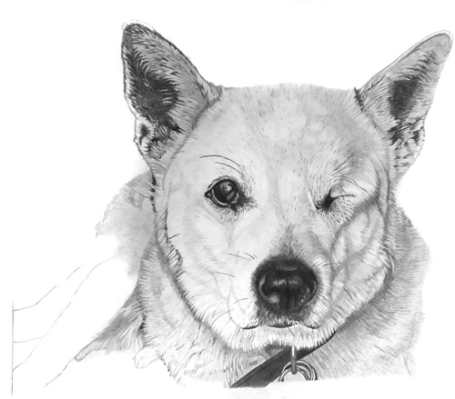
Deidre emailed to ask:
I have just bought you book “Drawing from Line to Life“, and I’m really enjoying it. I was wondering if I could ask you a few questions? When you start out on any drawing, what is the most common pencil you use for the initial outline?
Lightly applied 2B, because I can erase it completely without leaving any indentations.
What is the largest size of drawing that you do? My current drawing is 14″ x 11″. I am enjoying it, but sometimes I wish it wasn’t so big. Do you think it is better to have a larger drawing or smaller?
I think my largest is around 17″ x 12″ and the head studies in print were about 8″ x 12″ – whatever size best suits the subject. With experience, you can more easily judge the size above which detail becomes unrealistic. I’ve also found that increasing the size by 20% almost doubles the work involved due to the extra detail required.
Personally, I’ve learned to not let size, and the time required, bother me. I just begin in the top left corner and work outwards. I split every drawing into one hour chunks as I’m working and ignore the unfinished portion, so I get to “complete” many small drawings rather than agonise over the time I need to complete the entire drawing.
On your head portraits of people or animals, why do you prefer not to put a shaded edge around the drawing like you see commonly from other artists?
It’s called a vignette, and I don’t like them because it’s unnatural and looks unrealistic. This is especially true if you’ve faded the drawing at the base of the neck – it really needs to just fade out at that point, but a vignette outlines it and ruins the implied continuance of the animal.
I think many artists use a vignette because it helps to increase the contrast within the drawing – this is especially true of a white animal – but there are other ways of handling that. I use what I call “edge shadows” – using the shadows beneath the hairs around the extremity to provide a clear visual boundary. Don’t worry about the overall lighting direction, you can lie quite convincingly and place shadows wherever you need them. The viewer just assumes there’s a reflective surface outside of the picture that is bouncing reflected light back into the drawing.
If you have to resort to outline, create a “lost and found” edge where the line alternately appears and disappears – sufficient line to tell the eye that it’s an edge but not so much that it looks like a line.

I can clearly understand the edge of your dog and I don’t see any need to make it any clearer. The golden rule (for the inclusion of anything) is “If it doesn’t add to the understanding, don’t include it.” Subtlety is more natural than making something obvious. In your case, the ears are clearly defined, the head sufficiently so, and the neck doesn’t need its extremities defined, as it’s a secondary element. Personally, I’d terminate the collar half way down the rings, extend the drawing down an inch or so and use that extension to gently fade the rings and the bottom edge to white.
I can see guidelines on the left-hand side (its back legs?) that leads me to believe you intend to extend the drawing in that direction. Will that area add anything to our understanding of the dog? If those are its back legs, it will tell us that the dog is laying down, but is it necessary for us to know that? Will it helps us to better understand the head (the focus of the drawing)? Will we be distracted by wondering where the front feet are?
I’d just curve that side round to meet the collar and let it fade away to the left. That area is only required to put the head into context – and you don’t want to pull attention away from it.
The bottom of the collar of my dog, is just above the bottom of the paper, so I don’t have room to extend it down.
Golden Rule #1: Your paper should always be larger than your intended drawing! You can trim the excess paper off later but you can’t add it – as you found out. 🙂