Drawing Boards – advice and tips

DRAWING BOARDS
Gary recently emailed me to ask:

At present I am unable to afford a decent drawing board so I’m looking to make my own. I was just wondering if you may be able to offer some advice on which materials may be best for the job? For example, would a piece of MDF be okay on it’s own or is there a material you suggest for covering the wood? I was thinking about covering the would with that sticky-backed vinyl covering you can buy to line kitchen drawers but would the surface be too slippery to hold the drawing paper? Alternatively would Melamine faced chipboard be any better (Being made of chipboard it may not be as versatile as MDF and therefore not offer a suitable surface for drawing). Just wondered if you might be able to recommend anything suitable?

When I first began I was in the same situation that you are – working on the dining room table at that time! From there I progressed to building my own drawing boards and have used Melamine-faced chipboard satisfactorily. My current draughtsman’s drawing board is simply made of that too.

MDF (Medium Density Fibreboard) on its own would be fine. However, for best results, I suggest you need a hard surface under your paper, as you don’t want any give under your pencil as you draw, so plastic laminate on MDF would be ideal. By that I mean Formica or any similar plastic laminate, such as is used for counter tops. Don’t used a textured laminate but search for a smooth flat surface – they do exist.

I certainly wouldn’t use sticky-back vinyl – it has a habit of shrinking over time and with temperature changes, which will probably lead to an annoying border of adhesive on your board. It’s also, in my opinion, far too soft for a drawing surface.

My first home-made board was a plastic laminate covered cupboard door! I fitted angled wooden brackets beneath it to angle it by lifting up the back edge. My next was an old sheet of 24″ x 36″ blockboard that I covered with plastic laminate. This time I hinged two angled brackets beneath it to lift up the back edge by 12″, although you may prefer a lower angle. It was also thick enough for me to use standard drawing board clips to hold my paper in place.

Now I use a draughtsman’s full-size (A0) drawing board, which is so heavy that after I installed I kept checking the ceiling of the room below to make sure it wasn’t about to drop down a floor!

An ideal, especially if you don’t have dedicated studio space, is to use a commercial table-top drawing board.

Table-top drawing boards

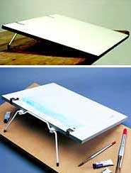
I have 15 of these that I use for my UK drawing workshops. Measuring 18″ x 24″, the folding handle swings down to form legs that give it a working slope – raising the top edge by about 5″. They also have notched rubbed strips at each side near the base, so the board can be moved forwards over your lap and the strips grip the edge of the table.

Drawing Workshop co-organisers wanted

Following a successful workshop tour of the USA this year it’s time to begin planning for next year. Nothing beats local knowledge, so I’m always grateful to receive assistance from my local co-organisers and in return I offer a free workshop.

USA & CANADA 2010

I’m planning to visit the US twice in 2010 – in May/June and October. I hope the first trip will include Canada, where I have had two tentative invitations, but more are welcome.

The second trip will probably include California (Solvang) and possibly a north California venue.

If you have suggestions for a venue in any state or province I’ll be happy to consider including it.

UK 2010

As well as running workshops locally in North Yorkshire I also try to run at least one elsewhere in the country each year – in 2009 it was Glastonbury and the year before I was in Hampshire. I’m looking for a co-organiser and a suitable venue in any other part of the country (or even near a past venue). Could you, or your local Art Society, help?

AUSTRALIA 2011

I am currently considering a trip to Australia in 2011, visiting as many locations to hold workshops as I can. More than one workshop may be held in the Melbourne area but I’m looking for suitable venues in other locations and states too. See below for details.

?
Co-Organiser details

The requirements are quite simple: a suitable venue, about 20 attendees, and a base to which I can ship supplies (workshop packs, pre-prepared line drawing etc — you could fit the whole lot into a suitcase!).

The venue need not be any art-related place. I use a village hall here in the North Yorkshire that has good light, a kitchen, plentiful parking, disabled access and toilets, and sufficient tables and chairs. A church hall or community hall would do too, or a hotel with a conference room (although they can be expensive).

Workshops would be either 2-day or 3-day, probably 10am – 5pm.

I need about 20 (maximum 25) attendees to make the workshop viable. Maybe you belong to a local art group and know of other groups you can approach? Would your local newspaper be interested in running an editorial piece on the event? This local knowledge is invaluable – you know things I cannot possibly find out from the UK.

I’m not expecting anyone to have to spend money – if, for example, posters or flyers are required for display in local art stores, I’ll arrange that from here or pay for you to do it locally. I’ll give all the support you need, such as circulating the workshop through my mailing lists, advertising on my websites and blog, paying venue deposits and so on. I will also advertise the workshop on other websites, such as the SAA website where I’m a Professional Associate, which has quite a few American and other foreign members, and on my own Starving-Artists site and at ArtPapa.com (both of which have an international membership). In brief, I’ll do everything I can to attract attendees and help in all other respects too.

If you’re interested, please email me to let me know.

To find out more visit my website’s Workshop Central.

Drawing Papers and Drawing Sizes

PAPERS AND PAPER MATTERS
Earlier today I was contacted by an artist who has signed up to my 10-week correspondence course – the first one I’m running at DrawSpace.com. She had a query about the Mellotex paper she had just purchased from my website’s shop. She asked:

I ordered both the Super White and the Ultra White Mellotex
simply because I didn’t know which ‘color’ I should use. How do you
decide which ‘color’ of paper to use? Is it as simple as using the
off white paper if your drawing has mostly darker values in it, and
using the whiter paper if your drawing has more white in it?

First, I must explain that Mellotex is available in a number of varieties and I stock Super White, which is a warm creamy colour, and Ultra White, which is a brilliant white.

When choosing the paper for project, think in terms of available contrast. If your drawing needs a softer, less harsh look, choose the Super White. Alternatively, if you want the maximum range of tones available to you (almost always in my case), choose the Ultra White. Both papers are double-sided plate finish, so they have virtually no detectable surface texture – perfect in my opinion for detailed, realistic drawings.

How do you decide how large to make a drawing? Is it easier to work in a large size? But since ‘large’ is relative, how do you decide what size to make a drawing?

Personal preference and experience play a large part. Increasing the size of a drawing by 20% will often increase the time to complete it by 50% or more, as the amount of detail is greatly increased. You reach a point where suggestion will no longer suffice and only direct depiction will do.

Personally, I have a handy trick that I use. Let’s say the study is of a scene which includes a dog’s head and foliage. Sometimes I’ll print out an enlarged line drawing but more usually I just imagine an element on a blank sheet of paper, then I hold my pencil over it and “pretend” to draw the face. This simple exercise gives me an excellent idea of the work involved, how long it will take to complete, and the level of detail required. I might “draw” other areas too, such as foreground foliage. Based on the results from these exercises, I adjust the size accordingly.

You must also take into consideration the amount of information you have available. If you’re working from poor reference photos, small is better! Don’t increase the size past the point where suggestion will suffice, if suggestion is all you can achieve with the information to hand.

How do you decide how much of the paper to use for your drawing – is there a standard border size that should be left on the paper for framing purposes?

I always use a full 24″ × 18″ sheet of Mellotex no matter how small the drawing is. That way I can enlarge the area of the drawing at any time if I need to. The paper is finally cut to size to suit the mat and frame. Paper is not that expensive – not when compared to a drawing that has insufficient margin to mat correctly!

If your drawing is a commissioned study, don’t stint on those borders. Put yourself in the position of your client. Which would you prefer to receive – a 7″ × 10″ drawing on a sheet of 8″ × 11″ paper, or the same drawing on a generous 18″ × 22″ sheet? Human nature sees value for money in the second. Additionally, if the drawing is handed around the family for appreciation (it will be!), fingers prints will be kept away from the drawing itself. And framers often like to give the subject room to breath in a frame, and that in turn produces a larger and more imposing frame. Don’t assume that it will be closely matted – a good framer might well decide to use much of that generous 6″ border that you provided.

Negative Drawing – part 3

MANAGEMENT
We previously explored the ways that Negative Drawing can:

  • Allow you to concentrate on one texture at a time.
  • Draw a structure without reference to it’s three-dimensional shaping.
  • Divide any area into a collection of easily-managed elements.

Don’t try to draw many textures at one time. To draw effectively, you must understand the area you are working on, feel its texture, experience its three-dimensionality. We’re creating our own world one step at a time. In order to transmit your mental image of wood through your hand and onto paper, don’t try to draw grass at the same time. If you’re drawing the deep confines of an old wooden crate, you need to experience the deep shadows diluting into mid-tones as they approach the light. You KNOW what it looks like in reality, so don’t dilute your image by suddenly trying to draw the wood around the opening. Concentrate and LIVE one element at a time and you’ll built a reality into your work.

DETAIL and TONE LAYERS
Negative Drawing can be used locally within any area, by using layers to divorce detail from shading. Work logically and with understanding and divide the task into two. Detail and Value. Line and Tone. Detail is often simple to comprehend, especially if viewed as a collection of abstract shapes and unidentifiable negative spaces between them, and line best suits their depiction. On the other hand, tone, which describes the lighting and three-dimensional form of the area, is best suited to an application with a broad, flat pencil lead with a complete absence of line. So why mix the two?

Let’s consider a dog, which has a rough coat of light brown hair, and we’ll work on a small area at a time, perhaps only a half-inch square. This, being manageable, aids our concentration and understanding. The detail layer, formed by line, contains all the cast shadows between the hairs, which negatively create the hairs between them and describe their texture and direction of growth. All tone is omitted so the hairs (created purely by negative drawing) remain virgin white.

Now a tone layer is applied. Some application may be global, describing the overall lighting, shade and three-dimensional form, and other may be local, perhaps enhancing a particular hair or suggesting colour. Further layers may be added as required.

Now, unique to this method, adjustments can be made with Blu-Tack (or a kneadable eraser), as the tone layer can be incrementally removed without affecting the detail layer beneath. I often find that the repeated partial removal and re-application of tone layers produces wonderfully subtle results. And for extra subtlety, try drawing the detail and tone layers and then gently and repeatedly remove both until the merest trace remains. It’s almost impossible to draw with that degree of finesse – something that this system overcomes.

FINALLY…
Let Logic rule: If you reach a point in the area you are drawing where your understanding wanes, leave it. Stop. Move to an adjoining area and work back towards the problem. Your understanding will have greatly increased once you have surrounded the problem area.

Don’t be afraid to draw “too dark”. Blu-Tack or a kneadable eraser will allow you to adjust the intensity later. In the meantime, you have simply split a job into two again: by first establishing the required lines with a weight that helps you see them, then adjusting their tonal values until they meet your expectations.

Concentrate on and draw one texture at a time. “Live” that texture and you will inject life into it.

Don’t be tempted to rush ahead. Doing so may result in inferior drawing. Remind yourself: “My drawing will only be as good as its weakest part!”

Don’t be tempted to leave something if its removal would benefit the drawing – no matter how pleased you are with it. And don’t “showcase” an area of your work that displays your technical prowess. In the words of Pierre Parisienne, “Don’t show me that what you are doing is difficult”. Ultimately it will shout “drawing”, destroy the overall reality, and drag the rest of the study down with it.

Parson Russell Terrier pup study 'What?
“What?” A completed drawing showing areas of subtle white hair produced by drawing over-strong and then adjusting with Blu-Tack. The result has a delicacy that is difficult to achieve by drawing alone.

Negative Drawing – part 2

NEGATIVE DRAWING
Negative drawing enables you to perform tasks easily. We previously saw:

  • How we can control separation of background, midground and foreground elements.
  • How we can isolate those areas we don’t yet understand.
  • How Negative Drawing protect our virgin whites.

Negative drawing involves the creation (or isolation) of an element within your drawing by simply drawing around it. To return to our dog example, by completing the background first, you have an established setting in which your dog can exist. Because you are drawing this dog as a part of its world, the two will become unified and possess an enhanced feeling of reality.

RECESSION
Up until now I’ve been referring to background and foreground. But in reality our dog is more likely to be situated in the midground. So by “background” I’m really referring to the major part of the setting – that area BEHIND the dog, and not the foreground, which is on a level with and below the dog.

We will have created enough of the dog’s world to give us an understanding on the environment – a ‘feeling’ for that world. Because we cannot avoid taking that world into account as we draw, the dog will inevitably become a part of it.

In practice, you might choose to partially draw the background to get a feel for it, then to begin drawing the dog, establishing the tones required for the background around its outline. That’s OK if that appears to be the logical way to work.

LOGIC
Logic, as I explained earlier, plays a major role in this way of working. Logic in this case is mainly dictated by understanding. You draw what you understand then, when that understanding wanes, you logically move to another area of understanding. This is difficult to describe but easy to understand in practice.

Let’s take one small area again – the junction of the dog’s coat along its back with the background. If you want that topline to be obvious to the viewer you cannot draw the dog first. Without a background, you have nothing to balance your tones to. So we draw that section of the background first, right down to the dog’s back. There we have two choices – if we fully understand the outline of the dog, we can draw around the hairs along its back, leaving them pristine white. Or we can stop short of the dog and make the junction a job in its own right. This gives you all the control you need. Finally you can concentrate on the dog, engineering the tones used within the coat to make it stand out from the background – to whatever extent you wish. It’s a logical progression that puts you in control.

Below you will see that I drew the brickwork down to but short of the dog’s back. Why? Because I was immersed in brick, not hair. Now I can concentrate on defining the dog’s outline while blending new drawing back up into the brickwork – I’m thinking “hair”, not “brick”.

Detail from Parson Russell terrier pup study 'What?'
Brickwork stopped short of dog. Now I can concentrate on defining the dog’s outline while blending new drawing back up into the brickwork. I was thinking “brick”, now I’m thinking “hair”.

Note that I didn’t attempt to draw the dog while defining its outline. My concentration was purely on the creation of the hairs around its extremity.

CONCENTRATION
A drawing, any drawing, can be broken down and simplified in this way. If you’re drawing the wooden side of a barn, just draw wood. If grass overlaps it at the base, draw around it. You’re drawing wood – your concentration is on wood – you’re living wood! And, as a bonus, when you begin to draw grass, you’ll have full control over those negatively drawn stalks that overlap the barn door, so you can highlight them, push them into shade, or make them as dominant or subtle as you wish.

WHICH IS DOMINANT?
Where any two textures meet, ask yourself which is dominant. Which will logically control the tones of the other. If we draw the grass first, the tones used within the blades will control and limit the tones available for our barn door. If we draw the barn door first, its tonal values will control those available for the grass. Which is logically dominant from the point of view of physically drawing them? Which is easier to engineer to overcome the limitation imposed by the other? No contest, in my mind, the barn door wins on all counts. It’s so much easier to engineer the blades of grass to stand out from, or blend into, the barn door.

As a bonus, Negative Drawing prevents you from polluting the virgin white within your drawing. Erasing graphite from a spot that should be a pristine white highlight will rarely achieve a good result.