Negative Drawing – part 1

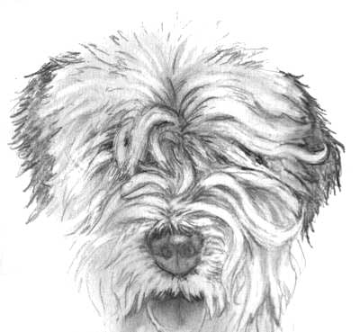
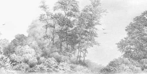
Negative drawing involves the creation of a element within your drawing by simply drawing around it. If, for example, you’re drawing a dog, it is often logical to draw the background first. This presents two benefits: you have an established setting in which you dog can live, so they will possess a unity; and you have full control over the dominance of the dog (the way it stands out, or blends in, to the background).

Logic plays a major role in this way of working. Let’s take our dog again. Because it is the main element, the focus of the drawing, we have a natural inclination to work on that first. But how light or dark should it be? Where is the light source positioned, and what sources of reflected light are present?

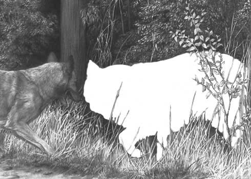
Now turn the strategy on its head. Consider drawing the secondary elements first. You should have a mental picture of what you want to achieve with the dog so, keeping that in mind, we have a logical starting point for the background. With the background completed we now have a setting in which our white silhouette of a dog exists. We have a feel for its environment. We know if the ambient lighting is harsh or diffused. We know what might overlap it, such as stems of grass or weeds, and how they fit naturally into the overall setting. So we now have full control over the separation of the subject from the background.

Let’s take one small area – the junction of the dog’s coat along its back with the background. If you draw the dog first, how dark do those hairs along the extremity need to be? Draw the background first, and draw around those hairs along its back and you have all the control you need. As you gently add tone and form to those hairs, you have the background to refer to at all times.

That single example has covered the three major benefits of using Negative drawing:

  • Offers control by separating the background, midground and foreground elements.
  • Isolates the unknown.
  • Protects virgin whites.
Background drawn before dog to allow maximum control when drawing dog.
Taken to extremes but this is a recreation of an actual event.

Section of finished drawing.
If those are the ‘rules’ then logic overrules them. In practice you draw until understanding ceases then you move to another area you do understand. As you draw, each area will suggest the treatment of the content of those surrounding it. Eventually, your drawing will expand to meet that unknown area. Now surrounded by enlightened drawing, you will gain a greater understanding of what that area requires. So, when I mentioned “completing the background first” that is not necessarily to be taken as the full truth! In reality I will work the background in stages around the dog, and I may (though not often) draw the adjoining portion of the dog too, but the order is always background first then dog.

DRAWING WITH UNDERSTANDING
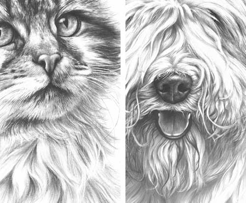
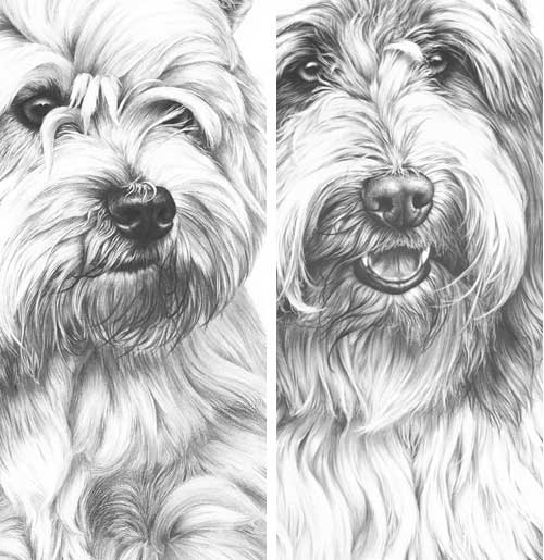
To draw effectively, you must fully understand the area you are working on. You must be able to experience it in three-dimensions, to feel its texture, and to know how it relates to surrounding areas. We’re not copying source photos but creating our own world in which all elements must co-exist. If you have first established the background, the environment, then you have a world in which you can create your main subject. This assists your understanding of the subject as an overall element.

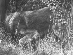
However, within that element other similar problems will occur, which can be solved using the same strategy. Perhaps you have a problem understanding the way the rear of the belly and rib cage meet the shoulder of the rear leg? Leave it. Draw the rear leg first and understanding will be clarified, so you can confidently draw the belly up to that previously ‘unknown’ junction.

In the meantime, you haven’t polluted the virgin white of that belly area with trials and test of possible tones. In my opinion the freshest, sharpest and most effective drawing is created with the first attempt. If instead you try out ideas within that area, perhaps by adding layers of tone in an attempt to understand the shaping, you will simply muddy the final result. Consider that a soft grade of graphite often will not layer to its full potential on top of a harder grade, because there is insufficient tooth to hold it, and you’ll see that your initial trials have greatly reduced the options open to you.

Keeping control of the drawing of the rope
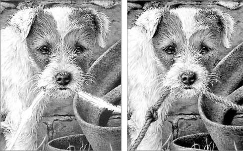
Keeping control of the drawing of the rope by establishing the background first

Drawing HAIR the Negative Drawing way

I’m involved in a series of discussions concerning the relative merits of the different techniques used for drawing hair – dog hair in particular – and I’m arguing for the use of Negative Drawing against the use of applying tone that is then cut through with a sharpened eraser. So, having set the scene, here is my initial argument, followed soon by a more in-depth look at the Negative Drawing method.

First, erasing hairs is a technique worth exploring and it may work well for you. However, in my opinion, it will rarely achieve a sense of true reality… and here’s why:

  • Layering tone onto an area before establishing the position and tonal values of the hairs that will exist in that area may result in the loss of the purity of the white of your paper – you may never be able to remove all of the graphite.
  • This immediately limits the range of tones available to you for those hairs and, more crucially, controls the brightness of your highlights.
  • Erasing will produce a soft-edged line. Intrinsically, hairs possess sharp edges. However, erasing may be beneficial if the hair is of a soft nature, and with fly-away ends that tend to soften the edges of bunches of hair. But in most cases, as I said, hair and locks of hairs do have sharp edges.
  • But, of far more importance than all of the above, erasing does not permit a full understanding of the hair you are working on. It is, in truth, the exact reverse of the technique required to render believable hair.
Drawing showing the erasing of hair within applied tone
Exercise showing the eraser method of establishing hair.

Let’s, for example, take a lock of white hair of an Old English Sheepdog, or similar smaller breed as shown above. That lock of hair springs from the top of muzzle, above the nose, to fall down the side of the face. Beneath the lower end of that lock, another lock curves down towards the mouth. A casual glance will lead you to believe that the two are one long single lock, as they appear to flow into each other.

ERASING
Erasing is that “casual glance”. You see a white or light shape in your reference photo that begins on top of the muzzle and falls down the face towards the mouth. You erase that shape and establish the position of the lock. Now you look a little closer, identify stray hairs emerging from the lock and attempt to erase those also. That’s when you discover that an eraser, however sharp, cannot produce a sharp pointed end to a hair. You can of course draw around the erased shape to sharpen it’s edges but, as the original edge was soft and blurred by the eraser, you cannot be certain that you’ve drawn into it sufficiently to overlay the non-white content.

Now let’s assume you have a similar lock close to the original one and, to suggest depth, you decide to cut an angled hair in between them – one that emerges from under one of the locks then disappears under the other. Not difficult, but you will have to start erasing within the white of one lock, cut through it’s outline, through the previously applied tone, and then through into the white body of the other lock. The eraser will drag graphite into the second lock, which now needs to cleaned up. Then the edges need repairing. And finally you can tone down the new oblique hair and add the necessary cast shadows and shading.

NEGATIVE DRAWING
Now we’ll work the reverse way – the way I work. First you lightly outline the position of the white lock. This forces your concentration away from the lock as one single entity and onto its edge, section by section. As you search for understanding of that edge and look ever closer you discover that it is not one long lock of hair from muzzle-top to mouth but two. The upper one extending down the side of the face where it overlays the root of the second that curves down towards the mouth. You find all those stray hair ends too as you work your way around the extremity of those locks. As you’re just outlining, you can establish those stray hairs so they possess truly sharp ends.

Once you have the lock of hair outlined, and the adjacent one, you ignore them and begin to work on the hair between them. That crossover hair you attempted to erase earlier is now simple to establish. You draw it between and up to the outlines of the two locks to either side. Your full concentration is on that tiny area so your understanding is greatly increased. Now you also have the facility to draw an even deeper layer behind that crossover hair, which you progressively darken to almost push it right into the shade. That makes the crossover hair stand out, so you can now tone that down too, to push it back into the midground, and add the shadows cast by the two main locks.

Those two main locks are as yet undrawn. They remain as pure white “silhouettes”. But now you can finally begin to work within them, working your way slowly down their lengths, one at a time. As each is surrounded by the previous drawing of the midground crossover hair and background hairs, you have perfect control over its tonal values. You could, for example, create a three-dimensional edge that curves down to meet that crossover hair beneath it, and you can control the tonal values of that edge so it as lost in the shadows or as plainly visible as you wish. You are thinking three-dimensionally, taking the lighting direction into account, and not just erasing a two-dimensional shape through previously applied tone – tone with values that you could only guess at.

Showing the use of negative drawing techniques
Drawings showing the use of negative drawing techniques

All those hairs – the two locks, the crossover hair beneath them, and the background hairs – are living forms. You are not trying (or tempted) to draw a large area at one time with minimal understanding, but slowly recreating those hairs so they grow out of the paper. As they grow, your own mind will spot inconsistencies with Nature and correct them; it may experience an imbalance caused by a too-clean edge and force you to break it up by adding protruding, wispy hair-ends; it will see the lock as a three-dimensional form and suggest the application of tone to the side receiving less light; and be your guide as to where to leave bright highlights. And, as you are working on pristine paper and not an erased surface, you will still have your brightest white available for your highlights.

In brief, and assuming you’re working from a reference photo, I believe that the erasing technique may cause you to look in too shallow a manner. To see “blocks” and “shapes” that you can create with your eraser in the previously applied tone. But to achieve a sense of reality, you need to study each tiny area until you fully understand the qualities (texture, three-dimensional form, edge features, etc) of the element you are about to draw.

Instead of erasing a long lock of hair and then, in my view, attempting to “repair” it and turn it into a semblance of hair, consider the Negative Drawing alternative. I recommend that you use Negative Drawing to isolate that lock of hair (you’ll learn much about it as you decipher it’s true outline), then establish the background hairs around it that will add depth to your drawing. Finally draw the lock itself, beginning at one end. Work your way slowly down as you experience it in your mind as a three-dimensional object. Make changes if you feel the need; perhaps introduce a narrow parting that exposes the background drawing beneath, if you feel the lock is looking too regular and uninteresting; but above all imagine it as being a real-life lock of hair. And don’t feel the need to complete it quickly and move on…… remember:
Any drawing is only as good as its weakest part.

Showing the use of negative drawing techniques
Drawings showing the use of negative drawing techniques

Drawing Trees and Bushes

Example of bush drawing

Drawing trees or shrubs really has to begin with observation. I’m forever looking at trees and trying to work out in my mind how I would draw them.

You really need that information in your mind – the layers of foliage and how they stack one over the other; the side and front elevations of blocks of foliage; the holes through which you can see sky; the relative sizes and appearances of the internal structure, and so on.

With a good three-dimensional idea of structure in your mind you can now begin drawing trees with confidence. I tend to “talk” to myself as I draw, as if explaining it to someone else. So I’ll be drawing a layer of foliage whilst telling myself that it will contain the cast shadow of the layer of leaves above; that this is at the edge of the tree and will show more sky; that I need more depth here so the appearance of a section of trunk would aid understanding.

Or of course you can take Diane Wright’s method – which is to draw intuitively and brilliantly and capture the absolute essence… 🙂
www.DianeWrightFineArt.com/drawing-trees

When drawing far-away trees or trees in mist I try to draw correctly first time. But if that doesn’t work, I will often draw stronger than I need to, which gives me more control over relative contrasts – then I gradually fade the area with Blu-Tack until I reach the desired overall tonal structure. Sometimes I then redraw and fade again – repeatedly at times – each time bringing the drawing a little more towards the reality I’m trying to depict.

Background trees in Weimaraner study 'Vanished!'
Background trees in Weimaraner study “Vanished!” © Mike Sibley 2004

When drawing midground or background shrubs and trees bear these points in mind:

  • Be aware that it has a real sense of roundness. It is a three-dimensional rounded form and should conform to the lighting present.
  • Is it perhaps a little too tidy? Even if it is a shrub clipped into a shape you can adapt it to suit your own requirements. Imagine looking at the bush in real life and asking yourself what, at that distance, are the major features that make it what it is.
  • One feature might be the dense shadow it casts beneath itself on the ground. If your reference bush is too low, lift it a bit. That shadow will properly ground the bush.
  • If you show dark areas within your bush that are assumed to be the shadows in the depths between foliage layers, be aware that there should be two distinct tones – a dense tone to represent the inner depths of the shrub, and a lighter shadow cast on that layer by the one above.
  • Another important feature to consider is the appearance of the leaves at the extremities (around the outside of the tree or bush). You can make excellent use of these by using them as visual clues to signal to the viewer’s eye the presence of an overall leafy appearance, and an indication of leaf size and possibly even the species.

Sketch on coarse paper with a blunt 6B Progresso pencil
But it all begins with observation. As an exercise, try sketching a tree in real life but really small – no bigger than 2″ x 3″ (or larger but using with a very soft, blunt pencil). This will force you to abandon detail and concentrate only on what is important.

You will find more information on drawing trees in my website’s Drawing Trees tutorial and a complete chapter in my “Drawing from Line to Life” book.

Drawing a Tree example from 'Drawing from Line to Life'
Drawing a Tree example from ‘Drawing from Line to Life’

A tree study from 'Done Balin' &copy Mike Sibley
A tree study from Bearded Collie drawing Done Balin’

Epson Counter-attack Successful!

My office workhorse Epson C66 decided to die yesterday. Annoyingly it was due to built-in obsolescence! The “Printer parts are nearing the end of their serviceable life” message changed to “I’m dead” or words to that effect.

Thank heavens for the Internet! I found a great little utility that not only solved the problem (reset the protection counter) but has opened up all sorts of money-saving goodies and improvements to the printer’s use.

For example, if you’re tired of your R2400 cleaning ALL eight colours when only one is blocked – you can now select and clean just the troublesome one (although I haven’t tried it yet on my R2400).

It’s freeware, a small download, and a great utility:

SSC Service Utility – download it at www.ssclg.com

This is just a selection of what it can do:

  • Work directly with CSIC in Epson Stylus printers cartridges.
  • Reset or rewrite any chip using special add on device.
  • Freeze internal ink counters.
  • Reset internal ink counters even with empty cartridges.
  • Separate cleaning of color and black heads for all Epson inkjet printers.
  • Hot swapping of cartridges supported.
  • Resetting of protection counter (even when it is already full).
  • More then 100 different Epson printers supported.

NOTE: Please be aware that resetting counters and fooling cartridge chips will probably invalidate your warranty (I had nothing to lose with my C66). But the single colour cleaning facility alone will make this software useful.

I found just one problem – it only recognises 7 of my R2400’s 8 colours (LLK [light light black] is missing). I just checked on the application’s forum and it’s listed as a known fault, so it should be fixed. In the meantime just being able to see the ink levels stated as percentages is a huge help….. except my LLK is the one about to run out 🙂

It’s very useful too for compatible (non-Epson) cartridges. I’ve been reading through a lot of posts about this software and they all seem to agree with that statement – especially if you usually refill existing cartridges. And if you do, using them invalidates the warranty (according to a post by an Epson service agent) so you’ve nothing to lose by trying this little application.

FIXING THE FAULT
Apparently my C66 counts the number of times the heads are cleaned. When it reaches the limit of the waste ink that (Epson decree) the sponge will hold, it shuts down the printer. SSC reset the counter for me but warned that I should clean the sponge at some point. So here’s how I did it – the squeamish should stop reading right now!

  • Problem #1 – the print heads are immovable and sitting on top of the sponge.
  • Solution – Use SSC to reset the counter.
  • Now your printer is unlocked, press the ‘change cartridge’ button, wait for the print head to move left then quickly unplug the power cord.
  • Take off the right end of the casing. You’ll find two ‘pinch’ connectors underneath; press in the connector at top of the back with a screwdriver as you push the housing off; and there’s one hidden under the top that you can’t get at so, as I’d nothing to lose, I brutally levered the end off with a screwdriver 🙂 The hidden lug broke off but the housing went back on cleanly.
  • Optional: gently push in one of the hinge lugs of the top cover to release it from the main body and remove it.
  • Inside, loosen the self-tapping screw at the base of the end of the metal assembly that contains the main mechanism.
  • With a screwdriver, push down the catch at the end of the carrier that contains the sponge.
  • Pull the carrier out of the printer and disconnect the plastic pipe.
  • Don’t take the carrier apart (I did but it’s not necessary).
  • Wash the sponge in situ under a cold water tap and dry the assembly.
  • Clean the wash basin before the wife finds out.
  • Wipe black finger prints off bathroom door (for same reason).
  • Reassemble in reverse.
  • Have a cold beer.
  • Congratulate yourself on saving the cost of a replacement printer 🙂
  • Print out ‘War and Peace’ while thumbing nose at Epson.

Job done!

Jenny’s Workshop wonder

As I claim my workshops are for the novice to advanced student maybe a little proof is needed? My July UK workshop had a spare place that my wife Jenny decided to take. Some background information might help here – Jenny does the catering for us (with her friend Ruth “cakes” Harrison) and…… well, perhaps I should let Jenny tell you…

“As Mike’s wife I’m always being asked by artists at his workshops if I am an artist too, but I haven’t drawn or painted since I was about twelve years old.

We had a spare place in the July workshop, so I decided to take it. The first day I worked my way through all the exercises alongside everyone else, and then began the main drawing of the workshop in the late afternoon. I chose to draw a Golden Mantled Ground Squirrel that Mike photographed in Yellowstone Park, when were there in June to hold his 5-day workshop.

My drawing is about 6″ × 5” and Mike drew the guide-line drawing for me, as he does for every artist in his workshops. I don’t have a lot of patience and thought I would quickly become bored but, once I began drawing, the time went so quickly. Everyone was lucky to get their lunch (my department) and cake!

The next day I really couldn’t wait to get started on my drawing again. Although I’ve watched Mike draw for almost 30 years, I never thought I’d ever try it myself – and now I want to begin planning my next one!

'Golden Mantled Ground Squirrel' by Jenny Sibley at a Mike Sibley UK drawing workshop
© 2008 “Golden Mantled Ground Squirrel” by Jenny Sibley

Now my Ground Squirrel is finished I must admit that the hardest part was the rocks. I found the fur easier because I know what animal hair looks like, but I don’t know anything about rocks. Mike told me to keep them simple, just to take my pencil for a walk, and let the eye make its own mind up about what they actually look like. I really must read that Drawing from Line to Life book 🙂

Mike didn’t help me more than anyone else during the workshop and fortunately, unlike husbands teaching wives to drive, he has enough patience for both of us. What’s next?? A Donkey… because I can’t persuade Mike to draw one.

And, if you’re planning on attending one of our UK workshops, please don’t worry about having to eat Mike’s rock buns – I promise I’ll still do the catering!”

I hope you agree with me that Jenny’s drawing is something she should be justifiably proud of – I know I am.