Terri wrote to ask:
I was just wondering, do you take pictures of your drawings with your camera? If so, could you please tell me the settings you have set on? Some of the drawings I do are too big for me to run thru my scanner and I’d like to take photos of them to post on my website. The photos of my drawings I have on there already don’t look very good – so I need to find a way to make them better.
I photographed my drawings for many years before I purchased my first scanner, and there are inherent problems with photography. I’ll probably go into this in more depth than you were expecting but I’m trying to fit it all into one post 🙂
First, I always had the best results from photographing my drawings in natural daylight. If you place your drawing so it’s facing the sun you’ll avoid the light being darker at one side than other. Preferably choose an overcast day so the light is softened and diffused.
Second, graphite is made up flat plates so it’s reflective. The easiest way to minimise that sheen is to use a polarized filter. Fit it to your lens, look through the viewfinder (SLR camera’s only), and rotate it until you reach the optimum position where the glare disappears.
The main problem encountered when photographing artwork with an SLR camera – digital or film – is that the camera’s internal meter (and that of most handheld light meters) is set to read white as an 18% grey – it aims for an average overall value. You can combat this in two ways.
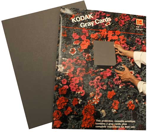
If you know how to set the white balance on your camera, zoom in until the viewfinder is filled with white and set the balance. A better solution is to buy a GREY CARD, also known as a ‘Neutral Test Card’. Mine are 8″ x 10″ and were made by Kodak in the US.

- Pin up your artwork – preferably outside in natural light.
- Place your camera on a tripod – do not attempt to hand-hold unless you have a very steady hand or the light is bright enough to guarantee a fast shutter speed.
- Position your camera so the lens (and body) are exactly square with the drawing. If the drawing is hanging on the wall, try zooming in and out (or move the tripod) until the image just fills the viewfinder with a small border around it. Now check that all four sides of the drawing are perfectly parallel with the edges of the viewfinder.
- With the camera on “auto”, hold your Grey Card immediately in front of your drawing (zoom in if necessary to fill the viewfinder with card) and note the camera’s readings.
- Put your camera on ‘manual’ and set it to those readings.
- If you have a remote control for your camera, use it to take the photograph. If not, use the timer, if it has one. This minimises any shake as you press the shutter.
Some cameras can take multiple bracketed photos too. If yours will, use it so you have the photograph as set up and a few more with exposures to either side of that setting.
This method worked well for me for years, and it certainly helped me with my book because I used it extensively when taking the photographs for it (with an Olympus digital camera in that case – nothing fancy).
Of course you could correct the 18% grey problem in Photoshop but the best results are obtained from solving it during the photography itself.
Most digital cameras will save your pictures in JPEG format, which is a “lossy” format. The compression applied causes the image to lose detail and clarity every time the image is saved. There are a few ways to avoid this loss in quality:
- Perform as many edits as possible in one session so you’re not repeatedly saving it as a JPEG.
- Convert your JPEG to your editor’s native format – PSD in Photoshop. Or convert it to the universally useful TIFF format, which is free of compression.
- Leave the images in the native lossless format throughout the editing process.
- Save your images in the native format to an archives folder, because you never know if you’ll need to edit it again for another purpose in the future.
- On completion of editing convert your image back to JPEG before putting it on your website.
I was once asked by someone else:
In explicit detail, please guide me in the process of reducing the file size so I can manage it!!
In this case it was a scan from a Cruse scanner but the same applies to all image files. This one was in TIF format, and in RGB colour (Red/Green/Blue) or possibly in CYMK (Cyan/Yellow/Magenta/Black), and high resolution (probably 300 pixels per inch or greater).
Pixels are the squares that your image is made up of – they are too small to see with the naked eye so they visually blend together. Each pixel will have colour and value information stored for it.
Images as shown on websites are low resolution – typically 72 pixels per inch (ppi), which is the monitor resolution. Because the monitor resolution is 72 (or 96) ppi an image will not be any clearer if you post it at a higher resolution – but it will take a lot longer to load – and be commercially useful to any fraudulent printer!
The first thing you should do is lower the physical size. Your current scanned image will probably be the actual size of the original – let’s say 20″ x 16″.
20 x 16 @ 300ppi = 6000 x 4800 pixels
20 x 16 @ 300ppi = 50.8 x 40.6 cm
20 x 16 @ 300ppi = 20″ x 16″
This is much larger than you require to fit on a monitor or web page. Methods vary, but all software will allow you to reduce the actual size. If you reduce it by 75% it will now measure 5″ x 4″, and the file size will have decreased accordingly. 20″x16″ at 300ppi = 28.8 million pixels. 5″x4″ at 300ppi = 1.8 million pixels.
Now your file is only storing information for those 1.8 million pixels, not 28.8 million.
Now reduce the resolution from 300 pixels per inch (ppi) to 72.
5″x4″ @ 300ppi = 1.8 million pixels
5″x4″ @ 72ppi = 104 thousand pixels
The storage space required for your image has now been reduced from that required to hold 28.8 million pieces of information to just 104 thousand pieces. That’s a file size reduction of 27,692%. If your original file size was 100MB, it will now only be 361KB.
At any stage you can also do the following… Your drawing is essentially in a black and white medium. Scanners pick up more information in colour, which is why your scan is in RGB. But that requires 24 bits of information per pixel. Black and white (or “Greyscale”) requires only 8 bits per pixel. By changing your image from RGB to Greyscale you further reduce the file size by 66%. That lowers your 361KB to 123KB.
NB: Greyscale is NOT the same as desaturating the image, which maintains the 24-bit data. In Photoshop go to image > mode > greyscale.
Now save your TIF, or PSD, as a JPG, which will compress the data. Depending on your software, you may be asked to set the compression. This might be 50% or “medium” etc. I choose “medium” in Photoshop for web use. Choosing a medium setting may give you a final file size of about 35KB – which is an 823,000% reduction of your original file.
Or, to put it another way, it will download in your website in about 4 milliseconds instead of 4 minutes! 🙂
Finally, if you think there’s any possibility of fraudulent copying of your image, especially for commercial gain, watermark it! In Photoshop:
1 – Open a new file (CTRL+N), set it to 72ppi.
2 – Type the text you want for your watermark. If it’s white text, it helps to fill the background layer with a colour. To get the “copyright” symbol hold down your ALT key and (you MUST use the numpad) type 0169.
3 – Add any bevels or other fancy doo-dahs you might want.
4 – If you haven’t got the Layers palette open go to Window in the top menu and choose “Show Layers”. Just below the tabs in the Layers palette you’ll see a box labelled “opacity”. It will be set to 100%. Click the little arrow to the right of “100%” and play around with the slider. I find a setting of about 45% works well. That will show a semi-transparent watermark that allows the image to be viewed through it.
5 – Save the image as “Watermark” or whatever you prefer.
Whenever you need to watermark an image, open both the image to be watermarked and the “watermark” file. Make sure you have the Layers palette open and that you can see both images in your workspace. Click on the watermark image to make it the active image (if it isn’t already). Go to the Layers palette, click on the watermark text and drag it onto the image that you want to watermark. Press V on your keyboard to select the Move tool and you can move the watermark wherever you want it to appear. Then save the newly watermarked image.
Here’s an alternative – the method I use:
Repeat steps 1 and 2 above.
3 – Add an outer bevel – try a size of about 3-5. Add a 1px stroke too if it aids legibility.
4 – In the Layers palette double-click the text layer (or use the top menu – Layers > Layer style > Blending options).
5 – Under “Advanced blending” find “Fill opacity”. Set Fill opacity to 0%. That will remove all the colour from the text so now all you see is the bevel and/or stroke.
6 – Save the image as “Watermark” or whatever you prefer.
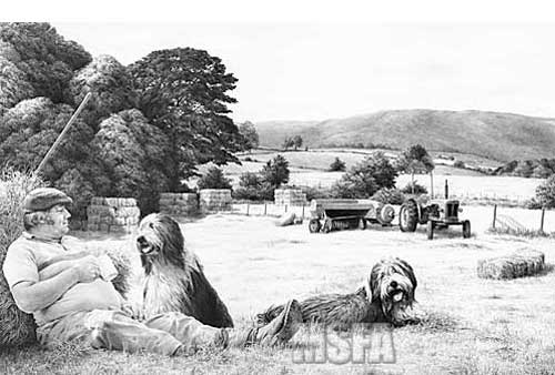
That’s how I created the MSFA watermarks on my own site:

The intention is to make copying and removal of the watermark as difficult as possible.
I hope that helps 🙂