Workshop Plus
ASSISTED ADVANCED: Session 01, 2025
Carolyn (Online Advanced)
WEEK 1: EXERCISE 1
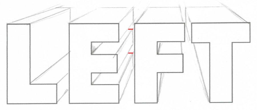
Trying to see the wood fibers and the lighter reflection on the edges of the deep cracks.
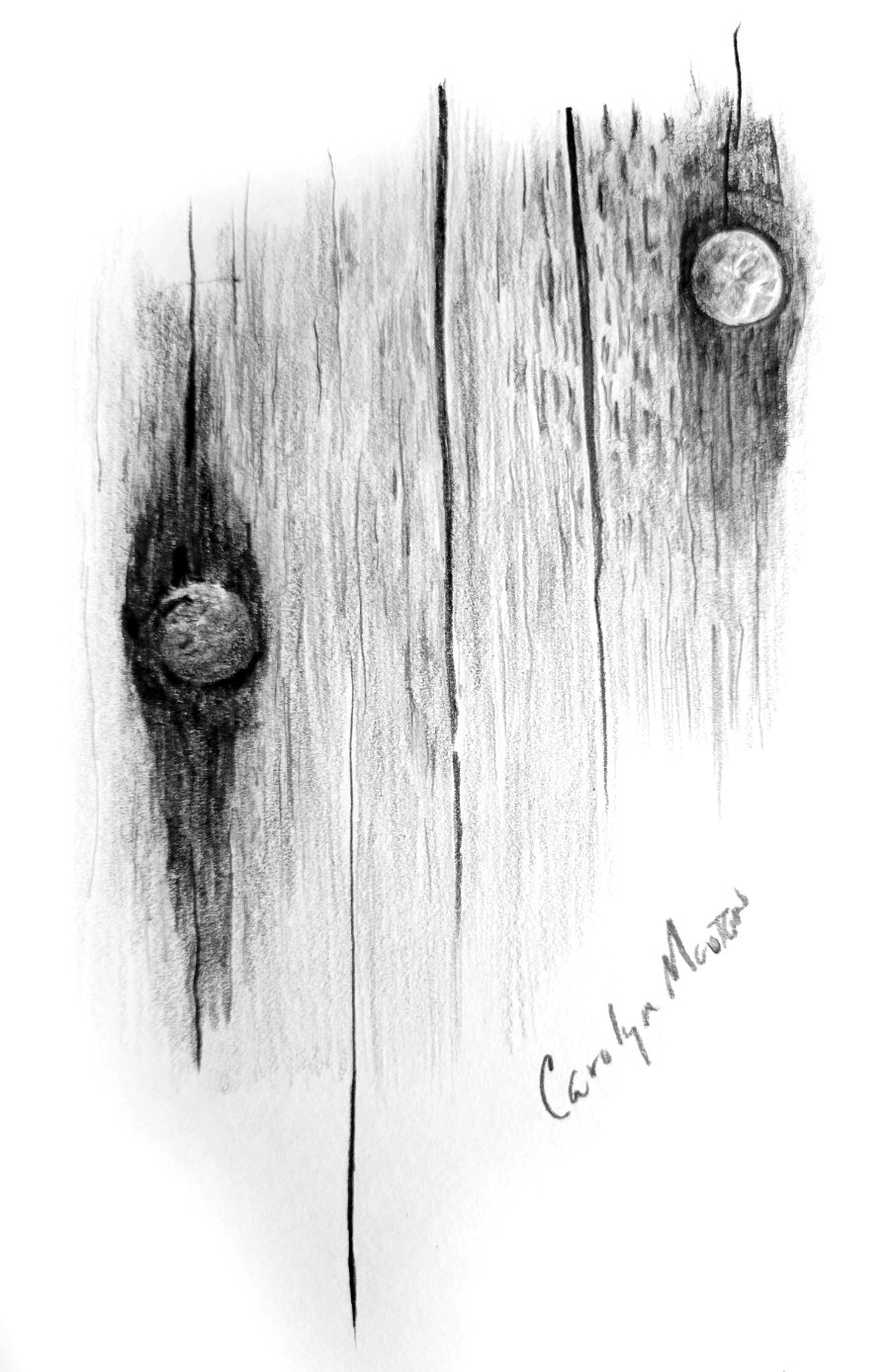
Those little touches of highlight running down the sides of the cracks signal that they can ONLY be cracks. Not marks on the surface. We instinctively understand highlights and shadows, and we KNOW those highlights only occur on an actual three-dimensional edge. And to really cement that they are cracks, your terminal tapers are wonderfully long and sharp - exactly as parting and rejoining woodgrain would be.
The wood is nicely understated but still obviously wood. Possibly with little machine-made digs into the surface by the right-hand nail.
The rust staining is correctly darker-toned woodgrain. Again, not marks on the surface. And the nail heads are superb. Both exhibit the sharp detail of rust. The left-hand head appears to be sunk into the wood. Possibly the right-hand one is too, as suggested by that tiny but all-important highlight on the lower edge of the wood. Again, those are signals we subconsciously see and immediately understand.
WEEK 1: EXERCISE 2
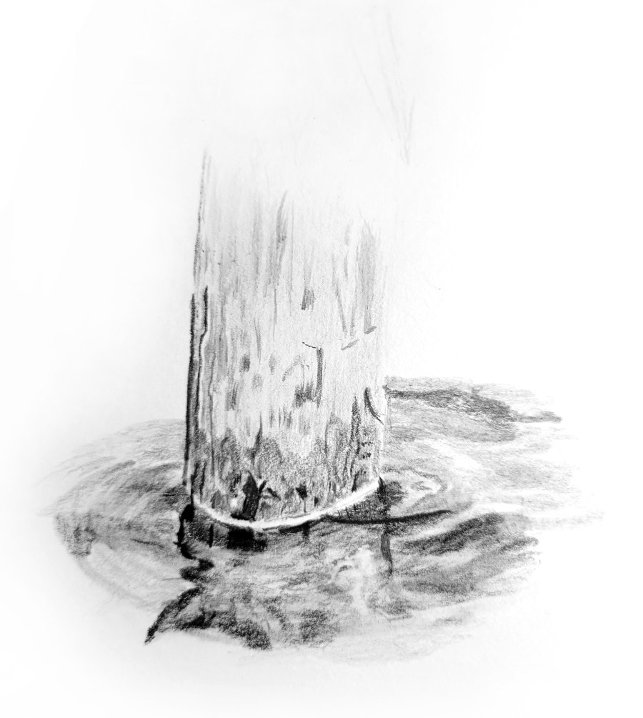
There isn't a lot of post, so I won't comment on that. But it's reflection in the moving water is super. Well, super up to a point...

That reflected and distorted left-hand edge is all that's needed to tell the story, and it does that very well. However - and I might be splitting hairs here - there are signs of radiating ripples to the left, and those ripples must account for the distortion in the reflection. So far, so good. But then the ripples don't continue within the reflection. That said, it sort of works as it is, but actual ripples would have worked even better.
By that I mean the top and fronts of any ripples face US. They cannot "see" the stumps behind. They can see and reflect the sky, which is why they are light and reflect light towards us. If you enjoy a good Who-done-it (not sure that will translate - detective stories) you'll enjoy drawing, because much of time we're searching for the clues that tell us what something is, or why it looks the way it does. In this case, the ripples would cut across the reflection in light bands. Light, as I said, because they reflect the sky towards us and not the post behind. I hope that makes sense?
Another point just occurred to me: your reflection is correctly darker than the post. I'll state right here that if it needs to be lighter for your drawing to succeed, then that's OK. You can (and I often do) bend the truth. It is not physically and logically correct, but the CLUES are there, so it's completely understandable. If necessary, the human brain is quite adept at making excuses for something not quite conforming to what it expects to see.
Reflections are less contrasty than the object itself. The darks might be similar or even darker, but the highlights will always be more muted. The highlights on the object are caused by light direct from the source being reflected back to you. Highlights in the reflection are not direct from the source, and the water itself, being transparent, will absorb some of the light. That's one reason why I favour cutting pure white ripples across a reflection - it works well because they are too white to be a part of it.
Finally, your ring of surface tension around the pile does its job, although I think it's too broad and would have used a lost-and-found band of brighter, thinner highlights to achieve the same goal. Not that yours is wrong, just different... and, of course, it actually couldn't exist in moving water. But that's back to the mind making excuses for something it understands, even though it knows it shouldn't exist.
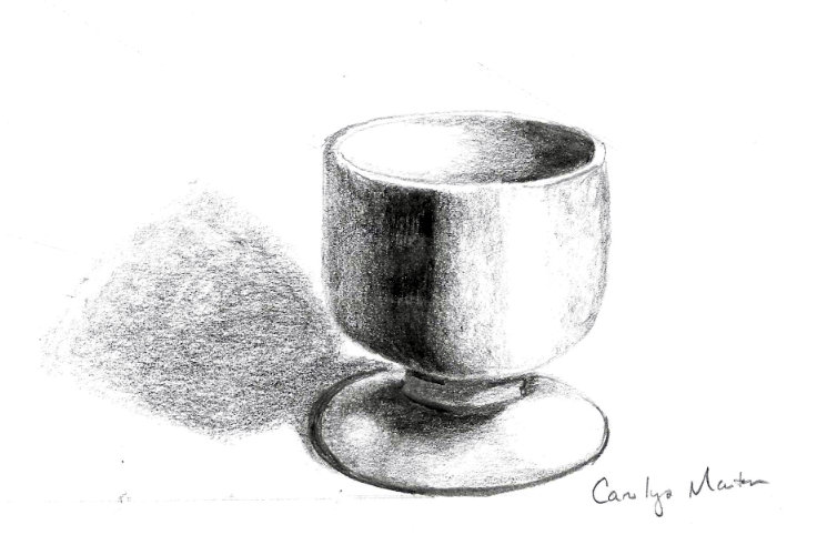
WEEK 1: EXERCISE 3
Exercise 3, is trying to be a stainless cat food bowl with a blue rubber base. I found I was trying to copy exactly what I was seeing. On the water, I started trying to just draw the water as I felt it should be, rather than copying it. I found I was more successful that way! So I'm working on not copying!
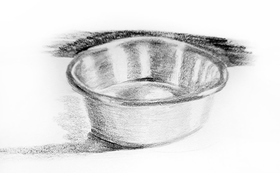
So, initially, I saw a brushed chrome or aluminium bowl - before I read your description. I now know it also has a rubberised band around the bottom... but that's been partly lost in your drawing.
I find the reflections sufficiently dominant to say "smooth and shiny". Then the soft edges of the reflections modify "shiny surface" to "satin". They also tell me a lot about the three-dimensional form of the bowl. Personally, however, I think your choice of pencil grade or paper (or both) are working against the expected texture. The soft grades used are grainy, which doesn't really describe the surface. Harder grades - or hard layered over soft - would have given a smoother appearance.
Finally, I asked my cat Susie what she thought about the bowl and she said there's only one thing wrong with it... it's empty!
Carolyn (Online Advanced)
WEEK 2: EXERCISE 1
WEEK 2: EXERCISE 2
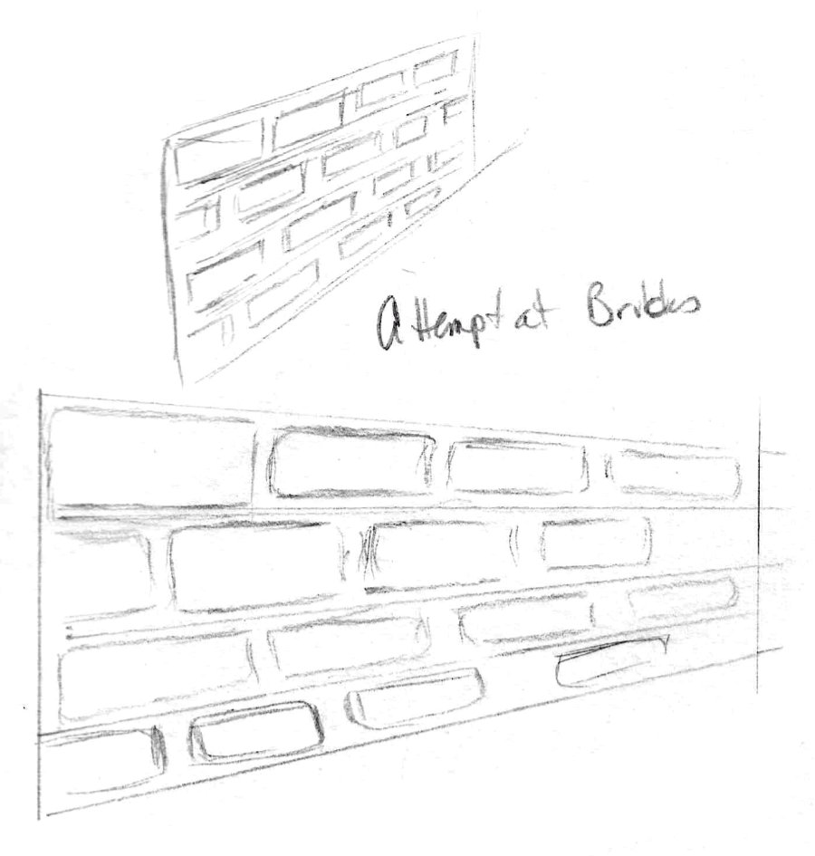
I had trouble with some of these. I do not think I understood the brick exercise, and the use of diagonals. I wasn't sure how/if I should use them for placement of the bricks.
 And the result shows why...
First, the rows in a brick wall are offset by half, so every joint in one row falls under the centre of a brick above. Yours sort of take a bit of a ramble - and the spaces between the bricks (the mortar) are impossibly wide.
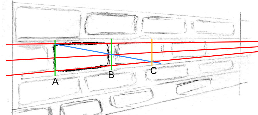
You've already created the perspective for the rows, so that's good. Now you need three convergence lines (orthogonals): one along the top of your first brick, one along the bottom, and a third midway - all emerging from the original vanishing point.
-- Draw a line at one end (A).
-- Draw another line at the other end (B) allowing for the mortar. I ran Line B up the far side of the mortar where I want the next brick to begin
-- Now draw a diagonal line from the top of the brick (where LINE A crosses the top orthogonal) through LINE B where it crosses the central orthogonal.
-- Where the diagonal line meets the bottom orthogonal (LINE C)... that's where the next brick ends. It fits into the space between LINES B and C. Perfectly in proportion and perspective.
Now you can draw the rest by eye. All bricks on the rows above and below move their joints half way along the row you just drew.
Try it, because it's a lesson well worth learning. And once you're really used to it, you can usually just do it all by eye. But you have to understand it first.
WEEK 2: EXERCISE 3
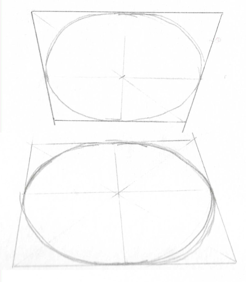
Despite being the result of multiple circuits, this is almost as perfect. Usually, just to make certain, I copy one half, flip it and lay it over the other half.. but I can't do that in this case,because of the multiple tracks. But I'd guess the differences are minimal and my eye would be happy to accept this as a natural ellipse within a drawing.
Try this to train your hand even more: Print out the PDF page with my drawn ellipse on it, place tracing paper over it and then trace it again and again - carefully until your hand begins to learn the gently unfolding or tightening curve. You've already avoided the most common problems - pointed ends and flat sides - so you just need to teach your hand the refinements.
WEEK 2: EXERCISE 4
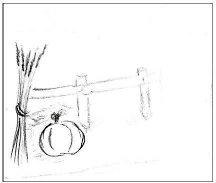
Scene in perspective, part of our pasture fence.
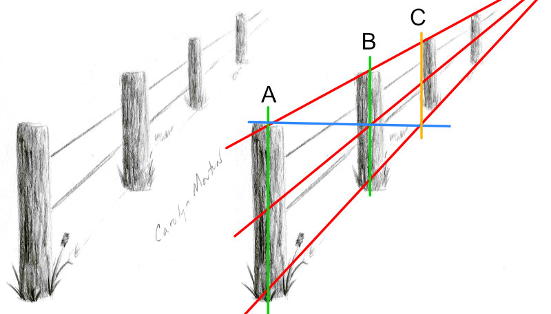
I can see this developing into a drawing with good recession, and a subject where aerial perspective will work very well, especially if you employ a little exaggeration. Don't fear exaggeration. These posts are very similar in value, but sequentially lightening them would reinforce the recession. Imagine a light mist that partially blurs the background. I find that sort of approach often presents an unequivocal scene to the viewer.
Just because I can, I checked the spacing. And I suddenly realised that I'm asking you to accept the "spacing in perspective" method without explaining why it works. My line from A to C finds the TRUE CENTRE in perspective at B.
Now knock in a fence post where you know the centre is. Do you recognise anything? The bricks?
When you pass a line from the top of one post, through the centre of the next post, and continue it down to the baseline, it will mark where the third post has to be placed. You are effectively using the first and middle post to determine the position of the third post.
You can use this method to work out any regular spacing that involves recession.
I hope that makes sense. And, as with most things, the more you are aware of this, and practice it, the easier it becomes to place things in recession by eye.
Carolyn (Online Advanced)
WEEK 3: EXERCISE 1
This is a sketch of where I think the Boston Terrier would be compared to the bigger dog. I tried to measure him at a little less the half the height of the other dog and place him on the step.
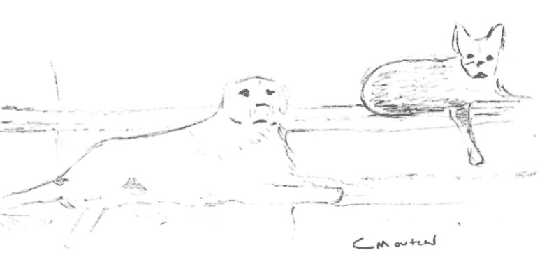 )? How you resolve the sizing isn't as important as getting a good result, but this is not correct. I'll post my method with next week's notes.
First, I would have preferred this to have been an image altered in Photoshop or similar. Your drawing is a perfectly acceptable alternative, but it gives me no idea of how you arrived at the smaller dog's size.
Just to check, I resized your drawing to sit on a "correct size" image.
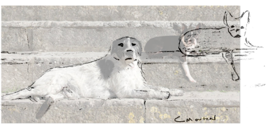
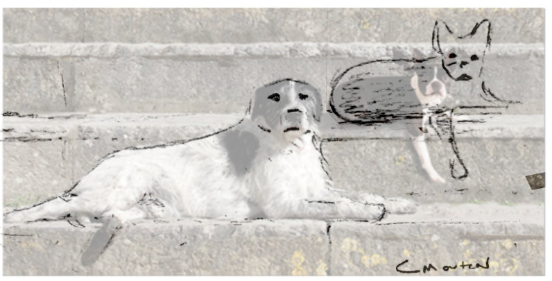
This is what I was hoping to see:
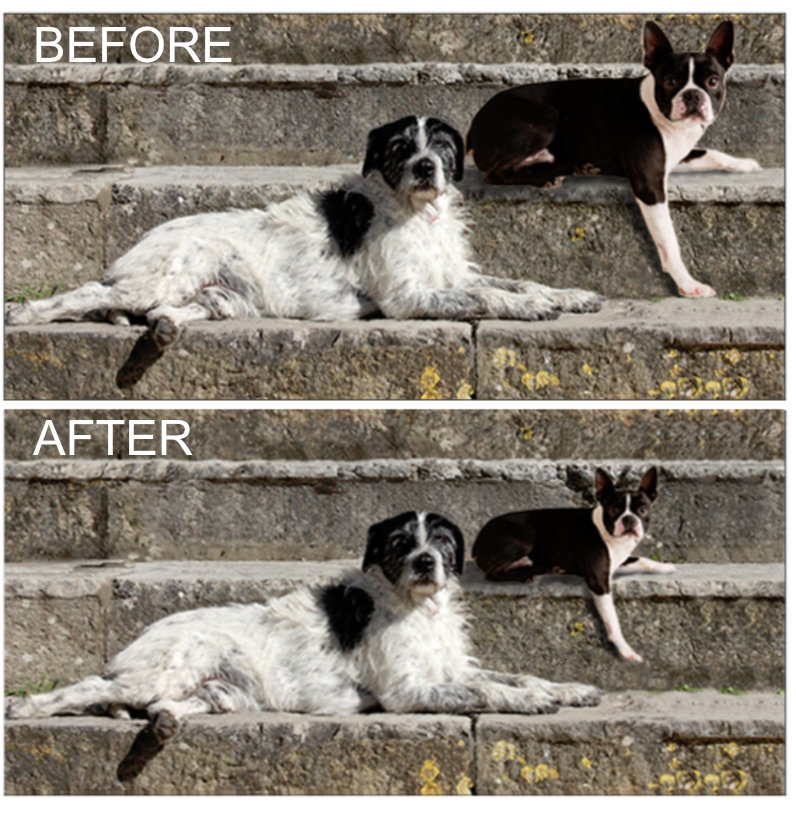
One of the memories that sparked this exercise was, years ago, seeing an artist's work where he'd placed Bull Terriers on a decorative set of stone steps - and the relative sizes were painfully incorrect. We have some expectation of what most things look like - 12" risers are not acceptable. And I suspect the unnaturally high risers resulted from adjusting the tread widths to accommodate his group of dogs.
WEEK 3: EXERCISE 2
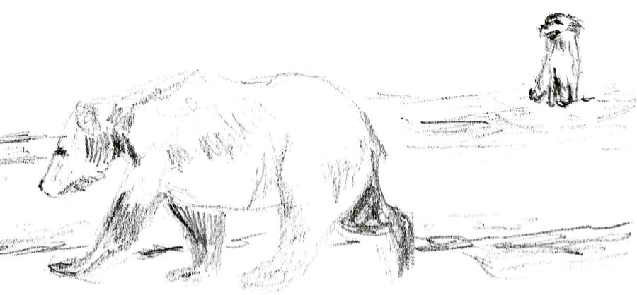
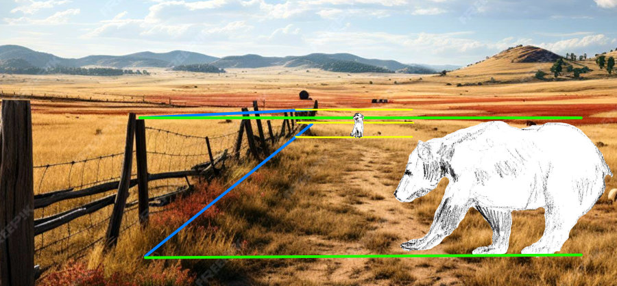
...a photo of a grizzly bear from a zoo, and the right is my 66 lb, 21 inch Australian Shepherd, in the background. I may have made him too small! But it was interesting trying to size him compared to the bear!
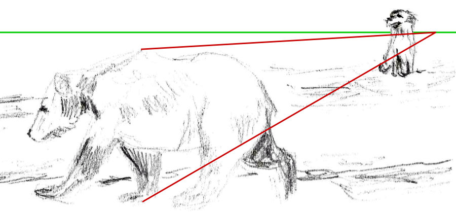
Between 3.3 ft and 4.9 ft, so I've decided this one is on the small side at 3.5 feet or 42 inches tall.
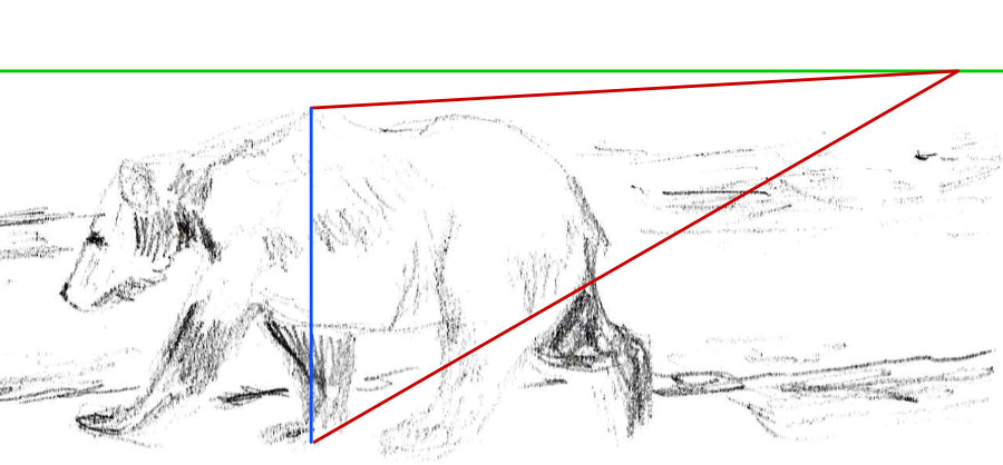
Your Shepherd is 21" tall, so it's half the height to the shoulder when standing. So he's half the height of the blue line. Move the blue line (B) to where you'd like to place the dog; and size the dog accordingly. Remembering that the dog is sitting down and only 21" to the shoulder.
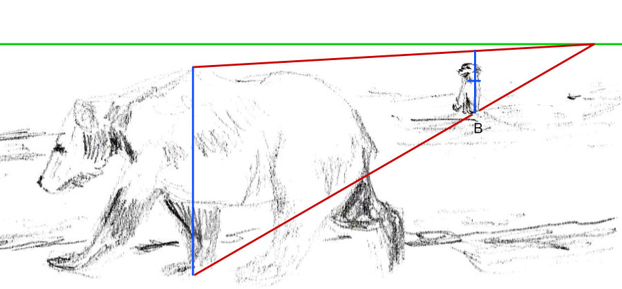

So, my yellow lines) are divided in half - because the dog is 21" high - and we can correctly size it to be half the height at its shoulder.
WEEK 3: EXERCISE 2B
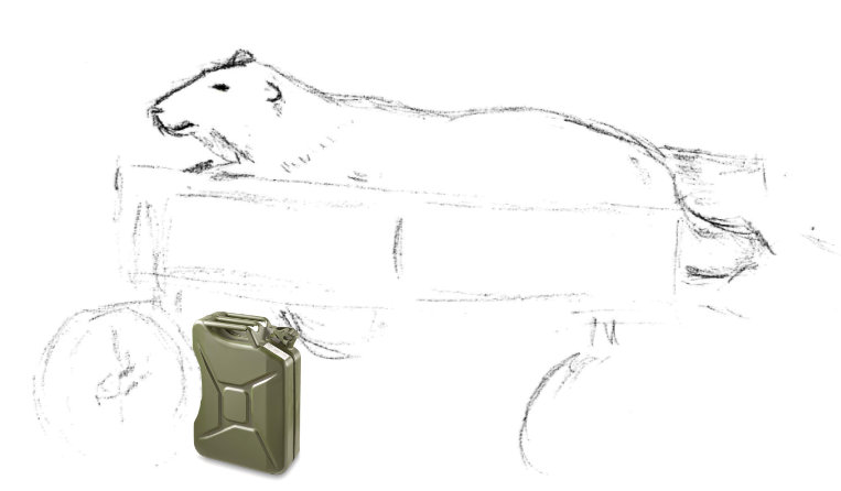
The other is a sketch of a polar bear from the zoo, in a metal wagon that my friend has at her house. Don't know how successful that was, but it was interesting to do!
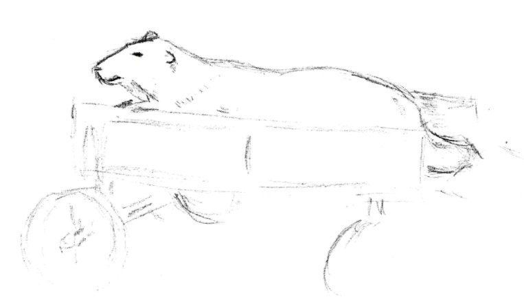
This could be a little stuffed Polar Bear in a child's cart. Or both could be full size. And that difference matters - if only because the cart has to appear to be strong enough to support a HUGE Polar Bear.
That said, your composition works - it's just confusing and doesn't nail anything down.
However, as soon as you throw in something instantly recognisable - such as a jerry can - it suddenly all makes sense size-wise.
Carolyn (Online Advanced)
WEEK 4: EXERCISE 1
I hope I understood this assignment correctly! Here are a few attempts of mine to have the subject to the side, as if splitting the drawing in thirds.
These look fine.
 . However, if the fence turned through 90 degree at the first post and recedes into the distance... that should work. The wider distant content would be nicely balanced by the left third.
 . Again, it depends on the far content for success. But if that contains nothing of any great interest, this should work well.
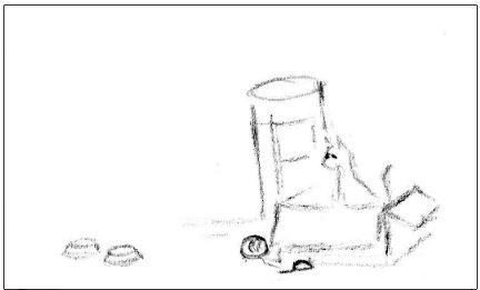
WEEK 4: EXERCISE 2

If I start at the dog, he is looking up at the couple and that leads me to them. The man is leaning toward the woman and their bodies are facing to the right side of the painting.
I tend to begin with the dog, too. Both the dog and couple are painted in stronger detail and brighter colours than the muted colours of the background. And they're look directly at me, the viewer, almost asking for an introduction. Interestingly, I also get the impression of superiority, as if they're looking down at us.
Gainsborough would wholeheartedly agree with that, too. I've forgotten the whole story but he detested working for this class of person. They hated the countryside but wanted to display their land, and Gainsborough was deliberately unkind to them in this painting - in ways you'd recognise if you knew the clues to look for, although the clues are probably meaningless is this later age.
Have you thought to ask yourself where the eye-level is? Technically - and based on flimsy evidence - the eye-level would appear to be low. There is very little to go on, because most elements are organic, so I went looking for anything man-made. The bench is the only element available and it's quite clear that we can see the front edge of the seat but not its top. So I'm conjecturing that the seat is exactly at eye-level. If that's true, it would explain my feeling of the couple's superiority. They actually are looking slightly down on us. In fact, If I zoom in to the painting, I'd say that their faces are pointing straight forwards, so they actually are looking down - especially Mr Andrews.
The bench leads my eye from the couple to the landscape. I think the three trees on the right edge stop my eye from going off the page, they seem to make me circle back to the middle of the portrait.
That's interesting move into the scene that rarely occurs with me. As I said, I tend to first notice the dog, or Mr Andrews' leg, because it's the brightest element in the painting, and then to the dog. Both lead up to the couple. My eye then travels up the shotgun to Mr Andrews' tricorn hat. From there, the hat sometimes points me up into the tree, which has branches that send me down the right-hand side. Or I follow the hat to Mrs A, and then follow the bench arm into the right-hand side.
Incidentally, the overhanging branch of the tree prevents your eye from leaving and pushes your view down to the wheat sheaves, which are leaning towards the background, leading you back to the sheep. The row of trees on the left then push back to the rolling hills and up to the clouded sky. Even the clouds seem to curve to the left!
In fact, almost anywhere you look, you can find subtle pointers that steer you around and back to the couple. Except for the quiet area with the deer and the barn, above the dog's head and to the left of Mr Andrews. That area provides a resting place for the viewer, so you're not forced to continually circuit. It's a device I've used myself, and it can work very well.
Lighting around the couple reinforces them as the focal point. Throughout the painting are spots of interest to stop and ponder. The small white flowers by the wheat, the sheep in the field, deer behind the couple on the left. What started out being a basic painting really can become quite fascinating with examination.
The more I study this painting, the more I find. If you look closely at the bottom right-hand corner... there's a cock pheasant sticking its head out from behind the left side of the foreground sheaf of wheat. I'd been looking at this for days before I noticed it.
The more you look into paintings like these, the more you learn about the tricks used to control your route. And, of course, the more you can incorporate into your own work.
Personally, I find the mechanics of composition to be absolutely fascinating, and I have done from way back in my school days. Doc Irwin, my English Literature master, was passionately interested in two subjects - collecting comic books, and advertising design. I can still remember the day that he explained the layout of a toothpaste ad - how the eye was forced to travel a prescribed route and always ended up on the product itself. It was that single explanation that fired my imagination and interest in the subject.
Carolyn (Online Advanced)
WEEK 5: EXERCISE 1
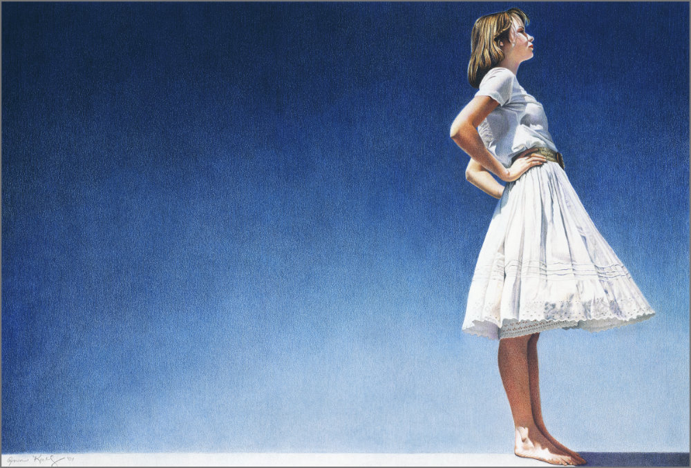
This drawing followed the rule of thirds, subject on far right. But is looking OUT of scene! There is no implied movement in this case. So this works to add drama, in my mind... An attitude of defiance is what I see in this. I think placing the subject this way works well.
First, that outward-looking pose itself breaks almost all the rules in one go... and yet it succeeds. I think this is a very special drawing of Ann's, and I've been attracted to it ever since I first saw it on my (now retired) Starving Artists website 17 years ago.
What works for me is that the girl appears to be leaning very slightly backwards, almost off balance, and that counteracts the forward movement implied by her right-hand position and looking out of the picture. It corrects the imbalance in the composition. Also, the arrow head of her elbows points me back in, and her head is slightly tilted back so she's not directly looking out of the frame but into the dark corner. In reality she is balanced - drop a vertical from her neck and it is correctly over her ankle But her hips are thrust forwards giving her that "leaning backwards" feeling. To be honest I don't really want to analyse it - just enjoy it.
Rule of repetition. It would be repetitive if the background was all the same solid blue. But the color gradient from light to dark blue is more interesting and makes my eye move around the picture. Using landscape is more interesting, too, leaving more space behind the subject, giving greater impact to the attitude of the woman. It wouldn't be as dramatic if it was in portrait layout. It has more emotion this way.
I absolutely agree with you. Personally, I think this is an excellent example of using the lighting for artistic effect without attempting to obey the laws of Nature. The light source appears to be high up on the left - that accounts for the shadow in front of her and that it only catches the back of her ankle. Her arms signify that too. But her face is also receiving light. I just noticed a shadow for the first time - cast by her right arm on her torso... if the light is high, just behind her, and between us and the girl, I think it all makes sense - including (almost) the light on the background plane. Previously I thought Ann was using reflected light to illuminate the front of the girl where light was required.
While not exactly a rule, have you looked for the eye-level? It seems low to me. I think the eye-level is somewhere around the hem of her dress or just above it. The ellipse of her belt proves that, and that I'm not particularly aware of looking down on her feet. We’re looking up at her which adds to my feeling that she’s standing tall and proud.
And Have you considered the Rule of Thirds? Other than the girl is standing in one third...
The subject's elbows point back into the space behind her, and her back is curved, with the dress flairing out in front of her. This makes my eye move around and back into the picture, instead of moving out of the drawing.
That, I think, is where the rule of thirds comes into play. She's almost exactly divided into thirds vertically. Not only do her elbows point back into the work - the point between her elbows is directly on a hot spot. And her left (lower) elbow is virtually on a one-third divisions, as is the rear corner of the skirt's hem, which is also very close to a hot spot.
You mentioned the gradated background earlier - what really works for me is that the girl appears to be leaning very slightly backwards, almost off balance, and that counteracts the forward movement implied by her right-hand position, and that she's looking out of the picture. It corrects the imbalance in the composition. Also, her head is tilted back so she's not directly looking out of the frame but into the dark corner. I wonder what she is looking at but that thought is defeated by the dark corner in front of her - in fact it's the darkest area of the background and possibly the darkest value in the entire piece, so perhaps she is only looking within herself?
I like this drawing a lot.
Me too! I could go on all day about this work. And, even after reading your analysis, and everyone else's over the years, I'm still not certain myself why it works - but it certainly does work!
Carolyn (Online Advanced)
WEEK 6: EXERCISE 1
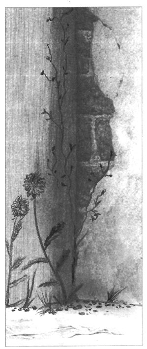
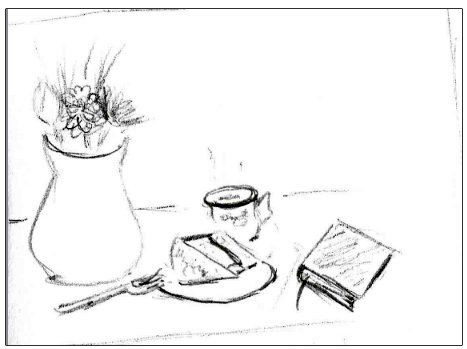
I think this is OK, Carolyn, if not very inventive. But, that said, it works well enough. Although the base is visible and could lead your eye out of the picture frame, the inward-curving weed steers me back in again. And the little stones do attract my attention away from the straight line of the base. And the little climbing weed in the dark corner adds a lot of realism, although once above the two weeds it does repeatedly point out of the frame.
WEEK 6: EXERCISE 2
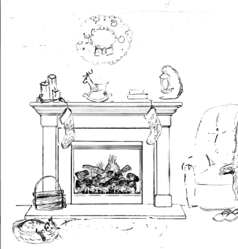
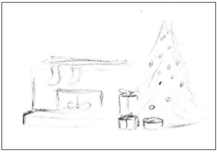
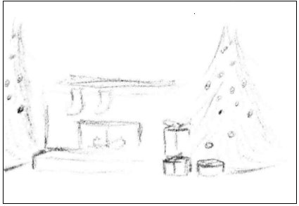
Very Christmasy! And it all works well. My only concern is with the armchair that's somehow embedded in the wall... but a vertical to the right of fireplace signalling the beginning of a deep alcove is all it needs. It's one of those problems where our minds can visualise things that can't actually exist.
Maybe part of a Christmas tree stopper to fill the empty left-hand side? But I like the slippers at the right - very subtle but definitely turning my attention back into the scene. The sleeping cat does the same. Even the right-hand candle of the three being shorter works to push me to the right. Good work.
Carolyn (Online Advanced)
WEEK 7 EXERCISE 1
I have trouble understanding the directions, but I think this shows that I should take a box out in the sun and look at it in real life! Only then will I fully understand, I think.
That really is the best solution. I learned with an array of objects and a desklamp - but the principle is the same. And as soon as it begins to all make sense, you'll find it so much easier to just create shadows on the fly.
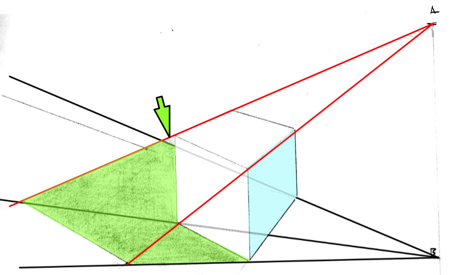
 Eventually I worked out from B you can only see the light blue face . So my black ground lines only involve that face - plus the unseen furthest corner.
As A is directly above B, A can only see the light blue face and the top. So my red lines follow the corners I can see from up there.
Everywhere else, the light can see the ground. You've made life a little difficult for yourself because one face of the cube exactly follows the same red line . But you were almost entirely correct - just the tiny arrowed section was wrong.
OK.. let's move on to VERSION 2:
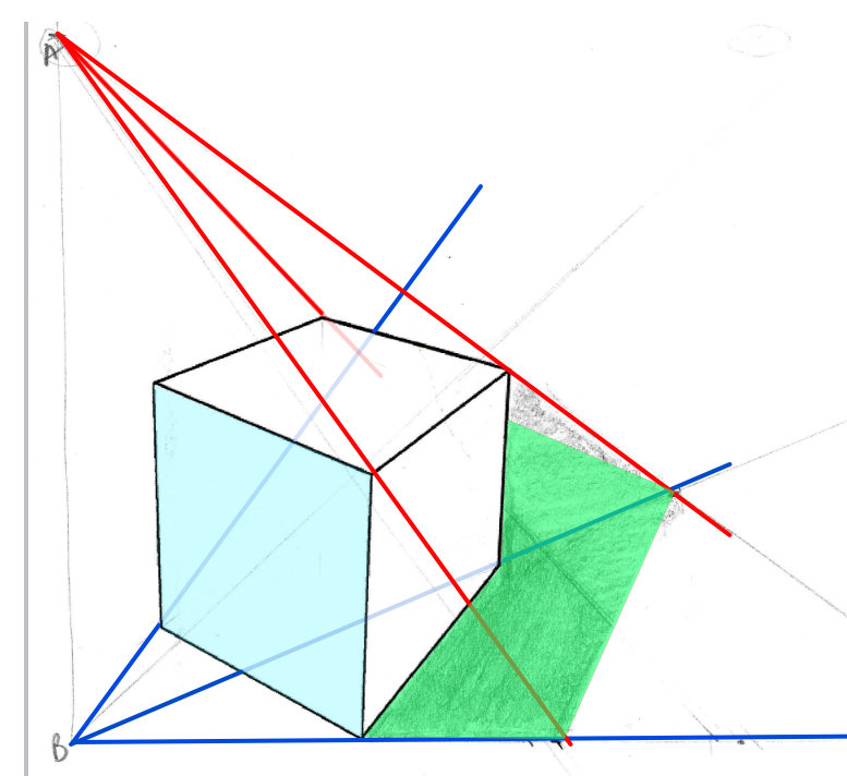
This might help you - assuming you need it!
- When I'm drawing shadows without bothering with convergence lines, I try to imagine I'm the light... Now what can you see from up there? Which are the furthest edges you can see that might block your vision of the ground? From up here (as the light) I can maybe see the top's left and right-hand corners and the far corner. The near corner doesn't count because I can see all the faces that spring from it. Now imagine where your line of sight for each corner meets the ground, allowing for any unevenness.
WEEK 7 EXERCISE 2
I'm not sure how to apply the angles for figuring lighting to a rounded object... I'm not happy with it but want to see what you say.
I'm sorry I haven't the time to work this out completely, but I have this one stored from a previous session, which is very similar:
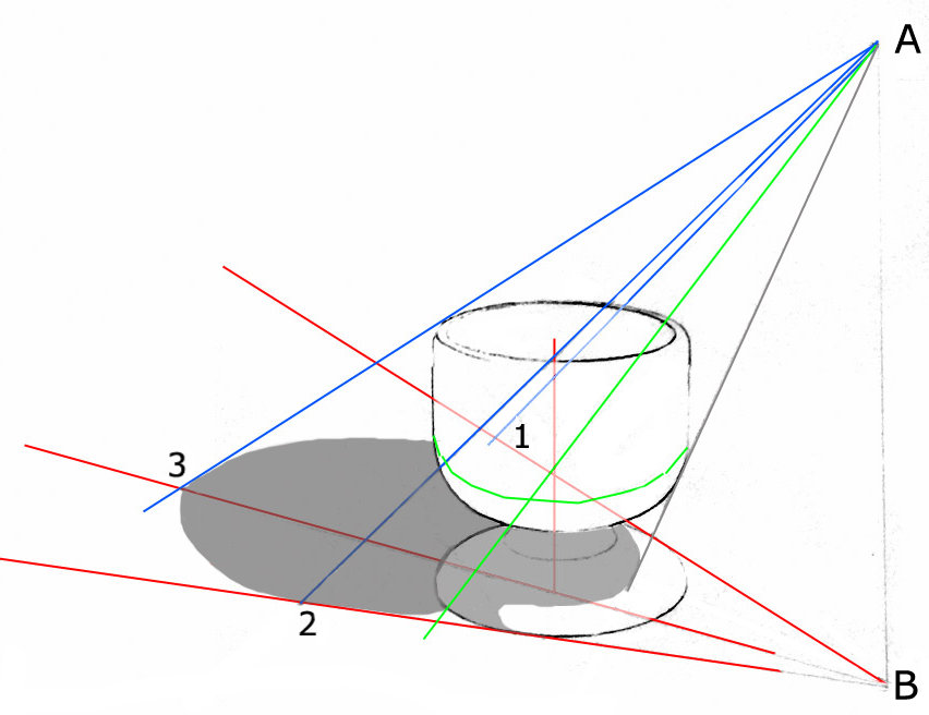
Red 1 and 2 give me the maximum width of the shadow. I'm assuming the cup and its base are the same width.
Blue 1 and 2 pass both sides at its widest point (as seen from A), which gives me the points at which the curve of the shadow meets the shadow of the sides.
Green is a line around the cup where the vertical side begins to curve underneath. The green ray passes through that curve (directly under the blue "widest point" above) so I now know where the shadow begins to curve back in.
The grey line marks where the shadow of the cup begins on its base.
The rest is eyeballed.
Enclosing it in a box won't work, because the corners of the box will all extend further out than the object itself. Construct the ground plane lines. Then, again, imagine you're the light. What can't you see from up there?
WEEK 7 EXERCISE 3
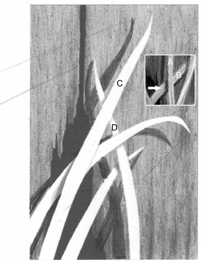
Otherwise this is very good. Those lines are exactly what you needed to do. This is splitting hairs a bit but, because this is sunlight, they should ALL be at the same angle. Due to its extreme distance as a light source, you can always assume sunlight rays travel in parallel straight lines. Also, your sun is very low in the sky, which is why my shadow cast by Leaf C on Leaf D is above the leaf rather than below.
But what really matters is that your cast shadows on the wall instantly describe the way each leaf bends, and their distance from the wall at any point. It's clearly obvious that some leaves bend back to touch the wall and others run parallel to it or lean back slightly.
As for the internal cast shadows... The further away the surface is from the leaf, the further the shadow has to travel. When the shadow of a leaf is projected both onto the wall AND another leaf, the shadow will split. The shadow of A on B (arrowed) has less distance to travel so it is nearer to A than the shadow of B cast on the wall.
In your drawing, the shadow of Leaf C on D has less distance to travel so it is nearer to C than the shadow cast on the wall. The shadows depend on which you think is in front of which, and what the angles of the leaves are. I've also introduced a little darker tone along the other edge of each leaf, just to define it. That's OK, but it has to be very subtle.
I hope this exercise proved to you how important and effective shadows are - even when the elements themselves contain no three-dimensional shaping.
Workshops UK
Tutorials
by Mike Sibley