Workshop Plus
WORKSHOPS 2013
UK, USA and Canadian Workshops and Online Course continuations
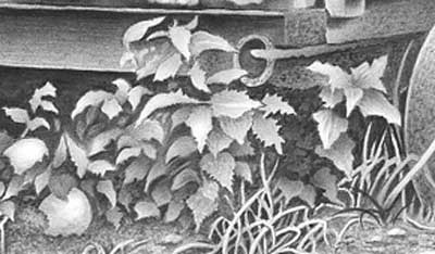
Fran (Hickory, NC - September)
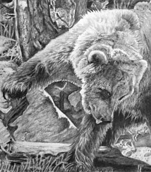
"I took your North Carolina workshop, and I wanted to share with you that I finally finished the bear project. I went back to the piece a few weeks ago and worked on it. I am NOT USED to any background, and I struggled with the multiple surfaces, depth and values in this drawing. The majority was the 2B (kind of amazing how versatile it is!). Can you give me feedback ? I would REALLY appreciate it. I am out of my comfort zone here. Lots of items I am happy with and some I'm disappointed (Wish the bears popped out more)."
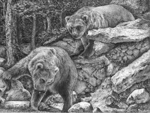 I want to tackle your last point first and then return to it with a possible solution. With practice, you'll soon discover that to make the bears stand out you need to have decided that before you began. If it's set as your goal, everything you draw from that point onwards will conform to that vision.
When I first saw this I liked it immediately. You're right, it is a little flat, but that's something that can be fixed. It was not an easy assignment and, unless you're used to dealing with compositions such as this one, it's difficult to keep the overall appearance in your mind as you work on each element. However, taking the elements individually there is so much good work in this drawing.
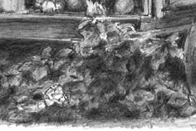
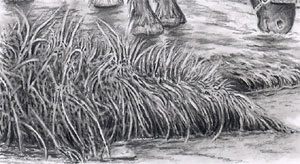
You've handled the overall composition very well - those right-hand rocks, for example, have dominance because of their sharpness and high contrast, and they echo the angles of the two bears, leading the eye back and forth between them. The textures you've created in those rocks, and the left-hand tree, are entirely believable! Elsewhere, the various areas of rock are nicely judged - they suggest rock-like textures without being over-detailed or too sharp.
I really like the wooded left-hand area, although it is a little light - it contains many of the values used in the foreground, which is why you have lost depth. I'll return to that later. The highlight running down the tree emphasises the texture of the bark and leads my eye down to the foreground bear, but the sharp edges and bright highlights vie for attention with the foreground. If you had softened the edges and muted the values in that area, it would have served as a shady backdrop and, being less detailed, would have added interest without it ever becoming a distraction.
The main problem is that everything has received the same careful treatment resulting in every element being equal in importance. That has produced a drawing with no obvious focus and diminished depth.
Before I get to the solution, your Grizzly Bears have totally believable textures, and character too. You've elevated the prominence of the left-hand bear's raised paw really well by using strong contrast. That's excellent because that paw is important to the simple story. As an overall scene I find the background to be too distracting but, taken individually, every element works very well. You should be very proud of yourself for a difficult job well done!
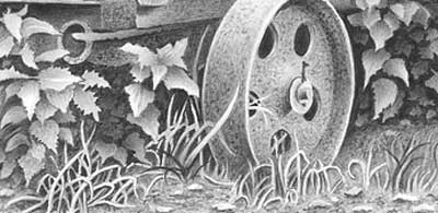
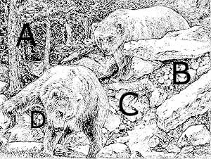 Personally, the first thing I do is decide where my focus is going to be - in this case it's the bears, and then everything else needs to be less-sharp so it doesn't attract too much attention. With that mental picture established, the drawing almost takes care of itself because I can consider how every mark made might vie with the bears for attention.
I've made four changes to your drawing - nothing drastic, just overall changes in value. Area "A" looks as though it's been darkened but all I did was mute the white and light content. That created more depth and immediately the bears begin to stand out.
 Area "B" received similar treatment to throw is further back into the shade of the rock above, and area "D" was darkened at the same time. But I then lightened the lower section of area "B" where I'd expect reflected light to brighten it, and to more gently feed the eye into area "C". Finally, area "C" was slightly lightened at the base, to bring it forwards, and the white darkened at the top to form an inclined plane.
I'm not claiming those simple changes made a huge difference, but I do think they're on the right track - and such changes are entirely possible within your existing drawing.
What I didn't do was soften any of the edges within the midground and background trees. They could be slightly less sharp and, when pushed deeper into the background they should create more depth and inject a degree of mystery. Save your sharp edges and high contrasts for the principle elements so you force the viewer to focus on them.
Lucky (online - Beginner)
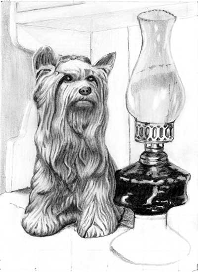
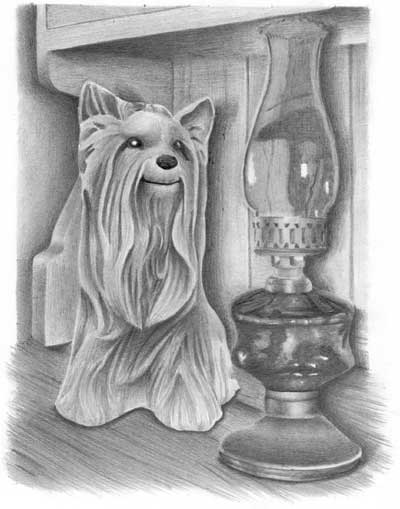
"Thank you for your patience whilst I finished off the "Lady with the Lamp." It was very challenging but I finally completed it. I took it one small area at a time. I think the small size with such detail was one the hard things for me to master.
I used the Blu-Tack to lighten some parts of "Kitty" and try to show some form. I lightly shaded some of the edges of Kitty with 4H so as not to compete with her highlights in the eyes. I lightened some of the glass bowl on the lamp with Blu-Tack as it was taking the focus away from Kitty."
I used the Blu-Tack to lighten some parts of "Kitty" and try to show some form. I lightly shaded some of the edges of Kitty with 4H so as not to compete with her highlights in the eyes. I lightened some of the glass bowl on the lamp with Blu-Tack as it was taking the focus away from Kitty."
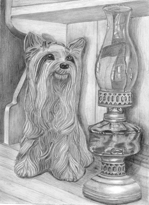 First, thank you for your patience. I've had so much to do lately that I'm far behind with these critiques. I think this works very well and there just a few things I want to mention.
This drawing relays your story very clearly to the viewer, and the clarity of information is excellent. The three-dimensional form of Kitty is immediately apparent. Your fine-tuning with Blu-Tack has definitely worked, and her position in space is firmly fixed in comparison to the lamp. The lamp has a fault - the bottom ellipse is not accurate - but I can clearly tell brass from glass, and I can see it's her focus of attention.
Nothing but nothing teaches as well as experimentation does. I applaud you for that, because by experimenting you learn not only the way things form but you also gain an invaluable understanding - and that never leaves you. It will be useful in many drawings yet to come.
"The cast shadow on the lamp was most difficult. I took many photographs and shaded my photo with different ideas and then used my torch shining on a table lamp to get some ideas. I have damaged the paper in a few places by using too sharp an edge on a hard pencil but a lesson well learned."
You've almost nailed it! The shadow moves back along the top of the dresser and climbs the back board. But I think it is too close to the lamp. Think of it this way: the further away the lamp is from the background, the further its shadow will be from the lamp. In this case Kitty's shadow is the same width as the lamp's shadow. but Kitty is much close to the wall, so the lamp's shadow should show it's greater distance by either widening and become more diffuse, or by shifting more to the right. That said, I really don't think it matters. Often what looks right is right and here both shadows do the job that you set out to achieve.
I'll just cover everything else is one go... I like the way the dresser top runs unnoticed into the background. The curves of the side of the dresser are well described (often a problem in this exercise), and the rest of the dresser is nicely suggested without it dominating the scene. I'm glad you decided to include the gaps between the boards because they provide a solidity to the back wall. I instantly understand that I need look no deeper.
Kitty is masterful, there's no other way to describe it. Your interpretation of the ceramic surface is so well drawn I could push my fingers into the depths and run them over the ridges. Her very dark eyes and nose immediately draw my eye to them, and I'm glad you changed her strange painted triangular eye highlights into more realistic ones. The curve of her mouth is delightful - it conveys such a friendly and warm spirit of character.
The lamp is equally as well drawn as Kitty. It conveys a full sense of reality. The soft sheen on the brass contrasts excellently with the harsh reflections from the glass. There;s no mistaking that that's what they are. And the reflections in the glass are wonderfully crafted.
As I mentioned, the rim around the base is not quite accurate - it appears to square with a rounded corner rather than being circular. The other ellipses are excellent throughout the lamp. Both brass collars have well-presented and subtle highlights that suggest their rounded nature, assisted by the recession of the punched holes.
Finally, you've managed to include sufficiently strong darks into the glass oil reservoir so they comfortably balance the darks within Kitty. That was essential. Without them Kitty would dominate even though the lamp is in the foreground. And those darks visually connect Kitty to the lamp very effectively.
"All in all I found that I have learnt an enormous amount both in technical areas (i.e. using the pencils and paper) and secondly in
solving problems associated with the drawing of the "Lady with the Lamp"."
Excellent! That's all that really matters, whatever the end result - except that in this case the end result is excellent too! :o)
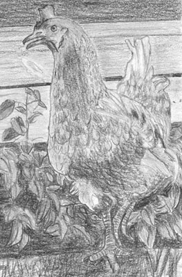
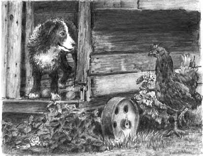
Mark P (online - Beginners)
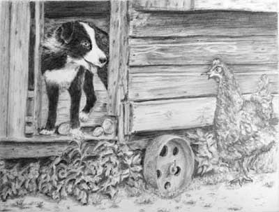
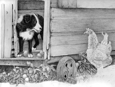
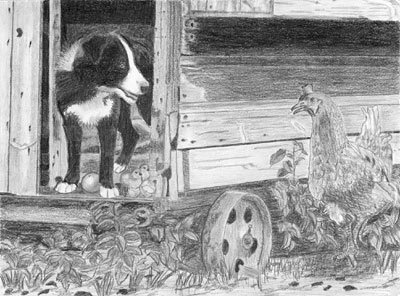
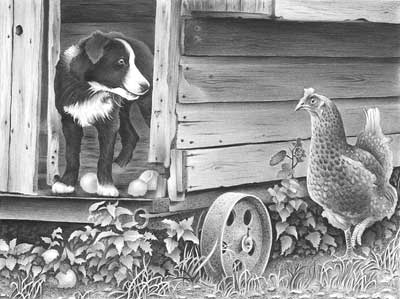
"Here is my version of the Henhouse Raider for the online course of December. I started it again on harder paper because I felt I had fiddled around with the previous version too much. Looking forward to your opinion."
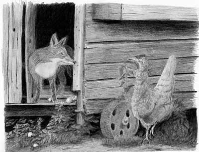 Well, this version appears to be free of fiddling, and very sharp and confidently drawn. And I'm really pleased to see you taking this by the scruff of its neck and wholeheartedly making it your own.
 When I first saw this three things struck me immediately. It has a remarkable clarity in many places; Henrietta is rather lost; and there's a really awkward break in the planks behind her that keeps dragging my eye to it.
You've taken the same approach as I would have done in making the interior of the henhouse very dark. That immediately creates depth and mystery, and it pushes the fox into the limelight. This composition is rather devoid of depth so you've done well to increase it.
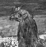
 The fox is looking good, although only you can really judge whether it's correct or not. It has a very keen eye and an expression that contains warmth, making it non-threatening. Also, I'm pleased to see you "living" in the scene as you drew it. That involvement has caused to correctly push the back of the fox into the shade, which is something many previous artists have failed to do.
The eggs are clearly visible which, as an important part of the story, they need to be, although the two on the ground are perhaps too obvious. Sometimes it's better to add a little subtly - in this case leaving the eggs partially hidden in the grass as "extras" to be found later by the viewer.
The wood of the henhouse is tonally interesting, judged well, and has a solid feel about it. As I mentioned earlier, my only reservation concerns the downward sloping break in the bottom board behind the hen. The left-hand half tends to mirror the angle of the right-hand half and both are very dark and intrusive. Considerably lightening the right-hand section would solve the problem by making it almost unnoticeable.
 Henrietta the hen has a believable covering of feathers but she's lacking a lot of her three-dimensional form. The drawing of her head is sharp so it should have stood out from the wood and increased her presence - but it doesn't. She's a bit lost in it. You need to find ways to get one or two really dark, sharp-edged areas into her head and couple those with bright highlights. Sharpness and contrast should push her forwards of the relatively soft-focus wall behind her. She's a major player in your story so you need to find ways to make her dominate the scene - on an equal level to the fox. I do admire the way you've highlighted her raised foot which, being the only implied movement in the composition, really helps the story unfold.
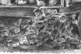
Finally, your foliage at the left-hand side has interest, depth, texture and a true sense of reality. It has sharply defined edges and good form and detail. I find the right-hand area behind Henrietta to be very vague. That might have been an attempt to stop it vying with Henrietta for attention, but just pushing it back into the shade would have been sufficient. Also, there;s a very unfortunate upright stalk immediately in front of her. That does take my eye away from her, and it forms a visual barrier that prevents her from moving forwards. On the plus side, you've established a lovely dark area beneath the henhouse that immediately gave you a wide palette of values to use for the foliage.
The rusty wheel is good - excellent ellipses and it has believable texture - and your foreground is very interesting without it being a distraction. Overall, I think you should be very pleased with this!
June (online - Beginner)
"Many thanks for the opportunity to send my final drawing even though family commitments have made it impossible for me to finish the exercise at this stage. I would also like to thank you for being so very, very generous with your time and knowledge."
 Thanks, June... but that's what I'm here for :) Overall, even at this stage, it's working well. I believe a drawing's purpose should be to tell the story clearly. I can immediately understand the three-dimensional form of Kitty, and the lamp possesses obviously different textures.
Your drawing of Kitty is excellent, as is your interpretation of the reference. No matter where I look I can understand not only the three-dimensional form but the relationship of that area to those surrounding it. That creates a very solid sense of three-dimensional form and depth. The shading and edges are a little soft for a ceramic surface but I find that to be quite appealing - half-ornament, half dog.
I'm happy to see you changed her triangular eye highlights for more realistic ones. Her very dark eyes and their highlights immediately draw my eye to them. The nose is good too, and has form without it being over-detailed and attracting too much attention to itself. Her bottom lip is really well rendered - almost pouting - which pushes it forwards, creating depth around it.
The lamp is progressing very nicely. The ellipses are correct, which is very important. A non-elliptical ellipse always draws very unwanted attention to itself and damages the reality of the drawing as a whole. The brass collar has softly-drawn highlights that correctly suggest both its round form and its satin finish, and it contrasts well with the sharp-edged, bright highlights on the glass.
The glass chimney could be a little smoother. Try using a 2H or 4H over your shading to smooth the surface and remove the white holes caused by your paper's texture. The expectation of glass is that it is hard and very smooth. The dark glass also pulls the lamp right into the foreground. That's good and I think it will still balance the darks of Kitty once this is completed, although you may just be on the verge of over establishing it.
I hope you find to complete this one day. I think the result could be quite spectacular.
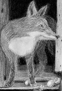
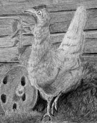
Sue (online - Intermediate)
"Not sure about this, can you advise please. I wanted Robbie to be a cheeky chap and express Henrietta's alarm."
 I'm reminded of how Walt Disney advised his animators. He gave each a mirror and told them to pull the same faces they wanted their characters to exhibit. That allowed them to work out which muscles were involved and how one movement influenced another. For example, if you watch yourself open your eyes wide to mimic surprise, you'll realise that motion also causes your eyebrows to lift.
 Regardless of how dogs or chickens react to anything naturally, it's humans who will be viewing your drawings and they look for human emotions. So think "human", practise in a mirror, and then build in your findings.
I'd make Robbie happy with his achievement and innocent of what might befall him. And Henrietta mighty cross!
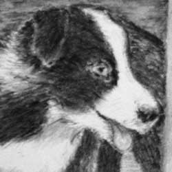 What does that involve? You'll have to make your decisions, but your Robbie is fairly close to the ideal. His nose is a bit askew, and I'd darken the lower corner of his eye so the white of his eyeball and highlight shine more brightly. I think that will help him to look in the right direction too. You already have a slight upward curve to the end of his mouth, which suggests a human grin.
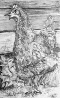 You've truncated Henrietta's lower beak a bit, but the "open mouthed" expression is excellent. I've increased the contrast in this crop from your drawing, because you need to maximise the contrast - a black pupil and brilliant white highlight in her eye - and the increase in three-dimensional form will give her more presence.
If you can, I'd highlight her raised foot too - it's the only movement in the drawing and important to your story. We don't know if she's paused or is running, but emphasising that foot will create some tension.
It's probably too late now, and possibly not even worth trying, but I would have been tempted to flatten the top of the circle of her eye to suggest a lowered brow - a human-style scowl. If that didn't work, I would have done no harm and could simply make it circular again.
You need be subtle about injecting human emotions into animals - but I've got away with it for over 30 years! :o)
Davide (online - Beginner)
"Thank you for giving us this opportunity to finish the drawing and even upload it to your site for a critique, I admire your dedication towards your students, you are made to be a teacher!
I followed your advice about Kitty's body and tried to model it a little bit more so the eyes and the nose weren't so prominent, to let the gaze explore her body. I tried to emphasise the difference between the glass and the brass by having sharper reflections on the glass, not sure if it turned well, honestly, they look a little like blobs to me. I used HB and 2H for the glass as suggested to hopefully give a smoother finish. I think the overall shape of the lamp is a little off-balance and I don't really know if that's because of a faulty shading or line drawing.
I also added soft cast shadows - trying to resemble a more diffuse light - for both Kitty an the lamp. Despite my efforts, I'm pretty sure the shadow of the lamp is wrong, to be honest. I can't say what is wrong really, but it doesn't look quite right."
 Overall this works well, although it could be improved. If I had to boil down the purpose of a drawing to a single basic, I'd say that it's to relay your story to the viewer, and the clarity of information is the essential ingredient. Here I can instantly understand the three-dimensional form of Kitty and her position in space compared to the lamp. The lamp has a couple of faults but I can tell brass from glass, and I can tell it's her focus of attention.
Working from the background forwards... I like the way the dresser top almost runs unnoticed into the background, and your treatment of the grain. The top curve of the side is well described too, and the rest of the dresser is nicely suggested without it dominating the scene, and I'm glad you decided to include the gaps between the boards. They provide a solidity to the back wall so I instantly understand that I need look no deeper. There is a fault there - the top line of the boards appears to "curve", so the end board, behind Kitty, looks as though it's angled.
Your drawing of Kitty is masterful and very well interpreted. I could poke my fingers into her depths and run them over the ridges. Her very dark eyes and nose immediately draw my eye to them, and I glad you modified her triangular eye highlights into more realistic ones. A good nose too - it has form without being over-detailed - although a little more highlight on the top might have added more three-dimensionality. I love the highlight and shadow beneath her mouth that accentuate her lips and give her a friendly grin!
Your soft cast shadow describes her position away from the wall but the shadow of the lamp is wrong - as I'll explain. The lamp itself looks good and conveys a full reality, except for the glass that appears to be tilting backwards. But it isn't - it's your shadow that's giving that impression. From the base up, your shadow suggests the background is the same distance away all the way up. Remember, the further away the surface is, the further away, and probably softer, the shadow should be. This shadow should angle back across the dresser's top from the base to the wall, and then climb vertically.
The rim around the base is not quite accurate at the right-hand. It should mirror the left-hand side but instead the rim tucks underneath. The ellipses themselves are excellent throughout the lamp. Both brass collars have well-presented and subtle highlights that suggest their rounded nature, assisted by the recession of the punched holes. And you've made a good distinction between the brass and glass surfaces - the stain finish of one contrasting markedly with the hard, shiny glass.
The glass chimney works very well indeed. The only error, as I mentioned, is that your shadow is telling me the chimney is entirely beneath the shelf above - in reality it wasn't under the shelf at all. The only other thing that troubles me is that the lamp doesn't contain any values as dark as those used in Kitty, so it tends to look flatter and rather less dominant. Balancing Kitty's dark values with matching values in the lamp, in small and scattered areas, would have visually connected Kitty to the lamp more effectively.
This was of course designed to stretch you, although it contains nothing that we didn't cover during the course, but I'm delighted to see you attacking it and solving its problems along the way, and it has remarkable clarity.
I thoroughly enjoyed working with you, Davide, and I hope we get to work together again in the future.
Carol (online - Intermediate)
"I am finally almost finished. I am pleased with most of it and close to being finished. Henrietta is my last major problem. I have yet to go over the wood with an H to finish it. Also, the plants under Robbie need to be muted so that they don't stand out. I darkened the wood behind Henrietta to make her stand out. I think I will put a highlight around most of her, because there should be reflected light on her from the henhouse. Her feathers just don't seem delicate enough. I also see from the close-ups of Robbie that he has what I would call medium long hair, but it is very fine. He looks like a puppy to me, so I did make his hair longer. I will go over a lot of it with a harder pencil but I wanted your feedback first."
 You're thinking about this in depth and making good decisions, Carol, so it sounds very much as if you're in full control. And you're correct about Robbie - he was a delightful 12-week old puppy.
The playful Robbie is looking good - plenty of three-dimensional form, lovely texture, and you've lost none of the impression of him being a black dog. His coat appears woolly, black and shiny, which exactly describes him. He spent most of our photo session playing with a soft yard broom! The bright glint in his eye adds to his character and draws our attention to him. The broken eggs are nicely displayed, and I like the way you've weeded the ground below him to better display the fallen eggs. I did earlier suggest a darker interior of the henhouse but the light you've introduced in there works really well. A light interior often causes Robbie to be drawn too lightly, but you've cleverly avoided that. The two balance well as they are.
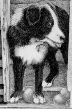
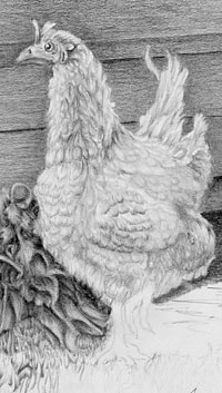 The wood of the henhouse looks old and weathered without attracting too much attention. You could have extended the nestbox's shadow downward to better display Henrietta... but I'll return to that. Henrietta herself is excellently drawn. She has believable feathering and very good three-dimensional form, due to your strong, well-chosen values within her. She also looks appropriately displeased, and the bright highlight in her eye makes a good second focal point. She's also a lot lighter than I expected, but that's not a problem. Instead of being the red Warren Ranger that she was, she could equally be a Buff Orpington or even a White Sussex. It's your world so she is whatever you decide to make her. As she is, she stands out well from the wall, her light colouring actually increases her presence, and I think your idea of creating a light "halo" around her will work against you. Keep her edges super-sharp and I don't think you'll have any problems. Your concern about the reality of her feathers is, I think, unfounded. It's Henrietta herself who is important and not her feathering, so a suggestion of feathering is all that is required, and being too detailed might simply confuse the viewer's eye.
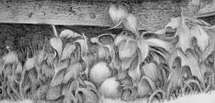 The foliage below Robbie appears to have lost some of its crispness and depth. Rather than "mute" it, I'd be very tempted to inject stronger darks to improve the depth, and that will emphasise the sharp edges of the foreground leaves too.
The rusty wheel is well studied but has a problem. The top of the rim's inner ellipse is higher than the outer one, which is distorting it. Also, it has only four holes in the central plate instead of five. In this case that matters. The human brain looks for patterns and can find it easily in even numbers, which often causes an unwelcome distraction. Introduce the fifth and you'll overcome that.
I'm very pleased with the way this is progressing and I hope you too!
Jackie (online - Intermediate)
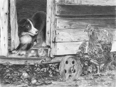
"Here is the Henhouse Guardian, he has turned into quite a baby sitter, and Henrietta seems quite pleased with the whole thing."
 I'm pleased too, and Robbie looks like a very proud "father" :o)
I'll start at the back and work forwards. Personally, I would have made the inside of the henhouse darker, especially behind Robbie's back. I could have used reflected light along his spine to separate him from it - just enough to make the junction visible while still maintaining a hint of mystery. That would have added depth to this rather shallow composition.
The wood of the henhouse looks old and rustic with just enough detail to satisfy a closer look. However I would have removed that rather dominant shape from the lower right of the door. Don't feel obliged to include something just because it's in the reference - this is your world, not the world of the reference. I like the shadow beneath the projecting nestbox that leads the eye to Henrietta's head, although having it stop exactly in line with a joint in the cladding was unfortunate - it seems to be a bit contrived and doesn't help me to immediately understand that it is a shadow.
 Robbie the dog has some three-dimensional form and texture, and the glint in his eye draws my attention to him and sets the scene well. However, I think his black hair would have benefitted from more work. His white hair is quite detailed, but his black hair looks rather flat and is devoid of layers and any indication of the direction of growth. Constructing thee hair by using layers of short strokes would have helped you to "sculpt" his form and giving the texture that is missing.
There is another "problem" - Robbie's front paws are in full light and his rear paw is inside the dark henhouse, but in your drawing they are both equally well illuminated.
 His rear paw should have been much darker. The same applies to his inner thigh (in the shade of his belly) and the floor of the henhouse. My impression is that you lightened the floor to help you to display his rear leg. But everything in Nature is not always easily seen, so you create a greater sense of realism by making the rear leg only just visible in the darkness.
Hatching the eggs and putting Robbie on guard was a lovely idea! The broken eggshells could have been both lighter and smoother - the use of H grades would have given a more realistic sheen to them - and do try to avoid using unnatural outline. We see edges because of tonal differences - line does not exist in Nature.
 Henrietta the hen, who is looking quite pleased with the arrangement, could have had rather more three-dimensional form. Her feathering is nicely suggested but she's suffering from not containing any of the darkest values. That affects her overall prominence in the drawing. A darker eye with a carefully drawn, small and intensely white highlight would have drawn attention to her more readily, and much deeper shade beneath her chest would have given her more solidity. She''s just looking a little lost in the composition.
I usually have to point out that another vital element is her left raised foot, because it's the only movement in the composition and adds a degree of tension, But you've tucked it behind her right leg, which is an interesting twist and alters the whole dynamic by removing the tension - and it works quite well.
I can see you have correctly designed and outlined the foreground foliage, but you've then omitted to create the midground foliage around them and the deep shade that gives everything depth.
I think this began very well - I love the humour and invention - but I feel you lost confidence in the later stages. Be bold! Get those blacks in early and everything around them will balance themselves accordingly. And, if you decide to lighten them, Blu-Tack will allow that at any time.
Deb (Toronto, ON - September)
"I was lucky enough to attend your Toronto workshop and enjoyed it very much. Although I was somewhat apprehensive when I arrived, finding that the class was almost all experienced artists, by the end of the weekend I was very pleased with what I had accomplished. Your enthusiasm and willingness to share your knowledge is much appreciated."
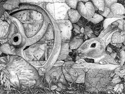 Thank you, Deb! I thoroughly working with you and everyone else. Also, I've corrected your scan as you suggested before I critique your final day's work.
 My first impression was that I like this. My second was that I like this a lot! :o) It lacks a little depth and modelling in places, but it is very well drawn.
Working left to right, Your rusty wheel is definitely rusty. It couldn't be mistaken for any other surface - well done. My only criticism is that it's quite heavily outlined, which damages its sense of reality. Try to use the differences in tonal value between elements (the wheel and wall in this case) to describe edges and not line, which is not a natural occurrence. The bricks are nicely underplayed with sufficient interest for close inspection but not vying for attention. In fact, I find them quite delightful as I inspect them closer, and you've nicely differentiated between the smoother bricks and grittier mortar. The only thing missing is a shadow cast by the wheel on the wall. That would have helped to tie the two together, reinforced the leaning angle of the wheel, and removed the need for outlining of the wheel. I like your solution to the insipid rock problem although I think you could have been bolder with the three-dimensional modelling. It has form but is a little too similar to the bricks in the values you've chosen for it. It appears to be a bit too reflective, which doesn't help me to read it as a stone or rock. You were brave to retain the complex Cow Parsley leaves! I would have chickened out and stuck a big leaf over them :o) Your negatively drawn grass works really well too - plenty of depth and an element of mystery built into it.
Moving right - the leaves above the rabbit have believable body and three-dimensional form. I could almost run my finger over them and feel each undulation, although the extreme right-hand leaves don't contain as much contrast as the others. You've lost depth there, and relied a little on outline again to define their edges. Cast shadows would have removed the need for that. Your background behind them is rich and dark so you could have broadened your range of values quite successfully. Never be afraid of really pushing some elements right back into the shade, which can be very deep because you've created intense darks as the absolute deepest shade. Don't forget you can always change your mind and use Blu-Tack to pull anything forward again.
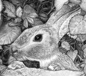 Your rabbit is lovely! it has a believable hairy texture that correctly varies between coarse on top and softer down the side of the head. When you draw your next rabbit, try to sharpen your drawing of the coarser hair - consider each mark before you make it and make every one count. The eye is superb - the intense black contrasts perfectly with the bright highlight. It draws my eye directly to the rabbit, as it should, and the shadow beneath the lower eyelid helps with that too. A touch of contact shadow beneath the paws would have helped to have emphasised them a bit - they look a little lost, especially the right-hand one - and, again, it would have removed the need for outline.
The stone block beneath the rabbit's paws has a lovely texture, and the detailed work in the leaves at its right-hand end are well-studied too. If you had introduced some darker values, or at least different values from the bricks, it would have more obviously angled rather than appearing to almost be in line with them, but it looks good as it is.
Element by element, this is excellent - it just needs the overall shading to be adjusted so you don't have so many of them based around the same values. You should be justifiably proud of this drawing. Good work, Deb!
Debra (Online - Intermediate course)
 Overall, I feel this is lacking a feeling of depth, but individual elements are well-drawn. Robbie the dog has character and presence with his mischievous grin, and he has a good three-dimensional feel about him. He looks hairy in a scruffy way that wouldn't have taken much more work to make it look more realistic. But he's solidly planted on the floor and you've correctly darkened his rear paw, as it's further inside the dark henhouse and in his own cast shadow.
The henhouse is well drawn with some attention given to small details. Unfortunately the values you've used for the ground are very similar, which flattens the overall depth in your drawing.
 Henrietta the hen has a good grumpy appearance although her eye, which has a bright light to attract attention to her, appears to be looking behind her - or possibly at the viewer, which is OK. Leaving a prominent highlight within her eye would have been preferable to just leaving her iris white. She is definitely feathery and has some semblance of form, but you could have been more bold with her shaping, leaving some areas highlighted and others pushed into the shade, especially beneath her chest.
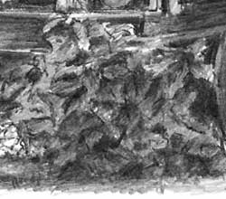 Your right-hand foliage is not defined but it does its job without being detailed. It adds a feeling for the environment without drawing much attention to itself, and there's nothing wrong with that. But you left-hand foliage appears to be a single mass. It lacks both depth and definition, which a foreground element requires. If you had begun with the deepest shade, made it intensely black, and then worked forwards while keeping your edges sharp, you would have kept control of it and created a lot more depth.
 Overall, I think you've done well and just need to slow down and think more about each element as you work. It's close to being really good but appears to be hurried in many places.
Update : 15.12.2013
 Apologies for the delay, Debra - I misplaced the image you sent me. The changes are not entirely what I was suggesting. The added shade does increase the depth but it's pushing the whole section backwards. This needed two things doing to it - increasing the intensity of the darks in selected areas, and sharpening the edges of the foreground foliage.
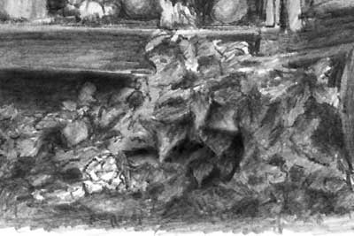 This is what I had in mind. I've just a quick go with one area and already the definition of the foreground leaves is making them stand forwards. The increased darkness of the background shade has allowed me to darken some leaves much more, so they appear to be emerging from that shade. I've also darkened the area below the bottom rail of the henhouse. Previously it was very similar in value to the rail but logically that area is underneath the henhouse floor and would be in deep shade.
As you shade each leaf, think about where it is. Will it have a shadow cast over it from leaf above? How far back in the shade is it? Will any part directly see the light and be highlighted? It all makes simple sense once you tackle it one leaf at a time. And, once you've established deep and dark shade, don't be afraid to push some leaves so far back that they almost disappear.
Scott (Hickory, NC - September)
"I finished the Bears from the workshop. Enjoyed drawing again since I've been working in watercolor this year."
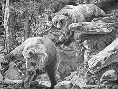 Having enjoyed your discursion into other realms, I'm happy to see you returning to graphite again :o)
 My first reaction (I pay a lot of attention to that) was this has many good points but overall it's lacking in depth. That said, this was not an easy assignment and, unless you're used to dealing with compositions such as this one, it's difficult to keep the overall appearance in your mind as you work on each element. Personally the first thing I do is decide where my focus is going to be - in this case it's the bears, and then everything else needs to less-sharp so it doesn't attract too much attention.
You've handled the overall composition very well - those right-hand rocks, for example, have dominance because of their sharpness and high contrast, and they echo the angles of the two bears, leading the eye back and forth between them.
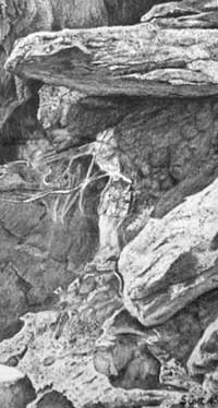 The textures you've created in those rocks as entirely believable! The area between those rocks and the left-hand bear is nicely judged, as I was explaining - they suggest rock-like texture without being over-detailed or too sharp. The removal of bright highlights has helped too. You've created good recession in that area, with an obvious change of plane between that vertical rock face and the sharply defined right-hand rocks and foreground.
 I really like the wooded left-hand area. The highlight running down the tree acts as a break to stop the eye wandering out of the drawing, leads the eye down to the bear, and it defines the tree's forward prominence. And the way the detailing of the bark diminishes with height prevents my eye from wanting to wander ever upwards. The same applies to the soft suggestion of foliage to the tree's right. What I feel doesn't work is the inclusion of sharp edges and bright highlights within the furthest trees. They vie for attention with the foreground, and the values used mimic those in the foreground too. If you had muted the values in that area, it would have served as a shady backdrop and, being less detailed, would have added interest without it ever becoming more than an area of secondary importance. Never a distraction but adding reality.
That background has resulted in a drawing with little recession and primary/secondary differentiation. In short, everything has received the same careful treatment resulting in every element being equal in importance to all others. That stratagem has produced a drawing with no obvious focus and little depth.
Don't worry! I personally believe this is a necessary stage of development. The clown on a highwire has first to be a master of his craft. He must understand everything in detail before he can begin to engineer, adapt and remove aspects of his performance, and push others into the shade so only the highlights he wants you to see remain. He creates an illusion by throwing attention on the main elements. In the same way, we artists have to learn to study and reproduce everything in detail. Only then can we begin to understand what can be omitted, what can be sharply define and what can be diffused and relegated to secondary background interest.
 In this case, your midground trees could have been slightly less sharp, and the background pushed into the shade, to create depth and a degree of mystery. That would have given you the option of using sharp edges and high contrasts elsewhere to force our focus on them. You've achieved that with the right-hand bear. His head is sharply defined and his body less sharp, throwing our attention onto the head. And the softer body allows the sharp foreground jutting rock to suggest depth. You've done that very successfully. You've made good use too of rich darks in the bear's head, which correctly dominate the slightly lighter darks within the rocks.
Both your Grizzly Bears possess character and believable textures. The left-hand one has a definite look of interest on his face, totally engrossed in his search. The more muted values in his head lose out to the darker values within his leg and beneath his raised right paw. That's good, because that paw is important to the simple story. And again, the softer drawing of the body pushes it into a secondary position and creates depth.
As an overall scene I find the background to be too distracting but, taken individually, every element works very well and I congratulate you on a job well done with what is a complex subject.
Liz (Toronto - September)
"I've been working on the image I started at the Toronto workshop this September. As usual my scanner is not doing a very good job with the graphite and, after seeing the first scan, I've have made a few darker areas to the tree (beside the vine, to make the tree rounder in form) and I have darkened Toby's belly. The grasses at the front, I have touched up a little and darkened them more."
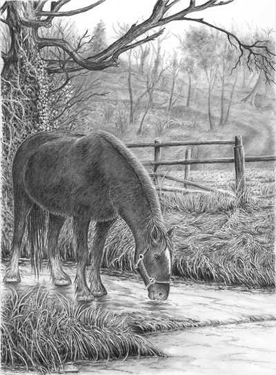 First, I admire your courage! Of all the compositions I have available, I think this poses the most potential problems - mainly because the background photo is pale and washed out, and that there are very few supporting photos for detail. That means you have to interpret to a large extent. On the plus side... you can't just copy the reference!
Viewing it overall, I noticed three things immediately. It has depth, clarity, and Toby (Tom is his real name) is not connected to the water. I'll return to that later, but I'm delighted with the end result.
The sharply defined foreground grasses work well to suggest depth, and the swirling nature of those on the far bank suggest the directional flow of the water. You've left the fence intact, which could have created two distinct midground and background areas, but you've solved that by giving us a clear horizon where the midground field drops away. That's sufficient to lead my eye through the fence and into the hillside beyond. It allows the eye to travel back into the scene that, being of a softer nature, doesn't vie with Tom for attention. It's a secondary visiting place that permits you to roam at leisure.
The recession you've achieved in the background works perfectly, as the does the suggestion of a curving path or embankment. I feel I'm being lead gently on the route you prescribed, further and further back into the scene. Then my eye encounters the tree, travels down it and back to Tom.
 Your sharp drawing of the foreground tree, and it's dark and solid values, pushes it forwards and the background back, creating a lot of depth. The vine, or ivy, is beautifully interpreted, as are the bare branches of the bush. Both are out of focus in the old, faded photo I used for the setting, so you've done extremely well with those. And your negative drawing skills are quite evident.
Using the same tonal structure for fence as you used for the three not only ties them together, it also reinforces the distance between them and the hillside. And you've maintained the same dark tones within the grasses too, which unifies the whole foreground area. The grass on the far bank is wonderful. I sense that the stream has risen with flood water and washed those stems flat. I can almost make out the way the water swirled among them - even if that wasn't your intention :o)
 The foreground grasses are really well drawn. They not only have the required clarity and sharpness, they also have order among the chaos. They aren't regimented but have a natural flow and, above all, they possess a sense of understanding. I've no doubt you became lost in that area as you worked so, with that direct mind to hand connection made, you drew what you knew, had experienced, and remembered - and as a result I too can understand it as a naturally occurring three-dimensional mass of grasses. That said, I think you could have introduced a measure of mystery by pushing some areas further back into the shade of others. Sometimes too much clarity is not a good thing.
The ripples and reflections in and on the water clearly state what it is and that it's wet and flowing. And Tom is obviously drinking from it as it flows around his mouth and nose. That connection works but I have a problem with Tom's hooves and their connection. He appears to be standing on a solid surface, as though it has iced over. First, I think you could have been a lot bolder with his reflection; used darker values and sharper edges, as you have beneath his right hoof. It's the rear connection that troubles me most. As the water is flowing, I think you'd expect to see some build up of it behind his hooves? Alternatively you could treat it as being slower water and introduce highlights of surface tension around the bottoms of his hooves - just a very subtle and thin ring with occasional brilliant white spots of highlight. If we were still together at Toronto, I could show you what I mean :o)
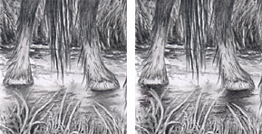 I've had a try... All I've done is darken the reflections, broadened them a bit to reflect the full width of his hooves and legs, and lightened the area between them to emphasise the reflections. That area will only reflect what it can "see" - the bottoms of his legs and the end of his tail - and not his body.
Tom himself possesses a solidity of form beneath his winter coat that I find very believable. And the contrasting smoothness of his head draws my attention directly to him. My only criticism is with his front forward leg. It is a little thin and, more importantly, it appears to be a prop that terminates beneath his body. It should extend up to his shoulder. If I look very carefully, I can see that it does, but you need to make it more obvious - probably by throwing a shadow behind it, or by darkening the shade beneath his belly, which would achieve the same end. And if you darken all his other shaded area at the same time, to increase the overall contrast, I think he'll possess a lot more presence. At present the darker tree is tending to draw my attention away from him.
However, don't let all that minimise the extent of your achievement. This is an excellent drawing and you've worked hard, with great understanding. It shows in the result and you've done a great job. You should be very pleased indeed with this!
Mark (online - Beginners)
"I got the drawing finished at last! I really enjoyed the course and I have certainly learned a lot from it. I finished drawing the hen fairly quickly, but found Robbie more difficult - I originally had him looking more detailed, but I thought he looked too light in colour, so I darkened him down a bit more.
I really enjoyed drawing the leaves and foliage but have somewhat lost the fallen eggs in them, and I didn't quite manage to get the grass looking the way I wanted - it looks more like individual strands rather then clumps of grass. That's something I need more practise with, but on the whole I'm pleased enough with it. Thanks again for everything."
I really enjoyed drawing the leaves and foliage but have somewhat lost the fallen eggs in them, and I didn't quite manage to get the grass looking the way I wanted - it looks more like individual strands rather then clumps of grass. That's something I need more practise with, but on the whole I'm pleased enough with it. Thanks again for everything."
 My first impression, which I pay a lot of attention to, is that this has a remarkable clarity. Everything is clean and sharply defined. At this stage, I think that's a wonderful achievement. Later, when you've had more experience, I think you'll want to scruff it up a bit! My concern is that it is too illustrative - every element, and all of its parts, is clearly displayed. However, everything is Nature is not that clear, and realism often arises from allowing some mystery to exist.
You've taken my own approach to this in making the top of the interior of the henhouse very dark and then lightened it as you descended. Your strategy has created depth in what is essentially s composition that contains little. It also creates a degree of mystery, and that's what is missing from the rest of the drawing.
Robbie the dog is looking wonderful - alert and happy with a solid sense of three-dimensionality and texture. His eye has a remarkable and brilliant highlight that attracts the eye to him and sends the viewer to Henrietta, completing the connection between the two principal players. And I'm pleased to see you "living" the scene as you drew - without that involvement you would almost certainly have made his back foot tonally match the front feet. But it is, as you were aware, inside the dark henhouse. That again adds depth, as well as increasing the sense of reality.
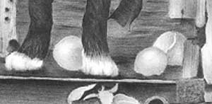 The eggs, an important part of the story, are clearly visible, partly as a result of your dark henhouse interior that increases their visibility by contrasting with, and emphasising, their highlights. They look very smooth too. That's where using the harder grades works well, because they can produce the same mid-tone range of values as the softer grades but with a much smoother and finer finish.
 The wood of the henhouse is very well judged tonally. It has a solid feel about it and isn't so detailed that it becomes a distraction, although I would have liked to have seen a stronger suggestion of grain. It's perhaps a little too smooth to realistically suggest old weathered wood. But tonally it allows the hen to stand forward of it, which was one of the major problem areas in this composition.
Henrietta the hen has a very believable covering of feathers and excellent three-dimensional form. The drawing of her head is wonderfully sharp so it stands out from the wood and increases her presence, which is important as she's a major player in the story. Also, I really admire the way you've highlighted her raised foot. It's the only implied movement in the composition, and that simple element adds tension - and raises questions about what might happen next.
 Your foliage is lovely - sharply defined with good form and detail. In the left-hand half, my only observation is that the midground is missing. You've created excellent mysterious suggestions of foliage beneath the henhouse but then immediately brought the foreground foliage into full sunlight. A midground bridge between the two would have suggested a lot more depth. The foliage in the right-hand half looks more realistic to me, because you've allowed the topmost foliage to create shade lower down. That has created the midground values that connect it to the darker foliage beneath the henhouse. What is most pleasing about both halves is your use of very sharp definition. A lack of sharp edges would vie with the expectations of the viewer - foreground elements require clarity, and you've provided them. And you're far from "losing the eggs"! I think they're nicely hidden - something to find on closer observation.
I like your treatment of the rusty wheel. It has believable texture, although rust is non-reflective and I think the edges of the rims are too bright. This is especially true of the left-hand side, closets to the henhouse. Allowing that wheel to gradually merge into the shade would have been perfectly acceptable and realistic. Don't feel you have to clearly display every edge.
 Your foreground is very interesting but you're correct in thinking it looks like a collection of individual leaves. Treat it like the weeds, and you have the basic strategy established in the grass overlapping the base of the wheel. Outline the foreground blades to isolate them for final drawing, then create depth behind them by establishing portions of stems, leaf-like shapes and even unrecognisable ones. Then variously push those secondary elements back intro the shade - some so far back that you can barely see them. Finally, spend time detailing the foreground leaves. It's those that tell they eye to accept everything behind them as also being grass. Next time you're outside, have a very close look at a clump of grass. You'll quickly realise that you can easily understand the foreground blades, you can make some sense of the layer immediately behind, but beyond that you simply accept all the odd shapes as belonging to it. Notice too, how dark the shade quickly becomes in there, and that the gaps and holes can often be almost black. It's not your grass that's wrong, it's simply that you didn't have the mental store of visual knowledge to recreate what you set out to depict.
Overall, I think you should be exceptionally pleased with this!
Abi (online - Beginners)
"OK, I am calling it … Done !!! a lot of "work" and a lot of fun! (I need to start jotting my hours!)."
 And every hour was worthwhile, Abi!
I'll start at the back and work forwards. Personally, I would have made the inside of the henhouse darker, especially towards the top, because it would have added depth to this essentially shallow composition. However, it has minimal detail and the reflected light on Robbie's back separates him from the background well.
The wood of the henhouse looks old and rustic without attracting too much attention - just enough detail to reward a closer look but not too much. I really like the diffused edge to the angled shadow beneath the projecting nestbox that gently leads the eye to the hen's head. And you've used the wood well to make the hen to stand out from of it.
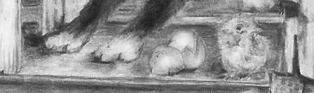
 Your reworked and repositioned Robbie the dog is looking good. He has plenty of three-dimensional form and texture, and the glint in his eye sets the scene really well. Pure mischief! I think the broken egg could have been both lighter and smoother - the use of H grades would have given a more realistic sheen to the shell. And I notice the second egg has hatched!!!! That's a lovely touch and turns the story on its head. Maybe Robbie is being protective? Well, the hurrying Henrietta will soon find out.
There is a "problem" - Robbie's back feet are on the higher floor and his front feet are on the lower floor. That's perfectly acceptable, but there is a conundrum. At the left-hand end, your lower floor slopes up to just below the upper one. However, at the right-hand end the lower floor is flat - it has to be as it has a chick standing on it and an egg that hasn't rolled off. But you've got away with it! This is, of course, your world and you make the rules so, because you haven't attempted to define the back of the lower floor at any point, each end makes sense in its own way.
 Henrietta the hen could have had more pronounced three-dimensional rendering but she has believable form and feathering. A darker eye with a carefully drawn, small and intensely white highlight would have drawn attention to her more readily. She looks appropriately displeased but I think her eye is a little vague for what is a major part of the simple story.
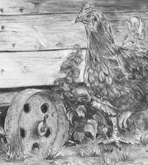 Another vital element is her left raised foot. Really sharp drawing combined with bold highlighting would bring it immediately to our attention. Although we don't know if she's paused or is running, it's the only movement in the composition and adds a degree of tension to the story.
The rusty wheel is well studied and your drawing suggests age, wear and imperfections. And your ellipses are almost perfectly formed. The foreground has just the right balance of detail without is grabbing attention. The broken ground and small clumps of grass are nicely judged, both to ground the hen, and lead in the eye without attracting the viewer's eye away from the two main players. A few well-chosen areas of intense black within the foliage, especially at the left-hand side would have created more depth, but it possesses a good sense of three-dimensional depth as it is. Your eggs have soft edges, which harms their sense of reality, but not greatly.
Overall, I think you should be delighted with this - I know I am!
Workshops UK
Tutorials
by Mike Sibley