Workshop Plus
WORKSHOPS 2007
US and UK workshop continuations
Gayle
 It was good to see you continuing with this instead of moving on to the main composition of the workshop, as you were obviously enjoying the project. The result is excellent in many respects. Tackling one small area at a time quite clearly aided your understanding of it as a three-dimensional and textured surface. I could see from the outset that you were already recreating the dog and not the photo - and didn't fall into my dastardly trap of just 'filling' in' the spots.
I appreciate that this drawing is relatively small, but I would have liked to have seen a little more subtlety of line used and more shaping. Switching to a harder grade, such as 2H or 4H, would have assisted you and given a thinner, less weighty line too.
 You've used a relatively dark tone of line throughout this piece, which imparts a rather flat appearance. By reducing the line elements within the most brightly lit areas to mere hints, and adding a light layer of tone, say 2H, over the more shaded parts, you would have emphasised the actual form and given this dog more life. That said, your drawing contains bags of character that override the lack of form.
Debbi
You've certainly grasped the principles involved. Indenting is always fraught with potential problems - you only have one chance to get it right - but here you've succeeded very well.
 You have kept the indenting to the minimum and used it where it counts. As a result the indented lines blend well with the hand-drawn surrounding lines and appear to be completely natural. Indenting gives a unique, crisp line that can look unnatural if the technique is overused or employed in softer areas.
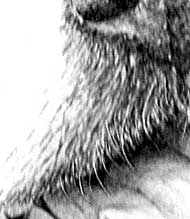 You've handled the other aspects of this exercise very well too.
Here below the nose we used negative drawing to create the short white hairs growing from the dark skin. The challenge is to gradually switch the negative drawing to positive as we move to the left. Here we must show the white hairs by drawing not the hairs themselves but their cast shadows. I have to say that you achieved a very good result with this transition.
Update : 6.10.2007
Debbi, apologies - I lost some of the detailing while I was cleaning this image. It's going well. Good use of lighter detailing below the left eye and down the cheek. It's very tempting when drawing a dog with strong blacks to continue to use hard tones. Here your introduction of lighter tones will serve you well when you add in a tone layer to give the overall shaping. Not everything needs to be instantly readable - often a mere hint is all that is required to add that touch of realism.
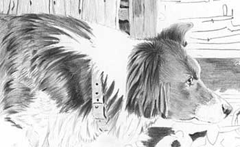
I like the way you're establishing the blacks of the right ear before proceeding. This is always a good idea, as you now have both the lightest and darkest tones fixed before you proceed. It makes finding the correct intermediate tones so much easier.
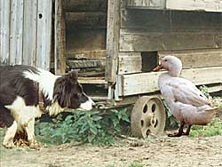
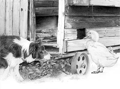
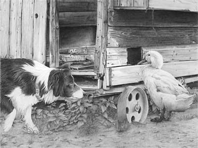
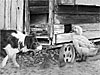
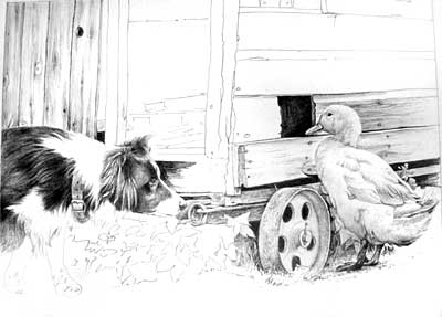 Personally, I would have completed the interior of the shed first to ensure that it didn't fight for domination with the tones used for the Collie. But I see you're establishing the intended tones for the interior around the Collie first, which will probably work out OK For you.
The Duck looks good! In this case you have drawn in the same order as I would. By establishing the dark hole and the intermediate tones of the wood first, you've allowed yourself the freedom to engineer the tones of duck as you worked on it - to make it stand out or blend in wherever you felt either worked to the best advantage. The Collie is looking sleek and black - a shiny coat giving enough clues to its make-up without it appearing to be an assembly of parts. It holds together well.
Dot
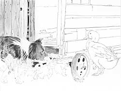
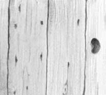 First, you need to think about what you're actually drawing. There is no reason why the gaps between the boards should be straight and regular - indeed they appear more rustic and interesting by being misshapen - but drawing a single line just won't do the job. You're implying that each board exactly fits the one next to it. In reality the gap will be wider in parts and narrow in others, as the two board are independently warped.
The woodgrain is good - established but minimal. This is a secondary element of the drawing, a bit player, so dominance needs to be avoided.
 You've made a good start on the dog. By first defining the division between black and white hair you've allowed yourself to concentrate on each individually. I appreciate that this is an area in progress, but I feel you've drawn a rather shallow representation of the hair rather than studying its actual appearance. Despite this, your approach works quite well, as it emphasises the working nature of this Collie. But it's not an approach that will serve you well in most other situations.
If you had decided before you began where your darkest and lightest tones lay, I think you would have drawn the chicken shed's door darker. As it is, it doesn't serve to push the dog forwards by isolating and emphasising the white of its neck. Also you have been tempted to draw the dog's head (nice eye!) and ear - but now you've limited the tones that you can use for the dark interior of the shed. If you'd first established the shed's interior (it contains most of the darkest tones in the scene) and left the dog's head as an isolated white shape, you could then have drawn the head with the full knowledge of the tones that surrounded it. It's much easier to engineer the prominence of the head this way than it is to engineer the background to the same effect.
6.10.2007
Well, I've tried to take on board Mike's comments and although I haven't done anything more with the dog, I have worked on the chicken shed.
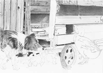 Dot, It's looking good but it could be a lot darker yet! The darker you make the interior, the more mysterious it becomes and less of a distraction. Also it would give real depth to the drawing and offset the white of the Collie so that it really shines.
I notice you stopped short of the ear. Do you see what I meant earlier? By drawing the ear first you've given yourself a problem. You've restricted the tones you can use inside the shed. But if you'd drawn the shed first (as dark as you wish) then you have much greater control when it comes to drawing the ear. You can engineer the tones used all around the edge of the ear to make it stand proud of the background, or make it blend in, as you wish.
10.10.2007
I'm finding the drawing is taking over like a really good book - can't put it down! I've been working on making the chicken shed darker and have taken some of the collie back to try and recreate my dark tones. I can now see the chicken shed coming to life and am really enjoying this challenge. Dot
 I can see you've really enjoyed yourself with the shed interior! But try not to be too analytical - not everything in real life is instantly understandable, so leaving enigmatic shapes and surfaces in deep shade adds life and depth to a drawing.
Do you now see what I meant about drawing the darks of the shed before the Collie? Now that you have those darks established, your Collie is looking quite pale. That was almost bound to happen, because without those darks to refer to you could only rely on guesswork.
I must say your shed is looking beautifully dilapidated! And I like the way you've handled the shadows below the nest box above the duck.
Rob
 I was happy to see your darks increasing in density, Rob. Never be afraid to go dark - really dark. The denser your blacks the whiter your white's will appear to be - and you can always backtrack with Blu-Tack if you wish to lighten them later.
If you're not certain where or how to establish your darkest tones first, try drawing the nostrils or pupils before you begin elsewhere. Having them available to refer to will greatly help you to work out all the intermediate tones required - to the point where they almost form themselves automatically. But without prior knowledge of you darkest and lightest tones (the nostrils and white of your paper) you'll just be guessing. You can of course adjust your tones later but, in my experience, nothing gives a sharper, crisper, feeling of realism than getting it right the first time.
The lighter tones used in the head and neck work really well - just sufficiently visible to aid understanding without them being intrusive. Nice work!
Gina
I'm still working to find the right tone for each object/animal. Now I'm working on the bird.
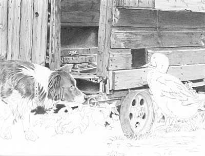
 I think you're succeeding! And I can see you are putting a lot of thought into this - letting each piece live in your mind as you work instead of relying only on the source photograph. The Collie's raised paw is a great improvement over the rather odd stance in the photo.
As for "trying to find the right tones" I think you're working this intuitively - drawing until understanding ceases then moving on to an area you do understand. By the time your drawing extends back to an area where you stopped, the problem will no longer exist. Now surrounded by well-considered tones, the answer will become obvious.
The foliage is not overworked. Nor is it intrusive. And the Collie's coat possesses just the right texture and has a lovely sheen to it. The white hair, too, blends naturally into the black. You've emphasised the eye perfectly - and that hint of a "smile" in the corner of the Collie's mouth removes any menace. Keep going - this is an excellent piece of work.
30.11.2007
Hey Mike, I finally finished it. Gina
 Excellent! There is little more I can say. The Collie's face is alive, and I can see flying feathers just around the corner. The delicate work to the back of the Collie's neck works wonderfully, as it does too on the chest.
The weeds and nettles could have been a little more vague - this is a case of "less is more", because if you make the leaves too defined and separated they lose their sense of reality. The ground, however, works perfectly, simply because it is suggested rather than defined.
The duck has a very good feel of solid three-dimensional form, and it's feet are firmly planted on the ground. The timber has just enough discernible grain to describe its texture while not being intrusive. And the shadow beneath the exterior nest box above the duck really does make it visually jut out from the shed - a tricky area that I think will be problematic for some artists.
This is a lovely drawing that possesses an overall unity, and tells its story simply and effectively. Well done!
Julian
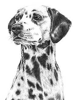
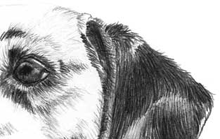
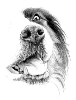
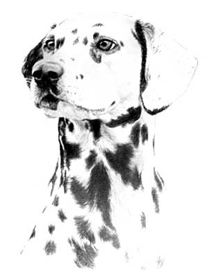
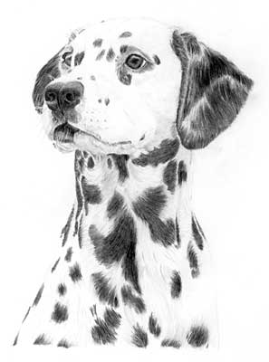
Hi Mike - My finished drawing of the Dalmatian from the workshop which I think went well....
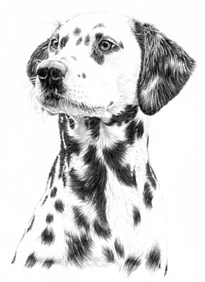 ...So do I! I can see you've put a lot of thought and work into this. If I have any criticism at all it's simply that your detail is a little too obvious. By this I mean you are concentrating so hard on establishing the detail that you may be overlooking the broader picture.
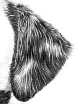 For example, I like the way you've carefully considered the problem of separating the bottom jaw from the neck. The highlighted line works well but is perhaps slightly too obvious. Likewise the hair on the ears - well-studied and drawn but a little coarser than in reality. You could solve that by simply adding a light overall layer of 2H or similar - keep applying the tone until the contrasts are just flattened enough to give the impression of a solid, smooth ear with subtle highlights and white and grey markings.
You succeeded really well with the nose. That was always going to be a problem given the raised angle of the head.
An excellent attempt! Everything is in its place and well rendered but a little too emphasised to achieve a true feeling of reality. Sometimes less is more.
WEEKEND WORKSHOP June 2007
The major project over the three days featured my own dog, a Parson Russell Terrier, Buster. The composition itself included a variety of textures from leaves to bark and hair, and was principally designed to introduce the attendees to Negative Drawing.
Jim
Mike - At last some progress with Buster but I am struggling with the hair!
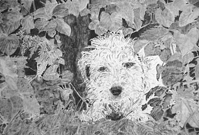 You've done a good job with the leaves, Jim, and the result is excellent in many respects. I suspect you found them easier to handle because you could tackle each one individually, and this clearly aided your understanding of them. The grass seems to have presented a few problems. The drawing of grass is essentially the same as drawing hair - seeking out the main visual elements, emphasising them so the eye understands "this is grass", or hair, then being less fussy with the surroundings and backgrounds.
Both areas suffer from the same problems: there are no "status" elements (the ones that tell us what the area is composed of) and no depth. The grass, in particular, would greatly benefit from the inclusion of some really dark shadows - the sort of shadowy depths where we cannot really understand what's going on but the surroundings tell us it must be grass.
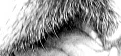
I like Buster's eyes and nose (again, you were able to isolate these and understand what you were drawing). I can also see that you have a good understanding of the negative drawing required for Buster's hair - the main shadows are established - but then I think you've allowed the complexity to overwhelm you. That's very understandable if you look at Buster's head in its entirety, but if you treat every little area as a drawing in its own right, it quickly becomes much more manageable.
As with the grass, the technique I'd use here is to first determine (and outline) the main or status hairs. The hairs that read well in this case are those falling forwards above his eyes, and the hairs of his top and bottom jaws. They are quite distinct. Taking the brow hairs: draw those first then push them forward by drawing less-defined hairs behind them, giving just a suggestion of hairs would be enough. Then decide how those areas would be naturally lit and add tone to suit. That will describe the three-dimensional shape of Buster's head, and the emphasised forward-falling hairs will tell the viewer that everything is to be read as hair. And in Buster's case you can use his colouring to advantage - particularly to isolate the hairs down the left side of his muzzle. Adding the light tan colouring behind those hairs will emphasise their sharp edges and push them forward to give a really good description of the three-dimensional shape of his face.
Rob
Buster was my first drawing for many years and I am very proud of him.
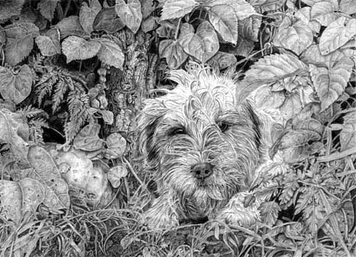
There's nothing I'd want to see drawn differently. Every leaf, every element has been carefully studied so you drew with understanding - which is a million miles away from "copying". Nor have you fallen into the "detail" trap of concentrating on it so heavily that the overall image lacks unity. Here, everything is as it should be and all combine to give a sense of reality.
You've made good use of those enigmatic shapes deep in the shadows that impart depth to the piece and increase its reality by making the brain work. Everything in Nature is not obvious and those half-glimpsed, half-understood elements play their part well.
If I have any criticism at all, it's simply that I think you've overworked Buster. As Buster is my own dog I know him very well - and this is Buster! But he just fails to be the dominant element. I think this is because you've attempted to draw every lock of hair with great accuracy, thus sacrificing the "half-understood" advantage of only drawing the major features with clarity. However, this will come with practise. I firmly believe that the "Detail is King" stage is an absolute necessity. An 'apprenticeship' where techniques and clarity reign. It's only on your eventual emergence from that stage that you begin to appreciate and practise the real art of drawing - recognising and emphasising the important, and playing down secondary elements - which can convey a true reality and add depth to your studies.
Buster and I are extremely pleased with this drawing. Well done!
Workshops UK
Tutorials
by Mike Sibley