Workshop Plus
WORKSHOPS 2021
UK, USA and Canadian Workshops and Online Course continuations
Helen (STUDIO, September - Foundation)
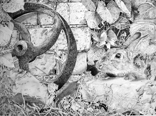
The Rabbit drawing has now been finalised with some strong shadows. I am hesitant about over-working areas, so will leave it as is, and I have learnt a tremendous amount through creating it. I really enjoyed this challenge, made so much more manageable by watching your fabulous videos...
 I'm glad you enjoyed it, Helen - it shows in the result. I've done the best I can with restoring your photo to what, I hope, looks like your original.
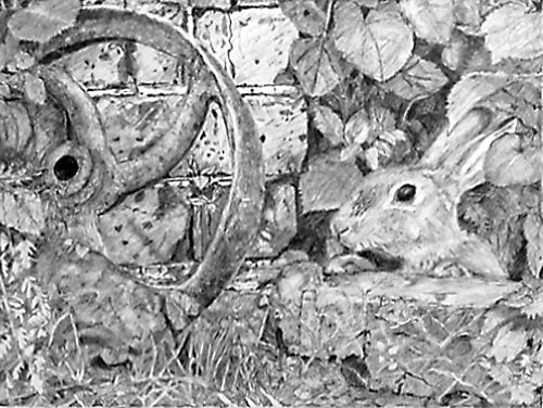
My first thought is that it lacks a little depth. The cast iron wheel now has weight and solidity, after you worked to darken it; and the extreme background within the right-hand foliage has good depth. But there appears to be a lot of mid-values missing. There's quite a jump from black to mid-grey, as I'll attempt to explain.
From left to right: Your rusty wheel has good shaping and is definitely rusty. It's definitely benefitted from the addition of the cast shadow, which visually connects it to the wall.
The bricks are underplayed as befits a secondary element, although I would have liked to have seem a little more strength of tone in them. They are rather washed out compared to wheel. Of course, they could be yellow bricks, but if you had red bricks in mind, they are definitely too light. Again, I'll return to this soon.
You decided to keep that awkward midground rock and, apart from (I know - here it comes again) it being too pale, It's got good structure and surface detailing. Its underside is receiving little light. If you consider the strength of the shade in the wheel, I think the rock, even if it's physically lighter in value, would have similar values. However, because your darkest values in the shade were light, they've forced you to use even lighter values in the light areas. And that in turn has severely restricted any three-dimensional modelling you might wanted to apply. The same applies to the bricks.
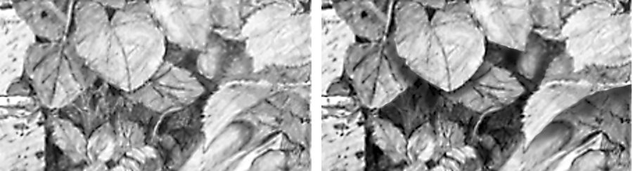
Moving across to the right: the leaves above the rabbit have excellent shapes and detailing but, again, that's rather wasted because the mid values are absent.
The background behind them is dense and dark, which gives a lot of depth to your drawing, but everything then springs forward into the light. Below, I just darkened light greys to mid-greys, and then toned down the white content - because leaves don't contain white.
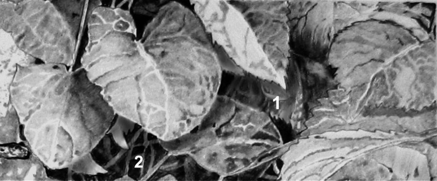
Apply the same thinking to the right-hand end, and I think you could create a lot more depth and clarity. I only worked on two areas.
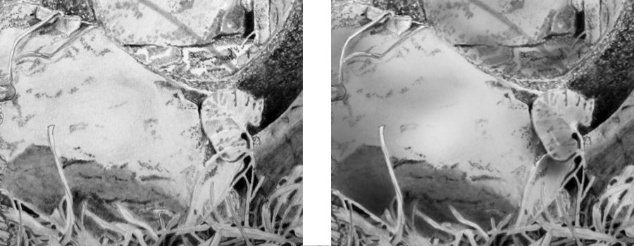
AREA 1: First, you've used outline separate the foreground leaf from its background. Outline doesn't ever occur in Nature. But that leaf will cast a shadow and we can use that to display its edge. You'll notice there are patches of white, which cannot naturally happen in shade. Then I darkened some of the background elements to push them back into the shade, creating more depth.
AREA 2: Much the same. I've darkened your existing cast shadow, and then looked at that area logically. That little white leaf behind the big foreground leaf cannot exist like that. It will undoubtedly be in the big leaf's shade. I pushed that back into the shade, and then, again, variously darkened the background stems to push those even further back. And I removed the white, because it cannot naturally exist there.
Never be afraid of really pushing some elements right back into the shade. It creates a sense of mystery that is entirely natural. Take a look into a mass of foliage and you'll quickly realise that you can understand the foreground layer, maybe the layer behind that too, but any deeper and you're just guessing. That lack of understanding is what conveys a sense of realism to the viewers of your drawing.
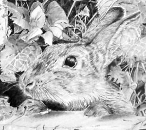
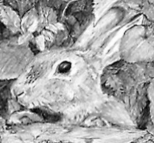
 Moving down: your rabbit is alert and lively! However, it just fails to be the obvious focal point of your drawing.
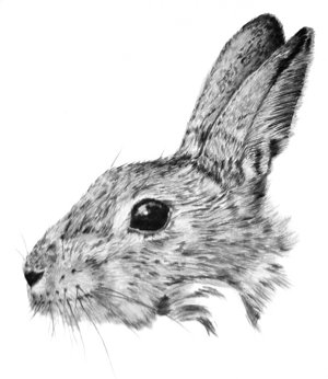
That said, your practice piece is superb! For an artist not used to drawing hairy critters, this has a variety of textures, good three-dimensional form, and bags of character and reality.
Moving down: your rabbit is alert and lively! However, it just fails to be the obvious focal point of your drawing.
That said, your practice piece is superb! For an artist not used to drawing hairy critters, this has a variety of textures, good three-dimensional form, and bags of character and reality.Likewise, your final rabbit has a good hairy texture that suggests coarseness in places and a softness in others. Contact shadows beneath the paws would have more firmly placed them in contact with the stone and increase their presence. A degree of shading within the ear would have created depth that is currently missing. And the eye is super! That bright highlight grabs my attention. Your use of lighter values around the eye helps to make that happen too.
 Overall, I think this just needs the balance restoring with darker values introduced into the right-hand side to counter-balance the rusty wheel. And a few mid-values throughout wouldn't do any harm either :o)
 For a first try, and especially with a fairly complex composition, you've produced a very creditable result!
Bridget (STUDIO, October - Foundation)
A rather belated thank you for a really enjoyable weekend on the foundation course. It inspired me and I learned a lot. Previous Christmases I have painted a small number of individual Christmas cards for family. This year I'm going to try my hand at pencil drawings.
 Inspired and you enjoyed it... I can't ask for more :o) If you need any help with your drawings, I'm only a short hike away, and the studio's always open.
There's good work in this and the various elements meld together very well. My main thought is that it could have even more depth and three-dimensionality. When you look at your drawing reduced down to this sizer, it becomes immediately apparent that the boss of the wheel takes my eye first and then rabbit's eye. So, it needs a degree of balancing.
Beginning at the left, the rusty cast iron wheel has really good three-dimensional shaping, although I think it's a little too smooth look really rusty. That said, I fear your image is too small for me too see clearly, and I'm going to struggle to extract any parts to focus on in this critique. So, with that in mind...
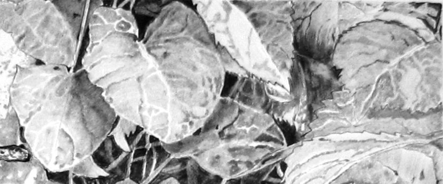
The bricks are solid and not over-detailed. That's good, because they are of secondary importance and shouldn't seek attention. The wheel definitely stands away from it, but it would have connected even better if you had created a cast shadow just under its top rim - where it's actually making contact with the wall. That admittedly-awkward rock is underplayed, but it has texture and form. The foliage in front of it hasn't really succeeded too well. I think that's due to it not casting shade on anything behind it, but I'll return to that as we move across to the right. These leaves above the rabbit have excellent shapes and detailing; and I feel you were seeing them three-dimensionally - as being real leaves. But, this area has a similar problem to the foliage at the left.
The background behind the leaves is neither sufficiently dense nor dark. The black holes between the leraves represent the extreme background. They tell the viewer "this is a far back as you can see", so everything else is in front of it. When you use this "black hole" technique, try to have a least one hole in each area. The viewer needs it as reference, in order to understand the surrounding depth.
The main problem is that your blacks are really dark greys. All I've done here is to slightly boost the darks overall, and then darkened the holes until they turned black. Then, to make sense of everything around them, I darkened some leaves and stems so they receded into the deep shade. I also removed any white or light patches that simply cannot exist in a shady place. And I introduced a couple of cast shadows that emphasise the edges of the leaves that cast them.
Don't be timid; really push some elements right back into the shade to create a lot more depth. The next time you're passing a hedge or a big clump of grass, take a good look. You'll see that you quickly lose any real understanding of what you can see. You'll understand the foreground layer or two, but deeper layers will just be bits of leaf and twig that you assume are parts of the same plant. That lack of understanding is entirely natural and what you should be aiming to reproduce in your drawings.
 I think you might have let the rabbit overwhelm you a little? That said, what I managed to extract from your image might not be doing your drawing the justice it deserves. But, looking at what I can see, the rabbit has some three-dimensional shaping; a nice touch of texture on its nose, and a lovely bright eye. But it lacks any real sense of it being covered in hair. However, I'm probably expecting too much for a first attempt. The drawing as a whole is very commendable. While it doesn't contain any techniques we didn't cover in the workshop, it was deliberately intended to stretch you. With that in mind, I think you should be proud of the result.
Workshops UK
Tutorials
by Mike Sibley