Workshop Plus
WORKSHOPS 2017
UK, USA and Canadian Workshops and Online Course continuations
Mark (Studio workshop, UK - October)
"The drawing has turned out better than I anticipated. I have learnt from doing it as well - start top left, using a sheet of paper as a hand rest to reduce smudging, practicing difficult areas on a separate sheet of paper, etc. I have also been referring to your book. I hope to attend another of your courses in the future. Although I have much to learn, and many skills to develop, your teaching has transformed my drawing ability which has given me much enjoyment."
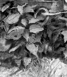
 It's a super, high-contrast drawing that works very well, and I'm happy if I assisted with that. It does have a couple aspects that could be improved but overall it's a lovely drawing.
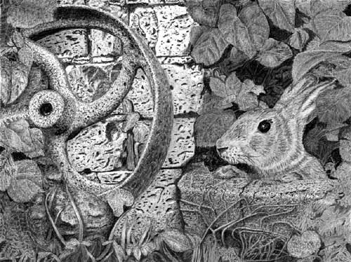
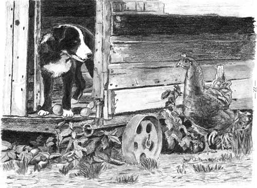
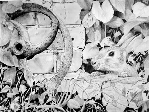
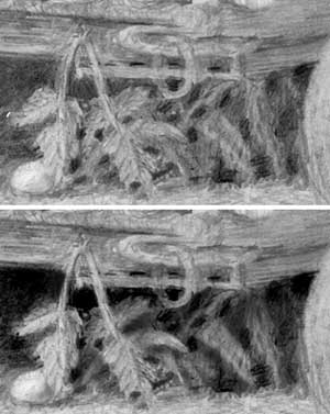
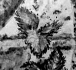
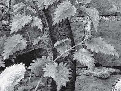
I'll begin top left and circle around. The initial darks in the old wheel fixed your tonal range and you chose very dark values, which gave you a very wide palette to work with. That in turn increases the three-dimensionality. However, it's the three-dimensionality that could be improved upon most, but I'll chip away at that as I work my way through it. For example, although all the left-hand leaves are individually well drawn - they have solidity and three-dimensional form - they are all very much the same value. That resulted in a loss of depth, and separation. You have one leaf casting its shadow on a brick, but none of the others cast any shadows. Yet, cast shadows would have defined the edge of the upper leaf and pushed it forwards. Crisp and sharp edges matter too and, again, cast shadows would have emphasised them. Remember: soft edges merge adjacent elements; sharp edges separate them.
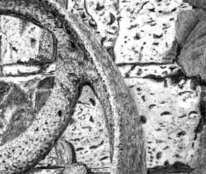 The old wheel is definitely pitted and rusty. It has good three-dimensional form, and I really like the way you've sharply pitted the edges of the rim. That alone sends the "this is rusty metal" message. The outer face is not as rusty as the spokes and that's as it should be. It was a working surface that we can expect to be smoother.
The bricks behind are nicely judged in value but, in my opinion, they are over-detailed and too contrasty. They grab attention too readily. They're secondary elements that should provide a suitable and sufficiently understated backdrop. Allowing the light to catch the bottom of all the holes was an excellent decision - even though there are a zillion too many of them! I think a smoother surface with a few token holes and depressions would have worked better - sending the same "brick" message but not causing a distraction.
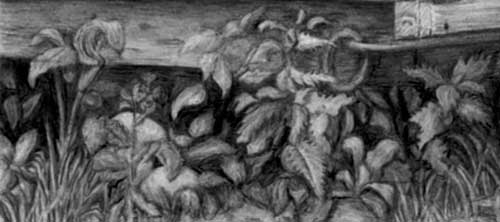
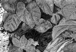 The right-hand foliage is as well-detailed as the left but it also has the same problems. There isn't much information supplied about their spatial relationships to each other. That's due to a lack of shadows, and that they are all similar in value. There's also quite a big jump between foreground and background. If you push a couple of leaves back into the midground you'll create more depth. Also, the depth could be increased further by increasing, in size and number, the areas of flat black. The black holes are essential for depth - they say "this is a far back as you can see". Be aware that if you make them too big we expect to see something in there, but that's easily fixed with a touch of an edge of Blu-Tack to create the sense of a twig or two.
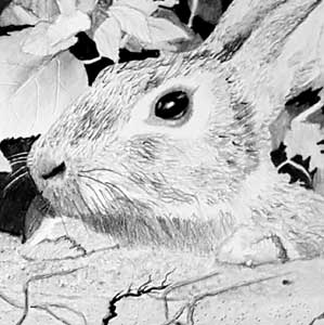
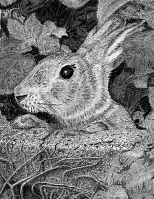 Your rabbit is simply delightful! Before I begin drawing an animal I imagine the feel of stroking it and pushing my fingers through its hair. The textures you've created are almost what I would expect to experience, and exactly in some areas, but there isn't much variation. I think this rabbit is soft to the touch in places, such as the cheek, and harsher elsewhere. I'm being picky - I know - but you could have included the various different textures. It has coarse hair on the top of the muzzle, softer cheeks, and short smooth hair on its ears. You don't have to draw it that way but I think it increases the sense of reality. The body hair is very well interpreted - you've banished those wiry guard hairs that would have attracted far too much attention, and instead used that texture for the fringe around the neck, where it achieves the most benefit.
But above all else, your rabbit has a wonderful dark and glossy eye. The strong black values and bright highlight draw our attention to it immediately, making the rabbit the obvious focus of the drawing. I notice you've also altered the rabbits feet so they appear to be different... possibly you noticed that I cloned one to create the other absent one in the reference. Overall, your rabbit is simply alive and full of character.
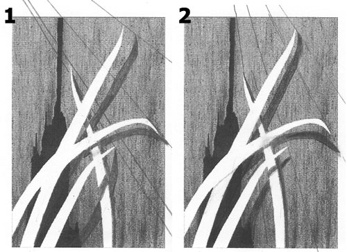
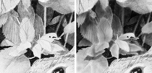
 The foreground is not, I think, the best area in terms of reality. The bland rock has almost disappeared, which was a good decision. You had a really good try with the grass and it almost succeeds. In fact, to a large extent it does succeed, but it suffers from the same lack of depth as the foliage above the rabbit. There are insufficient dark holes, and your grass is either foreground or midground, which loses depth. As I mentioned earlier, the black holes set the furthest plane, then everything else should step back from the foreground blades into the deep shade. Don't forget to use cast shadows either. They're wonderful devices for creating depth. I'll have a go to show you what sharp edges, cast shadows, and varied values can create - not with the foreground but the foliage above the rabbit:
However, despite my negative comments, this is a lovely drawing that has a lot to be admired in it. Of course, this composition was intended to stretch you and move your out of your comfort zone, even though it contains nothing that we didn't cover during the workshop. I think you should be extremely pleased with the result.
Elizabeth (online - Intermediate)
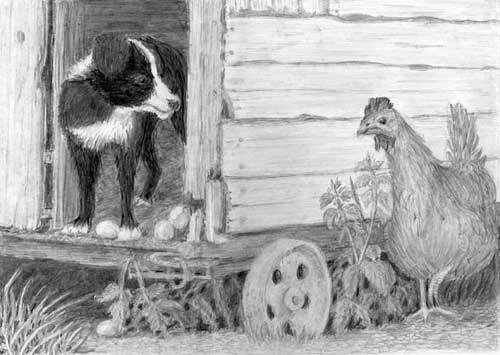
Thank you again for a wonderful class. I finally completed "The Henhouse Raider" and it was an excellent exercise in putting things together.
 I'm glad you found it useful. It includes much of what we covered and nothing that we didn't. Not that that's putting any pressure on you! :o)
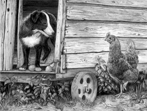
It's a very commendable drawing. The henhouse is particularly well drawn with wood textures that describe the old weathered surfaces very well without it fighting the primary elements for attention. It's tonally very well judged and has a heavy and solid feel about it. You've also used it well to make the hen stand forward, but I'll return to that. That's something many artists on the intermediate course have struggled with.
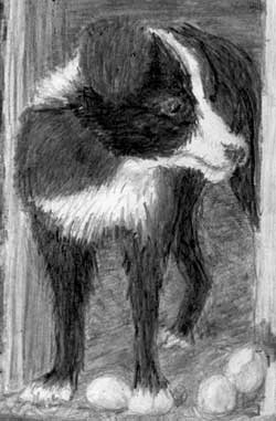
Robbie is looking splendid - very mischievous and wearing a big grin. He has excellent three-dimensionality, although little in the way of hair texture. The strong darks you've used really give him lots of presence and, despite the pleasingly dark values inside the henhouse (which give a lot depth), he succeeds in dominating them. You've even correctly darkened his rear paw, which is inside the dark interior, and probably in Robbie's own shadow too. My only reservation - which encompasses the entire drawing - is that your relatively course paper has resulted in darks peppered with holes. Those holes both dilute the intensity of your darks and damage the sense of realism. You've also relied on outline in some places (foreground foliage and the ends of the wood) and I think that occurred in an attempt to combat the soft edges your paper is dictating.
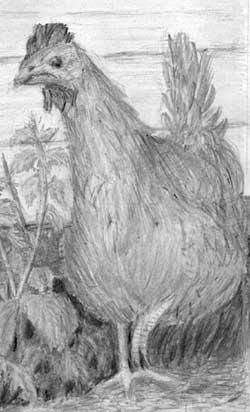
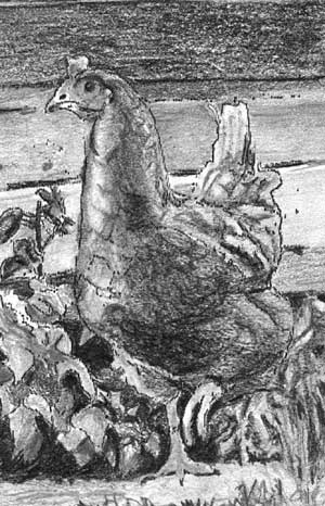 Henrietta's head is a little bit lost in the wood. Brighter highlights and lighter values would have solved that, as would very sharp edges. She has a subtle suggestion of feathers - to be honest, they're so subtle as to be almost non-existent - but I do get sense of them being there. That said, over-detailing would be as bad, if not worse, because they'd attract attention away from her expression. She has, however, got good three-dimensional form. And a lovely dark eye too, but if you'd left it with a truly white highlight, that would have attracted our attention to her immediately. You did that with her raised foot, which was an excellent decision, because it is an essential part of the story. We don't know if she's running or has paused but she does add tension, and implies the only movement in the composition.
 The rusty wheel perhaps looks a little too smooth and clean but it is very well drawn, and I like the way the base disappears into the surrounding grass. That brings me to the foreground foliage, which I think is the weakest area. Sharp edges are required - it's what the eye expects to see in a foreground element - but also because without them you lose depth. You have to make the layers in the foliage crystal clear. You've created a good deal of depth by pushing some leaves back into the shade beneath the henhouse. But there is no midground - all your leaves are comparatively similar in value, and, with one exception, none cast shadows on the others.
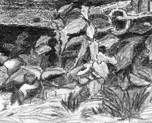 The foreground grass does its job but it would have been more realistic if you had used negative drawing to establish a few key blades instead of drawing grass-like lines, and possibly erasing some too. We see blades of grass in the same way the we understand hair - it's the dark gaps that define the edges.
Apart from the softness created by your paper, I think this is a very creditable drawing and one you should be justifiably pleased with. Thanks for joining me at Drawspace.
Marlene (Drawspace online - Advanced)
I have attached the three examples of week 7, exercise 3 - establishing cast shadows on leaves creating a 3-D effect.
 Marlene, these are as near-perfect as it's possible to be - with one exception.
 They all show a thorough understanding of the process. You even curved one shadow correctly that I would probably have erroneous curved the wrong way!
Example 1 and Example 2 are faultless. One of the main errors I see is the artist forgetting about the relative depths of the various elements. A shadow on the background, for example, passing over a closer leaf but not altering its position. All your shadows correctly step closer to the casting leaf when they fall on a midground surface.
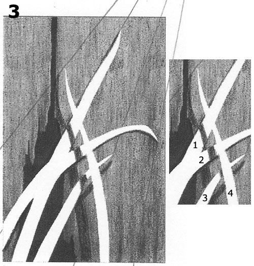 Example 3 is almost perfect too, but it does have one fault, which alludes to the common error above. Your shadow - the part that crosses over the three leaves - suggests all three leaves are exactly the same distance away from the wall. But the leaves' individual cast shadows suggest otherwise. The big tall leaf, for example, is almost flat against the wall, but the bottom leaf is obviously curving away from it.
In my version, I'm assuming leaf 4 is some distance away from the wall (as you've described); leaf 2 is in front of leaf 1 and touching it, probably laying flat across it, so they can almost be treated as being a single leaf; and leaf 3 is fairly close to the underside of leaf 4 until it bends back to almost touch the wood. In that case, the shadow cast by 4 onto 2 needs to be a little closer to 4; and the shadow cast across leaf 3 needs to be much closer to leaf 4, as the two are almost touching at that point.
All that said, in a drawing... you could easily get away with your version :o)
Many, many thanks to you for these last 8 weeks in the Advanced Class. In week 8, adding the computer to the mix slowed me quite a bit as I am not familiar with this program. In the years of producing stained glass, I used the layering technique with tracing paper as I composed panels, lampshades etc. Layering works quite well and now with the Photoshop Elements 2018 I can do all of it much faster as I gain skill. So thank you for including this in chapter 8.
 I'm really pleased you find Photoshop helpful. Like you, I used to use my own hand-drawn system for composing scenes. Usually I'd draw elements projected with my Artograph DB300 onto a single sheet. Any alterations, of course, involved erasing that element, repositioning or scaling it, and then re-drawing it. Your layering system is a definite improvement. But as soon as I discovered layers in PhotoDeluxe (the predecessor of Elements) I knew they'd be immensely useful.
Suddenly I could reposition, re-scale, rotate or flip, any element. And the undo facility allowed me to go back if the trial didn't work out. Now I compose exclusively with Photoshop.
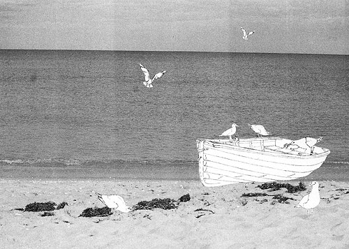
I know the ocean (taken from one of my photos) is not a line drawing. But I'll figure out how to do that also.
That doesn't matter. It's not even necessary. One of the great benefits of composing in Photoshop is that you can mix images from many sources - in this case, a photograph and line drawings. Equally, if you had photos of the gulls and boat, you could have placed them within a sketch of the ocean scene.The facilities in Photoshop are almost limitless. Need more seaweed? Clone some and add it to your scene. You're a gull short? Clone another and use that. In fact, I can see you did that, but I don't think it was entirely successful. The problem with cloning is that it creates repetition. Here, your two background gulls are rather unsettling in their similarity - obvious and rather unnatural carbon copies. So, let's try flipping the background gull...
 That's better! The repetition has been removed. The background gull is now flying into the scene. And it's heading directly towards the midground gull, which in turn leads us to the action on the boat.
The two foreground gulls work very well. They are interacting with each other and excluding us. And that works, because my eye skips to and fro between them, then, with nothing more to be gained, my attention drifts along the seaweed to the boat. You've created an interesting foreground diversion that mirrors reality but doesn't detract from the centre of interest.
Gareth (Drawspace online - Beginner)
I took your online course 'Drawing from Line to Life: DG104' last year and had a great time. I recently completed a skull study and wondered if you were still open to critiquing things as I'm always looking for ways to improve. No worries if you're too busy, thanks again for the instruction!
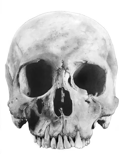 I'm not always prompt but I'm never too busy if someone wants to improve. Thanks for letting me see this, Gareth.
I think it's superb!
You were expecting more? OK... :o) It has an excellent and wide range of values, and strong darks always add more three-dimensionality and solidity to a drawing. This is on Mellotex (I use Conqueror Diamond White now) and I know intense darks need time and work. Yours are not only dark but solid, free of linear marks, and smoothly gradated. You've probably heard me say this before, but the visual clue to a deep, dark hole is that it contains nothing. Any irregularities in the shading risk being read as "features", and that immediately brings the darkness forwards - as though it's fabric hanging just behind the hole. Patchy or irregular shading destroys depth.
Your shading elsewhere is just as masterful. No signs of "drawing", only bone. And the bone is unmistakably smooth and very hard. You told me you used 4B, 2B and HB for this drawing, which surprises me. Hard, smooth surfaces are usually portrayed successfully by using hard grades, such as 2H, or 2H over HB to smooth it. Hard grades contain more fine clay in the mix, and that defeats the grainy appearance of the softer, more graphite laden, grades. But you've managed to succeed admirably with your softer grades.
Overall, I think this is excellent as it stands. There's absolutely nothing I'd wish to see drawn differently.
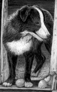
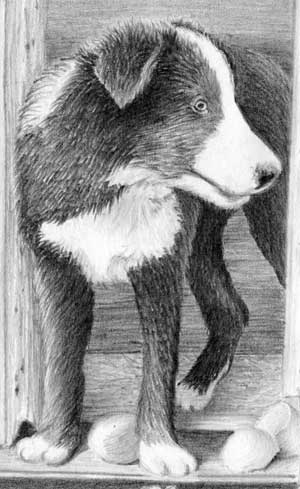
Allen (Studio workshop, UK - October)
"I finally finished the drawing I brought away from your workshop. I am reasonably happy with the end result, I know there are a few areas that could be improved (stone step)and it was quite a challenge with all the different textures, but really enjoyed doing it."
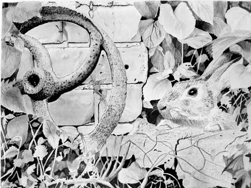 First, your photo obviously had higher contrast at the base and bottom right, so I've adjusted the contrast in the rest to match. Hopefully, it's closer to your original? In any case, this is the image I'll critique for you. There's some really good work in this and I can see you enjoyed it. It just lacks a little strength in key areas that would have given it more impact, it's missing a couple of useful elements, and one technique isn't working too well.
I've got to start somewhere so I'll begin at the left. The wheel is unmistakably rusty with good strong darks, and you've described the form of the oval spokes very well. Arguably, the outer face would be smoother than the inner areas - it's the working face in contact with the ground. You've chosen to make it quite rough and pitted, which isn't an error - just your interpretation - but sometimes altering something explains your story more clearly.
You've fallen for a common error in this - there's an optical illusion at the lower end of the visible rim that makes it appear to sweep upwards at that point. In fact, that is the edge of one of the spokes, which unfortunately matches the rim in value.
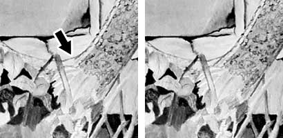 The rim should, of course, continue its way around the ellipse that is hidden behind the foliage. Try not to accept any reference as representing the truth! :o)
 Your bricks have texture while remaining secondary and unintrusive. However, incorporating a shadow cast by the wheel would have tied the two together and reinforced the lean of the wheel. You also missed the opportunity to contrast the gritty mortar with the smoother bricks but, again, that's perfectly acceptable and reflects your individual vision. On the plus side, your holes in the bricks really benefit from the narrow highlights you've placed around their lower edges. It makes it crystal clear these are holes and not marks on the surface.
 The leaves on this side have been sharply and confidently drawn with a very believable three-dimensionality. What doesn't work for me is your use of indenting for the main veins. I can understand why you chose to use that technique, but indenting produces a very mechanical, almost "too accurate" line, that rarely looks realistic. Try negative drawing instead - just draw around those veins and leave them white until it becomes obvious which values to apply to them. One of the problems with indenting is that it does restrict the values you can apply to them - usually just one, run the full length with a single pencil line.
Lower down, the foliage really benefits from the intense, dark background, and you've made a brave attempt at negative drawing for the grass. And made excellent use of unrecognisable organic shapes. What that area lacks is mid-values.
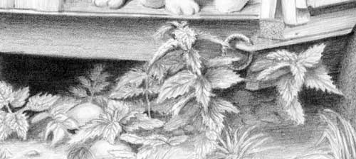
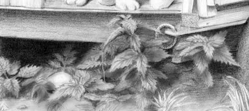
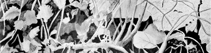 Don't be afraid to push some of the midground foliage further back into the dark depths. Aim to form a bridge between the light foreground leaves and those right at the back. That will lead our eye in and back.
 I've pushed some back, to give you an idea of what I mean, but many could have been even deeper. I've also dulled almost all of the white. Leaves don't naturally contain white, so try to remove it. Of course, removing it then flattens that area of drawing, but that in turn will show you where mid-values are required to restore the missing depth. In each area, try to think what you might see there in real life.
Your foliage at the top right has a sense of reality that matches the top left, and those dark values nicely balance the darks in the wheel. But the same problem exits - a big jump between the background and foreground. Push some of those midground leaves further back to provide steps from foreground to background.
 And shade some on in inclined plane - one end in the dark and the other coming forwards into the light. Those will further help to connect the different layers.
Your made a very creditable attempt at the rabbit. It's clearly hairy and you've made good use of those prominent dark hairs on top of its muzzle. It has a lovely dark and glassy eye too, with an attention-grabbing white highlight. Overall, it lacks a strong feeling of three-dimensional form, but that's nothing that a little more experience and confidence won't fix in time.
The stone that the rabbit is peering over lacks the sharpness and solidity that its foreground position demands, as does the ivy growing over it, but it only needs a bit more work to sharpen its detail and boost its contrast to some extent.
"22 hours in total, not sure if that's typical for a piece this size or
maybe I am just quite slow. "
I firmly believe that every drawing demands a certain time to fully complete it. Spending less time encourages harmful shortcuts, and taking longer often results in the drawing becoming overworked. I think you've done really well in your 22 hours, Allen. Now a little more work in selected areas will raise this to a whole new level.
Update : 15.11.2017
I have taken it on board and made adjustments. I struggled a bit with the texture on the stone step and with attempting to give the rabbit some "form" See what you think?
 There is definitely improvement! But there's still work to be done :o) The first thing I noticed was the shadow cast by the wheel on the wall, which creates a lot of depth; it ties the two elements together; and the sense of reality is greatly enhanced.
The rabbit now has believable feet - and you noticed, and corrected, that I copied it's right-hand paw to join the left-hand paw that was missing in the reference. The body still lacks solid form but I'm not overly concerned about that. It has a wonderful attention-grabbing eye and excellent hair textures, so the form is not so important.
You've made changes within the foliage behind the rabbit that improves it, but don't be afraid to be even bolder. At present everything is perfectly clear, but in real life I'd expect to not understand everything within the murky depths. I'll concentrate on that area for a while...
 You've established a few solid dark areas and that's good. They say "this is a far back as you can see and everything else is forward of this". The viewer needs that reference for full understanding. You have small organic shapes within those areas too, which adds some of the expected mystery. And your edges are sharp.
Now remove white from your leaves (they don't naturally contain it) and make use of those blacks. Push some of your foliage back into it. The sharp edges will ensure those shapes remain visible even if they're deep in the shade. And do take cast shadows into account. You know the lighting direction, so work out where each leaf would cast its shadow on those below.
My additions are a bit rough and ready but I hope they give you some idea of what I mean. Each leaf takes the light and its position, in relation to the others, into consideration. Dulling the white gives them more solidity, and the leaves as a mass will now push the rabbit forwards and increase its dominance.
Your negatively drawn grass doesn't appear to have been altered much? Make some alterations, as I suggested, to the top right-hand foliage, and then apply the same thinking to the foreground grasses. And don't leave large black holes - in real life you'd expect see something in holes that large. Just form an edge on Blu-Tack and use that to cut a few random "stalks" across them. Then push those new stalks well back into the shade. Because you created those rich darks, you have a wide range of values available, so play around with pushing the stalks back to create a few, or many, layers at different depths. If you change your mind, a quick touch of Blu-Tack will soon bring any one forwards again. You might be surprised how far back you can push some elements and have them still just visible,
As for your troublesome step, it has texture, but it's lacking three-dimensional form. The top and side are almost the same value, yet the light will most likely shine on the top but less so on the vertical face. Again, be bold and tone it down. And consider whether any of the dead ivy might cast a shadow where its raised above the surface. That's not essential but little things like that quickly raise the overall sense of reality.
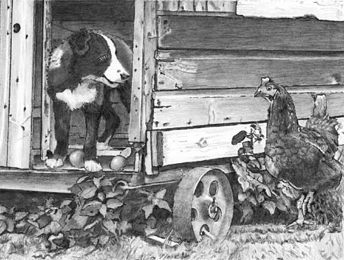
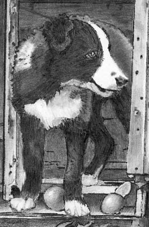
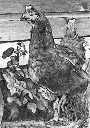
Mary (online - Intermediate)
I finally finished my final project for the on-line intermediate class. Overall, I am pleased with the results; I can certainly see I learned a lot in this class. I'll admit I'm hoping for a few positive comments as well :) Thanks again for your helpful teaching and critiquing.
 Well, this was well worth the wait, Mary - and I suspect there will be more than few "positive comments" coming your way :)
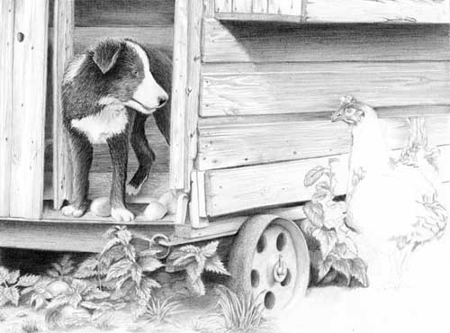
 You're thinking about this in depth and making good decisions, so it looks very much as if you're in full control. For example, you've added straw on the floor of the henhouse - that alone tells me you were drawing something "real" and not just relying on copying the reference. Also, the dark interior creates depth in a composition that doesn't offer much.
Robbie is looking splendid - plenty of three-dimensional form, very realistic hair textures, and you've lost none of the impression of him being a black dog. His coat looks woolly, black and shiny, which exactly describes him. He was a fun-loving 11-month old pup who spent most of our photo session "attacking" a soft yard broom :) A brighter highlight in his eye would have improved his appearance and better drawn our attention to him, but that's my only adverse comment.
 The broken eggs are nicely drawn - smooth, slightly speckled, and shell-like - and you've added a degree of mystery by partially hiding the fallen eggs in the foliage beneath him.
The wood of the henhouse looks old and weathered although, in my opinion, it attracts too much attention by being over-detailed and high-contrast. You could have extended the nestbox's shadow downward to better display Henrietta rather than omit it entirely, however... I'll return to that.
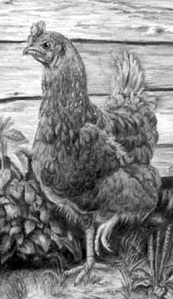 Henrietta herself is most excellently drawn - amongst the best I've seen. She has believable feathering and very good three-dimensional form, due to your strong, well-chosen values within her. She also looks extremely and appropriately displeased.
The bright highlight in her eye makes a good focal point, and if you'd done the same for Robbie they would have shared the focus. Henrietta's also darker than I usually encounter in this exercise, but that was very bold of you, and it works wonderfully well. This is your world so she is whatever you decide to make her. As she is, she stands out well from the wall... so omitting the next box above her was probably a good decision :) However, that box, and its shadow, would have prevented my eye going up and out of the frame, which you've lost. Conversely, your idea of creating a light "halo" around her is quite effective, without the halo being immediately apparent or distracting.
Finally, I'm a devotee of the Walt Disney style of animated expression... in a diluted way. Humans look for, and react to, human emotions in animals. Henrietta's features display an impressive down-turned beak and a lowered "eyebrow - between them they suggest intense displeasure, bordering on anger.
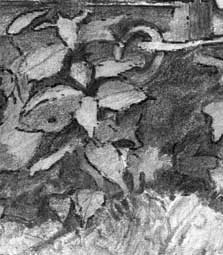
 The foliage below Robbie possesses depth and some mystery. It could have had even more but it serves its purpose well.
I'd be very tempted to push some of it further into the darkness beneath the henhouse to create even more depth, and that in turn would emphasise the sharp edges of the foreground leaves. At present, the leaves seem to be either foreground or background with little midground. And none cast shadows on any others. Those shadows alone would create depth and clarify their spatial relationships.
Overall, I think you've told your story in a very believable way. Thanks for letting me see this, Mary - it was a real pleasure to work with you.
Melodee (Drawspace online - Beginners)
I used copier paper as I did not have time to transfer my grid over to drawing paper. I also used my 2mm clutch pencils, and drawing board. Unfortunately, because I was not able to transfer the grid over to drawing paper, you can see the grid lines. Sorry!
 First - you knew this was coming! - working on copy paper did your drawing no service at all. But second... taken piece by piece, your drawing contains a lot of good work.
This drawing was, of course, designed to stretch you. If the principle purpose of a drawing is to relay your story to the viewer, then you've largely succeeded, but the various elements don't happily co-exist with each other.
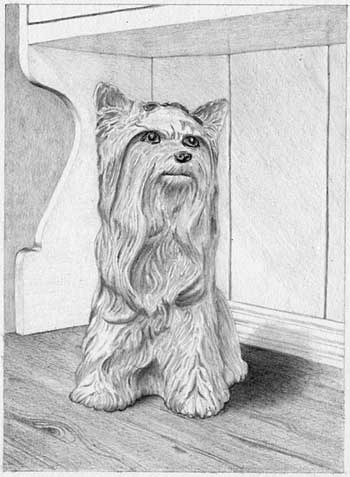
I'll work through your drawing from left to right... I like the way the dresser top almost runs unnoticed into the background, and that the background is sufficiently vague to suggest recession. There's no grain within the wooden top and it has the appearance of marble, but that's perfectly acceptable - it's your drawing and your vision. The curves of the vertical end of the dresser are very well described, and the rest of the dresser is nicely suggested without it dominating the scene, although there's no value change in the corner behind Lady the dog's head.
Your drawing of Lady has some three-dimensional modelling but the lack of contrast is a problem. I don't receive any indication at all that she's a shiny and hard ceramic model. To achieve that you need darker values so the contrast makes the highlights shine. On the other hand, the contrast achieved with Lady's very dark pupils, nostrils, and mouth immediately draw my eye to them, and I'm happy to see you modified her strange triangular eye highlights into more realistic ones. Conversely, the nose has no three-dimensional form, other than a hint of highlight at the top. Try to visualise every element in three-dimensions before you begin drawing it; consider the lighting direction; and then use the lighting to describe the form as you understand it.
 For example, her nostrils are not dark circles painted on the surface. They're deep depressions that will pick up a highlight along the bottom edge as it curves into the hole. On the positive side, I love the highlight beneath her bottom lip that accentuates her mouth, even though it's down-turned and makes her look rather uncertain - as does the odd shape of the right-hand eye.
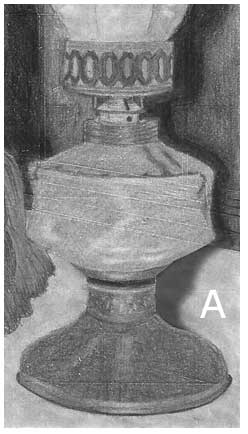
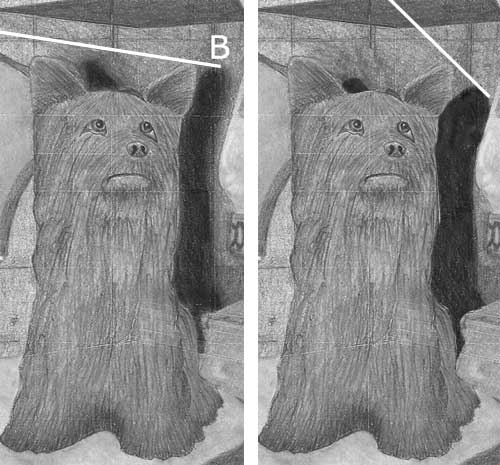
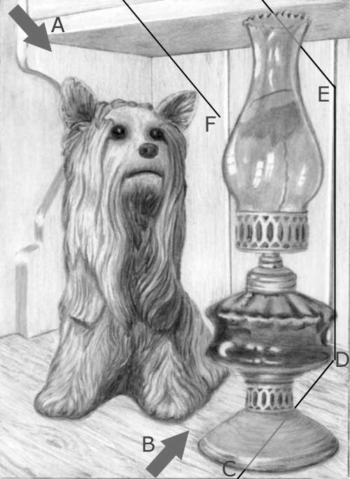
The cast shadows work well and are very bold. I can see you put a lot of thought into them, although you forgot to extend the lamp's shadow across the dresser's top (A). You're not alone in that - it's an omission made by a surprising number of artists on this course. Apart from that, your shadows are accurate, but only because you've chosen a very low lighting angle - you have the light shining directly onto the scene rather than from above, which the darker underside of the shelf suggests.
Working out, or deciding on, the lighting direction is easy. Simply join one point of the subject to its shadow (B). Shifting the lighting up moves the shadow down. And now the darker underside of the shelf looks more natural. That would also prevent your shadow of the lamp incorrectly falling on the underside of the shelf. You've definitely got the right idea, but need to consider the direction of the light more clearly.
 The lamp has some good work in it. The base looks very round and metallic, due to your clever use of highlights, and it has a satin sheen that contrasts well with the glass above. The ellipses are excellent throughout the lamp, and the recession of the punched holes in the top collar is good too.
You have, as I mentioned, made a good distinction between the brass and glass surfaces, but the reservoir is not as clearly glass as the chimney. That's mainly due to your choice of pencil grades. We expect glass to be hard, smooth, and highly reflective. Your shading of the oil reservoir is rather grainy, which is not an expectation of glass. You could have used both HB and 2B but then lightly layered it with 2H to smooth it out.
The chimney is smoother and the hard-edged, bright reflections alone send the "this is glass" message. However, it does have one fault: right at the top, it's impossible to tell which edge is nearest to us.
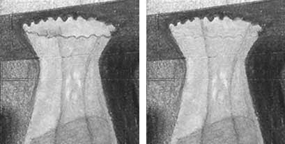 Given the perspective (we're looking up at that top) the crinkled, very top edge is the front edge. But you've used a very deliberate line for the lower edge that, in reality, is behind a thickness of semi-transparent glass. Fade that line and you should restore the correct recession.
As I mentioned earlier, this exercise was designed to stretch you, although it contains nothing that we didn't cover during the course, but I'm delighted to see you attacking it thoughtfully, and solving problems along the way.
I thoroughly enjoyed working with you, Melodee, and I'm delighted to be working with you again on the Intermediate course.
Debbie (online - Intermediate)
Here is my final picture for the intermediate class, unfortunately uncompleted. I have to concede defeat (for now). Once again I have learnt so much from each exercise in this class so thank you for sharing your knowledge and pushing me out of my comfort zone :)
 My first thought is that you've put a lot of work into this and, in some places, more than was good for the drawing. Absolutely everything is crisp and finely detailed, to the point of not being entirely natural. It helps if you think like a camera. A camera takes an average overview and focuses on particular areas. Conversely, our eyes continuously refocus and adjust to the localised light and shade as we pass our gaze from area to area.
In real life, when we look at Robbie, he'll be in sharp focus and everything else will be softened. The same applies to Henrietta. As artists we have the ability to focus on both characters at the same time and still soften the detail elsewhere.
For example, the interior of the henhouse is lighter than it needed to be, and the detail suggests the far wall is very close to the equally-detailed Robbie, which damages any sense of recession. Incidentally, the perspective of that far wall is wrong, but I can live with that :)
Personally, I would have made the inside of the henhouse much darker, especially behind Robbie's back. I could have used reflected light along his spine to separate him from it - just enough to make the junction visible while still maintaining a hint of mystery. That would have added welcome depth to this rather shallow composition.
The wood of the henhouse looks old and rustic, and its detail nicely softens with distance, both creating recession and not drawing my eye in that direction. This is your world, not the world of the reference, so feel free to change it in any way that benefits your drawing. The reference is also a composite, so it never existed in real life.
I like the shadow beneath the projecting nestbox that leads the eye to Henrietta's head. Allowing it to extend down even further (with appropriately softened edges) might help you to increase Henrietta's prominence. It will increase the contrast between thew wood and any bright highlights you leave in Henrietta, such as her key eye highlight.
 Robbie the dog has crisp detail that really works well, with one reservation that I'll return to. A bright key highlight glint in his eye would draw my attention to him more effectively than the slightly unnatural white ring around his iris. At that angle, and with his eye ball being curved, the right-hand side of that ring shouldn't be visible. However, his black hair is layered and finely detailed. His white hair looks good too, although not so on the muzzle which is rather flat in comparison, because it's devoid of three-dimensional shading. That said, it does very little harm because Robbie's cheeky character dominates everything :)
 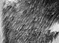 My reservation concerns his black body hair. It looks as though he's recently had a pair of scissors applied that has left him looking coarse and "spiky. That's entirely due to the multiple blunt ends in his coat. If you had pointed the ends of all those brightly lit locks, he'd look glossy and soft instead of harsh and wiry.
Congratulations on making his rear paw darker than his front feet. The same applies to his inner thigh (in the shade of his belly). Those are both commonly overlooked points. To return to my "darker interior" point earlier, I think you made the floor deliberately light to help you to display his rear leg. But everything in Nature is not always easily seen, so you create a greater sense of realism by making the rear leg only just visible in the darkness.
 I don't think your foreground foliage is working as well as it could, although you might still be working within that area. It has foreground sharpness and very little midground or background content.
You established strong darks beneath the henhouse but then too quickly lightened your palette for the foliage. A lot of it contains white, yet when was the last time you saw a white leaf? Because of your darks beneath the henhouse you had a broad palette of greys to work with within the foliage. You just need to be bolder. In my alteration (quickly done, so far from perfect) I dulled all the white and then tried to make sense of each leaf in relation to those around it. I also pushed some deeper into the darkness, attempting to create mystery and recession at the same time. Also, your fallen egg is now easier to find, but is still partially hidden.
 Overall, I think you're doing a superb job.
My main reservation is the abundance of detail, but I firmly believe the "Detail is King" stage has to be worked through before you learn to separate useful from distracting detail. You're definitely heading in the right direction.
Thanks for joining me, Debbie. I really enjoyed working with you again.
Marlene (online - Intermediate)
Thank you for this great course! I appreciate the logical progression and your detailed guidance, teaching points, and the clarity of your directions. Though this was a lengthy drawing, I enjoyed it. I wasn't really able to make the two eggs in the foliage stand out and grass is always a mystery to me...
 Your enjoyment shows - I think the result is super! Yes, the fallen eggs are rather lost, but your "mystery" grass looks like grass - there's nothing to be concerned about :o)
As usual, I'll start with the background and work forwards. First, I really like the boldness of your dark interior. And "bold" is what you needed to be. It's the one area that gives most artists the greatest problems, because they think the black dog will become lost if they make it too dark. But you can use reflected light along Robbie's spine to separate him from the background, and the dark background adds depth. It also does something else far more important - it sets a reference against which you can gauge every other value in the drawing. A light background almost always leads to a flat and low contrast drawing.
The wooden sides of the henhouse look superbly weathered and rustic, and, if I go looking for it, the detail is there but it's not intrusive. Before I go further, there's one aspect I must mention - outline. Your drawing is sufficiently high contrast to not need outline at all, but you rely on it to quite a large extent. Around Henrietta's head, for example, or the eggs, and the foreground leaves and Robbie's back. Line always looks unnatural because it doesn't exist in Nature. We see and understand edges due to the change in value between adjacent surfaces. I can't find a single area of your drawing where outline was necessary and that removing it would be detrimental.
 Robbie the dog has a suggestion of three-dimensional form, not much texture, but loads of character. Of the three, I'd vote character for the top place. He has a lovely bright highlight in his eye that immediately draws my attention to him, and the upward curve of his mouth suggests a cheeky grin. He's obviously pleased with himself! You've made good use too of reflected light to make his back stand out from the background.
The eggs look good and I'm assuming you used a hard grade to shade them. That was essential, because a 2H or harder grade draws with a smooth eggshell-like quality.
 Henrietta the hen is looking very displeased with Robbie's eggs-capade (sorry!), and the lighter values in her head draw my attention to her. She has sufficient three-dimensional shaping, and a nicely-judged suggestion of feathering. However, you've relied heavily on outline to pop her forwards of the wall and foliage. You could have darkened the wall where necessary, and adjusted the values of the leaves to make her stand out, or not, at any point. You've used heavy outlining again to emphasise her raised foot. I believe that foot is an important element in this drawing but outlining simply looks false. Darkening the rear leg (let's call it the shadow cast by her body) would have done the job just as well, and more realistically.
The immediate foreground grass works much better than you think it does. No matter how you draw it every viewer will always make their own sense of it. What doesn't work is the thick outlining of the leaves in front of the henhouse. Again, use value differences to display edges. Also, this is your world you're creating - it never actually existed - so feel free to make whatever changes you need to.
 In my alteration I've created darker holes through the foliage and additional background leaves, and then pushed those leaves back into the shade. Next I thought about which foreground leaf might cast its shadow on the leaves around it. The result - I haven't changed your leaves at all but all of the outline has disappeared. There is more depth, it's much easier to understand each leaf's relationship to the others, and it looks more natural. Part of your problem was not using intense blacks in the extreme background. Look into a clump of grass next time you see one and I think you'll quickly realise how very dark it can become in the depths. Darker darks give you a lot more values to play with so you can create more depth.
Many thanks for joining me on the course, Marlene, and I think you should be justifiably proud of this drawing.
Ruth (online - Intermediate)
Here is my finished effort which I really enjoyed doing. Couldn't get under the henhouse very black despite using B, HB, 2H and 4H in that order - I am beginning to wonder if it is the paper that won't accept it as it is something that doesn't seem to be improving. Robbie has been drawn as a young dog with more fluffy hair than a full-grown dog.
 Your enjoyment shows in the result! As for your blacks: try using a 2B or 4B and then burnish with an HB. Don't use hard grades because once you do there's no way back if you want to use anything softer again. And Robbie (who was only 12 weeks old in the reference) is looking very like the cheeky pup he was :o)
I'll start at the back and work forwards. Personally, I would have made the inside of the henhouse darker, especially behind Robbie's back. I know you can draw darker than that because Robbie is considerably darker. You might think that you'd lose Robbie in a darker interior but you can use reflected light along his spine to separate him from it - just enough to make the junction visible while still maintaining a hint of mystery. A darker interior would also have added depth by pushing the door frame forwards.
The wood of the henhouse looks old and rustic although the detail is rather soft. But I like your invention within the boards, and that big chunk missing out of the edge of the door. This is your world, not the world of the reference, and often it's those little extra added details that boost the reality and interest.
 Robbie the dog has some three-dimensional form and, of course, a fluffy texture. If the highlight in his eye had been as bright as the whites in his coat, it would have drawn my attention to him more readily. His black hair is looking good (I'm fighting the urge to fetch a brush!) and it runs very naturally into his white hair. The only exception is his ear, which looks quite flat. Constructing that ear by using layers of short strokes would have helped you to "sculpt" the form more easily. There is a small problem - Robbie's front legs and paws are in full light and his rear leg is inside the dark henhouse, but in your drawing they are both equally well illuminated. His rear leg and paw should have been much darker. The same applies to his inner thigh (in the shade of his belly) and the floor of the henhouse. My impression is that you lightened the floor to help you to display his rear leg. But everything in Nature is not always easily seen, so you create a greater sense of realism by making the rear leg only just visible in the darkness.
The eggs would have benefited from being shaded with a hard grade, such as 2H, because hard grades (due to their greater clay content) draw with a smoother finish. Your eggs have good three-dimensional form but they are not realistically smooth.
 Henrietta the hen, who is looking quite displeased with the potential egg robbery, would have benefitted from more three-dimensional shaping. She certainly has shaping but it is all tending towards mid-values. Much darker shading beneath her chest would have given her more solidity and would have thrown more attention onto her legs - more on that later - and more shade on her back would have pushed her tail further behind her. Also, as with Robbie, a carefully drawn, small and intensely white highlight in her eye would have drawn attention to her more readily.
To return to her legs - I think a vital element in this composition is the right-hand raised foot. It's the only movement in the composition and adds a degree of tension. With a darker underside to her body, and darker weeds too, you could have easily highlighted that foot.
 The immediate foreground works very well. It grounds Henrietta and leads our eye into the scene. What I think doesn't work so well is your midground foliage. As you mentioned, the shade beneath the henhouse is very light and offers very little sense of depth. If you had established strong darks beneath the henhouse, you would have had a much broader palette of greys to work with within the foliage. I suspect the same problem explains Henrietta's lack of form. The lack of dark shade beneath the house has forced you to use a very restricted palette of greys for her.
Where you have established strong dark values within the weeds, you've lost the benefit by immediately moving to midtones. If some of the leaves had been pushed right back into the shade you would have created more layers of depth. I can see you have correctly designed and outlined the foreground foliage, but you were too timid when you created the midground foliage around them and the deep shade that gives everything depth. It's also essential that your foreground foliage possesses sharp edges, which yours don't. Having soft edges, they appear to merge into the leaves behind them, and that loss of separation partially flattens the sense of depth you were beginning to create. Finally, think three-dimensionally and take cast shadows into account. "Will this leaf cast a shadow on the one below?" If it does, it will create a very visible sharp edge adjacent to the shadow and your leaf will be thrown forward of those behind. Cast shadows are very useful devices for creating depth.
Thank you for an excellent course which has encouraged me to look at the world in a different way - "How could I draw that?". I never imagined I would be getting excited about finding bricks and nettles to photograph as references, let alone enjoy trying to draw them. The exercises showed up areas for further practice and the lessons flowed logically . At the end it's amazing looking back at what one has achieved.
Thanks, Ruth! I'm really pleased with the advances you made. My main tip: be bold! Get those blacks in early and everything around them will balance themselves accordingly. And, if you decide to lighten them, Blu-Tack will allow that at any time. And, of course, as your store of references (both photographic and mental) grows, you'll have increasingly more information to work with as you draw. Many thanks for joining me on the course.
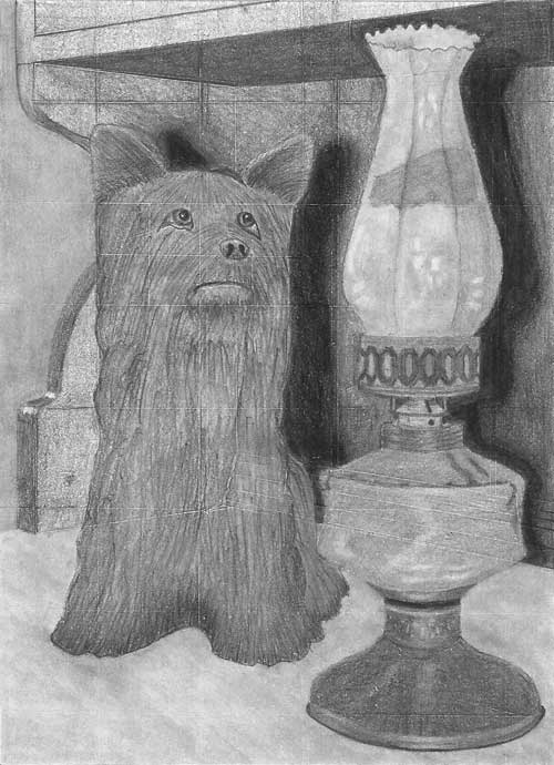
Debbie (online - Beginner)
I've only done Kitty and the background in the picture as I wanted to have a good go at Kitty and not be
rushed, but I still intend to have a go at the lamp. I'm quite happy with most things how they came out in the end apart from the contrast. I
feel the overall effect is too gray. I tend to play safe at the beginning and then like you've told us it's hard to go darker :)
 Well, at least you're listening - and then finding out the hard way. Nothing teaches like experience :)
 When I first saw this I thought it was disappointingly light, then I adjusted your scan and it began to look much better. However, I then darkened the midtones (see below) so you could see what a difference a broader palette of values creates. It has a lot more presence and three-dimensionality.
There is much I admire about this drawing. I'll begin with something that doesn't quite work well - the extreme left-hand background. It contains a texture formed by vertical linear shading. If you blend that area so it loses its linear structure, it will recede and the sharper end of the dresser will spring forwards. Texture belongs to the foreground and near midground. Blend it and it will clearly be far background, where we instinctively expect a lack of detail.
You've done well with the rather complex curves on the end of the dresser. They are accurately constructed and drawn, which is often a problem in this exercise, and your shading clearly describes their three-dimensional forms. The dresser itself is nicely suggested without it dominating the scene, although I find the diagonal linear shading distracting. If you blend (not something I often recommend) keep clear of the sharp edges and the joints between the boards. Try to just remove the linear content. The wooden top is excellent. It's obviously old pine without the detail attracting too much attention to itself.
Kitty, despite being light, is very well drawn indeed! Your interpretation of her three-dimensional form is unmistakable. She possesses a solidity and your shading definitely describes her smooth and undulating ceramic surface. Her lovely dark eyes and nose immediately draw my eye to them, but then you've dropped your values to light greys and lost the advantage of using the mid-values. The little upward curve at the corner of her mouth give her a very warm and friendly appearance, which add a great deal to her appeal.
Your cast shadow is excellent. Without being sharply defined, it describes Kitty's position away from the wall and the curve of the rear moulding. The dark contact shadow under the paws helps to fix her soundly to the surface too.
I thoroughly enjoyed working with you, Debbie. This drawing was of course designed to stretch you, and it will stretch you more if you complete the other half. I'm delighted with your approach, your understanding of what you were drawing, and your interpretation of the reference. Well done.
Karen (UK Studio Workshop November 2016)
Hi Mike....Karen from Tennessee here. I have attached the homework in progress. I'm really struggling with leaves...and my small boulder looks a bit like a brain. Definitely a work in progress.
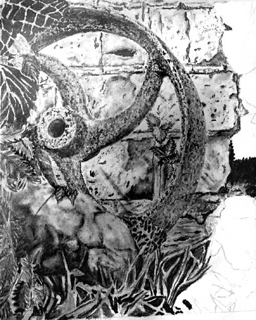 Hi Karen! Good to see you working on this. I'll reply to the leaf problem but I'll give your drawing an overall appraisal too. Please bear in mind that I've attempted to correct the directional lighting and variable contrast in your photo, so what you see here is what I'm looking at right now.
Your drawing is high contrast and that's good, but there are minimal mid-values - everything is either dark or light. Deep darks are good for providing depth; they increase three-dimensional understanding; and they add impact to a drawing. But everything in this appears to possess dark portions so it's become a collection of equal-value parts, rather than a natural scene where some elements dominate and others recede. For example, your wheel looks rusty and rough, but the multiple dark marks in the bricks behind echo the dark marks in the rust, which reduces the importance of both.
The same applies to your very dark leaves in the top left-hand corner. The values are very similar throughout and the ribs and veins are very light, so they read as flat objects. And they merge into the wheel because the dark values are very similar. Never mind what you see in the reference - it's a composite so it never existed in reality. Change it to suit what you need. Would it help if the top left leaf was lighter than the wheel? I think it would, because the darker wheel would emphasise the leaf's outline. That will immediately signal that the leaf is in front of the wheel, especially if the edge of the leaf is drawn very sharply - which it should be. Sharp edges divide elements and soft edges merge them together.
 Incidentally, the little leaves behind the wheel are really good! They conform to the lighting, and they have depth, texture, and a sense of reality.
The rock has three-dimensional form and good lighting, but it's soft - hence the "brain" appearance! Sharpen some of the edges and maybe introduce a few more highlights too. And consider the lighting direction - You have one blob shape on top that has equally dark shadows on both sides. The light appears to be shining from the left, so surely that left-hand dark shadow would not exist? Even if it's a deep fissure.
The grass is progressing well, but it would stand out from the rock a lot more if it was lighter. Try using very light values for the foreground blades, slightly darken the midground blades, and then make the background blades darker still. The foreground blades will stand out and be instantly recognisable, and the others will provide depth and recession.
Can you tell me what sort of pencil and stroke you use for the typical leaf?
It depends on how I see the leaf - glossy and dark, light and shiny, hairy and dull... However, I use the same approach for all. First I break it down into manageable sections. That's easy with a leaf because its veins and central rib provide the divisions.
 I use the flat face of a chisel point because it draws with soft edges that easily merge into prior shading. Grades? HB mainly. I might change to 2B for really dark areas but only if HB won't do the job. And 2H as a final overall layer. The 2H dulls any unintentional white holes, gaps and spots I've missed, so only the highlights remain white. If the highlights now look too bright, a very light layer of 2H solves that.
Two final points:
Only draw what you know and understand. For example, you won't know what value to use for the veins and ribs until the leaf is completed, so leave those white - as you have done. Now use the 2H layer to tone them down until they fit comfortably into the leaf that surrounds them.
And don't forget that leaves have a thickness. If one leaf overlaps another and you're having problems making one stand above another, use a tiny highlight around its edge to represent its thickness - only, of course, on the side of the leaf that is facing the light.
I hope that helps.
Mary (online - Beginners)
My final project for the on line beginner class. I confess I didn't like Kitty, at first, I wanted to make her a real dog. However, I realized attempting to make her look ceramic was part of the challenge. There were many other challenges, as you intended!
 There is some really good work in this, Mary. The first thing I noticed was the quality of the glass, which I'll return to. The overall three-dimensional rendering is good too. Your drawing tells the simple story very well and Kitty is clearly connected to the lamp. The dresser top runs almost unnoticed into the background, although it didn't need that line along its edge, and the background itself is nicely muted and devoid of interest. The curves of the dresser's end are very well constructed, with prominent highlights, which is something many artists on this course have problems with. The dresser itself is good too although, again, it includes outline that damages its reality. Try to use opposing values to describe edges rather than line. There are no lines in real life; we see edges because of tonal or textural differences.
Conversely, the lamp has both solidity and a sense of reality. It also has lines around the sides of the chimney, but that's OK - we're looking through a great thickness of glass as it curves around both sides, so a broad line is equivalent to what we'd expect to see. The silky sheen on the brass collars and their soft highlights perfectly describe their round nature, as do the perfectly receding cutouts as they disappear around each side. I think you have employed excellent artistic licence with the brass base. It really needed to match the brass collars rather than the glass in value, and that's exactly what you've done. There's no possibility of mistaking brass for glass.
 In the glass chimney, the reflections are bright and hard-edged and the shading is smooth. Those all add up to a surface that can only be glass. The reflections in the glass oil reservoir are good too, although there is linear shading that looks less like glass... but it does read as a reflection of the dresser's wooden top. If that's what you intended, it looking great. If not, don't use visible linear shading where line doesn't belong. We expect glass to be very smooth so visible line just creates confusion.
Kitty has lots of character, excellent three-dimensional form, and she's definitely ceramic and not hairy. Her dark eyes with their bright highlights draw my attention to her immediately. The thin highlight beneath the left-hand eye is a good device for defining its shape and adding extra contrast. I would have replaced her strange triangular eye highlights with circular ones, but that's just personal preference. Kitty's attention is obviously focussed on the lamp but she does look very worried! It's the downturned mouth that gives that impression. We humans instinctively look for human emotions in what we see. You could have created the beginnings of a subtle human grin by turning up the corners of the mouth. What you did was not wrong, but it does generate a feeling of concern.
The cast shadows was the biggest challenge. I did read about cast shadows and attempted various combinations but what seemed to be the right location for accuracy did not seem to work artistically. I think it would have been okay to place a shadow to the left of kitty, just a bit lower than her position. However, I couldn't come figure out how to work the lamp's shadow. Any suggestions? Or is that a problem to be solved in the next class?
 I cover the science of shadows in the Advanced course, but I'll give you a quick primer.
Imagine where the light is shining from - it's direction from above (A) and across the ground (B). I'm using sunlight for simplicity because the light rays are parallel.
I cover the science of shadows in the Advanced course, but I'll give you a quick primer.
Imagine where the light is shining from - it's direction from above (A) and across the ground (B). I'm using sunlight for simplicity because the light rays are parallel. C/D is the lighting direction passing through the base of the lamp. D/E is now the centreline of the lamp's shadow. Point E is the top of the shadow, because the light is above the lamp and shining down. You use the same system to find the top and position of Kitty's shadow (F). Personally, I find it useful to imagine I'm the light and then ask myself "What can I see from up here?" Everything I can't see is in the shade of something.
The shadows are not copies of the object casting them. For example, the lamp's shadow has to travel across the wood to reach the wall and then travel up the wall to point E. That will elongate it. Kitty is closer to the wall so her shadow will be very similar to her shape.
You need not be accurate. And, if you blur the edges of the shadow to suggest diffused light, you can be even more inaccurate. As long both shadows are treated in exactly the same way. Shadows tie all the elements together, much as your contact shadow around Kitty has grounded her to the wood.
Finally, there's one aspect I deliberately missed out. The shelf itself will cast a shadow on the back wall. That shadow will overlap the shadows of Kitty and the lamp BUT... as it is exactly the same value (because they share the same light source and strength) all three shadows will fuse into one. Shadows, unless you have multiple light sources, never sit on top of other shadows.
Don't be dismayed by any of this. The exercise was designed to stretch you - to move you right out of your comfort zone. Your work on Kitty is lovely! The lamp is equally as good. Looking over my notes from the course, I think you've done exceedingly well!
Marlene (San Antonio, TX - July 2016)
...my completed final project from the workshop in San Antonio, last July. It was a great time with endless amount of material to absorb. This project has truly been fun and I like using the clutch pencils. I used the full range of Staedtler pencil grades including the 9xxb by Generals, though mostly the 4H - 4B.
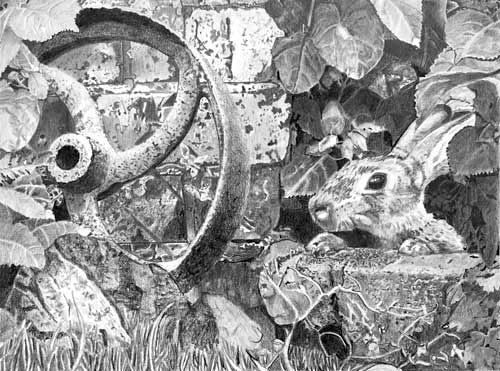 Thank you, Marlene! I'm so pleased you found the workshop helpful. My first impression was that I like this a lot! It lacks a little depth, but it is very well drawn. However, before I comment I should tell you that I've straightened the perspective of your photo and corrected the contrast. Hopefully, it looks like your original, but bear the changes in mind as you read on.
Working from left to right, Your rusty wheel is definitely rusty and couldn't be mistaken for any other surface - well done. My only criticism is that it's similar in a value to almost everything else - or everything in the drawing shares similar values. That's what creates the flat appearance. Nothing dominates or recedes. The bricks are nicely underplayed but, in my opinion, lack sufficient interest for close inspection. The dark features draw my eye to them but there's little else to see. Also the differences between the smoother bricks and grittier mortar aren't obvious, although that's not essential. However, you have created depth between the wheel and wall. The wheel's cast shadow at the top really tips it at an angle to the wall. That shadow helps to tie the wheel and wall together, then it's absence lower down breaks them apart and reinforces the leaning angle of the wheel.
I like the left-hand solution to the insipid rock problem, but the right-hand side doesn't possess the same degree of three-dimensional form. The left-hand side is instantly understandable but the right isn't. I'm reading it as a hollow curve, in which case the lighting should alter internally to reflect it's three-dimensional curve.
Removing the complex Cow Parsley leaves was an excellent choice! I too would have chickened out, and I would have stuck a big leaf over them :o) Your leaves on that side are very well-crafted and possess solid three-dimensional form.
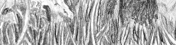
Moving to the right - the leaves above the rabbit have wonderfully believable body and three-dimensional form. I could literally run my finger over them and feel each undulation. Your background behind the leaves is rich and dark so you could have broadened your range of values quite successfully. Never be afraid of really pushing some elements right back into the shade, which can be very deep because you've created intense darks as the absolute deepest shade. Don't forget you can always change your mind and use Blu-Tack to pull anything forward again. A quick tip: try to achieve a good balance between the deepest blacks and the more forward layers. Your blacks are rather minimal and lost within the leaves. You need to make those blacks obvious so the eye can instantly compare the background to the foreground. Result - instant depth! This might give you an idea of the possibilities...
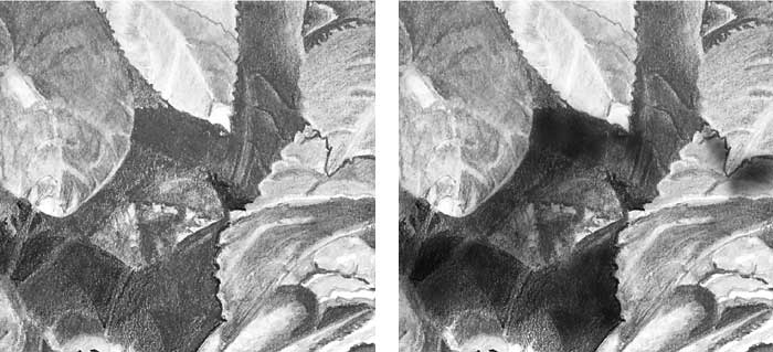
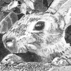 Your rabbit has loads of character! And a lovely dark, attention-grabbing, eye! It has a believable hairy texture, although it lacks the delicacy of drawing that represents the softness of the surface. If you'd looked a little deeper and had more time to spend on it you could have emphasised the change from coarse hair on top of the nose and head and the softer hair down the side and cheek. A touch of contact shadow beneath the paws would have helped to ground them, but well done for noticing I'd copied the right-hand paw to be its left-hand paw! Your alterations have definitely made each unique.
The stone block beneath the rabbit's paws has a really lovely texture, and the dead ivy clinging to it, which is a little lacking in tonal shaping, is well-studied too. Element by element, this is really good. It just needs a little more attention to finer detail. That itself will generate the midtones that are principally missing. You tend to jump from dark to light too abruptly, which is why it looks tonally similar throughout. But I think you should be justifiably proud of this drawing, Marlene!
I also love the very smooth surface paper and have several other smooth ones to try. The graphite shine still worries me and plan not to "fix" until I know the drawing is truly complete. Thank you again and I am looking forward to the intermediate on-line tutorial next week.
The Conqueror Diamond White you were working on is, in my opinion, an excellent replacement for the deceased Mellotex. It suits me very well too, because it is virtually free of surface texture, so every mark I make is the mark as I intended it to be. I really detest working on interfering textured papers! :o)
As soon as you've decided the drawing is going to be as good as it ever can be - fix it! And use a matt workable fixative. That will create a surface that diffuses light and removes almost all of the sheen from the graphite. As a bonus, you'll see your darks instantly strengthen and add more impact to your drawing. It's quite magical!
I'm looking forward to working with you online at Drawspace.com soon.
Update : 28.04.2017
Intermediate week 8 final project. I worked on areas that you suggested needed some work. Hope this is better.
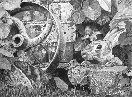 This is definitely an improvement! As I mentioned previously, the first thing I noticed was that it lacks the depth it could have had. You've fixed that with your more intense darks and other adjustments, and it now all melds together into one believable scene. Of course, I'm looking at two photos that I've corrected tonally, so what I'm seeing might not be accurate and some "changes" might not be changes at all :)
Your rusty wheel appears to have more body, and the wall is not so dominant. Did you tone down the lighter areas? If so, it's made a lot of difference by making the features less noticeable and the bricks more solid.
I still don't understand the rock but that probably doesn't matter. Your leaves were always good but the extra work just above the rabbit's head has helped to create a lot more depth in the shade.
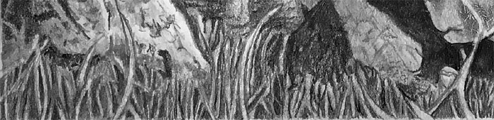
I really like that big black shadow between the wheel and rabbit. It was a bold but successful move. I'm not quite sure what it is but that doesn't matter. It connects the two elements really well by giving the eye an easy path to follow.
Fix it! It's time to move on, and to take what you've learned to your next drawing... you need avoid fiddling with this one :)
Workshops UK
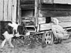
Tutorials
by Mike Sibley