Workshop Plus
WORKSHOPS 2012
UK workshop continuations
Monica (Maidstone. August 2011)
"It has been almost one and a half year since I attended your workshop... As you can see I am still working on "the Project". I don't mind to do so, I learn by experimenting and trying, but I could really use your reinforcement and feedback, to give me the fuel to proceed!"
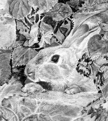
 Full marks for perseverance, Monica! :o) And even more marks for the quality of your drawing so far!
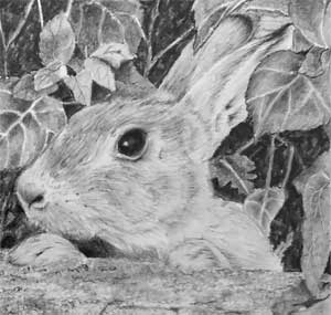
There is so much beautifully studied content in this, but sometimes that can present a problem, which is partly evident. On close inspection every area offers a wealth of treasures to be discovered, but as an overall drawing it lacks depth because everything is equally detailed. That's not a negative criticism. I firmly believe that the "Detail is King" stage has been reached before you can begin to understand where detail is required and where it's detrimental. So this is just a stage in your artistic development.
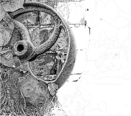
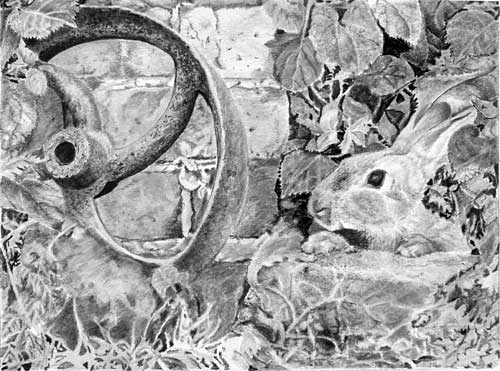
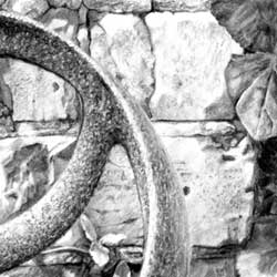
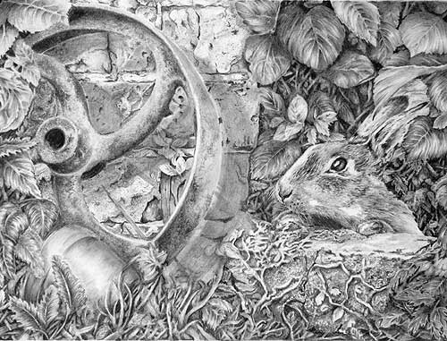
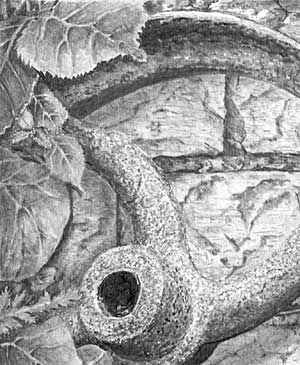
I'll take this one element at a time. The wheel is unmistakably rusty. It's dark values are nicely judged and will later balance those on the right-hand side. The oval form of the s[pokes are perfectly described, and the texture has an unmistakable clarity. I could run my fingertips over that surface and experience its broken surface.
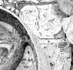
 There is an optical illusion in the reference, at the lower end of the visible rim, that I think you've avoided but you should probably make it more obvious. The rim appears to sweep upwards at its lowest point, but that upward sweep is the edge of one of the spokes that unfortunately matches the rim in value. The rim should of course continue its way around the ellipse that is hidden behind the rock, and all that's needed is a slight change in value of the spoke at the junction to split those two elements apart. I'm looking for that error, of course, but I doubt it will confuse anyone else, but it is a reminder to not accept any reference as representing the truth.
  Your bricks are so three-dimensional and display such realistic textures that I know they were alive in your mind as you drew them. That's the ideal. Nothing compares to drawing what you can see in your mind. It's difficult to explain, but I can always detect a copy of a reference that, compared to a recreated mental picture, is usually relatively lifeless. I liken the drawing of such surfaces as sculpting and, with a fixed lighting direction firmly in your mind, that's exactly what you have done.
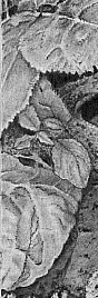 The leaves are as well-studied and interpreted as the wheel and bricks. They have been drawn with confidence and are three-dimensionally believable. Again, I can see that you throughly understood the three-dimensional form of every part and allowed you pencils to sculpt what you saw in your mind. Lower down you were brave enough to incorporate the Cow Parsley leaves, which are equally realistic. You've also used subtle cast shadows to create a sense of depth within all the leaves. Learning to see the scene as being real as it's drawn is the most common problem facing most artists at my workshops. Here I can see you experienced this scene and drew to recreate what you saw in your mind, instead of it being a "drawing exercise".
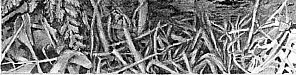 You've incorporated that awkward rock in a way that doesn't draw attention to it. It simply does it's job of breaking the curve of the wheel, and forms a backdrop for the leaves and grasses in front of it. This is one of those areas where over-detailing would harm your drawing. The grasses at the base have a lovely sense of realism and depth, although you could increase that depth by pushing some of the background blades further back into the shade - although you might have increase the strength of the background darks in order for that to work. One thing I recognised a long time ago is that not everything in Nature is fully understandable, and that lack of understanding is the "visual clue" in a drawing that makes them appear to be entirely natural. So if some of your blades are hardly visible in the shade, that's an expectation and not a problem. Your foreground blades tell me what that area is composed of. If my eye travels more than a couple of layers deeper into the foliage and it can still understand what it's looking at, that is not a natural expectation.
I'm really looking forward to seeing the completed drawing in 2015 :o)
"Unfortunately, for me it is not possible to come to England on short notice to get some more of your tutoring, so I wait for your online course to begin. Which level would you recommend me to start in?"
Definitely Intermediate, Monica, and the next 8-week session begins on February 6th. Head over to the course details and a link to Drawspace.com where you can book your place.
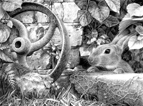
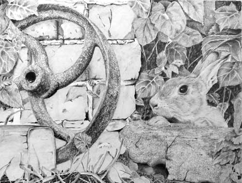
Pat (Studio workshop, UK - March)
"I hope you remember me from March workshop (lady who broke her wrists before coming) I have finally finished my last day drawing and I would like your opinion on it. It was hard work for me but I finally got there, I did find it a bit difficult to get the toning satisfactory so I hope I've done ok, but I really enjoyed the challenge. I only found time to do it after I had another accident - laid up for 8 weeks with a broken heel after falling off the loft ladder..."
 Of course I remember you! You were jiving when you slipped and broke your wrists. You weren't jitterbugging up the loft ladder were you? :o)
I'm glad you told me this was a photo and not a scan - that probably explains why it has higher contrast on the left, so I've adjusted the contrast on the right to match. I do hope it's closer to your original? In any case, this is the image I'll critique for you. There's some really good work in this and it just lacks a little strength in key areas that would have given it more impact.
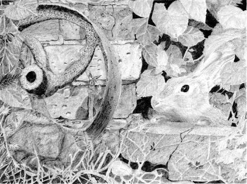
I've got to start somewhere so I'll begin at the left. The wheel is unmistakably rusty with good strong darks, and you've described the form of the oval spokes perfectly. You've fallen for a common error in this - there's an optical illusion at the lower end of the visible rim that makes it appear to sweep upwards at that point. In fact, that is the edge of one of the spokes, that unfortunately matches the rim in value,
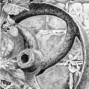 and the rim should of course continue its way around the ellipse that is hidden behind the rock. Try not to accept any reference as representing the truth! :o)
 Your bricks have texture while remaining secondary and unintrusive. However, incorporating a shadow cast by the wheel would have tied the two together and reinforced the lean of the wheel. The leaves at the top have been sharply and confidently drawn with a very believable three-dimensionality. Those lower down are less successful and might have benefitted from a darker background, which would be acceptable if they were casting shadows. And the lower left corner is a bit weak - soft forms and low contrast, but you've made a brave attempt at negative drawing for the grass. A little more work on the leaves would give them depth and more reality.
 Your foliage at the top right has a sense of reality that matches the top left, and your vague shapes in the dark shade suggest depth very well. Those dark values nicely balanced the darks in the wheel.
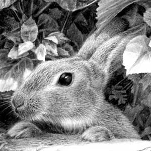
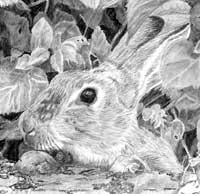
Your made a very creditable attempt at the rabbit. It's clearly hairy and you've made good use of those prominent dark hairs on top of its muzzle. It has a lovely dark and glassy eye too, although a truly white highlight might have helped to make it even more dominant - which it needs to be, as a device to draw your eye to the focus of the drawing. Overall, it lacks a strong feeling of three-dimensional form, but that's nothing that a little more experience and confidence won't fix in time.
You've done a good job with its paws - they are clearly different, yet the reference used a cloned left foot for the right one. And you've grounded them on the stone very well.
The stone that the rabbit is peering over lacks the sharpness that its foreground position demands, as does the ivy growing over it, but it only needs a bit more work to sharpen its detail and boost its contrasts to some extent.
I think you've done really well, Pat, and you should be justifiably proud of this.
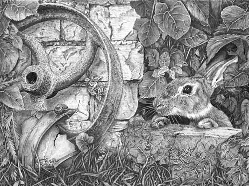
Glyn (Terrington St Clement, King's Lynn, Norfolk workshop, UK - August)
"Thanks for the recent workshop in Terrington. I believe we all learnt a great deal and enjoyed ourselves very much. I have attached the finished drawing that we began on the final day of the workshop.
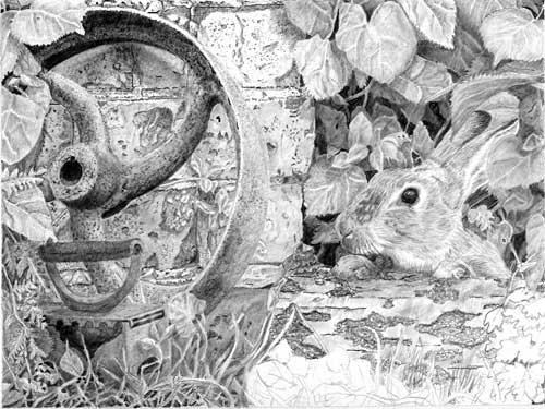
 First, many thanks for helping me to organise the workshop but second, and far more important... this a spectacularly good!
There's a wealth of excellent work, it's perfectly balanced, three-dimensional, instantly understandable, and yet it contains treasures to discover.
I'll take this one element at a time and begin with the wheel, which is unmistakably rusty. It's dark values are nicely judged and balance those on the right-hand side, and you've described the form of the oval spokes perfectly. There is an optical illusion in the reference, at the lower end of the visible rim, that you've included without question. The rim appears to sweep upwards at that point, but that is the edge of one of the spokes that unfortunately matches the rim in value. The rim should of course continue its way around the ellipse that is hidden behind the rock. Of course, I'm looking for it and I've no doubt it wouldn't trouble anyone else, but it is a reminder to not accept any reference as representing the truth.
 Your bricks are perfectly pitched in both tone and detail. They display a very realistic texture and make perfect sense when viewed closely, yet they are not over-detailed or distracting. The leaves on that side have been confidently drawn and are three-dimensionally believable. You were brave to incorporate the Cow Parsley leaves but, again, they are very realistic, and that's greatly helped by your intelligent use of the cast shadows that fall on them. The biggest problem facing most artists at my workshops is learning to see the scene as being real in their minds, instead of it being a "drawing", but I can see you have experienced this scene throughout.
 You've solved the problem of the rock and I love the way the roots that grow over it describe its form, helped by the cast shadow. The grasses at the base possess a wonderful sense of three-dimensionality, realism and depth, with sufficient background blades to satisfy my eye, no matter how deep it travels.
Moving to the left, your foliage has such a sense of reality that I feel I could lift any leaf to explore those behind it. The surfaces and textures have been handled really well - shiny Bindweed that contrasts well with the more muted and less reflective surrounding foliage. And the darker values, compared to the left-hand foliage work to balance the dark values in the wheel. The lighter foreground leaves serve to add an enormous amount of depth in that area and solidly place the rabbit in the mid-ground.
 The rabbit is masterful. It has wonderfully rendered textures, without them being coarse or dominant, and equally good three-dimensional modelling. It's lovely dark eye perfectly surrounds the highlight and they combine to instantly draw my eye to the rabbit, firmly identifying it as being the principle focus of the drawing. I also appreciate the work you've put into the paws - purposefully making them different from each other. In the reference, one foot was a clone of the other so it definitely required some artistic licence.
The stone beneath the Rabbit has a great sense of form and subtle texture, greatly assisted by the cast shadow of the rabbit and the growth of the dead ivy. And the subtle cast shadows within the ivy perfectly intertwine its sinuous growth.
Not only do I feel this scene was alive in your mind as you worked, I also admire that it extended to every single element within the drawing. The interaction between all the elements is superb, as is the overall study. Truly excellent work!
Don (Northlew, Devon workshop, UK - July)
 There's some good and inventive work in this, Don. My first impression (that I pay a lot of heed to) is that it's a drawing in two halves - the left succeeds rather better than the right because, except for the darks, the right-hand side is tonally weaker. That said, I'll start on the left.
Your wheel has a very realistic rusty surface and is correctly non-reflective, which is one of the key visual clues to a rusty surface. It's dark values are strong and balance those on the right-hand side. There's an optical illusion at the lower end of the visible rim that has caught you out. The rim appears to sweep upwards, but that is the edge of one of the spokes that unfortunately matches the rim in value. The rim should of course continue its way around the ellipse that is hidden behind the rock and foliage.
Your bricks are excellent! The top ones especially display a very realistic texture, and your mortar quite clearly extends both forward of the bricks and recedes behind them. The lower bricks are perhaps over-detailed and a little distracting, but that's easily fixed by applying a layer of darker tone over them to decrease the contrast. Your leaves on that side are confidently drawn and posses a strength of tonal value. And you've invented some good leaves to avoid having to draw that over-complicated Cow Parsley.
The grasses at the base almost work. You have right idea but have over-simplified and reduced the layers. The foreground blades are excellent, but if you try to picture that area in your mind I'm sure you'll see that you'd expect to see much more going on behind them. All it needed was a layer of grass-like shapes to partially replace your rather solid dark shading. Then you could have placed your darkest shading between those shapes, and finally pushed the shapes back into the shade. Visually that would give the eye more content to find if it explored between the foreground blades.
Moving over to the left, your rabbit is potentially well drawn but suffers from a lack of three-dimensional modelling that darker tones would have suggested. Basically, it lacks contrast and is too light overall. Apart from that, as far as I can see in your scan, the drawing is descriptive of the hair texture and it doesn't need much more work to increase the strength of the values to give an even better sense of reality. The eye is excellent and immediately grabs the viewer's attention. Darkening the head won't necessarily lose that attraction.
Your foliage has good depth and three-dimensionality but, again, it is too light and overpowered by the left-hand half of the drawing. Some of the midground leaves could be pushed a little deeper into the shade, which would add additional planes and further increase the appearance of recession. You have already suggested recession very well but it could be strengthened, and once darkened you'd have a better idea of how to strengthen the foreground leaves.
The stone on which the Rabbit is resting his paws is good, but deep contact shadows beneath the paws would more solidly ground him. And cast shadows could be used for the dead ivy growing over the stone to increase its presence and also help to balance the darker half of the drawing. The extreme foreground at the base of the stone is a little bare of interest - the inclusion of leaves, blades of grass, or anything else that springs to mind, would help to connect the stone to the ground and break up its lower edge.
You're not far away from achieving a really good result, and you should be justifiably proud of this.
John (Studio workshop, UK - April)
"Hi Mike, There isn't much more to do, I think!! I have found it hard not having had much experience at drawing much more than just a head of a dog. It was fun though seeing how different aspects of the course fell into place. The areas I had the most difficulty with were shadows, not being sure how to imagine them in what is a composite picture. The 'bunny' does seem to be lines rather than fur looking. The foreground is particularly difficult, that's why it is only part done. Trying to draw it as we did on the course is not the same. There is no deep black shadow so I'm not sure how to get the mid-tones to make it look real. At the moment it is just looks like white to grey jumble. I'm not sure where to look in your book for help. The Silver Birch log was probably not such a good idea, I thought it would be easier to draw. For all that, I'm quite happy with my first attempt. I would never have attempted anything like this before the course. Good course, good food, good fun. Thanks!"
 Before I tackle your comments, I have to say that you're being rather hard on yourself. I think this is remarkable piece of work given your starting point.
There's some lovely work in this, and inventiveness too. I think your substitution of the... I have a hazy idea of what it is but I can't remember!... for that rather weak rock in the composition is perfect. Your textures all work well and the drawing holds together well too, despite your difficulty with the shadows. Actually the shadows often suggest themselves if you imagine yourself being in the scene. The human mind is perfect at picturing a two-dimensional scene in three-dimensions and, as long as you have lighting direction firmly noted, the shadows fall into place. And usually they work even if they're technically wrong.
 Your wheel has a lovely rusty surface and is realistically non-reflective. It's darks work well too in balancing the darks on the other side. I think your brick textures are remarkable, and your mortar suggests the grainy texture well. And both offer visual interest without dominating the scene.
The rabbit, despite your is better than you hive yourself credit for. The lines are quite descriptive of the hair texture and growth directions and don't need much more work to increase their sense of reality. Just bear in mind that hair grows and covers the skin in layers, so draw each layer individually and try to tuck each layer behind the previous one. And use lines that suggest the hair's length, which you have done.
 The Rabbit's eye is near-perfect! It's black, glassy, has a lovely highlight and true three-dimensional rounded form. he only area that could do with a little more work is the side of the head, which has good texture but doesn't quite describe the rounded form of the cheek.
Your foliage has good depth, although some of the midground leaves could be pushed a little deeper into the shade, which would add additional planes and increase the appearance of recession. The leaves themselves, especially for someone not used to drawing them, succeed quite well. They lack a little definition, but I think that's just due to a lack of confidence. As long as you keep drawing such things will improve over time, almost without you realising it.
The Silver Birch log was a good idea and rather more successful than you might think it is. Just be a little more forceful with internal shadows (such as sharp shadows that suggest bark is lifting or curling away from the wood beneath) and I think you' should be very please with the result.
 When you say "The foreground is particularly difficult...There is no deep black shadow so I'm not sure how to get the mid-tones to make it look real." that's easily fixed. As I explained, this is your world and you're in charge, so simply inject dark shade wherever you feel it is needed. Never be persuaded otherwise by any reference. We're drawing our interpretation, not copying it. You're actually not far from achieving good results. You can inject a few very deep black internal shadows and then pay around with the midground, pushing selected parts deeper into the shade and letting other come forward. If you make an error a quick touch with Blu-Tack will soon allow you to rework it.
My initial reaction on seeing this drawing was of delight. Your should be justifiably proud of your achievement.
When you say "The foreground is particularly difficult...There is no deep black shadow so I'm not sure how to get the mid-tones to make it look real." that's easily fixed. As I explained, this is your world and you're in charge, so simply inject dark shade wherever you feel it is needed. Never be persuaded otherwise by any reference. We're drawing our interpretation, not copying it. You're actually not far from achieving good results. You can inject a few very deep black internal shadows and then pay around with the midground, pushing selected parts deeper into the shade and letting other come forward. If you make an error a quick touch with Blu-Tack will soon allow you to rework it.
My initial reaction on seeing this drawing was of delight. Your should be justifiably proud of your achievement.
Marian (Studio workshop, UK - March)
"Phew, I finally finished!! I loved every minute of it and certainly learned a lot. Your comments will be appreciated (I hope)!"
 You have been busy! This is a very involved drawing, and I love your flowerpot solution to that shapeless rock in the reference.
Your rusty wheel is unmistakably rusty - it couldn't be mistaken for any other texture - although I think its darker tones could do with reinforcing, especially towards the base. If none exist in that area in the reference you can invent some. A cast shadow from the flowerpot might work as well. Anything that will help to balance the dark tones at the right-hand side, which at present are rather dominant, producing an imbalance.
The bricks have sufficient interest for close inspection, possibly a little too much, and the shadow cast by the wheel is worked out well. A small error has arisen I think - that cast shadow appears to fall across the bricks and a small section of foliage, but the edge of the shadow doesn't alter direction as it passes over the leaves. As they are on a different plane (further forward) than the bricks, the shadow would cross them at a different angle. As I said, it's a small point but often it's the small things that can add that extra shot of reality.
 Your leaves, at both sides, are excellent! Those at the left are perhaps rather light (probably leading to the feeling of imbalance) but the right-hand ones are solid, wonderfully textured and I feel I could pinch one between my fingers and feel the surface. The background behind the leaves is pleasingly dark, although I think you could inject a little more mystery. It contains of lot of interest and a suggestion of depth, but don't be afraid of pushing some elements right back into the shade. That can sometimes be so deep that some elements almost disappear - or actually do disappear as they recede - which adds a measure of mystery. Not everything in Nature can be understood, and often its that hazy suggestion that suggests reality.
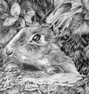 Your rabbit has a hairy and believable texture with a nice variety within it, from the coarser hair on top of its muzzle to the softer side of the cheek. The eye is perfectly judged. The intense black contrasted with the white highlight and the secondary highlight below draws my eye directly to it. The sharp drawing and deep tones of the nose work well too. Both paws appear to have a dark outline around their bases that can be easily expanded into a broader contact shadow that will help to ground them better and increase their presence.
Finally, the Ivy on the stone beneath the Rabbit and the grass are a good attempt at negative drawing, but I think they're a little too contrived. Everything is laid out for the viewer, clean cut and a bit over-designed. Because of that, it lacks depth and reality. Get in there, scruff it up a bit, and be more forceful when it comes to pushing some of it into the shade. That's all it needs to restore a good feeling of reality.
Overall, I think you should be delighted with this - I know I am!
Hazel (Studio workshop, UK - April)
"I finally finished the composite! Although I think I may have rushed some bits. I got some embossing tools and used them on some of the leaves in the top corner, what a difference for the veins on the leaves, I will use this for doing them in future. I think I enjoyed the bricks and wheel the most. I am going to attempt a drawing of a rabbit with grass and daisies next so any tips on how to improve those would be great. Thanks for everything!"
 If you rushed anything I don't think it's done much harm, possibly because my eye is caught by the good work in this. You've created some good textures and nicely tied everything together.
I've adjusted your scan before posting it because I'm fairly certain it's lost some of its contrast, so I hope I guessed correctly, but I've been conservative in the adjustment.
Working left to right, Your rusty wheel is definitely rusty. It couldn't be mistaken for any other surface - well done. The bricks are nicely underplayed with sufficient interest for close inspection but not vying for attention. The only thing missing is a shadow cast by the wheel on the wall. That would have helped to tie the two together, and reinforced the leaning angle of the wheel. I really like your solution to the insipid rock problem. Replacing it was a good idea, as was getting rid of the Cow Parsley leaves. Your negatively drawn grass works well too.
Moving right - the leaves above the rabbit have believable body and three-dimensional form. I could almost run my finger over them and feel each undulation. Your indenting of the veins has worked well, but I'm concerned that you might think it's the ultimate answer. Indenting can give a very mechanical line and, personally, I'd rather draw around those veins than indent them. That gives my more options of how to treat them. Indenting is such a one-time operation and difficult to alter later should it need to be. I'm a little less happy with the background behind them because it could have been much darker. It contains interest and suggests some depth but not much, because it's almost all on the same plane. Never be afraid of really pushing some elements right back into the shade, which can be very deep if you've first created intense darks as the absolute deepest shade. Don't forget you can always change your mind and use Blu-Tack to pull anything forward again.
 Your rabbit is lovely! it has a believable hairy texture that correctly varies between coarse on top and softer down the side of the head. When you draw your next rabbit, try to sharpen your drawing of the coarser hair - consider each mark before you make it and make every one count. The eye is superb - the intense black (that I was looking for in the background) contrasts perfectly with the bright highlight. It draws my eye directly to the rabbit, as it should, and the shadow beneath the lower eyelid helps with that too. The nose works for the same reason - the dark nostril gives depth and allowed you to use a wider range of tones around it to describe the nose's form. A touch of contact shadow beneath the paws would have helped to have emphasised them a bit - they look a little lost, especially the right-hand one.
The stone block beneath the rabbit's paws has lovely texture, and I really admire the work you've put into its lower left-hand end. The three-dimensional shaping in that area is perfect - I can immediately understand its form. It was a bold decision and one that has paid off. The detailed work in the leaves at its right-hand end are well-studied too.
This is a drawing you should be justifiably proud of. Good work, Hazel!
Dave (Studio workshop, UK - March)
"I would appreciate any advice or comments you may have on this drawing, as I found it contained quite a few challenges to overcome - trying to get the contrast/texture between the wheel, stone and brickwork to look correct was very testing. I have replaced the rock at the front of the wheel, with something a little bit different, (hope you don't mind), this also gave me a few problems of its own. I did enjoy drawing this set piece, and have tried to put into practice what you were teaching at the workshop."
 There's some excellent work in this, Dave, not to mention inventiveness. First, I don't mind you altering the composition at all, in fact I usually recommend that you do - to make it your own. I really like your solution for removing that featureless rock!
My initial reaction was that this lacks a focal point - everything is a little too evenly toned. However, when viewed full size that matters less than it appears to do here. It invites exploration and that is never bad. It's also possible that your scan is partly responsible, although I have adjusted it. Viewed overall, I think the problem lies with the brick wall. It's rather light tone causes it to dominate, which is not what you expect from a secondary, supportive element. I suspect that was an attempt to make the wheel stand out from it, but that could have been achieved by darkening the wall and then throwing the wheel's cast shadow on it more strongly than you have. That would have demanded stronger darks within the right-hand foliage, but that area can stand it.
More likely is that you completed each element without regarding the whole drawing, but that's to be expected with a study that's outside of your experience. Taken element by element, this is very well studied with some superb observation and execution.
 Your foliage is very believable and I'm delighted to view it. You've created an excellent dense and dark shadow within the wheel's central boss and the texture of rust is unmistakable. However, a rusty surface is not reflective so the white within it, which should be reserved for highlights, doesn't seem natural. All that's wrong here is that you've stretched the contrast too far. And that in turn probably resulted in the light brickwork. Stronger shadows beneath the spokes and rim would have allowed you to layer the rust with 2H or similar, removing the white. The resulting midtones would make the wheel look more solid and the surface dull without affecting the rusty look you've created. The problem is that once you create a high contrast area, such as this one, you also create problems for yourself. From his point onwards everything within the drawing will have to be balanced to this area's tonal range in order to compliment it.
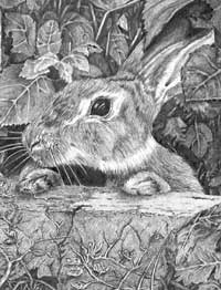 Your rabbit has character, good texture, and a lovely dark eye that would have attracted the viewers eye to it if the wall had not been vying for attention. Unfortunately, the eye highlight s not as bright as it could have been - pristine white almost always best, as it contrasts brilliantly with the dark pupil or eye. And because the eye highlight is just one of many throughout the drawing, it loses the impact it could have had. As a stand-alone rabbit, I like it a lot.
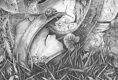 Finally, I can't leave without mentioning your inventive lower left corner! I think this area displays your true potential. It's superbly and confidently drawn, despite your mention of problems. The negative drawing within the grass works really well and creates a true sense of depth while maintaining a subtly that lends it a greater sense of reality.
 Well done, Dave.
Workshops UK
Tutorials
by Mike Sibley