Workshop Plus
WORKSHOPS 2009
US and UK workshop continuations
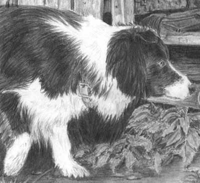
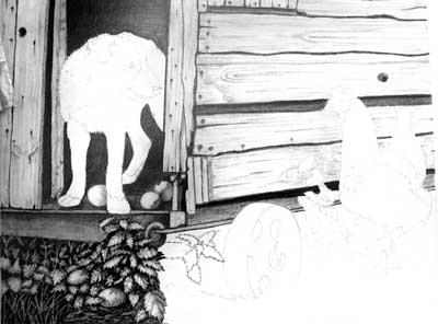
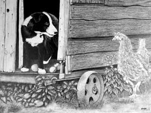
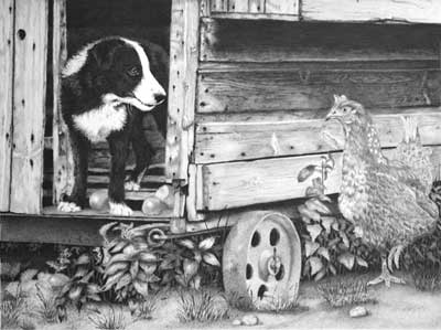
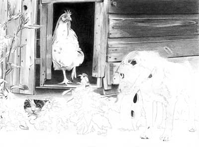
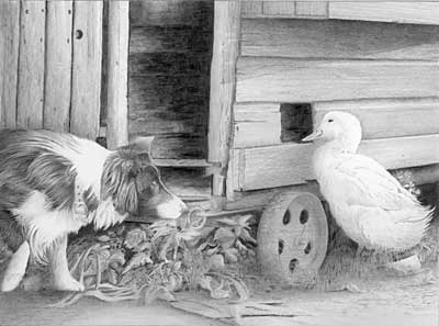
Pauline (Somerset, UK)
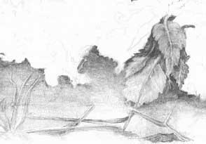
The workshop was great and although I had completed about two thirds of the picture I couldn't wait to get it finished while the techniques were still fresh in my mind. So 4 hours on the Monday and it was finished....well at least I think it is! The foliage was the hardest part for me, need a lot more practise to get it looking natural.
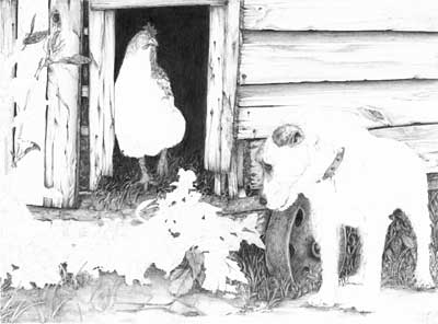
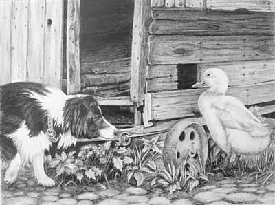 Well done, Pauline! There's a lot to be admired in this drawing. The henhouse offers a place to explore but doesn't attract attention away from the Collie, which is not easy to achieve. The Collie itself is quietly stalking the sound around the coner; your duck is blissfully unaware, as it peers through the hole into the henhouse; and your foliage works very well too.
 In fact your foliage possesses real depth and a good sense of reality, as does the cobbled ground.
My only slight criticism is that the wood on the wall above the duck is too grainy, as it attracts attention away from the duck. Wood rarely exhibits a strong pattern of grain and is most often very subtle and subdued. It's a secondary element in this study and would have benefitted from being played down.
I'm glad you slowed down to study and draw the Collie, as I could almost push my fingers into that coat. The duck too is well drawn, with just enough feather detailing to suggest an entire covering of feathers - which are rarely distinguishable as individual feathers on a duck, even if you have a live one in your hands. I like the way it's gently toned down too, so it reads correctly as a white duck in the shade.
Very well done! You should be proud of this drawing.
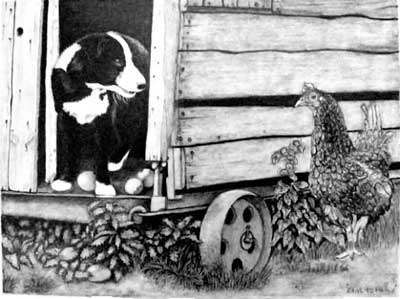
Kathryn (Somerset, UK)
I really enjoyed your workshop in Glastonbury. As a novice working with graphite I found it a very a very useful workshop and enjoyed the three days very much. I did not manage to finish my picture whilst there but could not wait to complete the picture. Thank you again for all your help.
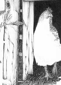
 Novice?! Well you aren't now!
This is very good, Kathryn. You've put so much thought into this that it greatly pleases me. The henhouse offers the only depth in this composition and you've used the opportunity to the full. The wood looks old and battered but it nicely played down so it doesn't attract attention away from the main characters. The duck is very well drawn, with just the right amount of detail to suggest feathers - and I love the invention of the rock that it's standing on!
 The stalking Collie is excellently studied. I can see you've really taken your time to study its make up and have rendered it piece by piece so you drew with understanding. Those layers of hair ring true. And that bright, steely gaze.... I wouldn't want to be the duck!
You should be very proud of this. I think you'll look back on it as a milestone drawing in your development. More power to your pencil!
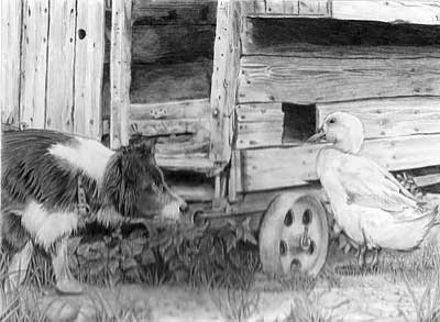
Emily (Somerset, UK)
Thank you so much for writing such an amazing book and running workshops for us lesser mortals to have the opportunity to learn from you! I had a fantastic time at Glastonbury and although I haven't finished the final picture, it inspired me to dig out an old photo of my border collie, who sadly, we had to have put down a couple of years ago. I am really pleased with the result and couldn't have achieved it without having read your marvelous book and attended the workshop!
 Thanks you, Emily! I don't often critique work that's not included in a workshop, but I'm happy to do it for you.
You say you are a little disappointed with her right eye. I think you're being too hard on yourself but there is a little inconsistency between the eyes. The feeling I get is that the left eye is looking directly forwards but the right one is looking in a slightly different direction... but I'm not sure why. Although it's a very marginal misalignment and I wasn't aware of that until you mentioned it.
You say you also "struggled with the positioning of her face, as she isn't straight on" but you've done very well. However, there is a small problem in the muzzle that might account for your problems with the eyes. Her nose is twisted clockwise. If you lay a straight edge on top of her head and move it down, the roots of her ears should sit at the same angle, which they do, as do the eyes, but her nose (bases of the nostrils) are too level. That in turn misplaces the central "gap" below her nose and may have moved her mouth also. Or she might have simply twitched her nose as her photograph was taken and that's not helping you.
Other than that, I think you should be very pleased. You could try altering the features again but you risk overworking it, so I suggest you accept it as it is and move on with lessons learned.
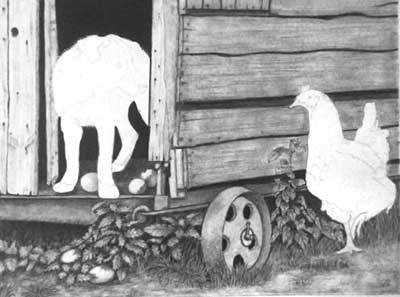
Edith (Sawley, North Yorkshire, UK)
...got some leaves done today and eggs. took over 6 hours to do. reasonable happy with it. Is it working okay? What do you suggest? I know it can be improved on but I haven't done this type of thing before. I darkened it a lot more behind the dog too with a 6B and then went over it with a 4b and a 2b.
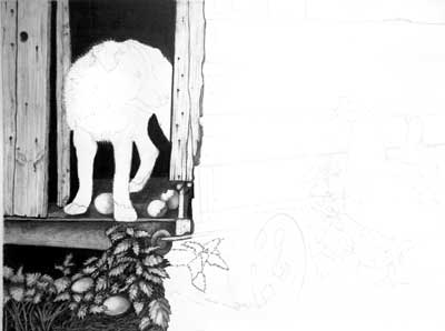 First impression? Looking really good.
The leaves are looking great but you're trying too hard and losing depth. You have the foreground leaves correctly well-defined, but aim for some randomness behind, with varying degrees of tone to suggest depth.
The dark background looks great - it should really push Robbie forwards, but try to get his back looking as though it's deep in the shade - visible but overtly so.
The wood is looking great too. Suggestive of the texture and age without being dominant.
The eggs on the ground may need cast shadows adding from the leaves around them. It will tie them in better. Not too dark but enough so the shadows describe the roundness and place them correctly in space.
You're achieving a good deal on impact in this drawing and I'm looking forward to seeing it progress.
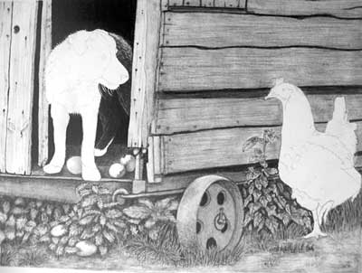
Update : 24.05.2009
Here is the next bit of my drawing but I have to say I am not happy. I have added more to the bottom left corner as you will see and did the wood too but two things here:
1: Should I leave the knot-hole in above the hen or take it out? the idea was to draw attention to the hen as the knot-hole draws attention to the dog. I can easily take it out if you think I should."
1: Should I leave the knot-hole in above the hen or take it out? the idea was to draw attention to the hen as the knot-hole draws attention to the dog. I can easily take it out if you think I should."
 I suggest you take it out. I'm quite certain it will draw the eye away from Henrietta. I also suggest you give the side wood an overall layer of 2H, which take out any white content, diminish the contrasts, and "blend" it. Then when you draw Henrietta, make the drawing of her contrasty and sharp. That contrast between the sharp hen and smooth background will make her stand out and attract attention.
2: It was only taken with my camera but your work looks smooth whereas mine looks grainy and bitty no matter what I do so what is your secret? I go over it with a lighter pencil, 2b down to HB for example, but I cannot get it as smooth as you do so why?"
I'm not sure, and I have to say that your drawing looks smooth to me. Possibly I draw with a lighter touch when layering, possibly (if you're referring to the side wall) it's because you're overworking it. It it should be also darker. You're using line to describe the corner of the door post, and you've been forced into doing that because both sides are the same tone. You have to decide whether the front or side of the henhouse is the darker side, then you won't need that line.
The wood on that side wall is also showing too much grain - it's tempting to include it but in reality grain is rarely noticeable. If you layer it, as I suggested earlier, that will retain the grain but make it appear more subtle. And if you decide to darken that wall, try layering lightly (many layers) with HB to achieve both effects at the same time.
Try not to work so hard on your foliage. It's very easy to over-think these things and lose the spontaneity. I don't dislike it at all, but it is a little regimented, and with no weeds growing as ground cover beneath the nettles. It's also very high contrast - you don't need to make every leaf so obviously separate from those around and beneath it. In reality, leaves touch, physically lay on each other, and are not immediately identified separately. Sometimes less is more, and this is one of those times.
Update : 26.05.2009
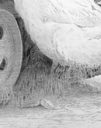
I spent the day on this today, about 8 hours. As you see I altered it again as I wasn't happy with the last update on it. darkened the wood and put leaf shadows on the eggs, altered the foreground and did the wheel."
 The post looks much better now that you're relying on line for the corner, and the darker wood on the side works better too.
I like the rounded feel of the wheel, but the top looks odd. It's a flat rim so the top should be flat too, but it slopes downwards to the right. Also the centre is too light and should conform to the lighting of the side of the henhouse, as should the central washer.
Also you are using line again - in this case to separate the rim from the centre. Personally, I'd adhere to the photo, which shows no hard edge between the two, just a curving surface that will be less distracting.
The shadows on the eggs work well, and they appear to be a part of scene now. But your foliage still troubles me, as it doesn't reflect a sense of reality. All the leaves are so sharply defined and the shadows so black that it lacks the subtlety and randomness of Nature. Basically, the drawing is too strong and dominant. That's correctable simply by toning those shadows down with Blu-Tack and maybe cutting some random marks in the shadows between the leaves, which you then push back into the shade.
The foliage by the hen looks much better in comparison. It's layered, not everything is immediately identifiable, and it's generally toned down and more subtle. I do like your ground and grass though - in case you were beginning to think I had a long list of "problems" :o)
If you want to begin work on Robbie, I'd start with his rear end - using that to define the outline of his head. You can use a degree of reflected light to slightly highlight the edge of his back, then gradually push that back into the shade until it reads correctly. Then I suggest you begin work on his head and work outwards.
Update : 26.05.2009
I have altered the wheel and darkened it too where you suggested, re-worked the foliage and added more under the house, and toned it down too. I've also done some of the dog but stopped until I know if I am on the right track with it - not done this kind of dog before."
 The foliage is much better! There are weeds beneath the house and in front, just as you might expect there to be. None of the leaves shout at you... but now I think you've gone too far, so they appear to be further away than the hen's weeds.
Now go back in and strengthen a few selected shadows. But don't touch the leaves - one of the things that bothered me was that big leaf beneath the corner post that was just too detailed - I could see things I'd not expect to see at this distance.
Robbie is looking good! Black hair just right. White hair too light, but you're correct to leave that. Complete Robbie and then go back and tone that white down, as you need his front legs to refer to.
Try drawing his eye next and then work outwards a little. Next draw his ear and when you do, aim to produced a really black cast shadow under the right hand edge, which will make it pop forwards. Then go back and connect his eye to ear.
Where white meets black, remember the white hairs overlay the black. So think back to the negative drawing exercises and draw the black up into the white, with good crisp points to suggest they are shadows cast by the white.
Update : 29.05.2009
I spent all morning and early afternoon on redoing nettles and then went on to the dog. Hope it's OK?"
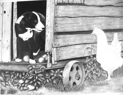 It's more than OK, I think it's very good indeed! Have you worked on his white areas yet? His back foot is far too white considering the shade that it's in. But he's got a good coat texture, a lovely bright eye, great character, and his form is clear (which is not easy to achieve).
The nettles look much better now, although I prefer the top of the main clump (below Robbie) than I do lower down, which is still a bit contrasty - those black shadows look too dark for the lighting and they make the leaves stand out too starkly, so it looks less like a clump with depth.
I must mention the eggs alongside Robbie... love them!
What grade of pencil do you suggest for the hen?"
I think I'd try an HB or F first and see how it goes. I'd also probably begin with the eye, as that contains the main black. Aim for a nice rounded form and use shade, reflected light, and sharp drawing to separate her from the wall.
Update : 03.06.2009
I had to darken the wood and lighten the hen - oh well..."
 Well, I would have done the reverse, because the hen is of equal importance to the story as the dog. I feel it's lacking any sense of presence. Ideally, you should be using some strong drawing for the hen, coupled with strong highlights too, and very sharp drawing, which will contrast with the softer drawing of the wood to give a good separation.
Well here is the FINAL FINAL of the dratted hen. I sat this afternoon and tried again to follow what you had said about darkening her more so I did, but I had to lighten the wood - does it work this time?"
 Much better! I also feel that this camera image doesn't do your work the same justice as your earlier scans.
Lightening the wood was a good move, as the re-worked hen now plays her part stage front and is no longer dominated by the henhouse. Well done!
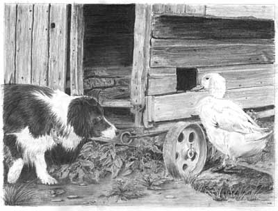
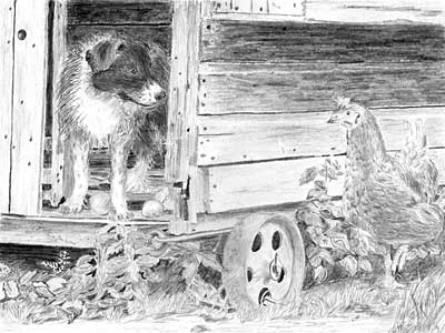
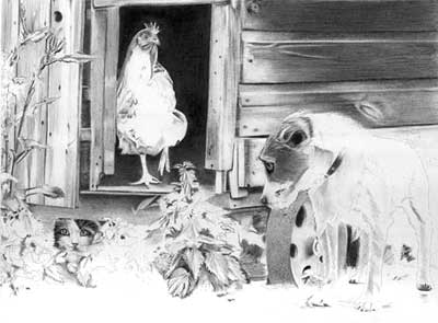
Mark (Somerset, UK)
Thanks for the course, I really enjoyed it and found it very useful. It was a pleasure to meet you. Anyway I have finished my drawing and if possible can you give me an honest view."
 Well done, Mark. This has many good points, especially the Border Collie, which has such a wonderful and focussed gaze that I feel sorry for the inquisitive duck.
The henhouse is very well drawn and I like the way you've played down the importance of the junk inside it. You have established a pleasing dark interior too, although it could have been smoother and less contrasty, as those changes in contrast tend to attract my eye away from the action.
The foreground works exceptionally well, and the nettles present a good sense of a natural reality - identifiable yet definitely a background element that contains depth.
I'm not going to critique your Collie at all because it's near-perfect. But I must point out that the use of line to separate its back from the wooden door is definitely not something you should repeat. Once that line becomes evident, all feelings of reality are immediately discarded.
You duck is very well drawn too, with sufficient suggestions of feather to relay the surface without being over-detailed. Your choice of tone for the hole in the works very well to attract attention immediately to the duck, and helps the duck to stand out, despite its tonal values being similar to the wood behind.
Overall, an excellent attempt and I congratulate you.
Norma (Sawley, North Yorkshire, UK)
Thanks for the workshop at Sawley. I thoroughly enjoyed it and it was great meeting you and Jenny. I've spent a while on the picture, but am not sure if it's finished?"
 I'm glad you decided to continue working on this, Norma. And I've not forgotten that you turned Robbie into your own dog :o)
Overall it's looking good. Your dog's face has a nice bright eye and he looks suitably happy, considering his fun with the eggs! You got the idea of negative drawing too with his white front overlaying his darker body. However, you've used line to outline your broken eggs, which is something you should work at removing in future. Just use the surrounding tones to define the edges instead of line, which has no place is a realistic drawing.
Your foliage could do mid-tones adding. You've correctly established the background first, using negative drawing, but all the leaves are a similar tones, which suggests they are all in the foreground. With no midground, your foliage is lacking depth. The wood is nicely studied and executed, as is the wheel, which has pleasingly accurate ellipses.
Finally, Henrietta, although tonally on the weak side, has bags of character and a nice sense of movement. She just needs some deeper shadows on her shaded side and beneath to lift her clear of the wood behind her. But I'm reluctant to suggest you touch her, as she has such character! :o)
I think I'd call this done, and then move on with lessons learned. You should be very pleased with this.
Grahame (Sawley, North Yorkshire, UK)
First let me thank you for another great workshop weekend, once again I came away with more knowledge and some great tips to help me with my drawings. Here is my version of the drawing exercise you gave us to work on. As you can see I have changed a few things to make it a little more individual, I couldn't seem to get the nettles right below the dog, so I invented a new weed! your comments and any advice are as always welcome."
 Thanks for letting me see this, Grahame - it was well worth the wait. There's so much I like about this and very little to criticise.
The wood is simply superb! It has age, character, and texture, yet it remains a secondary feature, as it should. Your attention to detail has paid well.
Robbie, is hairy (where hairy matters) but subtle, so it doesn't detract from his bright eye or smiling face. His eye is as perfect as it could be, working on this scale. You've also very subtly separated his body from the dark background, which works really well, and his white areas contain just enough detail but not too much - a very good balance.
Moving down to your "invented" weeds... Well done! This is your drawing and not mine, so changing those weeds was the right decision. And they work so well, especially the plant in the shade beneath the towing eye, which serves to give depth to the plants on either side. I like your ground too - believable grasses, stones to add balance and interest, and a dirt floor that does its job.
My only criticisms? The ellipse of the wheel is at fault down the right-hand edge. And Henrietta is not sufficiently strong. I feel you could have been more courageous with the range of tones you used for her - even the inclusion of one or two darker tones would help you lift her away from the background. Her textures are good, as are her eye, balance, and gaze, but she lack form. The use of darker tones around her shaded sides would increase her presence and improve her three-dimensional form.
It was good to have you with us again and I'm really pleased to see work of this quality.
Update : 03.06.2009
I agree with what you said concerning the arc of the wheel and chicken tone, I have worked on both, the pic I'm sending you seems to show the chicken with a little more contrast than the actual drawing."
 Those stronger tones certainly help but I think it could do even more strengthening. I feel you need to get some good, strong tones in there to lift her away from the henhouse - especially in her head. Be careful to retain, or even brighten the highlights, so you don't lose her in the wall. Try selected areas such as her eye and nostril - strong tones to pull the eye into her. She shares equal importance with Robbie in telling the story, so she needs to be dominant.
However, as a drawing of a hen, she's looking good, with a nice sense of body and three-dimensional form. Her lightly-toned feet work very well. In fact they catch the eye and help to draw attention to her. And that raised left foot is dominant, which is important, as it relates movement and story substance.
I'd leave this now Grahame and move on with lessons learned, as I suspect the hen looks stronger in the original, and only you can judge that. But if you want to work on the hen again, I'm happy to critique it here.
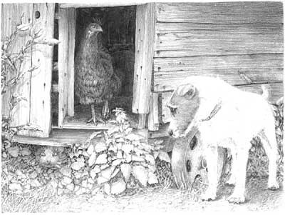
Amanuel (Goshen, Indiana, USA)
I am still practicing and trying to implement the techniques I learned at the workshop. Here is what I have completed so far from the workshop and more will come. Please give me your feedback on my progress so far."
 There's very little about this that I'd personally want to do differently.
Your door to the left is nicely played down and I'll be interested to see how you handle the foliage in front of it. And the wood to the right is equally perfect - a lovely attention to detail with just a suggestion of grain and aging that won't attract attention away from Amy the dog, and which you are already using to define her outer edge.
Don't forget, when you approach the drawing of the hen, that this is a composite arrangement and the hen's lighting is at odds with the scene she is now in. Personally, I'd dispense with her tail feather and push her tail well into the shade. And I'd spend time emphasising her two main points of interest: her head, that relays her annoyance; and her raised foot and thigh, that signals movement or suspended movement. Her body needs three-dimensional shaping but I would suggest just a covering of feathers.
The wood is perfect, and overall I feel that you are correctly "living" each element rather than seeing it as a collection of tones and textures. Keep up the good work!
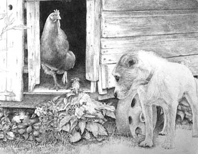
Roger (Ithaca, NY, USA)
Here is my finished drawing. I really enjoyed working on it and would like some feedback on it. My goal in taking the course was to improve the quality of my work. Although I've got a long way to go you certainly have been a big help.
 Thanks, Roger, and congratulations on completing this! It's not an easy drawing, and I've a few issues with its rendering, but there is also work to be admired here.
My first reaction is that you haven't sufficiently pushed the darks, except in the henhouse, which has resulted in a rather flat drawing. That will have made your life unnecessarily difficult, as you've forced yourself to work with a restricted palette of greys.
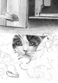
You also haven't given enough thought to where features exist within the drawing. For example, Louie the cat is underneath the henhouse and will be in its shade. The darker tones that the position requires would have served you admirably in not only hiding Louie but actually making him more easily understood once discovered by the viewer. The rear of the hen too is in the deep shade of the henhouse's interior, but here she is receiving to much light. Considerably darkening her tail and rear half would give her a better three-dimensional appearance and better describe the scene. That said, I think you've done a remarkably good job with the hen's feathering! They describe both her form and texture without being too overt.
Amy the dog is suffering a little from your restricted palette. I really like the way you've rendered her hair, but her tan facial colouring could have been drawn with more strength. That would have then allowed you to use a wider range of tones in her body while still retaining the white appearance.
Finally, the foliage looks good and reasonably realistic - especially just beneath the hen. I can see you've attempted to use negative drawing for the enigmatic weedy background, but your regular use of squares has resulted in a net-like appearance. You've got the scale correct, but try to vary the shapes, and then shade the remaining white with a variety of tones so you create planes of different depths. You'll add a lot more visual depth that way, and remember that some of those areas need to be pushed right back into the shade until they are barely discernible. Very little in Nature can be fully understood in that situation, so you need to engineer the same in your drawing.
I suggest you leave it alone, as it has many good points, and carry with you what you have learned into your next drawing. You've certainly spent time and effort on this and it shows to your credit.
Simone (Madison, WI, USA)
I am still working on the picture, and have most everything done now except some of the plant life in front of the coup, the dog, the cat and chicken... I do believe that they will remain white, as I'm pretty sure they are ghosts - and you know how ghosts are.. they don't like to be seen! :) ...take a look at it and let me know what it REALLY looks like. I turned it upside down... sure looks good that way!
 Ghosts eh?? You're not getting out of drawing them that easily! :o)
Turning it upside down works for many artists - but not for me. I try to teach the technique of experiencing the reality of the scene you are rendering, but turning it upside down destroys that reality in your mind.
 My first thoughts are that this is looking very good indeed. But do be careful of drawing elements in an illogical order (did I tell you I'm part Vulcan?). For example, you've drawn the foreground at the left, but you don't yet know the full range of tones required. When you draw the weeds above that area, there's a strong chance that they will cast their shadows on the ground, so at this stage you can only guess at the strength required for those tones. And you risk those ground tones dictating the tones used for the weeds, but the weeds possess more importance than the ground, so they need to be tonally dominant. However, I really do like the Nettles you've begun to render. Personally, I would have first created the background behind those foreground leaves and worked forward, But if the reverse works for you, go with it.
 Your partial drawing of the Dock weed against the door at the left is perfect! I'm looking forward to seeing that completed. The hen is beginning to take form too (don't be scared of those feathers!) and I love the straw around her feet.
Don't be afraid of tackling Amy the dog either! You may need to darken the wood behind her to better display her outline (great wood, by the way!). That will also make her white shine out with added intensity.
I'm really loving the way you are living in this study, which I can tell from your wonderful touches of detail. It's so obvious to me that you can see in your mind what you are drawing. Overall, there's much to be admired in this drawing - it just needs to be completed! :o)
Norma (Sawley, UK - September)
I did enjoy the workshop again, but would have preferred to have had longer to work on the drawing of Tom, the horse. I've spent quite a while on him and think it's finished????
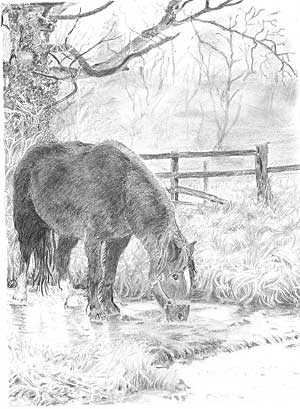 Finished? Oh, yes! :o)
There is more work that could be done, but there always is, so I'd call this completed and take what you have learned with you into your next drawing. This is actually a difficult drawing to attempt and I think you've succeeded admirably. Quite a step forward for you.
You could have created even more depth in this drawing by increasing the strength of the tones were they would count - the shadows beneath the grass where it hangs over the bank behind Tom, Tom's own darker areas, and especially in the foreground grass at the bottom left. But there's a lot to be admired about this drawing too.
Your hazy background works really well - enough to intrigue the eye but sufficiently underplayed to not draw too much attention away from Tom. Your tree possesses depth and interest too. The dark branch against the lighter background one really adds a feeling of reality; and the Ivy growing around the trunk plays its part very well. The relative strength of tone used for the fence serves to throw the misty background into the distance. Even the grassy bank works well, especially because of its relatively simple design. Even your water, due to the reflections, looks wet!
Tom looks remarkably good. I really like the way you've built up his form using short strokes of hair instead of relying on shading or blocking in the darkest areas. I feel that you were experiencing every inch of him as you recreated him beneath your pencil. I know you would have liked longer to have worked on him, but you've done a great job in the available time. You should be very pleased indeed with this!
Michelle (Fayetteville, TN, USA)
Thank you and Jenny so much for the workshop. I really enjoyed it. I picked up alot of great tips which I hope I have applied to this drawing. I've worked really hard, but I know there's still alot to be done. So far, I have stayed away from the parts I feel most challenged. Still not sure if I'm pleased with the plant to the left and of course its not finished but I'm stuck.
 Let's take this bit by bit, beginning with the Dock weed at the left. I'm not certain why you're unsure of this? It does its job of turning the eye back into the drawing, it stands proud of the door, it's not distracting, and the completed leaves have a solid and three-dimensional form.
Moving along, the hen has presence and a prominent expression, adding energy to the study. Her body is relatively unimportant, so I'd concentrate on creating form with just a suggestion of feathering. I'd also emphasise her raised foot and lifted thight, as they tell part of the story.
Do be aware that her rear is in deep shade, unlike that shown in the reference photo. You might also consider removing her tail feather, which would better concentrate attention on her beak and face.
 The wood of the wall looks wonderful! It's woody, aged, and possesses bags of character without it overpowering the drawing or Amy the dog. And those relatively dark tones are obviously assisting you with displaying Amy's outline.
My Louie (the cat) is so lifelike I can feel his claws digging into my shoulder! :o) You may need to darken him later so he correctly recedes into the shade beneath the henhouse, but that's a job for later. At this stage, avoid "adjusting" anything that you cannot make a firm decision about. Those Dock weeds that you're not sure about might look fine at a later stage, so complete them as far as you can and return to them, if you need to, much later. The same applies to Louie.
You should be very pleased with the way this is progressing. I know I am!
Update : 29.09.2009
I've made adjustments to the wood, still needs to be completed, but I've also added the wheel and been working on the foliage (leaves) which I seem not to be able to complete. I believe I am grass, leaf, and any type of foliage challenged. Any suggestions would be helpful.
 Have you considered weed-killer or concreting it over? :o)
I don't think you're challenged at all, but have just temporarily lost your way. Think of each plant in terms of layers. Outline and isolate the foreground ones, then work on those behind, leaving any light tones for the foreground ones. When they're surrounded by drawing, complete all the isolated leaves, so you can properly judge the tones required. And draw them one at a time, so you're only thinking about that single leaf. If you think of the plant as being in layers, it will appeared to be layered and possess depth.
 Tackle the grass in the same way that we did the straw at the workshop. Establish the deep background shadows first - unless, if you wish to, first outline any prominent foreground blades to isolate them. Now you'll have control of which blade appears to go behind or in front of another. And any outlined foreground ones can be drawn to tell the eye that everything behind them is also to be read as grass. I hope that helps. Incidentally, the wheel is looking magnificent! A lovely solid sense of form and texture.
June (Sawley, UK - September)
Thank you for a great workshop experience! I learned a lot those two days. I first went wrong with the grass - I wanted to put detail, but found it impossible in such a small scale. I used negative drawing but then ended up shading the 'grass' all one shade. Should I have not used this method here and stuck with the simpler grass method? Secondly... I just couldn't ground the dog, but was determined not to hide his paws behind more grass. These are just two of many points but overall I am quite pleased with it as it is the first time I have 'thought deeply' about what I was trying to do.
First, I have to tell you my immediate impression was that in many respects "This is one of the best attempts I have seen".
 The grass doesn't trouble me much at all except, as you said, it's flat, because of the single tone of shading. Remember how I told you that if you give the eye something to understand in the foreground, it will be happy with a more basic background? Well, the simplest remedy here is to give the eye what it wants. A knife-edge of Blu-Tack applied to selected foreground stalks will lift them away from the rest and restore the depth. Be choosy with those stalks - try to choose ones that the duck's feet might be disturbing, or have disturbed.
Your use of negative drawing was certainly the correct approach. It's just your very even shading that has compromised the feeling of depth and reality.
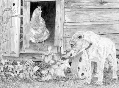
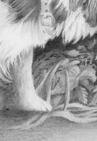 As for grounding the dog... I agree that it needs doing. You have two problems with that front foot: first, you've introduced a shadow that appears to be beneath it; and second, that shadow falls across the leaf that he's standing on, which reinforces the beneath feeling. I think you missed a golden opportunity here. Rather than have that leaf flat on the ground for the dog to stand on, imagine instead that it was curving down to the ground, so only the tip was actually touching the earth. Now when the dog stands on it, the leaf is most likely to go down to the ground behind her paw, and then spring up again as it emerges on the other side, before finally dropping to touch the ground again. The forward half of the leaf would then be raised to break through the bottom line of his foot. Give its shading a really good highlight to emphasise the rounded form at that point, so you make it visually obvious that the dog and leaf are connected. That interaction will ground him. I've used a similar device here:
 Also, you have a second leaf by his paw that, according to its cast shadow, is raised in the central section. BUT, if I'm reading that correctly, it's under his paw - so his paw must be raised off the ground. In fact the tip of his paw should be behind the raised portion of that leaf. If you correct those things and then strengthen the intensity of the cast shadows beneath those leaves, I believe you will succeed.
The weeds below the dog's head are really well drawn, but you could have varied the tones a little more. There are not many mid-tones, or leaves that disappear at an angle back into the shadows. But I'm nit-picking now :o) Overall it's a lovely drawing!
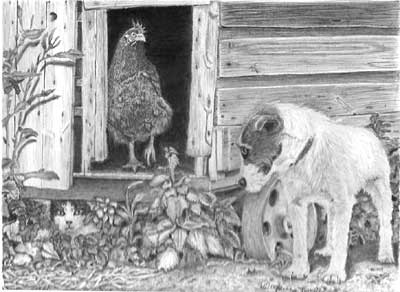
Martha (Goshen, IN, USA - August)
Thanks for a great workshop at Sycamore Gallery in Goshen,Indiana. Gained a lot of good information and met some great people. Attached is my effort at the composition you gave us. Many hours later I am ready for feed back and to move on to my own art work.
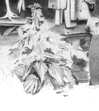
 Starting top left, the cast shadows of your big weeds work wonderfully well to give a great feeling of depth. That can be a difficult area for some, and you've done really well.
My first impression (allowing for the limitations of your scanner) is that you've created a lovely depth to what is essentially almost a single-plane composition. The subtle highlighting of the left hand door and the right-hand wall towards the centre, pulls both forwards, giving a sense of recession. In that respect, this is one of the best drawings I've seen.
The hen is nicely buried in the shade of the henhouse interior, throwing focus on her head and raised foot, which is exactly as it should be. Those two elements tell more of the "story" than the rest of her body.
Amy the dog is well-grounded and the look in her eye is perfect. It's a pity your scanner failed to pick up the lighter tones of her body, because I feel she would look good. You've used the weeds behind her to push her forwards and define her outline without them attracting attention to themselves, which is very good.
Moving to bottom left: the negative drawing of your grass has worked wonderfully well, and I suspect your nettles look good in reality. I'm less sure about Louie the cat, who I think could have been pushed a little further back into the shade. But you've done a good job with him.
And to end, your foreground is nicely vague, with just enough suggestion of detail so it does its job without causing a distraction.
Overall, it's a lovely drawing that I think you should be very proud of!
Scott (Fayetteville, TN, USA - August)
I learned alot from the workshop and enjoyed the opportunity to meet other people who share the same interest in art. Here's whats left of my drawing after obsessively overworking it. The detailed lines I had drawn became blurred after erasing too many times. I'll plan better next time and understand what I'm drawing before I put my pencil down. Overall, the workshop proved to be a good learning experience. All thats left now is application and practice, practice, practice. Thanks again.
 The first thing that struck me on seeing this, is the good use you've made of contrast. However, the very light door at the left hand side immediately pulls my eye that way, which is a pity. I feel you could have made more use of the big weed, coupled with cast shadows and a darker door, to prevent that from happening. That weed actually exists as a device to steer the eye back into the drawing, so its demotion to a mere suggestion foils that plan.
Moving across: your hen has a great feeling of three-dimensional form. The tail feather (below her beak) should be considerably darker, as it's deep inside the shady house - or it could even have been removed altogether. That said, you've used contrast and highlight very well to throw our attention on to her all-important head and raised foot. She also looks feathery without the feathers overly-attracting our attention.
The wooden wall and the rusty wheel are very good indeed. As is Amy the dog, who looks delightfully hairy and terrier-like, with a keen look in her eye. Why have you not completed her left paws? They are receiving the same light as her right paws, so they should contain a similar degree of shadowing and grounding. You've done very well with her wiry hair and her solid form, and her front and head are excellent.
The nettles below the hen are equally excellent, with strong tones where they work best and a nice feeling of depth. And a use of detail where it counts, which further emphasises the depth.
The negatively drawn grasses look good but I feel Louie the cat is just a little too obvious. You could have pushed him further into the shade beneath the henhouse. However, this is your drawing and not mine, so I'm not expecting you to see this the way that I do.
Try to curb your enthusiasm for erasing in future and think more deeply about each area before you begin :o)
I think you've done a very creditable job and the time you've spent on it has paid handsomely. Well done!
Francine (Ithaca, NY, USA - July)
In July 09, I was at your workshop in Ithaca. I finished my homework, so I send it to you for correction. Since my workshop, I find my drawing is better. Thank you again."
Francine - Gatineau, Québec, Canada
Francine - Gatineau, Québec, Canada
 Well, Francine, at least I can't accuse you of rushing this! :o)
The image you sent is out of focus at the bottom and, I'm certain, lighter than it should be - so I've attempted to correct both faults. I apologise if the result is not close to your original.
I can see you've spent a lot of time and patience on this, and the result was worth it. Your dark weeds with their cast shadows against the left hand door work really well to stop the eye leaving the picture and steer it back towards the hen.
Your hen is wonderfully feathery, you got rid of that distracting tail feather, and the focus is definitely on her all-important head. And the highlight on her raised foot adds a lot to telling the story. I like the dense, dark background too, which adds depth to this drawing. However, I would have liked to have seen the same dark tones introduced into the weeds below, to strengthen their form and balance the drawing. It's a bit top heavy without equally dark tones used elsewhere.
The texture of your wood is excellent, as is Amy the dog. You've done wonderfully well with Amy's coat. I can almost run my fingers through that wiry hair. I like her cast shadow too (which most people omit, in error) as it truly makes her a part of the scene and connects her to the ground.
I think your weeds and grasses probably look really good, but I can't get them into focus enough to appreciate them. They appear to have good definition and sharp edges, and a real sense of depth and recession.
Louie the cat is hidden well too, although you could have hidden him even more by toning him down. Sometimes it's good to find something later in a drawing, rather than having it all immediately obvious.
My overall impression is that this drawing is something you should be justifiably proud of. Very well done!
Laura (Zion, IL, USA - August)
I attended your Illinois workshop in August 2009. I really enjoyed the workshop, and the negative drawing techniques you demonstrated have really helped improve my drawings. I have finally finished the drawing project, and if it's not too late, am submitting it for critique. Thanks!
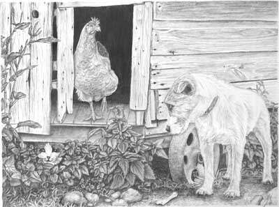 Never too late, Laura! And at least you've spent your time with care on this :o) I've adjusted the left hand side, because I'm certain the scan was lighter than you intended, so I hope it looks more like the original. Your hard work and patience with this has paid handsomely!
 Let's start at the back and work forwards. The dense black interior of the henhouse works really well, and frames the hen perfectly. It also adds depth to a composition that doesn't contain much at all. Unfortunately, you've spent a lot of time, effort and expertise on an error. The perspective of the floorboards is wrong, as they should follow the angle of the side of the shed that runs behind Amy the dog.
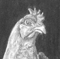 Henrietta, the hen, has a good solid feeling of form, and I'm glad you discarded that awkward tail feather. The well-positioned highlight on her raised foot adds a lot to the telling of the story. She also has the most annoyed expression in her eye - as well she might with Amy creeping up! I think you could have been a little more daring with the use of stronger tones but she works quite adequately as she is.
The texture of your wood is good, but it contains rather too many light tones that dilute the impact of your highlights elsewhere. The best way to fix that is to layer over the entire area with a harder grade, such as 2H, which is too hard to affect the strength of your dark tones. It will however dull the white and light content, close the contrast, and make the wood more unified and solid. All your detail will, of course, remain but it will be more subtle.
Your weeds at the left hand side work really well to steer the eye back into the drawing and towards Henrietta. You've not introduced any cast shadows on the wood, but that's OK, as the eye is quite capable of assuming them. And they might have over-complicated the area.
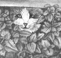 Louie the cat is well hidden, although, as he's in deep shade, you could have toned down his white. Sometimes it's good to let the eye stumble upon something later, rather than laying it out clearly. The weeds surrounding him are excellent! You've used negative drawing well, but never be afraid to push the rear-most leaves back into the shade. The grass is also excellently drawn and very believable, as are the rocks - and the bone! And your rusty wheel is - well...rusty - and with accurate ellipses.
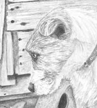 I love the look in Amy's eye - alert and curious but not intimidating. You've done really well with her coat too, and successfully created tones for her tan markings that don't conflict with the shadowed areas. I can feel the texture of her wiry hair, and I like the way you've grounded her feet, and her cast shadow, which is often omitted.
Overall, with the exception of the unfortunate perspective of the floor, this is an excellent drawing that does you, and the time you spent on it, much credit. Well done!
Workshops UK
Tutorials
by Mike Sibley