Workshop Plus
WORKSHOPS 2015
UK, USA and Canadian Workshops and Online Course continuations
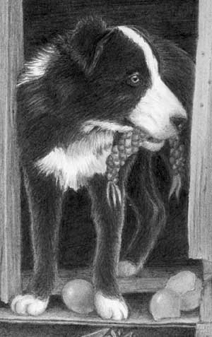
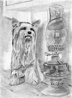
Mark (Drawing Dogs STUDIO workshop - August)
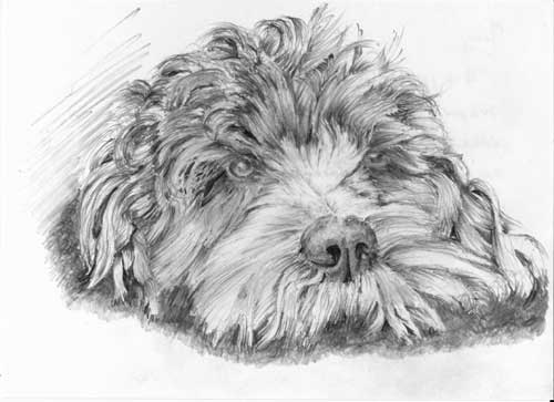
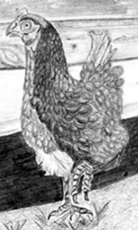
Thanks again for an excellent course at the weekend. I have been to a couple recently where there the teaching was poor and it is great to have faith restored with such thorough preparation. A tufty cockapoo which I have done this evening as a card for a friend.
I'm guessing this about 6 x 4 inches? You mention a card and I see light writing in the background (that I've removed), which tends to suggest that as the correct size.
That being the case - and that you completed it in an evening :o) - it's a very sound drawing. And because of the speed that it was drawn I'm being kind and not looking too deeply. There are a lot of blunt ends in the top-knot but in this case they lend it an air of untidiness, which suits it very well.
 The eyes tend to look cloudy because you've chosen fairly light values for the pupils. The right-hand eye should be in the shade of the brow above but the light values used for the eye haven't really made that a possibility. And the lightness is particularly noticeable in the left-hand eye because it is close to a very dark hole. That tends to emphasise the lightness. However, there is some excellent use of negative drawing in that area.
One area I really like is the nose and end of the muzzle. The nose has an excellent three-dimensional sense of solidity - and really dark nostrils. Those are the values I was expecting to see in the pupil - both are essentially deep and dark holes. And I love the way the hairs go in all directions as they rest on the ground - some curling beneath the lip, other pushed forwards.
The curly top-knot is so full of chaotic life! It lacks some three-dimensional definition, but not where it matters. The foreground is instantly understandable. You could have softened the edges and muted the darker values as you proceeded to the rear, which would have exaggerated the recession and presented more depth. But it works well as it is.
Overall, I think it's a delightful drawing and full of character. Thanks for letting me see it.
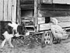
Maurizio (Drawspace online - Beginners)
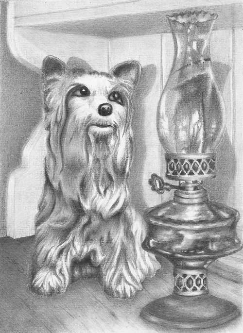
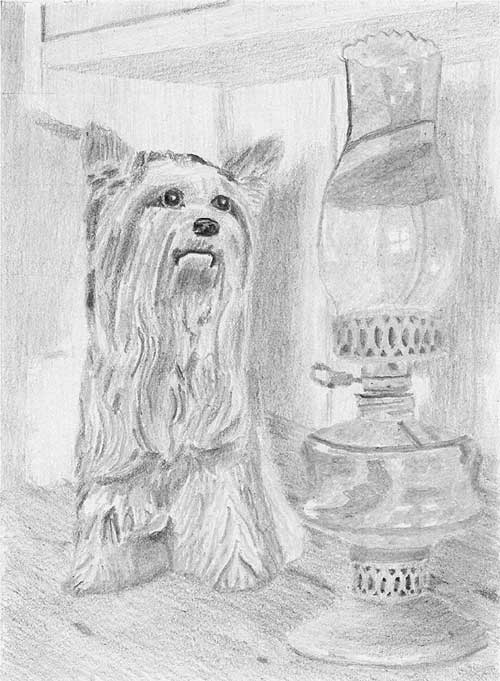
Mike I finished finally Kitty and the Yorkshire. It was not easy to find the same size and the parallelism for the lamp. Thanks again a lot. Maurizio
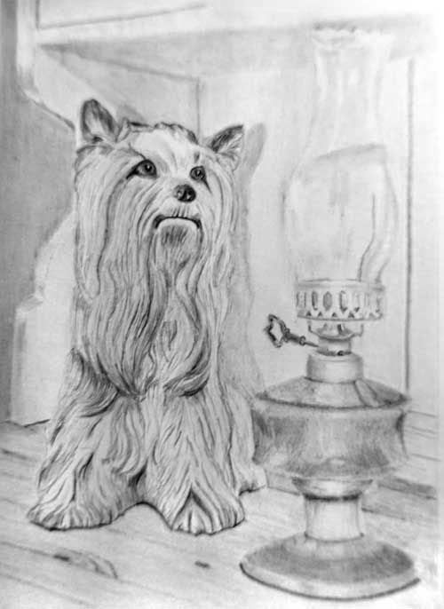 I understand the problems with the lamp but it's perfectly placed with Kitty and looking as though it belongs there.
Placing the lamp can be a real problem, although it's actual placement is less important than having Kitty looking directly at it. That's not easy because the lamp is further away from the back of the dresser than Kitty is. I think you have that connection perfectly produced.
There is a lot of good work in this and it was worth waiting for. Overall it works well, although it could be improved. If I had to state one overriding purpose of a drawing, I'd say that it's to relay your story to the viewer, and that clarity is essential. In this case I can easily understand the three-dimensional form of Kitty, her position in space compared to the lamp, and her texture. The lamp has a couple of faults but I can tell it's her focus of attention.
I'll work from the background forwards. I like the way the dresser top runs unnoticed into the background, and your treatment of the woodgrain. The top and bottom curves of the side are described very well too. And the rest of the dresser is nicely suggested without it dominating the scene - as though you've used a soft-focus camera trick. At this point I must mention that I've attempted to return your photo to what I believe your drawing looks like in reality - but I might be wrong!
 Your drawing of Kitty is excellent. I could run my fingers over her and feel every bump and hollow, and I instinctively know she will feel smooth, cold and glazed and not soft and hairy. Her very dark eyes and nose immediately draw my eye to them, and I glad you modified her triangular eye highlights into more realistic ones. The nose is excellent too - it has solid form without being over-detailed. I love the highlight and shadow beneath her mouth and the subtly turned up corners that give her a friendly grin!
Your soft cast shadow describes her position away from the wall but the lamp is missing its shadow. Including it would have tied both the lamp and Kitty to the dresser and both to each other. The lamp itself looks good and conveys a full reality, except for the glass that appears to be rather soft. One of the main visual clues to glass, or any hard shiny surface, is the hard-edged and often bright reflections. If you use soft-edged reflections you are describing a soft surface.
The rim around the base is not quite accurate at either side. Both should mirror each other but these don't. The ellipse of the base is wrong on the left-hand side - slightly flattened - and unfortunately a non-elliptical ellipse always looks wrong. The top brass collar has well-presented and subtle highlights that suggest its rounded nature, assisted by the recession of the punched holes. That you've converted the bottom collar to a plain and unpierced one is perfectly OK. This is your drawing and your world you are recreating so you should feel free to interpret it in any way that you want to.
 Where I feel the lamp fails to some extent is that there is little distinction made between brass and glass. You could have exaggerated the satin finish of the brass to contrast markedly with the hard, shiny glass. As it is, especially in the lower half, it's difficult to tell one from the other.
The glass chimney is good and, I suspect, better than it looks in your photo, which was very light in that corner. Again it looks soft but it probably looks much sharper in your drawing. The only other thing that troubles me is that the lamp doesn't contain any values as dark as those used in Kitty, so it tends to look flatter and rather less dominant. Balancing Kitty's dark values with matching values in the lamp, in small and scattered areas, would have visually connected Kitty to the lamp more effectively.
This composition was, of course, designed to stretch you, although it contains nothing that we didn't cover during the course, but I'm delighted to see you attacking it and solving its problems along the way. And, in Kitty at least, it has remarkable clarity.
I thoroughly enjoyed working with you, Maurizio. Thank you for letting me see and comment on this.
Daria (Drawspace online - Beginners)
This is my belated assignment for Week 8. Thank you in advance for your critiques and suggestion Mike!
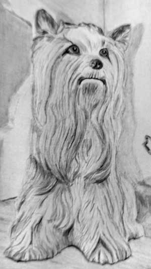
Well worth waiting for. There is a lot I admire in this, Daria - from the look on Kitty's face to the well-drawn lamp. The first thing I noticed about this drawing is the superb three-dimensional rendering - and the second was the distracting texture of your paper, but that's just a personal dislike of textures interfering with a drawing. Your drawing tells the simple story very well and Kitty is very clearly connected to the lamp - it's obviously her centre of attention. I'll work from the background forwards.
The dresser top, at the extreme left, separates cleanly from the background, and the background itself is nicely muted and devoid of interest, so it correctly appears to be behind the dresser. However, it doesn't quite work because the edges of the dresser's curves are very soft. Very sharp edges were needed there. Sharp edges separate different planes - it's the visual clue we expect to see. Soft or blurred edges suggest the two planes are merging - that they are in some way connected. You really needed a definite separation at the point to suggest recession.
The dresser's curving end is well constructed, which is something many artists on this course have problems with, and the dresser itself is described and drawn very nicely too.
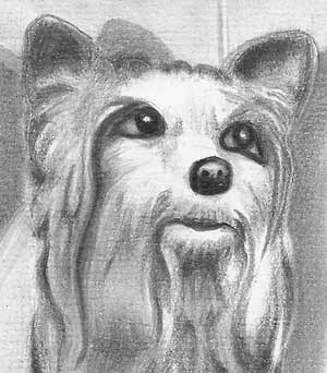 Kitty has bags of character, good three-dimensional form, and she's definitely ceramic and not hairy. In fact I think you've achieved just the right balance to state both "dog" and "ceramic" at the same time. Her rich dark nose and her eyes, with their bright highlights, draw my attention to her immediately. The lighter values beneath her eyes are an excellent device for boosting the contrast that draws us directly to her. The curve of her bottom lip , coupled with the wide-open bright eyes, give her a very warm and friendly appearance, and her attention is obviously focussed on the lamp.
 I must mention your shadows. Kitty has a clear shadow that is a little lower than her in height, so we can assume the light is shining from slightly above her. The lamp also has a shadow that is considerably lower. I don't think it is correct but, as is often the case, it sends exactly the right message. It clearly tells us that the lamp is further forwards from the back of the dresser than Kitty is. And that's all it needs to do. You've also omitted the lamp's shadow that should travel across the wood between its base and the back of the dresser. In this case, I don't think that was a good decision. That shadow would help to firmly anchor the lamp but, without it, it is almost floating.
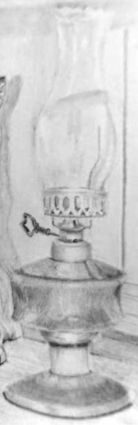
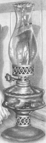 The lamp has both solidity and a sense of reality. The silky sheen on the brass collars and their soft highlights perfectly describe their round nature, although the receding cutouts could have narrowed more towards the edges. I think some artistic licence was required with the brass base, because its overall value equals that of the glass reservoir. As a result, it's not clear whether the base is brass or glass. I suggest you progressively lighten it until it's more closely associated with the collar above it than the oil reservoir. The brass collars are definitely not glass and contrast very well with the harsher reflections from the glass. However, they would have done so even more if the reflections in your glass had been even more hard edged.
Glass is highly reflective, so we expect to see brilliant highlights with hard and sharp edges. I think you might have formed your highlights by stopping at their edges, but the point where you stopped varies a little with each line, and that's resulted in edges that are not as sharp as they could have been. You should interpret a highlight as being sharp edged even if that is not evident in a reference, because that edge is one of the visual clues we subconsciously use to recognise glass or any very shiny surface.
Finally, there's one small problem area - the very top of the chimney is confusing. Your shading suggests that either the lower or upper curve could be the foreground one. In this case, the top curve is the one in front because it's an ellipse and we are looking up at it. I suggest you lighten the lower curve so its weaker appearance will correctly suggest it is behind the glass.
Don't be dismayed by any of this. The exercise was designed to stretch you - to move you right out of your comfort zone. Your work on Kitty is superb - especially your modelling of her body! The lamp is excellent too and just needs a little extra work. Looking over my notes from the course, I think you've done exceedingly well!
Christina (Drawspace online - Intermediate)
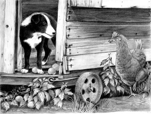
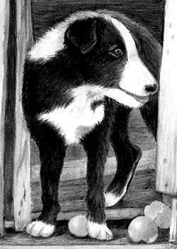
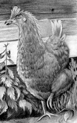
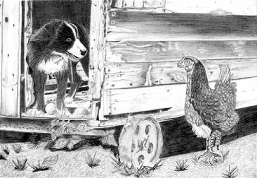
I really enjoyed the two online courses. I had no experience with pencils. Therefor I regularly stepped out of my comfort zone and "The Henhouse Raider" had challenged me even more. I'm not completely pleased, but a bit proud I managed to finish it after so much hours work. I tried to tell the story how I see it :)
Thank you for 8 wonderful weeks!"
Thank you for 8 wonderful weeks!"
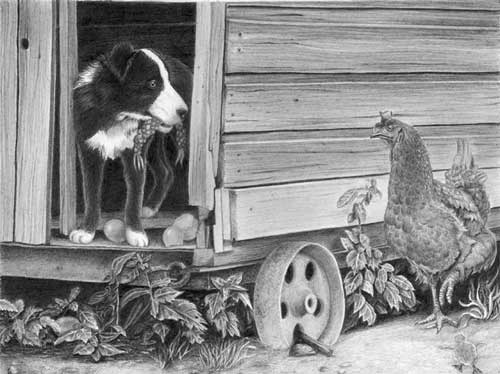 You should be both proud and absolutely delighted! This is superb! You've moulded and adapted it to tell your story - taking what you need and discarding or adapting elements that don't work for you.
Let's start at the back and work forwards. Your dark interior of the henhouse works well, adding depth to a composition that didn't possess much; and Robbie the dog looks hairy, glossy and black. I really believe you were living within the scene as you drew it because you've noticed things that many people miss - such as his back paw being in the shade of the henhouse and Robbie's own shadow, and the way the darkness creeps back from the front edge of the floor.
 You've done a good job of lifting his ear clear of his head. His eye is superbly drawn! You've done everything you could to draw our eye directly the bright highlight in his eye, and succeeded. When I first saw this I though Robbie was holding two chicken legs in his mouth - so I was relieved to find it was just his favourite rope toy!
The eggs at Robbie's feet are beautifully drawn - smooth with just the right amount of sheen and satin highlights. They contrast so well with the softness of his hair.
The treatment of Henrietta the hen, and your understanding of her, is masterful. She has a wonderful feeling of solid form and, in my opinion, just the right suggestion of feathering. In fact, I think it's the best I've seen over the years. You appear to have an natural sense of what to include, what to omit, and how to describe textures and forms that I envy.
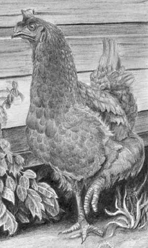 Her eye, her comb, her down-turned mouth all combine to transmit her sense of outrage about what is happening to her precious eggs. The cheeky-looking Robbie has got some explaining to do! I also admire the use of brighter highlights in her raised left foot. We don't know if she has paused or is running, but it's the only implied movement in the composition and very important to the story being told. Drawing our attention to it was an excellent move.
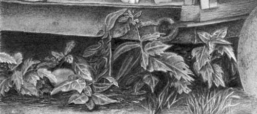
The drawing of the wood is very believable with its subtle texture and suggestions of decay. It's so easy to over-detail a secondary element such as wood, so you did well to avoid that. The removal of the nest box and its shadow beneath it was a sensible and brave move. It allowed you to remove confusion and clutter and award Henrietta more importance. And you've engineered the values of the wood very well in order to give Henrietta the prominence she requires.
Your weeds at the left hand side possess excellent depth. You've created deep shade and then pushed some of the weeds far back into it. I find some of the ribs in the leaves to be a little too light, broad and obvious. Toning them down with a light layer of 2H would do them no harm and narrow the range of contrast sufficiently.
Your weeds also do a good job of hiding the fallen egg, It gives the viewer something to find as a reward for looking deeper. Sometimes it pays dividends to allow the viewer to find some elements later.
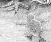
 Finally, the foreground: often less is more in a foreground situation, which is why I personally leave that area until last. That allows me to use it to balance the whole and not draw the eye down. And... well, another surprise!
I really have just noticed the little chick running to tell mother about Robbie's "game". As I said, it often pays to include little details that aren't found immediately, or even for weeks or months. It keeps the viewer's experience alive. I love it!
Well done, Christina!
I've throughly enjoyed working with you. This is an excellent result, especially for an artist relatively new to graphite pencil drawing.
Rob (Drawspace online - Beginners)
Thank you for a really wonderful course. You've been generous with your feedback, and it's been a big help. There's no doubt that I've improved a lot since this winter. Now I have many new techniques to practice!
 Thanks, Rob! I don't mind how late this is - it's working too quickly that generates problem. Slow is never a problem.
There's some good work in this Rob, especially in a drawing that was intended to stretch you. However, it could be improved. If the purpose of a drawing is boiled down to a single basic purpose, I'd say that it's to relay your story to the viewer, and the clarity of information is the essential ingredient. I can easily understand the three-dimensional form of Lady and her position in space compared to the lamp. The lamp has a couple of faults but I'll return to that later. Overall though, there is one overriding problem, even after I adjusted your scan in Photoshop, and that is its weakness in contrast. As a result it looks flat and, apart from Lady's face, it has no attention-grabbing impact.
Working from left to right... I like the way the dresser top almost runs unnoticed into the background, and your treatment of the grain. The top curve of the side is well described, and the rest of the dresser is nicely suggested without it dominating the scene. The extreme background however, to the left of Lady, is very vague and doesn't represent any form of depth. I suspect you just "filled it in", not really knowing what to do with it. That's quite understandable. Vague is what you needed in that area, but with an absence of detail or sharpness. Your lines of shading are quite distinct and relatively sharp-edged, so they appear to be very close to the dresser rather than a receding wall.
Your drawing of Lady is carefully studied and executed but the lack of contrast is a problem. I don't receive any indication at all that she's a shiny and hard ceramic model. To achieve that you need darker values so the contrast makes the highlights shine. On the other hand, the contrast achieved with Lady's very dark eyes, nose, and mouth immediately draw my eye to them, and I'm glad you modified her strange triangular eye highlights into more realistic ones. The nose has good three-dimensional form without being over-detailed. I love the highlight beneath her bottom lip that accentuate her lips and give her a very friendly and quizzical grin!
Possibly the biggest mistake I made in drawing this was fully drawing the dog and the lamp before thinking about where the shadows were going to land. I then had to try to figure out where the shadows should go based on the way I'd already drawn the lighting on the statue and the lamp. My first guess gave me a very narrow gap between Lady's shadow and the edge of the lamp, which looked weird. I decided to pull back the shadow from the edge of the lamp. I'm not sure this makes the picture totally consistent in the implied light source.
The shadows work - possibly because they are a little light and vague - but what really matters is the thought you put into them. I appreciate your train of thought and agree with the decisions you came to. Even if I didn't agree, I'd still commend you for asking yourself the right questions, and having the boldness to interpret rather than "go with the rules" or, when one is available, faithfully copying a reference.
Your soft cast shadow of Lady describes her position away from the wall but the shadow of the lamp doesn't work quite as well, because the lamp is further away from the wall than Lady is yet its shadow is the same height. That's a minor quibble and will probably go unnoticed. The lamp itself, because of its very restricted value range (lack of contrast) almost disappears into the background. The rim around the base is not quite accurate at the left-hand end. It should mirror the right-hand side but instead the top flows into the bottom rim, where the right-hand side has a step. The ellipses are excellent throughout the lamp with one exception - the top ellipse of the central collar should be almost a straight line, because it lies almost on the horizon. Both brass collars have well-presented and subtle highlights that suggest their rounded nature, especially the bottom one, and the recession of the punched holes is good too.
As an experiment, I did the glass parts of the lamp entirely in 2H. This may have been a mistake; I think the bottom part of the lamp might look better with some darker greys.
 I agree. You really haven't made much distinction between the brass and glass surfaces but, as I think you realise, that's due to your narrow palette of light greys. This adjusted image might help you to see what stronger values would have achieved. Darker values in the glass would have made it different from the brass and strengthened the glare of the highlights. And the satin finish of the brass would then contrast markedly with the hard, shiny glass.
That you chose light values for the glass is a pity, because the glass chimney would work very well indeed with stronger values. There's nothing wrong with the drawing itself, and your choice of 2H was good. It produces a very smooth finish that we expect of glass. You could have layered to create darker values; using HB or 2B lightly and then layering with 2H, which would smooth it out. Finally, the only other thing that troubles me is that the lamp doesn't contain any values as dark as those used in Lady, so it tends to look flatter and rather less dominant. Balancing Lady's dark values with matching values in the lamp, in small and scattered areas, would have visually connected Lady to the lamp more effectively.
As I mentioned earlier, this exercise was designed to stretch you, although it contains nothing that we didn't cover during the course, but I'm delighted to see you attacking it thoughtfully, and solving problems along the way.
I thoroughly enjoyed working with you, Rob, and I hope we get to work together again in the future.
June (Drawspace online - Intermediate)
I completely lost the plot with this one. I struggled to get Henrietta to stand out and as for the foreground - least said the better.
 This is much better than you think it is. Everyone who views this will seek there own meaning and see what they want to see in it. Only you know what you intended, so if you failed to attain your goal only you will know that. Everyone else will enjoy it for what it is - a delightful scene telling a simple story. Above all else this possesses clarity - possibly too much but that's better than too little, and it's a subject I'll return to.
The cheeky Robbie with his nice bright eye is looking good - plenty of three-dimensional form, lovely texture, and there's no mistaking him for being anything but a black dog. His coat looks sleek, black and shiny, which exactly describes him. The broken eggs are nicely displayed, and I like the way you've simplified the ground below him to display the two fallen eggs, with one partially hidden to be discovered later.
 I do have two reservations: first the interior of the henhouse could have been darker, which would create more depth. A light interior often causes Robbie to be drawn too lightly, but you've cleverly avoided that. However, his rear paw is as bright white as his front paws yet it is inside the dark henhouse and within Robbie's own shadow.
I love the detailing you've applied to the wood of the henhouse and the nails. It looks old and weatherbeaten without attracting too much attention. Henrietta is excellently drawn. She has very believable feathering and excellent three-dimensional form, due to your strong, well-chosen values. Personally, I think you pitched the amount of detailing perfectly - she's clearly feathered yet none are sharply defined. She also looks appropriately angry!
 I really like the way you've translated her fleshy comb into a raised crest. And her eye, with its bright iris and dark pupil, makes a good second focal point that draws me to her and increase her sense of annoyance. I would have liked her foot to be more firmly connected to the ground, and the dark shadow beneath the nettles is too low. It's not of great importance but her foot is almost touching the shadow yet her body is a distance away from the wall above, and the two uncomfortably conflict.
 Despite your misgivings about her standing out well from the wall, I think it works very well. You've cleverly used the dark shadow behind to highlight her light head and then progressively darkened her body to stand out from the lighter wood below. You've also used sharp drawing for Henrietta that helps with the separation. I think you could have increased it even more if you had slightly softened the grain of the wood around her.
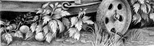 The rusty wheel is well studied and I like the twig pushed through the hole. Little extra touches like that raise the sense of realism. However, where the foliage below Robbie is beautifully crisp and sharp with excellent depth - sharp edges are essential to create receding layers and depth - I think the foreground, and some elements of the midground, are too sharp and clear. They all work marvellously well as separate elements but the clarity you offer the viewer is far greater than would be experienced in Nature. Don't worry - at this stage in your development that's to be expected. I believe everyone has to go through the "detail rules" stage before we begin to learn which elements can be softened in order to benefit others.
Overall, I'm very pleased with the result and I think you should be very proud of having created it.
Rob (Drawspace online - Beginners)
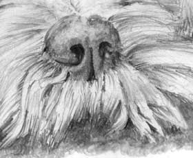
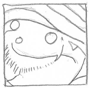 WEEK 7 - EXERCISE 1
Excellent. If I was to draw using this as a set of guidelines, I think I'd have the position of everything mapped out for me. If it looks like a bearded Elf wearing a hat... it's correct! :o)
I'll take this opportunity to explain the benefits of gridding, even though I no longer use it. If you can draw by eye, that's good. Some people can and some can't. But that's not really what this is about. It's about seeing. So someone who can draw by eye is not necessarily going to draw what they see - they may draw what they expect to see.
Gridding is an excellent tool for learning to see. It removes all three-dimensional form, lighting and texture, and taken box by box it also dissects the subject to the point where nothing is recognisable. That defeats the problematic all-knowing left brain and allows the right brain to see what it actually there. That lack of understanding is what you actually want. You're just following edges and creating accurate placements and relationships. "Understanding" is a left brain thing - and that's what you need to avoid. The understanding comes later when you turn your simple gridded image into your image.
My only criticism of your exercise is that some of the lines are rather hesitant and shaky. Good clean lines will transfer to your drawing paper and promote accuracy, but shaky lines will need to be redrawn and might cause damage to your drawing paper.
One solution is to plot the course of a line as follows:
- Mark the start and end points (and mid points too, if the line runs through more than one box)
- Study the line and get a good idea of its shape
- Have a dry run or two - from the start point, through the mid points to the end point, until your hand learns the curve
- Commit the line to paper - but don't look at the line you are drawing. Look instead at the next mark you are aiming for
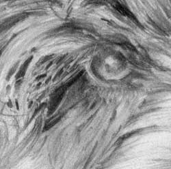
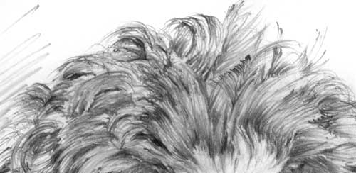
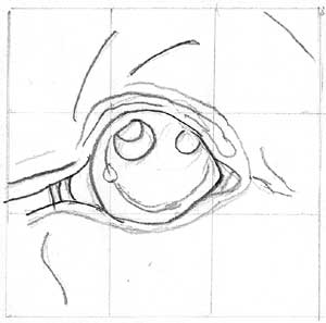 WEEK 7 - EXERCISE 2
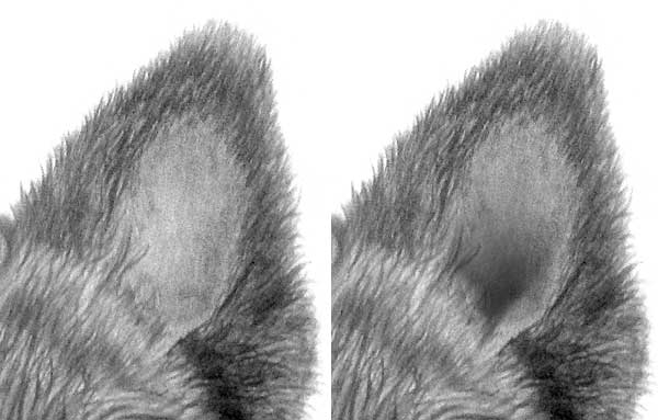
I'm not sure whether I should have added more reference lines in the parts of the photo that are all fur.
It's a good attempt... but, as you guessed, it's incomplete. You needed to explore the reference and note all that you saw, or thought worthy of including as a "signpost" to keep you on track during the actual drawing. The eye is easy. It's full of hard edges so it's simple to break down and control. The hair is a different story. In this case, almost all the useful features have gone unnoticed.
If you were to draw this eye and the surrounding hair, without producing detailed guidelines to help you, you'd began with little understanding of the features it contains. The same applies to the hair's direction of growth, which you also haven't included. When drawing, if you rely purely on "copying" the reference and taking a broad overview, an overview is all you will draw. Looking deep into the reference during the gridding stage helps you to understand the nuances and three-dimensional forms of every element. Basically, if you don't fully understand something, you cannot draw it successfully.
I cannot stress how important the groundwork is when you produce your guideline drawing. Its success, and the success of you drawing, depends on how deeply you look into a photo - and the deeper you look, the more information you collect - and that can be invaluable when you begin the drawing.
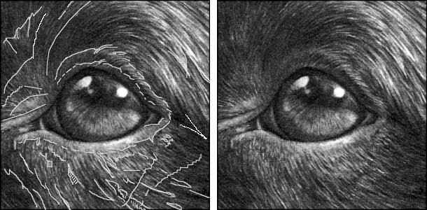 For example, there are lines running beneath the eye, to the right, that cut across the hair - they are edges where two layers overlap. Marking such features would help you as you drew the hair. And it would increase your understanding of the hair before you commenced drawing - whether or not you decided to include those features in the finished drawing.
When you're mapping what you see, include only those features you think you can find again, so make every line count and resist the temptation to add lines as "suggestions". You'll find drawing frustrating if you later come across a line that you cannot later identify in your reference.
Incidentally, if you choose to indicate the direction of growth in key areas, it often helps to mark them on your guideline drawing using a different system than the one you use for actual hairs or edges. Personally, I draw arrowheads on them, so I can tell them apart from lines marking features.
Lee (Drawspace online - Intermediate)
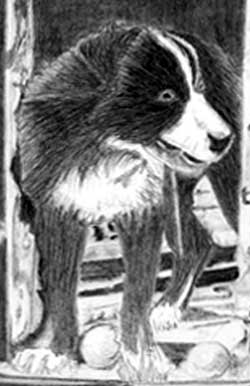
Hi Mike here is my progress thus far. I have just slowly been plodding along and have sort of enjoyed doing it but think now l am getting to the ground, dog and chook that it is going to challenge me somewhat so thought if you would not mind seeking your feedback at this time.
 The wood of the henhouse is looking good but do be careful to not over-detail it. It's a secondary element that shouldn't draw attention away from Robbie or Henrietta. If you give it a light overall layer of HB, that will preserve the detail and reduce the contrast. It will also unify everything and make it appear to be much more solid. I'd also consider darkening it to visually push Henrietta forwards. That's a potential problem area in this composition. However, a dark Henrietta against light wood will probably work just as well.
You've established a strong dark background inside the henhouse that will give depth in a composition that doesn't contain much. You can also reserve your strongest blacks for key areas within Robbie, and use reflected light along his back to separate him from the background. The floor in the henhouse is perhaps rather light. You'd expect a light floor near the doorway but the light will diminish with distance. Progressively darkening the floor as it recedes will also add depth and prevent the floor from taking the viewer's eye away from Robbie.
ROBBIE: Think about the texture of the hair. Imagine running your fingers through it. What do you feel? When you have a good mental picture, that will build itself into your drawing. Tackle him one small area at a time, so you give yourself time to understand each part in three-dimensions, and then consider how it will be affected by your chosen lighting direction. Don't forget, it's dark in that henhouse so Robbie will be darker as he recedes into it. That's particularly true of his white hair and the highlights.
HENRIETTA: Again, draw her one section at a time. Aim for good three-dimensional modelling rather than detailed feathers. Highlighting just a few feathers should be sufficient to help us understand that she is entirely covered with them. Try to highlight her raised foot - it's important to the story and the only movement in the composition, whether actual or implied.
FOREGROUND: I'd split this into two - the weeds adjacent to the henhouse, and the immediate foreground - and tackle them in that order. The foreground foliage should be sharply defined with good form and detail. Then let it degrade so the midground falls back quite naturally into the darkness beneath the henhouse. Finally, work on the remaining ground. Leaving it until last will enable you to use it to balance everything else. You could, for example, defined a set path for the viewer to enter the drawing.
All that said, don't forget that this is your world abiding by your rules, so do whatever you need to until it works.
Update : 23.03.2015
Overall l found it difficult if not overwhelming however l did most with obvious changes but l could not pluck up enough courage to do Henrietta until just recently so here it is all done and dusted.
I feel somewhat disillusioned as it is apparent l have heaps to do if l am ever going to be able to have some element of control over what l produce but in saying that l will not be deterred and will achieve some slow progress to achieve a reasonable outcome!!!!
I feel somewhat disillusioned as it is apparent l have heaps to do if l am ever going to be able to have some element of control over what l produce but in saying that l will not be deterred and will achieve some slow progress to achieve a reasonable outcome!!!!
 Don't feel disillusioned. There is an error in the way you were working, but errors are all part of the learning curve - and very important ones. How do you think I learned to draw? By making mistakes and then learning from them. Have a good look around it; identify the things that worked and those that didn't; then carry what you've learned through to your next drawing.
I understand this probably stretched you and it was intended to. Staying within your comfort zone teaches you very little. And there is nothing in this composition that we didn't cover one way or another during the course.
I'm going to pull out a couple of areas for comment but the overriding problem is not one of ability but of approach. The first thing that struck me when I saw this is that it lacks understanding. I can see how you tackled every part, and each is perfectly OK in itself, but it lacks cohesion and thought.
 Basically, you're not thinking about what you are conveying to other people - people who cannot see into your head to understand your intentions.
For example, Robbie has a face, an ear, a neck, and a body - but they read as a collection of parts because none of them recognise the presence of the others. I suspect you drew each area separately - so would I - but you were drawing what you saw instead of working out what it is and how you were going to explain it to viewers of your drawing.
Let's imagine we have diffuse lighting and it's shining from the left. You've drawn a highlight along the edge of Robbie's hair down the side of his ear, but the ear is in front of that hair and will cast a shadow on it. So that highlight belongs to the edge of the ear, and a shadow that creates a sharp edge to ear will throw the ear forwards. We will instinctively know that the ear is on top of the hair and closer to us.
In the same vein, Robbie has rounded legs but I think you were concentrating so much on texture that you forgot they are three-dimensional. The legs should turn into the shade as they progress to the right. The same applies to the area of chest between his legs - it's in the shade of his legs and his body, so it should darken as it recedes beneath him. Incidentally. the interior of the henhouse should be darker too because there is little light inside there. And Robbie's rear paw should be darker too, because of that lack of light.
 Henrietta is not easy! I'm fully aware of that, and my usual advice is to concentrate on her three-dimensional form with a suggestion of feathers. You've chosen the reverse - and that's fine, it's your vision. The feathers look really good, but you've told us little about her rounded form.
Think about every area before you draw it. Describe it to yourself; build up a mental three-dimensional picture of it; analyse its texture and perhaps work out a way you can describe it. Now, instead of drawing what you see in the reference, draw what you see in your mind. You can use the reference to supply detail and features but you are no longer dependant on it. To return to Robbie's ear, just say to yourself "It's further forwards than his head and I can use a highlight down one side to describe that edge, and use a shadow on the other side to describe that one. It's silky. I can feel the hair beneath my fingers. And it's curving forwards at the top, so the hair won't lay flat. It might be a bit spiky and I can see into it. After the curve it's flat and glossy". Now draw what you know instead of what you think you see.
Lovely feathers; Robbie is full of character and looking very mischievous. You're telling the story well, just not connecting the parts into a realistic whole. Finally, never feel compelled to draw exactly what you see in a reference. Robbie never saw this henhouse, and I'd burned it before Henrietta came to live here. It's a make-believe world - so bend it suit the world you want to create. Tell the story your way.
Claire (Studio Workshop - Beginners/Intermediate)
I can't tell you how much I enjoyed the course! I have never known time go so fast! Attached is not the drawing that I started as that is going to be a birthday present. Instead I have drawn another picture of Darcy. For my first attempt at drawing using the techniques you showed us I am really pleased with it. Please let me know what you think.
 What I think is that this absolutely delightful! And it could with a little extra care in places - but this advice is for next time. Attempting to rework this one would surely overwork it.
Your drawing has oodles of character, believable textures, and a good sense of reality. What it lacks is depth. That's mainly due to a lack of sharpness, and a rather ambiguous source of lighting. Let's cover that first.
The eye highlights suggest the light is high and to the right (Darcy's left). In that case I'd expect the right-hand side of the face to be in partial shade - at least more so than the left side. The right side is darker below the eye and the bottom of the cheek, but then you upset that by creating a very light area of hair to the cheek's left. Don't worry about what the reference might look like. You need to take from what you need and engineer it to suit your own goal. A degree of exaggeration often helps too. Make things obvious but in a subtle way.
 You could, for example, have created a lot more depth within the ears. I should feel that I could poke my finger down - if I chose to!
The right-hand ear is easier to work with, so I'll see what I can do with it. All I've done is to darken the inside so the foreground hair stands out from it. If the hair was very sharp-edged, it would stand out even more. Sharp edges separate planes; soft edges merge them.
 With that last point in mind, the edge that most bothers me is the lower jaw. It is forward of the neck but the soft edge suggests that it runs directly into it. Here you have two useful actions to take. First, sharpen the hairs along the lower jaw. And then strengthen the shadow below. That will help to create more contrast and clearly separate the two planes.
Finally, you've every right to be pleased with this drawing of Darcy. I'm just nit-picking - attempting to make your next drawing even better. There's nothing "wrong" with this one.
Workshops UK
Tutorials
by Mike Sibley