Transcript
INTRODUCTION
You might have heard, "You need to draw what you see, not what you know!" and I understand that. It means "Draw what you've observed. Not what you
think it looks like". But you need to take that one stage further...
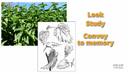
Look and study - then convey what you see to memory. And an ideal way to do that is to sketch it, because that forces you to closely analyse what you're looking at. And you're far more likely to remember it - and not just its form, but its texture and surface reflections. Now, "draw what you know" - Because you no longer just know, you
understand. And, if you need them, you'll have your sketches to prod your memory.
You see, there are aspects of everything we encounter that we subconsciously understand, but we need to bring that forward into our conscious mind. So we can repeat the same signals to send the same messages. It's what is commonly known as "seeing as an artist". And "seeing" doesn't just happen. It involves effort and a genuine sense of curiosity. You need to get into the habit of analysing everything around you. Keep asking yourself WHAT makes this WHAT it is? WHY do I know how it FEELS? HOW do I know it'll be heavy - or light - if I pick it up?
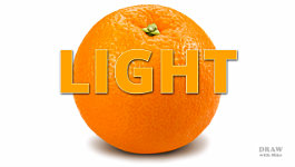
WHAT is it you're seeing that's telling you this is..... an orange.
LIGHT and REFLECTIONS
And the answer is very often LIGHT. Yes, LIGHT - and the way it's reflected.
It's not so much the orange's depressions you first see, but the
highlights that describe those depressions. And on top of that, it's the strength of the highlights, and where they appear, that describes the overall three-dimensional form.
Take the Evening Star mainline locomotive. Shiny and relatively smooth. Very smooth, polished to a high sheen, and definitely glossy. And the running gear has a more understated satin finish. When you look at those surfaces - you instantly know some are shiny. You don't need to think about it - you just
know... In fact, you know without a shadow of doubt that they are shiny.
So work out why you know that. Like the highlights that describe the dimples on the orange, you need to detect and extract the relevant information to use in your drawings.
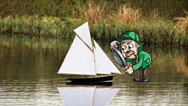
For example, if you look at a photo, and it has a puddle in it, you immediately know it's water. That it's wet. Let's remove the colour, since we don't have that luxury... and it's still a puddle. It couldn't be anything else. In fact, the feeling it is water might be even stronger. Of course, sometimes context plays an obvious part. If there's pond yacht on the water, that rather gives the game away, but even with the boat removed... you still instinctively know it's water... But WHY? That's what you need to solve. What is it we're seeing - or not seeing - that is telling us this is water?
Could it be the reflections we see in it? Well, they're darker than the object. And maybe that's why we know it's a reflection? In fact, it's very likely, because the reflection will always be darker. That's because the sails reflect light directly to our eyes - but the water reflects light from the sails, and absorbs some of it before we see it. A secondary reflection cannot compete with a direct reflection for strength.
If it's something made of glass, shiny metal, or it's ceramic and glazed - well, look at those reflections. They're all bright and hard-edged. Maybe those edges are the clue you need? Hey, this jug is from the old Ripon Workhouse. It's a fascinating place! And, I'll use some of its timeworn objects while we explore surface reflections. And that includes everything from bright and shiny, through satin and diffused, to dull and matte. So...
SHINY, WATER and RIPPLES
Let's begin with shiny. And to draw shiny you need to know what shiny looks like. Do your research. Analyse shiny objects. Discover what I call the "VISUAL CLUES". The clues we instinctively know how to decode. Then - once you have them - build them into your drawings.
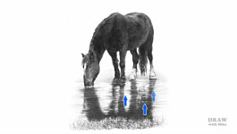
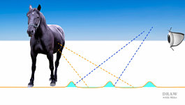
And it almost doesn't matter how you draw - just include the clues, and you'll send the same message that you extracted from your research. These light bands cutting across Tom's reflection can only be ripples. No matter how hard our minds try to find an alternative solution, a ripple is the only fully qualifying deduction.
What I'm about to explain, you already know. But you might not be aware that you know. This is where analysing comes into play. It brings these things up into your conscious mind so you, as an artist, can make use of them. Here, for example, the water can "see" Tom. The ripples can't - they're facing the sky above us. The rear of the ripples can see Tom but we can't see that side. We can only see the surfaces we're facing, and both surfaces can only reflect to us what they can see. And when what we see is a light band running horizontally across water, we instinctively deduce... it's a ripple. Just think about what you're seeing and it quickly makes sense. And - more importantly - so will your drawing.
Now - after analysis - what we once recognised subconsciously, we can consciously understand and make use of. It adds another tool to your box of tricks. And - as an artist, a creator of illusions, a teller of tales, a storyteller - they are tricks you need.
These old wheels have history - they were once shiny metal - then pitted with rust - but with the working faces worn smooth by the ground they rolled on.
Find the clues. Build them in. I used stippling to suggest the mortar is gritty. It reflects little light - but it might have tiny quartz grains in the sand that reflect brilliant highlights. The bricks are much smoother but porous - they scatter and diffuse light, leaving soft, reflected highlights around edges facing the light to describe the holes and depressions.
This rust on cast iron - it's mainly scribble - captures the sharp crests and deep pits that you'd expect to find. At least, you'd expect to see it once you begin to look around you in your everyday life. You slowly amass a mental library of objects, surfaces, and tactile experiences. Imagine dragging your fingernails over this rusty surface... and then drawing what it feels like.
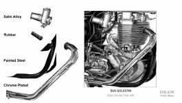
SHINY TO DULL
Of course different materials and surfaces reflect light in different ways.
So, work out what the differences are, and then use those to describe the varied surfaces: Dull rubber, aluminium - or any similar metal alloy, painted or powder-coated steel, shiny chrome-plated metal... In one respect shiny is no different from dull - or dull from shiny. You just have to work out why they look the way they do - because only then can you understand what you're drawing.
Take shiny... Earlier I mentioned
sharp edges. Well, they're a must have because there is nothing on the surface to scatter or soften the light. And what about intensity?
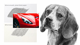
Well, because most of the light is being reflected directly into your eyes, shiny tends to be very bright. So, there's a need when drawing shiny metal objects - or ceramic or plastic - to be brave with contrast. Depending on how shiny your object is, there must be a significant difference between the darkest and lightest values in your drawing. Because high contrast is the key to success. But, don't overdo it. Too much becomes unnatural and cartoonish. So, you need to find the happy medium. And watch those edges too. If you soften them you'll lower the contrast and suggest a surface such as a soft plastic. Keep those edges sharp, so you emphasise the high contrast for ultimate shine. That said, only a perfectly smooth surface will have perfectly sharp edges. Even this well-crafted aluminium-bodied Ferrari California has some areas that slightly soften the edges.
PAPER ADVICE
Now, a word of advice: It makes sense to use a SMOOTH paper for a smooth subject such as this Ferrari. And you could rely on a coarse paper to help you create your rough textures, but - here's the kicker - you'll learn a lot more if you always use a smooth paper. That forces you to create every aspect of your rough texture; and you'll be in charge. What we see is what you intended us to see, and not something your paper has modified. However, even on smooth paper, it's minimal tooth can sometimes help to create textures. Here, my pencil is just grazing the surface, and the tiny imperfections and pits in the paper are suggesting the texture of felt without me having to create it. If that happens, go ahead and use it.
So far we've mainly explored shiny surfaces that reflect a lot of light. This felt hat, seen up close, can be classed as rough. Rough surfaces both absorb and scatter the light - because it's reflected in multiple directions by the many facets of the surface - so only a small proportion of that light meets our eyes.
And the scattered light softens the edges of every reflection.
THINK ABOUT WHAT YOU ARE DRAWING
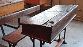
Describe to yourself what you're drawing. Ask yourself questions. Learn to be curious. Curiosity breeds a thirst for knowledge. And knowledge ensures you understand what you're drawing - or I should say interpreting, because what we're creating is really just an illusion. For example, here in the Workhouse schoolroom, there's one desk that immediately caught my eye. This desk... a desk with a story... It's seen a lot of life over its almost 150 years of existence.
It's had a hinge torn off, requiring the fitting of a replacement section of wood. It's ink-stained from the old dip pens. It has holes caused by - well, who knows... These are things we can see that add clarity to the story. Drawing it no longer consists of just copying shapes and values - now it's alive. We have something to say, to explain to our viewers.
From a practical viewpoint, we can see the light is shining from the left.
The holes that once held the inkwells have highlights running around their rims at the right. This highlight tells us it's a hole and not a mark on the surface. And that these are gouges - each with a side facing the light. And talking of the light, if we step to one side we also know the surface has been polished smooth from so much use. The glare from the surface tells us that.
So how can you reproduce that degree of shine in your drawing? What can you see? Or, perhaps more importantly - what can you NOT see? Personally, I see a lightness of value coupled with a very obvious reduction in visible detail. Some of the deep grain and gouges are visible... but little else. Look closely - apart from the dull repair patch - that glare diminishes as our eyes travel right. And every single hole, pit and gouge has a bright highlight facing the light. Run that sort of quick analysis on everything, and you'll be telling stories and not just copying photos.
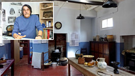
THE WORKHOUSE KITCHEN
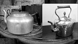
Here in the Workhouse kitchen this old brass Jam Pan is obviously well-used. The inside is smooth and clean; but the outside is quite battered. The myriad of knocks, scrapes, dents and dimples means it scatters light and reflects little. Conversely, the rim reflects bright highlights, and the inside emits a dull glow - where this copper kettle is shiny with no sign of that internal satin appearance. It has the same bright hard-edged reflections as the pan's rim, but the surface is smooth and polished. And look how easily you can understand each dent and ripple. But this is rather newer as it's Aluminium. But it's probably pre-modern plastics, because I think, from its shape, that the handle is Bakelite - and the knob, too.
The kettle is definitely smooth but not very reflective. This time the reflections are very soft-edged and diffused - so, less light reflected and dimmer highlights tell us it's aluminium. Or - if you take away colour - it could be brass. Or perhaps copper? Well, not like the copper kettle... because that's obviously shiny, which aluminium never is. But the old Jam Pan is similar. Take away its colour and - inside - it's just the same as the kettle - a satin-finish metal container. So how can you show the differences?
Personally, I'd simply keep the Aluminium kettle light in tone, and anything brass, darker.
Always - always, ask yourself questions. Take the time to get to know and feel what you're about to draw. Study the reflections and surfaces - Here we have wood, glazed china, cast iron, wickerwork, brass, aluminium, quarry-tiles, rough brickwork, and soft towelling. And, as I worked through the list, there's a good chance your eyes searched for each of them - and possibly found them - even though I didn't name what they are. Because you instinctively knew which reflective quality to look for.
The reflections, or lack of them, often contain the clearest descriptive message. So, work out why you can identify the various textures you see, and how they differ. And, before you know it, you'll be drawing realistic and instantly recognisable textures and surfaces.
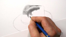
Well, no demonstrations this time. I really wanted to concentrate on the "why" and "what" rather than the "how". For the how, take a look at all three parts of CREATING TEXTURES in the Creative Series. There's a Link below. And have a go yourself at the hat I was drawing earlier. Download the reference photo and a guideline drawing. Then think about the different textures before you begin. Imagine how they feel beneath your fingers. Then draw it your way, at your own pace. And use the Exercises and Critiques forum for help at any stage. Because... Well, there's only one way to learn and improve... and that's to keep on drawing.
© copyright: Mike Sibley 2025


Sitting here in my living room surrounded by Christmas decorations, some shiny, some velvety, and some made of natural materials like pinecones and cedar and twigs, I can see how reflections define texture!
Then it might begin to dawn on us we didn't see what we needed to see to get the results we want, and we begin to look, really look, at what something looks like - asking the questions you mention: "what do I see which makes me know this is water?"