Transcript
INTRODUCTION
OK, this dates me - I was drawing for 20 years before digital photos existed. But this really does work. It exposes all the detail in areas of shade. And it reveals an important aspect of photography. Although you might not be able to see the detail in a photo,
it is there.
Photography - digital or film - has one problem: it's very basic when compared to our eyesight. Our eyes constantly adjust for brightness and focus as our gaze moves over a scene to explore it. Our pupils automatically contract and expand based on the level of light they're focused on. But Photography can only look at the entire scene, and set the exposure based on the overall average brightness. That leads to over-dark shadows, and burnt-out highlights.
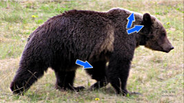
A burnt out highlight really is burnt out - there's no detail remaining. But dark shadows
can be lightened. Now you can successfully draw the lower edge of the belly, too. And the structure of this Black Bear's ear can clearly be seen.
So, I'm going to begin this new series of videos on
Image Tools For The Artist by looking at a group of particularly useful and versatile tools - tools with the ability to expose vital detail within your reference photos. Then, in the next video, we'll use the tools to enhance photos of your drawings, which is essential if you have a website or blog.
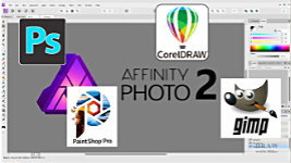
I'll be using Affinity Photo for all the videos. However, Photoshop (which I used for over 25 years), PaintShop Pro, the free GIMP, CorelDRAW, and many others, can all do what I'm about to show you. Often in similar ways - and using the same keyboard shortcuts.
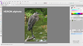
DEMONSTRATION with HERON
I'll use this image to demonstrate with. It's my own photo of a very obliging Heron, taken in Florida some years ago. I could attempt to draw directly from it but, in my opinion, it can be improved in a few areas, which will be reflected in the drawing. So, we have it open in Affinity Photo. Now, right away, I'm going to suggest you save your JPEG photo as a native Affinity Photo file - that's AFPHOTO, which is like a Photoshop PSD file.
Go to FILE - then SAVE AS…
See, the keyboard shortcut? CTRL+SHIFT+S - I'll use that.
So, simply press CTRL+SHIFT+S, then press SAVE. That saves it to the same folder with the same name - but now it will save all the LAYERS you are about to create. If you prefer, you can just use your JPEG file but, once you close the file the layers will be lost, so you cannot store the changes and alter them later.
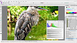
OK, so we now have our native Affinity HERON file to work on. At first sight it's relatively sharp, but it's lacking contrast. I want to correct that in my drawing, so it will help me if I correct it here too.
That will at least give me some idea of what's possible. So, let's first tackle the lack of contrast, which is making it appear flat and rather uninteresting.
Because it often works well, I'll use the AUTO functions before trying manual adjustments.
Auto-Contrast first... Well, it's a step in the right direction - if only a small one this time.
Auto-Levels next, because... it just seems to work better in that order.
That's helped the contrast problem. You can see how much if I switch the changes off and back on. We might as well try
Auto-Colour, too. Not much of a change this time. But it often generates a little more contrast. And it can add a greater feeling of realism. Although you'll be drawing in monochrome, having that reference feel alive might make a huge difference to the result.
MANUAL ADJUSTMENTS
Now we'll move on to the manual adjustments. And bear in mind: we're not aiming to produce a great photo - we're just trying to enhance and clarify a reference. And to aid that clarity, I'll sharpen this first.
In Affinity Photo you can use non-destructive live filters. Click here and choose UNSHARP MASK. Move RADIUS to the right... and then play around with it - and FACTOR, too - until it looks sharper without losing detail or looking jagged. That looks good to me. Although it's a higher level than I was expecting.
Hmmm… This still needs more contrast - even if only to make the edges easier to detect. For safety, I strongly recommend you COPY the current image to a new layer. That way, you can quickly revert to the previous state if your new adjustment doesn't work out. To do that, simply select the layer, then use CTRL+J. Now we have a copy using the same name.
Let's rename this to "LEVELS", as that's what I'm going to be using next.
Now, you'll notice that
sharpen has also been copied as a live filter. For simplicity, let's rasterise the new layer - that is, we'll permanently fix the previous adjustments. Right-click and choose Rasterise and Trim
.
Now use the keyboard shortcut CTRL+L to open LEVELS - or use the adjustments icon to select it. Either way, it's a live filter.
I'll just increase the
black by dragging the slider slightly to the right. a 10% increase looks OK to me. And I'll adjust the Gamma midtones to bring them back to what they were. You could also us the white slider to brighten, but you risk losing detail in the highlights.
Let's zoom into the head to check progress. You can do that by placing the cursor where you want to zoom to, and then scrolling with your mouse wheel.
OK, let's turn all the changes off... And back on... That's a definite improvement! And CTRL+0 takes us quickly back to the full image.
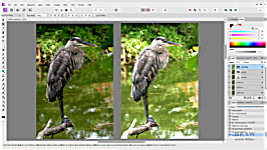
Now I'm going to suggest something that might surprise you, but I can thoroughly recommend it. We're going to
lighten it again - separately. So, duplicate the last layer again. And rasterise it - flatten it. Select the layer, so we're only working on that. And let's rename it LIGHTEN. Again, use shortcut CTRL+L for Levels. And this time I'll only use the white slider. Look how the edges and detail appear as I increase the brightness level.... Yes, that will burn detail in the highlights, but we're seeking detail in the shadows. 64% looks good.
That has totally destroyed the highlights, but that doesn't matter. Because the intention is to work from
both photos. The darker one is the one to work from. And the lighter one supplies all the detail you can't see in the shade, but that you can now build in as you draw. For example... you can see detail in the legs now - especially the darker rear leg. You can clearly see the edges and understand these dark feathers. And the same applies to the feathers further up.
ELISABETH'S METHOD
Now, at this point I must stress that there are many more ways than one to perform any of these adjustments. So far, we've looked at
my preferred methods. Others, we'll explore in later videos. But here's one method used by our DWM member ElisabethG.
Using my Heron again, Elisabeth begins by duplicating the image layer in the layers palette twice. Remember, that's CTRL+J for speed… Once… Twice.
Click on one of the duplicate layers to select it. Then rename it, by clicking the name. Type DARKEN. And press enter. Then name the other one LIGHTEN, or whatever descriptions you prefer.
To darken areas that are too light: select - click on - the DARKEN duplicate layer in the layers palette, and make sure LIGHTEN is turned off. Then, from the pulldown mode menu near the top of the layers palette choose
multiply. And use the opacity slider next to the mode menu to dial back the effect to see the detail you want. To view any area more closely, you can use the mouse scroll wheel to zoom in and out. You can also move the image around by holding down the spacebar and then dragging it.
To lighten areas that are too dark: turn DARKEN off and LIGHTEN on, select the LIGHTEN layer and, from the pulldown mode menu on the layers palette, choose
screen. Again, use the opacity slider next to the mode menu to dial back the effect until you can see the detail you want.
Elisabeth chooses to label her copies MULTIPLY and SCREEN and toggles the layer's visibility on and off, depending on which effect she wants to see. Or both, which might be useful. Remember, unless you left a layer's opacity at 100%, these layers are semi-transparent. You could also save each state as a separate file, and even print them out.
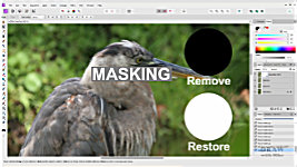
MASKING
What Elisabeth didn't mention is
masking - painting these effects in and out. We'll just cover the basics.
The background layer is our original photo, so we'll rename it ORIGINAL.
With the DARKEN and LIGHTEN layers turned off, select and copy the LIGHTEN layer and then place it above DARKEN.
You can just drag it, or use CTRL+LEFT and RIGHT SQUARE BRACKETS to move layers up and down the stack. To prevent confusion, rename it to LIGHTEN COPY and select the layer. Now, click the MASK LAYER icon.
Here's where the magic occurs... You can paint BLACK to remove an effect
And WHITE to restore it. Remember, this LIGHTEN COPY layer has the SCREEN effect applied to it. And if we remove a part of it, we'll expose the DARKEN layer beneath it. Like this...
Let's say we don't want the beak to be lightened. Maybe we prefer the darker values to draw from. Simply press B for BRUSH. Select the mask.
Make sure you have BLACK selected. If not, press X to swap the two colours. Now paint over the beak.
To quickly resize the brush, use the LEFT and RIGHT SQUARE BRACKETS to reduce its size or enlarge it. Take note of that, because it works for
any brush in Affinity Photo.
BLACK has painted away the lightening SCREEN effect. But it's strayed into the background at the tip of the beak. Well, WHITE RESTORES the effect, so...
X to swap the colours and...
PAINT WHITE over the background.
Notice how hard the erased edges are? If you see that as a problem, soften the brush. Go to HARDNESS in the top bar, click on the arrow, and drag the slider left to soften. Or right to return to hard. Let's take it back to 0% - fully softened edges. And now those edges are softened, and no longer a distraction.
It won't be long before you can quickly accomplish all the adjustments - and learn to use the shortcuts for speed.
- The SPACEBAR key to move around your photo
- The SQUARE BRACKET keys to alter the size of the brush
- D to set the DEFAULT Black and White colours
- X to switch between the two colours
- And finally, CTRL+1 to view the FULL-SIZE image...
- and CTRL+0 to fit the image to the screen and view all of it
And it's done.
EXPORTING THE IMAGES
Now, all that remains is to save the results and print them out. Or, of course, you could work directly from the screen. Your image is currently a native .AFPHOTO file, which will print perfectly. But you might want to save a copy with the layers merged into one, so the file size is much smaller. AFPHOTO, like PSD or TIFF, is a
lossless format. It doesn't matter how many times you save changes; it will never degrade.
But your copy only needs to be printed and not worked on, so saving as a JPEG is a good choice.
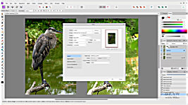
Simply go to FILE, then select EXPORT. Choose JPG in the top dropdown box. A quality of 85 is fine, but you can lower it for an even smaller file size. Click EXPORT. Navigate to where you wish to save the file…
and rename it if you want to. Then click SAVE.
Now do that again for your second image. Turn off everything, except the ORIGINAL image and turn on the DARKEN layer. As before, go to FILE, choose EXPORT. The settings are the same, so click EXPORT again, and rename it to whatever you wish. Then click SAVE… but you're not finished yet.
Use CTRL+P and, following your computer's instructions, print it out. Then repeat for the LIGHT version. Or you could use FILE, then PRINT, which, as it says here, is shortcut CTRL+P. So, it's much quicker to just use that.
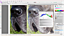
Now you have two JPEGs stored for safety. One is a sharp, high contrast image to work from. And another that allows you to see all the detail in the shadow areas. This is something I often do - a
working photo and a
lightened one. And then combine the two, so I know what I'm drawing and not guessing.
Here they are together, ready for printing. Look into the shadows. Now I can see detail and shaping in the nose. And look inside the mouth there are shapes, and hair. And it makes so much more sense now.
Maybe we can see even more if I copy it? Open Levels, and move the gamma slider - the mid-tone adjustment. There are features showing in the nose now that were invisible to us before.
Now, if we can obtain that improvement in our reference photos... imagine the clarity we can achieve with images of our completed work.
Here's a PHOTO of the finished drawing... And after adjustment....
We need to present our work looking its best online. And that's what we'll explore in the next video.
© copyright: Mike Sibley 2024


What I could offer for some of the younger users who prefer to work on their iPads and are already familiar with Procreate, is to experiment with two tools under adjustments (the magic wand icon, top left). Of all of the options in the dropdown, I would suggest Hue, Saturation, Brightness and Curves. Ignoring Hue, slide the Brightness control to adjust the contrast, then also slide the Saturation to see if that improves it. Or you can use the more refined Curves tool to increase contrast by dragging the nodes on the line, downward on the left one, and upward on the right one to create an S-curve. This definitely improves contrast.
There's more to it of course, for example the method of using a screen layer and a multiply layer, as well as masking are all available in Procreate too.