
The DEMONSTRATION series
TEXTURES: Stone and Rock
"TEXTURES: Stone and Rock", although it focuses on drawing stone, explores the technical HOW and the mental WHY. Because, once you've learned the HOW, the WHY is far more important.
Featuring a demonstration drawing, Mike explains the benefits of drawing the feel of the surface, rather than the way it looks. Translation, not copying. And - so you can learn at home by doing - you can DOWNLOAD the references and guideline drawing to follow-on at your own pace. And you can join our DWM Community for assistance and critiques at any stage. Simply join (it's cheap!) and post your drawings to the Exercises and Critiques forum.
If you find the "talking through my thinking" useful, take a look at the YouTube edit of this video.
WHAT YOU GET...

Introduction
While introducing the subject, Mike reminds you that we graphite artists can only make four marks - dot, line, shading, and cross-hatching. And you can take a dot or line for a walk and create scribble.
Drawing rocks...
First the bad news... A rock drawing technique does not exist. Just chose the marks that best describes the surface texture you want to create. Mike explains where he might use each of the marks and why.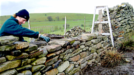
Drystone walls...
An introduction to the Drystone walls that abound in the beautiful Yorkshire Dales - not far from where Mike currently lives.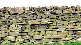
Demonstration subject...
Mike selects a suitable wall to draw. One with a variety of stone sizes and shapes. These often ancient walls are stacked dry without mortar.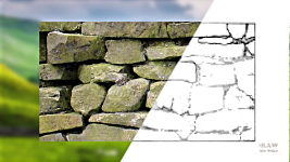
Demonstration area...
Mike chooses a section of the drystone wall to draw. And then, as it's reduced to a guideline drawing, explains the reason for his decision.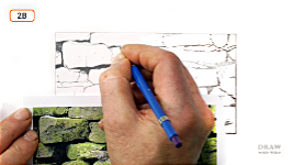
Making the first mark...
Begin somewhere you fully understand - in this case it's the deep dark holes. Discover how to draw believable solid, dark holes... and that you now know the entire range of values available to you.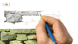
Creating texture...
Using scribble to create the rocks because it's an unending process that permits you to create as you think. Mike reproduces the three-dimensional form in his reference, but using the texture of his choice.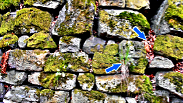
Analyse and draw...
Analyse what you see so you draw with understanding, and don't be constrained by your reference. If you feel like adding lichen, grass, or moss... do it.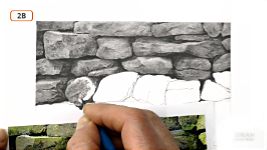
3D Scribble...
"Sculpting" with scribble. Creating a surface that is not photo-realistic but presents the sense of reality. Incorporating Visual Clues that connect to your viewer's subconscious expectations...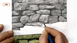
Translate and Relate...
Drawing is translating one medium into another - photos (or life) to a drawing - in a way that injects your own feelings and tells your story.
Copying or...
Why copying is good - initially. And why you need to move on and create. Because copying involves zero understanding, but drawing is essentially built around understanding, and telling YOUR story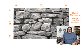
Conclusion...
Well, that's Mike's story. Now let's see yours - use the link below to get your reference and guideline drawing. Then join us at DWM so we can help you.Watch the 5-minute PREVIEW:
Transcript...
Transcript
INTRODUCTION
When it comes to drawing - this time we'll explore fabrics - there are two basic approaches: copying what you see or understanding what you see and drawing that.
They both produce usable results. But I'd argue that understanding is far more powerful than mere observation.What do you see? Garments? Certainly. Differences? Probably, but subconsciously. Texture or feel? Probably not. Now let's try that again, but this time we'll use CONSCIOUS thought.
This man is wearing a thick knitted jumper. We know that without any shadow of doubt. But WHY do we know that?
This women has a lightweight, figure-hugging dress. It could be made from a man-made material, such as nylon, but assume it's natural silk. Well, it meets all the expected criteria, even though we don't consciously know what those criteria are.
This one's easy, isn't it. The common Denim - in this case, jeans... except - we know that without a second glance. Not twill, not corduroy, not cotton or linen or polyester. Denim. 100% positively denim.
This Linen probably sits between denim and silk. We can immediately see it's lighter and more closely woven than Denim, obviously not knitted, and less-reflective and heavier than silk, but not so heavy that it can pull out its own creases.
And let's try just one more. Fleece, which has a totally different surface texture because the combing completely hides the weave beneath. And it's instantly recognisable...
But that's the point, they are ALL instantly recognisable. Not in a "that's such-and-such fabric" way, but in a "light, heavy, thick, thin, I know how it feels" way. A way that requires no conscious thought. And that's why we artists need to study them. To raise them to conscious level.
And this - this is important: Each texture has a code built into it. An essence that we recognise. Study - extract the code - insert it into a drawing... and, whatever your style, you'll transmit the exact same message. This is hard, or soft, or coarse and rough under my exploring fingertips. Everything contains the clues to its being - clues that we instinctively understand.
INTRODUCTION TO VISUAL CLUES
Tell me what this is... NOW: Correct. It's an aircraft. A plane. A child's drawing of a plane. The body, has wings attached. It has a tail. A round propeller at the front. And a pilot sitting in the cockpit looking forwards. Children have knowledge of the primary Instant Recognition system, but little else. That essential system stores images in your memory that are facing you - just like the wings and propeller. Then the secondary Visual Clues system investigates and supplies information about light and shade, surface, form, positioning, and so on. It's like the shadows you see every day, yet take no notice of. Without them - we lose so much vital information. Like spatial positioning... And even contact... We instinctively understand shadows. They're visual clues that help us to understand three-dimensionally. On the ground? Or in the air? On the ground... In the air. You know that to be true without any thought at all. You just know. So, we need to look and think and understand to reveal the clues before we can confidently use them.COPYING vs UNDERSTANDING
That said, copying might capture some of the essence, possibly successfully. But copying is so very restrictive. It nails you down to that surface, in that location, under those conditions. Understand the clues, and you have the freedom to transmit your message under any circumstances. Let's take SILK. I could say: Just draw what you see. Well, it's lighter here... Slides into shadow there... Carefully blend the two where they meet. But so much better is to notice that there are only folds. No creases. Silk falls and wraps around. It doesn't stick out at odd angles. It never forms sharp creases. Oh, but now you're beginning to unlock its code. It does only form folds. It never forms sharp creases. It falls and hangs and wraps around. We can extract more: It's so fine a weave, that the weave itself is effectively invisible. And that close weave makes the fabric surprisingly reflective. It also, incidentally, has a reverse side that is less reflective. That's satin. So, now we can use all the clues of silk, adjust the reflective property, and clearly state satin.ASPECTS TO BE AWARE OF
Fabrics are both interesting and fun to draw because of all the folds and the variety of the shading. As a basic requirement you need to be aware of several things:- The type of fabric and its reflective qualities. Imagine silk at the shiny end of the spectrum and knitted wool at the other.
- The lighting direction and its strength. From high on the left? A cloudless sky. Or overcast.
- The stiffness of the fabric. Are the creases rigid and rounded, like canvas? Or does it drape and flow with softly curving lines.
- The SHAPE of its folds, their direction, and sharpness?
INTRODUCING THE CANVAS BAG DEMONSTRATION
Here we might have the opposite of Silk - heavy and thick. Unfortunately, I can't find the canvas bag I wanted to show you. This one's not as stiff but it's similar. And it has the same distinctive appearance - a coarse weave with rounded creases. It's too thick and stiff to form sharp, knife-edge creases. Maybe it could be denim? Well, No... One tell-take difference is the bag's vertical and horizontal weave. Denim has a diagonal, oblique weave... OK, maybe it physically doesn't - but visually - it does! Also, this cloth bag has simple seams. So, too, might denim, but if you want to really signal denim always look for unique properties that you can use to your advantage. Denim jeans, for example, have a unique multi-layered seam. One that divides into alternate dips and crests along its length. Draw that undulating seam and you make it crystal clear that the garment is denim.
COMMENCING DEMONSTRATION
So... I'm going to draw the canvas bag that I can't find. Nothing is fixed. I can make changes as I go along. And also if I'm not quite sure how to begin, the piece that I rest my hand on is the same paper that I'm drawing on. It always is. So, if necessary, I can always think "Well the grain of this is going that way." You can always have a practice first to get the feel for it.This is fabric and I want to try to gently suggest the warp and weft of the weave and then use the modelling within that. So, let's have a go in here... So... Material sticks out there - goes back into the shade - comes back out. So, that's what I'm after doing. I'm going to say that's coming out into the highlight... I have photos of similar canvas bags to help me reproduce this one. They're in the download pack if you want to try this yourself. And I'm using what I think is the obvious choice to represent its surface appearance - cross-hatching... following the warp and weft of the cloth as it folds and dips and rises. Well, you could ask: Should I reproduce this bag's coarse weave? Is it important to understanding it? In this case I think it is, because the texture contains the chief visual clues. Knowing it's a cloth bag, rather than plastic or leather, seems rather important.
OVERCOMING PROBLEMS
I wasn't quite certain which grade to begin with - so I chose an HB. It seemed to be working out fine, but 2B appears to be describing the texture better. With an occasional layer of 2H to dull any white content, and reinforce the three-dimensional form. You know... I think my initial confusion was caused by the fact that I'm drawing this the wrong way. That is... you know when you're drawing hair that you draw the gaps and not the hairs? Because the gaps are darker. So, you draw those to create the hairs in between. Well... the same applies here. Strictly speaking, I should be drawing the holes between the weave. But I'm not... You have to ask yourself why do I know this is canvas. Well, I think the weave is the most noticeable feature - the principal Visual Clue. So, I'm drawing hatched lines close to each other, and aiming to be subtle. There should be just enough line remaining to suggest the coarse weave. Any more, and it might send the signals for hessian sacking - where I think the holes and coarse weave are equally dominant clues. My lines simply need to suggest the weave of the canvas. In a way that causes the viewer's mind to see and understand the visual clues - the remnants of the criss-crossing lines - that say "This is canvas".MOVING ON
I want to move to a lighter area now to get a feeling for that. I always fade the guidelines before I start on the area then draw it more accurately. Whilst that is about correct... this isn't. This is 2B. Chisel Point, but I'm using the edge rather than the flat face. To make sure I get well into the tooth. I don't want any white holes in the tooth remaining. This is just a reminder to me that it runs off into the shade. This isn't the finished shaping.There is a thin highlight running around there. I want to retain that. That's that piece I pushed back into the shade. I want to have a go at this area in here. I'm going to concentrate on the horizontal weave first because that will help me get the shaping right. I'm steering clear of that line at the moment because I can't really work out what it needs to look like until I've completed the areas around it. We'll go to 2H. And we'll use the vertical shading to fill in the white. Every line is tapered.
There is an even lighter area there... which I like because I've got the light shining in from the door. I need to do that first in order to gauge how bright that should be. When that's done I think that is now too dark but I'll show you how to lighten that quite simply. I think that is too dark. So, you get a bit of Blu-Tack and we pinch a little finger. And then we can very gently just lighten this down. I'm going to stroke it or dab it. It has different effects. I want to leave it darker just there. We can take a bit more out here and still leave the weave showing. That's what I was trying to achieve.
When you're shaping areas like this... this is where the Blu-Tack comes into its own. Let me show you what I'm trying to do here. I'm sort of emulating this area here. I like this little crease running through there. A little bulge. But it's a very subtle little bulge. So, I think what we're going to do is gradually build it up... Just a slightly darker than you think it should be. And then I pinch a little point of Blu-Tack... You know this effectively blending - without losing the definition. Blending makes everything softer, this just makes it lighter. And it also doesn't flatten the tooth. So, you can try again and again. Take it off, apply it, take it off... It doesn't really matter at all, because the Blu-Tack doesn't damage the tooth.
That's 2B. It keeps that edge sharp. It gives me a little safety margin to shade up to. Although, for safety, I prefer shading AWAY from it. Now I can put my pencil into that line, and then pull it out. Although I always say apply hard over soft, because the hard grades contain more fine clay which fills the tooth, you can use that to your advantage sometimes, and I'm about to do that. This is 2H. And I'm going to use HB in a minute to strengthen the values in here - this area in here. And by putting the 2H down first, when I switch to HB.... I've got more control now, because the paper doesn't have the same opportunity to grip onto the graphite. Because there is already fine clay in the tooth.
I'm going to blend this - and this is very unusual - ever so slightly, because it just teases those edges out. That's all I'm trying to do. And I'm trying to destroy any white because canvas bags just don't exhibit white. You've got to remember that blending always lightens so you need to over apply the graphite a bit if you know you're going to do that. I'm going to take just a little bit of highlight out of here... and just curve it off around there... I'll just go back and just tease those edges out again.
I'm going to have to do the strap next. The darks in here I think will help me to decide whether the highlights in here are correct. And once I've got those, sort of the way I want them, I can balance that and this to this side of the bag. I don't want this overly dark. I want to be able to see the strap. I want to see the buckle in there. But not too much because I don't want it to attract too much attention. Right, that's the plan.
Because it's thick canvas, this edge down here, it's going to be quite broken, because the weave is going to be going across that. I'm not going to try and copy it, but what I am going to do is break it up. So, I'm just going to go down here and just create a rather irregular edge. Just enough I hope to suggest that that canvas is going over that edge. The light is going to catch it, I think around here probably. So, first of all, even though this might not be visible once it's completed, there might just be remnants of this line remaining. Just to suggest that I'm going to check for 2B and then go to HB. And lighten it a little bit along here. The usual thing - drawing lines with tapered ends from both directions so they overlap in the middle. The only important thing now is that I like this edge running through here, which is just where it tips over the top. And I think I'll put a contact shadow in.
TIPS, TRICKS AND VISUAL CLUES
It's always preferable when you can't draw away from an edge. It's just safer.
You can put your pencil into the edge to draw away. Taper the end. Always taper the end. And then you can go into the other side. Join up. Taper the end. A taper over a taper, is just a line with no join.One of the key properties - the visual clues - of a fabric might be the amount of light it reflects, and that primarily depends on the thickness of the yarn and its attendant tightness of weave. Silk, for example is made from the unraveled cocoon of the silkworm caterpillar. Used as a thread, it is very fine indeed. And, as a result, the weave is incredibly tight, to the point where it's barely visible. And that tight weave creates an almost smooth, reflective surface that does indeed appear to be shiny, which is one of silk's major Visual Clues. It is not, however, a solid smooth surface. So, its reflections are always soft-edged. Never hard - as you'll see on a truly smooth surface. That woven texture will always absorb some light and diffuse the edges.
Another shiny fabric is nylon - like this hunter's jacket. Those burnt-out highlights on the pocket alone tell us its a shiny, man-made fabric. Which reminds me, if I was to place this canvas bag alongside a smooth or shiny texture, they would work to emphasise each other's differences. Here, for example, the contrast created by the completely non-reflective suede elbow patch makes the nylon look even shinier - leaving absolutely no doubt as to the jacket's material.
Just to repeat what I was just saying, draw away from an edge. If you know what the value is going to be in this area, then you can outline it first. Draw along that edge, which I've done here, and also around the buckle. Because I know pretty well what value it's going to be here, that line should disappear. But if you try to draw down and stop, that's fraught with problems, you can very easily overshoot. But if you outline, it gives you a little safety margin. Then you can get into that outline and draw away. Always tapering the ends of the lines so they overlap seamlessly.
It might look as though there's no detail in this area. That's really because I'm trying to kill the detail. I don't want it to attract attention. I'm not going to concern myself with stitching. This, I think, can go way, way back into the shade. I'll push it right back. I think I might just pick out a little highlight on that edge down here. A flat face HB. That might be enough I think.
PLANNING AHEAD
I'm just doing a little planning next and I'm thinking that I cannot draw this until this is in, and this bit I think is going to be troublesome until I know what's going on in here. I don't want the strap to be too intrusive so I need to push it back because I need the background to surround it before I can do that.
So, I think we're going to do this area, possibly that strap then because that will lead us into this. It's always helpful to plan. Right that's it then I think. This area next - this area in here.I'll use my go-to tool for this, Which is a colour shaper. See it takes minimal graphite. It just lightens very gently. I think I need to get the strap done in order to work out whether that's working or not in here. I think it is up here. I don't think it is down here at the moment. But we'll get this strap in first.
Now, I'm not quite sure how I'm going to treat this area in here. Whenever you've got an area you're not sure about, I find it's better if you just ignore it, work around it. Once that's surrounded, I should have a much better idea. Once that's surrounded by drawing, I should have a much better idea of what to do in there. So, I'm going to start up here, more in the shadows coming back down into this hole here. So, I'm going to start up here, I think.
I try not to use erasers because it can flatten the tooth, but this is a 2B outline. It really isn't in the tooth at all.
MAKING AND BREAKING THE RULES
This rolled edge is casting a little bit of shadow under its edge. In my world it is anyway. That's the beauty of drawing. This is my world. I make the rules. Well, you can make the rules, or break them, but they do have to make logical sense. For example, I mentioned earlier that silk (or similar nylon and satin) does not form knife-edge creases. In use - when it hangs - that's true. But fold it... that's a different matter. It's thin so it might fold very crisply. Canvas, or another heavy weave like this bag, cannot do that - it's simply too thick. The same is true of a heavy knitted garment. Or a blanket. The well-rounded folds are the Visual Clues to them being thick and heavy fabrics. A woolly jumper, and other knitted clothing, folds like a blanket. And, of course, one of its unique clues is its very visible knitted surface. Another is its soft nature, because all those fly-away, multi-directional fibres scatter the light rays and make it non-reflective. And a third is its depth, and wide contrast - because knitting, unless its very fine, invariably consists of both rows, and holes.I'm not sure what's going on in there. So, I'm going to move down to this strap. The strap is sewn beneath this, but the stitching is there. And, there's a line there. Which is, I think, the top of the strap that's pushing from behind the fabric. I'd rather want to keep that. A little touch of highlight along that edge. It could do with one anyway. Because it will help to define that edge. This flat-face feels lovely. Because it's on a previously drawn area that's been erased. This is really just skating, sliding over the paper beautifully. Very slippery. Which means I can be very subtle with the shading. And feather edges quite easily.
I love this circular shading. I always call it sculpting. Because there's no need to stop. There's no break in concentration. You can just sculpt an area. Sculpt its three dimensional form as you're working. Just circle after circle until it begins to look the way you see it in your mind.
Oh, I've got the perfect flat face on this HB! It's literally just skating over the surface. No line, just soft edges. I'm just going to brighten that a little tiny bit along there.
This is how we're doing so far. I'm not trying to copy it, just taking what I want, discarding what I don't want. I love that bump on the end of that strap. I think we've nearly got that right. I just need to get this curve in now to account for that shadow coming back down to there.
DRAW WITH MIKE COMMUNITY
So... why not try this yourself, using the link below to the reference material and guideline drawings. You could draw any of the canvas bags, or your own. And, if you join our DrawWithMike community, we can help you and critique it and offer advice at any stage in our Support Forum. And you'll have a wealth of knowledge available to you in all the videos. From the Beginners Level, through intermediate, and beyond.DEMONSTRATION COMPLETED
Oh, suddenly we're nearly reaching completion. There's a fair bit of finessing too to do. That edge is wrong in there. That's a dark line. Nothing has an outline. So, either that's got to be lightened or this is going to be darker. Or a combination of the two. So, I'll take a little bit of that out. Just strengthen it slightly. Just darken the background until the outline disappears. Well from here on it's in the shade. That's looking better. I don't like this bit... there's no mystery. It's a bit too obvious. There needs to be a bit of mystery just here. I think that needs to disappear back into the shade. I'm going to a 2B. I'll try and push that even further back. And then HB on top of that to smooth it down because the 2B is too grainy. I'm quite happy with that. I'll go and have a coffee and then come back to it and have a fresh look.The only thing I want to alter is this little bit here. There's an outline running around that. Nothing in life as they say has a line around it. So, I want to just darken up that area. Just to the point that the outline disappears. I'm quite happy with that. A little bit of 2H on the top just to smooth it out. Actually a little bit of HB on that. There's a bit of a gap there. And there. That's better. OK. We're done. So, I think we're talking about 5½ hours (over 4 days). And I'm calling that done.
ON COMPLETION...AND FINALLY...
Well, that was canvas and I used hatching - the obvious choice, because it echoes the weave - But sometimes it's not obvious at all. This lovely soft fleece is one of those textures. Lacking sharp edges, it's difficult to analyse. But I instantly think "soft". and "deep". That's probably because this fleece - like any fleece - is like a sheep's fleece. It's made up of bunches of hair. And it parts with deep valleys wherever it's bent around a curve. And that's one of its main visual clues.I found this was a texture best begun in areas of little interest. That approach allows you to experiment a little, until you get a "feeling" for the surface. I began Charlotte's fleece on the left before spending time drawing in more detail on the right. Don't take anything you see at face value. Ask yourself questions and dig a little deeper. Talk to yourself; describe the surface. Oh, and while we're here... Remember I mentioned the suede elbow patch contrasting with the shiny nylon jacket? That they emphasised each other's differences? Well, I deliberately drew the collar with sharp internal edges and maximum contrast, because that sharpness increases the softness of Charlotte's flawless, two-year-old skin. And, of course, it also makes the fleece look softer.
But you won't see that sharpness in the reference. Nothing has to look exactly like your reference. Don't just copy - copies have no soul - no personal input. So, tell me what interests or excites you. Describe the form and textures. You've a story to tell - your story - and you can't do that by copying someone else's words or photos.
Whatever the texture, Think - analyse - and, whether virtual or physical, run your fingertips over it. Now you're drawing what you know and feel. Rather than just see. For example... George's socks are clearly thick and woollen - even though the actual stitches aren't visible. I drew the feel of them - the rounded folds, the appearance of ribs - not the physical, detailed surface. Don't just draw what you see - an impersonal collection of shapes and values.
Always, always, ask yourself questions. Take the time to get to know and feel what you are about to draw. And, before you know it, you'll be drawing very believable, realistic, and instantly recognisable fabric textures.
Well, the bag's helping to tell my story. The lovely Bearded Collie patiently "Ready & Waiting" to leave for work - or just a walk - you decide.
Have a go at the bag yourself - the whole bag, just a section of it, or draw your own. Use the link below to download your helpful reference photos and guideline drawing, ready for you to begin. Check out DrawWithMike as somewhere to go for learning - and to post your drawing, so we can enjoy it and help you if you need it. Because there's only one way to learn... and that's TO DRAW. :)
© copyright: Mike Sibley 2025

Ralph Allen (c.1693 - 1764) was a British postmaster, merchant and philanthropist best known for his reforms to Britain's postal system. He purchased local stone mines from his postal profits and had Prior Park, Bath, built as his country house to show off the versatility of Bath stone... I am confident that I shall do some investigating there! Thanks Mike. What has started as a drawing has now led me to a history lesson and a day out!
It's very inspirational to hear you create the world as your mind sees it, and understanding that it really all has to do with light.
That moment when we are so immersed in creating our worlds is a very "zen" moment I think, when the hand just seems to understand what the brain is thinking.
[If you found the "talk us through your thinking" useful, take a look at the YouTube edit of this video. MIKE]