Transcript
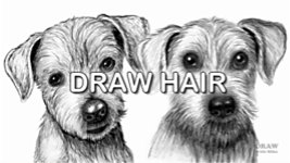
Hair, whether human or animal - we all know what it looks like, and even how it feels. Unfortunately, however, that doesn't mean we can automatically draw realistic looking hair; and many techniques, which seem intuitive, don't capture the real ESSENCE of hair. This old drawing of mine, for example, uses techniques I thought would work... but they fall short of any sort of reality.
I have over 40 years of experience, during which I've learned a lot about what doesn't work, but also what DOES work. So, in this video, and the next two, I'll share with you, all I know about drawing hair.
First, we'll take the drawing of hair apart, to learn what can go wrong, and then we'll reassemble it, using techniques that actually DO work. And I'll show you HOW and WHY they work, too.
There are a number of techniques, which most of us try, that seem to be good choices, but they simply don't give the results we're looking for. As the drawing grows, there's something missing. It just doesn't look right, which can be really frustrating. So, what's up?
Well, there could be a number of reasons, which we'll explore, as I show you the best techniques for drawing realistic hair, and what might be going wrong. For example, maybe you're not using the most appropriate method? Such as, a drawing technique that doesn't produce sufficiently realistic effects.
Perhaps the quality of the lines you're drawing are not fully describing what you're trying to depict. Or the depth of your vision is too shallow. That is, you're drawing too superficially; not looking beyond the top layer of hair. And all those faults are present in this drawing of mine. So, let's take a look at these issues in depth. And then I'll introduce you to a technique that solves all of these problems.
UNSUITABLE TECHNIQUES
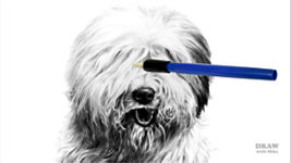
First, the technique you're using is possibly not the best choice for the job, even though its use appears to make perfect sense. You might, for example, be using an eraser to create white hairs, as I did in this Old English Sheepdog's leg. Or maybe you're drawing actual hairs - in the correct position, of the correct length, with the correct curvature, and the correct width... yet, they simply don't look like real hair.
Let's start by looking at the ERASING method. When you need light or white hairs to cross over darker hairs, or even cast shadows, we don't have a white pencil; so, how can that be achieved? Well, erasing seems like a quick and easy solution. I certainly thought so when I drew the Sheepdog. But, let me shoot forwards a few years, because I drew this again... And this time I used a far more suitable method for drawing the hair - which I'll cover later in this video. The difference is unmistakable, because the clarity, depth, and sense of realism have all obviously improved.
Erasing within darker hair is a common solution to drawing light hairs... but, as you can see, it has its drawbacks. First, as the eraser cuts through the existing drawing, it inevitably drags some graphite with it - especially along the edges. That creates hair with SOFT edges, but the actual edges of hair are hard and sharply defined. A minor point? Maybe. But you're already straying from a feeling of realism.
There's another problem with erasing too - when you're cutting through pencil lines, you're unlikely to erase back to pure white. And, because erasing needs a degree of pressure, you might also be forcing some graphite deeper into the tooth - again, making the restoration of pure white almost an impossibility. In either case, you're not creating what the viewer expects to see - it's not how they recognise hair. Oh, they'll KNOW it's hair, because of its context, but it won't look like REAL hair. As I'll demonstrate, better ways than erasing exist, which preserve the white of your paper, while producing much sharper, more detailed, and realistic results.
DRAWING HAIR
Another problem with drawing hair arises if the artist initially ignores the hair and concentrate on the three-dimensional form. Shading that first - before drawing the hair - actually compounds the problem. Because, drawing the hair on top of the background shading has one major flaw: you've covered all the white. Now, you've removed the ability to create bright highlights - other than erasing, which we know is a flawed choice. If you're trying to draw REALISTIC hair, shading the form first NEVER works!
Another - and I believe the most common and major problem many artists encounter when drawing hair is that they... DRAW HAIR. Again, it appears to make sense. You can see the hairs, so you draw what you see. These are delightful drawings, and they're aimed at exposing character, but they fall short of being believable. Why? Well, all the thinking so far is simply MISTAKEN. In fact, it's so far from the drawing of real hair that it's almost the reverse. You're standing the art of drawing hair on its head, and expecting perfect results. But I can see where the problems arose.
This Billy Goat is obviously covered in hair. You can see it quite clearly. Look closely, and you can see the individual hairs that make up its coat. They're clearly separate, and you can easily see what to draw... you can sense a "but" coming, can't you? Well, here it comes... But... When you draw hairs by physically drawing them - that is, your pencil lines represent the hairs... you're making a FUNDAMENTAL ERROR.
What you're actually drawing is dark hair on a white skin. It's as though the animal or person is illuminated from inside. THAT's why it looks so strange! You're drawing the
exact opposite of what you see. Because, in reality, the hair shades the skin from the light, so the skin is
always darker than the hair. Even black hair is lighter than the skin beneath. That's because black hair isn't black. It casts dark shadows, but the hair itself is shiny and reflects light, which creates highlights.
So the big secret to drawing believable hair with a pencil is NOT to draw the hairs. It's to draw
the shadows of the hairs, in the gaps between them. And by 'hair' I mean either individual hairs or locks; that is, clumps of hair.
In both cases - single hairs or locks - we understand where their edges are by seeing the shadows between them. And, as graphite artists, we cannot draw light on dark, so we have to draw the shadows, not the hairs. That said, a single black hair on top of white hairs CAN be a simple pencil stroke, but at all other times, you simply can't draw lines to represent hairs.
That's particularly evident when you draw white hair. You can't draw anything white with a pencil that only makes dark marks - or anything light against a darker background. And that leads to the realisation that you almost
never draw hair. We visually detect boundaries because of the contrast between light and shade. So, to create that contrast, you draw the shade - the dark gaps between the hairs. Then you craft the hairs to sit naturally within that shade.
This West Highland White Terrier doesn't have a single drawn white hair - they exist purely because of their shadows. Drawing around them, for example, created the white hairs that rest on top of the nose - the hairs themselves are just plain paper. Elsewhere, after the white locks of hair were defined by their shadows, they were shaded, area-by-area, according to their position within the chosen lighting scheme. Yes, some positively-drawn, dark lines DO exist, but those between the nose and mouth, and under the chin, are wet hairs that clump together, and they are
darker than the white hairs behind them. By using positive drawing for those, it can be clearly shown that they lie above the hairs beneath them.
So, erasing isn't a good choice, because it leaves unrealistic edges, and it involves applying graphite where you actually never wanted it. And drawing hairs doesn't work, because it's the reverse of what we see. Whereas, drawing the shadows is far more faithful to reality. In fact, it's the ideal method, because it both defines and creates very sharp edges. And the "hairs" themselves are left white until you know what to do with them. That's Negative Drawing - no misplaced graphite, no prior shading, and full control over every stage of the result. In fact, it's the ONLY method that correctly reproduces hair as we see it.
POOR LINE QUALITY
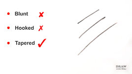
Another common problem is poor line quality. I'll cover this one quickly. There are three possible ends to any line:
- A Blunt end
- A Hooked end
- And a Tapered end
Only one applies to hair. The other two destroy any sense of reality.
And there are two possible techniques:
- Lines Hatched in sections and
- Fluid lines drawn in a single pass
Again, one looks completely unnatural. The other realistically suggests hair.
That said, I'll show you a workaround soon, which can produce a fluid line when drawn in sections.
Remember - we draw gaps not hairs. And gaps between hairs are like splits in wood - they always terminate in a sharp taper. A gap never has a blunt end. It's physically impossible for that happen, and viewers of your work will instinctively understand that. And look how you're immediately attracted to them - as your viewers will be too.
Those tapers matter. And the easiest and most efficient way to produce a sharp taper is to draw UP into the gap. If you begin the line with the taper, you're more likely to produce a blunt end, and, because you can't apply sufficient pressure, it will probably be lighter than you expected. Yet, that shade will naturally become darker as it disappears beneath the meeting of the two hairs. You have more value control drawing up into the taper. It might be a marginal issue, but worth the concern.
And that workaround I mentioned? If you have to draw a line in stages, taper BOTH ends. Because a taper over a taper produces a single solid line. ALWAYS taper EVERY LINE when drawing hair. Including all the detail within the locks, not just the gaps between them.
SHALLOW DEPTH OF VISION
Shallow depth of vision is a problem not with your technique but your ability to see and fully understand. It's so easy to see only the foreground, and to ignore, or just loosely suggest, the rest. That's a case of shallow depth of vision. In reality, you need to represent the depth. And that can be especially important when drawing hair, because it's the midground and background that defines the edges of the foreground. Like this...
Look at this foliage and ask yourself "why do I know where the edge of each leaf is?". It's because each foreground leaf shades those leaves behind from the light, and might directly cast a shadow on them. This results in the leaves behind being darker. And the further back you look, the same remains true. Every layer, no matter how dark, has darker leaves behind it. Until you reach pitch black darkness and can see nothing. Remember that, because the same - is true of hair. Your depth of vision - the layers you can detect - is essential when creating a sense of realism in your drawings.
If all you see is the foreground locks, you have a problem. Because, as you saw in the foliage, the midground and background hair is of equal importance. However you interpret or copy what you see, you first have to SEE, and understand it, in depth.
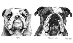
And, if you can't see the foreground hair for the form - you have an even greater problem. This boxer, for example, is a creditable drawing... but it has
no hair at all. It's 100% form. And this early Bulldog of mine mainly suffers from the same problem. I almost completely ignored the smooth hair. There is at least some semblance of it, but it's been relegated to "unimportant" - which it isn't. Like a Magpie, it's so easy to fall under the spell of the bright and glittery bits. You're attracted to the showgirl; the shiny, sparkly star of the show - the FOREGROUND, and the obvious parts. You're really not seeing what's behind - and discounting it as uninteresting, or even unnecessary. Yet, it's as important, if not more so. Because it provides context and depth - and they combine to produce realism.
Look at the difference that paying attention to the depth in your references produces. 1979 - a year before I turned professional... and, 12 years later. The last of the 52 Open Edition head-studies I drew. Study your references closely. The deeper you can explore, the more you'll have to work with. But, of course, the techniques you choose to do that work are important.
SO, WHAT DOES WORK?
So, what does work? What combats the streaking of erasing, provides depth by clearly separating layers, and creates light hairs on darker skin? Negative drawing - and here's why...
We cannot draw light or white on a dark paper. So, we have to draw the reverse - dark shade to expose the lighter foreground. If this white Cockatoo was a Grey Parrot we'd still have to draw the shadows first, because the shadows will ALWAYS be darker than the feathers - or hair. Even black hair, as we saw.
So, let's get down to the basics and draw a line. And now a second - leaving a gap between them... And that's it. I've created a white hair between two dark gaps. It's that easy. If you can do that - and see it as a
white line, and not two
dark lines - you're well on your way to using negative drawing to draw realistic hair.
DEMONSTRATION
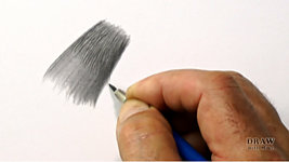
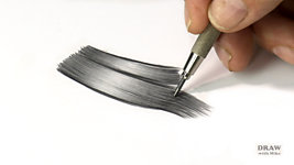
So, let's expand on that. I'll create a wavy lock of long dark hair - because that's the easiest to explain. We'll tackle this one wave at time. So, let's begin with a couple of guidelines to fix the shape of the first wave in the lock. And, as before, make the first mark. And a second - leaving that all important gap between them...
I'm using a 2B for this initial layer, because it draws dark marks with relatively sharp edges, which is exactly what we need. Remember, the white gaps ARE THE HAIRS, so I'm leaving plenty of gaps as I draw the dark shade in between them. And every line has to be tapered. There's no such thing as a blunt end in hair. Take you time. A taper isn't a quick flick; it's a controlled lifting of the pencil.
Now I'll begin at the other end. Keep the first end in your peripheral vision, and aim your new lines in its direction. Your gaps should appear to flow from one end to the other. I'm
looking at the white shapes, not at the lines. If there's one essential piece of advice I can give you when drawing negatively, it's look at the white as you draw. It's the white you're creating; the dark lines just expose it.
So, what we have is white hairs with sharp sides separated by deep shade. No erasing; no smudged edges; and no planning - it's all intuitive. The position and shape of the lock, and this wave we're working on, is fixed, but its internal features are invented as you draw. You'll learn a lot more about that in the next video.
The next layer will be slightly lighter in value than the first, and extend just a little further. Every line begins at the beginning. And notice that the gaps in the first layer are beginning to fill with the lighter value. They're starting to look like dull highlights in the dark end of the lock. You can taper both ends of your lines, but if you find it easier to just taper the final end, that's OK. As I'll show you, new drawing can be grafted onto both ends of this wave, and blunt ends will disappear under the new lines. But, for safety, taper them if you can.
Now I'll extend it a little further. Again drawing slightly lighter. I'm gradually teasing the hair in towards the centre of the lock. One of the most common errors is to draw too few layers. The more layers you use, the more control you have over the final result. Ideally, the values should sweep seamlessly from the dark ends to the lighter centre. I'm reaching the point now where the 2B is beginning to look grainy, and "grainy" doesn't suggest hair. So, I'll change to using an HB.
The HB contains more fine clay, so it produces a smoother finish. I'm gradually moving closer to the centre highlight - and, as before, every line starts right back at the beginning. That constantly burnishes the softer 2B and fills any holes in the tooth. And that, in turn, creates the smooth, naturally shiny look of hair. Look for "happy accidents" too. There's a light hair appearing here, so I'll make a feature of it by darkening the gaps on either side of it.
Now we're finally reaching the point where the HB is looking grainy, so I'll switch to a 2H.
Because every line begins right back at the starting point, you're building layer upon layer at the dark ends. Where the HB burnished the 2B, now the 2H is burnishing the HB - smoothing it, and removing any white holes in the tooth.
I think I'll leave the central highlight quite light... And the gaps that I originally left are really looking like dull highlights in the darker ends. I'm drawing very lightly now, so the gaps fade into the wave's central highlight.
Now, either side of this lock will be other locks, and between them will be gaps into which almost no light enters. Notice that as soon as the dark gap passes the wave's bright highlighted centre, the highlight glows more intensely.
Bear in mind that my video lights are making my darks look paler than they are. In reality, they're as black as I can make them.
So, let's just stop for a moment and review what we've done...
- Guidelines defined the shape of this wave in the lock.
- From the first black line, we knew the full tonal range available.
- We looked at the white lines as they appeared, and not at the lines being drawn. Concentrate on those white lines, because THAT'S what we're creating.
- The lock was created from dark to light - gradually extending the drawing towards the highlight with each layer, using decreasing pressure.
- And the grade was changed every time the current one looked too grainy.
Take your time - one small step followed by another. Give yourself time to recognise those happy accidents. And every line has to look as though it runs from one end to the other, so aim for the other end, even though you're going to stop your line short. Work slowly, so you have control - I can work faster only because I'm very used to doing this.
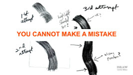
And be prepared for this to not work for you the first few times. You will make errors, as Karen recognised in her example from my Intermediate course at Drawspace:
- Hooked ends - lines that don't follow through to the other end.
- Blunt ends - lines that begin or end abruptly, which is totally unnatural within hair.
But now the good news... "highlight should be?" - where it is. It's correctly on the top of the curve. But, here's something important I realised years ago. Unless you do something really outrageous, such as hooked or blunt ends,
you cannot make a mistake. The human brain will always try to make sense of what it sees. Of course, what your viewers see might not be what you intended, but they don't know that, so they'll make their own subconscious decisions until what they see makes natural sense to them. "Wrong position"? Possibly... but I can easily make arguments for why those highlights naturally fall where they are - and so can every viewer of Karen's drawing.
So, we now have two partial and isolated waves, and you know the basic technique. To extend either wave, just graft new drawing onto its dark ends, and repeat. Earlier I said these ends can be blunt... but if you've tapered them, the graft can be made more easily. Because you can easily and seamlessly graft new drawing onto dark areas and shadows, you draw dark end to dark end. Wave....
after wave... after wave... And then you begin the next lock. Again, wave... after wave... until each lock is complete. And all you need is the ability to draw a single wave of hair.
In the next video I'll show you how you can break down even the most complex drawing into simple stages, working from background to foreground, while creating the background spontaneously. That alone removes most of the stress.
For now, concentrate on a single wave within a lock, and then repeat that along its length. Even the most complex subject becomes manageable when it's broken down into its various parts.
Instead of being confronted, and confused, by a complex arrangement of shapes and textures, you can use the layering of hair as divisions to concentrate your focus on just one manageable area at a time.
And I'll introduce you to Drawing Breaks - natural boundaries within hair that you can work up to, and then seamlessly graft on the next section. Working from section to section, one stress-free section at a time.
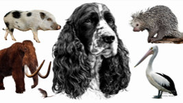
You'll find this way of working is undoubtedly the most efficient hair-drawing method, and it applies to all hair, with variations, from Pigs to Porcupines, and Mammoths to Mice - even birds... because feathers are modified hairs and obey the same drawing rules. And from human curls and dreadlocks to long, silky dark or blonde hair. There are other methods but, in my experience, negative drawing gives the greatest control and the sharpest and most realistic results.
© copyright: Mike Sibley 2022