Transcript
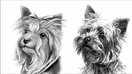
When it comes to drawing, I'm self-taught. I slowly evolved from copying photos to creating textures. That is: I began to draw what I understood, rather than only what I could see. In my case, the predominant texture was hair; but only because I knew the pet portrait market. These two drawings are about 10 years apart, and bear in mind that, back in my day, the Internet wasn't "a thing". Indeed, no-one I knew owned a computer. So, I relied partly on books - remember those? :) - and mainly on good old-fashioned practice - with plenty of errors and occasional triumphs.
And, as with anything to do with drawing, or any other skill, nothing beats regular practice. You learn by DOING, not watching. You can watch videos till the cows come home, but they're all worthless, including this one, unless you put them into practice. And the same applies to the creation of any texture.
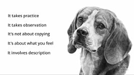
- It takes practice
- It takes observation - you need to build up a store of visual and tactile experiences
- It's not about copying what you see...
- It's about what you FEEL: is it rough or smooth, for example.
- It involves description: explaining what you feel in a way that others can understand
Now, a word of advice: you
could rely on a coarse paper to help you create your rough textures, but you'll learn a lot more if you use a smooth paper. That forces you to create every aspect of your rough texture; and
you'll be in charge. What we see is what you intended us to see, and not something your paper has modified.
So with smooth paper in mind, let's begin with something simple.
SKIN
You've met Charlotte before, and no doubt you'll meet her again, because it's the only human portrait I've ever drawn. She also has the perfect two-year-old flawless skin that suits our purpose. Well, "perfect" and "flawless" describes it quite accurately, but let's analyse it further - so we know WHAT we're drawing. And you really should practice this, no matter what you are about to draw.
This skin is:
- Smooth: This skin feels smooth when brushed with a finger
- Flawless: It contains, as I said, no features or flaws, no overtly visible pores, or any visible pencil lines.
- Peach-like: To the touch, it's like stroking a peach - smooth and soft, not slippery.
- Soft-edged: And there are no hard edges. Everything flows smoothly from value to value.
The overriding surface, then, is SMOOTH and FLAWLESS. So, hard grades seem to be the most appropriate. Their fine clay content will produce very smooth results - but not dark results. And, in places, we can see that dark is necessary. Fortunately, there's a solution - using soft grades beneath hard. A 2B soft grade in this case, lightly applied, so it sits on top of the tooth. Then, as soft grades are grainy, which doesn't suggest smooth skin, it can be burnished with HB... and then 2H. So, you achieve the dark SOFT value with the smoothness of the HARD grades.
Here it is in practice: The 2B is laying down the darker value... Then HB burnishes the 2B - it smoothes and polishes it. And then the 2H smoothes that further. The result, as I said, is the darker value of the 2B with the smoothness of the 2H. And to be certain no pencil lines remain; I might lightly blend the result.
But, don't fall into the common trap of thinking this is
purely a skin-drawing technique. It isn't. It's a
smooth surface technique.
It applies to glass and ceramics; shiny chrome-plated surfaces with their bright highlights; smoothly painted or lacquered areas with more muted highlights; cast alloy parts, with satin-smooth surfaces and soft highlights; and calm water and fine mist. And, by using shading with tapered lines, you can create wide expanses of sky in manageable sections - and those are just a few from a long list of possibilities.
Skin... it possesses no visible signs of shading. Values flow gently from one to another. It's a perfectly smooth, but peach-like, surface that reflects only very soft, diffused highlights. And - we'll be returning to this later - notice how the sharpness of the fleece makes the skin look even softer - by contrasting one texture against another.
FELT
So, let's develop that smooth skin into a texture you can more easily feel under your fingertips. This - the velvety appearance of felt. It's not smooth - you can feel the nap and its softness. So, we'll use soft grades this time, instead of hard - because soft grades draw lines and marks with soft edges. But I suspect the edge of the point will be needed too.
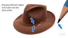
It's always worthwhile exploring what we are about to draw. Something else I can see is that the band around the hat contains visible, sharply defined ridges. We could use those to contrast with the softness of the felt. The hard ridges will make the felt look softer. The edges of the band also have an extra thickness; and the highlights those pick up, could help us to separate the band from the felt - as could the band's cast shadow.
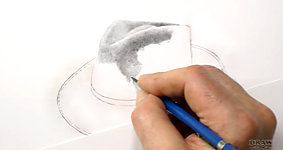
I'm beginning with the flat face of a 2B - a narrow one, because the features within the nap of the felt are small, and a flat face draws marks with soft edges. But I'll use the sharp edge too, where I need to. Although the overall feeling is soft, you'll often need harder edges to clearly define the boundaries of features. And the 'features' here are the little raised ball-like shapes on the surface. The edge bites into the tooth, completely filling it. This random scribble is pure negative drawing - drawing the background to define the foreground tiny surface bumps. Then a turn of the lead to the flat face applies seamless shading - partly to remove all white, but mainly to describe the three-dimensional form. The edge provides the background detail; the remaining white shapes provide the highlights; and the final flat-face layer ties them all together. And, as long as the background drawing is sharp-edged, I can push whole areas further and further into the shade, while still maintaining clarity. And I'm using a mix of circular and random shading - which means I can draw endlessly. And that affords you the ability to change direction and weight at any time, so you can sculpt it. You can follow the contours and the hollows and crests. The light is diffused and shining from almost directly above, so I can easily work out where the light will catch any crest as I draw; or where an area can only see partial light. Or no light at all.
Earlier, I warned you about the folly of using rough papers to create rough textures. But if you find the tooth is working for you, go with the flow. That's what I'm doing here. Because my pencil is just grazing the surface, the tiny imperfections and pits in the paper are suggesting the texture of felt without me having to create it. If that happens, go ahead and use it. Oh, if you suddenly find you're drawing darker marks than you intended, that's almost entirely due to stress. And that's causing you to grip the pencil too tightly. RELAX. I'm barely grazing the surface of the paper, and it's so easy for me to grip a little too hard and cause the drawing to darken.
By now, you should know that there are only a few basic drawing techniques to master. And by layering or incorporating those techniques, you can create anything that you see or feel. Or, I should say, that you can see AND feel. Because, the appearance of something rarely fully describes it. You have to reproduce the essence of it too. For example, with a slight modification, this could be a trilby or a fedora, or anything made from suede or leather. This time it's felt. But, if you draw it more coarsely, it becomes fleece. More sharply, and it's brick. More angular and... well, you see where I'm going with this...
Like Charlotte's soft skin, this felt diffuses the light, and its soft fibres absorb much of it too. Hard edges are absent; smooth transitions occur between highlights and shadows; and changes of value are velvety in nature.
Conversely, hard, smooth surfaces, such as glass or metal, are highly reflective. Far more of the light bounces off the surface to shine into our eyes. So, unlike this soft felt, very smooth surfaces have highlights with crisp edges, and strong contrasts between light and dark values.
That's SOFT, and HARD and SMOOTH, but what about ROUGH?
Rough surfaces scatter the light; and this felt, seen up close, can be classed as rough. The light is reflected in multiple directions by the many facets of the surface, so only a small proportion of that light meets our eyes. However, ROUGH alters with SCALE. The deeper the valleys, and higher the crests, the rougher the texture. We'll be returning to that later.
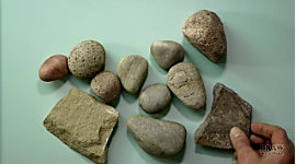
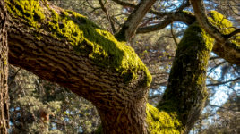
ROCK
For now, let's ramp up the texture a bit more and choose something that's rough, easy to create, requires no references, and just a minimum of observation... ROCK. It's so easy to draw that you might feel you should be trying harder. Surely it should be more difficult than this? But... No. It isn't! Of course it does depend, to some extent, on the depth of your observation, and the type of rock you envisage using. But rocks are plentiful - on a beach, on a building site, near road construction, or maybe surrounding a bonsai tree in a pot. Perhaps in your garden. If you dig into the soil, you might find simple round rocks and interesting pebbles. They could be granite - like this - or limestone, for example, and they might be sanded smooth by being rolled around in a river bed. Sandstone, and other sedimentary rocks, have a grainy feeling. Your fingernails catch if you drag them over the surface. As the rock is laid down, something interrupts the process before it begins again - resulting in layers of various thickness. Split a sheet of stone and, if you're lucky, you'll find fossils too. Think "sea anemone" on a stalk. These Crinoids are the 500 million year-old fossilised stalks.
So, if you thought rock was dull, grey, boring stuff... it isn't!
This is Quartz. It's very hard - glassy and reflective - and it forms beautiful crystals. Like these wonderful examples which are Amethyst. And this might surprise you - this highly reflective rock is Galena, which is the ore from which we obtain Lead.
However, in a drawing, we need less attention-seeking rocks, so let's return to the simpler and far more common variety. This is a composite scene I created for my workshops. The rabbit lived 40 miles away from the brick wall. And the stone it's standing on is concrete. But, in the hands of artists taking my Foundation workshop - well, it most often becomes rock. All you need is a notion of what the texture might feel like; knowing, or deciding, where the light is coming from; and possibly the colour of the rock.
For example, In Whistlers Cove, the scene is largely imaginary, although I had references for the dogs and the boat. But I mainly relied on memory for the midground boulders. They're based on rocks I explored and climbed over on Reighton Sands, and they were almost white. Not chalky white, or as porous as chalk, but smooth and hard. And, more importantly, I observed that white rock reflects light, so
there are no very dark areas. The rocks reflect light onto each other and that dilutes any cast shadows. Holes... that's a different matter. Holes
will be dark, because little to no reflected light can enter there. You see? If you just draw without thinking, you'll miss these important characteristics.
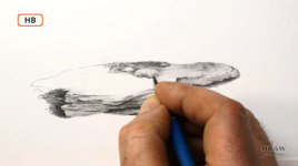
Eventually though, however much thought you've given to your texture, you need to make that first mark - preferably, somewhere where you feel comfortable. It could be a short thin line, or a broad squiggle. I think this rock could be gritstone or sandstone, and we know they feel gritty to the touch, but I want to be a little subtle about that. A suggestion is often more powerful than sharp reality, which also tends to attract unwanted attention. So, short, sharp marks might be best. Or even stippling. Or whatever you think might best describe the way it feels.
In this case, I'm going to focus on sharp edges and angles, and circular drawing and squiggles. What I'm NOT going to do is shade the form first and then add detail. That NEVER works. It compromises values you might need later, and muddies everything. Instead, let your marks and shading suggest the form and features. Incidentally, I'm using a blender - lightly! That's rarely to soften the drawing - usually, I take care to not do that - no... these rocks do not naturally contain white, so the blending subtly and smoothly covers it. As well as not containing white, I know this is sedimentary rock, so it will have visible layers. And, as you can see, I use those layers to break up the drawing into manageable sections. I can work my way along one layer and then go back to begin other layers above or below it. Just let it grow. Let it spill out of your mind. And if you find it's beginning to bore you, or perhaps an edge is beginning to look too dominant, introduce a feature to correct that. Maybe it's time to let a small plant grow out of it, or a patch of moss to exist. Just go with the flow and
draw what you'd expect to see if this was real life. I've introduced a couple of old roots, and bits of rubble that frost has broken from the rock above. And that makes sense of the fallen rubble on the right.
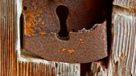
RUST
Well, let's move on - let's get tough and rough. If you take gritty rock and enlarge the technique it begins to form rust. When water reacts with iron it eats into the surface, so you do need to observe that rust forms raised nodules, not unlike felt or grainy sandstone, but on a larger scale. And when those raised lumps are knocked or fall off, they leave pits. Dark, sharp-edged pits. Those pits are one of rust's visual clues. Another - and a very useful one - is that edges appear to be irregular and "eaten into", as you can see here. Creating an edge like that can only say one thing: RUST.
And rust is variable. Rust on sheet steel, for example, forms a fairly flat, non-reflective, and relatively shallow covering of a multitude of tiny pits - and a few deep pits in this case. Whereas, the pits on thick iron are more widely spaced, considerably deeper, and delamination occurs - that is, the metal flakes off in layers... as I know to my cost. You should see the bucket on my tractor! It has more holes than bucket :) And you learn all this by observation.
The rust I'm about to draw is part way between those two extremes. But first, I'm aware that the pits formed by rust are darker than the surface, and have steep-sided edges. That means, any pit large enough to be easily visible, will pick up a highlight on the edge facing the light. And, if it's deep enough, it will have an internal shadow cast by the edge that can't see the light. That highlight is essential. It's an unmistakable visual clue that tells the viewer "this is not a mark ON the surface, but a pit IN the surface", because if it's not a pit, that highlight cannot exist.
This is the stub axle from an old henhouse. Have you noticed? I never throw anything away! Well, you never know when you can make use of it :o) It is, as you can see, quite heavily corroded, but it's not that easy to see clearly. So, I'll create a lighter version. Now I can base the values I use on the darker photo, and the lighter one helps me to see the detail in the dark areas. And this might help too, because it emphasises the crests and troughs.
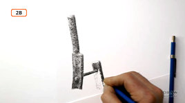
As you draw, try to feel the textures. I'm deliberately using short, sharp marks - using a 2B, so I produce dark marks with hard edges. There's nothing soft about rust. The technique employs a mix of negative and positive drawing. Just as in the rock earlier, highlights are merely drawn around and shadows are simply created by applying more pressure to the pencil. Essentially, one grade of lead can achieve all the required values. This is ideal, because extensive areas can be created, using a direct chain from thought to hand to paper with no interruption. You can FEEL your way around each feature, and shape the three-dimensional form.
Staying with the "one grade" scheme, almost all of this is in 2B. But I will switch to an HB for areas that I want to be lighter - so I can maintain the same FEEL without drawing too dark. And then I use a 2H to remove any white, because white is not a value associated with rust.
It doesn't matter if I'm drawing this with the aid of a reference, or entirely from my imagination; I'll analyse it before I begin. Always - whether a texture is new to you, or known - analyse it first. Discover its essential qualities - its Visual Clues. Then break down the drawing of that texture into manageable parts. Instead of worrying about creating the overall surface, search instead for the area that you most feel comfortable with. Now, just concentrate on drawing that one small area. If your initial attempts fail then erase and try again, or, preferably, experiment on a scrap of the same paper until you get a feel for the texture.
When you've achieved acceptable results with that first area, complete it and extend it into the next section. Now, using the experience you've gained so far, you'll find drawing the new area is much easier. At each stage, you can use the previous drawing as a guide for the next. Slow down, take your time, and master simple areas before you deal with the more complex ones.
BARK
Now let's move things up another notch or two. Coarse bark - sharp-edged like rust but on a grander scale.
To return to what I was saying about ROUGH textures and SCALE. As you scale up rough surfaces, so the properties alter. Our felt absorbed much of the light and reflected just a little. Similar surfaces with many tiny pits, like rusty metal or rock, will have minimal contrast, because the diffused light is too weak to create bright highlights. However, rough surfaces, such as this deeply fissured tree bark, have many ridges that catch the light and cast dark shadows behind them, which creates strong contrast and sharp edges. To create a really dynamic feel, we can contrast the highlighted crests with dark cast shadows, or the deep dark depths of major splits.
Looking deeper: there are two separate systems of texture here. Large masses of bark with hard edges. And a series of smaller masses with narrower but equally sharp edges within each mass. If our tree is to be in the foreground, we need to discover that information. But, if it's to be midground or background, we need to step back and seek what is truly important. Let's just boil it down to its most obvious elements. Its essential Visual Clues. Try half-closing your eyes, to remove the detail, and look again. Two features stand out from all the others: VERTICAL SPLITS - where the bark divided as the tree grew. And, sometimes narrower, HORIZONTAL SPLITS within the vertical bodies, that divide them into sections.
You might think I'm stating the obvious, but going through this exercise before starting your drawing helps to fix the characteristics in your mind - especially those that you can use to your advantage. By describing the surface to yourself, you build up a mental picture before committing anything to paper. Now, when you begin to draw, you'll have concrete features to depict, not just a vague notion of the surface.
At all times, I'm mentally describing to myself the forms that are under my pencil. Will it receive full light? Will it cast a shadow? Will reflected light dilute the strength of tone on its shady side? Is this edge raised slightly so it will receive more direct light than a flat surface? And be aware too that 'happy accidents' might occur that correctly define the texture. Welcome them; immediately extend the area and make a mental note of what you're doing; and now you can use that chance discovery as a base for the remainder of your subject.
All it needs is OBSERVATION and the ability to either physically or mentally FEEL the texture. And if you don't know how a texture FEELS, you really can't successfully portray it.
So, understanding the structure of your subject permits you to extract the key visual elements, and draw it convincingly, without resorting to slavish copying. For example, you could see this bag and notice that it has a coarse weave. Should you reproduce that? Is that important to understanding it? In this case I think it is, because the texture contains the chief visual clues. Knowing it's a cloth bag, rather than plastic or leather, seems rather important. So, how do you reproduce the cloth texture? The obvious approach is to use cross-hatching - following the warp and weft of the cloth as it folds, dips, and rises.
The difference between coarse fabric and leather is that... the fabric demands the use of LINE to describe its weave. The boots need an ABSENCE OF LINE. Leather is a flat, unbroken surface. So, where some textures require sharp edges and line, others benefit from flat faced leads used with random or circular shading. And these boots are such a case, because the flat face draws with soft edges that merge. And, because circular shading can travel, unbroken, in any direction, it can essentially sculpt any area. you can feel your way over the crests and into the hollows, while applying your chosen lighting direction. You'll notice too that I'm drawing leather, so I'm not drawing the laces. They need a different approach to describe their fibrous texture.
Whatever the texture, first closely analyse what you see and determine the Visual Clues - the unique combination that makes the surface appear as it does. Then look for properties peculiar to that surface or material -
the way it hangs, the amount of light it reflects, how its transparency affects the visibility of the underlying surface, the depth of its polished sheen.
Armed with this information, you can draw free of control by reference sources. Coupled with your knowledge of the use of light and shade, you now have sufficient information to draw and create textures spontaneously.
And that's what we'll be looking into in the next video.
© copyright: Mike Sibley 2022