Transcript
I believe there is a school of thought that says "use the values in the reference because they MUST be correct." Why? Because… well, because the reference says they are. We're not talking here about an artist who is drawing, let's say, a face. We're talking about artists who couldn't care less if it's a face... an apple... or a plane. Because, if they COPY the values and shapes they see, it's bound to look correct. Well... No. Because that's impersonal; dispassionate; there's no personal involvement.
And creating a texture is no different. It's not about copying what you SEE, be it in a reference or even in real life. It's DRAWING WHAT YOU FEEL. And, because that's worth repeating, you can be certain I will be :)
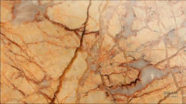
Everything that exists in our world has its own texture. Even very shiny surfaces. Oh, but wait!... this ISN'T TEXTURE it's PATTERN. This marble has been polished perfectly flat and smooth. It has NO texture. This is where copying can present problems. If you copy without understanding, you'll most likely recreate the pattern as a three-dimensional texture. But an artist who draws what he or she knows and feels will reproduce the hard, flat, shiny surface. OK, you could argue that even a totally smooth and shiny surface has a texture, because its
lack of texture
is the texture that perfectly describes it. And you'd be correct, because
describing the object is what creating textures is really about. Draw what you know and feel.
Here's a more every-day example. See the shine? And its hard, straight edge? That tells us the surface is
flat; not textured. And, to provide clarity, I might emphasise the play of light of that surface reflection, which is independent of the pattern itself.
Let's reduce this to its basics: Everyone has a mental store of images. It's how we easily recognise things as we make our way through our world. You can add to your mental image store purely by looking. But, to remember them long-term, (which, as an artist, you need to) you should study them in more detail... so, let's go and find and study some.
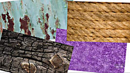
These old henhouse wheels have really interesting textures. They're rust-brown, but that won't help us. We can't make use of colour. So, we know these are rusty, but WHY do we know that? Well, they reflect very little light. They're the opposite of shiny. They seem to be covered in deep, dark pits, which probably explains the lack of reflection. I can feel the rough surface under my fingers. And - more importantly - if I drag my fingernails over the surface I can feel them catching on the edges of the pits. And, if I look closely, I can see they catch because those pits have angular edges.
The ivy feels really smooth, almost waxy And I can feel the ribs on the back, which are far more prominent.
Badger's hair feels smooth. But his mane is completely different; it's coarse and wiry... unlike the soft hair on his nose, which is almost silky in places. You get the idea? All these experiences are being stored for later use.
The horses' trough is smooth and COLD! Especially today. I can feel its galvanised surface has been eaten into a little in places. So, not rusty, but not completely smooth either. That knowledge might come in handy one day.
Farm tractors regularly rip up our lane, so we're often tipping stone into it. This is concrete from the Great North Road... This is stone from the fields. One is rough, angular and sharp and arrived on a truck. The other is smooth and rounded - formed and polished by the river that carried it here.
This rope feels smoother than I expected, so it's probably nylon or polypropylene - man-made and not hemp-based. I can feel short fibres along its length too - like stubble. Natural hemp rope has these too, but many more - it's almost hairy. Of course, you can draw rope without the wayward fibres, but if you include it, you'll make the "this is rope" message far more obvious.
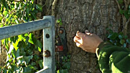
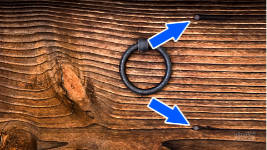
These metal gates, like the horse trough, are smooth and cold to the touch.
But I find this texture far more interesting. I love the bark on this Oak tree. It's so full of tactile interest. Did you know that bark doesn't expand as the tree grows? Instead, as you can see here, the tree splits it vertically, and new bark gradually grows to fill the gaps. The more trees you can explore - and touch - the greater the store of textures you'll have available for future drawings. So, if you're inventing a scene - rather than using references - you'll be able to inject far more variety.
Oh - an oak gall. I find them fascinating. They're made by a species of wasp that alters the tree's DNA, so it converts acorns into hatcheries for them. This feels very angular but not sharp. The edges are subtly rounded... and there's the hole where the adult wasp emerged.
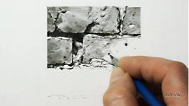
This coping stone on the bridge is concrete, but this is well-worn and weathered rock. The surface feels gritty and it's finely pitted. You can plainly see where it was laid down in layers, and it will cleave along those lines too. And I know that dragging my fingernails over it will remind me of this experience if I later need to draw stone like it.
Feel it.
Soak it up. Add it to your growing library of textures. And, if you don't have a tactile memory of a texture, imagine feeling it
before you begin drawing. Now you'll be drawing an "experience" rather than values, edges and shapes.
Talking of "experience", bear with me for a minute or two, because this is a little off-topic, but not as far off as you might think. These timbers, now being used as fence posts, came from the outbuildings of Mousefoot - a farm that once stood in this field. The foundations were quite visible, until recently when the field was sold, and the new farmer erased Mousefoot from history. But the previous farmer, my neighbour David was born in his next-door farm and remembers the outbuildings of Mousefoot well (but not the house, which disappeared a century ago). And he clearly remembers the origin of these timbers. See the remains of that mortise joint at the top? Well... the post I rescued from that fence... also has one. This was used to build the barn and sheds at Mousefoot; and it was
previously on the high seas. These timbers are from dismantled 19th century sailing ships. This wood once sailed the world's seven seas - or maybe just the North Sea coast, we'll never know. :)
As for the wood itself, it's Oak; the mortise would once have housed a tenon to form a solid joint; and it's suffering from wet rot, caused during its days at Mousefoot. Wet rot forms this cubic appearance, so it's not dry rot, which is a fungal infection. I used this timber for inspiration here in this drawing.
Do you
need to know all of this to make use of the wood? Or to create its texture? No, but it does increase your involvement. It becomes an "article of interest" rather than just a discarded lump of wood. And, as I said, you're drawing
something you understand, rather than just copying values, marks, and shapes in a reference. That said; don't draw it without thinking about
where it is in your drawing: background, midground, or foreground.
The foreground is usually sharply detailed. It contains the information the viewer needs to understand the rest of the drawing. By the time we reach the midground, things become less clear. These trees are sharply-drawn scribble, describing the texture and form, but no detail. And in the background, everything is reduced to low contrast, soft-edged shading, and very hazy forms. Now, you might be thinking this is taking the subject of textures too far. But no. Textures are ALL IMPORTANT. Far more important than mere surface detail or three-dimensional shaping. And here's why:
There are two ways of interpreting what you see: Three-dimensional form with the addition of texture, or Texture that creates the three-dimensional form. Let me explain: This is a fairly common way of working - possibly the most common. You take your subject and you reproduce its three-dimensional form. Then you add texture to the structure - hair, in this case. Right now, I'm not going to fully explain why that's a mistake, but it is. Why? Because that's
not how we see form. Think about it. You've shaded the skin, yet you cannot physically see the skin at all. It's all hidden beneath the hair.
In real life, the reason - the only reason - we know what the three-dimensional form looks like is because of the
shadows and highlights in the texture. The hair IS the texture; and the texture - only the texture - tells us everything we need to know about the form beneath. And that doesn't just apply to hair. It applies to any texture that covers the object beneath it. It's the object's surface texture that provides all the clues to its form. Of course, you do need to know the three-dimensional form before you begin drawing, but you cannot create form and then "add detail". Because it's the detail that tells you all about the form!
OK - having got that out of my system... I have some good news for you...
When you're about to create a texture, you're searching for that killer content that says "this is what I am". I call them visual clues. They're the clues your viewers subconsciously recognise; the keys to unlocking the message. This should explain my meaning: the water Tom is standing in... You knew it was water before I mentioned it, didn't you? Yes, you did! What else could it be? It contains a reflection of Tom; and it displays bands of highlight. Supplied with those clues, the only valid solution is
ripples on water.
Except... they aren't. They aren't carefully crafted rising and falling ripples. They're just light gaps in the shading. But they send they intended message. The essential clues. Light bands cutting through a reflection decodes as water.
In fact, it almost doesn't matter how you present the clues. Whatever your style of drawing, as long you include the clues, they'll send their message.
To best explore textures, remember them, and extract their clues - Rub your fingers over the surface; feel the soft coat of the dog or rabbit;
drag your fingernails over rough surfaces; and, if you have the opportunity - sketch them. Sketching helps you to understand what's important and what to discard as distracting content. Bricks, for example. I might see a brick and not readily understand the importance of its surface texture. My memory might be just "brick; smooth; about 9 x 3 inches". But a sketch encourages you to analyse the surface, and concentrate on its edges and features. And you'll very likely remember them, and have them available for later use. Don't copy Know something about it Do a little research. Like this...
Wood has grain. Why? Because it annually grows a new layer. This is Spring wood: it's fast-growing; so it's soft and pale and wide. This is Summer wood: The growth has slowed down, so it's more condensed and harder and dark. In Winter: the growth abruptly ceases. Now you know that the light, fast-growing, Spring wood merges seamlessly into the harder summer wood. And, as the growth quickly slows to a stop, it creates a hard edge. It signals the end of that year. And the dark rings are those we count to determine the tree's age.
Once again, you don't need to know these things, but you can never know too much. And knowing them really does help, because you're drawing what you know and not just what you can see. And, because you understand what you're looking at, you'll correctly draw the spring wood to seamlessly merge into the summer wood. No longer will you draw a dark mark to represent a ring, because now you know one edge of that dark summer line is sharp and the other edge is soft; and that results in an increased sense of reality. That's a far more powerful approach than just blindly drawing what you see - or think you see.
Think logically. Explain things to yourself. For example, you might see a dark line on wood and recognise it as a split. BUT if you draw it like this... you've failed. You've drawn a dark mark
on the surface. Why? Because splits are formed by the grain parting. That creates very fine tapers at each end. And those tapers are one of the visual clues to it being a split. Omit the tapers, and your split becomes a painted line. You'll know it's not a split - even though you probably don't know that you know that :) It's to do with subconscious recognition. Splits are tapered. And your mind will never accept a blunt-ended line as being a split, because it doesn't conform to what it expects to see. So, don't just draw - draw and
think.
If you are drawing something that's rough, think rough. Rough usually involves hard edges - tree bark, for example, or the sharp edges of crushed stone. And think smooth if the surface is smooth, like the metal trough or the gate. Let your drawing flow onto the paper with no hint of line.
And when you work with understanding and not just observation, magical things can occur. The setting for this drawing is purely imaginary, so most of it had no references. That actually helped me to immerse myself into the scene as I drew it. I was effectively creating my own world.
Some things were planned, most weren't. And one that wasn't was... the plaster that fell off wall! It was quite unexpected, but felt completely natural. Cracks began to appear and spread. A section of plaster came loose. Then another. As I worked my down the doorpost, more fell off. Then more, exposing the old brickwork beneath. The light is shining in through the doorway. It's an old barn. Old brick. Old wooden doorpost. Damp
will spread into this wall, the post
will swell, and the plaster will eventually fall off. It's a fact of Nature.
Here's another instance. In the many decades of its life, it's inevitable that machinery, horses, even people, brushing past this corner will have caused damage to the plaster. Chip by chip, the bricks will have been exposed. And that's when you remember that the chipped edge will break sharply at random angles. And that a patch of time-worn lime plaster will look grainier but less so after it's been painted or whitewashed. And you know this because you've consciously studied plaster, have perhaps sketched it, or felt it, and as a result, have retained that knowledge. Whether you're creating an imaginary world or one based on references, consider the surface detail before you begin to draw it.
Now, some artists consider it wrong to distract themselves with detail too early. They think it's a mistake, but I think it's the essential approach. If you begin in a sketchy manner and try to tighten it up later, that not only takes more time, it also looks contrived and less assured. You lose the sharpness that spontaneous and immediate drawing provides. Just remind yourself that it's the
detail that creates the form and texture. And that DRAW ONCE produces the freshest and sharpest results. Of course you can just copy what you see in a reference, but that is far from ideal.
The ideal is to draw what you know and understand about it, and that's what I'm doing here. I've looked at bricks and I know the surface is porous. Where a hard, smooth surface, such as glass, is highly reflective, the tiny pits in a brick's surface will absorb much of the light. That creates very soft, diffused highlights - too diffused to ever be bright or white. But that's not true of the mortar. It contains sand, and mixed with those silica grains might be grains of quartz, and they can be highly reflective. So, leaving little spots of white in the mortar, and none in the brick, might help you to convey that they are two entirely different textures.
Also, use the appropriate grades. Soft grades are coarse and grainy. Hard grades are smooth. I'm using a 2B, and I might layer 2H over it later to remove all traces of white.
Whatever tools and pencils you have available, you can draw textures very effectively. There's no magic involved - just an enquiring mind and practice. And thinking about what you're drawing. Here's a trick that's worth trying: before you draw a texture, quickly analyse the surface by describing it to yourself
in words...
These
beach pebbles are round; smoothed by constant turning in the surf - and by river water, if that's how they got here. A wide variety of types of rock, and textures. Some, I can see, have holes where pockets of a softer rock have dissolved out of the harder one. But I suggest you rein in your imagination sometimes. The four-pack plastic appeared because I was bored with pebbles! Maybe not my best-ever idea :o)
What a lovely collection of
rust and paint textures! And depth too - provided by the shadows beneath the raised paint and delaminated metal. The rust is heavily pockmarked and non-reflective. There are at least two layers of paint. And its weathered surface is too matte to reflect much light.
This
rock wall is another really interesting mix of textures. The rock appears to be in layers, so it's sedimentary. It's gritty and sharp. And, because it's attracted the moss, it's probably damp and moist most of the time. The moss will feel quite soft to the touch. And there are two types of moss growing here, so I can use either or both.
By now we know something about
wood, so... The surface looks sculpted. If I run my fingers over it I think the soft Spring wood has weathered, leaving raised ridges of harder Summer wood. The nails have finely-pitted rusted heads. The ring appears to be a late addition. It's hanging down, but I think the wood was originally vertical, because the rust-staining from the nails is unnaturally horizontal, and only to their right. COPY - and you might not notice that.
You could treat this splendid
Pelican's bill in a similar way to wood. Its throat pouch as being fabric. And the eye as glass. And I could use the crown feathers to signal that everything white is also feathers, because the rest fit together so tightly that individual feathers can't be seen. The crown feathers carry the essential visual clues.
What a lovely soft
fleece. But why do I feel that? I think it's because it's like a sheep's fleece - it parts with deep valleys wherever it's bent around a curve. And that's its main visual clue. I found this was a texture best begun in areas of little interest. That approach allows you to experiment a little, until you get a "feeling" for the surface. I began Charlotte's fleece on the left before spending time drawing in more detail on the right. Don't take anything you see at face value. Ask yourself questions and dig a little deeper. Describe the surface to yourself. And remember: Carbon copies have no soul. Nothing has to look exactly like your reference. It only has to carry the same message. So, tell me what interests or excites you. Describe the form and textures. You've a story to tell, and you can't do that by copying someone else's words - or photos.
Whatever the texture - Think; analyse; whether virtual or physical, run your fingertips over it.
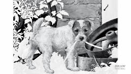
This drawing has a number of textures and each needs to be treated differently... WOOD, for example. This wood is weathered; it possibly sailed the seven seas :o); and it contains grain, splits, and some decay. The FOLIAGE is varied but mainly feels smooth when touched; some leaves will feel thicker than others; they will all reflect some light; and most contain ribs that form grooves on top and raised lands beneath. Conversely, the MORTAR is Gritty; Sandy; it feels grainy and sharp. But the BRICKS are considerably smoother. However, unlike mortar, they do not contain white or light values. Holes, cracks, and edges have a highlight along the edge facing the light. And I can see the surface chips and breaks with sharp edges. The RUST, as we saw earlier, is rough to the touch; dragged fingernails catch on deep, sharp-edged pits; and, except where it's worn smooth, the surface reflects very little light. The HAIR, in this case, is quite coarse with no fine flyaway ends; it's slightly rough and wiry, but the ears feel silky. The NOSE can be wet or dry - this one's dry, so it has soft-edged highlights. And the top half is visibly more textured than the bottom. The EYES are glassy; curved; reflective; the surface is moist, and one eye has a line of water at the base. That thin bright highlight might be a very useful device for defining the bottom edge of the eye.
And the ROPE is coarse hemp; and it displays a surface stubble of short hairs.
Don't just draw what you see - an impersonal collection of shapes and values. Take the time to get to know and feel what you are about to draw. And, before you know it, you'll be drawing very believable and realistic textures.
© copyright: Mike Sibley 2021


It's funny, and maybe because it's Christmas time, but I can hear my mother saying that you know when the dough is ready because you can feel it. That would drive me crazy until one day, I understood. We learn through our hands.