Transcript
There are several ways to create the illusion of depth in a drawing - and we'll take a look at each one, before moving on to their connections with light, shade and shadows.
Overlapping and Layering, for example. When one object in a composition is in front of, and partially hiding, another, it gives the illusion of recession. Because objects appear to be smaller when they are further away from us, we can use Scale to indicate distance. As objects, or complete scenes, recede away from us they become visibly lighter. Colours begin to fade, and so does detail. What we can clearly see near to us, becomes difficult or even impossible to see at a distance. And, as distance increases - and light and detail decrease - colour becomes progressively more blue.
So all these things - overlapping; scale; dilution of colour and detail; and a tendency to become blue - help us to describe distance, depth, and recession. They supply visual clues that our brains understand. We look; we analyse; we arrive at conclusions - all subconsciously. But we artists can
consciously provide the visual clues. We can use clues that send
specific messages, to seek to control the experience gained by our viewers.
OVERLAPPING
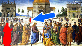
Let's take Overlapping - or Layering - first. Overlapping is a method that has been used by artists for centuries. Perhaps less so - as a device - since the discovery of perspective. But, because objects with partial or broken contours appear to be further away than those that appear as complete shapes - overlapping one object with another is still a perfectly valid way of suggesting recession.
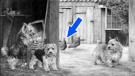
Here, I needed to push the outbuildings further back and the barn forwards. The buildings are too close to use a reduction in detail or contrast, so another means was needed. The solution... tucking a hen between the two. That immediately clarified that there is some distance between them.
Layering, or overlapping, one object with another - the doorpost with the hen, in this case - immediately signals that the first is some distance in front of the second. And, because the right-hand hen is higher (and, therefore, further away) there is visibly more space between the hens and the buildings behind them. That both creates and enhances the illusion of depth.
Removing one - or both - hens, doesn't necessarily close the gap, but it does leave it looking rather vague. But the inclusion of anything in that space - especially if partially hidden - leaves the viewer with only one viable solution... there is a width of yard between the two buildings.
A drawing is physically two-dimensional. That is: It has width and height but no depth. So, it's necessary for an artist to provide viewers with some sort of indication of depth and distance. And this is where overlapping come into play.
When you overlap things, it can
only mean that there are three dimensions. You are sending a clear message to the viewer that your drawing contains depth.
SCALE
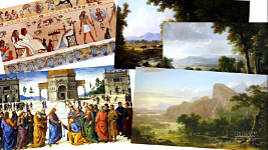
Another way to create depth in artwork is, as we've seen, by altering the size of things. Logically - if we duplicate our young lady and her companion, drawing them larger will make them appear to be closer to us. And drawing them smaller will move them further away. It's a simple rule, and one that is seemingly obvious, but also one I've seen poorly executed - surprisingly often.
OK... that's an unforgivable exaggeration :) But - briefly, because it's outside the scope of this video - you can use linear perspective to obtain the correct relative sizes. Otherwise... This happens :) Relative size IS important!
Basically, scale provides depth and recession. The further away the smaller it becomes. However, we're really talking about
western art here, and the discovery of perspective, so you do need to be a little careful. That's because scale doesn't always suggest depth. In the art of some cultures, size can also identify rank. Here big denotes
importance, not
nearer. So, size alone is not the clearest signal to send. But it's perfectly useable when combined with one or more other properties - such as being weaker in value and colour with distance.
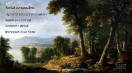
LIGHTER, LESS DETAIL, and BLUER
For the purposes of this video, I'm going to combine the dilution of contrast and detail, with an increase in blue colouring. That's because, as distance increases, so the contrast between the dark and light areas decreases. In other words, everything becomes lighter. The amount of visible detail decreases too. That's to be expected; simply because we cannot clearly see detail at a distance. And, everything becomes increasingly blue with distance, because the short wavelength of blue light causes it to be scattered by water and dust particles in the atmosphere.
That "scattering by dust" creates "
atmospheric" or "
aerial perspective", which is the natural occurrence that combines the three. The further away an object is, the more atmospheric particles will be between it and you. That creates the haze you see when looking at something far away. And it's that haze that prevents the full strength of colours in any distant object from reaching our eyes.
So, aerial perspective:
- Causes everything to become lighter, which...
- reduces contrast. We instinctively understand low contrast to mean distant and areas of high contrast are seen as being near to us.
- Blurs and softens edges, so details flow into each other and disappear from view. If you add detail to everything, you'll lose depth, because nothing is dominant. We understand hard edges to belong to the foreground - they can identify the focus too; and midground and background objects to have increasingly softer, and more blurry edges.
- And, of course, everything becomes increasingly blue - or grey if clouds hide the sun and blue sky from view.
Now, a word of warning. If, like me, you work background to foreground; and your drawing involves distance - the background can often look unnaturally flat. But
don't worry - because that's
ideal. Later, when you include a midground or foreground object, the two will combine to enhance the sense of depth. From a compositional point of view, this will lead the viewer's eye into the scene, from where it can travel at leisure into the distant background.
Of the "contrast, detail, blue" changes caused by aerial perspective; blue, as graphite artists, is one that we can't accommodate - or maybe we can... :)
Where a painter can use gradations of blue to suggest recession, we have to use fading and softening. To compensate for their being no colour available to us, I prefer to exaggerate this effect by adding mist to the scene. That helps to push the background back visually, and reinforces the "distant" message.
SHADOWS DEGRADE WITH DISTANCE
And talking of MIST and GRADATION... that brings us back to the shadows we saw in the previous video, because they too degrade with distance. Shadows obey the laws of recession. Here "recession" isn't referring to a vast distance to the far-away horizon, but in a more local manner - the way they alter as they extend away from objects that cast them. But the result is the same.
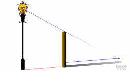
Previously, for simplicity, we assumed shadows remained constant throughout their length, but a number of factors affect their appearance. Aerial perspective has very little effect, because shadows are relatively short. So the blue-tinted haze, for example, doesn't play a part. But they do lighten with distance, and their edges soften. And that's mainly due to ambient and reflected light. In the case of an artificial light source, stray light dilutes the edges. And shadows created by sunlight are diluted by reflected light. So, let's take the simplicity of sunlight first. Sunlight, as seen from your tiny spot on the Earth, possesses parallel rays.
DEMONSTRATION
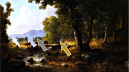
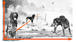
But those rays, as we've just seen, illuminate surfaces in the vicinity of the shadow, and then bounce off them to shine onto the shadow. That's reflected light. This is a cast shadow and it's meeting another cast shadow - one cast by the rock above. There is only one light sources, so all cast shadows will be the same value. This shadow needs to merge into it - not lighter - or darker, so it sits on top of the existing shadow.
Now, the centre of this rock is receiving bright sunlight, and it will be reflected in multiple directions. Reflected light is never as powerful as direct light, because the reflecting surface - the rock, in this case, - absorbs some of the light. But what is reflected will shine onto our shadow. That will dilute its strength. Usually, I'd allow for that while shading, but I'm using my trusty Blu-Tack instead this time just to explain the point.
Also, I know this tree is leaning away from the rocks. So the shadow having further to travel will degrade with distance. Again, reflected light will probably soften the edges.
Now, the shadow will spring forwards here, because this rock is jutting out over the rock below. The shadow has less distance to travel, so it will be sharper again. However, after it emerges from the shade under the rock it meets another bright sunlit patch. Again, that will cause the shadow to lighten and soften. And, by now, the tree is some distance away, so it will probably be progressively lighter than it was below. And if you're not
completely accurate... don't worry. Viewers of your drawing will subconsciously form their own understanding and be happy to accept the solution.
Once you understand these basics you can be as inventive as you need to be.
CREATE YOUR OWN LIGHT DIRECTION?
In the previous video we had the light source fixed. You might, for example, choose to use the lighting you see in your reference photos. Happily accepting its direction and strength or softness. But, once you have everything boiled down to mere guidelines, no lighting or form exists. So, now you can impose your own lighting direction - if you choose too.
Here, for example, I chose to have the light at the left. And it's only the light that ties all the elements together, which was important, since this is a composition made from various different sources. How do you do that? By knowing the basics, which - by now - you do. But let's look at a few examples:
Imagine your reference had the light in front, but instead, you choose to alter where the light is shining from - because that better suits your drawing. But maybe a back-light isn't what you needed? Just swing it round to light from the front at the right.
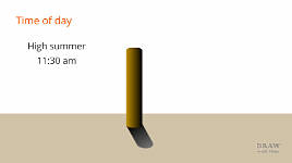
Now let's suggest the time of day: High summer, 11:30 am. And using an artificial light source - remember that core shadow? And the increased softness of the shadow itself?
Or you could signal the season. Low sun on a bright winter's day, or sunset... or sunrise - not that I know what sunrise looks like. I'm a night owl :)
And we can describe gradients within the adjacent three-dimensional objects or land. Shorter post; shorter shadow. Even shorter... or a tall post with the sun much higher in the sky.
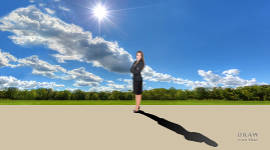
or our young lady. And let's change the light to a low artificial light - perhaps from a table lamp. The spread of light will be so wide that she'll have a never-ending shadow that quickly fades out. Because the abundance of reflected, or ambient, light will soon dilute her shadow - and severely soften its edges.
Now a more elevated lamp: In both those cases, remember the spill of light around the sides lightens the cast shadow, except for the core. And it
need not be completely accurate to send the intended message. This shadow is correctly orientated; there is a core stemming from her feet; and stray light has quickly degraded the shadow. And that's sufficient.
Let's convert that to sunlight... Now we have much sharper edges created by the strong light with its parallel rays. Because the rays are parallel, there's no spill this time. Only ambient light and light reflected off nearby surfaces can dilute the shadow. And I can choose the shadow's degradation to suit my drawing, because you, the viewer, have no idea what reflective surfaces might be outside of the frame.
CONCLUSION
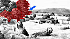
My former neighbour George, two Bearded Collies, shadows, and recession - all in one place. With distance, the trees lighten and lose detail, sharpness, and contrast - and scale plays its part too. Trees overlap other trees. Stacks of hay bales overlap the trees behind them. And the trees cast strong, sharp-edged shadows across the stacks. The tractor and baler cast shadows on the ground. All conform to the left-hand lighting. Even George's boot casts a shadow. But the Beardies?
Artistic licence says I can give the right-hand Beardie a hint of shadow on the grass in front of it. A full-blown cast shadow would compete with the Beardie for attention. That's NOT what I want to occur.
And the left-hand Beardie? It casts no shadow at all. Its shadow would fill the gap between the two dogs, but I want them to be visually separate. One looking at George. The other looking at
you. And that,
intensionally, brings YOU into the scene, happily sitting on the grass on a warm July day.
The recession; the shadows - the strong, the weak, the missing - all perform one task: They
send specific messages to the viewer. Messages that they can subconsciously understand and react to.
Recession is depth. Cast shadows create depth too, but add infinitely more, neatly packaged, information. You can choose the direction of the light. Its HEIGHT. It could be low, or high - whatever best suits your drawing, and the message you want to convey. And you can determine its strength.
Notice the perfect core shadow at the left - and that it tells you this is artificial light and not sunlight. But you are already aware of that. You undoubtedly are. When Diane signals "winter" by keeping the sun low in the sky, you instinctively understood that - because the shadows are so tall.
OK - the snow is a give-away too :) - but we know these shadows contain all the clues to it being
winter. Conversely, we know that sunlight that is high in the sky creates very short shadows, and that when that occurs... it's summer.
In real life, everything is seen in three dimensions, and has height, width and depth. And
depth is the vital ingredient for making your two-dimensional drawing appear to be three-dimensional. It's all about being aware of where the light is coming from, being consistent with that direction throughout your drawing, and suitably establishing the recession and shadows.
Once you understand the basics of how light behaves, and recession is created, it's quite remarkable how adding a small amount of extra information can greatly improve the viewer's experience.
And now you have the building blocks needed to convincingly portray the illusion of depth in any of your drawings.
© copyright: Mike Sibley 2021


Overlapping, layering, illusion and recession are such difficult subjects to explain to the untrained eye, yet you do it beautifully...thank you Mike.
The idea of reducing colour and detail and scale with distance seems intuitive, but I know that I often don't pay enough attention to this.
The idea of adding objects to create additional depth is a real eye opener for me. I'm thinking of the way you used the hens in front of the outbuildings in your drawing.
Finally, it seems obvious now that you've demonstrated it, but shadows do behave exactly as objects do with recession! So helpful!