
The CREATIVE TECHNIQUE series
SHADOWS and LIGHT
This video breaks the subject down in easy-to-understand ways. And - once you understand the basics - it's quite easy to apply them effectively.
If your drawings often look flat, the probable cause is the lack of three-dimensional modelling - using light and shade to explain the forms. You need a sound understanding of how to manage your lighting and how, and where, your shadows should fall.
And there's an elephant in the room that cannot be ignored: Simultaneous Contrast. If you're not aware of how it effects what you see, it can wreak havoc with your drawing. Mike suggests two ways to banish its meddling ways.
Three demonstrations walk you through the basics of building shadows, and how to experience you 2D drawing as a 3D world. And a number of animations take all the mystique out using light and shadows to add life to your drawings.
WHAT YOU GET...

Introduction
When we draw, we are recreating what light looks like as it illuminates our subject. And the way shadows are formed by anything blocking that light. So, to draw with any sense of reality, you have to know how light and shadows works.
Using photos - or not...
Even if you use photo references, you still need to know how light works, because cameras do not see the way we do. You'll need to supply what the camera omits - fill in the burnt out highlights and dense shade.
Light, Shadow, and Recession
You have to adopt the concept of CONSCIOUSLY looking at the world around you to study the ways light and shadow behave. Because we instinctively understand those things, we rarely or never look at them.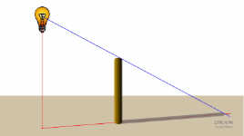
Light and Shadows 101
How light and shadows work together: An explanation of the basics on horizontal, vertical, and sloping surfaces. Once you know how to create shadows, it's easy to calculate them by eye.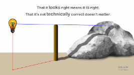
Light and Shadows 201
Finding the position of the light in relation to the object, and then casting its shadow across uneven surfaces. Why a need for technical acccuracy isn't necessary. And how to see your flat drawing in 3D.
Three demonstrations...
In three demonstrations, Mike walks you through the basics of building shadows (of a tree onto rocks), and experiencing your 2D drawing as a 3D world. A side-view plan helps you view the scene from another angle.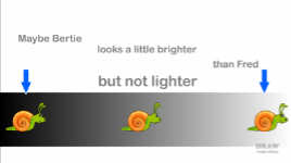
The evil Simultaneous Contrast
Bertie, Martha and Fred explain why Simultaneous Contrast is such a problem. It's an entirely natural problem that you will encounter, possibly often, and one that can drastically affect your drawing.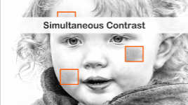
Drawing problems...
Mike uses one of his drawings to explain how Simultaneous Contrast can lead any graphite artist astray - because our eyes naturally exaggerate the contrast they see.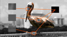
Reference problems...
You might think judging values in a coloured reference would be less of a problem if it was reduced to B&W... and you could be correct. You could also be making a major error that will cause you to misunderstand values.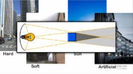
Light types and Shadows
The four light types: hard, soft, natural, and artificial. And why artificial light and sunlight create completely different shadows. The effects of reflected light is covered too.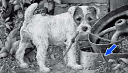
How we see and understand light
Do you need to faithfully reproduce every shadow? No. Mike uses Maisie the pup to explain why you only need to those that send the intended message. But you do need to understand the theory before you break it in practice.Watch the 5-minute PREVIEW:
Transcript...
Transcript
So, to draw with any sense of reality, you have to know how light works. And how shadows are formed. And that's true even if you work from reference photos. Why? Because, as I've mentioned elsewhere, the way our eyes naturally see is NOT the way a camera sees. Our eyes, as we look around us, constantly re-focus and adjust to the light and shade. But a camera can only see an average focus and strength of light across the entire scene. That results in burnt out highlights; shadows that are too dark; and detail obliterated from essential areas.
So, if you use photos, you still have to know how light and shade work. Cameras do NOT truly capture what we see, but we'll happily accept their limitations. However, we won't accept them in a drawing. We know a photo is false, but a drawing is purporting to be realistic.
So, when you're working from photos, you need to add what you KNOW to what the camera has ignored. And if you're working directly from your imagination, you have to create the entire scheme of light, shade, and shadow. In both cases, you need to see like an artist, not as a camera - to see your two-dimensional drawing as a three-dimensional world.
And that's what we're going to concentrate on.
How do you know the ways light and shadow behave? By studying the world around you, and building up a store of information. You have to adopt the concept of consciously looking.
Lighting - shadows - recession... we instinctively understand those things. We have an in-built system to handle them. And that system is essential; because in order to safely move around our three-dimensional world, we need to instantly read and understand the clues.
But... in order to draw with any sense of realism we need to be consciously aware of those visual aspects of our everyday life. We need to look at the way shadows form; and to understand why and how recession occurs. Ask yourself, "Why do I know the hills are further away than the fields and trees?" And we need knowledge of how different lights create different shadows, and the interaction between the two.
Now, we won't go too deep into theory here, so just bear with me for a second: Very simply... Drawing shadows is, as I mentioned, just an exercise in seeing your two-dimensional drawing as a three-dimensional world. And a shadow can be defined as being anywhere that is blocked from receiving direct light.
So, let's take an object and study its relationship with light: First, you have to know where your light source is (in this case, I'm treating it as sunlight. I'll explain why later). Now you need to know its position relative to the object. You do that by finding the point on the ground directly beneath it. Just drop, or imagine, a vertical line. Think of it as being like a lamp on a post. This is where you decide if the light is behind the object on a level with it or, as here, in front of it.
Now - because light always travels in a straight line - you know the direction of the light in relation to the object, and the direction of its shadow, but not its length. To find that, just connect a ray of light to the object and continue down to the ground line. And now you know the shadow's length. In practice - and just using common sense and logic - you can easily estimate all of this by eye.
Here's the trick I use:
Don't look down and try to work out where the light can reach; instead, look up at the light from the other end. At any point, simply ask yourself, "Can the point of my pencil see the light - or no light?" That way, you can estimate the position of the light far more easily - especially if the light source is not visible in your drawing. And if you're not entirely accurate... well, the viewer doesn't know exactly where the light source is either, so that really won't matter.
Let's return to our shadow, and briefly cast it on an upright surface. The light source hasn't altered, nor its position, only the shadow changes - because the ground line climbs the wall vertically. Using the RAY line again gives us the length and height of the shadow. OK... so... let's move the wall closer to the object. And, as you'd expect, nothing changes except for the shadow's length and height.
Finally, let's make the wall an inclined surface. Again you know the length of the shadow, and it might be longer than you expect - because the wall is leaning away from the object. Do you see a link here? It's: the further away the surface is from the object, the further the shadow has to travel.
So - judging the distance from A to B, at any point, forces you to see your drawing three-dimensionally. The aim is to explain to yourself: "This is nearer; this is further way: so the shadow does this or that..." And what you're doing is - defining the area that is blocked from the light source. Like this...
Let's imagine a shadow falling across something rather lumpier than a flat wall :o) These! Again, assume my lamp is the sun - it's low in the sky, so maybe it's a sunny morning, or a bright winter's day.
Drop a vertical to find its position relative to the shadow-casting object. You know the height of its shadow. Yes, you do... look... Just pass a line from the light through the top of the object and... you know the shadow's height.
The sun's rays are parallel to each other, so shadows won't widen with distance. To work out where this shadow appears, just ask yourself: "How far away is the rock from the post at this point".
Does that look OK? A believable shadow? Well, I've got good news for you: No, it isn't.... but... there are two things to bear in mind:
That it LOOKS right means it IS right, and...
That it's not TECHNICALLY correct doesn't matter.
We're sending messages to the viewer, not passing a technical illustration test.
Technically, the end of the shadow is outside of the picture plane. This shadow should wrap over the top of the right-hand rock... but if stopping it early benefits your drawing, then do it. Because, sometimes the shape of a shadow can convey our meaning better than the object itself. The viewer sees the shadow and comes to conclusions. In this case, maybe its right-hand end is turned towards us, so the shadow can travel no further. If it looks right, it's because your brain has a viable solution for what it sees. Now, what it sees might not be what you intended, but that doesn't matter. The shadow has done its job.
It's:
- Provided depth and recession
- Described the three-dimensional form of the rocks
- Defined the distances between the elements
- Told us the sun is low in the sky
- and On a bright cloudless morning or Winter's day
SHADOWS are IMMENSELY POWERFUL TOOLS. They can instantly convey a huge amount of information. To make something look three dimensional, like our two rocks, it's the LIGHT that does the work, and the shadows it creates.
To keep everything simple, we'll continue to use a single hard light - the sun on a cloudless day. The sun's hard light creates shadows with sharp edges, and produces the widest tonal range. It also has parallel light rays, so shadows don't become wider with distance. When you're learning, it's the simplest way to study light and shade, and to see the difference between the values.
Demonstrations
So, we're going to use a single light source for the following demonstrations, and that will be strong sunlight. But first - and most important - is knowing where the sun is! I've decided it's behind me, and to our right; and it's quite high in the sky - think "summer afternoon". And remember: Light always travels in a straight line.Now we know where the sun is, let's set about casting the shadow of this tree on the rocks. If these rocks have flat vertical faces, then the tree will be a constant distance from the rocks. The shadow, however, will dip into and out of the gaps between the rocks, but it will generally follow the shape of the tree. My shadow is telling us the tree is upright. If it were leaning back, or towards us, then the shadow would reflect that.
So, let's do that again. But, this time, we'll assume the rocks are curved (which they obviously are), and that each one, towards its top, will curve further and further away from the tree. So, as it climbs, the shadow will progressively travel further. Then it will spring forwards and begin to climb up the next rock. The shadow will not, of course, just continue unbroken from rock to rock. Where it stopped at the top of this rock, it's some distance away from the tree. But when we again see the shadow it's much closer to the tree.
Finally, let's imagine our tree is leaning slightly forwards - and I'm going to move the sun a little left - to ensure all the shadow falls on the rocks. Now the tree will become progressively further away from the rocks as its shadow climbs up the cliff; and each rock will be curving away from it too. So, let's break the job down and study each rock in turn.
We can see from its shading and cast shadow that this middle rock is curving underneath itself, so I think the tree's shadow will begin here, where it merges into the existing cast shadow. As it climbs up the rock, I'm following the points where I don't think my pencil point can see the light. I repeat: All you have to ask at any point is: "Can this point see the light?" Remember too, you're using this shadow to describe the three-dimensional form of each rock. It might be a two-dimensional drawing but, if you want to make it look realistic, you must imagine it - experience it - in three-dimensions.
Returning to "can this point see the light": As I mentioned earlier, there are two ways of looking at it: from the light's viewpoint, and from the viewpoint of the tip of my pencil. It feels natural to look at it from the light, but I've found the reverse to be more useful. I know where the light is, so I can pause at any point and ask, "Can my point see the light? Partial light? Or no light?" The answer provides the "no shadow"; "weak shadow"; or "dense shadow" answer.
Now, you might think that following the light down to where it shines on an object - or starting from the point of the pencil up to the light source - is the same principle either way. But, I'd argue that it's not really the same at all...
Looking from the light to the object and then determining the shadow should work, but you're looking in from the outside. But looking at the light from surfaces behind the object should determine whether that particular point, or area, is in its shadow. You see? The second way places you IN the drawing. I find it far easier to imagine an area in three-dimensions when I'm in it, rather than looking at it from outside.
Well, let's move on... I can see from this rock's cast shadow that it's jutting out above the middle rock. The tree's shadow can't just continue upwards, because there's no direct light there, but there is to the right. Also, the rock is now closer to the tree, and the tree's shadow will not have so far to travel. So, the shadow will resume here. Now, realistically it will also become lighter - more diluted by reflected light - but we'll ignore that for this demonstration, and just focus on where it will fall. Notice that I'm not shading a shadow - I'm drawing darker rock. Shadows do not exist - they are not a "thing". They are the absence of light - in this case on rock, so the shadow is rock.
In my mind, the face of this rock is more upright than the one below, so the shadow will follow it up and out of the picture plane. All you have to do is question the amount of light reaching your pencil point.
Shadows really do impart a lot of information, and they'll tell your viewers much more about the scene than you might imagine. And, if you get it wrong... well, the viewer will simply adjust their understanding of the tree, or the rocks, until it fits your shadow.
And have you noticed the omission? My shadow is of the trunk - not the side branches. Keep it simple. It's the trunk that's telling the story. The branches would simply cause confusion.
Also, there is only one light source, so ALL cast shadows will be the same value. The tree's cast shadow cannot, and should not, lay on top of another cast shadow. And that - because your shadow might cross light areas and merge into darker ones - brings us to a very important problem. A problem you will almost certainly encounter. One that will drastically affect any drawing - and it's entirely a result of our natural perception of what we see.
Simultaneous Contrast
Let me introduce you to three friends of mine... I suppose one should be called Shelly... but, No... They are: Bertie, Martha, and Fred.You'll notice that Bertie is lighter than Martha, and both are lighter than Fred. I'll prove it. This is Bertie's major value - and Martha's - and Fred's. To make that clearer, let's join those together - light to dark.
So, beware! If you reduce your references to B&W - so you can "better understand the values"... you are probably making a major error. Because, you're creating a huge problem where one didn't previously exist.
See what happens when we isolate Fred... We're going to need to use relatively dark values. And with Bertie - well, he obviously needs lighter values. And Martha is - sort of neutral.
Except... no!
Let's remove the background and... suddenly, everything is not as you thought. All three are identical in value! Camera trickery? Oh, no! Just your eyes fooling your brain. Even half way up, your eyes still think Bertie is lighter than Fred. Poised above, and you might still think that. It's all an optical illusion that will throw you right off course.
If you're a painter - or you use COLOURED references - the problem is almost non-existent... Maybe Bertie looks a little brighter than Fred, but not lighter. But we're not painters - so, the illusion is a serious handicap. One that can make nonsense of a drawing.
There's a name for the illusion we've just seen: Simultaneous Contrast. Our eyes exaggerate the contrast they see. When we see a light area, but it's within, or adjacent to, a very dark area - that causes us to draw those values lighter than they should be. Conversely, this area of darker shading is in an expansive area of light values. That will probably cause you to draw it darker than it needs to be.
That said, the system I use, which I'll describe soon, overcomes the problem of simultaneous contrast - so the values you see here in Charlotte are the correct values. Even so... looking at these two areas, there's a high chance that you think they are fairly similar in value? And, possibly, the top one is slightly lighter than the lower one? Well, you're partly correct... but not enough to award yourself a cigar. Now it's difficult to believe this is merely a copy I've moved up - but it is. Lower down, the dark shading of her fleece made us see her skin as being lighter than is. Look what happens if I move it to a truly light area. It becomes even darker - compared to where we extracted it from.
Simultaneous Contrast is something you learn to fight against. But, before I suggest a solution, let's just take another example, this time from the point of view of a reference... this sleepy Pelican.
When you see him is full resplendent colour, you might think judging values would be less of a problem if he was reduced to B&W... and you could be correct. Except - judging, or matching, values is not what you should be doing - but we'll return to that later. In the meantime, let's put your plan into operation. We'll choose an area to study and extract its values... This will do. It's low in contrast, so it should be easy to detect the value. It's even easier if you squint at it - to remove any detail - so let's blur it to obtain an average. If you squint at that, our average patch disappears, so I guess we've got that about right.
Let's try something a little more complex - this area of bill, which is adjacent to the light sky, so it will look a little darker than our previous patch. We'll average that and then find one more area. A lighter one this time... But, this is adjacent to a dark area, so maybe it's not as light as we think it is. Confusing, isn't it!
So, let's simplify it and study them in isolation. Well, they're surprisingly similar. The last area - from the railing - does appear to be lighter, as we suspected it might... but it's not significantly lighter. That area only looks lighter because of its close proximity to the dark trees. Even here, it looks lighter against the trees than its exact copy does against the sky.
If you insist on reducing your reference down to monochrome, you cannot - and should not - trust your eyes when determining values.
So, we need a solution - and I have two to suggest. First, find the darkest value, and establish a portion of it in your drawing, right from the outset. That helps, because now all values fall naturally between white and that dark value - regardless of their surroundings in the reference. Now you know why I've been advocating that approach - because that patch gives you a CONSTANT VALUE REFERENCE. No matter where in the drawing you're working, that constant reference defeats the problematic illusion - and even more efficiently if you combine it with my other suggestion... and that's based on the fact that: If you work from B&W references you will misunderstand values. A mid-value in a light area will look darker than it actually is. And that same mid-value in a dark area might even look light enough to be a highlight.
The solution, that I have constantly adhered to, is to ALWAYS USE COLOURED REFERENCES... and then interpret the values you see. Well, that's a subject for another video - but never determine the values in the reference and then use them directly. Make value decisions that help your drawing convey the message you wish to send. Because, as the snails have proved, you can't trust your eyes to slavishly copy the values you see.
Well, let's return to our shadows and light. So far we've just used bright sunlight - and I suggest you do that while you're learning. It is by far the simplest light to control and understand. First, sunlight has parallel rays. That means your shadows won't widen with length, and they won't have a complex core shadow either. What? What's a core shadow? You see them everywhere but almost certainly don't notice them.
Remember: Lighting shadows recession... we instinctively understand those things? Our world is given its three-dimensional reality by light and shade. You see shadows every day, but when did you last stop to study them? Possibly never, because we don't need to. We accept shadows as natural occurrences and don't need to work out where the light is coming from, how many light sources there are, or what the quality of the light is. Our brains subconsciously, and instantly, perform that shadow analysis. So now is the time to begin to consciously look at them.
I've mentioned the "quality of light" a couple of times, so what exactly is it? Well, light can simply be perceived in two ways:
Hard, which produces hard-edged shadows and
Soft that has hazy shadows.
And there are two types:
Natural, which is sunlight, and
Artificial, such as lamplight, or candle or firelight.
As you begin to study the shadows around you, bear these four in mind, and study the differences.
Let's take hard and soft first. A hard light is most often created by a single light source, such as the sun. Because of the sun's great distance from the Earth its rays only diverge by a few degrees. When they reach you - or me in my tiny patch of the Earth - they are essentially parallel to each other. So, the sun, on a cloudless day, will create shadows with hard, sharp edges. And, because everything surrounding a shadow is so bright, shadows appear to be very dark.
Soft light creates more diffused and softer shadows that tend to easily blend into mid-tones. The sun shining through clouds on an overcast day, if it's strong enough to cast shadows at all, will produce soft blurry shadows, because the clouds disperse and spread the light. And on a completely overcast day, cast shadows are so soft that you might not be able to see their edges at all - or even work out where the light is coming from.
So, that's Hard and Soft light, but their shadows will also be modified by the type of light creating them. Either natural or artificial.
The only true natural light is sunlight. We've just covered soft sunlight and, just to recap, hard bright sunlight produces parallel-sided hard-edged shadows.
However, artificial light behaves differently. Apart from specialised lights with very narrow beams (like lasers, for example), artificial light almost always has wide-spreading rays. And those diverging rays play an important role because, unlike the sun, this light isn't a vast distance away. The sun does, of course, emit light in all directions but, as we've seen, the narrow band of rays that reach the Earth are essentially parallel. A bare lightbulb, too, sends out rays in all directions. That creates shadows that widen with distance. Of course, most often a reflector is fitted, to redirect the rays and increase the intensity, but it's still a wide-ranging light source. So, an artificial light source will cast a shadow behind an object. But the spread of light will creep around the object being illuminated - diluting its edges.
Remember the core shadow I mentioned earlier? That's it. The single dark cone behind the object that receives no light. While you draw, keep this image in mind as you ask yourself "Can this point under my pencil see the light partial light or no light at all?"
Do you recall the "fill light" from the previous video? In natural outdoor lighting that equates to reflected light. Reflected light is - as the name suggests - light reflected by nearby surfaces. In the same way that stray light diluted our shadow and left only a core... reflected light can affect the entire shadow. It might, for example, bounce off an adjacent object or surface and lighten adjacent shadows - including any cores. But not as completely as the direct light does, because - being reflected - it loses some of its strength.
However the shadows are formed - by sunlight, reflected light, artificial light - they have one benefit of overriding importance: the addition of cast shadows is the addition of extra information. A vast amount of it, tied up in a simple, easy-to-read package.
You should be very aware of your lighting and shadows when you draw. Know the direction your light is coming from, and ensure you maintain a consistency throughout your drawing. Each object might cast a shadow - or shadows if there is more than one light source - and each shadow must fall in the same direction, opposite to that of the light.
But... Do you need to faithfully reproduce every shadow? Emphatically, No! You need only include those that send the message you intend. But you do need to know the theory before you break it in practice. Like this...
Does this scene appear to be unnatural to you? No? Good! It contains a shadow here that tells us the nail is protruding from the wood. It's an important nail, because it points you towards our star - young Maisie.
Here's another shadow that shows us this blade of grass is standing away from the rusty wheel. And... hey! That's pointing to Maisie too. What a very fortunate coincidence! :o)
Those shadows promote the importance of those two elements. But did you notice that no other blades of grass are casting shadows? Or that the rope doesn't cast a shadow across the wheel? There's no need. Your brain is quite happy to fill in the blanks for you.
So, keep shadows simple.
If it doesn't add to the story, omit it.
Add too many, and you decrease the importance of those that matter.
© copyright: Mike Sibley 2021

"Ask myself can my pencil see the light?" is very very useful. I tried it and it's very intuitive. Our brains know what we "should" see.
Bertie Martha and Fred were wonderful teachers! I'm more likely to retain the lesson because of that inspired bit of animation.
The analysis of your Maisie drawing is also eye opening. The purpose of the nail and its shadow are quite clear to me, but the use of shadow under that single blade of grass and the absence of shadow under the rope brought a smile to my face. Brilliant use of shadow only where necessary! I probably would have unnecessarily agonized over all of those individual grass blade shadows!