Transcript
Do you recall this from the earlier video? It's creating a white line by drawing an adjacent dark line. More crucially, when you
look at the white line as you draw the dark one, the feedback from your brain to your hand is focussed on the width of that white line. The white line, or whatever shape you're surrounding, has become a positive reality, and the dark line is incidental.
THAT'S Negative Drawing.
That might at first seem to be a rather primitive and obvious notion, but that simple shift of focus
can transform the way you draw.
As you draw black, you need to train your eye to see white, and afford that white its true importance. That white of the paper is also the only white we have, so you need to preserve and protect it. Negative Drawing achieves that. And it's the ideal tool to break down any drawing into very manageable sections.
It's how I work. It is, if you like, MY SYSTEM.
And, as you're drawing black and leaving white, you're working dark to light, which usually means background to foreground like this...
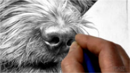
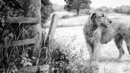
Let's take one small area - the junction of the left-hand side of the dog's head and ear with the background. If you draw the dog first, you have an immediate problem. How dark do those hairs along the extremity need to be? Indeed, how dark should the dog be? Or how light?
Of course, you can engineer the background to suit your choice of values for the dog. But now the dog is controlling the background. And, if you judge its values incorrectly, you adversely affect the entire drawing.
Draw the background first and now the dog exists in a world it can interact with. You have all the control you need... except... you need to draw around those hairs to leave them white and
correctly proportioned. And, as we saw earlier, you do that by
looking at the white as you draw the dark lines. Later, you can gently add tone and form to those hairs. Because you have the background to refer to at all times, you have the opportunity to accurately push a foreground element, or any part of it, into the background shade, or make it stand forwards.
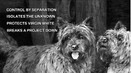
That single example has covered the four major benefits of using Negative drawing:
- It offers control by separation of background, midground and foreground layers
- It isolates the unknown - areas you're unsure about and can return to later.
- It protects virgin whites until you determine the required values.
- It breaks down any project into manageable sections.
In practice, you draw until understanding ceases. Then you isolate that now unknown area and move to an area you do understand. As you draw, each area will suggest the content of those surrounding it. Eventually, your drawing will expand to meet that unknown area and now, surrounded by enlightened drawing, you will gain a greater understanding of what that area requires.
To draw effectively, you must fully understand the area you're working on. That understanding might arrive
as you're drawing - that's what's happening here - but you must be able to SEE it clearly in your mind, to experience it in three-dimensions, to feel its texture, and to know how it relates to the surrounding areas. When you can do that, you have a far better chance of creating a sense of realism.
If, like me, you make a lot of use of negative drawing when working, you'll understand the concept of breaking a drawing down into planes and shapes and manageable sections. I might, for example, isolate a foreground element by outlining it. Then I can concentrate purely on drawing its immediate background. All this focus, this concentration, on very localised areas can produce very realistic results... BUT... it has an intrinsic flaw...
There are times when detail can be
a devastating distraction. I've always been one to walk with my head down, studying everything at my feet in great detail. The drawback to that is I often miss the bigger picture. So, you need to stand back. To have the bigger picture in mind as you create the localised detail. I form that picture in my mind while I'm creating the composition and guidelines. Later, I might be working locally, but I know how this part fits into the whole.
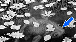
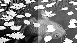
I'll use this study, by Maurits Escher, to explain that thinking - and we'll recap on the lessons in the previous two videos too. Here, as the title suggests, Escher is depicting three "worlds" on three different planes. Imagine the leaves being outlined and ignored as the water, and its enclosed objects, is drawn. The water forms the negative space between the leaves, as it also does between the branches of the reflected trees, and around the fish.
For simplicity, let's just take a section of the drawing and work with that.
I don't know how Escher handled the technicalities of this drawing, or of his structured approach, but I can tell you how I would tackle it - simply because it makes logical sense.
There are "Three Worlds" and three principle planes, but, in no particular order, FOUR main elements:
- the trees
- the leaves
- the fish
- and the water
Remember, good drawing is a result of understanding. That's helped by focusing our concentration on one element at a time, so we'll divide the study into those four.
You should avoid multitasking. Even though you might feel you're making good progress, it's very inefficient and detrimental to your drawing. Working on two or three different elements at the same time makes it difficult for your mind to focus on any one of them. Award yourself the luxury of doing just one thing at a time. You'll find it a lot less stressful, and the end result will be far superior.
And let's draw dark to light, so we know the value of our darkest value at the outset. We'll also work background to foreground - because that way each element has an environment in which it can exist. In each case, as we move closer and closer to the foreground, we will have a surrounding reference.
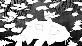
I'll explain in more detail later but, for now, let's keep it simple. We'll begin, as always, with a reasonably accurate guideline drawing in which we can work. Personally, I'd outline the leaves and the fish, but design the trees "on the fly" - as I drew them - but I'll stay true to Escher's design here and outline those too.
The trees contain the darkest values and are also within the background plane. Leaving the spaces between the branches pristine white will help us to achieve a good positive shape to negative space balance. You could argue that the trees are actually
foreground reflections on the surface of the water, so the water is the real background. And you're correct. But I'm talking about
layers in the drawing, not actual physical depth. In this case, the trees are equal in depth to the water, and we need to know their dark values to determine the values we should use for the water.
The water next. Just the water - not the fish. If you outline the leaves and fish in a value that is never darker than the expected background value, your outlines will disappear as you work, and they'll provide a narrow safety margin - a buffer that you can shade up to without fear of softening those edges or entering forbidden territory. And, because the trees exist, it's easy to gauge the values required for the water.
The fish can be drawn with confidence, when you're satisfied with the overall tonal value of the water. Surrounded by completed water you now have full control over its visual dominance, or lack of it, at any point. Imagine if we had drawn the fish first... we'd have to engineer the water to make the tail blend into the dark water. Then the water, in turn, would control the values required for the trees. If you drew the fish too light, that would affect everything else, and the
entire drawing would lack contrast.
The Leaves, that float on the topmost plane, can now finally be tackled. Your mind is clear of all other elements and you can concentrate fully on depicting them realistically. And, because you're not confusing your mind, you'll be using your knowledge and memories of the subject - and even references if you wish.
As I said, to draw effectively, you must fully understand the area you are working on. To experience it in three-dimensions. To feel its texture. We're not copying source photos - even if you're using them for guidance - we're creating our own world in which all elements must co-exist. By first establishing the background, you have a
world - an environment - in which your main subject can exist. That greatly assists your understanding of the subject as an integral element.
However, within each primary element, problems will occur, but they can be solved using the same strategy. Perhaps, for example, you have a problem understanding the way the scales degrade towards the tail... although I doubt Escher did! The solution is to draw around the problem and to complete the surrounding areas. Now your entire concentration is purely on the problematic area, and your understanding will be clarified. You can close the gap with confidence and finally complete that previously 'unknown' area.
More importantly - you haven't polluted the virgin white of that area with trials and tests of possible solutions. If, instead, you'd tried out ideas within that area, you would simply muddy the final result. Consider that erasing damages the tooth; that a soft grade of graphite will often not layer to its full potential on top of a harder grade, because there is insufficient tooth to hold it - and you'll see that your initial trials have greatly reduced the options open to you. In my opinion the freshest, sharpest and most effective drawing is created with the first attempt.
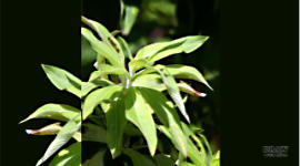
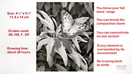
So, let's finally put this into operation. This is the photo that sparked the idea, both for its depth and the subject. The drawing will use the same procedures as Escher's THREE WORLDS, and It might help to know how the composition was arrived it, so...
- I cut out the main plant and removed the butterfly.
- Now I had something mobile to work with I moved it to a darker area of background. This is a light-coloured butterfly, so a dark background will help to make it dominant.
- I removed the original butterfly because I prefer this pose.
- It was cut out from this image (I'm reliably informed it's a White Peacock) and pasted into the composition.
- Then I cropped the area I decided to use - leaving the butterfly on a Rule-of-Thirds hotspot.
- The background is OK, and I like the foreground interest at the base. But the main plant is floating. To fix that, I copied the plant, moved it below itself, flipped and rotated it, and darkened it. That should work.
- Finally - more as a reminder to myself - I added a "stopper" in the top-right corner, which I'll probably modify later.
And that's it - ready to begin work.
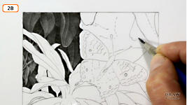
From that I produced the working guideline drawing - leaving plenty of opportunities to invent elements as I draw. This drawing spans 16 days of work, so I'll walk you through its creation, stopping to explain areas relevant to Negative Drawing, and I'll include general drawing advice too.
First, this top left corner needs to be broken up into different elements. In the reference, it's empty and dark. But I want to create layers of depth. Layers that you can peer into, and that draw you deep into the drawing.
I'll work background to foreground, and I'll begin this area with the most important mark in the drawing - absolute black. Every value in the entire drawing now has to fall between this black and the white of the paper. It is - as you saw in the dark forest earlier - the
absolute background. Everything else is in front of this dark shape.
I'll invent leaves and stems and, as you'll see, unrecognisable organic shapes, to add both interest and depth. I'll introduce some of those organic shapes here and push them deep into the background. Now let's move forward to the next layer and draw the first leaf. By beginning with a background leaf, I can safely experiment until I get a feel for the foliage. Immediately, Negative Drawing comes into play. I'm shading around the central rib and leaving it white; because I have no notion of the values required until it's surrounded by drawing. Now I can add value to that rib without guesswork being involved.
This is important - you need to create areas of
solid black within each local area. They're references that tell the viewer "this is as far back as you can see", so it's clear that everything else is further forward.
I'll try more organic shapes in this empty area. Nothing is planned. It's all spontaneous. And I must remind you that
all edges must be sharp. When you push these shapes back into the shade, those sharp edges will ensure they remain visible. I'm burnishing this with HB, to remove all the white holes within the shading - they're the pits in the paper's tooth. That immediately increases the intensity of the darks. And I can use the sharp edge of the HB's chisel point to further sharpen the edges. If holes remain, I use a 2H too. It's too hard to alter the values, but its fine clay content will fill the holes very efficiently. That alone both smoothes and darkens, because you perceive the values to be darker when the white holes are removed.
The light is shining from the top right. That's my decision, and bears no relation to the reference - which is actually lit from the left.
As you can see, I use circular shading extensively, using the flat face of my chisel point. That face draws soft-edge lines that flow into each other for a smooth result. It also allows me to "sculpt" a shape, as the point follows the contours, or travels in an arc from one value to another. Again, this is negative drawing, because I have no idea of the value required for the central rib.
I want the top of this leaf to go way back into the shade, and the bottom to curl forwards, so I'm lightening my shading as I work down. When I say, "curl forwards" it's still in the background, so it needs background values. Maybe a hint of midground values if it curls forwards enough... but never foreground values. everything I'm drawing in this area is in the shady background. Changing to an HB to burnish the 2B, I'm pushing that top edge deep into the shade - and bearing in mind at all times that any light that can shine in here is coming from the right.
This next leaf is one I want to explain. In the reference it's out of focus, and I don't want to draw it like that. i do want to fill that space, but it does not have to look like the reference. I don't personally like "out of focus", because that's not the way we see. Our eyes adjust their focus as we look deeper, and that's what I want to represent.
I always fade my guidelines to mere shadows before I begin any area. That way they disappear into my drawing.
I like the way the edge of this leaf in the reference is curled, so I'll keep that. But I can be as free as I like with its structure and three-dimensional form. Again, I'm working around the contours, to remind myself of its three-dimensionality. But let's skip forwards a way...
I've decided that this area here needs to be dark, but a little lighter in this area above the butterfly's wing. It should help to make the butterfly stand out from the background. This curve is OK, but it needs something to break it - something to stop this leaf taking the viewer's eye out of the frame. so, I think a new leaf just here, pointing back into the drawing, will do the trick. Now, I want to fill the area with suitable interest - remembering that I can change my mind at any time. The rest, I'll invent as I draw. But I have decided that I want ALL of this area to be in the background. and, I'm using a lot of negative drawing - beginning with background shapes, because i know their values, and then working forwards.
Use
logic and lighting at each stage. The lighting is from the right, and logic will explain how each leaf interacts with the others. here, for example, I know this leaf is behind the one above, so, logically, it will be in its shade. but I can use a little reflected light to catch the edge, and help the eye to separate it from the leaves around it.
This, I see as being the
back of the leaf, and, once again, I'm using negative drawing. Drawing around everything that is of unknown value. That allows me to concentrate purely on the three-dimensional form. I can sculpt it, without confusing my mind by handling the ribs at the same time. Now, changing to HB, I can tone down the ribs so that they sit comfortably in the body.
This is where Negative Drawing meets "looking at the white". This antenna needs to have smooth, parallel edges, and the outline offers a buffer that I can shade up to. For this second antenna I'm using a golfing approach - taking a few practice swings until I get a feel for the curve. Now I'm confident I can draw it accurately, I'll commit the lines to paper. Importantly, I'm
looking at the white line I'm creating, and not the line I'm drawing.
Remember logic? I've made an error here. If this is the back of the leaf... this leaf cannot be both lighter and in front. I'd like it to be lighter, so it has to be further forwards. The solution? To split the two apart. But now I've decided this smaller leaf should be in front of both, and the central leaf further back - so it will help the antenna to spring forwards. That worked out! I think promoting this leaf to the midground was a good choice. Although I'm darkening the top, to prevent it from taking your eye out of the frame, the lighter lower end now points nicely to the butterfly.
I got a bit over-enthusiastic with the shading of this leaf, and now I think it should be lighter. That's not a problem. Blu-Tack, lightly stroked, is perfectly capable of gradually removing a layer of graphite. And, applied lightly, it will remove only the top layer without affecting the layers beneath. You could try this with a kneadable eraser for a similar result. Blu-Tack, I find, often suggests detail and form too, and I like what has appeared. Now it just needs a little detail adding back in, and this lightened rib slightly dulled.
I've moved on a step or two, and I want this area to be dark - to have a lot of depth. That's partly because the foliage beneath it is midground approaching foreground. Deep shade in this area will allow me to play down the midground foliage without it losing its prominence. As before, sharp edges matter. If your shapes (leaves, in this case) have sharp edges, you'll be able to push them so far back that they almost disappear yet will remain visible.
Just to recap before I move on again. The way this Negative Drawing system works is... You start with the background - which needn't be black. In this case it is, but it helps if it includes your darkest value. Then, when you move forward to the next layer, you can either make it stand out from the background, or you can push it back into it. Because the background already exists - you can physically push it back into the shade. And then, when you've finished this and move forward again you've got exactly the same facility. You can decide if this leaf is merging back into the background with this one, or really standing out sharply in front of it.
For example, I'm going to push this end right back behind this one. Let it come forward into the light a bit. Which will help to break up this uninteresting area. I'm also going to let it pick up a little highlight along this edge, because I think that edge is tipped up. I don't want it to be too sharp or over-detailed, because it's in the background. And then the tip wants to be in front of this leaf, but it's also possibly in the shade of this one. I'm pushing this a little further back. And if I push it too far, there's nothing lost - I'll just use a stroke of Blu-tack to pull it forwards again. I'll give it a touch of HB to smooth it out and... Oh! I like that! A little highlight has appeared along that edge. You really should be looking for these happy accidents all the time! In fact I prefer that highlight to this one, so I'll almost take this one out.
Try and look at things logically. In my mind, I think this leaf emerges from under here, and it's going to have a shadow cast on it. So, that's going to be relatively dark here. I think it's going to catch a little light there, and then it drops over an edge. We've also got the central valley running through. So, it's going to be a bit darker there... The light's going to catch again - but not a lot of light, just reflected light. And then I'm going to curve the bottom back so the bottom is pushed back into the shade. And I think we'll re-route the central rib so it doesn't point to the corner. So, that's the plan.
Right, we've moved on, and the foreground work is about to begin. I've decided to start with an F grade, because it draws more smoothly than an HB. F sits between HB and H and stands for "Fine Point". Again, I'm sculpting the three-dimensional form that I perceive this leaf to have. That's the general approach; so let's move on to a more descriptive leaf.
I thought our previous leaf would cast a shadow on this one, but I've decided it's not essential, so this leaf now depends entirely on Negative Drawing. Apart from minimal planning of the ribs, everything is being created as I draw. That gives me a great deal of freedom to interpret. But you must remember to always ask yourself how the light will affect the area you're working on.
The shading needs to be so subtle that it's taking me some time to get a good feel for these foreground leaves, so I will be adjusting them from time to time. Again, I'm using Blu-tack to adjust the top layer without affecting the layers beneath. Then my blender - a painter's Colour-Shaper - adds a final smoothing, and removes white from the ribs. That's important, because leaves don't naturally contain white, and I want to reserve white for the butterfly.
I'm returning to the top, to correct a possible distraction this midground stem.
I'll try to dull it down first, although I doubt that will solve the problem. I've already pushed this area of this background further back into the deep shade and again here, because they'd probably be in the shade of these leaves above. I haven't quite decided what to do with this stem yet, but I really want to connect those to this, and these to the butterfly. I need something to bridge the gap between there and there. Right, I've decided to make a drastic change to this stem. I'll replace it with a leaf. It'll serve the same purpose - to bridge the unnatural dark band running along the top of the light foreground leaf.
That stem has to go. Never be too precious about what you've already drawn. If something has to go, for the sake of the drawing, then it has to go. For now, I'm letting the Blu-tack suggest the shape. And, unlike an eraser, Blu-tack can remove drawing without damaging the paper. That's created quite an interesting shape with a curve that I didn't intend. In fact, I'm drawing this leaf just as the Blu-Tack erasing suggested.
So, this is the point we've reached - and it's time to make a start on the butterfly. As usual, the first job is to fade the guidelines. And, I don't ever treat these guidelines as being accurate. They just mark the positions. This is not a scientific illustration, so I can freely interpret and make any changes that I think will better suit the drawing.
I'll make a start here and get a feel for the form and texture. Stippling might help ... but I'm not convinced it will help that much. In any case, I'll try marking a bar or two to get a feel for those. I've noticed that all edges are relatively soft, which I guess is the result of the make-up of the wing. What I'm doing is practicing the Line then Tone method of working. The idea is that you put the detail in first, which is almost always line-based. Then you follow that up with a layer on top that describes the lighting and three-dimensional form. As I use a chisel point, that's
all the edge work, followed by
all the flat face work. So, here, I can concentrate purely on the detail without taking much account of the shaping.
This is also
entirely negative drawing. Drawing the line content first removes any tendency to experimentally shade an area. And line draws dark marks, so you're working around any white areas, and any that are of unknown value. I know the shapes I'm surrounding are a reddish hue, but... I can't judge their values until their surroundings are in place. This is both Negative Drawing and Logic in action. Because Negative Drawing is a very logical process. And now, with the line in place, the tone can be added on top, using the flat face of the point for soft-edged lines.
Now,
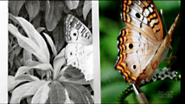
I have a major problem! I had to stop work on this - because there's something completely missing... the rear edge of both wings! So... changes have to be made. I was using this reference to plan the structure of the wing. I worked my way down here, as you can see, past this first spot - down to the point, which is here, and then.... ohhh... all of this is missing. This wing has been torn off, roughly around this area.
This is the reference I was working with and this is what it should look like. I repaired this using a photo of a different butterfly. So, I've got a decision to make. Shall I continue drawing with the damaged wing? Or do I repair it? Well, I've decided to use it as a positive learning experience... and repair it.
As there's no time like the present, let's start cutting into the leaf... I'm getting close now to needing an eraser. Bear in mind that as soon as you use an eraser you are probably flattening the tooth, or altering the structure of the paper. Blu-tack, of course, does little harm - it just lifts the graphite up and out. Well... I think I have the shape about right... and indeed I have. The wings are complete. Just the body to draw... and it's finished.
Now - all that remains is to sharpen a few edges... push some parts of the foliage deeper into the shade... and here the "organic shapes" are looking a little too "lattice-like", so I'll cut a new leaf shape into it... and then push that back into the deep shade... And we're done!
I wasn't flitting from area to area, so I gave myself plenty of time to properly consider each element as I drew it.
I wasn't starting light and gradually darkening - so I didn't have to redraw again and again, which destroys the freshness of the drawing.
However complex the drawing, I find Negative Drawing to be an absolute blessing. It's a "must have" for your armory.
- You know your full tonal range right from the outset. You can break the composition down into smaller and smaller manageable elements, which makes keeping control so much easier.
- You can concentrate purely on one section, and easily work out shadows as you progress.
- As you move forwards through the layers, every element is surrounded by the environment in which it exists.
- It removes any need to erase back to white, which is never completely successful.
And, of course, Negative Drawing IS OUR WHITE PENCIL. It protects and preserves our only available white until we know, without any shadow of doubt, what we need to do to it.
© copyright: Mike Sibley 2021

 Watch the video : Try the Butterfly drawing!
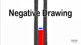


But I must say the most important lesson I learned, and one that you did not mention, is patience. How patient you were in each of the areas is something that I must work on.
As you know from the type of projects I enjoy they are more of a story than a still life. In order to improve my works I now need to focus more on the various areas as individuals in order to better build the story.
Thanks for the wonderful series.
I have talked to so many artists who have told me that the background in not important but I have always felt that the surrounding environment gives meaning to the work. At the end of your video I felt great satisfaction that I had learned new things and reinforced old understandings.
I so enjoyed seeing how you worked out your composition from several images. That was wonderful to see!
But, forgive me for this, the most valuable parts of this video are the ones where we watched you struggle to find a solution to an unexpected problem. The fact that you had to face problems, some of which I would consider extreme, is the best lesson of all. Anyone looking at the final drawing would never imagine that you had to incorporate several important corrections. The stem above the butterfly and of course the bottom part of the butterfly itself come to mind. It's encouraging for all of us to see this.