Transcript
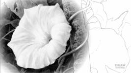
Negative Drawing - the act of creating white or light shapes by drawing around them - is both a universally useful and wide-ranging skill. And, in my opinion, an
essential skill too. It is, undoubtedly, the best 'white pencil' the graphite artist possesses.
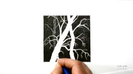
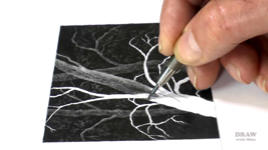
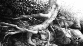
Here, I'm using it to create light hairs against dark. Negative drawing is a two-stage process - first creating the shapes, and then adding the shading and detail. However complex a job might appear to be, it's always possible to break it down into manageable elements or processes. And negative drawing is the ideal tool for that.
Even if you're not aware of it, you almost certainly already use negative drawing. That's because we can't make any marks lighter than the paper. When creating something we want to appear white, we do so by putting shading adjacent to it. To make the object itself appear to
be white, we use very light marks to show its shaping. We cannot, of course actually draw using white as a colour. And we can surround the white of our paper with very dark shading to make it appear lighter and brighter.
Because negative drawing has such a wide range of uses, and is essentially indispensable - no matter how you work - I'm going to concentrate on the ways I use it, but I suggest you make that a starting point from which you can work out your own uses. One essential benefit, for example, is that negative drawing allows you to concentrate on one aspect at a time.
Using my way of working, from dark to light, you establish the very darkest values first, so you know your full tonal range before drawing commences. That creates white shapes surrounded by black or dark shading. Later, you can return to those white shapes - now surrounded by their individual backgrounds - and begin to give them the tonal values they require. And by "later" I might mean almost immediately or next week. The only rule is "do it when the time feels right".
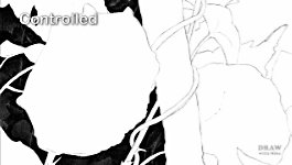
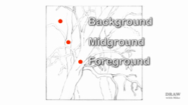
Negative drawing can be used in two distinct ways - controlled and spontaneous. In a controlled scenario, a background area might be carefully and accurately drawn around midground elements to define their shapes - to establish their existence as white silhouettes. Then those midground shapes are developed to surround the previously planned foreground elements - 'previously planned' because they constitute the composition, and provide the basic positioning data for everything else. Then, of course, the foreground can be completed, with full control over its separation.
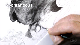
Spontaneous drawing, however, involves the instinctive and speedy drawing of shade and shadows. Those expose and display the white areas between them - with no outlining or previous planning. As I'm doing again here with this dog. Most of the time I use negative drawing spontaneously - that is, without prior planning or guidelines - but equally often that's
within a planned area. Confused? Let me explain.
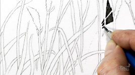
Any element that has to be accurately displayed - usually a foreground element - is designed and outlined. These are the elements you want the viewer to see and understand - as I'll explain later. Behind that I create the background spontaneously, and often the midground too. However complex a job might appear to be, it's always possible to break it down into manageable elements. Here, I've mapped out the foreground stalks; lightly drawing a line either side to delineate the space that constitutes the stalk and leaf. Remember, you are defining white space, so be aware that it is the inside edge of your pencil line that counts - you are drawing that line around a white shape.
That done, now I've switched to a spontaneous style of working to map out the less distinct reeds in the midground and background. I rarely outline anything in these areas but create stalks merely by drawing the negative space. Here is where you let your imagination go free, working at a pace that prevents conscious intervention. You will find yourself introducing stalks here and there that might even surprise you with their placement - but that's just you tapping into your natural sense of balance.
As you work on the background areas, introduce random shapes and lines - we'll return to this soon. As long as these vaguely follow the rules of natural grass, reeds, and foliage, they will serve to fool the brain into seeing more detail than exists. In life you couldn't distinguish every element in such an arrangement (especially in areas of deep shade) so you shouldn't be able to do so here either.
Along the way, your background work will create shapes within the midground. You might even deliberately outline some of them. That's OK. Go with the flow. Do whatever you feel is necessary. But, don't try to be too accurate - inaccuracies often lend an extra realism. And don't touch those foreground stalks - they are 'unknowns'; you can't properly define their tonal values until you have completed the reeds behind them. In fact - when you think about it - none of the foreground or midground elements can be confidently drawn
without knowing something about the environment they are a part of. Incidentally, one reason I prefer to create these areas spontaneously is because... well... drawing should be FUN! Personally, I don't want to be a slave to a plan at all times. I want to enjoy myself and be creative.
So, the background is complete and the midground elements surrounded. Now picture, really picture, yourself looking into an area in depth. Begin to add reality to the situation. Create in there what you
expect to see in real life. Tone some stalks down a little; and others so much that they are barely visible. And you
can do that, because you're pushing them back into shade that
already exists. You see those organic shapes in the top left corner? That's a useful device that we'll look at more closely soon.
If you can see the reality in your mind you will achieve a sense of reality in your drawing. If you're not sure how to treat something, leave it white then go back to it once it's surrounded - as I've done with the foreground at the base. It's going to be water and I can't draw the reflections until I know exactly what reflections are required.
Finally, the foreground stalks are given body and detail. You see the level of control this method allows? At any point, you can cause a stem or leaf to stand out or slip back into the shade. Then the lower foreground foliage is drawn, using exactly the same approach and, now we know the elements within the foreground foliage, the water and reflections can be established.
Negative drawing offers the means to tackle complicated tasks in manageable stages and, within each white space, presents the opportunity to draw it to completion, removing the need to return to that area, which would muddy the result. Your goal should always be to avoid overworking, and to produce sharp and crisp drawing. This is particularly true when the dividing lines of shading are miniscule - such as the light hairs of this Lynx-Point Siamese cat. The hairs exist only because of the slim negative spaces drawn between them.
Before we move on, I want to introduce you to Random Organic Shapes - a negative drawing device that I've often used, and that you saw earlier. This depends on the creation of solid and dark shading - so bear that in mind. I'm using a 2B on super-smooth Conqueror Diamond White. If you use anything softer, consider burnishing it with a harder grade, such as HB, to fill any white pits in your paper. The blacks
must be solid.
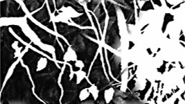
I always use spontaneous drawing for this technique, because it seems to offer the best natural appearance. The aim is to create unrecognisable organic shapes. Why? Because the deeper you look into something, such as foliage, the less you understand. That's entirely natural. So, this creates background elements that, deliberately, cannot be recognised. But the human mind is quite happy to accept these shapes as belonging to the foreground elements.
In other words, the foreground identifies the object - let's say it's a small plant. You peer more deeply into it and, two or three layers back, you really cannot make sense of what you're seeing - bits of stem, sections of leaf, all of it in deep shade. And that's what this negative drawing produces. It fools the eye into seeing much more depth and detail than actually exists. Here, for example, it created three layers of depth. Two are recognisable tendrils. The third is... something organic. Sometimes you might want to only use portions of recognisable shapes, such as these leaves - some pushed so far back into the shade that they're barely visible. But they create a natural sense of depth. Or here, where the shapes are not pushed right back, but provide contrast, so the intense black background itself provides the depth.
Incidentally, everywhere that you see leaves, not a single leaf was actually drawn. All this foliage is produced by negative drawing, and you see the leaves only because the background around them is darker.
So, to return to the simple organic shapes. The groundwork is almost done and what we have is a collection of flat white organic shapes with,
and this is important: CLEAN, SHARP EDGES. Soft edges will
not work. They will appear to be lighter patches and not distinct shapes. And we have a dense black background. You need sufficient black areas so, at any point, the viewer knows "this is as far back as I can see". That's why your blacks must be solid and black. If they are lighter you simply restrict the amount of depth the viewer can detect. Now, we'll move to phase 2: making visual sense of everything.
I'll keep this quick and simple, because you'll soon see this repeated but in more detail. The aim is to create yet more depth. Bear in mind that everything is in the shade. Don't use foreground values, and try to avoid midground values too, unless the shape you're shading approaches the midground in depth. The best way to judge the values is to create what you expect to see in Nature. These are dark holes within the structure - so, imagine what you might see in there. Push some shapes so far back into the shade that they almost disappear. I've said this before, but it bears repeating: notice they are still visible because the edges are sharp.
You can allow other shapes to come forwards, perhaps even encroaching into the midground. And yet others might be on inclined planes - one side catching a little light and the other disappearing completely into the dark depths. These inclined shapes serve to connect the layers and lead the viewer's eye back through them. Let's stop work there and we'll take a look at that in a more practical situation.
This time we'll include other elements of negative drawing too. First, I'll run through this quickly, step-by-step, and then demonstrate it for you: All we have is the outline of a foreground tree. Now, we can't work on that tree because we have no idea of its environment - the setting in which it exists. But let's assume you have a clear idea of the story you want to tell, and a mental picture of the final result. You could, of course, imagine the setting and draw the tree appropriately. But establishing the setting first is a much more logical approach.
So, in my mind, I see a deep dark and mysterious forest. A forest of old and gnarled trees. With that in mind, I might begin with the extreme background and work forwards, creating the environment in which the tree's white silhouette can live. But, this time, we'll create a simple midground too. Lightly, so we can tell it apart from the main tree, let's design a second tree, and maybe a third, behind the existing one. And, perhaps we'll give the existing tree a branch or two that extends behind the trunk. Remember, these are knobbly, old trees that don't possess a single straight branch or twig!
Well, this obviously needs a third tree for balance. Observe the negative space - all that is not tree - and aim to produce a pleasing balance between positive and negative areas. The principle object here is to preserve the virgin white of the foreground tree until we understand what values it requires. We'll do that by splitting this drawing into three separate elements - background, midground and foreground - and begin with the one we know most about: the background. And, at every stage, we'll use negative drawing - creating elements within the drawing by simply drawing around them.
By the time we draw the tree, we'll have a feel for that environment. We'll know if the prevailing lighting is harsh or diffused. We'll know what might overlap our subject, such as branches or grass or weeds, and how they fit naturally into the overall setting. And we'll have full control over the separation of the subject from the background.
So, background first. It will be super-dark, and I usually heavily outline each branch as I reach it. That creates a narrow safety margin and ensures edges are sharp. I'll also include those white organic shapes, to suggest distant masses of foliage. I know I going to keep repeating this :o) but If you want to suggest depth then all edges MUST be sharp. Once you'd pushed any shape back into the shade, it will depend on those sharp edges to remain visible. Now we have background darks as a reference, we can begin to push those shapes back into the gloom. You can push any further back at any time, or use a kneadable eraser or Blu-Tack to pull them forwards again.
Now, with the midground completed, we have a forest for the trees to live in. To add interest and depth, we can pull the right-hand tree a little further forward. And finally, we have full control over the separation of the foreground tree.
So, that's the plan. Now, I'll demonstrate each step for you from the beginning. We'll assume the darkest values are in the background and not required for foreground use - so let's have a go at creating a forest incorporating the background to foreground and negative drawing way of working.
I'll begin by filling in the background - using a 2B burnished with HB. I'm creating those organic shapes we saw earlier, to suggest clumps of foliage. And I'm only creating them in the top half. While it's true that bushes might grow lower down, I think the only light filtering into this forest is through the tops of the trees, so I'd expect it to be darker closer to the ground. You might not agree... but this is my forest in my world... so I make the rules.
As you shade, invent more twigs or leaves too if you wish. But you must avoid drawing into any of the outlined foreground or midground elements. And - DO NOT BE AFRAID TO USE BLACK. SOLID BLACK... it's essential in this case.
You have a number of options. One is to fully complete the background before moving forwards. But you could equally decide to complete one area and then progress to the midground. As long as you have sufficient environment for any element to exist naturally, feel free to work on it.
You see how complex the drawing is looking already? And it was produced without stress. Not once did I have to consider how I might draw the midground or foreground trees, or what texture I should use to represent bark. In fact, the only aspect of the trees I had to think about was their external outline.
Now, we're going to continue working forwards from the background. Those random, organic shapes that I drew around are there for two reasons: first, they relieve the visual boredom of large expanses of flat tone; and they will now become shadowy, enigmatic forms - representing unknown shapes and foliage within the deep shade of the forest. I'll continue to use the same 2B - because on my paper that produces the darkest solid values. And, if I wish to, I can push any shape, or a part of one, so far back it disappears.
Squint at the drawing so you can see only areas of tone, and think "deep shade". Just as you saw earlier, we'll tone some shapes down so much that they almost disappear. We'll leave others a little clearer. You don't need to be fussy - just shade right over a whole block, and then further darken some parts and not others. If necessary, use your kneadable eraser or Blu-Tack to adjust the values; and use it to lift out new shapes if you feel the drawing is looking unbalanced. If you find any shapes are beginning to look like light patches, sharpen the edges. Soft edges are almost certainly the culprits. They visually blend the shape into the background, so they form a single plane. You need two distinct planes to suggest depth.
With the background now completed, we'll turn our attention to the midground trees. Are they alongside each other? Is one behind the other? You decide. It's your world. You can signal your decision with the values you apply. If they're alongside, their values should match. If one is further away than the other, it will be deeper in the shade of our forest, and therefore darker. Make a few simple decisions before you begin. Which direction is the light shining from? Will the bark texture be visible, or will the trunks be smooth? Don't think "drawing", think "forest". Go and look at a tree, or even photographs of trees. Fill your head with tree imagery.
My concentration and imagination needs to be on "tree" - and only "tree". By breaking the drawing down into parts, you simplify every stage. Even now you don't need a crystal-clear vision of tree textures or form, because these trees are in deep shade, and only partially seen. And what you learn from drawing these trees, you can carry over when drawing the foreground tree.
As you draw, you'll find your mind suggesting features of old trees; reminding you that trunks, branches and twigs narrow with length; suggesting the position of random lighter patches in areas that lack interest. In short - you'll be I thinking TREE.
As I mentioned earlier, one of the benefits of this method of working is that it allows you to concentrate purely on one element at a time. If you're not certain how to draw this first tree, try this: Begin at the base, or top, and work your way slowly towards the other end - constantly asking yourself questions:
Is this bulge where a branch once broke off?b
Is that mark I just made a split in the bark?
Is this branch behind the tree or growing out from its side?
Explain things to yourself:
If that side is receiving a little light, this must be the shaded side.
This branch is growing out from the rear, so let's bend it and push it back into the deep shade.
b
You can only convincingly draw what you fully understand - and understand in three dimensions.
My love for graphite stems from the ability of my thoughts to travel directly from my mind onto paper - no colours to mix, no drying time between layers - just an unbroken process. Graphite is a wonderful medium for subjects such as this.
Using this way of working from dark to light, you know your full range of values from the outset. Couple that with negative drawing and the white of your paper remains pristine white, until you KNOW the tonal values and shaping they require. DRAW ONCE. MOVE ON.
You might have noticed that otherwise exceptional drawings are sometimes hazy and unnecessarily soft. I'm convinced that's due to the overworking that results from working light to dark - and from erasing back to white. Negative drawing solves both of those problems. As I said earlier, it's our white pencil. As the only white we have is our paper, this method protects that white until you know precisely how you want to change it - if at all.
As I explained: Negative drawing offers the means to tackle complicated tasks in manageable stages. Darks first. Not necessarily all of them, just enough to act as "darkest value" references. The midground, drawn with the knowledge of the background behind them. Then the foreground elements that now exist within an actual environment. All drawn within the white spaces you created, which gives you the opportunity to draw perfectly and completely, without later alteration.
Getting it right the first time will always give a sharply defined finish that all other methods muddy. It's a liberating and controllable way of working. And it scores above all other methods in the drawing of complex negative shapes.
© copyright: Mike Sibley 2021