Transcript
I define tonal shading as being solid shading - such as this wet mud. All methods of shading - hatching, cross-hatching, circular, scribble and stipple - will, if taken to extremes, result in solid areas of shading. I'll take a look at the most commonly used - close linear shading.
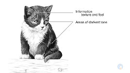
But first, shading - any shading - requires prior thought. Carefully consider what you're about to draw. Look for areas and values that relay the most information. This area tells me much about the texture and feel of the hair. Identify the areas of darkest tone - the shadows and holes - and, when possible, establish at least one of them fist, such as the pupil in this case. That will assist you in working out all the intermediate values - they'll fall between the wite of your paper and your initial dark area.
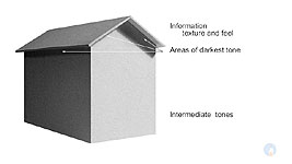
Now let's transfer those points to our subject - this matboard model house. Texture is whatever you want to make of it. There's no reason to reproduce the flat cardboard appearance. It never existed as a real building, so feel free to suggest any interesting textures or surface features. The areas of darkest tone are fairly obvious. And the intermediate values encompass almost all of the building.
A word of warning: Don't use values too light for the purpose. This, as I said, is a matboard model illuminated by a single desklamp - so the values, relative to each other, are true. There are other points to consider too, which I'll cover along the way. The first of those is:
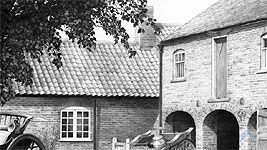
Nothing in life has a line around it. Don't rely on outline. Banish it! There is no "line" in this photo. Study it and work out why you can tell one plane from another. Use the shadows and changes in value to describe the edges. That's how we see and understand them in real life. We instinctively know how to decode shadows.
This tells us about the type, direction, and strength of the light. This one shows us the roof juts out beyond the wall. And this one is the most important - the planes of the roof and wall don't meet. The roof overhangs the wall.
With that research firmly in mind, let's make a start. Draw the outline of this - or a similar - building. About 3 inches by 4 inches wide (7.5 x 10cm). Now begin with the lower edge of the roof. Why? I'll explain. First, the shadow is the darkest value, so everything else has to be lighter. Second, that edge has to be super-sharp. And here's why... Soft edges merge planes. This suggests the top and bottom areas are somehow connected. But sharp edges suggest the two are separate. They could be adjacent and touching, but they are separate elements. If we move one, it becomes more obvious. And even more obvious if we add a cast shadow. That creates recession too. If that edge is soft, it creates confusion. The elements try to merge again. That edge
needs to be sharp! And, if we skew the top element - there's our roof. Perfectly separated from the wall, on its own independent plane. Much of drawing is about what I call
visual clues - providing assistance and clarity to the viewers of your work. Don't confuse. Be clear.
You can begin by shading the roof or left-hand wall, but first, establish that sharp edge. It needs to be both dark and sharp. Soft grades draw dark but soft-edged lines. Hard grades draw sharp lines but lighter in value. So I'm opting for the mid-way grade - HB - and applied with some pressure. It's OK to use a ruler for this edge - but rule a light line and then draw over it by hand. Otherwise the too-perfect line will look false and mechanical.
Now I have both a straight sharp edge and a narrow safety margin I can shade up to or, in this case, away from - because I'll use a 2B to extend that line down to form part of the shadow. That's my "darkest value" reference.
Roof or wall? I'm opting for the roof. The angled roof is receiving a little more light than the dark left-hand wall, but not as much as the brightly lit right-hand wall - so I need to choose appropriate values for it. Shade along the roof. You can also shade vertically across its height but your lines must then follow the angles of the ends - the correct perspective. If they don't - all visible lines will look completely unnatural and cause confusion. Also, don't shade the roof or walls in sections and just stop your lines. You will create distracting edges within your shading. Taper the ends of every line so your sections join seamlessly. Don't forget the roof has a thickness. In the reference you can see reflected light has caught the bottom edge. You can make good use of that.
After the shadows, the left-hand wall is the second darkest area. Again, you can shade this horizontally or vertically - or even use circular shading - but, as with the roof, you must take perspective into consideration. This time vertical shading can be just that - vertical. But horizontal shading needs some thought. It's so easy to forget about perspective as you shade. All your lines must follow the perspective, and the simplest way to ensure that is to draw a few light lines across the wall before you begin shading - guidelines to help you vary the angles as you shade down. Or you can shade vertically and avoid the extra work!
Using the same plan, I'll begin the right-hand side with the cast shadow. But this lighter wall will reflect light back up into the shadow and, at least, dilute its lower edge. Always look at your drawings in this way. A brick is a brick. A tile is a tile. Wood is a plank of wood. None are "just areas to be shaded". Keep each element alive in your mind and your drawing will reflect that life.
The hint of cast shadow on the left-hand side is very useful, because it separates the edge of the roof from the wall - and both are very similar in value. Alternatively, you could draw either one darker or lighter than the other - and even omit the shadow if you choose to. It's your drawing - your world you're creating - so your rules apply. There is absolutely no reason why your drawing has to look exactly the same as the reference.
The rules that applied to the left-hand wall also apply to this wall - apart from it being more brightly illuminated. Make sure your lines follow the perspective. And on no account use diagonal shading. Any lines that are visible, whether blended or not, will supply clues to the surface texture. Diagonal lines, or cross-hatching, don't conform to any known wall surface and will simply look very unnatural and strange. THe only exception is if you are totally confident your cross-hatching will blend line-free. But, as a rule, cross-hatching is more suited to textiles than walls. Err on the side of caution and avoid cross-hatching.
If you want your lines to more smoothly flow into each other, consider blending -
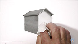
lightly! Heavy blending will knock the life and freshness out of your drawing. And do avoid all sharp edges. Where I'm using my finger and tissue for the larger areas, I'll use a tortillon adjacent to edges. Blend only if it will benefit a particular area. You're recreating a building - not just "drawing" or "shading", or "copying a reference". Whatever you're drawing, it's a solid, three-dimensional form, that obeys the rules of Nature.
© copyright: Mike Sibley 2019


Thanks, Liza. I should go back through the older videos and add the grades used. No 2H used (it's a green Faber clutch pencil). Both my 2B and HB are blue Staedtlers - but my 2B is newer and shinier, so...
LEFT SIDE:
Roof: 2B
Roof shadow on wall: HB top line with 2B shadow beneath
Wall: 2B
RIGHT SIDE:
Roof shadow at right 2B + HB
Thin roof shadow at left: HB
Wall: HB
So, pressure was decisive with the values obtained. I didn't, but could have, smoothed the right-hand wall with 2H, and the left-hand wall with HB, but I knew I was going to blend instead.