Transcript
This lily is ideal for practicing your shading and blending skills. While I work on this for you, I'll concentrate on Layering and Shading, and in particular, Blending. But first, we need a guideline drawing - so we can concentrate on building the form and texture without having to think about shape and position.
As with any drawing, you need to know a few things about the subject, and your goals:
- The lighting. Where is the light shining from. Or if you're adventurous, where would you like it to shine from. The line drawing has no lighting or three-dimensional information, so you can light it from any direction.
- Identify the main highlights...
- and shadows. So you have a basic plan.
- What do the petals feel like? Imagine running your fingers over them. I think they are smooth and waxy, and fairly thick.
So, now you know what you're drawing. It's no longer a set of featureless shapes.
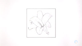
Draw a box about 4 inches (10cm) square. Smaller if you want to, but not too small or you might have difficulties with the blending in tight areas. Now draw the outline of your lily. I recommend you use a 2B lightly. It can be completely erased and it won't indent your paper. I've drawn it darker than I usually would, so you can see it, but before I begin in each area, I'll fade the outlines.
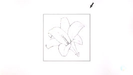
You've already worked out - or decided - where the light is shining from. I suggest you draw an arrow in the margin as a constant reference and reminder. Remember the "highlights and shadows" question? I think the lily will be darkest deep down in the throat - and the very darkest is going to be this tiny triangle. Now I know the lightest value (the white of my paper) and the darkest - so every other value has to fall between those two. And now I have those two reference points, I find the intermediate values almost fall into place automatically. Don't be surprised if you find yourself drawing darker than you expected to - because you'll want to make natural sense of that initial dark triangle. In any case, when you blend, that will lighten your values to some extent.
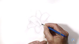
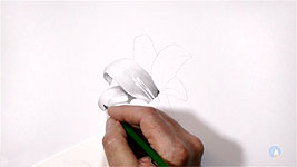
Let's make a start. I'll begin by shading the bottom of the big 10 o'clock petal. I think this petal is dished, like this in cross-section. So it will catch the light at the left-hand side. I'll use a little light 2B first with a flat face - so it sits on the surface. The darker I can make this, while still maintaining a natural appearance, the deeper the throat will look. And the stamens - left white - will stand out more. "Left white" because I have one major rule:
only place graphite where you know it belongs. That protects the virgin white of the paper, which is the only white we have! And it's helped to almost banish erasing.
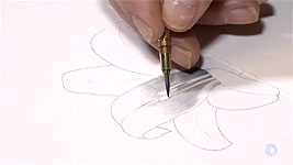
Now I'll layer with HB to smooth the 2B. Shade in the direction of growth. Imagine this lily has veins along its petals. Any visible lines will look like intentional surface detail or features.
Now the HB is beginning to look grainy. "Grainy" doesn't in any way suggest a smooth and waxy surface, so I'll switch to using a 2H. Essentially, I'm doing this:
- Short tapered lines of HB
- Slightly longer tapered lines of 2H, to smooth the HB
- and slightly longer tapered lines of 2H again, which will fade perfectly into the highlight.
That's one reason I work dark to light. It's easy to fade out, but more difficult to smoothly fade in. Another reason for working dark to light is that I can always graft new drawing onto dark shading by overlapping it, and I can do that because
all my lines are tapered. It allows me to shade seamlessly in sections.
I've decided to break with the plan and establish the shady end of his petal now. But first, I'll fade out my guidelines so they will disappear beneath the shading. I'll begin with a little 2B, and then smooth and complete the area with an HB. The values of this area will help me when I draw the cast shadows on the 9 o'clock petal. Now I'll begin at the other end, lightly, and shade back towards the highlight. The reference doesn't show any tone at this point but adding a little removes the need for outline. Build up values slowly in layers, so you have full control over the result.
With the shading of that petal completed, I'll begin work on the 8 'clock petal, which will help to determine the value of any cast shadows. Look at the lighting arrow - it's quite obvious the 10 o'clock petal will partially shield the light from this petal. That's very useful for two reasons: It provides a distinct value change, so no outline is needed. That's how we see edges in real life, and
nothing in life has a line around it! And the other thing: I can use the shadow to describe the three-dimensional form of the petal the shadow is falling on.
If you ask me for one piece of advice, it would be this:
always think of whatever you're drawing as being real. It's never "a drawing". You are recreating the actual subject. That's why we ran through those questions at the start. You cannot successfully draw what you do not understand.
In this case, we discovered the petals have a natural thickness. Here, for example, I can use outline, because it represents the thickness of the petal in shade. And here, I used the reverse - using the highlighted thick edge of the petal to separate it from the lower petal.
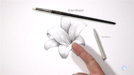
Now the shading is complete, the blending begins. You might choose to not blend it, which is a perfectly valid decision. But for the purposes of this exercise, I suggest you do.
I use three tools for blending: a colour-shaper, a tortillon, and my finger. But
never use your finger directly. The natural oils in your skin will leave fingerprints. Graphite, like forensic dusting powder, will stick to the oil, and
it cannot be removed! I'll begin by using my finger wrapped in plain toilet tissue. Don't use any that contain oily moisturisers. Cheap and thin is best.
Using small light circles, gradually spread the graphite into the white highlights - avoiding any highlights you pass that you want to remain white. When you blend - remember, you are redistributing graphite, and not pushing it into your paper. So, use a
light touch at all times.
You can then, if you want to, blend light to dark - with a clean piece of paper. That will remove some graphite, and lighten and smooth the highlights. And stay away from the dark areas, or you will lighten those too. For small areas, use a tortillon, or even a colour-shaper, which absorbs (and so removes) less graphite than a tortillon. When you next visit your local art store, look outside of the drawing section to see if you too can find useful tools intended for other mediums or crafts - anything you can put to good use.
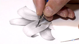
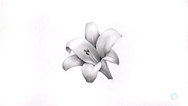
Finally, let's complete the drawing. I'll add some tone to the stamens. They need to sink into the shade from which they are emerging. I'll also use a thin edge of Blu-Tack to clean the stamens higher up. This is only tone spread by the blending, so it should remove easily. And I'm cleaning the anthers too. This lily is soft and gently curved, so I want strong contrast and sharp edges in the anthers, to separate them from the petal behind - it will make them stand out.
I'll build in as much contrast as I can. I'll use anything that will make them look different from the petals. And above all,
sharpness! Remember: soft edges merge adjacent planes; sharp edges separate them.
And a final piece of advice: When you intend to blend, careful application is the key to success. Hurried or careless shading will always produce poor results. Blending cannot obliterate blunt or hooked ends, or completely fill gaps. It's your
pencils that produce an evenly toned or gradated area,
not your blender, which can only smooth out irregularities. Only when the preparation is carried out with care, will blending correctly perform its function.
© copyright: Mike Sibley 2018