
The ARTISTS TOOLS series
IMPROVING REFERENCE PHOTOS
Featuring demonstrations - using Affinity Photo but usable in Photoshop or any similar image app - discover how to make life easier for yourself by upgrading your references. Learn how to add features to a plain subject. Rescue a House reference from being distorted and partially hidden behind a large tree. Discover how to merge parts of various photos into a single reference, and changing the colour of hair.
And the final demonstration takes you step by step through the process of moving a "prop" and creating a second leg for a young pup.
WHAT YOU GET...
Introduction
Nobody who sees your drawing is going to see your references, so you can - and probably should - seek to improve them. Don't accept your references as being fixed in any way.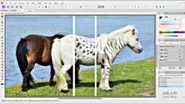
Creating from scratch
There are times that your reference is missing a vital element - or you need something that doesn't exist - so you're only recourse is to create it. With tongue in cheek, Mike creates two very unusual Shetland Ponies.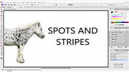
Tiger Striped Pony...
Mike takes you through the stages of finding suitable photos of stripes, and then applying them to the Shetland Pony in a believable way.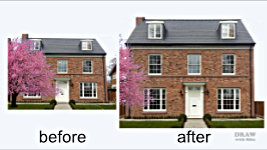
Saving a House...
If you've been commissioned to portray a house, your client isn't going to thank you for a week's work drawing a tree that's hiding it from view. Or for not correcting the camera distortion and faulty perspective.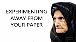
Protecting your paper...
Before you put pencil to paper, the more you can learn about your subject the better, and sometimes attention to detail at the prep stage can save you from over-detailing or other problems.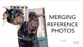
Combining Photos...
Don't just choose one photo and discard the rest. They contain essential details, and elements that will improve your chosen photo. You can even combine them into one perfect reference photo.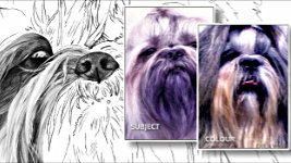
Changing Hair Colour...
Featuring his Shih Tzu drawing, Mike explains how he changed the lovely model's colours into the more common grey and white, using a separate reference of a grey and white dog.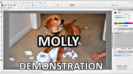
Creating a missing limb...
Full demonstration: Creating a missing limb and rearranging the reference photo so the torn toilet roll is between Molly's paws. And lots more...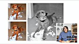
And finally...
Having produced a reference that better describes Molly's wonderful personality. And mocked up what it might look like as a drawing, Mike warns that you should never be afraid to alter a reference. All that matters is the end result.Watch the 5-minute PREVIEW:
Transcript...
Transcript
INTRODUCTION
Nobody - NOBODY who sees your drawing is going to see your references, so you can - and probably should - seek to improve them. Don't accept your references as being FIXED in any way. We've all possibly at some point thought, "This reference is almost ideal... but I really wish it had..." well, whatever you desire. In this case, I would really like my Shetland Pony to have... SPOTS! Or, because in a virtual world, we can have whatever we want, let's go for... STRIPES!But, unfortunately, snazzily striped Shetland Ponies don't exist - and neither do Spotted ones. So, we need to manufacture them. And for that I'll use Affinity Photo, but any similar app will do, such as Photoshop or GIMP.
SPOTS and STRIPES
How do we achieve it? Like this... It's a white pony and we need spots, so a spotted white horse would be a very good choice. That's partly, because the body structure is similar, so the three-dimensionality of the spots might be suitable with little or no manipulation. Apart from the final demonstration, I'll be concentrating more on than how to do it, but I'll at least give you a quick explanation. So, let me show you how the Striped pony was built.TIGER STRIPES
First, what could we use? Well, a white tiger seems be most appropriate, so let's find one. That looks very suitable. So, I'll copy it to the video's Sources folder. And open it in a layer above the pony before reducing its opacity, so I can see both tiger and pony. Now I can rotate it to better line up with the pony's body and then cut away everything I don't need. Now it's in place, I've used Levels to adjust the white to match the pony, decreased the opacity until it all flows into one, and finally, soft-erased between the markings of the tiger wherever I really need the shaping of the pony to show through.Now lets complete the make-over by adding stripes to the front leg, wherever you think they might appear; the back leg; and the neck. Just copy bits from elsewhere, rotate, stretch, distort, and partly erase until its unrecognisable. Always avoid repetition! It's immediately noticeable. A final check. Maybe adjust the opacity... and, with no magic involved, Shetland Pony meets Tiger. Don't waste time perfecting it, because it doesn't need to be exact in any way. It's just a reference for you to work with. But also a reference that reflects your vision. You're about to draw the way you see it, not as the reference originally stated.
UPGRADING A REFERENCE
The same applies to inanimate objects too. If you've been commissioned to portray this house, the client isn't necessarily going to thank you for charging them for a week's work drawing the tree - the tree that's responsible for a third of their house being hidden from view.Fortunately, this house is typically symmetrical (OK, it really isn't but bear with me). Or there might be a similar neighbouring property you can borrow from. But before we can fix that, we have to deal with the wonky perspective. I'll rotate it until the central window frame is vertical, and the base horizontal. Now, from the top menu, choose FILTER > DISTORT > PERSPECTIVE and pull the handles until the verticals are vertical.
That's fixed the horizontal distortion, but the house is now too squat. I'd use the door as a guide - it's probably 6'6" x 2'9" (200 x 84cm). So, I can use this measurement of width to find the true height, and stretch the image up to match. That looks good to me.
Now we can copy the right-hand half, and flip it over the left to cover the tree. But immediately you'll notice the house is not as symmetrical as we thought. Look at that dormer window as I expose the lower layer. So, we need to move the new half to the left until the window is correctly positioned, and expose some of the brickwork from the layer behind it. And then cut and move the left-hand end further out until the house is its correct width. Just to be fussy, let's alter the left-hand dormer windows to avoid repetition. Replace the chimney stack. And remove any duplication from the brickwork.
Then we have the option of removing the neighbouring houses to showcase this one. And perhaps reintroducing the tree - because the client expects it to be there. Done! We've gone from a distorted reference to one that showcases the client's property. And one, I feel, they'll be delighted to accept.
EXPERIMENTING AWAY FROM YOUR PAPER
Before you put pencil to paper, the more you can learn about your subject the better, and sometimes attention to detail at the prep stage can be a life-saver. Because over-detailing can be a problem. You might be tempted to enhance what you see in a photo, or in real life, to its detriment. You might produce a result that doesn't carry the message you intended. It might even look false. For example: if you concentrated on this lady's facial contours and wrinkles, they would draw so much attention to themselves that you'd lose sight of the lady herself - it wouldn't look like the person at all. So, you might instead choose to go for the middle character-filled appearance.
And the good news is... you can - as I've just done - test all of this in Affinity Photo. No guesswork. No damage caused to the surface of your drawing paper by tests or erasing. No time wasted. Try these things out in Affinity Photo first.COMBINING REFERENCE PHOTOS
This lovely Tibetan Spaniel has its own year-old puppy ears attached to its older head. From the neck down it's a completely different dog. And it wasn't this colour. It had, unusually for the breed, a darker muzzle and head. So, I used this one as a model for the colouring. Now, this subject can quickly become quite complex, so I'll be brief.If a client has sent you a bunch of photos - or you've taken them yourself, as I did for this Rottweiler - don't just choose one and discard the rest. First, the rest might contain essential details that are absent from your chosen photo. The rest might also give you a much better three-dimensional picture of your subject in your mind. And the rest might also contain elements that will simply improve your chosen photo by their inclusion.
And, if YOU are taking the photos, take as many as you can, from all angles. Of course, these days you can easily enlarge parts of a 40MP photo. But in my days, I was using film, so I'd also zoom in to capture detail. I'd be taking photos then realise one was possibly near perfect. Immediately, I'd zoom in to the eye, then the nose, and then any other parts I might need to see in close detail. Never miss that opportunity. OK. Back to merging photos.
Here, my principal chosen reference needs a more suitable neck. You can cut away parts you want to change. And place parts of one photo behind, or on top of, another with the option of switching it off and on for comparison. This is beginning to look good and, with the bottom cut-off decided on, and a few minor changes, it made it through to become the Rottweiler print. So, we've gone from this... to a more comfortable-to-view straight neck.
Oh, before I forget... How do you correctly scale the two to match? I tend to use the eye or nose. For this one, I used the size of the eye. Reduce the top layer to 50% opacity. Adjust the size of the bottom layer to match. Restore the top layer to 100% opacity, and their sizes will match. There's almost always something in one photo you can match to the other.
However, there are some fixes you can't make. Such as when lens distortion makes a dog's nose look too big, or simply enormous! There isn't a fix for that. Distortion can happen to any subject. Earlier, we saw how the camera angle had caused the house to lean back and squat down. That's what your extra photos are for. They supply corrections as well as additional detail... but only if you've taken them.
In my day, I could take up to 180 photos during a visit to a dog - thinking, "25p. 25p. 25p." as I snapped away - because developing cost 25 pence per photo. Now, in the digital age, you don't have that financial constraint. So, take plenty!
CHANGING HAIR COLOUR
By now you might have realised that if you can change bodies and - anything really - you can change colours. And if you can source detail from, say, a red horse and apply it to a white horse, then changing colours should be more than possible. And it is. You saw it just now with the Tibetan Spaniel. Here's another in more detail. This is my Shih Tzu drawing, but this is the reference. It's a lovely dog and a perfect subject for me to choose... except the most common colouring is grey and white. And I really DO want to sell prints!  So, what best serves my requirements is to use my chosen reference but base its colours on a separate reference of a grey and white dog. And it's easier than you might believe! Find a suitably coloured model online. It helps if the pose is similar, but that's not vitally important. And now look at what's on your paper... guidelines. Just lines. Nothing else. No colours. No form. Just outline. So, you can change the lighting or colours using the separate reference.
I usually begin with an eye or the nose. Now extend your drawing outwards. Let's say from the nose toward the left-hand eye. The main SUBJECT reference shows you the direction of growth, all the tiny features to be found in that area, and the shapes the hairs form. Now all you have to do is look at the COLOUR reference and draw the hair accordingly. And once the first section is completed, you simply - and it is simple once you get yourself attuned to it - expand the drawing outward from that initial section. One single small section at a time. Combining the COLOUR and SUBJECT references at each stage. And sometimes a feature in the COLOUR reference makes its way into the final drawing, because you can readily pull information and features from both sources. In fact, you can pull detail and features from a variety of sources and combine them. And even recreate missing elements by cloning those you have.
MOLLY the Pup Demonstration
Let me introduce you to Molly, who recently passed away from old age. Here she is as a pup and Mary, Molly's owner, would like to draw from this photo - but wishes it was a little different. So, we'll remove the foot - because it's distraction - and then rearrange Molly.First, we'll copy the original image, so we can always return to it. In Affinity Photo that's CTRL+J. I'll rename the copy as NO-FOOT. These days you could use the Healing Brush, Inpainting, or the Patch tool, but I prefer to use the CLONE tool manually. Choose the area you want to paint with, ALT-click to select it, and now you can "paint" that area over the feature you want to cover. I need to choose a second area to completely remove the foot. And I'll remove the darker area below it, too.
Now CTRL-J to copy again. It's the quickest way to backtrack if anything goes wrong with the next action. We'll name it "ROLL", because I want to isolate the toilet roll. Mary would really like Molly to have two front legs and the roll to be placed between her paws. Zoom in... Choose the LASSO tool, select the polygon mode and click your way around the roll. Fairly accurately, but there's no need to be too fussy. It's just a reference, not a work of art.
Now, with the roll selected, I'll use CTRL+X to CUT that section, and CTRL+V to paste it. That automatically places the cut section on a new layer, and if we turn it off... we're left with a hole. We don't have to fill the hole, but I will - to prevent it from being a problem later. I'll copy the layer beneath and name it NO PAW.
Again, I'll use the CLONE tool. We'll choose a suitably empty area of floor, ALT-click to select it, and paint over the hole. Selecting new areas of carpet when I need to fill more of the hole. Let's turn the ROLL Back on... and move it... to get some idea of what we need for the missing leg. OK. Not as much as I thought.
With the ROLL layer turned off again... I'll zoom in to the right-hand leg... Choose the LASSO tool again and click my way around the leg - more leg than I think we'll need. Now copy and paste to a new layer which I'll name L-PAW, for LEFT PAW. Next, move the copied leg and fit it over the missing one. I'm using the central joint to roughly position it. And now the excess above can be erased - using a soft eraser to blur the edges. As it is, the new leg is mirroring the other too closely. And puppies in particular tend to splay their legs outward. So, I'll rotate it and reposition it until it looks more natural.
I think that's looking good, and it conforms to the angle of the dog - but it's best to be certain of that. I'll use the PEN tool to draw a line that follows the perspective of the carpet. And then move the line to touch the ends of both paws. Well, in case using carpet perspective wasn't such a good idea...
I'll move the line up to lay across the tops of the two legs. Rotate it to match the joints... And... Yes, I think that's acceptable. However, it's obvious that the left-hand paw is a copy of the right-hand one. Of course, I could flip it horizontally, but if I don't, I'll ensure the lighting direction is still correct. Instead, I'll set about altering its appearance. The human mind is adept at recognising two things: REPETITION and PATTERN, so we need to remove both.First, I'll erase a part of that large and very visible tuft of hair between the toes. Then, using the LASSO tool, I'll copy a part of the right-hand paw onto a new layer. Then, I'll move it to bulk up the same feature on the left. A little soft erasing blends the two together. There is still one prominent repeated feature remaining, so I'll use the same strategy. Copy part of the right paw. Move it to the left. Position it. Rotate it. Blur its edges and erase a part of the original paw on the layer beneath. Then finalise the position. Now I think the two paws look sufficiently different. I'll zoom out to check... and yes, they look OK. Just a little housekeeping to do. Select the top feature and CTRL+E merges it into the layer below. And again - or you can right-click and select Merge Down - so the parts of the PAW are now on a single layer. Let's take another look at the toilet roll... Not bad.... Not bad at all.
Time to stop and store what this looks like before we move on... Go to the top of the stack Right-Click and choose Merge Visible and I'll name the result "ALL-1". OH!!! I turned off ALL-1 to view an earlier layer and had accidentally turned off NO-PAW. That's exposed a part of the original roll of paper - before we moved it... And that really makes good sense of the second paw. And it lessens the presence of the roll while leading the eye up to Molly.
However, once again we have to remove all repetition and pattern. This hook shape repeats. So, we can copy a part of this... move it... rotate it... erase parts... There are other repetitive shapes here too... And there are two visible rolls. So, I'll delete part of the top layer to expose the layer beneath... because too much detail at the base would attract unwanted attention, and to suggest that the left-hand part is a continuation of the right-hand roll. Of course, we also need to remove the section of tube to the left of the paw and I'll use the CLONE tool for that. That will do.
Time to store this stage before we move on. As before, go to top of stack right-click select Merge Visible. That merges everything into a new image on a new layer, which I'll name "ALL-2". With or without the extra paper? With, I think... Because it very fortunately follows through beneath the dog.
Now just a couple of refinements to improve our subject and make working with this reference easier. Copy the nose to isolate it on a new layer. And then copy it. If this doesn't work out, we can delete this new layer and reveal the old one. I'll begin with Levels - CTRL+L - to improve it. Gamma to... 0.577 brings out the form and detail and then Black to... 1% for a touch more contrast. I'll just erase that distracting light edge. If we sharpen it that should improve the detail. That's better... Remember, we're not trying to produce a super photo - just a reference that provides the detail we need.
The eye has an unnatural green and light pupil. As usual, I'll copy the eye then (shortcut B for Brush) Paint the pupil a solid pitch black. It's lacking useful detail, so I'll try Levels... Gamma to lighten the mid-values and Black to add a little extra contrast. I like the lower lid highlight But the top one makes eye look smaller. So, let's delete that. Better but now the eye is lacking life and isn't looking directly at anything or anyone. So, let's add a key highlight with a patch of reflection. I'm painting the key highlight and now hit "2" on the keyboard to reduce the opacity to 20% for the curving reflection. That's maybe OK... but let's try again.
Always copy before you try altering anything. All it requires is CTRL+J. Yes, you can backtrack the history, but this way you preserve an earlier stage, so you can easily compare the two - or as many attempts as you need. I'll enlarge and brighten to see if that improves it... probably too much. But we can compare by switching between the two... I think the first one is the best. That's the maximum contrast in the whole drawing right there. A bright white highlight adjacent to the pitch-black pupil. And that bright highlight immediately draws your attention to Molly. JOB DONE!
That's probably as far as we need to go, but let's save the result. We've gone from this... to this. Finally, just to get a feel for what this might look like as a portrait... Crop away the unwanted portions. Add space above Molly's head. Visually it would help if we filled that area. I'll copy the image and turn off the top one. Now I can use the CLONE tool to fill the top of that layer. I'll copy that layer twice more in case they're needed. And turn the top MOLLY layer back on. Then I can move the various background layers up and into position until that area is filled. We're not aiming for perfection, just a handy background we can work with.
Now, turn off the top layer, and merge all those layers into one background layer. Turn the top layer back one to restore Molly... And merge everything into the final version. And, because I can't resist a look... let's see what it might look like when it's a drawing.
And that's it. We've taken the only reference from this... To this... And produced a reference that better describes Molly's wonderful personality. Never be afraid to alter a reference. All that matters is the end result - your drawing - not the steps you took to achieve it.
Next time we'll explore ways of combining photos, sketches, line drawings, and other sources into a single composition. And that necessarily involves changing the lighting and creating believable shadows. So, I look forward to seeing you there.
© copyright: Mike Sibley 2025

Molly's transformation is another eye opener. The way you align the joints when creating the missing paw, and then test the perspective makes perfect sense. Following this logic rather than using trial and error as I often do will give me the tools I need to eliminate the guesswork.