Transcript
INTRODUCTION
Nothing improves the way other people see your work, than seeing that you respect it yourself. So, we'll explore ways we can promote poor-quality photographs of line-work to first-class images that do your work proud.
And we'll improve photographs of your completed drawings, so they don't suffer from the inherent problems of photography. But first, you have to understand what the problems are.
Nothing improves the way people admire your work, than seeing that you respect it yourself. So, no more poor-quality photographs of line-drawings. Just first-class images. And discover how to enhance photos of your completed drawings that really do your work proud. Images that no longer suffer from the inherent problems of photography. So let's dive in and understand what those problems are.
PROBLEMS and SOLUTIONS
As I've mentioned elsewhere, unlike our eyesight, which constantly adjusts for distance and brightness as we move them over a scene, photography encounters two major problems.
The first is that it exposes everything based on the scene's
average brightness. That leads to burnt out highlights and over-dark shadows.
And the second: cameras read white as an 18% grey. So, what you see is never truly equal to reality. And this problem can be seriously detrimental when photographing your completed work.
So, using Affinity Photo by choice, we'll be exploring ways to enhance photos of your drawings, which is essential if you have a website or blog.
Oh, I should mention that I prefer Affinity Photo's
light appearance. You can opt for the
dark screen if that's preference. But I find the light interface is less tiring on my eyes.
OK...back to the 18% problem...
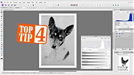
TOP TIPS: PHOTOGRAPHING YOUR WORK
In the old days of film, I'd point my camera at this card - it's an exact 18% grey. I'd half-press the shutter on my old film camera to read the exposure values and then manually set the camera to those values.
Then I'd take the photo - knowing the camera would correctly read white as white. Now, you can set the same white balance in a good digital camera... but probably not on your phone.
That's why your white paper inevitably appears to be grey. And I've noticed many people either don't know to set the white balance, or don't bother to do it. But you SHOULD! Because you want to represent your work in its best light.
If you don't have access to a scanner and have to use a camera then you need to correct its inherent problems. Because... Well... this is hardly a good sales pitch, is it? Or this? Would you want buy this? In the hope that it looks better in real life than it does here? Even in detail? probably not. It's dead. It's flat. it has no contrast. Always correct your photography, so your website or blog best reflects the quality of your work. And preferably, use a scanner. Even a combined printer/scanner will produce much truer-to-life images than your phone.
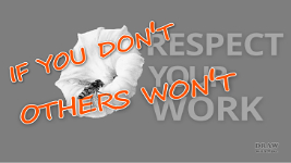
Respect your work because if YOU don't, others won't.
So let's explore one way to achieve that in detail. Now, understand this is MY way. There are many ways to achieve most things in Affinity, and no doubt I'll cover them in later videos.
DEMONSTRATION: LINE DRAWING
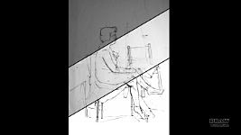
OK... I'll use an image that was part of one of my Advanced Drawing courses at Drawspace. Where we use Affinity Photo, or similar, to put compositions together from a variety of sources. It's something I often do, and we'll definitely look into that in depth at some future time.
For now...I'm going to use this lovely composition by Luzia. It's a collection of separate sketches compiled into a single image. And with shading to add weight to some of them - to bring them into the foreground. Now, I'm not suggesting you need to improve this - it's just an idea, not a finished drawing, but it is
excellent practice.
Have a go yourself. There's a download link below to Luzia's composition, and a copy of my finished result as a guide.
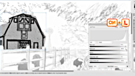
As a composition, it's looking good, but the pale background is making the story-telling difficult. So, let's fix that first - that's the tree, barn, and windmill - with keyboard shortcuts, which I strongly suggest you get acquainted with, because they save so much time!
First, the three sections need to be isolated. So... CTRL+J to duplicate the layer, so you can easily backtrack. I'll use the
polygonal lasso to isolate the tree. That's keyboard [L] for Lasso. Make certain polygonal is selected. Then, simply click your way around the tree.
Now I'd like to remove that shading and strengthen the line work. Open LEVELS with CTRL+L. Well, you could go to LAYER > NEW ADJUSTMENT LAYER > LEVELS... but why would you? Make life easy and learn the shortcuts.
I'm a PC user, so Mac-users need to use command for ctrl and option for alt in these videos.
WHITE at 77% and GAMMA at 1.536 is about as close as I can get to white. CTRL+D to Deselect the area. And I can fix that darker lower part separately by isolating it and using the DODGE tool but I'll come to that later.
Now the barn - the same way. Duplicate the layer. And Lasso the barn.
The darks lines are very weak, so open LEVELS. And move the black slider right to increase their value and intensity... 88% looks good. But now the white is grey and blotchy. Moving the white slider to more than 98% affects the blacks. So, we'll use the GAMMA midtones slider... about 0.86 has cleaned that area and taken it back to white.
Hmmm... It looks as though the windmill could have been done at the same time as the barn. Well, the LEVELS were applied to a mask, and that can be extended - or reduced. Open up and click on the MASK to select it. Select the BRUSH tool - shortcut [B] And press [D] for the Default B&W colours.
When painting on a mask, black removes parts of it, and white adds to it. We want to add the Windmill to the Mask, so paint it in with white... I think that's too dark. Well, we can paint it out again, but only partially. Press [X] to swap the colour from white to black. Now go up to OPACITY and set it to about 50%. Move the brush over the windmill to see the effect -
don't click, just move it. Change the opacity if necessary, but I think this looks OK - so, now I'll click, hold, and paint over it to lighten it. That looks OK, so let's rename it "BARN+MILL".
Now let's tackle the elements that Luzia shaded over. They're a little too prominent. We'll begin with the calf. You could use the LASSO again, but, as the shading is the same value overall, we can use the SELECTION BRUSH tool. Just paint over the calf. To quickly alter the brush size, use CTRL + SQUARE BRACKETS. If the selection strays outside of the shape, press ALT to paint it out. And to add areas, like the calf's back, press SHIFT and paint. That's ALT to SUBTRACT, and SHIFT to ADD.
OK. Done. Now CTRL+L for LEVELS. I want to bring out the line work while reducing the grey shading. White to 70% seems to entirely remove the shading. Now black to about... 54% strengthens the dark lines. But I'd like
some shading, so let's back off the white to... about 85% - before the shading becomes too grainy. And then lighten it with the gamma slider to... 0.34. CTRL+D to deselect. Well, maybe that's a little too light? Simply fixed. Open LEVELS again... and I'll decrease the white to... say... 90%. That looks OK. So, close LEVELS, and then CTRL+D to deselect.
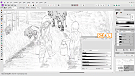
We'll do the same to the goat the pups the dog and the cow. The children now look out of place, as their line work is weak, and every other living element has been shaded. So, let's fix that.
We can use the Selection Brush tool again to isolate the two children. Turn on ADD - the other is SUBTRACT. Now we don't need SHIFT to add anything. And, as previously, we can use ALT to subtract from the selection... We'll need ALT to subtract here... We can ADD here, simply by clicking and dragging. And then ALT again here....
The Selection Brush looks for EDGES, so it's easier to contain and isolate the shapes of the children. Unlike the LASSO, which would make avoiding the adjacent drawing difficult.
Now, because we have ADD selected, we can move on to the boy without losing our selection of the girl. That's done... So, we can use LEVELS to improve the presence of their line work... I'm happy with that and want to fix it, but still make it non-destructive - that is, I'll be able to return to any layer to alter it at any time. I've copied it and flattened it. And finally, as they're still isolated and selected, we can make sure black is the foreground colour, and use CTRL-BACKSPACE to fill them with black. Or go to EDIT > FILL WITH PRIMARY COLOR. Obviously that just turns them into silhouettes, so reduce the opacity to around 10%. And we're done.
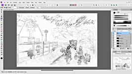
Well, almost. A final LEVELS adjustment to the whole scene will add a little punch. So let's combine all the layers into one single layer, because we want to adjust the entire scene. Turn all the layers on. Right-click on the top layer. And click the MERGE VISIBLE option. That conveniently combines and flattens everything into a single layer. CTRL+L for LEVELS, And a push of the black up to... 32% adds clarity.
OK... we've gone from this.... to this... That's quite an improvement. And now we really are done.
HOW TO TAKE GOOD PHOTOS
Right... I've been trawling through my collection of photos of my drawings from many years ago. All, obviously, taken with a film camera - not digital - a Canon AE1 in this case. And all on colour film, which was far more readily available than B&W in those days.
This one (Sealyhams] is a typical nightmare! It's not just bluish, it's a
gradation of blues from one side to the other. Save yourself a lot of time and trouble by always lighting your work evenly. Ideally, photograph it outdoors on an overcast day.
I used to place my work flat on the ground and photograph it from above.
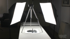
If you're photographing indoors, try lighting your drawing from both sides to spread the light. And photographing your work flat beneath a tripod works well. TOP TIP #1: Now stand a pencil or something similar in the centre and turn on your lights. Look at the shadows cast by the pencil. Then adjust the lighting until the two, or more, shadows match and mirror each other, and now you know the lighting is even.
TOP TIP #2: Another Top Tip - If your camera or phone has a timer, or remote control,
use it. A nudge when touching the camera to take the photo can cause blur or poor focus. So, once it's set up, try to not touch it.
TOP TIP #3: And here's another Tip... Photographing indoors or out - you should be as square to your drawing as possible. If you have a zoom lens, zoom in or out until you can just see space around the outside of the paper. Now move, tilt, and shift around until all four sides of your drawing are parallel with the outside edges of your camera's frame. Now you're accurately placed to take your photo without any distortion. You can zoom in again first, but if your camera or phone has sufficient resolution, just take it and crop the image later. My old Canon 20D had a resolution of only 8MP, but it worked just fine.
OK... where was I... Oh, yes... This is a nightmare. Don't do it!
You
can correct photos like this - and I have - but it's a very time-consuming process, and the results are rarely good.
So, you have your camera square to the drawing, your lighting is even, you've pressed the go-for-it button, and you perhaps have a photo like this... Well, in this case it's a
scan of a photo, which means it's now a digital image, the same as a photo in your phone or camera.
DEMONSTRATION: HEADCASE to SHOWCASE
As there isn't any colour in the drawing, reducing the image to greyscale will simplify matters, by removing the false-colour problem.
Go to DOCUMENT > CONVERT FORMAT > Click the dropdown box, select GREY/8, and click CONVERT.
Now we have the absence of colour, take a look at the HISTOGRAM. If you can't see it, click its tab alongside COLOR. And if the tab doesn't exist... Go to WINDOW > and check HISTOGRAM. It displays the values present, and their strengths. Black is on the left; white on the right.
So, at the right, you can see there's a band of pure white. That's the photo's white border. Then there's a sizeable gap before the values in the photo begin to show. So, we know there's quite a drop-off in value of what should be white paper, but is currently grey.
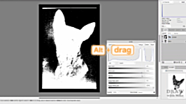
CTRL+L opens LEVELS. We need to move the white slider left, to increase the brightness, but... TOP TIP #4: here's a really useful feature.
Hold down ALT as you drag the slider. Keep dragging until the display shows your alterations are beginning to appear within the subject. Back off a little, and then release. That's as white as you can make it without losing the light detail. And it's close to perfect, because already the drawing is beginning to seamlessly flow into the white border around it.
So, that's as far as we can take LEVELS. But we have a number of options to make the background even whiter. We could use CURVES, but I want to keep this process simple. FLOOD SELECT is another option, but I know that will have problems with this image. Fortunately, there's a third option that offers more control. That's the LASSO [L]. Draw around the dog, INVERT the selection (to select everything that is NOT dog), and delete it. That leaves a transparent background, but a white background would be more useful, as we can compare it to the adjacent values of the drawing. Go to DOCUMENT > and uncheck TRANSPARENT BACKGROUND.
Quick progress check... This is looking so much better already. Let's zoom in a bit...
The white background is displaying the darker halo around the head and there's a couple of ways to treat that. You can select the DODGE tool [O], set it to highlight, and "paint" over the grey to lighten it. Or... which is my preference, you can ERASE it. You never know when you might want to use this image without its background, so removing it now will save time later.
And at any point you can resize the brush using the square brackets.
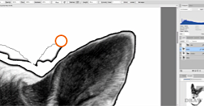
And setting the HARDNESS to about 70% will soften the edge of the erased area without it encroaching into the subject itself. You can carefully erase all around the head. But you can speed it up, and make fewer errors, by using the SHIFT key. Click the erase brush up alongside the head. Move the brush to the next spot you can safely reach
in a straight line. Press SHIFT and click to erase the section between the two points. Now press and hold the SHIFT key, and click your way around the head in short, straight lines.
The signature is awkward. So, I'll LASSO around it to isolate it.
Then cut it [CTRL+X] and paste it [CTRL+V], which will automatically place it onto its own layer. Now I can use LEVELS to lighten the background and darken the signature. And maybe use the ERASE tool to remove any stubborn parts. Let's turn it off and get back to the body.
Well, the base is a whole different story. The white of the dog needs to be brightened as well as the removal of the unwanted background. And there isn't a defined lower edge, so that will need to be faded out. We could isolate it, so we don't affect the top half, and use LEVELS. But I'll begin by copying it for safety, and then using the DODGE tool. DODGE gives us good control. I'm choosing a large brush that's very soft. Pass the brush over an area and it will show you what the result of using it would be. You can alter its intensity by adjusting the OPACITY. I'm opting for 10%. You can repeatedly brush an area to lighten more, but you can't as easily darken it again.
Click the arrow and use the slider. Or simply click keyboard 1 for 10%. 5 will give you 50% and so on. And if you want, let's say 48, type it more quickly... 4/8... there, 48%. That allows you to very quickly alter the opacity - the strength - at any time while you're using the tool.
The reason this lower part is darker is because, despite the careful lighting, there is a slight gradient from top to bottom. That means
you can't treat both at the same time. Any attempt to successfully lighten the lower half will OVER-lighten the top half.
Apart from the lower hard edge, I think that's OK. I'm going to use a very soft ERASE for this edge. And, I don't need to avoid the signature, because it's on a separate layer and turned off. Now, this is a major cause of frustration... the eraser doesn't appear to be working...
Well, we're
ERASING, so we can see through to the layer below.
TURN IT OFF. Slow and steady... gradually fade out that lower edge.
There's a fault. That white hole is easily fixed. Call up the CLONE tool - shortcut K. Make the brush soft - about 50% - to avoid any hard edges showing. Place your brush over an area that roughly matches the missing part. Press and hold the ALT key and click to select it. Now go back to the hole and Affinity Photo will show what applying it will look like. If it's OK, just click. We're nearly there. And the background has now been completely erased around the head.
TOP TIP #5: And here's another top tip I often use. To ensure you've
completely removed the background... go to LAYER EFFECTS > OUTLINE > Increase RADIUS until the outline appears. Now go around the image and erase anything you missed. This way, catches all the errors from small... to large. All those marks you might regret missing later.
And when you've finished, turn off the outline.
Finally, I'll combine all the layers. So, turn on those you want to include. Not the old LEVELS layer! Nor the ORIGINAL image. Right-click the top layer and choose MERGE VISIBLE. I'll name it FINAL. Then I'm going to try LEVELS once more just to fine-tune it. A little extra black - 6% - gives it a touch of extra punch.
If you want to check it at its full size - that is, 1-to-1 - use CTRL+1. Now 1 pixel of the image is 1 pixel on your screen. Or 100%, as it says up here. And if you press the SPACEBAR, you can drag the image around to check it all. Everything looks OK, so... CTRL+0 takes us back to FIT TO SCREEN. And we're done.
CONCLUSION
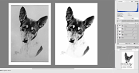
We've gone from this... to this.
If you are trying to sell your expertise and attract commissions, or sell prints, which do you think would be more effective? No contest, in my opinion. So, there you are... Respect your work, and others will respect it in turn.
© copyright: Mike Sibley 2024

 Remember Starving-Artists.net? Mike ran that popular artists showcase site for over 10 years, and cleaned and enhanced every single image in every gallery before it was posted. And he's cleaned some real horrors!