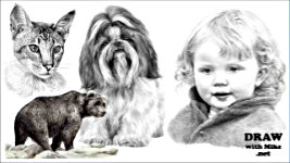
Transcript
As well as the drawing of Spots and Patches, and ways you can use hair to nail the story you're telling, in this final part we'll explore the often-difficult subject of representing COLOURS in our purely black, grey, and white medium.
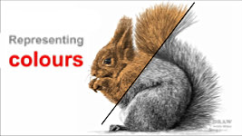
I'm fairly certain this is a red squirrel, but it could be grey - or green, or blue. From our point of view, as graphite artists, it doesn't matter, because
it's the same colour overall. What's important here - and which Jolanda has clearly portrayed - is the quality, length and
feel of the hair. And the overall lightness of value, which tells us it's not black.
You can instantly tell from the deep V-shaped shadows between locks that the hair is relatively short. That it's soft, because some locks visibly bend and curve. And that the hair is layered, because it parts as the body flexes. But what about when clearly depicting the colour really matters?
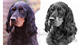
Here we have Jolanda's "Ivy, Senja, and Dolly". Ivy is quite obviously Black and White. And, more crucially, Senja is not. She could be light brown to a rich red, but she IS coloured. And Dolly could be a tabby in a variety of browns, but not black and white. In reality Ivy is a typical B&W Border Collie. Senja is a rich red, bordering on ginger, and she clearly has a light brown nose. And Dolly is a brown tabby. But I think we already knew that - based on what we can see, and our general experiences of cat and dog colours. Jolanda has done an excellent job of translating the various values into distinct and "recognisable" colours.
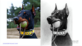
Here, in Jolanda's Doberman drawing, you instinctively know which parts are tan coloured, and - despite similar values - which are highlights in the black hair. The nicely-judged boundary of black and tan tells us there are two colours. And then we know to read the top of the lip as tan in full light and not shiny black hair. Hitting that right balance of colour versus highlight is critical. Viewers of your drawing have never seen the reference, so you need to find ways of telling your story very clearly.
Colour vs B&W references
As we saw in the previous video - do not draw from B&W photos, or turn your coloured photos into B&W. As you've just seen, you immediately give yourself a major problem. How do you know what is tan - or brown, or grey, or blue... or what is highlight? Is this highlight or tan? Highlight. Or this? It's tan. Perhaps that's not important in this context? But you've removed the option to display it. work from colour. You need that information!
Now, I'm not advising that you only work from colour. There are times that having both coloured and B&W references is really useful. For example, colour will show you which areas need to be treated differently to clearly describe their colours. And, perhaps more importantly, permit you to follow coloured patches that pass through dark areas of shade. And, with the distraction of colour removed from your reference, a B&W copy can often increase your perception of the detail. Work with both colour and B&W, or just colour. But not solely from B&W, because - and there is a real risk of this occurring - a B&W reference might fool you into copying its values. So, as I said, you
need that colour information. You are not copying values, or drawing the photo. You're telling me, the viewer, about your feelings for the subject; emphasising what you consider beautiful or interesting; interpreting what you see, and drawing the subject the way you see it.
Interpreting Colour
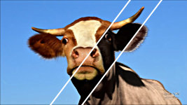
Often that interpretation includes describing the colour. And that's an art in itself. Let's take this REDDISH-BROWN cow. If it's drawn too Dark, it suggests the cow is black. What else could it be? Base your values on a scheme that's too light, and you suggest it's a washed-out pale brown. But, judge it correctly, and it will look red, or once it's translated into graphite, possibly mid-brown. But if colour
really mattered, you'd be painting and not drawing. Some subjects, like sunsets - lovely, isn't it? - Well, they simply DON'T work in graphite.
And neither does this cow - at least, not as well as it could. It's using the values from the original photo. But we can describe the detail and three-dimensional form more clearly if we apply some artistic licence. So, let's just adjust the contrast a little. Brighten the highlights and darken the shadows. Because we can do that without affecting the suggested colour. Perhaps the body is competing for attention with the head? So, let's soften the body detail. That suggests recession and throws our attention onto the sharper face and head.
And that brings us to a common problem, where either a lack of sharpness - or simply a lack of understanding - is evident. Spots and coloured patches that don't reflect reality.
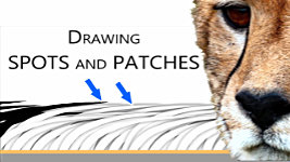
Spots and Patches
What I'm about to say might seem obvious - but it's the solution to an error that I've often seen -
SOLID SPOTS. Spots are
hairs, not blobs of paint. And patches are areas of different coloured hair, but they are still hair. This Dalmatian has spots of black hair... within white. It's laid down layer by layer and, depending on the direction of growth, the black hair overlaps the white hair on one side of the spot. The black hair is a continuation of the white hair that simply changes colour.
This Cheetah's eye-stripes are dark hair passing through a lighter body.
So often, I've seen them drawn as though they are painted on.
They aren't - they're just long narrow patches of hair. So, it pays to emphasise that it IS hair. Even if it looks solid in your reference, you know it isn't. So, draw it to look solid but using hair-like strokes. Sufficient detail will always remain within your marks to announce, "this is hair". The difference is subtle. But you're representing it in its natural form. And you're not omitting the overlaps.
The lighter hair will overlap one edge. Along the other edge, the hair of the stripe will overlap the light layer. Those edges, as well as the internal detail, are critically important. They're what differentiate between a sharp-edged, painted-on stripe, and a stripe as it naturally occurs. So, whether it's a stripe, patch, spot, or just an area in deep shade, never be tempted to just "block it in". Always create it with hair-like strokes that reflect the hair's length and following the direction of growth. It takes longer but, in terms of the realism being conveyed, it's time well-spent.
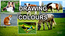
Drawing Colours
Apart from bleached, deliberately coloured, or grey highlights... we humans each have hair that's a single colour. Whether the subject is a natural blonde, a self-styled blonde, or has wavy brown locks; perhaps a grey-haired man, or an elderly woman. Or a girl with raven black hair, or a spectacular redhead... oops... or a spectacular redhead... We have just one colour. So, whatever type of reference you're working from, representing the colour in human hair is relatively simple.
However, dogs cats cows horses and ponies and other animals often display
multi-coloured coats, which complicate the drawing process. Experience is the best teacher, but you do need to decide before you begin how you're going to best tackle the problem.
Back in the days when I used to exhibit my work at major dog shows, there's something very satisfying about hearing someone say "That Black Retriever's lovely... but I adore that beautiful Brown spaniel!" Yeah! Success! :o)
Colour is where slavishly copying a source photograph will get you into trouble. You need to engineer your tones and values for the colour differences to succeed. If, as we saw earlier, you're drawing a black and tan dog, your values must be pitched so the eye can distinguish between a highlight in the black and the body colour of the tan. So - and I promise this is the last time I'll mention this! - if you habitually work from B&W references, so you can copy the values more accurately, you really have... shot yourself in the foot!
As I mentioned, there's something very pleasing about overhearing: "What's the Brown dog looking at? Oh, it's a crab!" Instinctively assuming the colour you intended. To the eye, a brown dog will appear lighter than a black one; and a fawn or wheaten one, lighter than a brown - even if the other colour isn't present. When it is, the comparison is immediate. One has to be black and the other brown. If the perceived colour is important to your drawing, you need to carefully consider your tonal range before you begin.
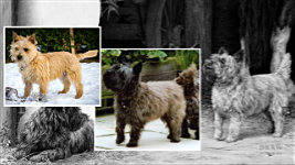
For example, The Barn Patrol contains a black dog, and a brindle and a wheaten. In this case, the reference for the wheaten was brindle, so its colour was manufactured, using a completely unrelated dog as a guide.
Using those three colours was purely a commercial decision, because they're the three main colours of the Cairn Terrier - and I want to sell prints... So, making obvious distinctions between the colours was important.
And, you have to pitch your values so the eye can distinguish not only between a highlight in the black and the tan body colour, but also between the tan and cast shadows. Context plays a large part in that, but you can't be too careful.
Nailing the Story
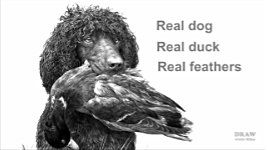
Finally, hair, whether it's human or animal, has more uses for the artist than merely clothing the subject. Little, for example, better connects a dog to the bush behind it than the interaction of a leaf or two pushing the coat out of place. Often the smallest interaction between hair and situation will greatly increase the sense of reality. Such as, firmly connecting a mouth to the duck its retrieving. This Irish Water Spaniel, as I mentioned in the previous video, originally held a pheasant in its mouth. In substituting the much bulkier duck I had to remodel the top lips - to stretch and spread them to accommodate it. That in turn, affected the feathers. So, they've been pushed out of place by the lips, firmly melding the two into one believable whole.
When you think "real dog", "real duck", "real feathers" as you're working, these things appear to be obvious. But think "drawing" and you'll miss the opportunity to raise the level of perceived realism. "Perceived" because I'm not aiming at photo-realism, just a natural connection to what you expect to see in real life.
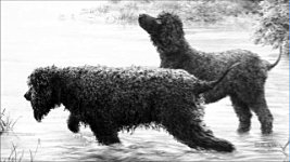
We instinctively know the difference between wet hair and dry hair. If you stand a dog in water and draw wet belly hair and fringes, you immediately tell the story that it has been wading and splashing but not swimming. And here, there are four identifiable states...
•
Completely dry. No wet tell-tale highlights. No heavy clumping of locks.
•
Absolutely soaked. There are bright highlights, typically associated with water droplets - but not so bright that they'll attract unwanted attention. The hairs are heavily clumped together. It's naturally darker, too. And there's that wet belly hair again.
•
Wading. More wet belly hair - but, although the belly, legs, and ears are wet, the body is noticeably drier.
• And a mere spectator.
Standing in water. Wet legs, but otherwise quite obviously dry.
Keep environmental influences firmly in mind. As you draw hair you have to take into consideration what movements your subjects are making; how they are interacting with their surroundings; and how their hair will react to these factors. Try to picture the motion of the hair in your mind and it will become an ally in the telling of your story.
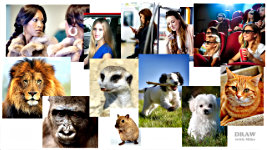
There's an important quote in my book - Drawing from Line to Life - from artist Rebekah Lynn, who said: "If you can't draw hair from your imagination, it means you don't really know what hair looks like. There's a simple solution. Study it." So... study it. As often as you can. There's hair everywhere you look. Your own in a mirror. Folk seated in front of you in a car, on the train, or a bus, at the movies. Lions, Gorillas, Meerkats, Mice - at the zoo, in photos online, the local pet store... well, maybe just the mice. :) Your dog. Your granny's dog. Your neighbour's cat.
And don't just look...
explore. Study the way the hair shifts and parts as the subject moves. If you can, run your fingers through it. The
feel of it will last in memory much longer than the physical details. Twenty something years ago I buried my face into the luxurious coat of a beautiful Samoyed - to the embarrassment of both the owner and my wife - but I remember the texture to this day.
Whenever you have the opportunity to handle any hair - don't let it pass. If it's too big to handle... improvise. :) And if you can't feel it, at least take photos, and study the hair as the subject moves around. Do whatever it takes, because you're building up a comprehensive mental library of images, experience, and understanding. Invaluable information that you can recall as you draw.
We have friends who rescued a young rabbit from their hay baler. They raised and domesticated it. So, I had the opportunity to photograph, and stroke, a wild rabbit up close. And include it in a composition that I use in many of my workshops. Drawing what you
know is always better than drawing what you can see - or think you can see.
And, once you get past thinking about how to draw hair, you can begin to look at it objectively. Wild and windy for example. Well, "they'll do for facial details", I thought, and "I'll return another day to photograph them properly". But then I realised the windblown hair of these Afghan Hounds serves two purposes. It forms a direct connection between the two dogs, unifying the arrangement. And it allowed me to display their entire faces, which are rarely visible when the coat is this long and profuse.
British cartoonist Gerald Scarfe once said, "I never use the first idea that occurs to me - because it's already been done." The same applies here. When drawing or painting Afghan Hounds, almost all artists concentrate on the long flowing locks. I decided to concentrate on the dogs as dogs, not as mobile display-stands for a fancy hair-do. Oh, I've done that too. Because, commercially, it makes sense to appeal to the greatest number of owners.
So... if there's one aspect of drawing hair I'd want to emphasise, it's: Don't
DRAW - THINK. That is, don't look at values and shapes and draw them. Think HAIR. That single mental change in approach is all you need to raise your game. That said, don't expect instant miracle results. Every error you make teaches an invaluable lesson. Take it one small step at a time, and let your skills develop naturally.
Whether the hair is long, short, curly, black, blonde, red, human or animal... The same techniques apply. All the hair drawing techniques we've covered in this, and the previous videos apply equally to feathers, fleece and other skin coverings. And, indeed, relate to any texture on any surface.
•
ANALYSE what you see: you know it's soft to the touch; or coarse and wiry; or smooth, or gritty; or sharp, or blunt. Wet, or dry.
•
EXTRACT the visual clues that are telling you that. The signals you instinctively decode to understand what you're seeing. They are there. Then...
•
BUILD them into your drawing: to transmit the same message.
You know this is smooth. You know this is wiry. And this you know would feel soft and woolly. Explore and discover why you know that. If there's a "secret", that's it; analysing why each coat texture looks the way it does. Then you build your findings into your drawing. If you successfully extracted the right signals from the source, then you will inevitably send the same message with your drawing.
Wiry hair, for example, has deep, sharply edged shadows where the hair parts, and very hard edges. Smooth hair, because it doesn't clump into locks or contain deep gaps, reflects light from an almost seamless surface. And conversely, long wavy hair looks the way it does because it does contain curving locks of hair with sinuous highlights and shadows. And the lack of hard edges tells us it will feel soft.
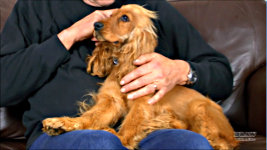
This is Hettie - who joined our family two weeks ago. Her body hair is smooth... but not shiny. The visual clue is that it doesn't reflect much light, so there are no shiny highlights. Her lovely wavy ears are a mass of complex curls. Each casting shadows and reflecting light. And the hair is thick and heavy enough to form separate locks. Her facial hair is relatively short. It reflects enough light to display its three-dimensional form, but - like her body hair - no bright highlights. So, it's smooth, but not oily or shiny. And the hair on her head is wonderfully fine and soft. And, unlike her ears, the hairs remain separate and don't clump together into locks.
Run your fingers over and through the surface - mentally if you can't do it physically. Determine its texture and, with your newfound knowledge, picture it in your mind as you work.
To achieve a sense of realism - knowing how it
feels will make a ton of difference to the way your drawing looks.
Observe, research, and then draw what you
FEEL.
© copyright: Mike Sibley 2023