Workshop Plus
WORKSHOPS 2024
- Latest posts:
- Luzia
UK, USA and Canadian Workshops and Online Course continuations
Luzia (Drawspace online - Intermediate)
As for the paper, I hate it. That's all there is to say about it.  I have one more kind to try then I'll just order from you.
I have one more kind to try then I'll just order from you. 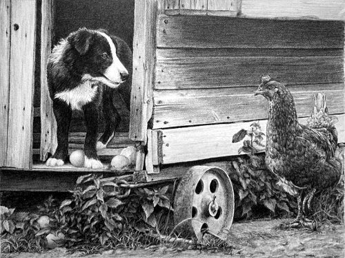 First, although your paper's texture is interfering with the drawing, I've seen far worse. I think you'll like the Conqueror Diamond White I use. Very smooth and doesn't interfere at all, but it still takes soft grades well.
Second, this is an astounding result! I admire it, and your skill, in many ways.
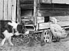
As usual, I'll begin with the henhouse and work my way forwards. But first, I must commend you on your wide choice of values. The strength of your darks has added a lot of depth to a composition that is not displaying much. The interior of the old henhouse recedes really well, the space beneath it is both dark and solid, and the shadow cast by the protruding nest box has a lovely natural feel about it.
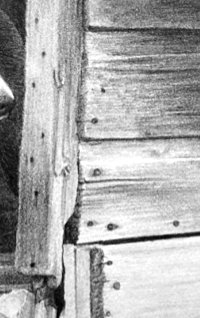
The drawing of the wood, with its subtle textures and splits and decay, is very believable throughout. I feel I can drag my fingernails over the surface and feel every bump and groove. The nail heads are not only non-intrusive, they're also very believable. There's a natural sense of randomness, as some stand out proud, others are sunk in with rust staining filling the depressed wood around them.
It's so easy to over-detail a secondary element such as wood and its features, so you did well to avoid that. The nest box I mentioned earlier is obviously protruding, and you've engineered its shadow to give Henrietta her due prominence.
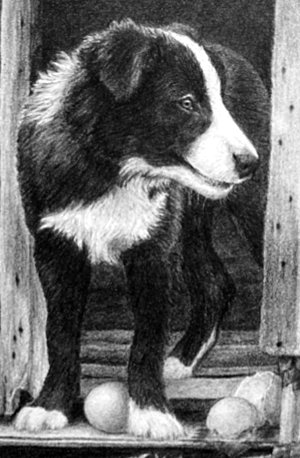
Robbie the dog looks not just delightfully hairy but naturally, too. And with a good overall texture.
I feel you were living within the scene as you drew it, because you've included things many people omit. For example, where others would think his back is dark and just block it in, yours clearly has a covering of hair. Even the reflected light running down his back, which separates him from the interior wall, widens to conform to the bulge of his hip. And, of course, I really have to commend you on Robbie's alert and watchful eye. The juxtaposition of brilliant key highlight against the black pupil pulls our eye to him immediately. And because he's interested in what's happening, so are we.
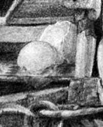
And I must mention that you're the first artist on this course, in over sixteen years, to have drawn the white albumen of the broken egg slowly sliding off the step!
Wonderful!The eggs themselves contrast well with the softness of Robbie's hair. They're smooth and matte, which benefits both hair and shell. And the broken shell of the right-hand one has an obvious thickness that tells the story of the mishap well.
The key to succeeding with composite compositions like this one is to always be aware that you have to connect the elements and make them live together. Neither Robbie nor Henrietta ever saw this henhouse, but your attention to detail, and your story-telling, have knitted everything together excellently.
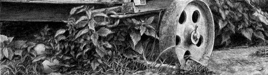
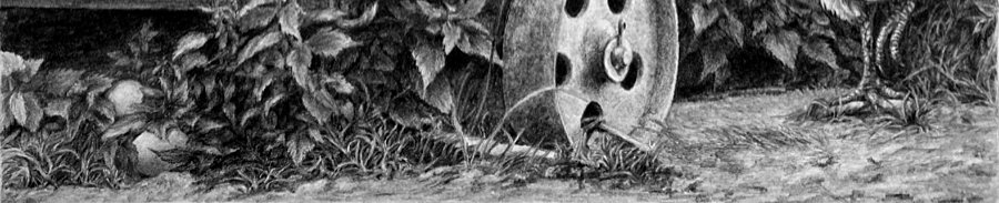
Moving on to the weeds, they possess good depth, and that's due to the deep shade you established beneath the henhouse. It's given you the opportunity push some of the weeds far back and create instant depth. There's a definite sharp-edged foreground too, and a midground that nicely connects the two. That weed to the left of the wheel, for instance, is clearly growing from under the henhouse and bending forwards into the light. The more I look at your weeds the more I discover. Even though the fallen eggs are clearly visible once they've been discovered, you did a good job of hiding them in the weeds. I often enjoy hiding little things in my drawings for the viewers to find some future date.
I had some issues with the hen, she didn't want to be drawn. I argued with her for a while and eventually she gave in. Her feathers started looking a little like scales and I realized I wasn't following your instructions and was over-detailing each one. So I stopped that and it seemed to go in a lot smoother.
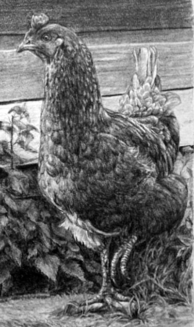 Well, you won the battle! These are amongst the best feathers I seen. She IS feathery but I see HEN and not FEATHER. But when I look closely, the individual feathers I see are naturally curved and quite realistic. Overall, she has a wonderful feeling of solid form, and she appears to be transmitting a sense of outrage about what might be happening to her precious eggs.
 The foliage behind her made it hard to tell where her feathers stopped and the leaves starter, so I switched it to grass.
That you made the conscious decision to change what wasn't working tells me a lot. You absolutely have to be living in, and creating, your own world for such things to occur. At least, to achieve the degree of success you accomplished.Returning to Henrietta - there's one area that presents the most problems: separating her head from the wall behind. The wall is necessarily mid-values, as it Henrietta. But you've made excellent use of edge highlights to achieve that separation. Well done.
Finally, the foreground, where often less is more. I personally leave that area until last, because that permits me to use it to balance the whole and draw the eye in to the composition. I think your foreground does exactly that. It contains plenty of interest if my eye strays to it, yet it doesn't dominate the scene.
This is a truly excellent result, Luzia, and I've thoroughly enjoyed working with you. Thank you!
Workshops UK
Tutorials
by Mike Sibley