Transcript
When you merely copy, you're working from a flat and two-dimensional reference, and that can only result in drawing shapes and values. You lack the information to do anything more. But, once you learn to explore and analyse what you see, your two-dimensional knowledge becomes both three dimensional and linked to emotion.
Being three-dimensional in memory, you can turn it and study it. You'll gain an understanding that forms a solid picture in your mind, and that permits you to play around with the object, and create features and textures spontaneously from your imagination.
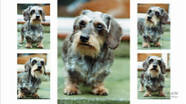
Here's a drawing produced by artist Glyn Rand in one of my Foundation workshops. As soon as I saw it, I knew he was understanding and thinking as an
artist and not a copyist.
Glyn interpreted the reference - and could do so only by
thinking about what he saw. He soaked up the information from the reference, processed it, compared it to what he already knew, and then produced an informed interpretation.
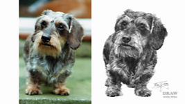
How do I know that? Touches like this... Remember, this is a composite composition. This leaf sits on this leaf only because I placed it there - in Photoshop. But Glyn knows it needs believable form and, far more importantly, it will cast a shadow. And knowing that only occurs when the artist is
creating something real. That leaf is no longer something to copy. In the artist's mind, it's a living leaf, poised above another living leaf.
The same applies here. The reference displays an almost flat, bland leaf. Glyn has brought it to life, by understanding that the leaves above this one will cast their shadows on it. And that the sunlight will light up the tip.
When you stop, absorb, and think... you transform the flat reference into a scene that lives in your mind. You are creating your own world, in which you become immersed. I know Glyn did that. For proof, you only have to look at his ivy, growing along the dressed stone... It has: form, three-dimensional lighting, cast shadows, depth, and a sense of reality - without being faithful to the reference. But that ceases to matter, because all the key elements - the Visual Clues - that identify real three-dimensional Ivy are in place.
What has this to do with texture?
Everything! Because it's texture you're drawing. Texture that's three-dimensional and altered by light - but it's a surface, and every surface has a texture - even a totally smooth one, because being totally smooth is what best describes it.
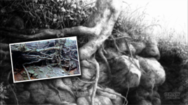
Here's the tree reference I used in Overlooked! Although it's a poor-quality photo, I was determined to use it in a drawing someday, because the exposed roots intrigued me. So, I reversed it, sketched the relevant parts... and put it away. Then I built on that, using my knowledge of tree bark (which I played down), and the growth habit of the tree and its exposed roots. I could, of course, pull some information from the reference (despite its poor quality), but here's the kicker...
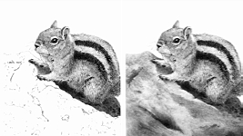
The more you draw, the more you see, the more you retain. You cannot help but look more closely at the world around you. And you'll soak up that information, and remember it for future use. We can't help it. We're detailed-orientated pencil artists. and to 'look' you can add 'feel'. Because we feel more acutely too, and retain those feelings. And that's important, because to reproduce a texture, you have to know how it looks and how it feels under your fingers. Here, you need to feel the difference between Rabbit hair, Tree bark, and Rock.
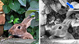
The same applies to this composition too. And, once you can do that, you can make good use of poor quality references, because you use good quality images, and your imagination, to supply the missing detail. For example, I deliberately used a soft-focus rabbit in the composition, because its pose best suited my requirements, even though it's undeniably short of clear information. But it's a good exercise for artists at the workshop to have to think and not copy. So, I supplied this one as a repair reference. You can't clearly detect the rabbit's various hair textures in the composition, but you can in this one. So, you use the second to provide an understanding of the first. Or, looking at it another way, you draw the second, using the pose of the first. Either way, you correct that fault, produce believable and realistic textures, and get to use an otherwise useless photo that happens to have the preferred pose. And, of course, you're no longer copying. You're
thinking and understanding - taking textural information from one image to apply to another. You'll remember those textures too, and, over a period of time, you'll amass a sufficiently large mental store of information to draw many textures without the need for references. Like this....
I drew the guidelines, but this is my wife Jenny's drawing of a Golden Mantled Ground Squirrel. The Ground Squirrel is relatively easy - we had a good reference, and all the edges are clear and sharp. But, without a reference for the rock, Jenny found she had problems. So I advised her to
take her pencil for walk:) In other words, to make a random mark; to let that mark suggest the next; and let those suggest the form of the rock - bearing in mind that the light is shining from above left. Let me show you how easy it is, once you wean yourself away from always relying on references.
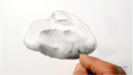
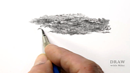
ROCK DEMO
We'll use this round shape as our guideline, make the prior decision that it's a smooth rock, and just let the marks create the rock's form. Make that first mark - it could be a short thin line, a broad squiggle, or a small, soft-edged patch of variegated tone. You need know nothing more than the basic details - such as, how you think it would feel. Smooth? Gritty? Rough? Sharp-edged? I think smooth, in this case, but I know nothing else about it, apart from the direction of the light. In fact, knowing more could be a hindrance. Ideally, clear your mind of all preconceived ideas.
If your marks or shading look like part of a surface feature - an edge, a hole, a chip - expand on it. If not, draw a second... third... more marks, until it triggers something in your mind. Here, I have what looks like the beginnings of an area of partial shade. Well, the light's shining from up here, so this could be an edge where the rock turns away from the direct light. In that case, I know the rock will be lighter above my patch. And I've decided to make the edge more angular, to emphasise that change.
I often begin shading an area with a 2B chisel point, until it reminds me of something I've seen, resembles a known feature, or suggests an area of shade or highlight. Vary the weight as you work. That way you might create, for example, a dark mark that looks like it could be the edge of a depression. You know the lighting direction, so work on that depression according to the light. Be subtle. Just let your pencil graze the surface - skate over it lightly. Or, if you've chosen your rock to be rough or broken-surfaced, attack it with more force.
This rock is smooth. Some marks might suggest surface imperfections, but I want this to be fairly free of distracting dark marks, or even visible pencil lines, so I'll lightly blend it - avoiding any sharp edges, because blending will soften them. Blending will also gently shade light areas, and remove white, which rock doesn't naturally display.
This area at the base is obviously going to curve beneath the rock, away from the light. Here, I'm happy for the paper's tooth, and surface imperfections to suggest a rougher surface. I'll use circular shading too, to create little bumps and hollows - not deliberately - I'll just let them form spontaneously. It's all happy accidents - serendipity. Make marks and welcome the random result. If you recognise it as "being something", develop it. If it means nothing to you, alter it, shade over it, attack it with Blu-Tack or a kneadable eraser. Have fun! Just keep how it feels in mind and let your mind dictate the result. And, before you're aware of it, you'll have a solid, textured rock that appears to be highly detailed... but it only took a relatively short and enjoyable time to create.
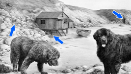
Thinking this way while you're drawing textures, leads to a wider treatment of what you're drawing - or composing. For example, the rocks were loosely based on reference photos - but the cliff face is entirely imaginary. As are other aspects too. Because I wasn't tied to references - apart from the dogs that
have to be accurate - I could easily immerse myself in the study. As a result, it became apparent that some way to access the sheds was needed, so the access path was created. Not an actual path, but the posts and partial handrail suggest it's there. The empty area beneath the raised shed would be a natural place for storage, so the crab pots and barrels appeared. The boat would not be left untethered. The right-hand end of the cliff could lead your eye out of the picture frame, so the cave was excavated. That feeds your eye down and back along the seaweed at the high water mark.
When you completely rely on references, and copy what you see, you are seriously restricting your freedom to imagine. It simply doesn't produce the best results. Conversely, by conducting a little research; by verbally describing and physically feeling textures; by thinking and not just looking; you add understanding to the finished result.
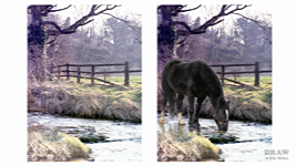
When you just draw what you see, that's all you can use. But, when you understand what you're drawing, you can be far more inventive in your description - even to the point of being almost abstract. These all feature the same element - and, despite the variety of styles, I'm quite certain you immediately recognised it in each one... water. As long as you include the Visual Clues you discovered during your research, the viewer will instinctively recognise what you've presented.
In Whistlers Cove, I know the rocks will reflect in the water. That the dogs' reflections will spread across the surface. That the submerged seaweed will be less sharp and contrasty than the seaweed on the surface and rocks.
When you break your connection with references, you attain freedom to invent. For example, this is another composite study - this time with Tom, and it's based on a dire, fuzzy reference. But maybe 'fuzzy' is a bonus? Because it forces me to interpret. The misty background contains vague shapes that I can make use of or discard. And I can see the midground tree is covered in ivy, but not the details. I like the idea of covering my tree in ivy too, so... pure invention - with a nod to the reference.
This is important: the textures I'm demonstrating, and the techniques used, are intended to convey the
feeling and essence of the texture, not to be photographically accurate. My contention is that if the drawn surface can be clearly read as being only that texture - it's done its job. In fact, that might actually be better than reproducing it exactly, because it's more immediately understandable.
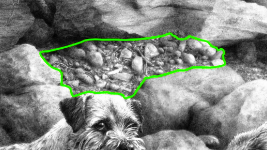
ROUGH GROUND DEMO
So, with that in mind... let's have a go at spontaneously creating an area of rough ground... Well, maybe not THAT rough! But I need to have some idea of what to expect in this scene. So, I'm thinking this area is relatively flat, but not this stony... probably bare earth - perhaps roughened by an animal constantly moving over it. Maybe a few stones have risen to the surface? And perhaps grass and weeds have been trampled.
OK, so that's painted a picture in my mind, without being in any way specific. So, let's make a mark and see where it leads us.
I like to use a chisel point for this - a flat face for soft lines, and a sharp edge for when I need hard edges. So, let's make a start with the first mark. That first mark leads to others... I'm thinking 'broken ground'. Basically, I'm making marks and then thinking, "what does that remind me of". Maybe this slopes down to there... no, I've changed my mind - I think it would be more like that... and that shape could be a stone… There'd be a bit of shadow beneath it here. Oh, it's a stone in a hole - it has to be because of that shade there. Darken down this side and leave a bit of highlight on top. That's a bit too light overall, so let's darken it some more.
That could be something... that shape. Let's add a cast shadow. It could be a blade of dead grass or a weed, or a piece of straw. Knock it back a little bit... a little more shadow beneath that. That, I don't actually like - I'll split it from that one - and I'll make this more of a hole...
And all the time, I've no idea what's going to appear. I've just got this rough ground idea in mind.
I don't want it to get too busy, so, a little flat area in there. I'll drop the weight off a bit now, and that's something new appearing... more dead grass I think... although I don't know what it is, but I don't need to know what it is. I'll put a bit of shadow under it, to raise it off the ground. I'll add a few more random lines to stop it looking too linear. More random marks, to see what they might suggest. I'll take the white out... It's losing a bit of interest in here, so I'll give it something to lift it... Another pebble I think in there... I'll flatten that area, so it's not too busy...
It's beginning to look like broken ground now... It's going to fade here, because it's a receding plane, so it will become lighter with distance, and less sharp. It's not that distant, of course, but it will recede. And it will attract less interest too, so overall it looks less busy. And all the time I'm just making marks and trying to make some sense out of them. There's a little shape appearing there... so, I'll develop it a bit... That's a hole... There's a bit of a straight line there, so I'll just nick into that, to stop the eye seeing it as an unnatural straight line.
I like those lighter pebbles... I'll keep this area light, and relatively flat, with a little interest in it... and kill the white...
The result is almost always something that possesses a sense of reality - simply because you're constantly recognising reality in what you're drawing. Let's take this back to more natural size... this is a local area technique, not one for broad vistas.
Using this method, you are unlikely to create areas that don't look real to you, or at least suggest something you've seen. For example, in this drawing, apart from the rope, the ground was the last section to be drawn. It was intended to lead your eye in, and tie everything together, but without attracting unwanted attention. Yet, if you look deeper into it, you will find small features that don't look out of place.
Again - because decisions cannot be made until the context has been created - the floor was the last area to be drawn. In this case, old flagstones suggested themselves. And they were shaded in small sections - deliberately inviting irregularities to occur - because that variety suggested dips and crests in the surface. As they appeared, I'd stop to develop them before moving on. And foremost in my mind was their texture - smooth but gritty - like fine sandpaper.
And sometimes I'll draw spontaneously in areas within a drawing. It might be more controlled, but still not in any way planned. I knew, for instance, where all the rocks would be positioned. I had lines containing the areas of foliage - without knowing what the foliage would look like, because that too was drawn spontaneously. But this area...defeated me.
I didn't want it to be another rock, because that would cause too much separation between the scene and the dog. Too bland, and the dog would be too dominant. So, as I told Jenny with her Ground Squirrel, I "took my pencil for a walk". I made marks that suggested forms. Those forms suggested adjacent forms, such as the feather (which ties in with the feathers below the dog); and the bits of twig, that reflect the tree above. Many shapes are organic and abstract, but that's OK in a natural world, where not everything is completely clear all of the time. Textures arose that created the bumpy, debris-strewn section between the rocks. And everything, from twigs to pebbles, received the textures they needed, not by using references, but because I know how each one feels - and how they differ from each other.
EXPLORING A POTENTIAL REFERENCE
I have a love of anything old and partially derelict, because it contains the most wonderful textures. The last time I held a Canadian workshop in Calgary, I was introduced to this abandoned barn and farmhouse. I took many photos of the barn,and a few inside the farmhouse. And a few outside - particularly of areas of textural interest. The old putty in the window frame, the curves of the warped and weathered boards, the bent nails... they all tell a story.
Well, despite the huge barn, and house, I'm only going to choose a small portion to explore for textures - and consider what we can do with them. At this scale, the photo begins to degrade, but that's not a problem, because we're not copying it - just using it as a reference to interpret.
And I'm going to cut it down even more.
I like the nails but not the width of wood that puts the nails too far right. So, let's move them. Then crop away the unwanted right-hand side. And the lower quarter doesn't contain much interest - so let's crop that too. We could reduce this to guidelines now, but instead, let's pause and consider what we are about to draw. Exploration now will avoid errors later, and we'll gain a much deeper understanding.
For example, there's obviously a board missing. There's a nail hole here - which the sun is shining through to create this bright spot. And another hole here where the missing board was nailed into place. So, what's behind it? Well, it looks like bitumen roofing felt, but it has water stains, so it must be porous. Maybe it's thick card of some sort? Or perhaps hide? And behind that is a black hole... except... it isn't. It's the shadow of the card.
Despite the distortion caused by the curled surface of the card, you can easily plot its main shapes. This section of edge, for example, is clearly this edge - and so on. There is, however, no way of finding out what happens here. No amount of lightening the reference will produce any information. It's simply black. But it's still not a hole. Why? Because, once again, we can take a section of edge and, allowing for distortion, match it to the shadow's shape. And this hole is letting light through to here, where it's shining onto ... something, which I think is both card and wood.
But wait... there's a nail here... and it's just possible to see that it has card to its right and wood to its left. And, of course, it has to be nailed into something - so it's WOOD that's behind the shadow. If you noticed that, award yourself the Sherlock Holmes Badge of Investigation.
Of course, you can CHOOSE to draw that area as card - or a hole - but at least you fully understand the reference, and the options it offers.
And now you can plan - if you want to. You could choose to dive straight in, and that might work well. But, for now, let's think about making a few decisions. Nothing too concrete, just notes on what might be possible or beneficial. For example, the card, or hide, has a thickness. We can display that as a highlighted edge, because it will add clarity to the separation of the card from its background.
I like the pale values of the side board, because it will showcase the nails and their shadows. And demoting the wood grain to mere suggestion will help with that too. And, talking of nails, the bottom one appears to be galvanized, but that's in its Calgary world. This is my world, and I prefer both to be rusty. And I'd opt to dilute their shadows. Can I really do that? Given that the shadows are strong at the left? I think I can.
There are times that you can break the rules of Nature. At the left, you understand the light to be strong and harsh. But at the right, the viewer will be attracted to the nails more than their shadows. And those subordinate shadows signal the nails are protruding from the wood, and that the top one is bent down towards the surface.
Overall, the wood is a variety of values, and I'll probably keep that variety, but not necessarily as it's presented. As Sherlock Holmes and I noticed, there is undoubtedly a second piece of wood behind the bottom board. I can keep it that way, but I don't want its prominent grain to echo that of the lower board, so I might flatten it to some extent.
The top board is angled towards us, and it's brightly lit. I think drawing it smoother will make a feature of the nail hole's split, because of the increased contrast. And, I like the bottom board's darker values - darker, of course, because it was hidden from the sunlight until the board above fell off. Those darker values will serve to add bottom weight to the drawing. And I really like the prominent grain. I can "feel" those summer growth ridges as I imagine dragging my fingernails over the surface.
So, whatever you are drawing... think not only about its three-dimensional form and the direction of the light, but also about
how it feels. Adapt your drawing technique to suit each texture. Think about it; ask, "what is it that tells me this surface is: shiny and metallic and hard; rough and gritty, like this ancient stone window frame; deeply fissured and undulating; soft and woolly to the touch, fibrous and smooth, feathery or downy, alive and hairy... Then
draw what you feel.
And speaking of hairy - creating Fur and Hair is what we'll begin to study in the next video.
© copyright: Mike Sibley 2022