Transcript
By now, if you've been watching these videos in sequence, you should have an appreciation of the importance of white, negative space, and dividing your drawing into manageable parts. But, sooner or later, you'll be wanting to tackle three-dimensional modelling. And, for that, you need an understanding of how to manage lighting and contrast.
The combination of those two result in the breadth of values present in your work - and it's those that set the mood, and create the interest that engages the viewer.
Do you sometimes look at a drawing and think, "That looks interesting but it's unnaturally flat and lifeless"? Yet another might possess impact, and arouse the desire to explore in more depth. Well, that's usually due to the degree of contrast. One of the most expressive and important components that you use in your drawing is the contrast between your light and dark values. If you diminish that, you suck the life out of the drawing.
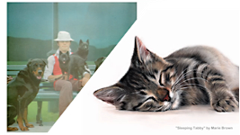
Of course, in the hands of an experienced artist (this is an acrylic painting by Michael Leonard), a deliberate lack of contrast can be used to set the mood.
I'm still amazed by those shiny black shoes... even though black doesn't feature at all.
Anyway… in this case, it signals a gentle and calm walk in the park with the dogs. So, limiting contrast to an understated range of light tonal values (known as "high-key") can result in a successful and delicate result. But, without that experience, a similar approach might also result in a disastrously flat and dull drawing.
Conversely, using a broad, contrasting range of values (or "low-key") can excite the senses of the viewer. This is not the same as saying a drawing is too light or too dark. A drawing can be dark and alive, or light and soothing. Marie, for example, used pastel pencils here to create a great deal of depth. The key lies in the use of contrast.
Pastel pencil - acrylic - graphite... it doesn't matter. The KEY is CONTRAST.
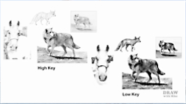
So... High-Key - Low-Key - what the heck are they?
Well, they're lighting schemes. If you've haven't heard of "high-" and "low-key" lighting, then it seems logical to think that "high key" refers to high contrast - but, No. It's the reverse - and it CAN be confusing - but that's because we're applying
photography terms to art. But bear with me, because we can apply any combination of this lighting to anything in our drawings.
And - this is important - when you begin to consciously think about lighting, you begin to understand shadows too. And they combine to create three-dimensional form.
So, why does high-key refer to low contrast?
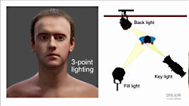
3-POINT LIGHTING
The word KEY refers to a KEY LIGHT. The most common lighting system, to light a newsreader for example, is three-point lighting. First, is a BACK light that effectively supplies a subtle highlight around the head. Then a strong KEY light is used to supply the main illumination. And finally, a less powerful FILL light softens the facial shadows. The three combine to produce a solid appearance that's devoid of strong shadows, and is separated from the background.
For now, it's just the KEY light we're interested in.
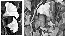
LOW-KEY lighting often uses a LOW number of KEY LIGHTS - often just one - and it's used to achieve strong three-dimensional modelling. Low-key light accentuates the contours of an object by throwing areas into shade. It can be quite dramatic. Or it can add mystery, and heighten the sense of alienation felt by the viewer, so it's often used in horror films. And it can be used quite naturally - where the values you use are those expected. Such as this, which is based on an overall scheme of dark values but with high contrast highlights for the flowers.
HIGH-KEY uses multiple light sources, as we've seen, and the effect is to produce uniform lighting with reduced modelling. Because contrast levels are low, images can evoke feelings of contentment and calm. The soft lighting, free from dark shadows, is often the choice for portraiture. And, in terms of drawing, high-key can make a landscape seem strangely ethereal - even magical if that's your aim - due to the use of white or light values where you might expect them to be darker.
So think of HIGH KEY as FULL OF LIGHT and LOW CONTRAST; and LOW KEY as a LOW number of strong lights generating HIGH CONTRAST... and you won't go far wrong. Or, as an artist, you can think purely in terms of CONTRAST and not mention key at all... but you DO need to understand how lighting works. And the best way to understand the effects is to experiment. Try this yourself.
Choose a relatively simple subject, and keep the drawing small to save time - this only 3½ inches (9cm) wide. Then draw it twice.
I'll just digress briefly... I use this wolf in my Intermediate course at Drawspace, where I explain that I found working on a small scale taught me a lot - especially in recognising what is essential and what isn't.
As a drawing becomes smaller, only essentials can be included. And what makes a small drawing readable from a distance IS the essentials. For example, it's almost impossible to draw a detailed nose on this wolf, but if you place the top and nostril highlights correctly in a black nose shape, it will read as a believable three-dimensional nose.
In HIGH-KEY - restrict yourself to a narrow palette of light greys.
Remember, high-key suggests recession, or an overcast day; and it usually produces a sense of peace. And - this is important - there are NO DARK VALUES. The most common error is to automatically draw a black nose and dark eyes. In high-key drawing, ALL darks are muted.
When you choose a LOW-KEY lighting scheme - use variations of dark tones with strong highlights. That high contrast - powerful darks pitted against bright or white highlights - suggests bright sunlight and has far more presence.
You can see how these two approaches produced vastly different results. One could be on a misty, foggy, or overcast day; and the other is more dynamic and forceful. With some manipulation, you can combine high and low key within one drawing, which helps you to control the viewer's experience.
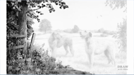
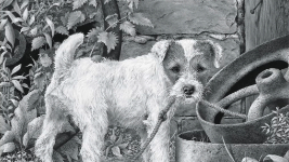
Here, for example, I used a high key (low contrast) misty background with low-key (high contrast) foreground subjects, which gives a greater sense of depth, and the subject more presence, while depicting a gentle and peaceful scene.
CONTRAST IN USE
I think artist Carol Rosinski perfectly explains: "Key" she said, "is the range of values in a drawing, and manipulating those values is a little like playing music. If you play the same song in a higher or lower octave, it's still the same song even though it sounds different. With a drawing, changing the key lightens or darkens its values, but underneath it's still structurally the same scene."
And, just like musicians, we artists can combine different mixes of the same song. For example, "Spinney Lane End" is essentially a low-key drawing with high-key midground elements to increase the overall perceived contrast and depth.
If the darks are reduced in intensity it becomes a low contrast drawing that loses depth, mood, and impact.
Contrast can extend to other aspects of the work too, such as warmth and coolness, and is not solely concerned with tonal variations.
In this drawing, I used darker values to contrast the shady end of the lane
with the bright, sunny fields beyond - each reinforces the mood of the other.
I wanted to place you, the viewer, in the shade and yet feel the warmth of the scene in front of you.
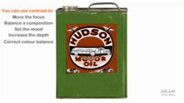
You can use contrast to:
- MOVE THE FOCUS within a drawing - but take care - don't create two separate independent elements. Here, the values of the midground trees serve to connect foreground to background.
- To BALANCE A COMPOSITION. Notice how the intruding bush at the right balances the darker left-hand values.
- To SET THE MOOD, as I just mentioned, by contrasting shade with warmth; or you might depict bright sunlight seen through the window of a dark room.
- To INCREASE THE SENSE OF DEPTH and three-dimensional form. Low contrast tends to flatten form - you may have seen this in your photography if you used a flash, which bleaches the shadows. But natural sunlight, or any oblique directional light, displays the shadows that enhance the three-dimensional form.
- And contrast can CORRECT A COLOUR BALANCE. For example, a dark red label on a dark green tin, when reduced to monochrome, might exactly match each other in value. This is why I NEVER work from B&W references. Darkening the label might give a more realistic balance, and restore the label's presence... or lightening it might be a better choice, and also increase its legibility. In either case, CONTRAST is the graphite artist's colouring tool.
USING PHOTOGRAPHIC REFERENCES
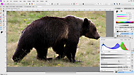
In the same ways that contrast can adversely affect the outcome of your drawing, it can affect your references too. A camera does not see the world in the same way that we do. As we move our eyes over a scene, they constantly refocus and adjust to the light and shade. But a camera can only adjust to an overall AVERAGE strength of light. Returning to our Black Bear... that "averaging" often results in burnt out highlights, and shadows that are too dark - both obliterating the detail we can see with our eyes. Fortunately, there are ways to overcome that.
The next time you begin a drawing, try printing extra copies of your photos.
First, try lightening the shadows to expose detail. Here, you can now clearly see the belly detail, and the insides of both the furthest legs. See how much we lose if we return to the "normal" photo? Now let's try darkening it too... in the often-vain hope of detail appearing in the highlights.
You can use almost any image software to achieve those aims. For example, in Photoshop and Affinity Photo, which I'm using here, try the Levels tool. Adjust the top slider to darken the darks and the Gamma slider to alter the mid-tones.
Well, that's not helped with the body, or those burnt out highlights, but the muzzle has more definition. And if the grass is an important element in your drawing, that's MUCH clearer now. Combine the three photos as you work and you'll have all the information available, as if seeing it with your own eyes.
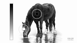
Notice how bleaching the shadows has partially flattened the bear's three-dimensional form. I hope it goes without saying that you interpret the original photo. You work directly from that while including detail from the lightened one. You have to inject contrast back into it to restore its solidity and three-dimensionality, but now you can incorporate, or ignore, whatever detail best serves your purpose. And while you're working, bear this in mind...
HOW WE SEE AND UNDERSTAND LIGHT
The human brain seeks understanding of a drawing and will quickly scan it for clues. Anything "paper white" is read as "white", even if the paper is off-white, and it looks for the darkest value that it can label "black". Once found, it now understands the significance of all the values in between.
As a consequence, if the artist has used a mid-grey to represent deep shade, that mid value will be read as "black", so the drawing makes visual sense. But it doesn't conform to the brain's expectations - it isn't natural and thus lacks a true feeling of reality. And there's no mystery. Because those weak shadows can't hide anything, everything is on view and immediately taken in. Such a drawing doesn't invite further investigation. Always try to use a full range of values, from light through medium to dark. As a generalisation, a good drawing should include all three.
Of course, there will be times that the absence of darks will be beneficial. In a drawing of a flower, for instance, that seeks to emphasise the delicate nature and satin texture of its glowing white petals - as beautifully rendered here by Marie Brown. Or a scene might require the absence of light values - except, perhaps, in key areas. Or it might be a nighttime scene, or the dark skies of an imminent storm. In this way, the choice of key used for the drawing can signal the mood, the warmth or coolness, the weather, the time of day, even the seasonal time of year. And, apart from depicting an overcast day, CONTRAST is usually the best tool to use.
THE MECHANICS
Contrast, of course, depends on solid darks and blacks. And they depend on your shading skills. So, be aware that graphite will adhere to the top of the tooth and some, depending on pressure, will enter the surface pits. That will often leave some pits unfilled, which will appear as white dots. Try scanning your shading and looking at it on your computer monitor and you'll see what I mean. In normal viewing the eye makes allowances for the pits and reads the tonal value as an average. Which means that those white pits, and any gaps, in your shading - no matter how small - will
dilute the strength of your dark shading. They need to be removed!
Let's darken half... See the effect that has? This is something often overlooked. Some artists even believe it's a natural result of drawing. It isn't. And needn't be. If you want to draw with sufficient contrast to add presence and three-dimensional solidity to your drawing... I recommend burnishing. That's layering with a harder grade, which will fill those holes and fix that problem. It will immediately broaden the range of values in your drawing and increase the contrast.
Finally… Before you begin to draw, always have decisions made about the lighting direction and it's quality. A hard, harsh, directional light, or a soft, diffused light, such as sunlight shining through a white fluffy cloud. It's also a wise move to know where your darkest values are going to be before you begin. Just identifying one or two main areas will definitely assist you. And if they're black, good contrast is ensured.
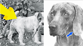
And if your reference doesn't possess strong shadows, invent some. Don't let that situation carry over to your drawing. Work out where their inclusion would be beneficial, and then engineer your drawing to accommodate them. This natural shadow really helps to divide the ear from the head. And it adds emphasis to the curl of the edge of that ear. But here while the ear
is separate from the neck... wouldn't a cast shadow add a great deal more depth? Add the contrast that a cast shadow supplies and... now you feel as though you could slide your hand under this Weimaraner's ear. It's been thrown forward away from the face; the shadow contrasts with the sharp, highlighted edge; and it describes the curve and three-dimensional form of the cheek.
Contrast can make a drawing. And a lack of it usually breaks it.
© copyright: Mike Sibley 2021