Transcript
I'm using the term "Light values" to mean areas of light tone - probably flat or gently gradated - that's smoothly applied. So, that might be an expansive sky, the gentle curves, peach-like bloom, and flawless skin of a young child's soft cheek, or the shiny glazed surface of a white teacup or mug.
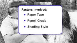
In general, the application of such values requires delicacy, but there are other factors involved too that affect the smoothness or texture of your shading:
- PAPER TYPE - Your choice of paper and its texture or tooth
- PENCIL GRADE - The grade of pencil you use
- SHADING STYLE - The way you apply the graphite
So, let's take a look at how these factors work together to create smooth light shading...
1: PAPER TYPE
The paper you choose can have a dramatic effect on the result. This is a particularly heavily textured paper, but I'm just using it to prove a point.
Notice how the hard grade fills the tooth. The mid grade doesn't cover to the same extent. And the soft grade is peppered with holes where it hasn't filled the tooth at all.
Now let's try my preferred paper - Conqueror Diamond White. A good alternative might be any smooth bristol board. For really SMOOTH shading use a SMOOTH paper otherwise your paper will impose and imprint its texture onto your shading.
2: PENCIL GRADE
Pencil grades themselves affect the results of your shading. Again, this is Conqueror, and notice that even on a smooth paper, the soft grade looks grainy. For super-smooth shading, use layers of hard grades over soft. One to provide the value, the other to smooth it out. As we'll see later...
3: SHADING STYLE
Your shading style will also influence the appearance. For really smooth results, use circular shading, because it approaches every pit in your paper from every direction. However, it's not ideal for really large areas, because it's difficult to be consistent. On the other hand, linear shading has its own set of problems, but I'll show you how to overcome those, and explain as we go along.
I'll begin with small areas of light shading and work my way up to large expanses.
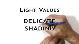
Light Values: Delicate Shading
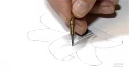
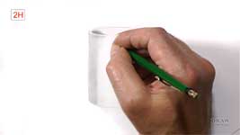
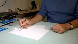
For shading this white lily's petals, and in general, I use a pen or "writing" hold, and the flat face of a chisel point.
There are other holds, of which I use only one - the overhand grip - which I'll demonstrate later. But in all cases you have a need to maintain a light contact of pencil to paper. That requires a constant reference against which you can judge your pressure.
For small areas, where you draw with your fingers, or from your wrist, rest your hand on a scrap of paper and let your little finger either sit or slide over it. That constant contact will keep your hand in control of the pressure.
This lily, which you might have seen in the Basic Techniques videos, uses both linear shading and blending. Ideally you should work dark to light, and use a tapered line that feathers and fades to white.
Simply stopping a line, or shading back in the other direction, leaves a blunt end. And an overlap of blunt ends when shading adjacent areas will result in a double layer of graphite and very obvious banding.
Well, over the years I've developed a technique to overcome both the blunt end and the overlap faults. It's
the tapered line.
A tapered line is one without obvious start and end points. It's begun by swinging the pencil point down on to the paper, to form a taper and ended with another taper as the point swings up again. This is important, as you'll see later.
Think of it as landing a light aircraft taxiing along the runway and smoothly taking off again.
The chief benefit is... you can extend a tapered line endlessly with no evidence of a join. Because when you draw one taper to sit on top of another taper, the result is a
single solid line.
Working on this lily, every line of shading is drawn towards the highlight, where it's tapered - so it fades away into the highlight.
Now, to ensure no visible line exists, I'm very lightly blending with a tortillon with my tissue-wrapped finger. That drags a little graphite into the edges of the highlight, so my tapered ends now flow seamlessly into it.
In other situations, where no similar highlights exist, the shading can be very lightly applied with unbroken to-and-fro, or zigzag, shading, but tapering the ends is a certain way to ensure success.
That simple exercise covered the basics of what we need to know for shading, tapering, and blending - so let's develop them, increase the scale, and look at even smoother shading...
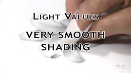
Light Values: Very Smooth Shading
I occasionally add a remarque to a print - that's a small original drawing in the margin. Most, like this one, are less than 1½" (3cm) high. This was a retirement gift for a police officer, and the mug required very smooth light shading. I'm not going to attempt to complete it, but just demonstrate how I'd draw a part of that mug. And I'll draw it much larger this time.
There are two main ways to tackle this curved surface:
- Contour shading
- Linear Shading
Well, what we need is consistency of value, so I think vertical Linear shading will be the option returning the best results. It's more controllable.
Of course, a third option exists too - Circular shading. But I'm going to rule that out for now. It's ideal for exploring complex areas of variable tone but, here, we need smoothness and a lack of variation. That said, I can see a use for it arising very soon.
Here, I'm using linear shading with tapered ends. The tapers can be very short or long, but all that matters is that you don't just stop a line dead. Blunt ends have absolutely nothing to do with a smooth glazed surface.
I'm also tapering my ends near the top rim and drawing AWAY from that edge, because that's much easier to do than attempting to accurately stop there.
However, that edge doesn't really exist as an edge. It's simply a surface that curves up and over, and down inside the mug, exposing a bright highlight at the point where it directly faces the light.
This is where circular shading is useful, because I can easily vary the value as the shading runs up into the highlight. Using the flat face of my point I can shade fairly smoothly too, although all of this mug will eventually be lightly blended to ensure no sign of line remains.
I mention this only because, as the mug is isolated and out of context, I'm leaving the outline in place. Just bear in mind that outline looks completely unnatural in a realistic drawing. Of course, you need boundaries to shade up to, but just be certain your outlines are lighter than the shading, so they disappear beneath it.
Let's move on from one linear shaded and blended mug to another. We'll increase the scale again, and turn to producing silky-smooth gradated values with layering and hatching. For that we'll use the shading of smooth skin. Well, maybe George - wonderful character that he is - isn't the best model for that :o) so... we'll use young Charlotte instead.
Light Values: Layering Smooth Gradations
Two-year old Charlotte has the typically smooth, blemish-free, complexion of a young child. She's also blonde, so her pale skin tends to need predominantly light values. That might lead you to believe that you need to shade lightly and then blend, but that's only partly correct.
Blending is the
final embellishment. It's carried out after the careful rendering of layers of shading. In other words it's
the shading and careful drawing that produces the subtleties, NOT the blending.
Personally, I'd recommend anyone relatively new to drawing to avoid blending or "smudging". First learn to get the most out of the shading. Then, and only then, introduce blending as a final smoothing action.
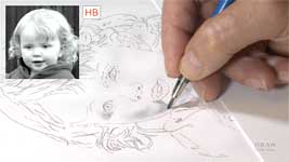
In the original drawing, I began with the eyes. By first defining an area of sharp-edged clarity, I had something to balance the more delicate shading of the face against. The paper represents my lightest value and the pupils of the eyes contain the darkest so, with both established, all other values more easily fell into place.
I'm using HB and 2H, and I'm taking care to avoid being so heavy-handed that I indent any lines, because no amount of blending will eradicate them. Also I find that squinting through half-closed eyes at my reference sufficiently reduces the detail - like this - so I can see the differing bands of value - the areas of shade, mid-tone, and highlight.
Establishing the darker areas first, carefully avoiding the creation of hard edges, gives me a good feel for the correct shaping. These areas are then extended with lighter tone, and the very lightest areas are left white.
I'm alternating between the flat faces of an HB and a 2H, and hatching and cross-hatching. Flat face lines merge easily, and hatching gives very subtle control of the overall result.
Where I previously wanted to recreate the silky smoothness of the skin, by feeling it under my pencil, now I want to feel the bumps and hollows. It's a change of mindset helped by the change of technique.
Whatever technique you're using, and whether you're shaping curves or hatching smooth areas - there will be times that you need to draw darker than your current grade can accomplish - at least, without using excessive pressure. Remember, the shading needs to be light and sitting on top of the tooth, so it will blend most effectively later.
So, when you need a darker value, shift down to a softer grade. This is 2B. Its flat face is drawing broad soft-edged lines that flow into each other. It's also being applied VERY LIGHTLY on top of the tooth... and it's quite grainy in appearance. Too grainy to represent a child's perfect skin. But, don't worry, we can work around that.
It's a two-part operation - soft then hard. The 2B provides the darker value but not the smoothness. The harder grades draw more smoothly but lack the depth of value. So, we'll combine the two.
Using a harder grade, work back over the dark area. This - Hard over Soft - is burnishing. Using the harder grade to polish and smooth the softer grade. I recommend using a pencil two grades harder. So, HB over 2B, or 2H over HB. This HB is doing a good job of smoothing the darker 2B shading and filling the tooth of the paper. If that's still not smooth enough, burnish the HB layer with 2H. You can lightly blend too at any stage if lines look as though they might remain visible.
After blending, further applications of 2H will gradually build up and smooth the gradations. And I sometimes fine-tune areas using the graphite-coated blender like a soft pencil.
As long as the shading is light enough, and no undue pressure has indented the surface, all the blended pencil strokes should completely disappear. As I mentioned, additional layers of graphite can then be added, and blended as required, to build up the tones. For example... in the real world… when was the last time you saw pencil lines in the sky?
Never? Me too!
Light Values: Extensive Smooth Shading
Now we're entering the realms of gentle shading, including skies and other large areas that need light and seamless shading. This requires delicacy and a super-smooth finish. It also uses a method - a way of holding my pencil - that I don't use at any other time.
So, how big an area are we talking about? This big. And bigger.
And not just for skies. The background and fabric were created with very lightly applied HB and 2H, sitting on top of the paper's tooth, so it blended flawlessly.
Here both the sky and sand were produced the same way.
Three things are in play here:
- It's the only time I use the side of my lead and a modified grip, but we'll return to that.
- The shading is so lightly applied that unbroken zigzag shading can be used for speed.
- And - in the earlier sections of this video - I was drawing either with my fingers or my wrist. Both give you a lot of control and accuracy.
But wide vistas of sky, for example, are far too expansive to shade in such restricted ways. So, try working from your elbow. That immediately lengthens the arc of movement and the area covered. You can even work from your shoulder. Now you can make wide sweeping movements and cover a much larger area. However, you sacrifice a great deal of control. The longer your arm, the longer the arc, and the greater the room for inaccuracies.
However, as I mentioned earlier, you need to create a point of reference. Secure a strip of scrap paper or card across your drawing, rest your hand or little finger on it, and slide it across the card as you shade. Now you know where you hand is in space, how far above the paper your fingers are, and how much pressure your hand is exerting. It's a simple idea but it has a major impact on the result. And it's probably something you already do without thinking about it. But knowing that you do it and why is very useful, because, whether you're working from your shoulder or your elbow, your hand will now be fully in control of the pressure you apply.
I'll concentrate on shading a wide area of sky, but this technique can be used for any part of a drawing that needs to be toned down, either before or after drawing has commenced. If you want the focus to be on the scene but need to include some of the sky, the way you create the sky can often make or break a drawing.
And skies are more important than I once realised! I used to leave them white - but I soon discovered that adding even a light tone to skies immediately increased the brilliance of highlights within the drawing. In other words, removing all white from a drawing, except where it is intended, forces the viewer's eye to read those intentional whites and highlights as pure brilliant white.
Let's take another look at that, because the effect is quite dramatic. Applying an overall, smooth tone to skies can present technical problems; there should be a total absence of line, and smoothly graduated changes of value. Any marks that don't conform to Nature immediately reduce your carefully rendered realism to mere "drawing".
I almost always hold my pencil in a normal "writing" position, for maximum control, but for skies, and other large expanses, I use an overhand grip - letting the weight of the pencil do the job, and using the side of the lead. And, as I just explained, my little finger is controlling the overall pressure.
I'm using only the weight of my clutch pencil to apply the tone and, as usual, with a 2H pencil. I'll switch to an HB now so you can see it more clearly. I'm also using a technique that I
cannot recommend - at least, not until you know exactly how YOUR shading performs with YOUR pencils on YOUR paper.
Briefly, I'm shading in a zigzag fashion. Although it's a very speedy way of shading, I usually advise against this practice. The reason being that zigzag shading can produce blunt ends where the direction is reversed. And later adjacent shading can lead to the overlap problem. Basically, zigzag shading is OK if used VERY LIGHTLY, but those blunt ends WILL be a problem if the shading is too heavily applied. That's because heavier shading will enter the tooth of the paper and those buried blunt ends will not blend away.
The safer alternative, which we've already looked at, takes longer and needs more care. That's creating a taper at the end of each line. And you should also stagger the ends to prevent the eye detecting an edge. Each shaded area will, as I explained earlier, now have a feathered edge that you can seamlessly overlap with adjacent areas of shading. As we saw earlier, a feathered edge layered over a feathered edge equates to a - solid - matching - tone.
Automatically creating tapers can take some time to learn, but once you get a feeling for drawing this way you can begin to shade very large areas in convenient, manageable sections.
The only problem is that you're working expansively, on a large scale, so avoiding small features is not always possible. If, for example, you come across a feature in the sky, such as a bird, that doesn't need to be toned down... well, avoid it if you can, but don't worry about simply shading over it. Your shading should be very light and on top of the tooth, so Blu-Tack or a kneadable eraser can easily return it to pristine white. However, don't use any other form of eraser, because that's more likely to result in partial erasure and flattened tooth.
Blu-Tack and kneadable erasers work because graphite adheres to them and is lifted out of the tooth. Others require pressure and that might push some graphite deeper.
Once the area is completely shaded you will need to blend it. Blending is a technique I only use where it has an entirely beneficial effect, and this is one of those times. I want to absolutely ensure that no linear content remains.
When applying the graphite, bear in mind that blending will lighten the original value. Knowing beforehand that you intend to blend means you can apply your graphite in the most effective way. That's why I use the overhand pencil-weight method, because the graphite sits on the top of the paper and not deep in the tooth, so it will blend with the maximum of ease. I usually blend very lightly with toilet tissue wrapped around my finger. As I did with the lily earlier. And, again, I prefer to blend in small circles to achieve maximum coverage.
Of course, as the tooth of the paper is still available, I can apply additional layers, if required, to build up the tone. And then blend that too. As long as the blending is light, and uses the same or a harder grade, there isn't a limit to the number of layers you can apply. However, that's true of MY pencils on MY paper. You might encounter different results.
Well, I hope I've at least given you a starting point from which you can run your own experiments.
Ultimately, you need to find what works for YOU, and the only way to do that is to ignore the rules, and explore every possibility.
© copyright: Mike Sibley 2020